Introduction
Histograms, particularly when implemented in Python using Matplotlib, serve as robust tools for dissecting dataset distributions. Our exploration begins with a comprehensive definition, illustrating statistical insights through blocks that represent frequency. This article delves into the significance of histograms, addressing when to deploy them and their real-world applications. Understanding their role in extracting business insights underscores the importance of data visualization in data science projects, where tools like Matplotlib facilitate convenient and effective histogram plotting.

This article was published as a part of the Data Science Blogathon.
Table of contents
When to Use Histograms?
Before using any technique, we first need to analyze when we can use that (in this case, histograms) to get the best out of it. Hence, in this section, we will discuss some key aspects where histograms can be extremely useful.
- The first thing to remember while using histograms is the data type, which usually gives better insights into the numerical data.
- Then if we want to see the distribution of the dataset for that reason, this plot is handy to determine whether the data is normally distributed or not.
- Histograms can also be helpful when we want to find out about the client’s process in terms of output being generated.
- When we get the problem statement to analyze the time series data at that time, histograms can come to the rescue to help start the analysis, which can determine changes occurring over time.
- Histograms are also very beneficial in identifying popular statistical measures such as median, standard median, minimum, and maximum data points.
Loading Necessary Libraries
import numpy as np import matplotlib.pyplot as plt import seaborn as sb import pandas as pd plt.rcParams[“figure.figsize”] = (10,6)
Let’s discuss in a nutshell the use of each library that we have imported:
- Numpy: Used to implement the statistics and mathematical formulae using pre-defined functions.
- Matplotlib: This is the OG library for data visualization we will mainly use this only to plot the charts/graphs.
- Seaborn: Another visualization library built on top of matplotlib.
- Pandas: Used for DataFrame manipulation and data cleaning.
Loading Data
Let’s load some 1D data and get some insight into it!
To keep this section easy to understand, the data generated is something I’ve thrown together. It’s not just an analytic function from Scipy – that would make it too easy – but I’ve ensured it’s not pathological.
Let’s start with the imports to make sure we have everything right at the beginning. If this errors, pip install whichever dependency you don’t have. If you have issues (especially on windows machines with NumPy), try using Conda install. For example:
import numpy as np

# Uncomment the next line if you need to install NumPy using Conda.
# !conda install numpy

# Now, let's load the data from two files, "example_1.txt" and "example_2.txt".
d1 = np.loadtxt("example_1.txt")
d2 = np.loadtxt("example_2.txt")

# Print the shapes of the loaded data arrays.
print("Output:", d1.shape, d2.shape)
Output:(500,) (500,)
Inference: As mentioned above, we have loaded two datasets that I have created for demonstration purposes, and when we had a look at the shape of both of the datasets then, we saw that both of them have 500 rows.
Histogram Plots
Now it’s time to get our hands dirty and see different aspects of histograms. Here we will discuss 3 plots that can help get the nominal data distribution simultaneously for both datasets.
- Normal plots: For a basic understanding of histograms, i.e. to see the distribution of data points within the specified range.
- Density and bins: Taking a step forward to density parameter will help us know the probability connection with histograms, and bins will help in the normalization
- Customizing styles: To give histograms a good look and feel, we will also customize it based on their availability.
plt.hist(d1, label="D1") plt.hist(d2, label="D2") plt.legend() plt.ylabel("Counts");
Hit Run to See the Output
import numpy as np
import matplotlib.pyplot as plt
import seaborn as sb
import pandas as pd

plt.rcParams["figure.figsize"] = (10,6)

d1 = np.loadtxt("example_1.txt")
d2 = np.loadtxt("example_2.txt")
print(d1.shape, d2.shape)

plt.hist(d1, label="D1")
plt.hist(d2, label="D2")
plt.legend()
plt.ylabel("Counts")
plt.show()
Codes to Plot Histogram in Python using Matplotlib
- Inference: We have used the hist plot from matplotlib for both D1 and D2 to plot the histogram. Note that, in the plot, we can see the blue area as D1 and the yellow area as D2, performed by the legend() function.
- Drawbacks: Major drawback is that the plots are completely opaque; hence we cannot spot the distribution clearly; second is irregular bin size which is portraiting the false story.
bins = np.linspace(min(d1.min(), d2.min()), max(d1.max(), d2.max()), 50)
counts1, _, _ = plt.hist(d1, bins=bins, label="D1")
plt.hist(d2, bins=bins, label="D2")
plt.legend()
plt.ylabel("Counts");
Here’s the Output

- Inference: In this step, we have almost resolved the drawback of normalizing the bins so that now the data points stimulating the false story give better insight.
- Instead of the default bins, we have created a new variable which stores the range of minimum and maximum values from the distribution of the D1 and D2 datasets to have the custom bins.
bins = np.linspace(min(d1.min(), d2.min()), max(d1.max(), d2.max()), 50)
counts1, _, _ = plt.hist(d1, bins=bins, label="D1", density=True)
plt.hist(d2, bins=bins, label="D2", density=True)
plt.legend()
plt.ylabel("Probability");
Output

- Inference: As mentioned at the start of the article, histogram is highly related to probability. One can notice in the Y-Axis and compare it with the previous plot where it has counts, while in this plot, we have a probability distribution. We have achieved this by adding only one parameter, i.e. density and setting it up as True.
bins = np.linspace(min(d1.min(), d2.min()), max(d1.max(), d2.max()), 50)
plt.hist([d1, d2], bins=bins, label="Stacked", density=True, alpha=0.5)
plt.hist(d1, bins=bins, label="D1", density=True, histtype="step", lw=1)
plt.hist(d2, bins=bins, label="D2", density=True, histtype="step", ls=":")
plt.legend()
plt.ylabel("Probability");
Checkout the Output
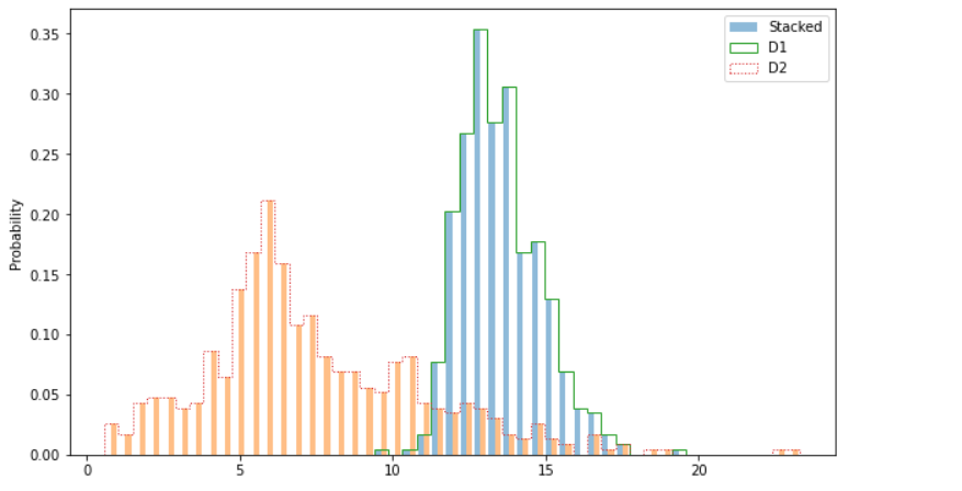
Inference: Now comes the styling part where we will improve the look and feel of Matplotlib’s histogram plot by changing and adding a few parameters from the hist() function.
- Stacked chart: There is no specific function to achieve the stacked functionality. We just have to add two or three datasets as a list and work is made!
- Alpha: This parameter is used to manage the opacity of bars. We can use this when we want to highlight one data more than another.
- Hist-Type: This parameter can convert the typical histograms into bar charts (step) as we can see the spacing between the continuous distribution, which is quite similar to bar graphs.
- Line width & line style: Line width is denoted as “l-w”, which helps us to increase or decrease the width of the line, whereas line style is denoted as ls; one can notice that I have chosen the “:”, which is visible too for the D2 dataset.
Conclusion
We now reach the final part of the article, where we will briefly review everything discussed so far about histograms—covering their definition, purpose, applications, and practical implementation. Rather than providing a paragraph explanation, let’s opt for a point-to-point briefing.
- Starting with the introduction, we learned about histograms, which answered our “what” question. Then from what, we traversed to “When”, where we discussed when is the best time to use those plots.
- After getting theoretical knowledge, we moved forward to implement the histograms plot, where we first drew the basic plot of the same and gradually moved towards discussing the parameters like density and bins.
- At last, we learned how to improve the plots’ look and feel by using basic parameters like alpha, line width and line style, stacked chart, etc.
Frequently Asked Questions
Q1. What are the important things to know about histograms?
A. Histograms visually represent data distribution, offering insights into patterns, central tendencies, and variations. Understanding when to use them enhances data analysis and interpretation.
Q2. What are the 4 parts of a histogram?
A. A histogram comprises four main elements: bins (intervals representing data ranges), frequencies (counts of data points in each bin), axes (x and y), and bars (rectangular blocks indicating data frequency).
Q3. What are 2 important characteristics of a histogram?
A. Two crucial characteristics of a histogram are shape (indicating data distribution) and central tendency (highlighted by the location of the central peak or mean).
Q4. What 4 things does a histogram reveal about the process?
A. Histograms reveal the process’s central tendency, variability, shape of the distribution, and potential outliers or anomalies, providing a comprehensive overview of the underlying data patterns.
The media shown in this article is not owned by Analytics Vidhya and is used at the Author’s discretion.


