This article was published as a part of the Data Science Blogathon.
Introduction
Ever wondered what would be the conversion drop and consequent sales drop(conversion is when someone buys a product) for eCommerce companies or payment aggregators if Debit and Credit cards are dropped from the payment page?
But why is this experiment needed, if it is feasible, and what is its motive? On average, payment gateway providers charge anywhere between 1-3% as charges. Annual maintenance charges, Integration charges, and Merchant Discount Rate (MDR) are the 3 main components. Obviously, companies would want to reduce this cost and effectively increase their profits. But business teams are interested to know how will revenue and sales be impacted if this experiment goes live. Firstly, only 4 percent of Indians have a credit card and spend annually Rs.15K, hence card holders are high-value customers. This experiment would mean a poor customer experience, a loss of revenue and probably an increase in customer churn. So this experiment will not get a go-ahead from business teams. So what can be done to assess the impact? How to derive experimental results without running an experiment?
Here’s a secret, synthetic control methods can solve this problem with utmost ease and without loss in revenues or customers. If this was an experiment, the hypothesis would be – removing cards as a payment method will not impact revenue and sales. The test base would comprise customers who do not have cards as a payment option, and the control base would have cards as a payment option.
Synthetic Control Method: Case Study
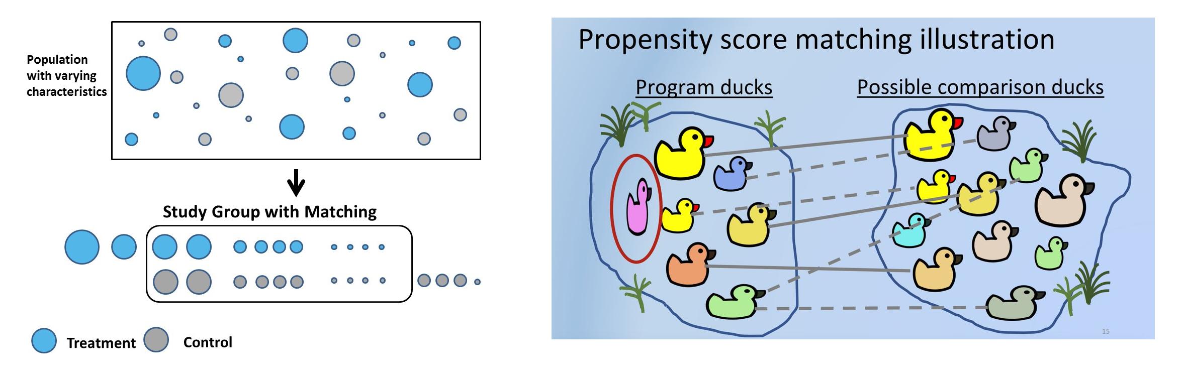
Synthetic control methods(SCM), in simple words, will choose for every test customer a similar control customer using a pre-defined set of features or covariates whose pre-treatment characteristics are similar but have not undergone treatment. In SCM customers are called units, interventions are called treatments, and features are called covariates. Companies use SCM for many practical use cases. Uber, for example used SCM to test whether providing driver contact detail before a ride increases customer satisfaction.
Sometimes hypotheses cannot be tested in an experimental setup due to legal, business, or platform reasons. For example: in Bangalore, Meghana’s biryani is one of the best, and online delivery platforms(Swiggy or Zomato) noticed that there is a high probability that high-spending customers order from Meghana as well. The hypothesis is that Meghana customers on average, spend higher than the rest. But Swiggy or Zomato cannot remove Meghana’s from the platform for 50% of the customers just for the sake of the experiment. There would be customer, as well as restaurant backlash. Using SCM, a synthetic control can be created where test and control customers have similar pre-treatment covariates, and the hypothesis can be validated.
Solving selection bias and using the right business heuristics while choosing the right control becomes very important and can even reverse the outcome of experiments. For example, the test will be a set of customers who ordered Meghana’s. For control, vegetarian customers can be chosen. But intrinsically, test and control are different in that control has never tried non-veg cuisine. Another way to control is customers who never ordered biryani, but this would not be an appropriate control, as Meghana’s is heavily a biryani-serving restaurant. Another way to control is using geographies. As Meghana’s isn’t present in Delhi, Delhi customers can be used as control. But the food habits of Delhi users are different from south Indian users and this will cause bias if the experiment is broken down into various dimensions like age group, gender, and cuisine. Right business heuristic thus becomes a quintessential part while solving for synthetic control.
Table of Content
- Practical Steps in Propensity Score Matching
-
Problem statement
-
Data Pre-Processing
-
Propensity Modelling
-
Matching using NearestNeighbors
-
Before and After Matching
-
Statistical Test to measure the impact of treatment
-
Another Way to Match using NearestNeighbors
-
psmpy – Python Propensity Score Matching Library
-
Disadvantages of PSM
Steps Involved in Propensity Score Matching
Synthetic controls can be created using matching. Propensity score matching is the most common method used to create SC because it’s easy, less time-consuming, saves a lot of dollars, and can be scaled to a large user base. The process can be repeated N times until the most similar test, and control cohorts are matched.
Steps involved in propensity score matching:
- Select a large group of customers – age, sex, sales, units, etc. These are covariates that can cause bias.
- The main goal is to match the covariates before intervention. For each customer who paid using a credit card – test customer, in control, there needs to be a customer whose pre-treatment covariates are similar to that of the test but did not pay using a card but used UPI or internet banking instead.
- Fit classification model to get propensity scores. Accuracy isn’t important as predicted probabilities are used to match different users. Tree-based or logistic regression can be used. The advantage of tree-based is assumptions of logistic regression can be ignored.
- Using the probability score, say 0.6 and 0.61 can be matched using k nearest neighbor. Matching can be 1:1 or 1:many, which uses duplicates.
- Now investigate how the treatment has affected the outcome. The treatment is binary, 1 or 0. Ordered Meghana’s or not, used card or not. But the outcome can be either continuous – future revenue or binary – churned or not, etc.
Problem Statement
The dataset used here is based on customer payment history. Let’s break it down by taking a cue from the debit card problem statement.
Hypothesis: H0:Customers paying with cards have higher post revenues. Alternate hypothesis: H1: Customers paying with cards do not have higher post revenues(hence the experiment to remove card payments altogether from the platform). If P<0.05, we can reject the null hypothesis and conclusively say that customers paying with cards do not have higher post revenue.
There are three time periods here: Pre-period, on which the features/covariates are based. Treatment period, where customers pay using cards. Post period where the outcome, in this case, post revenue, is measured. Choosing these periods carefully is important to avoid event bias, ensuring no promotional event was planned and executed during this time. For example, during Oct, Nov due to festive and cashback from banking partners, users prefer credit cards as they offer 500 to 5000 discounts. Considering this period for the analysis would clearly bias the results.
For the sake of this analysis, let’s assume the pre-period was Jan’21 to June’21, and covariates used to train the model are derived from this period. The treatment uses debit/credit cards during the treatment period, and it’s the model’s dependent variable. Let’s consider the treatment period was the first week of July, and the outcome post-period was the next 30 days.
Exploratory Data Analysis of this dataset has been updated here.
Data Pre-Processing
- Read the dataset and drop irrelevant features. card_payment is the dependent variable:
df_fintec = pd.read_csv("https://raw.githubusercontent.com/chrisdmell/Project_DataScience/working_branch/07_cred/Analytics%20Assignment/data_for_churn_analysis.csv")
cols_basic_model = ['number_of_cards',
'payments_initiated',
'payments_failed',
'payments_completed',
'payments_completed_amount_first_7days',
'reward_purchase_count_first_7days',
'coins_redeemed_first_7days',
'is_referral',
'visits_feature_1',
'visits_feature_2',
'given_permission_1',
'given_permission_2']
df_fintec_LR = df_fintec[cols_basic_model]
df_fintec_LR["is_referral"] = df_fintec_LR["is_referral"].astype(int)
df_fintec_LR.fillna(0, inplace = True)
oh_cols = ["is_referral","given_permission_1","given_permission_2"]
df_fintec_LR.drop(columns = oh_cols, inplace = True)
Hit Run to see the output
import pandas as pd
df_fintec = pd.read_csv("data_for_churn_analysis.csv")
cols_basic_model = ['number_of_cards',
'payments_initiated',
'payments_failed',
'payments_completed',
'payments_completed_amount_first_7days',
'reward_purchase_count_first_7days',
'coins_redeemed_first_7days',
'is_referral',
'visits_feature_1',
'visits_feature_2',
'given_permission_1',
'given_permission_2']
df_fintec_LR = df_fintec[cols_basic_model]
df_fintec_LR["is_referral"] = df_fintec_LR["is_referral"].astype(int)
df_fintec_LR.fillna(0, inplace = True)
oh_cols = ["is_referral","given_permission_1","given_permission_2"]
df_fintec_LR.drop(columns = oh_cols, inplace = True)

print(df_fintec.head())- Prepare train test split and scale features(catboost works without feature standardization as well):
df_fintec = df_fintec.rename(columns={'is_churned': 'card_payment'})
X_train, X_test, y_train, y_test = train_test_split(df_fintec_LR, df_fintec[["card_payment"]],random_state = 70, test_size=0.30)
scaler = StandardScaler()
scaler.fit(X_train)
X_train_Scaled = scaler.transform(X_train)
X_test_Scaled = scaler.transform(X_test)
X, y =X_train_Scaled ,y_train
Propensity Score Matching Modelling
- Use a simple model, as we are more interested in the propensity score:
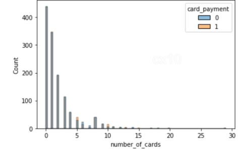
clf = CatBoostClassifier(

iterations=5,

learning_rate=0.1,

#loss_function='CrossEntropy'

)

clf.fit(X_train, y_train,

verbose=False)

y_pred = clf.predict(X_test, prediction_type='Probability')

y_pred

y_pred_df = pd.DataFrame(y_pred,columns = ["zero","one"])

y_pred_df.head()


df_test = pd.concat([X_test.reset_index(drop=True), y_test.reset_index(drop=True)], axis=1)

df_test = pd.concat([df_test.reset_index(drop=True), y_pred_df[["one"]].reset_index(drop=True)], axis=1)

df_test['revenue'] = np.random.randint(0,50000, size=len(df_test))

display(df_test.head())

sns.histplot(data=df_test, x='one', hue='card_payment') # multiple="dodge" for
.png)
As observed in the histogram, there are clear areas of overlap, thus, similar units can be obtained using PSM. If there was no overall between them, it isn’t possible to find matches.
Matching using NearestNeighbors
- Matching using NearestNeighbors.
from sklearn.neighbors import NearestNeighbors
caliper = np.std(df_test.one) * 0.25
print(f'caliper (radius) is: {caliper:.4f}')
n_neighbors = 10
# setup knn
knn = NearestNeighbors(n_neighbors=n_neighbors, radius=caliper)
ps = df_test[['one']]  # double brackets as a dataframe
knn.fit(ps)
# distances and indexes
distances, neighbor_indexes = knn.kneighbors(ps)
print(neighbor_indexes.shape)
# the 10 closest points to the first point
print(distances[0])
print(neighbor_indexes[0])
# for each point in treatment, we find a matching point in control without replacement

# note the 10 neighbors may include both points in treatment and control

matched_control = [] # keep track of the matched observations in control

for current_index, row in df_test.iterrows(): # iterate over the dataframe

if row.card_payment == 0: # the current row is in the control group

df_test.loc[current_index, 'matched'] = np.nan # set matched to nan

else:

for idx in neighbor_indexes[current_index, :]: # for each row in treatment, find the k neighbors

# make sure the current row is not the idx - don't match to itself

# and the neighbor is in the control

if (current_index != idx) and (df_test.loc[idx].card_payment == 0):

if idx not in matched_control: # this control has not been matched yet

df_test.loc[current_index, 'matched'] = idx # record the matching

matched_control.append(idx) # add the matched to the list

break
# try to increase the number of neighbors and/or caliper to get more matches
print('total observations in treatment:', len(df_test[df_test.card_payment==1]))
print('total matched observations in control:', len(matched_control))
total observations in treatment: 8988total matched observations in control: 1296
# control have no match
treatment_matched = df_test.dropna(subset=['matched'])  # drop not matched
# matched control observation indexes
control_matched_idx = treatment_matched.matched
control_matched_idx = control_matched_idx.astype(int)  # change to int
control_matched = df_test.loc[control_matched_idx, :]  # select matched control observations
# combine the matched treatment and control
df_matched = pd.concat([treatment_matched, control_matched])
df_matched.card_payment.value_counts()
1 12960 1296Name: card_payment, dtype: int64
sns.histplot(data=df_matched, x='number_of_cards', hue='card_payment')

sns.histplot(data=df_matched, x='payments_completed_amount_first_7days', hue='card_payment')
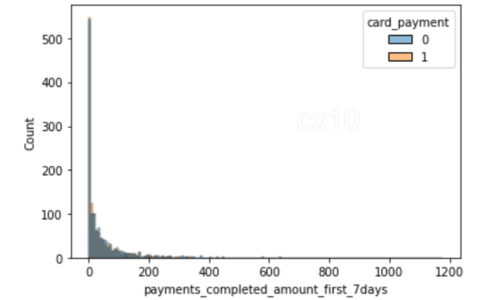
From the 2 histograms, it’s clear that post propensity matching, the distribution of covariates is nearly the same for 2 features – the number of cards and payments completed amount first seven days. The same can be plotted for other features as well.
Before and After Propensity Score Matching
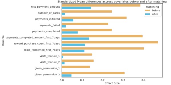
The distribution of covariates before and after should show significant differences in SD; only then can it be concluded that matching has been effective.
from numpy import mean
from numpy import var
from math import sqrt
# function to calculate Cohen's d for independent samples
def cohen_d(d1, d2):
	# calculate the size of samples
	n1, n2 = len(d1), len(d2)
	# calculate the variance of the samples
	s1, s2 = var(d1, ddof=1), var(d2, ddof=1)
	# calculate the pooled standard deviation
	s = sqrt(((n1 - 1) * s1 + (n2 - 1) * s2) / (n1 + n2 - 2))
	# calculate the means of the samples
	u1, u2 = mean(d1), mean(d2)
	# calculate the effect size
	return (u1 - u2) / s
effect_sizes = []
cols = list(X_train.columns)
# separate control and treatment for t-test
df_control = df_fintec[df_fintec.card_payment==0]
df_treatment = df_fintec[df_fintec.card_payment==1]
for cl in cols:
    _, p_before = ttest_ind(df_control[cl], df_treatment[cl])
    _, p_after = ttest_ind(df_matched_control[cl], df_matched_treatment[cl])
    cohen_d_before = cohen_d(df_treatment[cl], df_control[cl])
    cohen_d_after = cohen_d(df_matched_treatment[cl], df_matched_control[cl])
    effect_sizes.append([cl,'before', cohen_d_before, p_before])
    effect_sizes.append([cl,'after', cohen_d_after, p_after])
df_effect_sizes = pd.DataFrame(effect_sizes, columns=['feature', 'matching', 'effect_size', 'p-value'])
fig, ax = plt.subplots(figsize=(15, 5))
sns.barplot(data=df_effect_sizes, x='effect_size', y='feature', hue='matching', orient='h')
.png)
Cohen’s D, or standardized mean difference, is one of the most common ways to measure effect size. Before matching, the difference in SD is higher between the test and control (blue bars). After matching the SD difference is lower, the test and control have similar distributions before the treatment period.
Statistical Test to Measure The Impact of Treatment
Students T-tests to compare the means of two groups. If it was post-period retention or churn, Chi-Squared Test could be used.
# student's t-test for revenue (dependent variable) after matching
# p value is not significant now
from scipy.stats import ttest_ind
print(df_matched_control.revenue.mean(), df_matched_treatment.revenue.mean())
# compare samples
_, p = ttest_ind(df_matched_control.revenue, df_matched_treatment.revenue)
print(f'p={p:.3f}')
# interpret
alpha = 0.05  # significance level
if p > alpha:
    print('same distributions/same group mean (fail to reject H0 - we do not have enough evidence to reject H0)')
else:
    print('different distributions/different group mean (reject H0)')
25105.91898148148 24040.162037037036
p=0.062
same distributions/same group mean (fail to reject H0 – we do not have enough evidence to reject H0)
As P-value > 0.05, we fail to reject the null hypothesis, thus, customers paying with cards have higher post revenues. Thus saving time and resources that would have gone into building this new feature.
Another Way to Match Using NearestNeighbors
Apart from PSM, there are other matching methods as well. A snippet of code for the same.
from sklearn.preprocessing import StandardScaler
from sklearn.neighbors import NearestNeighbors
def get_matching_pairs(treated_df, non_treated_df, scaler=True):
    treated_x = treated_df.values
    non_treated_x = non_treated_df.values
    if scaler == True:
        scaler = StandardScaler()
    if scaler:
        scaler.fit(treated_x)
        treated_x = scaler.transform(treated_x)
        non_treated_x = scaler.transform(non_treated_x)
    nbrs = NearestNeighbors(n_neighbors=1, algorithm='ball_tree').fit(non_treated_x)
    distances, indices = nbrs.kneighbors(treated_x)
    indices = indices.reshape(indices.shape[0])
    matched = non_treated_df.iloc[indices]
    return matched
import pandas as pd
import numpy as np
import matplotlib.pyplot as plt
treated_df = pd.DataFrame()
np.random.seed(1)
size_1 = 200
size_2 = 1000
treated_df['x'] = np.random.normal(0,1,size=size_1)
treated_df['y'] = np.random.normal(50,20,size=size_1)
treated_df['z'] = np.random.normal(0,100,size=size_1)
non_treated_df = pd.DataFrame()
# two different populations
non_treated_df['x'] = list(np.random.normal(0,3,size=size_2)) + list(np.random.normal(-1,2,size=2*size_2))
non_treated_df['y'] = list(np.random.normal(50,30,size=size_2)) + list(np.random.normal(-100,2,size=2*size_2))
non_treated_df['z'] = list(np.random.normal(0,200,size=size_2)) + list(np.random.normal(13,200,size=2*size_2))
matched_df = get_matching_pairs(treated_df, non_treated_df)
fig, ax = plt.subplots(figsize=(6,6))
plt.scatter(non_treated_df['x'], non_treated_df['y'], alpha=0.3, label='All non-treated')
plt.scatter(treated_df['x'], treated_df['y'], label='Treated')
plt.scatter(matched_df['x'], matched_df['y'], marker='x', label='matched')
plt.legend()
plt.xlim(-1,2)
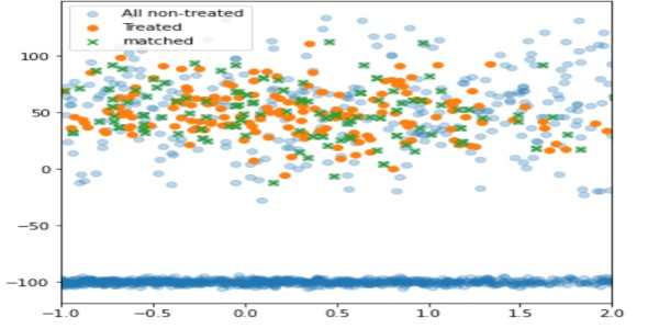
Using this technique, only non-treated units with proximity to the treated are matched(in green), while the rest have been left out(light blue).
psmpy – Python Propensity Score Matching Library
PSMPY simplifies PSM, effectively reducing it to just 10 lines of code. Model building, matching, and scaling are taken care of by the framework. One downside is that it scales poorly for more than 50K units.
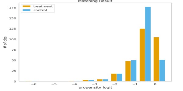
from psmpy import PsmPy
from psmpy.plotting import *
df_fintec.fillna(0, inplace = True)
psm = PsmPy(df_fintec, treatment='card_payment', indx='user_id', exclude = ['is_referral', 'age', 'city', 'device'])
# same as my code using balance=False
psm.logistic_ps(balance=False)
psm.predicted_data
psm.knn_matched(matcher='propensity_logit', replacement=False, caliper=None)
psm.plot_match(Title='Matching Result', Ylabel='# of obs', Xlabel= 'propensity logit', names = ['treatment', 'control'])
display(psm.effect_size)
psm.effect_size_plot()
Disadvantages of Propensity Score Matching
Their covariates values will not be identical for two individuals with identical propensity scores. PSM effectively balances the average values of covariates across cohorts. Basically, if the average of the number of cards across the test and control is the same, but if two users are chosen with the same propensity values, their covariates will differ.
As the number of covariates grows, the curse of dimensionality affects matching, reducing the chances to nearly zero.
Conclusion
Compared to PSM, A/B tests are time-consuming, resource-intensive, and sometimes inconclusive; methods like PSM can help companies drive the right product strategy. For analysts, PSM saves time and effort and provides quick results to tough business problems. Key takeaways :
- Synthetic control can be used when AB test cannot be performed.
- Controlling for inherent bias can lead to good results.
- Choose appropriate pre-period covariates based on the problem at hand.
- The hypothesis needs to be backed by business acumen and data.
Let me know the other use cases of PSM in the comments section below.
Good luck! Here’s my Linkedin profile if you want to connect with me or want to help improve the article. Check out my other articles on data science and analytics here.
The media shown in this article is not owned by Analytics Vidhya and is used at the Author’s discretion.
Data scientist. Extensively using data mining, data processing algorithms, visualization, statistics, and predictive modeling to solve challenging business problems and generate insights. My responsibilities as a Data Scientist include but are not limited to developing analytical models, data cleaning, explorations, feature engineering, feature selection, modeling, building prototype, documentation of an algorithm, and insights for projects such as pricing analytics for a craft retailer, promotion analytics for a fortune 500 wholesale club, inventory management/demand forecasting for a jewelry retailer and collaborating with on-site teams to deliver highly accurate results on time.