Introduction
Data visualization is a pivotal aspect of data analysis, offering an intuitive understanding of complex data through graphical representation. Among the various tools available for data visualization in Python, Seaborn’s jointplot stands out for its ability to illustrate the relationship between two variables and their distributions. This article talk about the definition, importance, utility, and components of a jointplot, offering a thorough understanding of its role in data analysis.

Table of contents
Brief Overview of Seaborn and Its Place in Data Visualization
Seaborn, a Python-based data visualization library, simplifies the creation of attractive statistical graphics by providing a user-friendly interface on top of matplotlib. Tailored for statistical data visualization, it seamlessly integrates with pandas, enhancing the handling and plotting of dataframes and series. Leveraging Seaborn results in elegant plots with fewer lines of code, boosting productivity and readability.
Noteworthy for its ability to handle large datasets, Python Seaborn offers diverse plotting functions for distribution, regression, and categorical data analysis. The library’s default themes and color palettes prioritize modern aesthetics, ensuring visually appealing and interpretable plots without extensive customization. Bridging the gap between detailed statistical analysis and graphical simplicity, Seaborn is particularly valuable for exploratory data analysis (EDA). Its advanced plotting functions, including jointplot, pairplot, and heatmap, empower analysts to uncover complex patterns and relationships in data, making it an indispensable tool in the data scientist’s toolkit.
Definition of a Jointplot
A Jointplot is a figure that showcases the relationship between two variables, combining scatter plots, hexbin plots, regression plots, or 2D kernel density plots with histograms, KDE (Kernel Density Estimate) plots, or other representations of the univariate distribution of each variable on the margins. This multifaceted approach highlights the correlation or potential relationship between the two variables and provides insights into their distributions.
Importance and Utility of Jointplots in Data Analysis
The Jointplots serve a crucial role in exploratory data analysis (EDA), facilitating a deeper understanding of the data by simultaneously presenting the distribution of individual variables and their relationship to one another. This dual perspective aids in identifying correlations, trends, outliers, and patterns that might not be evident from examining the variables in isolation.
In data analysis, Jointplots are invaluable for:
- Identifying Relationships: They help in discovering the nature of the relationship between two variables, be it linear, non-linear, or if any clusters form.
- Spotting Outliers: By visualizing the data points directly, outliers that do not fit into the general pattern can be easily spotted.
- Understanding Distribution: The marginal plots provide a clear view of each variable’s distribution, offering insights into skewness, kurtosis, and other distributional properties.
The Components of a Jointplot
A Jointplot is comprised of several components, each adding a layer of information about the data:
- Central Plot: The heart of a jointplot is the central graph, typically a scatter plot, hexbin plot, KDE plot, or regression plot. This plot illustrates the relationship between the two variables being analyzed.
- Marginal Plots: Surrounding the central plot are the marginal plots, which show the independent distribution of each variable. These are usually represented as histograms or KDE plots, providing a glimpse into the distributional characteristics of each variable.
- Annotations: Seaborn’s jointplot can also include correlation coefficients and p-values as annotations, offering a statistical perspective on the relationship between the variables.
Creating a Jointplot in Seaborn
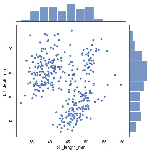
The graph you’ve provided is a jointplot, which combines a scatter plot and histograms. Here are the key insights from the graph:
- Scatter Plot Insights
- The scatter plot shows the relationship between two continuous variables: bill_length_mm on the x-axis and bill_depth_mm on the y-axis.
- There appears to be a negative correlation between bill_length_mm and bill_depth_mm. The bill depth decreases as the bill length increases, and vice versa.
- The distribution of points suggests variability in the relationship, with some scatter or spread around a general trend. A few outliers exist, particularly in longer bill lengths with greater bill depths.
- Histogram Insights (Top and Right Margins)
- The histogram at the top shows the distribution of bill_length_mm. It appears to be roughly normally distributed, with a slight right skew, indicating there are more observations with a higher bill length.
- The histogram on the right side shows the distribution of bill_depth_mm. This distribution also seems normal but with a slight left skew, indicating more observations with lower bill depth.
- General Observations
- The bulk of the data points are clustered around the center of the scatter plot, indicating that the most common bill lengths and depths are around the mean of the data.
- There is no clear indication of distinct groups or clusters, suggesting that the data might come from a single population or species.
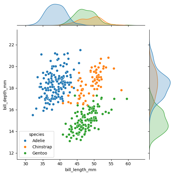
Assigning a hue variable will add conditional colors to the scatterplot and draw separate density curves (using kdeplot()) on the marginal axes:

Conclusion
Understanding and effectively using Jointplots can significantly enhance data analysis processes. By providing a deep dive into Jointplots, this article aims to equip you with the knowledge to leverage Seaborn’s capabilities for insightful data visualization, aiding in discovering meaningful patterns and relationships within your datasets.
Also read: Become a Data Visualization Whiz with this Comprehensive Guide to Seaborn in Python.
Growth Hacker | Generative AI | LLMs | RAGs | FineTuning | 62K+ Followers https://www.linkedin.com/in/harshit-ahluwalia/ https://www.linkedin.com/in/harshit-ahluwalia/ https://www.linkedin.com/in/harshit-ahluwalia/


