Introduction
Data visualization is a crucial aspect of data analysis, aiding in comprehending and communicating complex datasets. Among the myriad visualization techniques available, area charts stand out for effectively representing quantitative data over time or categories. This comprehensive guide delves into the intricacies of area charts, exploring their definition, benefits, creation, customization, and advanced techniques using Python libraries such as Plotly.
Table of contents
What is an Area Chart?
An area chart is a type of data visualization that displays quantitative data over time or categories. It is similar to a line chart, but the area between the line and the x-axis is filled with color, visually representing the data’s magnitude. Area charts are commonly used to show multiple variables’ cumulative totals or compare the proportions of different categories.
Benefits of Using Area Charts in Data Visualization
Area charts offer several advantages in data visualization. Firstly, they clearly represent the magnitude and trends of data over time or categories. The filled area makes it easy to compare the values of different variables or categories at a glance. Additionally, area charts can effectively display positive and negative values, allowing for a comprehensive data analysis. Moreover, area charts are visually appealing and can enhance the overall aesthetics of data visualization.
To create and customize area charts in Python, you can use libraries such as Plotly, Seaborn, and Matplotlib. These libraries provide a wide range of options to customize the appearance of the area chart, including color schemes, labels, legends, and annotations. By generating your short dataframe with relevant data, you can easily plot and customize area charts to suit your specific requirements.
Step-by-Step Guide with Code Examples
Plotly is a powerful Python library that allows you to create interactive and visually appealing data visualizations, including filled area charts. This section will provide a step-by-step guide on creating filled area charts using Plotly, along with code examples.
To begin, you will need to install the Plotly library. You can do this by running the following command in your Python environment:
Code:
pip install plotlyOnce you have installed Plotly, you can import the necessary modules and create a short dataframe to plot the values. For example, let’s make a dataframe with two columns: “Year” and “Sales”. Here’s the code to create the dataframe:
Code:
import pandas as pd

data = {'Year': [2015, 2016, 2017, 2018, 2019],

        'Sales': [100, 150, 200, 180, 250]}

df = pd.DataFrame(data)

df.head()
Output:
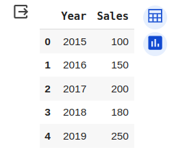
Next, you can use the Plotly library to create a filled area chart. Here’s the code to generate a basic filled area chart:
Code:
import plotly.express as px

fig = px.area(df, x='Year', y='Sales')

fig.show()
Output:
This code will create a filled area chart with the “Year” column on the x-axis and the “Sales” column on the y-axis. You can customize the chart further by adding labels, titles, and adjusting the color scheme.
Customizing Area Charts in Plotly
Plotly provides various customization options to enhance the appearance of your area charts. You can customize the fill color, line color, opacity, and more. Here are a few examples of how you can customize your area charts using Plotly:
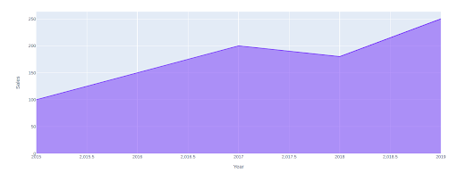
Changing the fill color: You can specify a different fill color for your area chart by using the “color” parameter. For example, you can set the fill color to blue by adding the following line of code:
Code:
import plotly.express as px

fig = px.area(df, x='Year', y='Sales')

fig.update_traces(fillcolor='blue')

fig.show()
Output:
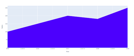
Adding a line border: You can add a line border to your area chart by specifying the line color and width. For example, you can add a red line border with a width of 2 pixels by adding the following line of code:
Code:
import plotly.express as px

fig = px.area(df, x='Year', y='Sales')

fig.update_traces(line=dict(color='red', width=5))

fig.show()
Output:
These are just a few examples of how you can customize your area charts using Plotly. Experiment with different customization options to create visually stunning and informative filled area charts.
Advanced Techniques for Area Charts
Area charts are a powerful visualization tool in Python that allows us to represent data visually, appealing, and informatively. This section will explore some advanced techniques for creating and customizing area charts.
Creating Stacked Area Charts
Stacked area charts are handy when we want to compare the contribution of different categories to the total. They are commonly used in finance, economics, and other fields where it is essential to understand the composition of a whole.
Benefits and Use Cases of Stacked Area Charts
Stacked area charts offer several benefits. Firstly, they allow us to visualize each category’s total value and individual contributions. This helps us understand the relative importance of each category and how it changes over time. Secondly, stacked area charts make identifying trends and patterns in the data easy. By stacking the areas on top of each other, we can see how the composition of the whole changes over time.
Stacked area charts are commonly used in financial analysis to visualize the performance of different sectors or industries within a market index. They are also helpful in tracking the progress of various projects or initiatives within an organization.
Steps to Create a Stacked Area Chart in Python
We can use libraries such as Plotly, Seaborn, or Matplotlib to create a stacked area chart in Python. Here, we will focus on using Plotly.
First, we must import the necessary libraries and create a short dataframe to plot our values. We can use the Pandas library to create a dataframe with random values.
Code:
import pandas as pd

import plotly.express as px

# Create a dataframe with random values

data = pd.DataFrame({

    'Year': [2015, 2016, 2017, 2018, 2019],

    'Category A': [10, 20, 30, 40, 50],

    'Category B': [20, 30, 40, 50, 60],

    'Category C': [30, 40, 50, 60, 70]

})

# Create a stacked area chart

fig = px.area(data, x='Year', y=['Category A', 'Category B', 'Category C'], title='Stacked Area Chart')

fig.show()
Output:
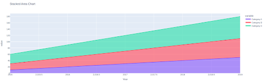
By specifying the x-axis as ‘Year’ and the y-axis as the categories, we can create a stacked area chart showing each category’s contribution over time. The resulting chart will be displayed as “Stacked Area Chart.”
Customizing Stacked Area Charts
Plotly provides a wide range of customization options for stacked area charts. We can customize the colors, labels, axes, and other visual elements to make the chart more visually appealing and informative.
To customize the colors of the areas, we can use the `color_discrete_sequence` parameter in the `px.area()` function. This allows us to specify a list of colors for each category.
Code:
import pandas as pd

import plotly.express as px

# Create a dataframe with random values

data = pd.DataFrame({

    'Year': [2015, 2016, 2017, 2018, 2019],

    'Category A': [10, 20, 30, 40, 50],

    'Category B': [20, 30, 40, 50, 60],

    'Category C': [30, 40, 50, 60, 70]

})

# Create a stacked area chart

fig = px.area(data, x='Year', y=['Category A', 'Category B', 'Category C'], title='Stacked Area Chart',

              color_discrete_sequence=['#000000', '#FFFF00', '#800000'])

fig.show()
Output:
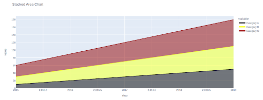
In this example, we have specified red, green, and blue as the colors for the categories A, B, and C, respectively.
We can also customize the charts’ labels, axes, and other visual elements using the various parameters provided by Plotly. For example, we can set the x-axis label using the `update_xaxes()` function and the y-axis label using the `update_yaxes()` function.
Code:
fig.update_xaxes(title_text='Year')

fig.update_yaxes(title_text='Value')
These are just a few examples of the customization options available in Plotly. We can create highly customized and visually appealing stacked area charts by exploring the documentation and experimenting with different parameters.
Handling Missing Data in Area Charts
Missing data is a common issue when working with area charts. It can occur for various reasons, such as incomplete data collection or data entry errors. This section will explore techniques for handling missing data in area charts.
Dealing with NaN Values in Data
NaN (Not a Number) is a special value in Python that represents missing or undefined data. When plotting area charts, NaN values can cause gaps or distortions. Therefore, it is important to handle NaN values appropriately.
One common approach is to fill the NaN values with a specific value or interpolate them based on the surrounding data points. This can be done using Pandas `fillna()` function.
Code:
data.fillna(0, inplace=True)In this example, we have filled the NaN values with 0. Alternatively, we can use interpolation methods such as linear interpolation or spline interpolation to estimate the missing values based on the neighboring data points.
Techniques for Handling Missing Data in Area Charts
In addition to filling or interpolating the missing values, other techniques can be used to handle missing data in area charts. One approach is to exclude the missing data points from the chart entirely. This can be done by filtering the dataframe to remove rows with NaN values.
Code:
data.dropna(inplace=True)Removing the rows with missing values ensures that the area chart is based only on the available data points. However, this approach may result in a loss of information if the missing data points are significant.
Another technique is to visualize the missing data separately using a different color or pattern. This can help highlight the areas where data is missing and draw attention to potential gaps or inconsistencies.
Code:
import pandas as pd

import plotly.express as px

# Create a dataframe with random values

data = pd.DataFrame({

    'Year': [2015, 2016, 2017, 2018, 2019],

    'Category A': [10, 20, 30, 40, 50],

    'Category B': [20, 30, 40, 50, 60],

    'Category C': [30, 40, 50, 60, 70]

})

# Create a stacked area chart

fig = px.area(data, x='Year', y=['Category A', 'Category B', 'Category C'], title='Area Chart with Missing Data',

              color_discrete_sequence=['#000000', '#FFFF00', '#800000'],

              pattern_shape='Category C')

fig.show()
Output:
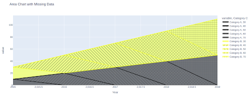
In this example, we have used a different pattern (represented by ‘Category C’) to indicate the missing data points.
By applying these techniques, we can effectively handle missing data in area charts and ensure that the resulting visualizations are accurate and informative.
Common Mistakes to Avoid in Area Chart Creation
When creating area charts using Matplotlib, it’s important to be aware of common mistakes that can lead to misrepresentation of data or a less effective chart design. By avoiding these mistakes, you can ensure that your area charts accurately convey information and are visually appealing.
- Misrepresenting Data with Incorrect Scales: One common mistake is misrepresenting data by using incorrect scales on the chart’s axes. Choosing appropriate scales that accurately reflect the range and distribution of the data being plotted is crucial. Failing to do so can result in distorted visuals and misleading interpretations. Always take the time to carefully consider the scales and ensure they accurately represent the data.
- Overcomplicating the Chart Design: Another mistake to avoid is overcomplicating the design of the area chart. While adding necessary elements such as labels, titles, and legends is important, overcrowding the chart with excessive information can make it difficult to interpret. Keep the design clean and simple, focusing on the key elements that must be communicated. This will make it easier for viewers to understand the chart at a glance.
- Ignoring Accessibility and Usability: Accessibility and usability are often overlooked when creating area charts. It’s important to consider how the chart will be viewed by different audiences, including those with visual impairments or color blindness. Ensure the chart is accessible by using appropriate color palettes, providing alternative text for images, and using clear and concise labels. Additionally, consider the usability of the chart by making it interactive and allowing users to explore the data further.
Conclusion
In conclusion, creating area charts in Matplotlib can be a powerful way to visualize data. By avoiding common mistakes such as misrepresenting data with incorrect scales, overcomplicating the chart design, and ignoring accessibility and usability, you can create effective and visually appealing area charts. Remember to carefully consider the scales, keep the design clean and simple, and prioritize accessibility and usability. With these tips, you can create informative and engaging area charts for your data analysis needs.
Seasoned AI enthusiast with a deep passion for the ever-evolving world of artificial intelligence. With a sharp eye for detail and a knack for translating complex concepts into accessible language, we are at the forefront of AI updates for you. Having covered AI breakthroughs, new LLM model launches, and expert opinions, we deliver insightful and engaging content that keeps readers informed and intrigued. With a finger on the pulse of AI research and innovation, we bring a fresh perspective to the dynamic field, allowing readers to stay up-to-date on the latest developments.


