Introduction
In data analysis, creating visual representations is key to understanding and communicating insights effectively. One tool that shines in Python is ggplot. Built on the grammar of graphics, ggplot offers a straightforward way to make beautiful plots. This article will dive into ggplot’s features and why it’s such a valuable tool for visualizing data in Python.

Table of contents
What is ggplot and its Use?
ggplot is a Python library that provides a high-level interface for creating beautiful and informative visualizations. It is based on the grammar of graphics, a powerful framework for describing and building visualizations. With ggplot, you can easily create a wide range of plots, including scatter plots, line plots, bar plots, and more.
There are several reasons why ggplot is a preferred choice for data visualization in Python:
- Intuitive Grammar: ggplot follows the grammar of graphics, which provides a consistent and intuitive way to describe plots. This grammar consists of building blocks, such as data, aesthetics, and geometric objects, that can be combined to create complex visualizations.
- Flexible and Customizable: ggplot offers a high degree of flexibility and customization options. You can easily modify the appearance of your plots by changing the aesthetics, adding layers, or adjusting the scales. This allows you to create visualizations that effectively convey your message and insights.
- Reproducibility: ggplot promotes reproducibility by providing a declarative approach to plotting. This means you can specify the desired plot characteristics clearly and concisely, making it easier to reproduce and share your visualizations.
- Integration with Python Ecosystem: ggplot integrates with other popular Python libraries, such as pandas and numpy. This allows you to leverage the power of these libraries for data manipulation and analysis while using ggplot for visualization.
- Beautiful and Professional-Looking Plots: ggplot offers a wide range of themes and styles that can be applied to your plots. This ensures that your visualizations convey the intended message and look appealing and professional.
Getting Started with ggplot
This section will cover the initial steps to get started with ggplot in Python. We will discuss how to install ggplot and import the necessary libraries.
Installing ggplot in Python
To begin using ggplot in Python, we first need to install the ggplot library. This can be done by using the pip package manager. Open your command prompt or terminal and run the following command:
Code
!pip install ggplotThis will download and install the ggplot library on your system. Once the installation is complete, you can import the necessary libraries.
Importing the Necessary Libraries
After installing ggplot, we must import the required libraries to use them. In Python, we can import libraries using the `import` keyword. Here are the libraries that we need to import for ggplot:
Code
from plotnine import ggplot, aes, geom_pointThis line of code imports all the necessary functions and classes from the ggplot library. Now, we are ready to start creating beautiful visualizations using ggplot.
Now that we have installed ggplot and imported the necessary libraries, we can move on to the next section, where we will explore the different types of plots that can be created using ggplot in Python.
Creating a Scatter Plot
A scatter plot is a type of plot that displays the relationship between two numerical variables. It is useful for identifying patterns or trends in the data. In Python, you can create scatter plots using the ggplot library.
To create a scatter plot, you must first import the necessary libraries and create a dataframe with the data you want to plot. You can use the panda’s library to create a data frame from a CSV file or manually enter the data.
Once you have your dataframe, you can use the ggplot function to create the scatter plot. The ggplot function takes the dataframe as an argument and specifies the variables to be plotted on the x and y axes.
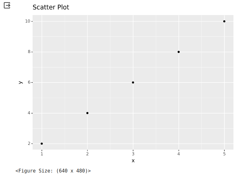
Here’s an example of how to create a scatter plot using ggplot in Python:
Code
from plotnine import ggplot, aes, geom_point
import pandas as pd
# Create a dataframe
data = {'x': [1, 2, 3, 4, 5], 'y': [2, 4, 6, 8, 10]}
df = pd.DataFrame(data)
# Create a scatter plot
(ggplot(df, aes(x='x', y='y')) + geom_point())
Output
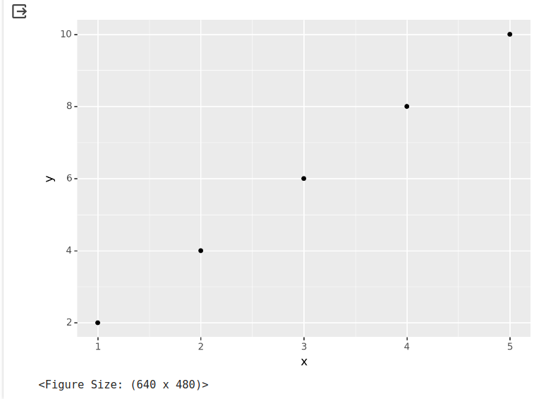
In this example, the dataframe `df` contains two columns, ‘x’ and ‘y’, with the corresponding values. The `ggplot` function is used to create the scatter plot, and the `aes` function is used to specify the variables to be plotted on the x and y axes.
The `geom_point` function adds the points to the plot. This function creates a scatter plot by default, but you can customize the appearance of the points using additional arguments.
Customizing Plot Aesthetics
Once you have created a basic plot, you can customize its aesthetics to make it more visually appealing and informative. This section will cover some common customizations you can make to your ggplot scatter plot.
Changing Colors and Shapes
You can change the colors and shapes of the points in your scatter plot to differentiate between different groups or categories. The `geom_point` function has arguments that allow you to specify the color and shape of the points.
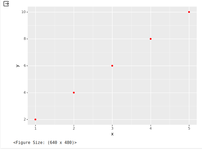
For example, you can use the `color` argument to specify a color for all the points in the plot:
Code
(ggplot(df, aes(x='x', y='y')) + geom_point(color='red'))Output
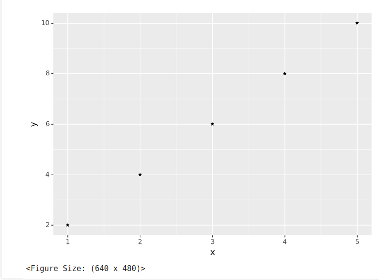
You can also use the `shape` argument to specify a shape for the points:
Code
(ggplot(df, aes(x='x', y='y')) + geom_point(shape='*'))Output
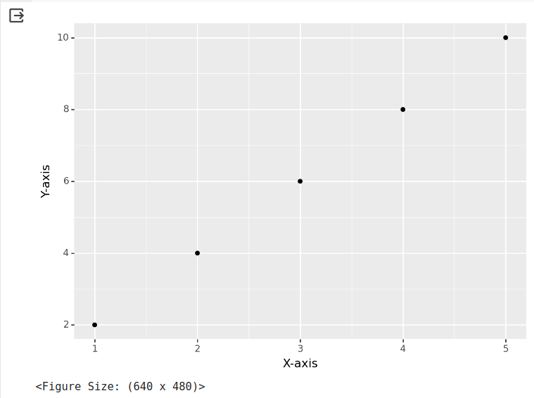
Adjusting Axis Labels and Titles
You can customize the axis labels and titles to provide more information about the plotted data. The `xlab` and `ylab` arguments of the `ggplot` function can be used to specify the labels for the x and y axes, respectively.
Code
from plotnine import ggplot, aes, geom_point, xlab, ylab
import pandas as pd
# Create a dataframe
data = {'x': [1, 2, 3, 4, 5], 'y': [2, 4, 6, 8, 10]}
df = pd.DataFrame(data)
# Create a scatter plot with axis labels
(
    ggplot(df, aes(x='x', y='y')) +
    geom_point() +
    xlab('X-axis') +
    ylab('Y-axis')
)
Output
You can also use the `ggtitle` function to add a title to the plot:
Code
from plotnine import ggplot, aes, geom_point, ggtitle
import pandas as pd
# Create a dataframe
data = {'x': [1, 2, 3, 4, 5], 'y': [2, 4, 6, 8, 10]}
df = pd.DataFrame(data)
# Create a scatter plot with axis labels
(
    ggplot(df, aes(x='x', y='y')) +
    geom_point() +
    ggtitle('Scatter Plot')
)
Output
ggplot(df, aes(x='x', y='y')) + geom_point() + ggtitle('Scatter Plot')Adding Legends and Annotations
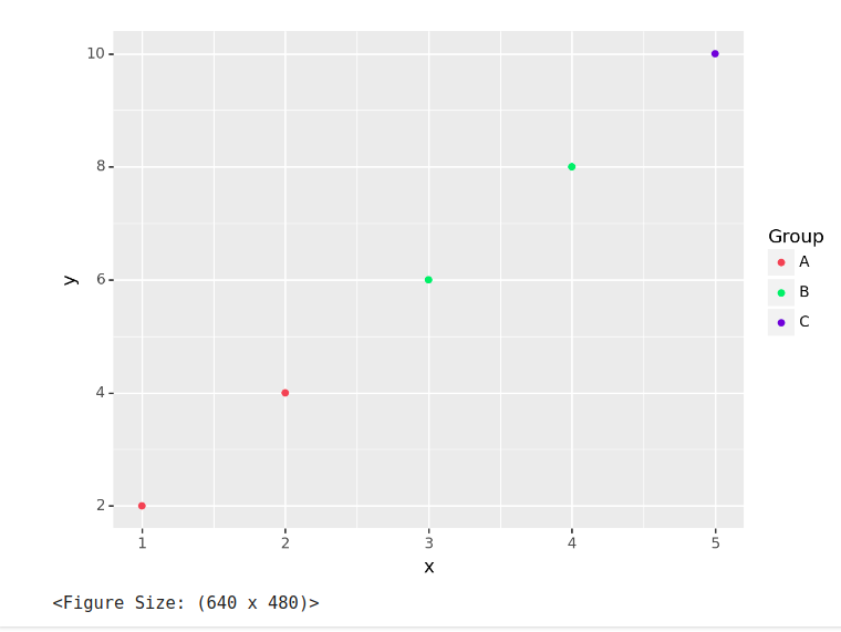
Legends and annotations can be added to your scatter plot to provide additional information or context. The `labs` function can add a legend to the plot.
Code
from plotnine import ggplot, aes, geom_point, labs
import pandas as pd
# Create a dataframe
data = {'x': [1, 2, 3, 4, 5], 'y': [2, 4, 6, 8, 10], 'group': ['A', 'A', 'B', 'B', 'C']}
df = pd.DataFrame(data)
# Create a scatter plot with color aesthetic and label
(
    ggplot(df, aes(x='x', y='y', color='group')) +
    geom_point() +
    labs(color='Group')
)
Output
You can also use the `annotate` function to add text annotations to specific points in the plot:
Code
from plotnine import ggplot, aes, geom_point, annotate
import pandas as pd
# Create a dataframe
data = {'x': [1, 2, 3, 4, 5], 'y': [2, 4, 6, 8, 10]}
df = pd.DataFrame(data)
# Create a scatter plot with a text annotation
(
    ggplot(df, aes(x='x', y='y')) +
    geom_point() +
    annotate('text', x=4, y=8, label='Annotation')
)
Output

These are just a few examples of the customizations you can make to your ggplot scatter plot. Experiment with different options and settings to create the perfect visualization for your data.
You can also read: A Complete Beginner’s Guide to Data Visualization
Customizing Themes and Templates
When it comes to data visualization, aesthetics play a crucial role in conveying information effectively. ggplot in Python offers various options for customizing the appearance of your plots by applying predefined themes or creating custom themes. This section will explore how to customize themes and templates in ggplot.
Applying Predefined Themes
ggplot provides a range of predefined themes to apply to your plots. These themes define your visualizations’ overall look and feel, including the colors, fonts, and gridlines. By using predefined themes, you can quickly change the appearance of your plots without having to tweak each element manually.
To apply a predefined theme, you can use the `theme_set()` function followed by the theme name you want to apply. For example, to apply the “classic” theme, you can use the following code:
Code
from plotnine import ggplot, aes, geom_point, theme_set, theme_classic
import pandas as pd
# Create a dataframe
data = {'x': [1, 2, 3, 4, 5], 'y': [2, 4, 6, 8, 10]}
df = pd.DataFrame(data)
# Set the theme to classic
theme_set(theme_classic())
# Create a scatter plot with text annotation
(
    ggplot(df, aes(x='x', y='y')) +
    geom_point()
)
Output
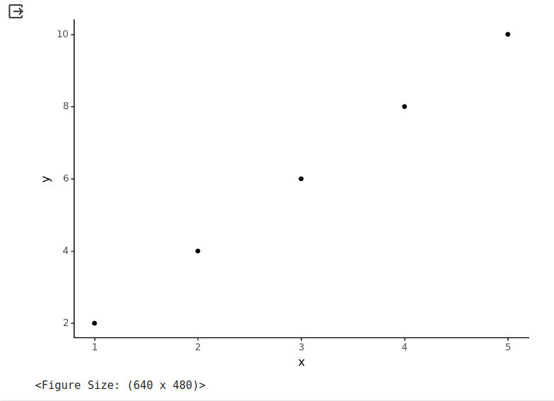
This will set the theme of your plot to the “classic” theme. You can choose from a variety of predefined themes such as “gray”, “minimal”, “dark”, and more. Experiment with different themes to find the one best suits your data and visualization goals.
Creating Custom Themes
If the predefined themes don’t meet your requirements, you can create your own custom themes in ggplot. Custom themes allow you to have complete control over the appearance of your plots, enabling you to create unique visualizations that align with your brand or personal style.
You can use the `theme()` function to create a custom theme and specify the desired aesthetic properties. For example, if you want to change the background color of your plot to blue and increase the font size, you can use the following code:
Code
from plotnine import ggplot, aes, geom_point, theme, element_rect, element_text
import pandas as pd
# Define custom theme
custom_theme = theme(
    plot_background=element_rect(fill="blue"),
    text=element_text(size=12)
)
# Create a dataframe
data = {'x': [1, 2, 3, 4, 5], 'y': [2, 4, 6, 8, 10]}
df = pd.DataFrame(data)
# Create a scatter plot with custom theme
(
    ggplot(df, aes(x='x', y='y')) +
    geom_point() +
    custom_theme
)
Output:
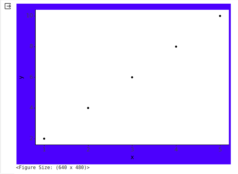
This will create a custom theme with a blue background and a font size of 12. You can customize various aspects of your plot, such as axis labels, legends, and gridlines, by specifying the corresponding aesthetic properties.
Saving and Sharing Plots
Once you have customized your plot to your satisfaction, you may want to save it for future reference or share it with others. plotline provides several options for saving and sharing your plots.
To save a plot as an image file, you can use the `plot.save()` function. For example, to save your plot as a PNG file named “my_plot.png”, you can use the following code:
Code
plot.save("my_plot.png")Conclusion
In summary, ggplot emerges as a vital tool for anyone working with data in Python. Its simple yet powerful features create stunning visualizations that convey complex information easily. By mastering ggplot, users can unlock new possibilities for presenting data and telling compelling data stories.
If you are looking for a Python course online, then explore: Learn Python for Data Science
Also read a comprehensive guide on ggplot2 in R
Seasoned AI enthusiast with a deep passion for the ever-evolving world of artificial intelligence. With a sharp eye for detail and a knack for translating complex concepts into accessible language, we are at the forefront of AI updates for you. Having covered AI breakthroughs, new LLM model launches, and expert opinions, we deliver insightful and engaging content that keeps readers informed and intrigued. With a finger on the pulse of AI research and innovation, we bring a fresh perspective to the dynamic field, allowing readers to stay up-to-date on the latest developments.


