Introduction
See the data. Show the visual. Tell the story. Engage the audience.
Tableau is one of the most popular Data Visualization tools used by Data Science and Business Intelligence professionals today. It enables you to create insightful and impactful visualizations in an interactive and colorful way.
It’s use is not just for creating traditional graphs and charts. You can use it to mine actionable insights thanks to the plethora of features and customizations it offers.
Famous for its ease of use and simple functionalities, making insightful dashboards like the below takes only a few clicks:

In this article, we will look at a few advanced graphs that go beyond the drag and drop feature. We will create calculations to dive deeper into our data to extract insights. We will also look at how R can be integrated and used with Tableau.
This article assumes that you possess a fair amount of knowledge about using Tableau, such as basic chart formation, calculations, parameters etc. In case you don’t, I would recommend referring to the following articles first and then heading back here:
- Tableau for Beginners – Data Visualisation made easy
- Intermediate Tableau Guide – For Data Science and Business Intelligence Professionals
Table of Contents
- Advanced Graphs – Visualizing beyond ‘Show Me’
- Motion Chart
- Bump Chart
- Donut Chart
- Waterfall Chart
- Pareto Chart
- Introducing R programming in Tableau
1. Advanced Graphs – Visualizing beyond ‘Show Me’
Almost all Tableau users are privy to the various elementary graphs, such as those shown in the introductory dashboard. Such charts can be easily made using the ‘Show Me’ feature of Tableau. But since this is an article meant for advanced users, we are going to move beyond ‘Show Me’ and explore graphs that require some extra computations.
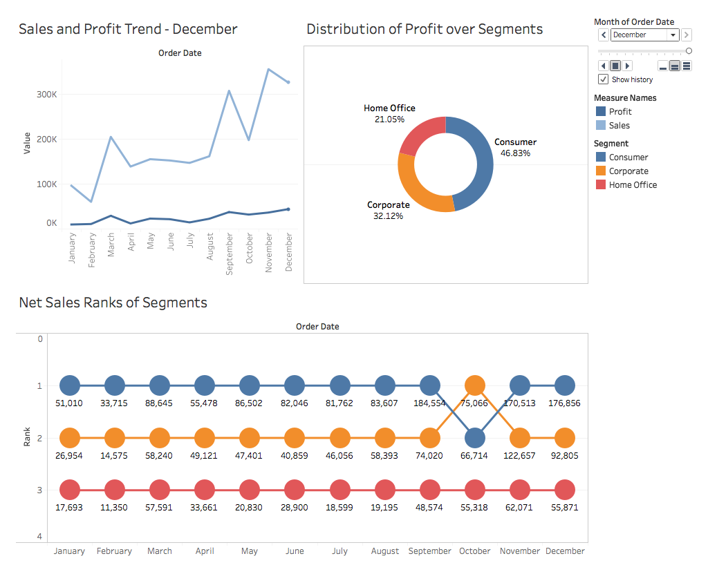
First, let’s take a quick look at what we are going to be making in the next few sections. Below is some basic analysis of the Sales and Profit of our Superstore. Simple graphs will serve the same purpose as those in the dashboard, but I think you would agree that there is something exciting and enrapturing about the grandeur of these charts.
1.1 Motion Chart
Before we begin, have a look at Hans Rosling’s World Economics Representation visualization. Hit play, and see the magic unfold.
Interested in making one of your own now? If you have already started worrying about animation, don’t! What you saw is called a Motion Chart. Using this, you can view the changes in your data in real-time.
So let’s start by downloading the Superstore dataset which can be found here.
By now making trend lines like the following should be easy for you:

But what we are first going to learn in this section is how to make the below trend lines in motion:

So let’s get started!
- Import your dataset, and create the aforementioned Trend Chart. Our X-axis was the Order Date (in the format of Month) and Sales and Profit are the Measures.
- All you need to do to make the Motion Chart is drag Order Date over to the Pages shelf, and change the format again to match with the X-axis.
- Change the Mark Type from Automatic to Circle.
- Go to Show History, and select Trails to view the trend change. And voilà! Your Motion Chart is ready for launch.
- Press on the arrow buttons to see the motions, change the Show History customisations, the speed etc.,:

1.2 Bump Chart
Suppose you want to explore the Sales of the various segments of the Superstore (for an entire year). One way to do this is the following:

While an alternate option could be the below:
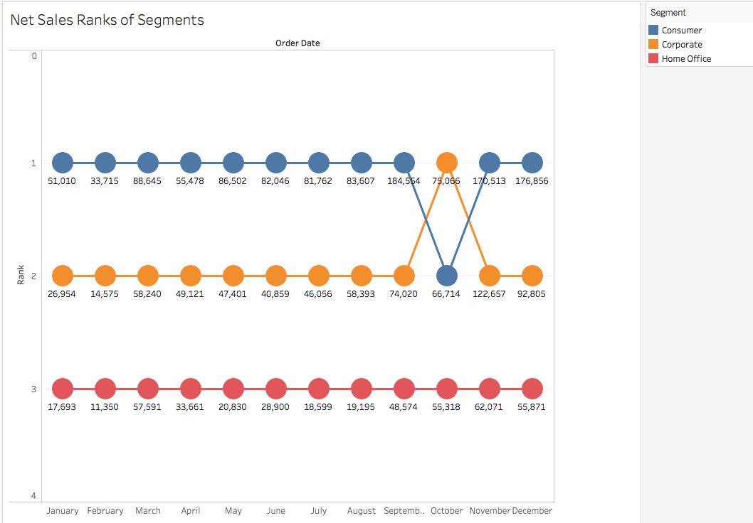
Although the Line chart managed to show the difference of Sales between each Segment, the Bump Chart (in the above image), gave a more clear and concise picture of the same outcome.
Such charts are mostly used to understand how the popularity of a particular product is changing over the years.
Let’s try and make one of our own now:
- First we need to think of the Measure on the basis of which we wish to rank our Dimensions. Here the Measure we have taken is Sales and the Dimension is Segment.
- You need the help of a Calculated Field to make Bump Charts. So quickly create a calculation as below below. We are going to rank the Sum of Sales for each Segment :

- Now drag Order Date over to the Columns and change the format to Month. Drag Segment to Colour in the Marks Pane. And finally drag Rank over to the Rows.
- In the graph that you can see now, the Ranks have been allocated based on the number of months. However, we need them to be on the basis of Segments. So right click on Rank in Rows, and go to Edit Table Calculation.
- Since we wish to Compute Using Segment, change the configuration to:

The chart that you will get won’t look like the chart in the dashboard because it lacks the Labels. Let’s remedy that quickly, with the help of a Dual Axis:
- Drag Rank again onto Rows and repeat Steps 4 and 5 to get:

You see Rank and Rank (2) in the Marks Pane? We are going to use these to create those circled Labels.
- To convert the above into a Dual Axis Chart, right click on the second chart’s Rank axis and choose Dual Axis.
- In the Marks Pane, choose either Rank or Rank (2), and change the Mark Type to Circle instead of Automatic.
- Here the Ranks are in descending order. To change it to ascending, right click on the left Rank axis – > Edit Axis – > Reversed Scale. Repeat the same for the right Rank axis as well.
- Finally, drag Sales onto Labels – > Quick Table Calculation – > Percentage of Total, to get our desired bump chart.
1.3 Donut Chart
A donut chart is yet another representation of an elementary chart. To put it candidly, its a pie chart with a hole in the middle, but it helps put more emphasis on the various segments, as you can see below:

Let’s understand the difference as we create this.
- We will begin with a simple Pie Chart depicting the Profits of each Segment:

- To create a Dual Axis for the Pie Chart, drag Number of Records from Measures over to the Rows, twice. Change the Measure of each green pill, by right clicking on them and choosing Minimum in place of the default Sum:

- Choose the second Pie Chart in the Marks Pane, and drag every Measure / Dimension out of it. Reduce the size of the chart, and change the colour to white (although not shown here):

- To create the Dual axis, right click on the second Pie Charts’ Y – Axis, and select the Dual Axis, to get your chart.
You must have understood by now that all the above charts, although different in their final looks, were all derived from the core graphs of the ‘Show Me’ feature. But wait, its not over yet. I have more to show you.
1.4 Waterfall Chart

A waterfall chart derives its name from its analogous orientation and flow. Here we have plotted the Running Sales of the Superstore over its years, and you can see the two small red areas in the middle of 2013 and the beginning of 2014, indicating that the Sales actually dipped and also the measure by how much.
This implies that such charts are used to analyze the cumulative effect of a Measure, and see how it increases and decreases as a whole. To understand this better, let’s visualize it.
A waterfall chart is a derivative of a Line Chart, so we will begin with this graph:

Note: Here the X-axis is Order Date (in Month-Year format and converted to Discrete). And the Y-axis is Profit.
- Right-click on the green Profit Pill, and select Quick Table Calculation – > Running Total.
- Change the Mark Type from Automatic to Gantt Bar:

- Create a Calculated Field called ‘NegProfit’:

- Drag this NegProfit over Size in the Marks’ shelf to get:

The calculated field was used to fill in the space in the Gantt Chart. A negative value in Profit would extend the bar downwards, whereas a positive one would extend it upwards.
The length of each small bar in the chart represents the amount of change in Profit from one month to the next.
- Finally, drag Profit over to Colour :

- You can go ahead and change the colour to a two-step variation and distinctly view the rise and fall :

The graph that you will get could be very easily represented in the form of a Bar Chart as well. Do note that I have reversed the colors here, to make the anomalies stand out:

But I am sure you would agree that using a Waterfall chart was a more intuitive way of representing the data, especially to see the changes in Measures such as Sales and Profit over the years.
1.5 Pareto Chart
Below I have visualized a popular 80-20 principle of data analytics. If you have not heard of it, let me try and explain it with our example. It is often observed that the majority of the sales of a Superstore come from a select few products.
One cannot expect bread and eggs to have the same sales figures as cakes, right? This is officially termed as the 80-20 principle, meaning that 80% of the Sales come from 20% of the Products. In our Superstore, this principle can be observed in the below chart, where most of the sales are generated by Phones and Chairs :

Quite a popular visualization, Pareto charts are often used for Risk Management to determine the most common problems that are having the most negative impact on a project; but as we will see, it can have other applications too.
Let’s see how its done:
- We are going to start off with the following chart. This has Sub Category as the X-axis and Sales as the Y-axis. The graph is in descending order:

- Next, drag Sales over to the chart, until you see a green highlighted bar, and a dotted axis towards the far right :

- Drop Sales here to create a Dual Axis. Change the Mark Type of the first chart to Bar, and of the second chart to Line, to finally get :

- Right click on the second green Sales Pill, and add a Running Total Calculation to it:

- All that is left is to just change the colour schemes, and your Pareto Chart is ready!
2. Introducing R programming in Tableau
One thing I like about Tableau is that its not just a tool meant to create pretty graphs with mere drag and drop actions. With the release of Tableau 8.1 in 2013 came a plethora of new functionalities.
The introduction of R, to enable making richer and dynamic visualizations, was one of the predominant features. R can be used with Tableau for techniques like Clustering, Prediction and Forecasting, to name a few.
I wanted to start the exploration of R and Tableau through Clustering, so I used the ultra popular Iris Dataset. It contains different features to distinguish between 3 types of flowers, namely Virginica, Setosa and Versicolor. As you can see in the below image, the R integration quite easily creates clusters of these 3 species:

Interested in making this yourself? First let’s go through the basics and the installation process, before delving into the visualization!
The following depicts the flow of control between Tableau and R to make this integration possible:

R scripts are written in Tableau as Table Calculations, which are sent to the R serve package of R. Here the module carries out the necessary computations and returns the result to Tableau.
Note: To properly understand and thereby use this feature, you must possess some knowledge of R and its various syntaxes. For the same you may refer to the following tutorial:
Learn Data Science in R from scratch
Now let’s look at the steps for this integration:
-
- Install R
- Install the Rserve package
- Run the following in the R command line:
-
install.packages(“Rserve”); library(“Rserve”); Rserve()
-
- Run the following in the R command line:
- Configure Tableau to run in R
- Open Tableau – > Help – > Settings and Performance – > Manage R / External connection. Fill in the fields with the following default information and select Test Connection:

So now that you have the proper ingredients ready, let’s start cooking!
As was shown in the image above, you make use of Tableau’s Table Calculation to communicate with R :

If you scroll down the list of functions, you will come across the following four:

Tableau automatically understands that the script is meant for R when these functions are included in the calculation area.
I hope that your initial excitement of making the clusters is still there! Let’s proceed.
- Download the Iris Dataset from here.
- Import the dataset in Tableau, and make the below graph:

- Here you are getting the Sum across different Measures. To get discrete values, go to Analysis, and uncheck Aggregate Measures, to get:

- Finally, to form the clusters, drag the Class Dimension over Color in the Marks Pane:

What we have above is a Scatter Plot, which shows clusters of data points divided into 3 distinct clusters.
Let’s try doing the same with R now, and compare the two visualizations that we will get. We will be using the most common clustering algorithm, K-Means:
- Begin with the same scatter plot as point 2 above.
- Create a new Calculated Field and fill it with the following:
 For clarity, the above Calculation is :
SCRIPT_INT(
'result <- kmeans(data.frame(.arg1,.arg2,.arg3,.arg4), 3);result$cluster;',
SUM([Petal length]), SUM([Petal width]),SUM([Sepal length]),SUM([Sepal width]))
- Finally drag the newly formed Field Cluster to Color in the Marks Pane, to get your clusters ready!
Although there are a few overlaps, the two visualisations do appear to be quite accurate.
This was a small gist of the potential of integrating R with Tableau. It’s applications are limitless, and I am sure you must have already started to think of the different ways you can interact with it.
End Notes
It would be naive of me to say that this is all there is to Tableau. As new versions roll in, so do new functionalities.
Not only that, people are always experimenting and exploring Tableau, and coming up with new visuals. There are multiple blogs where people publish their experiments with data too. Do check them out.
You can also find new and gorgeous visualizations weekly on Tableau’s official Gallery page. I would definitely advise you to keep referring to these posts, creating your own visuals, and sharing it with the community.
Stay creative and all the best on your journey as a Data Explorer!
Learn, Engage, Compete & Get Hired.


Really very helpful! Many thanks once again!!!!!
Quite impressive thanks.
I am a newbie to Tableau. I teach at Bangkok University but in May I am introducing Tableau to the Shanghai Business School. It is possible to meet with you to help me with a walk through with Tableau Public before April 30th Cell 0898943030 Thanks Willard Van De Bogart Language Institute Bangkok University [email protected]
Hi Williard, Thank you for your response. Can you tell us what exactly you wanted to discuss so that we can take the conversation forward.