Introduction
The idea is to go from numbers to information to understanding
– Hans Rosling
In today’s data-driven world, the ability to transform raw numbers into meaningful insights is a powerful skill. Tableau, one of the most popular data visualization tools, helps you bridge the gap between complex datasets and actionable understanding. Whether you’re new to data analysis or looking to enhance your skills, this guide will walk you through the essentials of Tableau, enabling you to create compelling visualizations that communicate insights clearly and effectively. Let’s explore how Tableau can simplify data visualization, making it accessible to beginners and professionals alike.
If you want to learn beginner-level Tableau in a course format, check out our free course, Tableau for Beginners.
Overview:
- Learn about Tableau’s core features, from its intuitive interface to the various chart types it offers, and how to use them effectively.
- Explore how to import, clean, and connect various data sources in Tableau, ensuring seamless integration with your workflow.
- Learn to create dynamic dashboards that allow users to explore and interact with data through filters, tooltips, and actions.
Table of contents
Sample Dashboard in Tableau
What can you make out from the picture below?

This Dashboard, made on Tableau, visualizes a Supermarket’s Sales and Profit Analysis.
At a glance, you can see:
- The Sales distribution of various categories relative to each other
- Their respective Profit margins.
- Each Category’s Sub – Category Product Sales
- And finally, the Sales growth of Categories over the years
So, in this article, we will learn how to make such data visualization using Tableau to understand our data well.
Overview of Tableau
What is Tableau?
Tableau is a Data visualization tool widely used for Business Intelligence, but it is not limited to that. It helps create interactive graphs and charts in dashboards and worksheets to gain business insights. This is made possible with gestures as simple as drag and drop!
What Products does Tableau offer?

What do you need to know before using Tableau?
You don’t need to know much to use Tableau, but it’s still preferred that you have a basic awareness of all the types of graphs, such as bar graphs, line charts, histograms, etc.
It will also be beneficial if you possess some basic understanding of database management ( datatypes, joins, drill down, drill up, etc.). Even if you don’t, there is no reason to worry since I will cover all such concepts in this and forthcoming articles.
Installation
To work on Tableau, you need Tableau, right?
Tableau Desktop, Public, and Online offer Data Visual Creation from the five products mentioned above.
Tableau Desktop
It is available in the following three formats for data visualization using Tableau:
- Free trial for 14 days
- You get free access to the Desktop for a full year if you are a student or a teacher.
- Purchase Tableau
Tableau Public
Tableau Public is purely free of all costs and does not require any license. However, it has a limitation: All your data and workbooks are made public to all Tableau users.
Tableau Online
Tableau Online is the best option for creating your Workbooks on the Cloud and accessing them from anywhere.
Getting Started
Now that you have the suitable product installed and set up, I am pretty sure your hands must be tingling with anticipation to begin visualizing using Tableau finally! Well, let’s not keep you waiting. Go ahead and launch the tool.
Connect to the Data

You should see a screen similar to the one above. This is where you import your data. As is visible, there are multiple formats for your data. It can be in a flat file such as Excel or CSV or directly load it from data servers.
You can see that Tableau itself offers some Sample Workbooks with pre-drawn charts, graphs, and other visuals. I would suggest going through these later for further exploration.
The best way to learn is to get your hands dirty. Let us start with our Data, which can be found here. The data concerns a United States Superstore deliberating over its expansion. It wishes to know the prospective regions of the country where it could and hence requires your help.
The first thing that you will need to do is import the data onto Tableau. So quickly follow the below steps:
- Since the data is in an Excel File, click on Excel and choose the Sample – Superstore.xls file to get:

- You can see three sheets on the screen, but we are only going to be dealing with Orders here, so go ahead and drag the same on Drag sheets here:

The imported data looks a bit different for the first few rows. Don’t worry; the solution lies right ahead.
Data Interpreter
3. Do you see the option to use Data Interpreter? Click on it to get the following clean view:

All that messy data magically disappeared!
If you open the Excel data file, you will see some metadata in it, i.e., information about data :

Tableau imports the entire data file as is, but anticipating such discrepancies explicitly provides a solution as a Data Interpreter. If you wish to view the exact changes it made, click Review the results and choose the Orders tab in the opened Excel sheet.
As it will show, it simply removed the erroneous data.
Data Visualisations
As soon as you have imported your dataset, next to the Data Source tab near the bottom of the screen, you immediately must see Go to Worksheet. A Worksheet is where you make all of your graphs, so click on that tab to reach the following screen:

Don’t get overwhelmed by the various elements that you see here. We will cover them all one by one.
Let’s start with Dimensions and Measures:

Moving onto Shelves :

Tableau Visualization is possible by dragging and dropping Measures and Dimensions onto these different Shelves.
- Rows and Columns: Represent the x and y-axis of your graphs/charts.
- Filter: Filters help you view a strained version of your data. For example, instead of seeing the combined Sales: Sales of all the Categories, you can look at a specific one, such as just Furniture.
- Pages: Pages work on the same principle as filters, with the difference you can see in the changes as you shift between the paged values. Remember that Rosling chart? You can easily make one of your own using Pages.
- Marks: The Marks property controls the mark types of your data. You may represent your data using different shapes, sizes, or text.
And finally, there is Show Me, the brain of Tableau!

When you drag and drop fields onto the visualization area, Tableau creates default graphs for you, as we shall see soon. However, you can change these by referring to the Show Me option.
Note: Not every graph can be made with any combination of Dimensions or Measures. Each graph has its conditions for the number and types of fields that can be used, which we shall discuss next.
Also Read: Types of Plots: Visualization from Concept to Code
Various Graphs and Charts
So far, we have covered the requisite theoretical knowledge. Let’s finally begin with some visualizations now.
I prefer to start from the shallow side of the pool, slowly swimming towards the deeper end. So I would suggest beginning by getting an overview of the Superstore Sales and Profit Statistics. That would include the Net Sales, the Net Profit, and the growth of the two measures, to name a few. Here is a gist of what we will be making :

Net sales are on the rise, but Profit is creeping up slowly. We can also clearly see the peak Sales Months, which could be attributed to various reasons. We can only know more as we explore more.
Before we start, I recommend that you name your Worksheets as being done here. Since I will be referencing them back and forth throughout the article, it will be easier for you to follow.
Text Table
Let’s begin with the simplest visualization, displaying the Net Statistics numbers. As smart as it is, Tableau automatically computes such values under Measure Names and Measure Values. Follow these steps to make what is called a Text Table :
- Drag Measure Names from Dimensions onto the central empty area to see a Text Table.
- Measure Names will be displayed automatically onto Rows, so drag them from Rows to Columns.
- Since we don’t need Measures like the Row ID, Discount, etc, you can drag them off from below the Marks Pane to get something like this :

Note: Don’t get confused by the different colours of the fields you see. Just remember one small trick: Blue means Discrete, and Green means continuous.
So we have the net Sales and Profit values, let’s delve deeper by getting the Sales and Profit Values over the years. Let’s make another, but a more detailed, Text Table :
1. Drag Order Date from Dimensions and Sales from Measures to Rows.
2. Right-click on the green Sales Pill and select Discrete instead of Continuous. We want the explicit values, not the bar graphs.
3. Finally, drag Profit on the ‘ABC’ column to get :

4. Do the same thing for Monthly Sales and Profit Values, but this time, change the format of the Order Date from Year to Month by right-clicking on the Order Date in the Rows and choosing Month to get something like this :

Line Charts
We have just covered the numeric part of the Dashboard, but that is not its selling point. It’s the Line Charts. Let’s quickly learn how to make one :
1. To create the chart of Sales and Profit Growth, drag Order Date over the Columns, Sales over Rows, and then Profit over the formed Sales axis – so that you see an equals sign – to get the following :

2. Repeat the same to find the Peak Sales and Profit Months, but again change the format of Order Date from Year to Month, and get:

If you click on Show Me, you will see the types of Line Charts you can make. If you hover over each one, you will also see its Dimension and Measure requirements. I recommend referring to Show Me in case you ever feel lost.
The previous Tableau visualizations gave us a brief overview of the Superstore. Let’s dig a little deeper now. The next thing I can think of exploring is the demographic of the Sales and Profit. What are the States that have the highest Sales Revenue, and which ones are generating the maximum Profits:

Also Read: Top 20 Data Visualization Examples
Pie Chart
Before discussing the inferences, let’s first create the Pie Chart of Region Sales :
- Drag Regions onto Rows and Sales onto Columns.
- Go to Show Me, and select the Pie Chart.
- And finally, drag Sales over the Label in the Marks Pane to get :

The visual shows that the two opposite ends, East and West, lead in the Sales game. Let’s dissect this a bit more.
Note : Whenever you have some geographical data, plotting and seeing it on a Map is always advisable to gain better insights.
Map Chart
So, we are now going to make the Map Chart of State Sales Distribution :
- Since it is the States that we wish to analyze, drag States onto the empty area so that you automatically see a Map with small Circles. Follow this step by dragging Profits next. You will notice the size of these circles changing to represent the varying values of Profits. This is called a Symbol Map. But we will convert this into a Filled one by going to Show Me and selecting the Filled Map.
- Drag Profits again, but this time onto Label in the Marks Pane, to view the Profit Values mapped as well, like so :

California and New York are the top sellers from the West and East regions. Unfortunately, other states, such as Texas and Colorado, have negative profits even after having good Sales! This is certainly not good news for the Supermarket. You can perceive a good analysis for the other States as well.
Scatter Plot
And lastly, here are the steps for making the Scatter Plot of Sales and Profit Analysis :
- Drag Sales onto Rows and Profit onto Columns. You will see one tiny circle representing the Total Sales and Profit Values.
- To get more information, drag States onto the graph created so that these circles/bubbles scatter to represent the individual States.
- We added a Median axis as a Reference Line to better understand the data’s central tendency. To do this, right-click on the Sales / Profit Axis—> Adding Reference Line and choose Median over the default Average Reference.
- Finally, for some more insight, drag States again, but this time onto Label in the Marks Pane, and get:

The findings from the Map chart become more prominent with the following Scatter plot inferences :
- The states in the top right, with high Sales and Profits, mean good business for the organization.
- States with positive Sales and Profits but near the two respective axes have some scope for improvement.
- Meanwhile, the states in the 2nd or 3rd quarter do not generate much revenue.
Example
One of the great things about Tableau visualization is that it lets you interact with the visuals. Have a look at an example :

When we clicked on the Central Region, it highlighted and showed the Central States of the US and their respective Sales and Profit scatter. Here, we used the chart as a Filter, a feature of a Dashboard. We shall learn how to make one at a later stage.
We have yet to touch one pretty important analysis: Product Statistics. High Sales could be easily attributed to the high cost of the products sold. Also, when you are considering expansion, you will want to know the Sales distribution of the Products too:

Here, we visualize not just the sales but also the profits.
Also Read: How to choose the Right Chart for Data Visualization
Highlight Table
It’s quite surprising to see categories that have high sales and generate negative profits, like technology in November 2015 or furniture in October 2016, and this is inferred from the first chart, also called a highlight table. As the name suggests, it highlights the relative proportion of the Measure Values of our data. So, let’s learn how to make one :
- Drag Category and Order Date ( Year ) in Rows.
- Drag Order Date (Month ) over Columns and Sales over the empty ‘ABC’ fields.
- Select Highlight Table from Show Me, and drag Order Date ( Year ) back to Rows if it got re-shuffled.
- Finally, drag Profits over Colour in the Marks Pane to get :

Bar Chart
The Product Sub Category Sales is a Bar Chart, which is also quite easy to make data visualization using Tableau:
- Just drag Sub-Category over to the Rows
- Drag Profit onto the Columns.
- Go to Show Me and choose the Horizontal Bars.
- For some customization, drag Sales over Colour in the Marks Pane to attain this final visualization:

The above graph gives us a good idea of the various products’ Net Sales and Profit margins. Notice that even though Tables’ Sales are quite high on the scale, it’s the only product with the least profit.
Now, just like before, consider interaction with the Tableau visualization:

We can now view each category’s products’ sales and profits at a low-level granularity for year and month!
Other Functionalities
Congratulations! You have now covered one of the important aspects of Tableau! But it’s not the end of your learning just yet. Data visualization using Tableau offers some advanced functionalities, too, some of which we will cover next:
Filters
Until now, we have only made simple charts that provide cumulative, combined data over the Superstore’s lifetime. Filters are the way to go when looking at sales of a particular product in a particular year or month or viewing the distinct aspects of the data.
Let’s head back to the first-ever Chart that we made of Peak Sales and Profit Months :

The Tableau visualization here accumulates all four years of data for all Regions, States, Categories, and Subcategories.
The steps of turning any Dimension into a Filter are the same. Let’s first experiment with the Order Date ( formatted to Year ):
1. Drag the Dimension to the Filters’ Shelf to see the following pop-up. Here, we will be choosing Years :

2. Choose the values that you want to be a part of your Filter :

Right-click on the newly generated Filter, and then choose Show Filter :

You can also change the format of your Filter, for example, whether you wish for a Dropdown list, a Slider, a Single Value List, etc :

If you feel that some of your filters can be applied to other sheets as well, then rather than repeating the steps, you can Apply the Filter to all other relevant Worksheets :

Drill Down and Drill Up
By now, you must have gotten some picture of how our Data is built. We have Category as the main Field, divided into categories, further distinguished into the various Product IDs and their corresponding Product Names.
This concept of breaking down our data to reach the absolute depth is called Drilling Down:

Similarly, you can drill down from Order Date to Order ID to Ship Date to Ship Mode. This is also referred to as making a Hierarchy of data.
Product Drill Down in a Bar Graph
Let’s consider the ProductDrillDown first, which is a Bar Graph :
- First, you need to group the dimensions you want into a single hierarchy. So, drag Sub-Category from Dimensions on top of Category in the Dimensions itself, and change the Name of the hierarchy to Product.
- Now drag Product ID and Product Name over this Product Hierarchy
- Do the same for Order Hierarchy to get:

4. To finally plot your data, drag the Product Hierarchy onto Rows and Sales onto Columns, and get:

This was just a simple Bar Graph, but you will see a small plus sign if you hover over the Category axis. Click on it to get a coarse version of your data. Do the same for the other generated axis to reach absolute depth.
The Tree Analysis of Product Sales is a TreeMap, which is a great way of representing Drilled Down data and is quite easy to make :
5. Following the drill down from Step 4, go to Show Me and select the TreeMap chart to get the following :

So far you have analyzed the present scenario, but for expansion consideration, let’s try and analyze the future too.
The following Dashboard shows the Trends over the Sales Months and a Forecast over the Years. And both of them tell a different story altogether :

Although the store’s sales have increased throughout the year, the future looks bleak. The sales seem to be constant for the next three years, but fortunately for the Store, the Profit is increasing steadily. Let’s get to making the above now.
Trend Line
Traverse back to the Peak Sales and Profit Month Chart and follow these steps to make a Trend Line of your own :
- Go to Show Me and choose the Dual Combination chart to get this chart :

2. To get the Trend Line, go to Analytics and simply drag Trend Line over the chart to get :

Forecasting
For forecasting, we will deal with the Sales and Profit Growth chart. The construction is similar to Trend Lines’s but with a small change. The steps are :
- Drag Forecast over the chart.
- You can also change the time frame of the Forecast by right-clicking on the Forecast Area and opting for Forecast Options, after which you can make your customizations:

Clusters
Let’s head back to the Sales and Profit Analysis chart we made. Remember the detailed inference that we had generated from it? We will make that a bit more prominent now by using Clusters. To make them:
- Go to Analytics and choose Clusters.
- You can format the Cluster formation as you wish. Here, we are clustering based on the Sum of Sales and Profit, choosing the number of clusters to be 4:

- To view the Cluster information, right-click on Clusters in the Marks Pane and select Describe Clusters to get this pop-up:

Dashboard
I am sure by now you must have gotten a pretty good idea of what a Dashboard is, having seen it plenty of times throughout this article.
If not, a Dashboard is simply a means of combining Worksheets to convey a message. Without much further ado, let’s get right to it!
Consider the State Sales Distribution Map chart and Product Sub Categories.
What if you wanted to know the various Sales margins of each Product within separate States? We observed that Texas was one of the States with the lowest Profits. By looking at the following Dashboard, you will see that the reason is it’s not managing to generate Profits for the majority of the Products:

Now consider the state-wise Sales distribution of a Sub – Category:

The above beautifully shows Appliance distribution nationwide, where California seems to be the major Profit contributor.
How to make a Dashboard?
Making such a Dashboard is quite easy. Let’s see how :
- This time, we will create a new Dashboard instead of creating a New Worksheet. Click on the window-like icon next to the ‘New Worksheet’ icon in the bottom panel to get the following:

- See the multiple worksheets we have made over the left until now. All we have to do to make a Dashboard is drag these sheets from the pane to the empty area ‘Drop sheets here’.
- So, to create the previously displayed Dashboard, drag State Sales Distribution and Product Sub Category Sales. The Dashboard will automatically allocate space for both of them.
Note: Even after creating the Dashboards, you can still edit your Worksheets; the same changes shall be reflected here.
If you were to click on the States or the Products after creating your first ever Dashboard, you wouldn’t observe any change. For such visuals, we must first convert the Charts into filters.
4. click on the small Down Arrow on each chart you wish to turn into a Filter and select Use as Filter:
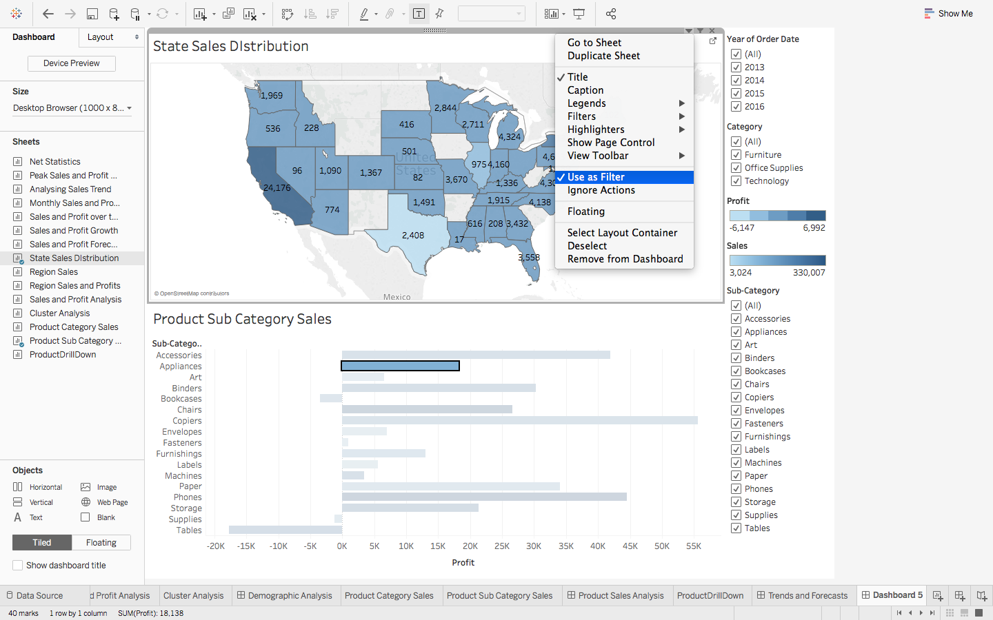
Note: When creating Dashboards, using your charts as Filters is preferred rather than cluttering up the view with custom ones.
Story: Bringing it all together
Just like Dashboards were a way to combine the Worksheets, a Story is where you combine all the dashboards and, if need be, individual Sheets to convey, as the name suggests – a Story.
- Just like before, you drag your Worksheets and Dashboards onto the space :

So, let’s combine all the Dashboards we had made into what could perhaps make a decent presentation for a beginner. Do sure to Add a Caption to all of your Dashboards to convey your message clearly :

If you have ever encountered Tableau Stories online, the ones you could interact with, instead of just viewing, that is made possible by publishing your Workbooks onto the Tableau Server.
If you have one set up, then all you need to do, after creating your Stories, is go to Server -> Publish Workbook and enter the Server Name :

Conclusion
What we have covered so far is pretty much the basics of Tableau. It has various other features, which I will cover in my forthcoming articles. As the saying goes, ‘With practice comes perfection’, so it is suggested that you experiment as much as you can with Tableau.
Below is a sample Dashboard that I would encourage you to try and make. You will get to test the skills you have learned so far and hopefully acquire more. The dataset used is the same as the one we have been working with so far :

This article explores key data science and analytics aspects, focusing on practical tutorials for effective data visualization using Tableau. The author highlights the significance of data visualization techniques using tools like Tableau, emphasizing calculated fields and creating impactful dashboards. With a blend of Microsoft Power BI and Python, the tutorial covers visual analytics, catering to data scientists and analysts. The narrative delves into machine learning concepts, considering real-time data points and efficient data storytelling. The article hints at future explorations of advanced features while offering insights into Salesforce integration and SQL proficiency for comprehensive data analysis.
You can also check these articles – Guide to Learn Advanced Tableau
Also read: Intermediate Tableau guide for data science and business intelligence professionals
If you want to learn more about Tableau, here is a free course dedicated to understanding the topic in a structured and detailed manner- Tableau for Beginners
Frequently Asked Questions
Q1. What is Tableau Data Visualization?
A. Tableau is a leading data visualization tool that translates raw data into interactive and understandable visualizations, such as charts and graphs, aiding in data analysis and interpretation.
Q2. Can I use Tableau for free?
A. Yes, Tableau offers a free version known as Tableau Public. However, more advanced features in Tableau Desktop and Tableau Server require a paid license, and you can check pricing on the Tableau website.
Q3. Why is Tableau the best Visualization tool?
A. Tableau is considered the best visualization tool due to its user-friendly interface, extensive visualization options, real-time data connectivity, and seamless integration with diverse data sources.
Q4. Can I use Tableau for Data Analytics?
A. Tableau is used in data analysis to visualize complex datasets, facilitating tasks like business intelligence, performance analysis, market research, and informed decision-making.
Q5. Can I do Data Visualization With Tableau?
A. Data Visualization with Tableau involves leveraging the software to transform data into meaningful visual representations, including dashboards, charts, and graphs, enabling effective communication and interpretation of insights.


A very informative article
Thank You Gopika!
Awesome article! Very interestingly and informatively presented. Thank you.
Thank You Deep. Glad you liked it :)
So comprehensive! Thanks! I have a question, do let me know if you have any insights on this. Is tableau planning to have a software package for Linux? I can see that it supports only windows and Mac!
Hey Vikram, Although Tableau Server for Linux is in its beta stage, unfortunately the other softwares are not available for usage in Linux. As far as I know there has been no news regarding the same either. But there are alternatives. You can always use Tableau Online or set up a Virtual Environment and run Tableau on the Guest Windows / OS X. Hope this helped!