This article was published as a part of the Data Science Blogathon.
Introduction to Matplotlib:
John D. Hunter created Matplotlib, a plotting library for Python in 2003. Matplotlib is a low-level plotting library and is one of the most widely used plotting libraries. It is among the first choices to plot graphs for quickly visualizing some data.
Using Matplotlib, you can draw lots of cool graphs as per your data like Bar Chart, Scatter Plot, Histograms, Contour Plots, Box Plot, Pie Chart, etc. You can also customize the labels, color, thickness of the plot details according to your needs. The above image is drawn using only Matplotlib.

The official website to Matplotlib is https://matplotlib.org/. The website contains lots of examples to create different kinds of plots. But for a beginner into Data Visualization, it would be difficult to keep up with the example and its code. This article bridges the gap between not knowing anything about Matplotlib and highly efficient to make various kinds of plots within a short period of time.
So enjoy Plotting!
Importing Matplotlib:-
So to start using Matplotlib, you need to import Matplotlib and hence create the environment to perform visualizations. Go to the terminal window and type pip install matplotlib and press enter. It will download the required packages within seconds and then you are good to go!
Open any editor of your choice. It would be best if you download Anaconda and work your code in Jupyter Notebooks.
import matplotlib.pyplot as plt
%matplotlib inline
- The first line shows how you import the Matplotlib library. Pyplot is just an interface helping us to make easier and better plots. We name it as plt so as not to use matplotlib.pyplot every time we call some methods and hence plt seems faster.
- The second line actually is for users doing visualizations in Jupyter Notebooks. It is a magic command that tries to show the plots ‘inline’ i.e. to show the plots in the notebook itself and not displaying the plots in another window, which you know is difficult to refer to.
Plotting a very simple sine graph:-
Python Code:
import numpy as np
import matplotlib.pyplot as plt
x = np.arange(0, np.pi*4, 0.1)
y = np.sin(x)
plt.plot(x,y)
plt.show()
The plt.plot() method creates a graph between two variables entered as arguments.
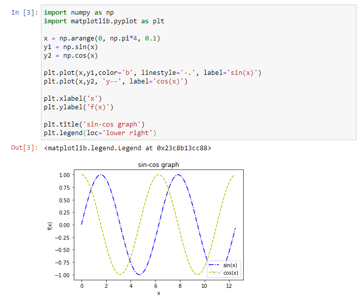
This above plot now can be modified in several ways. We can change the thickness, color, pattern of the line. Moreover, we have not yet added labels, title, legend. We will do these all in the next steps.
Adding Labels, Title and Legend:-
- We can add labels using function plt.xlabel() for x-axis and plt.ylabel() for y-axis.
- We can add a label for an individual line (plot) using the parameter label of the plot() function.
- We can add a title/heading to the plot using plt.title() function.
- Finally, we can add legend using the plt.legend() function and using loc parameter, we can modify the location of the legend position.

Changing styles of the plot:-
We can change the style of the plot by varying the color, marker, marker size, line style, line width.
- Changing the color:-To change the color of the line, just specify the color you want in the ‘color‘ attribute of the plt.plot() function. There are specific color names you can use. Some of the most commonly used colors are:
Character Color ‘r’ Red ‘g’ Green ‘b’ Blue ‘k’ Black ‘w’ White ‘c’ Cyan ‘m’ Magenta - Changing the marker:-To change the markers on the line, specify the desired type of marker in the ‘marker‘ attribute of the plt.plot() function. Like color names, there is a specific style of different markers. The most popularly used markers are mentioned below:-
Character Description ‘ . ‘ Point Marker ‘ , ‘ Pixel Marker ‘ o ‘ Circle Marker ‘ x ‘ X marker ‘ + ‘ + Marker ‘ D ‘ Diamond Marker We can change the marker-size by specifying the amount in the ‘markersize‘ attribute of the plt.plot() function.
- Changing the line style:-Sometimes different line styles are required for each line under the same plot for easier visualizations. Therefore the various line styles available are:-
Character Description ‘ – ‘ Solid Line ‘ – – ‘ Dashed Line ‘ – . ‘ Dash-Dot Line ‘ : ‘ Dotted Line You can tweak the line style width using the ‘linewidth‘ attribute of plot() function.
Shortcut :- You can write ‘r – -‘ instead of mentioning color=’red’ and linestyle=’- -‘.
Various other styles:-
Matplotlib offers other style formats to better represent the plots we make. All the available formats can be seen using the command plt.style.available. Upon executing the command, we get to see the following available styles:
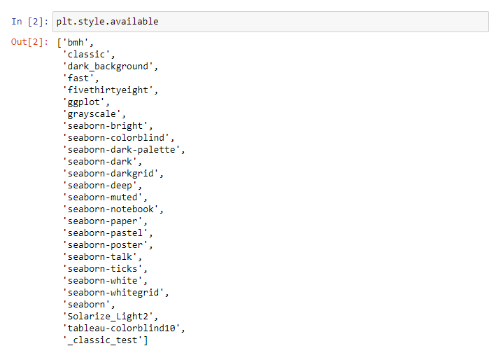
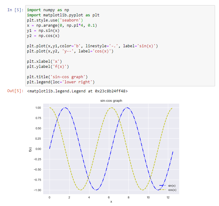
That’s lots of styles! To use a certain style, for example, ‘seaborn’, we enter the command plt.style.use(‘seaborn’). Whatever style you like, just enter that style within the parameter list.
By comparing the above plot with the below ‘seaborn’ stylized plot, you can observe the obvious differences. This style added a grid and a grayish background to the plot.
Saving your figure:-
After you obtained your figure, you obviously need to save the figure for future references. So you can save your figure on your local machine in a number of formats. Generally the most common formats used are : .png, .jpeg and .pdf format.
Now after you decided in which format you want to save your figure, the command for saving figure in Matplotlib is pretty easy. Use plt.savefig(‘Filename’.pdf). This will save your figure in the .pdf format in the location where your current editor/workspace directory is.

Mostly .pdf format is the best way to save your figure because if you try to zoom in a .pdf figure and a .jpeg figure/.png figure, you will find at a certain level of zooming, the latter figure will become pixelated, whereas the .pdf format figure will maintain a high level of resolution at any level of zooming. Moreover, .pdf figures will have a smaller file size than a .png figure.
Various Types of Plots:-
There are numerous types of plots available in Matplotlib, each has its own usage with certain specific data. Proper selection of plots is very essential and this needs to be understood before moving forward with the creation of plots.
For example, to display car sales during the year 2019, you can choose Bar Plots. But instead, if you choose the Line Plot, it would be a little harder to interpret. Similarly, if you choose Pie Plot, it would be devastating as 12 months stacking in a Pie Plot would be unreadable.
So the most commonly used plots are:
- Bar Plots
- Histograms
- Pie Plots
- Area Plots
- Scatter Plots
- Time Series Graph
Bar Plots:-
Bar Plots/Graphs are named so because the plots are created in somewhat rectangular boxes or bars. These bar plots can be either horizontal or vertical. The graphs are constructed in order of the frequency. For example, in the previous instance if its car sales over a year, we would put a number of months on one axis and the sales count on the other axis. The bar heights are scaled according to the magnitude of the other axis.
In Matplotlib, Bar Graphs are made using plt.bar() function.
Let’s plot a Bar Graph.
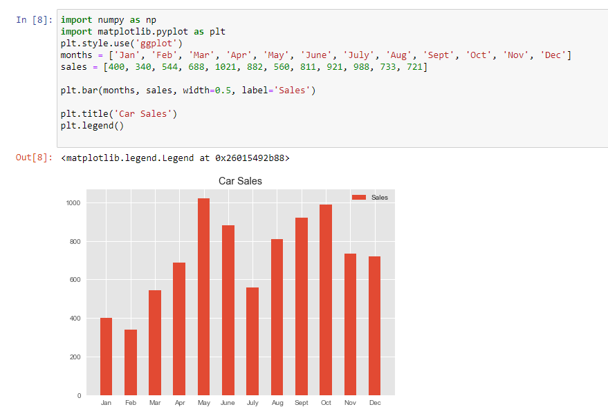
As you can see we just replaced plt.plot() with plt.bar() and voila! We get a bar plot. The width attribute in the plt.bar() is just specifying the width of the bar. One thing to know here is about ticks. Ticks are the markers denoting datapoints on axes. Example Jan, Feb, etc in our case. But for some reason, if you want to change the ticks, you need to use the function plt.xticks() for the x-axis and set the ‘ticks’ attribute value to the tick values you want.
Histograms:-
Histograms are very close to Bar Plots but they are different in one very important manner. Bar plots are generally used for categorical variables data like we had 12 categories of months. On the other hand, histograms are used for a continuous range of data. So for a large amount of data, histograms are a very efficient way to reflect the distribution of occurrence and proportion of each class interval. Just like Bar plots have bars, Histograms have bins. The histogram plot helps us to know a lot about the distribution of particular data i.e.- is it a Normal Distribution or Poisson Distribution or Binomial Distribution etc. Understanding the nature of distribution provides much more statistical insights into the data.
Histograms are created using plt.hist() function. It has an attribute ‘bin‘ which takes into input the range/nature of bins you want for the histogram. Leaving the ‘bin’ attribute empty will assign default bin values.
Let’s plot a simple Normal Distribution histogram.
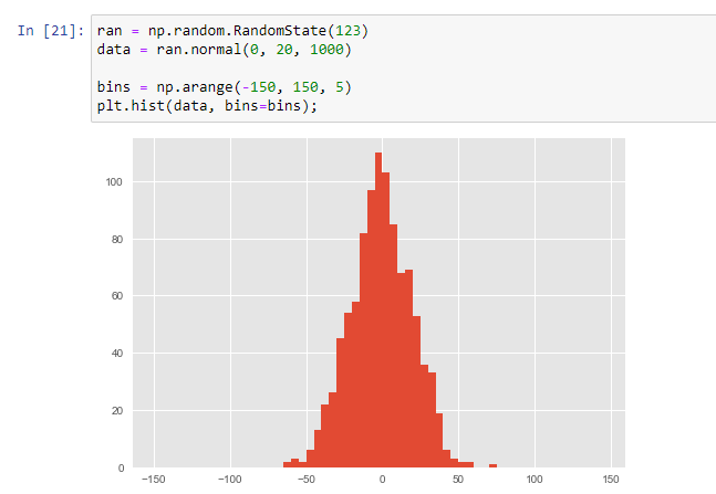
We have taken a normal distribution data and plotted a histogram of that data and made custom bins of fixed size = 5 over a range -150 to 150. The default bins by Matplotlib isn’t that good.
You can of course plot two histograms side by side by using another plt.hist() function. But if it overlaps, make sure to use the ‘alpha’ attribute and set the value to 0.5. The ‘alpha’ attribute is used to alter the opacity of the plot. Hence providing a clear vision of the two overlapped histogram plots. Try this yourself now.
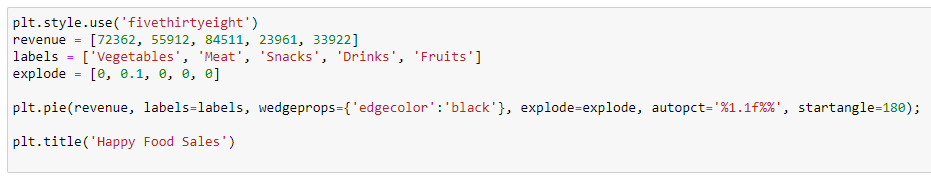
Pie Plots:-
Pie Plots are very simple plots and I am sure many have made some sorts of pie charts in your childhood, like in Powerpoint or manual Projects. Pie Charts are simple circular-shaped plots where each slice of the pie represents a certain value. The bigger the slice of the pie, the greater is the value.
Real-life examples where pie plots are used can be stated as: In grocery shops, one can make pie plots for the sales of ‘vegetables’, ‘fruits’, ‘meat’, ‘soft-drinks’. One thing to note is that only a few categorical data can be represented in a pie plot in order to make it easily understandable. The more the slices, the more difficult it would be in distinguishing whether one slice is greater than other slices. So better use pie plots when total categories are maximum 6.
You can create pie plots using plt.pie() function. plt.pie() has a number of important attributes like wedgeprops, autopct, explode, startangle.
Attribute ‘wedgeprops‘ is a dictionary that takes a key named ‘edgecolor‘ which as the name suggests provides an edge color to every slice of the pie for better visuals.
Attribute ‘autopct‘ takes in the value ‘%1.1f%%‘ and it’s used to show the distribution of that sales in terms of percentage in numerical format. Obviously its easier to compare two slices numerically rather than just looking at which slice appears to be larger.
Attribute ‘explode’ is a list of values whose purpose is to lay greater emphasis on some particular slice by popping out that slice a little bit.
Scatter Plots:-
Scatter Plots are an extremely popular and useful way of determining the nature of an unknown variable by plotting it with a known one. Scatter Plots use markers or dots unlike bars as in bar plots. Scatter Plots are used when there is a relationship between two variables as if one variable is dependent on other variables. We plot these relationships in terms of markers.
But if there is no dependency between variables, then scatter plots are still useful as they help us with the knowledge of the correlation between those two variables. Correlation between 2 variables tells us how closely one variable is dependent on the other variable. If they are high-positively correlated, then the plot would be a somewhat straight line with a positive slope. On the other hand, if it’s high-negatively correlated, it would still be a straight line but with a negative slope. If it’s not at all correlated, the plot would become somewhat be arranged equally.
In Matplotlib, scatter plots can be created using the plt.scatter() function. It has a number of useful attributes that we need to encounter.
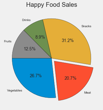
As an example, we would be taking a California Housing Dataset available on Kaggle. This dataset consists of house location, house type, etc in the state of California. Let’s take a quick peek into the dataset.
Our motive is to create a scatter plot taking longitude and latitude as axes. The scatter plot would then help us in gathering information about the density of the houses in the state of California. We will also use the attribute ‘alpha’ set to 0.5 for better results.
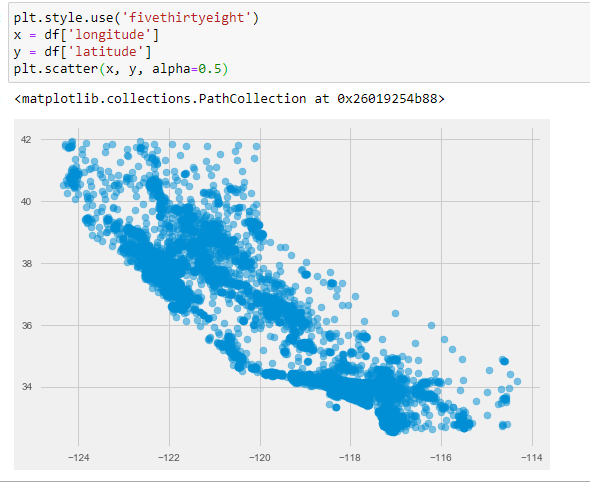
So we can see that the highly-dense areas of California are middle-left sections and bottom left section. It can be said that most people have houses close to the bay.
Area Plots:-
Area Plots are used in a dataset where greater importance is given on changes and trends rather than actual numbers. For the latter reasons, we use Bar Plots. The area Plot is much more cleaner to read when we need to show the distribution of categories as parts of a whole. For example, we may want to compare the sales gathered over two different years and check whether there was an improvement as compared to the previous year.
Area Plots are a part of Stack Plots as different categories are stacked over one another. In Matplotlib, Area Plots can be created using plt.stackplot(). We will take an example of the bike and car sales over a year and compare using area plot.
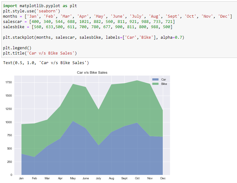
We can clearly see there are more bike sales than car sales but the ratio of bike and car sales is nearly equal to 1 in most cases. In December, there is a noticeable decrease in bike sales but an increase in car sales comparatively.
Time-Series Graph:-
Well, the time-series topic is generally a part of Pandas, But since time data are so common in various datasets that I thought of introducing a little bit in this Tutorial. Time-Series is a big topic which, if you want to know more, head over to any Pandas book.
So time-series is basically a dataset which involves time or date or months or years. These are not a usual string or integer data types. These have separate DateTime datatype. But mostly, the datasets have time-series data in the form of strings. So Pandas/Matplotlib recognizes it as mere text and hence will show wrong graphs and plots. This is what most people do wrong.
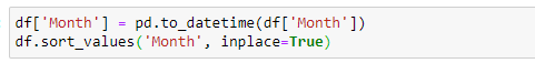
So first change the datatype of this time-series into datetime by the following command:
pd.to_datetime()
In the argument list, enter the time-series column and overwrite it on that very column. After this, you sort the column for the best results.
After you have done this, plot the time data using plt.plot_date() function and put in the arguments like time data on the x-axis(preferably) and the other data on the y-axis. You have an attribute called ‘linestyle‘ that joins the required points by a line.
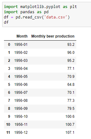
Below is the dataset:-
Using .dtype, we find its not in datetime datatype. So we convert it into datetime datatype by:
Now we plot the time vs beer production:-

We can observe that there is a higher amount of beer production in winter months and lower in the summer months.
What’s next?
So, if you have come this far, pat yourself on the back. You have just covered the basics of Matplotlib very well. You are now ready to plot bigger and more complex plots. You need to really practice as much as you can to be proficient in this. You can always head over to the official Matplotlib website and look into the gallery examples they have provided. They have some really awesome plots you can checkout.
For practice, you can check out the Kaggle website, download datasets, and start plotting!


