Pneumonia Prediction: A guide for your first CNN project
This article was published as a part of the Data Science Blogathon
Introduction
Deep Learning is a very powerful tool that has now found usage in many primary fields of research and study. Neural networks and deep learning has been around for quite some time, but due to the lack of data, there was not much popularity for a long time. The creation of the ImageNet has been the primary driving force in the further development of Deep learning and Convolution Neural Networks.
If you want to read more about Deep Learning and CNNs, here are two awesome articles from Analytics Vidhya that I suggest you read:
Convolution Neural Network(CNN) by Manav_M
A Comprehensive tutorial on Deep Learning – Part 1 by SION
In this article, we shall take a practical approach to learn and train a simple model of CNN. We will use a dataset called Chest X-Ray Images (Pneumonia), which you can find on Kaggle here. Before getting into the analysis, let’s get a little familiar with what Pneumonia is.
What is Pneumonia?
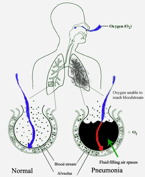
Pneumonia is a kind of lung infection that can happen to either of the lungs. This infection can be caused by several reasons like bacteria, viruses, or fungi. The infection causes the lung sacs to fill up with pus or liquids which leads to the breathlessness of the patient.
1) Importing Libraries
import numpy as np
import pandas as pd
import matplotlib.pyplot as plt
import cv2
import random
import os
import glob
from tqdm.notebook import tqdm

import albumentations as A

from tensorflow.keras.layers import Conv2D, Flatten, MaxPooling2D, Dense
from tensorflow.keras.models import Sequential
from tensorflow.keras.preprocessing.image import ImageDataGenerator
2) Loading Data
train_data = glob.glob('../input/chest-xray-pneumonia/chest_xray/train/**/*.jpeg')
test_data = glob.glob('../input/chest-xray-pneumonia/chest_xray/test/**/*.jpeg')
val_data = glob.glob('../input/chest-xray-pneumonia/chest_xray/val/**/*.jpeg')
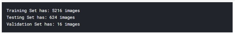
print(f"Training Set has: {len(train_data)} images")
print(f"Testing Set has: {len(test_data)} images")
print(f"Validation Set has: {len(val_data)} images")
We create a function to visualize multiple images at once, which will be helpful in our EDA later.
def plot_multiple_img(img_matrix_list, title_list, ncols, main_title=""):
fig, myaxes = plt.subplots(figsize=(20, 15), nrows=3, ncols=ncols, squeeze=False)
fig.suptitle(main_title, fontsize = 30)
fig.subplots_adjust(wspace=0.3)
fig.subplots_adjust(hspace=0.3)
    for <a onclick="parent.postMessage({'referent':'.kaggle.usercode.11298373.41303076.plot_multiple_img..i'}, '*')">i, (img, title) in enumerate(zip(img_matrix_list, title_list)):
myaxes[i // ncols][i % ncols].imshow(img)
myaxes[i // ncols][i % ncols].set_title(title, fontsize=15)
plt.show()
3) Data Distribution
Before starting with EDA, let us look at the distribution of all the classes in our data.
DIR = "../input/chest-xray-pneumonia/chest_xray/"
sets = ["train", "test", "val"]
all_pneumonia = []
all_normal = []
for cat in sets:
path = os.path.join(DIR, cat)
norm = glob.glob(os.path.join(path, "NORMAL/*.jpeg"))
pneu = glob.glob(os.path.join(path, "PNEUMONIA/*.jpeg"))
all_normal.extend(norm)
all_pneumonia.extend(pneu)
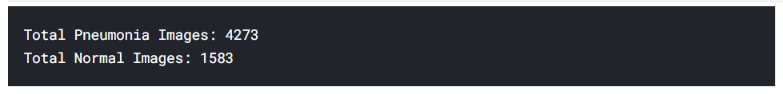
print(f"Total Pneumonia Images: {len(all_pneumonia)}")
print(f"Total Normal Images: {len(all_normal)}")
labels = ['Nomal', 'Pneumonia']
targets = [len(all_normal), len(all_pneumonia)]

plt.style.use("ggplot")
plt.figure(figsize=(16, 9))
plt.pie(x=targets, labels=labels, autopct="%1.1f%%")
plt.title("Image Category Distribution")
plt.show()
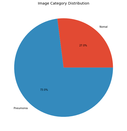
There is a clear imbalance between images of pneumonia and normal images. If this problem was not detected in the early stages, we couldn’t make our model perform efficiently. Let’s get on with EDA now.
4) EDA
Shuffling the images randomly.
random.shuffle(all_normal)
random.shuffle(all_pneumonia)
images = all_normal[:50] + all_pneumonia[:50]
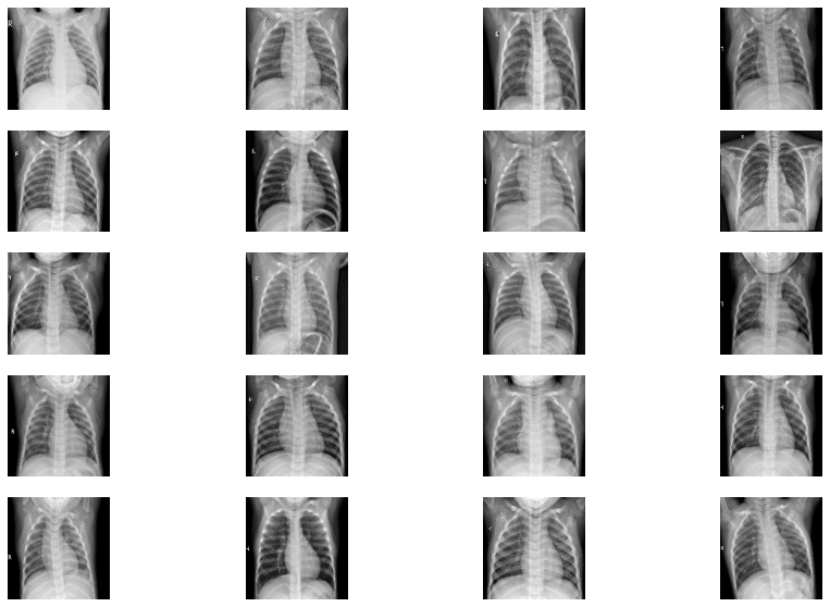
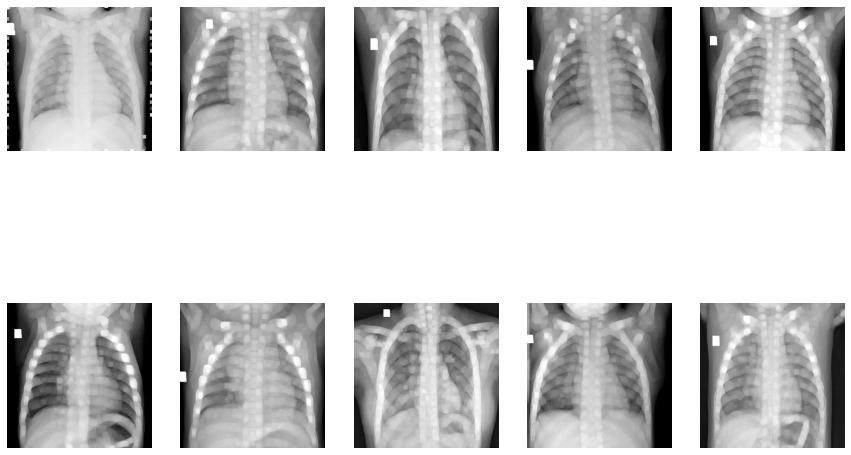
Viewing the images in X-ray
fig=plt.figure(figsize=(15, 10))
columns = 4; rows = 5
for i in range(1, columns*rows +1):
    img = cv2.imread(images[i])
    img = cv2.resize(img, (128, 128))
    fig.add_subplot(rows, columns, i)
    plt.imshow(img)
    plt.axis(False)
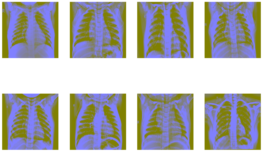
Now let’s try Ben Graham’s method. First, we convert the images to greyscale and then apply Gaussian blur to them.
fig=plt.figure(figsize=(15, 10))
columns = 4; rows = 2
for i in range(1, columns*rows +1):
    img = cv2.imread(images[i])
    img = cv2.resize(img, (512, 512))
    img = cv2.cvtColor(img, cv2.COLOR_BGR2HSV)
    img = cv2.addWeighted (img, 4, cv2.GaussianBlur(img, (0,0), 512/10), -4, 128)
    fig.add_subplot(rows, columns, i)
    plt.imshow(img)
    plt.axis(False)
Now, let’s look into the pixel distributions. We’ll use the Fourier method for this.
fig=plt.figure(figsize=(15, 10))
columns = 4; rows = 2
for i in range(1, columns*rows +1):
    img = cv2.imread(images[i])
    img = cv2.resize(img, (512, 512))
    img = cv2.cvtColor(img, cv2.COLOR_BGR2GRAY)
    f = np.fft.fft2(img)
    fshift = np.fft.fftshift(f)
    magnitude_spectrum = 20*np.log(np.abs(fshift))
    fig.add_subplot(rows, columns, i)
    plt.imshow(magnitude_spectrum)
    plt.axis(False)
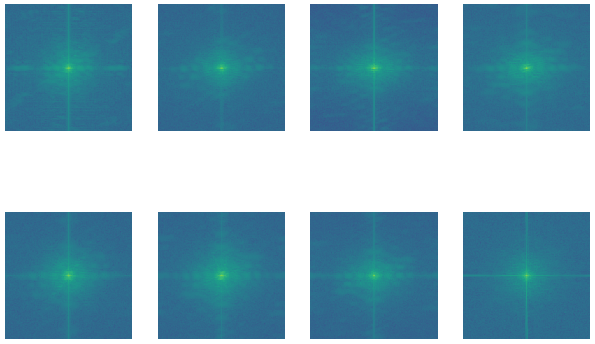
All these images might look like a bunch of green dots on a blue background, but that’s not all. These images are basically magnitude spectrum which tells us where the majority of the growth is.
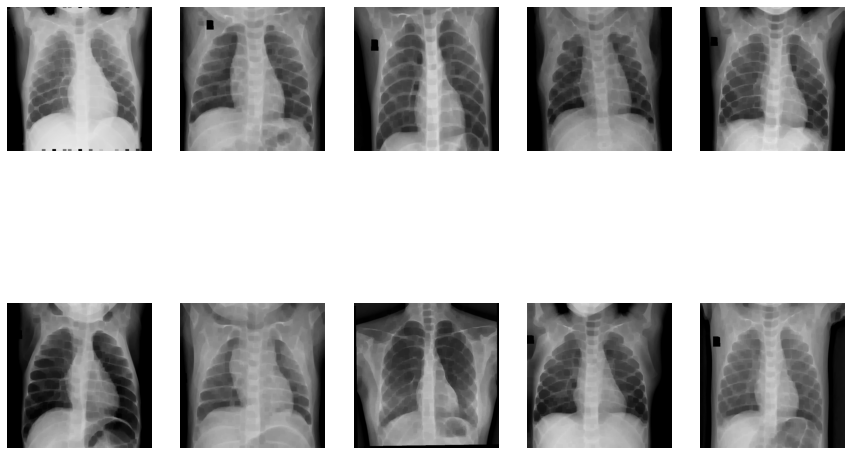
Image Erosion:
fig=plt.figure(figsize=(15, 10))
columns = 5; rows = 2
for i in range(1, columns*rows +1):
    img = cv2.imread(images[i])
    img = cv2.resize(img, (512, 512))
    img = cv2.cvtColor(img, cv2.COLOR_BGR2RGB)
    kernel = np.ones((5, 5), np.uint8)
    img_erosion = cv2.erode(img, kernel, iterations=3)
    fig.add_subplot(rows, columns, i)
    plt.imshow(img_erosion)
    plt.axis(False)
Dilation of Images
fig=plt.figure(figsize=(15, 10))
columns = 5; rows = 2
for i in range(1, columns*rows +1):
    img = cv2.imread(images[i])
    img = cv2.resize(img, (512, 512))
    img = cv2.cvtColor(img, cv2.COLOR_BGR2RGB)
    kernel = np.ones((5, 5), np.uint8)
    img_erosion = cv2.dilate(img, kernel, iterations=3)
    fig.add_subplot(rows, columns, i)
    plt.imshow(img_erosion)
    plt.axis(False)
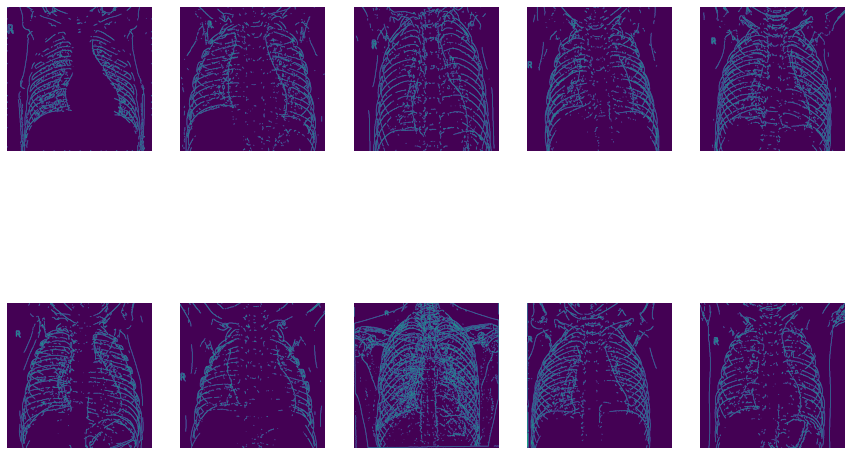
Now let’s use OpenCV’s Canny Edge Detection:
fig=plt.figure(figsize=(15, 10))
columns = 5; rows = 2
for i in range(1, columns*rows +1):
    img = cv2.imread(images[i])
    img = cv2.resize(img, (512, 512))
    img = cv2.cvtColor(img, cv2.COLOR_BGR2GRAY)
    edges = cv2.Canny(img, 80, 100)
    fig.add_subplot(rows, columns, i)
    plt.imshow(edges)
    plt.axis(False)
5) Model Building
First, we divide our data to create a training and validation set using the Keras Image DataGenerator.
train_gen = ImageDataGenerator(
    rescale=1/255.,
    horizontal_flip=True,
    vertical_flip=True,
    rotation_range=0.4,
    zoom_range=0.4
)
val_gen = ImageDataGenerator(
    rescale=1/255.,
)
# Flowing the data in the Data Generator
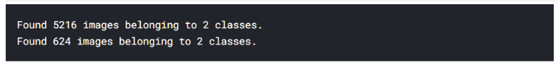
Train = train_gen.flow_from_directory(
"../input/chest-xray-pneumonia/chest_xray/train",
target_size=(224, 224),
batch_size=16
)
Test = train_gen.flow_from_directory(
"../input/chest-xray-pneumonia/chest_xray/test",
target_size=(224, 224),
batch_size=8
)
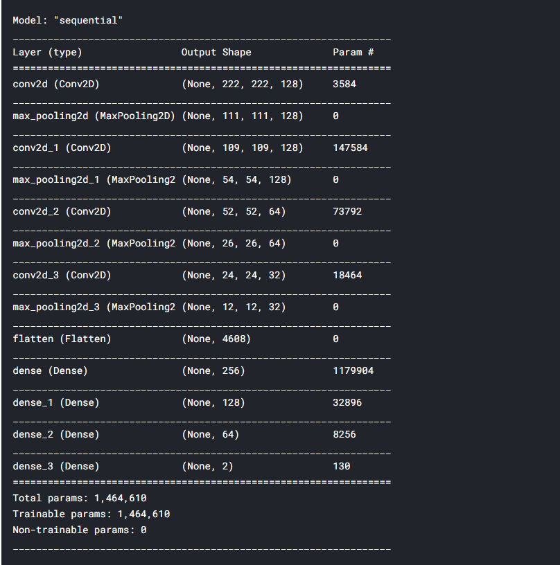
Now the most interesting part. We start building our model using the Keras Sequential API. It’ll be a simple CNN. We’ll use the Rectifier Linear Unit as our activator function.
model = Sequential()
model.add(Conv2D(filters=128, kernel_size=(3,3), activation='relu', input_shape=(224, 224, 3)))
model.add(MaxPooling2D(pool_size=(2,2)))
model.add(Conv2D(filters=128, kernel_size=(3,3), activation='relu'))
model.add(MaxPooling2D(pool_size=(2,2)))
model.add(Conv2D(filters=64, kernel_size=(3,3), activation='relu'))
model.add(MaxPooling2D(pool_size=(2,2)))
model.add(Conv2D(filters=32, kernel_size=(3,3), activation='relu'))
model.add(MaxPooling2D(pool_size=(2,2)))
model.add(Flatten())

model.add(Dense(256, activation='relu'))
model.add(Dense(128, activation='relu'))
model.add(Dense(64, activation='relu'))
model.add(Dense(2, activation='softmax'))
# Compiling the model to see it's structure and parameters
model.compile(optimizer='adam', loss='categorical_crossentropy', metrics=['accuracy'])
model.summary()
Now our model is ready!!
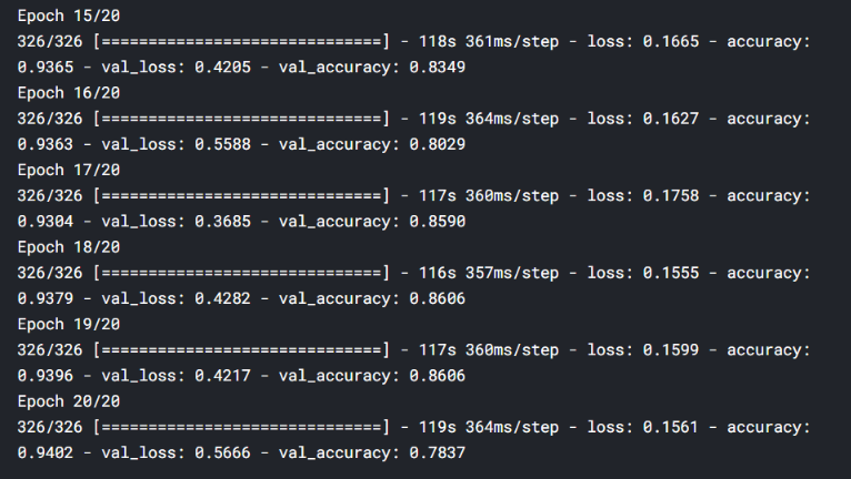
Let’s train it for 20 epochs and see how it performs. I’ll add the last 5 epoch’s screenshot:
hist = model.fit_generator(
    Train,
    epochs=20,
    validation_data=Test
)
Saving the model:
model.save("best_model.hdf5")
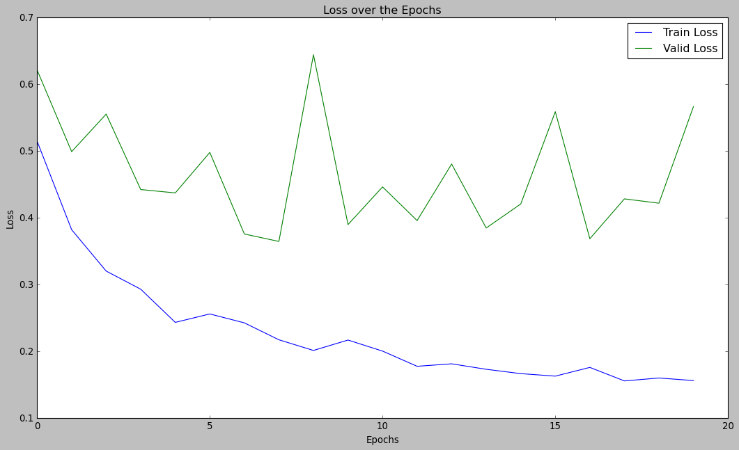
Now, let’s visualize the performance of our model:
plt.style.use("classic")
plt.figure(figsize=(16, 9))
plt.plot(hist.history['loss'], label="Train Loss")
plt.plot(hist.history['val_loss'], label="Valid Loss")
plt.legend()
plt.xlabel("Epochs")
plt.ylabel("Loss")
plt.title("Loss over the Epochs")
plt.show()
plt.style.use("ggplot")
plt.figure(figsize=(16, 9))
plt.plot(hist.history['accuracy'], label="Train Accuracy")
plt.plot(hist.history['val_accuracy'], label="Valid Accuracy")
plt.legend()
plt.xlabel("Epochs")
plt.ylabel("Accuracy")
plt.title("Accuracy over the Epochs")
plt.show()
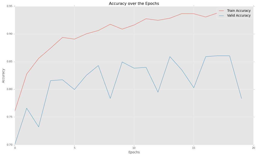
So as you can see, our model can provide almost 86% of accuracy which is quite decent. Thus we can confidently use this model for predicting pneumonia in real-world cases.
Conclusion and End Notes
In this article, we learned how to create a simple CNN using the Keras library.
For our Exploratory Data Analysis, we mostly used the library OpenCV. First, we saw how our data is distributed in both the classes and found that there are substantially more images of pneumonic lungs than normal ones. Beginning our EDA, we first shuffle the images randomly to nullify the effects of having more data of one type.
Next, we applied Ben Graham’s method and the Fourier method for Pixel distribution. Then ending our analysis with Image erosion and Dilation and most importantly Canny edge detection.
Lastly, we create our CNN model using Keras Sequential API, run the model for 20 epochs, and plot the performance of our model over time.
I hope this article helps you, and if you want to read more of my content, check out my other blog:
Thank you and have a nice day.
The media shown in this article are not owned by Analytics Vidhya and is used at the Author’s discretion.


Nice article Pritam. How to learn Open CV
very interesting Thank you very much