This article was published as a part of the Data Science Blogathon
Introduction
Data is everywhere in today’s world of data, and we can only benefit from it if we can extract information from data. Data visualization is the most visually appealing aspect of data analysis because it allows us to interact with the data. It’s that magical technique for conveying information to large groups of people in a single glance and creating interesting stories out of data. Pandas is one of the most popular and widely used data analysis tools in Python. It also has a built-in plot function for samples. When it comes to interactive visualization, however, Python users who don’t have front-end engineering skills may have some challenges, like many libraries, such as D3, chart.js, require some javascript knowledge. Plotly and Cufflinks come in handy at this point.
When there is a large amount of data and it becomes difficult for businesses to extract decisive information from it, data visualization plays an important role in making critical business decisions.
Plotly is a charting library built on top of d3.js that can be used directly with Pandas data frames thanks to another library called Cufflinks.
We’ll show you how to use Plotly interactive plots with Pandas data frames in this quick tutorial. To keep things simple, we’ll use Jupyter Notebook (installed using Anaconda Distribution with Python) and the famous Titanic dataset.
Data Visualization in Python
After completing data cleaning and manipulation, the next step in the data analysis process is to extract meaningful insights and conclusions from the data, which can be accomplished using graphs and charts. Python has a number of libraries that can be used for this purpose. We are typically only taught about the two libraries matplotlib and seaborn. These libraries include tools for creating line charts, pie charts, bar plots, box plots, and a variety of other plots. You’re probably wondering why we need other libraries for data visualization if we already have matplotlib and seaborn. When I first heard about plotly and cufflinks, I had the same question in my head.
Plotly
Plotly’s most recent release was 5.1.0, while cufflinks’ was 0.17.5. Because older cufflink versions do not support newly released plotly versions, it is critical to update both packages at the same time or find compatible versions. On Anaconda Prompt, run the following commands to install plotly (or on Terminal if you use OS or Ubuntu)
Plotly is a charting and open-source library that allows for interactive plotting. Python, R, MATLAB, Arduino, and REST, among others, are among the programming languages supported by the library.
Cufflink is a python library that connects plotly and pandas, allowing us to draw charts directly on data frames. It’s essentially a plug-in.
Plotly charts are interactive, allowing us to hover overvalues, zoom in and out of graphs, and identifying outliers in the dataset. Matplotlib and seaborn charts, on the other hand, are static; we can’t zoom in or out, and every value on the chart isn’t detailed. Plotly’s most important feature is that it allows us to create dynamic web charts directly from python, which is not possible with matplotlib. We can also make animations and interactive graphs out of geographical, scientific, statistical, and financial data using plotly.
Install “plotly” and “cufflinks“ using an anaconda environment
conda install -c plotly plotly
conda install -c conda-forge cufflinks-py
or using pip
pip install plotly --upgrade
pip install cufflinks --upgrade
Loading Libraries
The Pandas, Plotly, and Cufflinks libraries will be loaded first. Because plotly is an online platform, it requires a login credential to use it online. We’ll use offline mode in this article, which is sufficient for Jupyter Notebook.
#importing Pandas
import pandas as pd
#importing plotly and cufflinks in offline mode
import cufflinks as cf
import plotly.offline
cf.go_offline()
cf.set_config_file(offline=False, world_readable=True)
Loading Dataset
We mentioned that we’ll be using the Titanic dataset, which you can get from this kaggle_link. Only the train.csv file will be used.
Python Code:
import pandas as pd
import cufflinks as cf
import plotly.offline

df=pd.read_csv("train(1).csv")
print(df.head())
Histogram
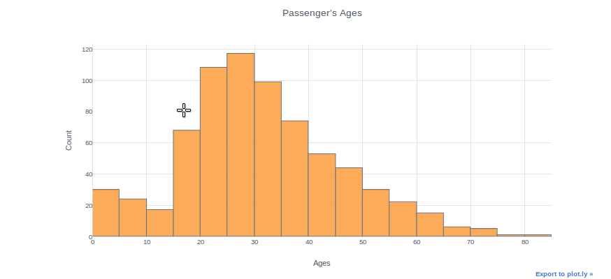
Histograms can be used to inspect the distributions of a feature, such as the “Age” feature in this case. We simply use the (dataframe[“column name”]) syntax to select a column and then add the iplot function. As an example, we can specify bin size, theme, title, and axis names. With the “help(df.iplot)” command, you can see all the parameters for the iplot parameter.
df["Age"].iplot(kind="histogram", bins=20, theme="white", title="Passenger's Ages",xTitle='Ages', yTitle='Count')
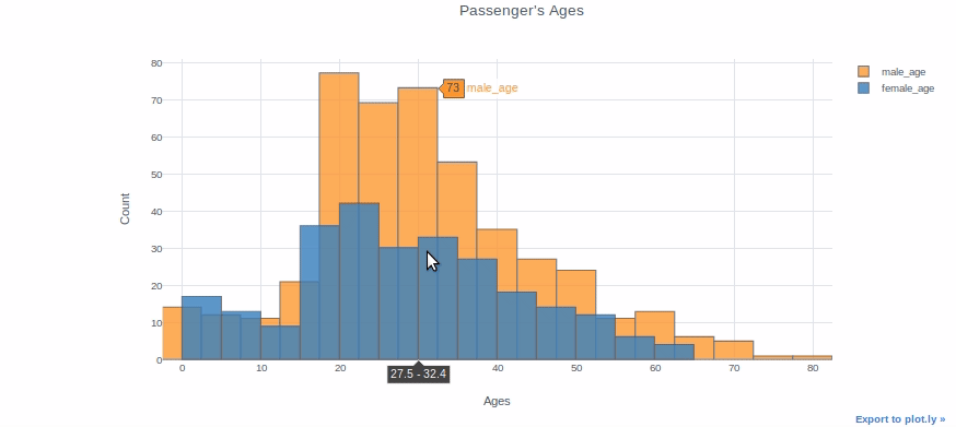
You can plot two different distributions as two different columns if you want to compare them. We will, for example, plot the ages of female and male passengers in the same plot.
df["male_age"]=df[df["Sex"]=="male"]["Age"]
df["female_age"]=df[df["Sex"]=="female"]["Age"]df[["male_age","female_age"]].iplot(kind="histogram", bins=20, theme="white", title="Passenger's Ages",
         xTitle='Ages', yTitle='Count')
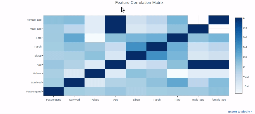
Heatmap
Heatmaps can be used for a variety of purposes, but we’ll use them to check the correlation between features in a dataset as an example.
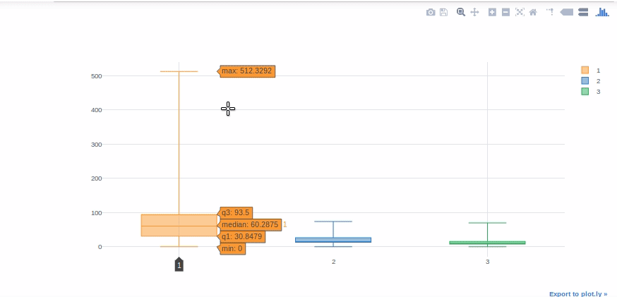
Boxplot
Boxplots are extremely useful for quickly interpreting data skewness, outliers, and quartile ranges. We’ll now use a boxplot to display the “Fare” distribution for each Titanic class.
#we will get help from pivot tables to get Fare values in different columns for each class.
df[['Pclass', 'Fare']].pivot(columns='Pclass', values='Fare').iplot(kind='box')
Scatter Plots
Scatter plots are commonly used to visualize the relationship between two numerical variables. For the variables “Fare” and “Age,” we’ll use scatter plots. “Categories” allows us to display the variables of a selected feature in various colors (sex of passengers in this case).
df.iplot(kind="scatter", theme="white",x="Age",y="Fare",
            categories="Sex")
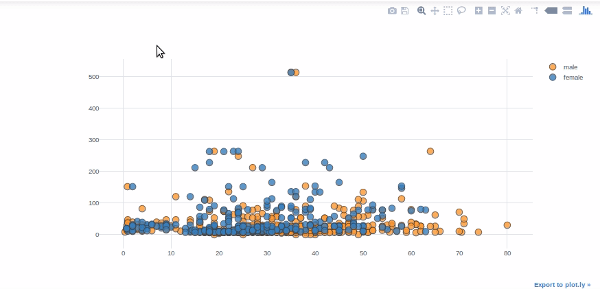
a quick reminder: the “categories” parameter must be a string or float64 type column. For example, in the Bubble Chart example, you must convert the integer type “Survived” column to float64 or string.
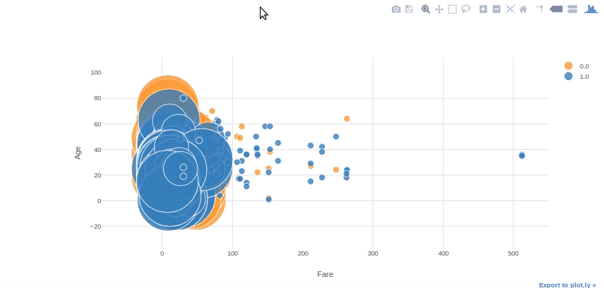
Bubble Chart
We can use bubble charts to see multiple variable relationships at the same time. With the “categories” and “size” parameters in plotly, we can easily adjust colour and size subcategories. With the “text” parameter, we can also specify the hover text column.
#converting Survived column to float64 to be able to use in plotly
df[['Survived']] = df[['Survived']].astype('float64', copy=False)df.iplot(kind='bubble', x="Fare",y="Age",categories="Survived", size='Pclass', text='Name', xTitle='Fare', yTitle='Age')
Bar Graph
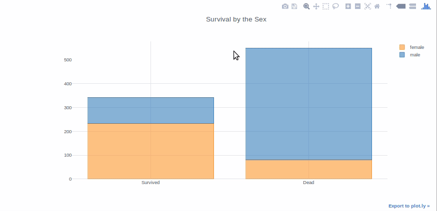
Bar graphs are good to present the data of different groups that are being compared with each other. Plus they can be used stacked to show different variable effects. We will make a bar graph to show survived passenger count by sex.
survived_sex = df[df['Survived']==1]['Sex'].value_counts()
dead_sex = df[df['Survived']==0]['Sex'].value_counts()
df1 = pd.DataFrame([survived_sex,dead_sex])
df1.index = ['Survived','Dead']
df1.iplot(kind='bar',barmode='stack', title='Survival by the Sex')
I’ve tried to explain everything as simple as possible. I hope it makes it easier for newcomers to pick up plotly.
Plotly also provides scientific charts, 3-D charts, maps, and animations. You can visit plotly documentation here for more details.
Check out EDA – Exploratory Data Analysis Using Python Pandas and SQL CLICK TO READ
EndNote
Thank you for reading!
I hope you enjoyed the article and increased your knowledge.
Please feel free to contact me on Email
Something not mentioned or want to share your thoughts? Feel free to comment below And I’ll get back to you.
About the Author
Hardikkumar M. Dhaduk
Data Analyst | Digital Data Analysis Specialist | Data Science Learner
Connect with me on Linkedin
Connect with me on Github
Data Analyst | Digital Data Analysis Specialist | Data Science Learner Currently working in Data Analytics field. I have done my post-graduation. My main focus is growing in the fields of Data Science and Analytics.


