This article was published as a part of the Data Science Blogathon
Overview
Python Pandas library is becoming most popular between data scientists and analysts. It allows you to quickly load, process, transform, analyze, and visualize the data.
The most important thing to remember when working with Pandas is that there are two types of data structures: Series and DataFrame:
- Any data type can be stored in a series, which is a one-dimensional indexed array (integer, float, etc).
- Pandas’ primary data structure is the DataFrame. It’s a two-dimensional data class (rows and columns) with different data types in each column. A DataFrame can also be given an index and additional columns.
For a public sample of random Reddit posts, I’ll use some common commands for exploratory data analysis using Pandas and SQL.
Importing the packages
We start by installing the following packages, which will be used in our data analysis:
#Getting all the packages we need:
import numpy as np # linear algebra
import pandas as pd # data processing
import seaborn as sns #statist graph package
import matplotlib.pyplot as plt #plot package
import pandasql as ps #sql package
import wordcloud #will use for the word cloud plot
from wordcloud import WordCloud, STOPWORDS # optional to filter out the stopwords
Reading the data
I’ll be doing the analysis for a publicly released dataset of random Reddit posts on Kaggle, as I mentioned earlier. This Kaggle link will lead you to it.
df = pd.read_csv('r_dataisbeautiful_posts.csv')
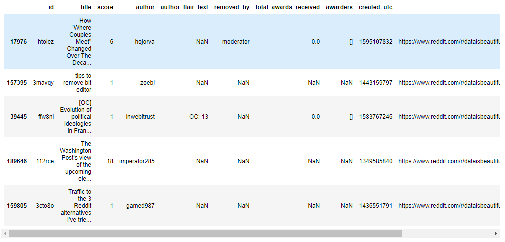
df.sample(5)
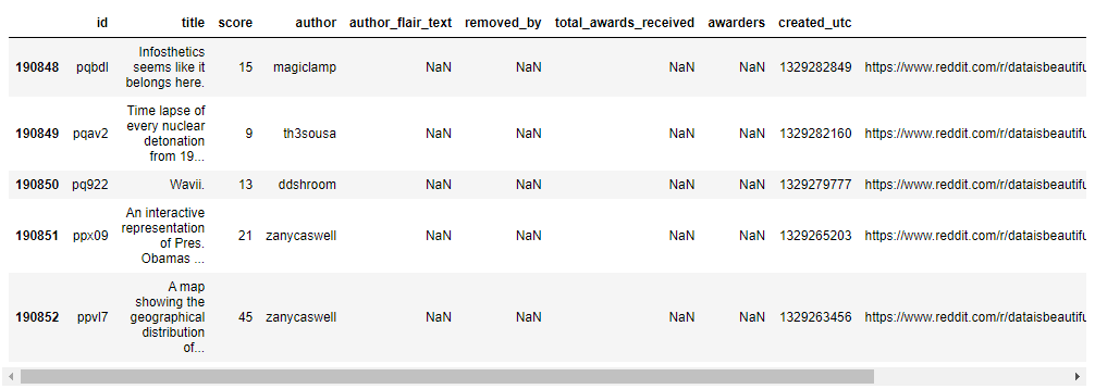
df.tail(5)
print("Data shape :",df.shape)

Getting a feel of the dataset
Exploratory data analysis is a quick look at your dataset to help you understand its structure, form, and size, as well as find patterns. I’ll show you how to run SQL statements in Pandas and demonstrate a few common EDA commands below.
Let’s run basic EDA
df.info()
df.describe()
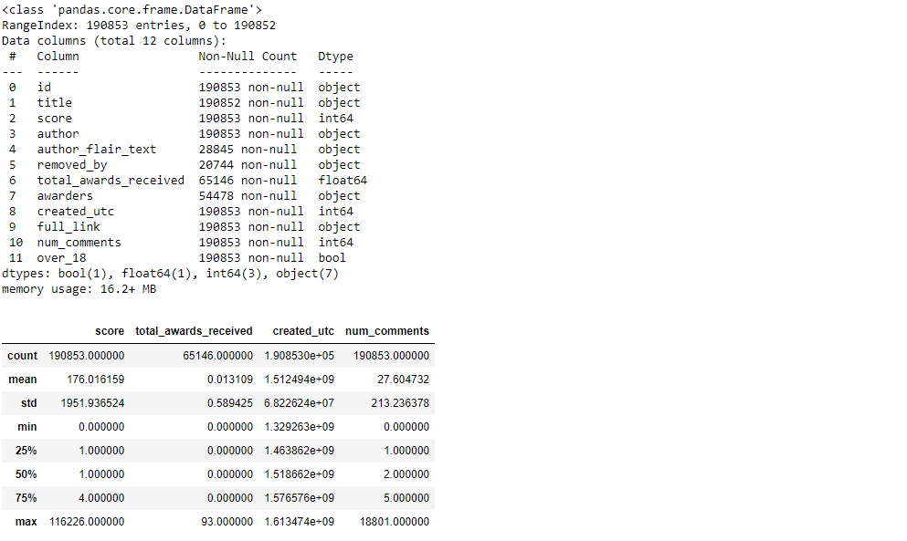
We now know that the DataFrame we’re working with has 12 columns with the data classes boolean, float, integer, and Python object. We can also see which columns have missing values and get a basic understanding of numerical data. Score, num comments, and total awards received columns have a distribution.
We can also use built-in statistical commands like mean(), sum(), max(), shape(), or Dtypes() to delve deeper into columns. These can be applied to the entire DataFrame as well as to each individual column:
#Empty values:
df.isnull().sum().sort_values(ascending = False)

Running SQL in Pandas
One of the most appealing features of the Pandas library is its ability to work with SQL and tabular data. Importing the panda SQL package and running the following commands is one way to run SQL statements:
q1 = """SELECT removed_by, count(distinct id)as number_of_removed_posts
FROM df
where removed_by is not null
group by removed_by
order by 2 desc """
grouped_df = ps.sqldf(q1, locals())
grouped_df

#Visualizing bar chart based of SQL output:
removed_by = grouped_df['removed_by'].tolist()
number_of_removed_posts = grouped_df['number_of_removed_posts'].tolist()
plt.figure(figsize=(12,8))
plt.ylabel("Number of deleted reddits")
plt.bar(removed_by, number_of_removed_posts)
plt.show()
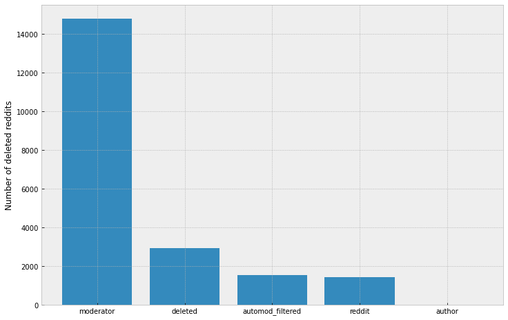
The majority of deleted posts (68%) were removed by a moderator, as can be seen. Authors remove less than 1% of the content.
Who are the top three users whose posts have been removed the most by moderators?
q2 = """SELECT author, count(id) as number_of_removed_posts
FROM df
where removed_by = 'moderator'
group by author
order by 2 desc
limit 3"""
print(ps.sqldf(q2, locals()))

Hornedviper is not a good user
*Let’s see how many posts with the keyword “virus” are removed by the moderator.*
#Step 1: Getting proportion of all removed posts / removed "virus" posts
q3 = """
with Virus as (
SELECT id
FROM df
where removed_by = 'moderator'
and title like '%virus%'
)
SELECT count(v.id) as virus_removed, count(d.id) as all_removed
FROM df d
left join virus v on v.id = d.id
where d.removed_by = 'moderator';"""
removed_moderator_df = ps.sqldf(q3, locals())
#print(type(removed_moderator_df))
print(removed_moderator_df.values)
print(removed_moderator_df.values[0])

#Step 2: getting % virus reddits from all removed posts:
virus_removed_id = removed_moderator_df.values[0][0]
all_removed_id = removed_moderator_df.values[0][1]
print(virus_removed_id/all_removed_id)

The keyword “virus” appears in 12 percent of all posts removed by moderators.
#Top 10 reddits with the most number of comments:
q4 = """SELECT title, num_comments as number_of_comments
FROM df
where title != 'data_irl'
order by 2 desc
limit 10"""
print(ps.sqldf(q4, locals()))

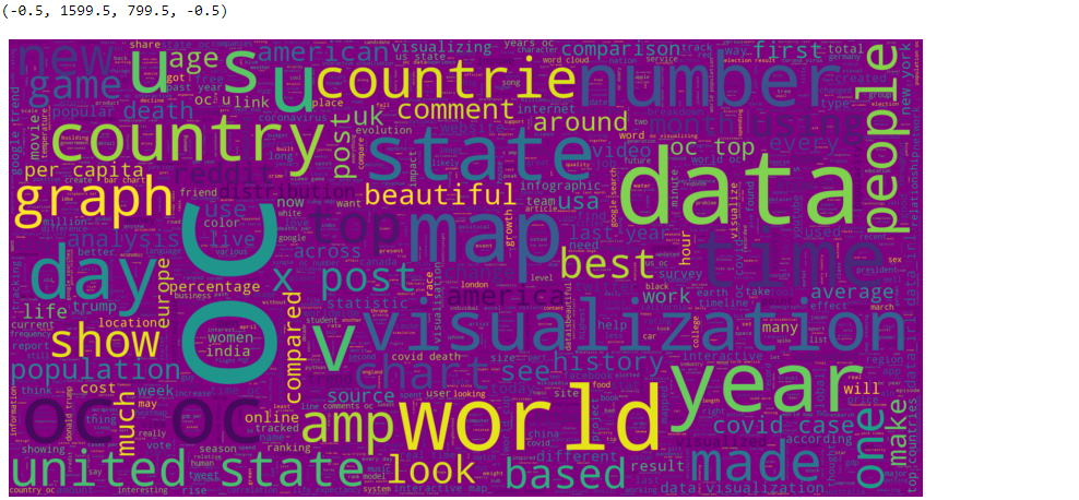
The most frequently used words
Let’s look at a word cloud of the most frequently used words in titles.
#To build a wordcloud, we have to remove NULL values first:
df["title"] = df["title"].fillna(value="")
#Now let's add a string value instead to make our Series clean:
word_string=" ".join(df['title'].str.lower())
#word_string
#And - plotting:
plt.figure(figsize=(15,15))
wc = WordCloud(background_color="purple", stopwords = STOPWORDS, max_words=2000, max_font_size= 300,  width=1600, height=800)
wc.generate(word_string)
plt.imshow(wc.recolor( colormap= 'viridis' , random_state=17), interpolation="bilinear")
plt.axis('off')
Comments distribution
#Comments distribution plot:
fig, ax = plt.subplots()
_ = sns.distplot(df[df["num_comments"] < 25]["num_comments"], kde=False, rug=False, hist_kws={'alpha': 1}, ax=ax)
_ = ax.set(xlabel="num_comments", ylabel="id")
plt.ylabel("Number of reddits")
plt.xlabel("Comments")
plt.show()
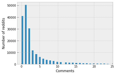
As we can see, most have less than 5 comments.
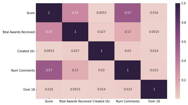
Correlation between dataset variables
Let’s look at how the dataset variables are related to one another now:
- What is the relationship between the score and the comments?
- Do they rise and fall in lockstep (positive correlation)?
- Is there a positive correlation between them when one increases and the other decreases, and vice versa (negative correlation)? Or do they have nothing to do with each other?
Correlation is expressed as a number between -1 and +1, with +1 indicating the highest positive correlation, -1 indicating the highest negative correlation, and 0 indicating no correlation.
- Let’s look at the table of correlations between the variables in our dataset (numerical and boolean variables only)
df.corr()

With a correlation value of 0.6, we can see that score and number of comments are highly positively correlated.
There is a 0.2 correlation between total awards received, score (0.2), and the number of comments (num comments) (0.1).
Let’s use a heatmap to visualize the correlation table above.
h_labels = [x.replace('_', ' ').title() for x in
            list(df.select_dtypes(include=['number', 'bool']).columns.values)]
fig, ax = plt.subplots(figsize=(10,6))
_ = sns.heatmap(df.corr(), annot=True, xticklabels=h_labels, yticklabels=h_labels, cmap=sns.cubehelix_palette(as_cmap=True), ax=ax)
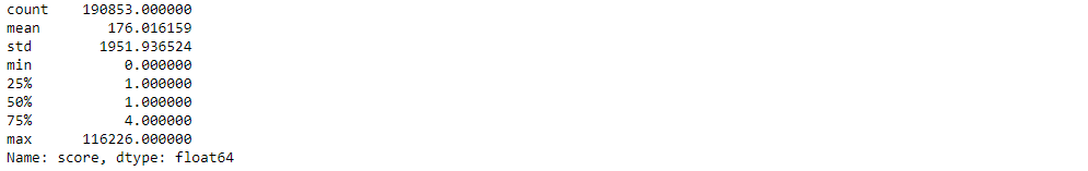
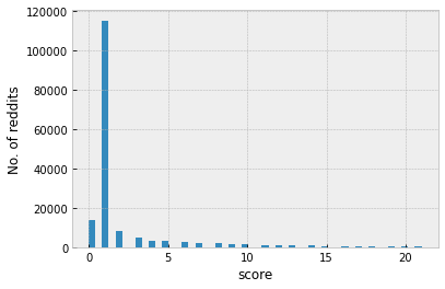
Score distribution
df.score.describe()
#Score distribution:
fig, ax = plt.subplots()
_ = sns.distplot(df[df["score"] < 22]["score"], kde=False, hist_kws={'alpha': 1}, ax=ax)
_ = ax.set(xlabel="score", ylabel="No. of reddits")
Pandas allow you to create and run a wide range of plots and analyses, from simple statistics to complex visuals and forecasts. Also, we can do fast and best analysis using Pandas and SQL. One of the most appealing features of the Pandas library is its ability to work with SQL and tabular data.
EndNote
Thank you for reading!
I hope you enjoyed the article and increased your knowledge.
Please feel free to contact me on Email
Something not mentioned or want to share your thoughts? Feel free to comment below And I’ll get back to you.
About the Author
Hardikkumar M. Dhaduk
Data Analyst | Digital Data Analysis Specialist | Data Science Learner
Connect with me on Linkedin
Connect with me on Github
Data Analyst | Digital Data Analysis Specialist | Data Science Learner Currently working in Data Analytics field. I have done my post-graduation. My main focus is growing in the fields of Data Science and Analytics.


