Introduction

The Motive
In this blog, we’ll have a detailed study and analysis of Covid-19 vaccination through DATA. We’ll use Tableau for the same. PS – This blog can be used to learn the basics of data analysis, visualization, and storytelling! It can also be used as a utility for Data Science projects, editorials, etc. Let’s get started 🔥

Image Source
Dataset for Tableau Visualization
Download the dataset from kaggle. Note – The dataset was lastly updated on 15-10-2021. So the blog focuses on the insights of this version (15-10-2021) of the dataset.
- Context – Data for covid-19 are gathered daily from the Our World in Data GitHub repository for covid-19. Data is collected and collated at the country level in a single file called ‘country vaccinations.csv.’ Then, to add vaccination sources information, this data file is merged with the locations data file to include vaccination sources information We’ll be using the first file for analysis in this blog.
We now connect the data to Tableau. In Tableau, data fields (columns in the data) can be categorized to measure and dimension based on the type of information they hold.
- Dimensions: qualitative values are contained in dimensions (such as dates, names, geographical data, etc). Dimensions can be used to categorize, segment, reveal data details, and regulate the level of detail in a display.
- Measures: are quantifiable numeric and quantitative quantities. Measures can be aggregated. Tableau (by default) applies an aggregation to a measure when you drag it into the view
Let’s have a look at the data fields of country_vaccinations.csv –
Dimensions
- Country – the country for which the vaccination data is provided.
- Country ISO Code – ISO (International Organization for Standardization) code for the country.
- Date – date for the data entry; some of the dates only have the daily vaccinations while others have (cumulative) total.
- Source name – source of the information (international organization, local organization, national authority, etc.)
- Source website – website of the source from where information was scrapped.
Measures
- Total number of vaccinations – this is the absolute number of total vaccinations done in the country.
- Total number of people vaccinated – a person, depending on the immunization scheme, will get one or more (typically 2) vaccine shots. Note – At a certain point, the number of vaccinations might become greater than the number of people.
- Total number of people fully vaccinated – this is the number of people that received the entire set of vaccination according to the immunization scheme (typically 2).
- Daily vaccinations – for a certain data entry, the number of vaccination on daily basis.
- Total vaccinations per hundred – ratio (in percentage)of vaccination number vs total population up to the date in the country.
- Total number of people vaccinated per hundred – ratio (in percentage) of population immunized vs total population up to the date in the country.
- Total number of people fully vaccinated per hundred – ratio (in percent) of the population fully vaccinated vs total population up to the date in the country.
- Number of vaccinations per day – number of daily vaccination for that date and country.
- Daily vaccinations per million – ratio (in parts per million) between vaccination number and total population for the current date in the country.
- Vaccines used in the country – total number of vaccines used in the country till the current date.
Before we move to the analysis part, go through the next section to learn the basics of visualization in Tableau.
Tableau

Image Source
- About
It’s an easy-to-use data visualization software that is mainly used for business intelligence. It helps in simplifying raw data into a comprehensible format. Anyone can learn to use Tableau without having prior programming experience.
It makes data analytics and reporting as easy as dragging and dropping. Tableau can combine data from various data sources such as databases, cloud data, spreadsheets, and even big data- all into one program to perform dynamic analysis.
It can deploy wherever and however, you want by integrating into your existing data infrastructure, be it on-prem or in the cloud.
- How to use Tableau
1. It’s pretty much drag and drop.
2. You will rarely go into the complicated calculation but generally, just drag and drop! 🖱️
3. With Tableau, you’ll be able to make impressive visualizations quickly. It’s fun and simple.😀
- Connect data to Tableau
– Import the data in the Data Source tab. Drag and drop data sources to join or make a union of them. Tableau has options for connectors for almost any data source you can think of.
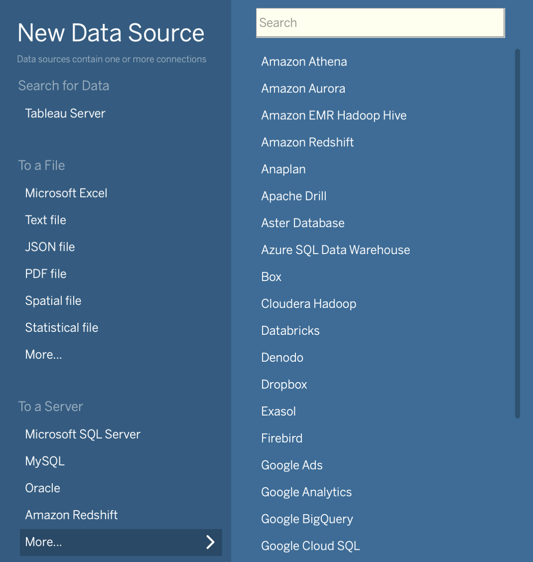
Connector Options in Tableau
– Since the vaccination dataset is a CSV file, select Text File and upload the data.
– Most of the work is done in worksheets. Like in a spreadsheet program, each worksheet in Tableau is in a tab at the bottom of the window.
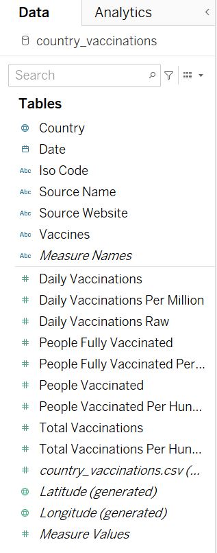
Side bar shows all the data fields
- Create line chart
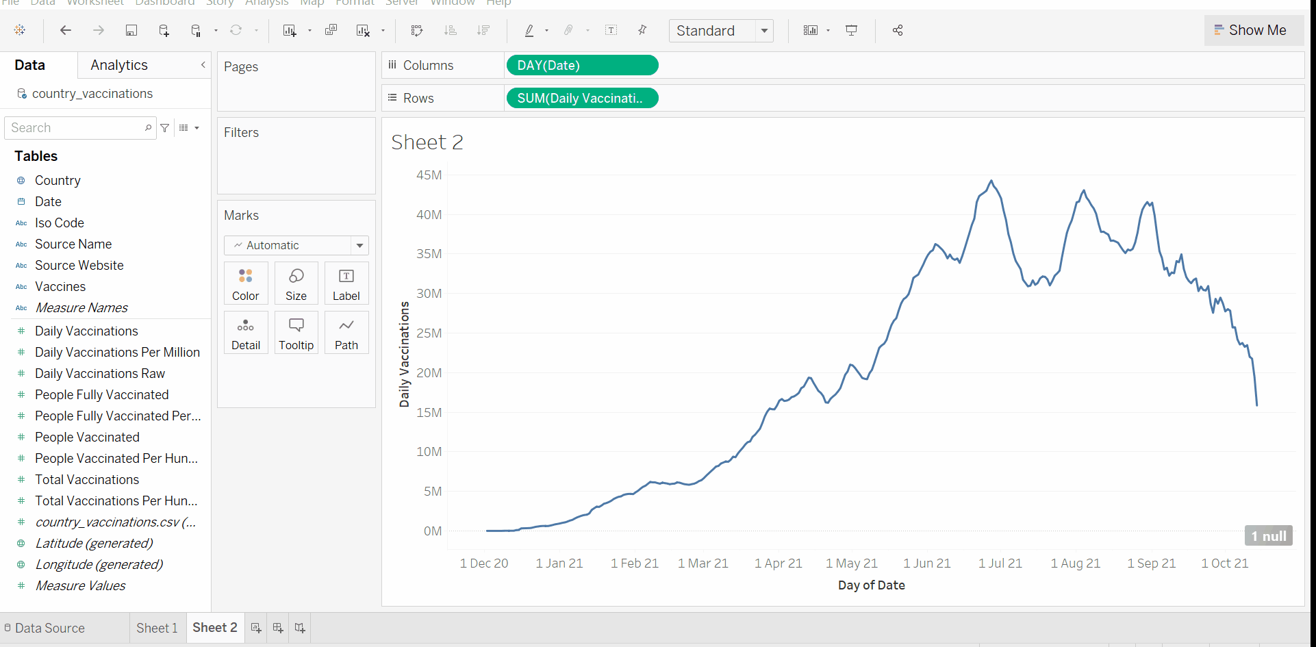
1. Drag variables from the left sidebar to Rows and Columns fields at the top of the worksheet. To make the line chart of daily vaccination, drop Date to Columns and Daily Vaccination to Rows.
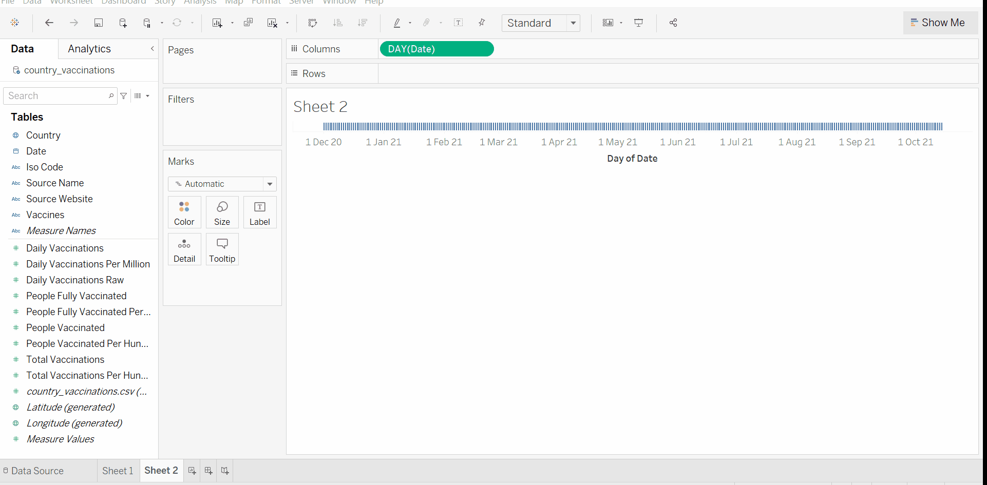
Step 1
Note –
-
Dimensions are qualitative (categorical) variables, discrete, by default. They include strings and dates. They are colored blue.
-
Measures are quantitative (numeric) variables, continuous, by default. They are colored green.
-
Tableau assumes that you want to sum measures any time you use them, by default. You can change the aggregation function with a right-click on that variable.
2. To view the data of a specific country, drag Country to Filter card.
Step 2
- Create Map Visualization
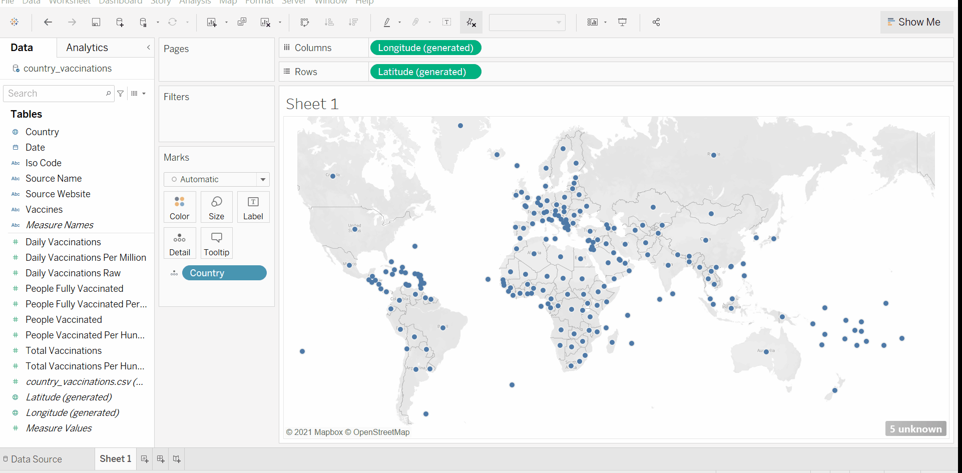
1. Drag Country variable from the sidebar and drop it to the empty canvas (view).
Step 1
2. To add data to the view, drag the desired measure to Color in the Marks card.
Step 2
3. Apply the desired filter –
Step 3
- Creating a calculated field
1. Right-click on the sidebar and select Create Calculated Field.
2. Write the calculation for the new variable using inbuilt functions.
Step 2
We have covered all the basics of Tableau need in the next section. Now, let’s begin!
Analyzing Data in Tableau
- Key points about Data Source –
- The total number of sources of the data is 84. The top 3 data sources by count are – World Health Organization, Ministry of Health, and SPC Public Health Division.
- The total number of websites from which the data is scrapped/collected is 139. https://www.unidoscontraelcovid.gob.bo/ is the biggest source website of the data.
Daily Vaccination
Let’s look at the daily statistics of vaccination in severely hit Covid countries like India, USA, China, and UK.
Tableau Tutorial: Creating daily vaccination line chart of India. Tableau Visualization 2,3&4 are created in a similar manner.
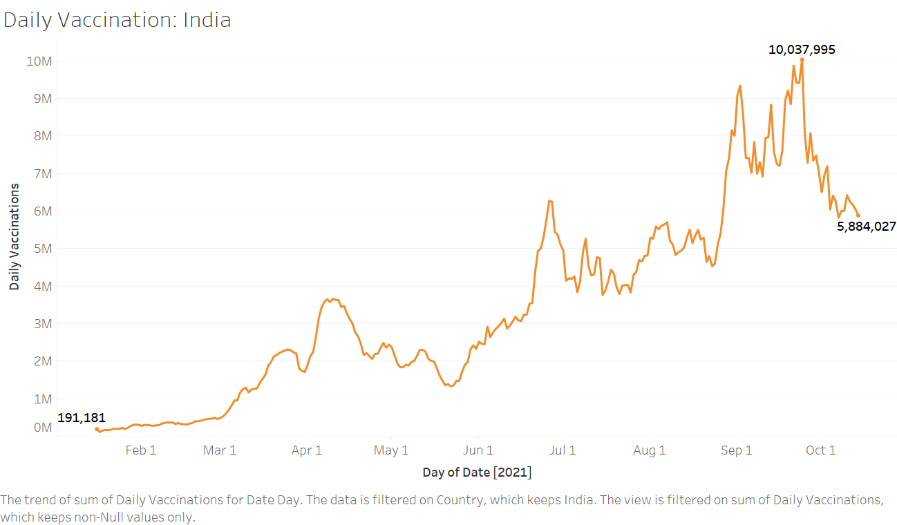
Tableau Visualization 1: Measure – Daily Vaccination, Dimension – Date(Day, Month, Year).
– Vaccination drive in India began on 16 January 2021 with 191K vaccination dozes on the very first day. In almost 2 months, the campaign was able to touch the mark of 1 million vaccine doses per day. With this steady increase in the rate of vaccination, India crossed the mark of 10M (1 Crore) doses daily in the month of September. However, since then there has been a fall in the vaccination rate.
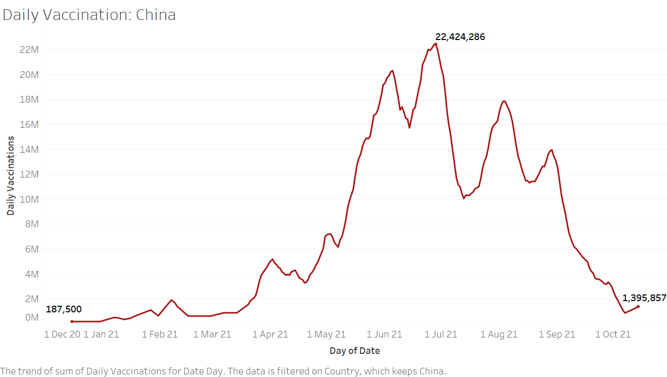
Table Visualization 2
– Vaccination campaign in China began quite soon, on 16 December 2020. In between mid-May and September beginning, the campaign constantly crossed the mark of 10M vaccination jabs daily. However, since the end of August, there has been a constant decrease in the vaccination rate in the country.
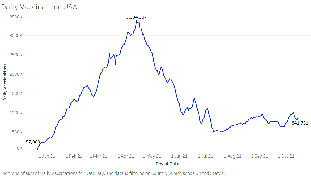
Tableau Visualization 3
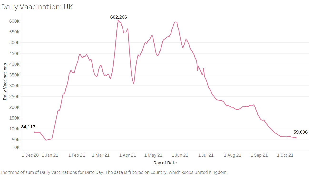
Table Visualization 4
– Vaccination numbers in the USA have been less since the month of April. The curve shows an increasing vaccination rate lately from the month of October. While the campaign in UK has been successful as its curve shows a steady increasing rate of vaccination. The campaigns of both countries began early in the month of December.
Looking at the graphs of daily vaccination in the countries, we can easily conclude that none of the countries were able to constantly have a high number of vaccine jabs daily. Consistency is all that really matters. We’ll now find the consistency in daily vaccination mathematically.
Consistency in Daily Vaccination
In Tableau, we create a calculated field called ‘Consistency’-
STDEV([Daily Vaccinations])/AVG([Daily Vaccinations])
This expression corresponds to Inconsistency in Daily Vaccination. The formula of inconsistency is the same as the coefficient of variation.
Coefficient of variation (CV) = σ/μ (Where σ = standard deviation, μ = mean)
Here a lower value would indicate high consistency in daily vaccinations.
Tableau Tutorial: Creating a map viz. of Countries vs Consistency (Visualization 5)
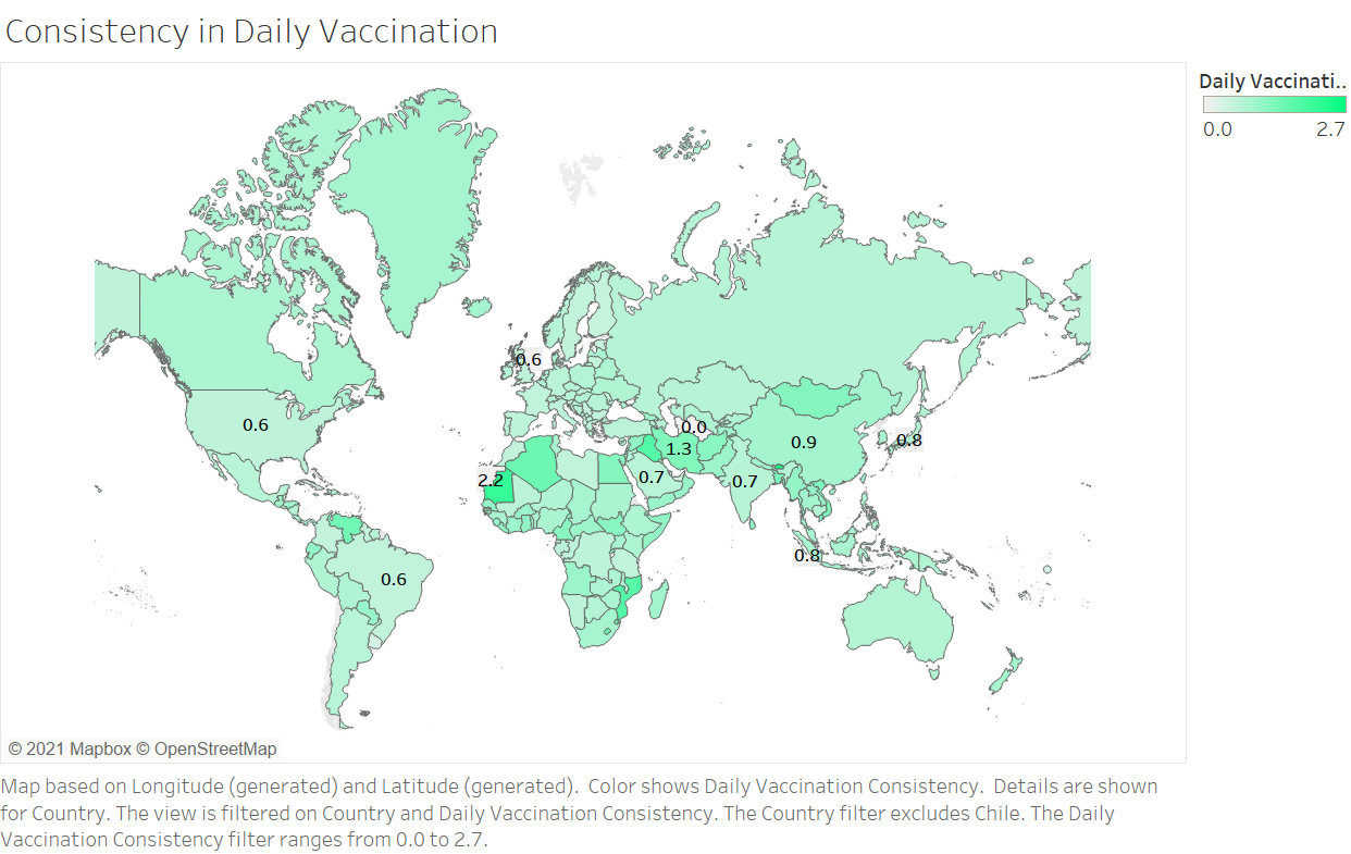
Tableau Visualization 5
- Key Insights –
1. Turkmenistan, a country in Central Asia, has the highest consistency in daily vaccination in the world. 41,369 vaccine doses have been administrated daily in the country between 1st March and 29 August! Maybe, the data is flawed.
2. UK, USA are highly consistent in daily vaccination numbers. Their inconsistency scores are 0.60 and 0.56 respectively.
3. Among the 4 topmost populous countries in the world i.e China, India, USA, and Indonesia, USA is most consistent followed by India, which has an inconsistency score of 0.7. Inconsistency scores of China and Indonesia are – 0.9 and 0.8 respectively.
4. Countries of the middle east such as Iraq, Iran, and Syria have a very low consistency in daily vaccination jabs. While middle east countries such as Turkey and Saudi Arabia have high consistency, both have inconsistency of 0.7.
- Daily Vaccination per Million
The daily vaccination figures of countries would have a lot more significance when taking their population into account. A higher value of Daily Vaccination per Million of a country indicates that the country will achieve herd immunity sooner/ the immunization of the population is going at a high rate. This data field is in fact one of the most important in determining the success of the vaccination drive of a country.
Daily Vaccination per Million = Daily Vaccination / Population of the country (in Million)
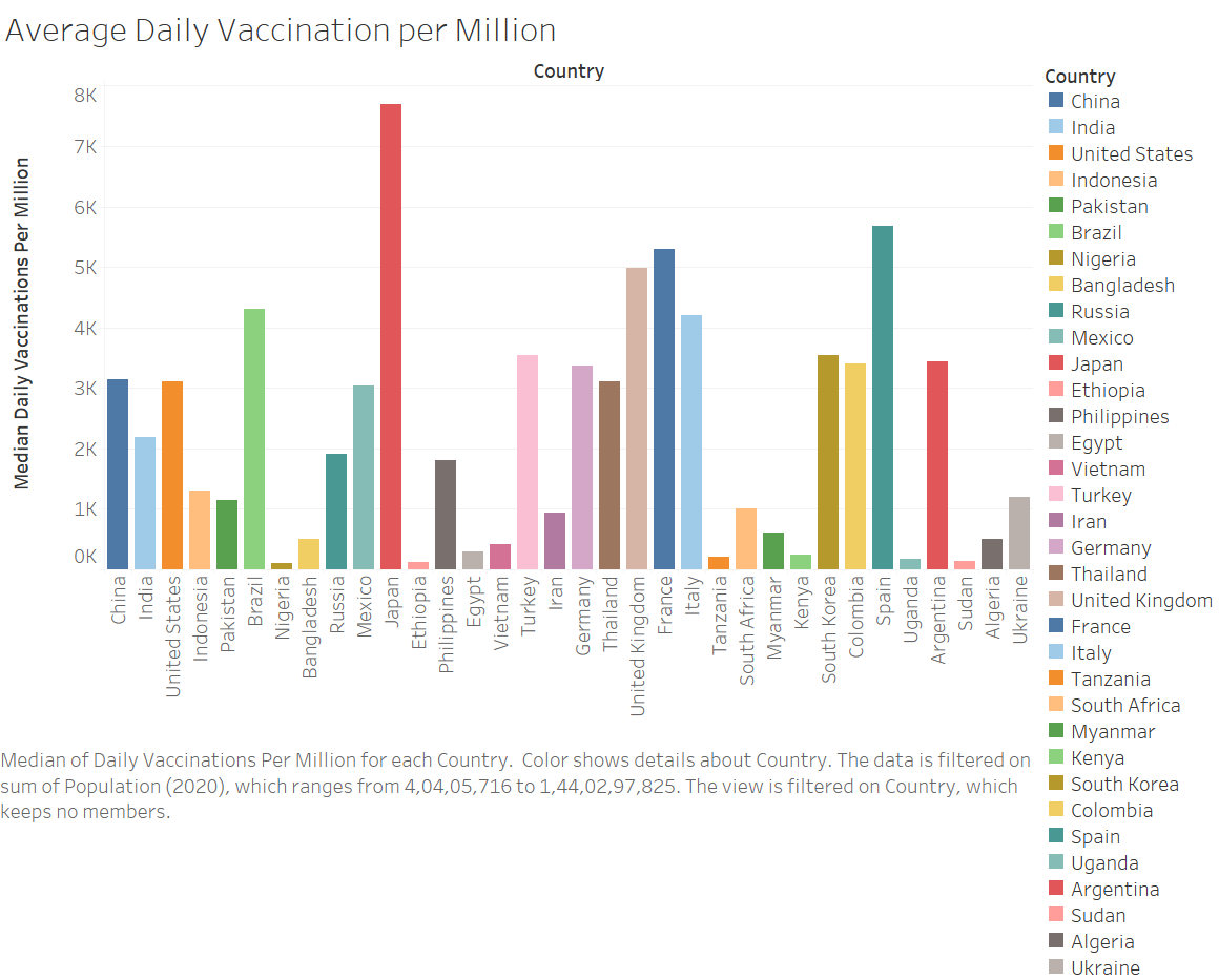
Tableau Tutorial: Creating a barplot of Countries vs Median Daily Vaccination per Million (Visualization 6)
Note – For sorting countries on population, an external CSV file has been added.
Note –
1. This is a bar chart of the top 31 countries by population and their Average (Median) Daily Vaccination per Million.
2. I will use ADVM as an abbreviation of Average Daily Vaccination per Million.
- Key Insights –
1. Japan has the highest ADVM among the top 31 populous countries. It also has high consistency in daily vaccination (inconsistency = 0.8).
2. European countries have high ADVM. Spain and France hold 2nd and 3rd position respectively among the 31 countries. They also have high consistency in daily vaccination.
3. Nigeria has the lowest ADVM. Only 104 Nigerians are being vaccinated daily out of every 1 million population of the country.
4. India is strongly competing with the superpowers of the world. In fact, it has higher ADVM than Russia! Among the top 5 most populous countries, it stands in 3rd position.
- Percentage of Population Fully Vaccinated
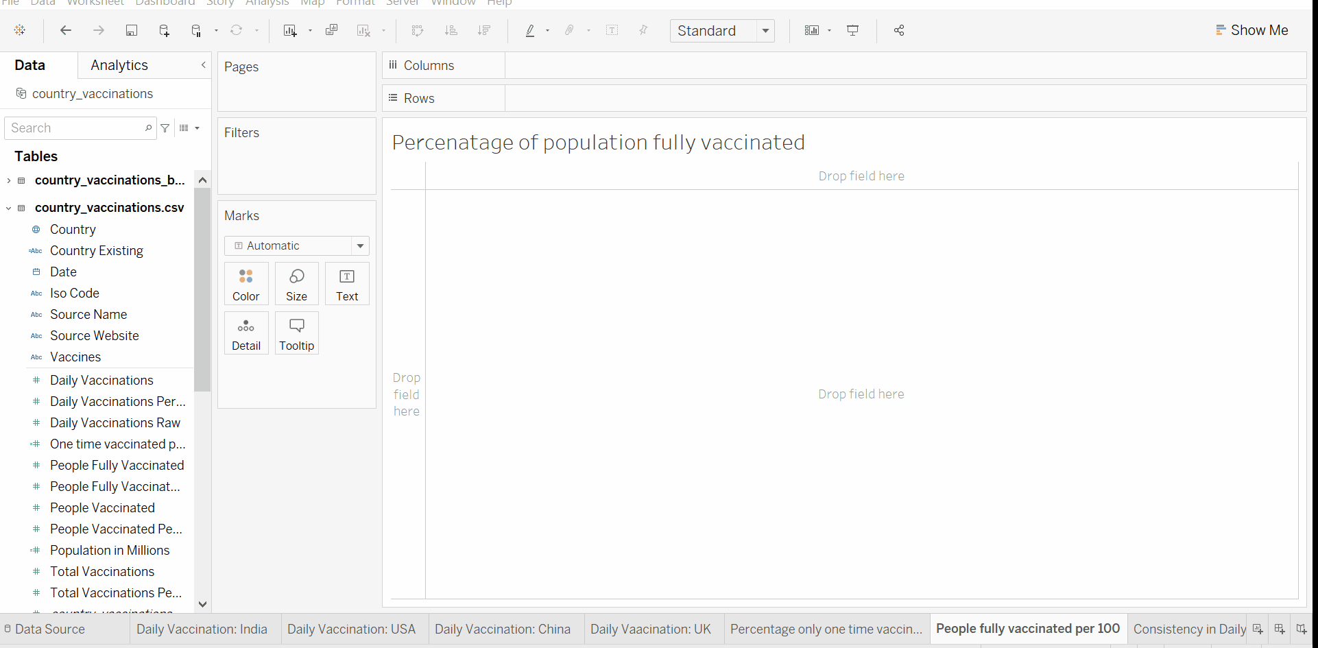
Tableau Tutorial: Creating a map visualization of Country vs people fully vaccinated per hundred (Visualization 7)
Tableau Visualization 7
Note –
1. The visualization corresponds to the percentage of the population of the countries fully vaccinated till 14th October 2021.
2. The data field Total Vaccinations per Hundred contains some missing data. The missing data are excluded from the visualization. The insights we’ll discuss will hence be accordingly to it.
- Key Insights –
1. Countries of North America have a high percentage of fully vaccinated population. Canada has almost 3/4th population fully vaccinated.
2. Only 19.82% of Indians are fully immunized. The vaccination campaign in India has a long way to go.
Previously we saw that India has good vaccination figures like high ADVM and daily vaccination consistency. But still, it lacks in full immunization of the population. Let us dig deep to find out the reason.
Now we create a calculated field namely ‘One time Vaccinated’ to find the percentage of the population that is only one time vaccinated –
([People Vaccinated Per Hundred] - [People Fully Vaccinated Per Hundred])
Tableau Tutorial: Creating a map viz. of Countries vs One time vaccinated (Visualization 8)
Note – Please follow the previous section of this blog to learn to create a calculated field.
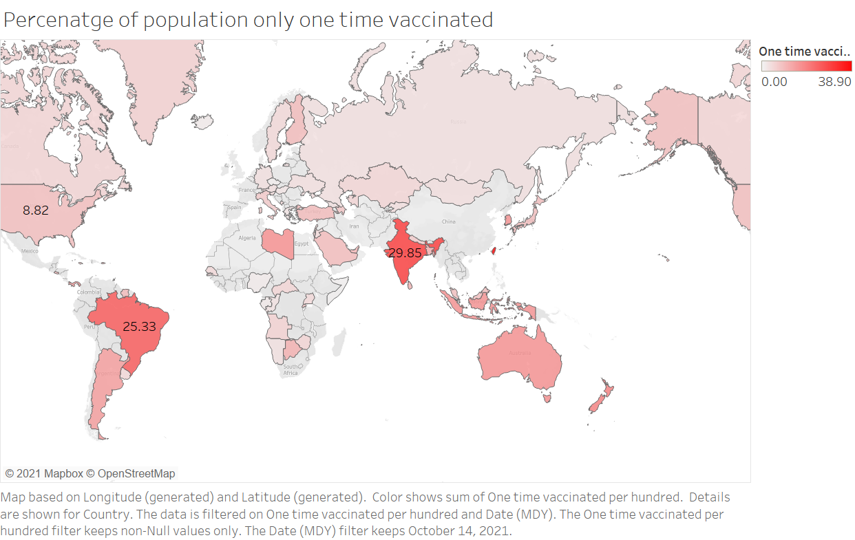
– India has the highest percentage of the population which has taken their 1st shot of vaccine but hasn’t appeared for the 2nd one. There can be various possible reasons for it. One of the reasons can be that a large part of the population is unwilling to get their second dose. Hence it is important that awareness programs are carried out to motivate people to get fully vaccinated as 1st vaccine doesn’t ensure immunity against the Covid.
After all this analysis and discussion, one question still remains. Despite having a successful vaccination drive, why are the infection rates in UK and USA still high? One possible reason for it can be the inability of VACCINES that are being used to immunize the two countries.
To uncover some more insights, we’ll now look at the different vaccines used across the world.
- Vaccines
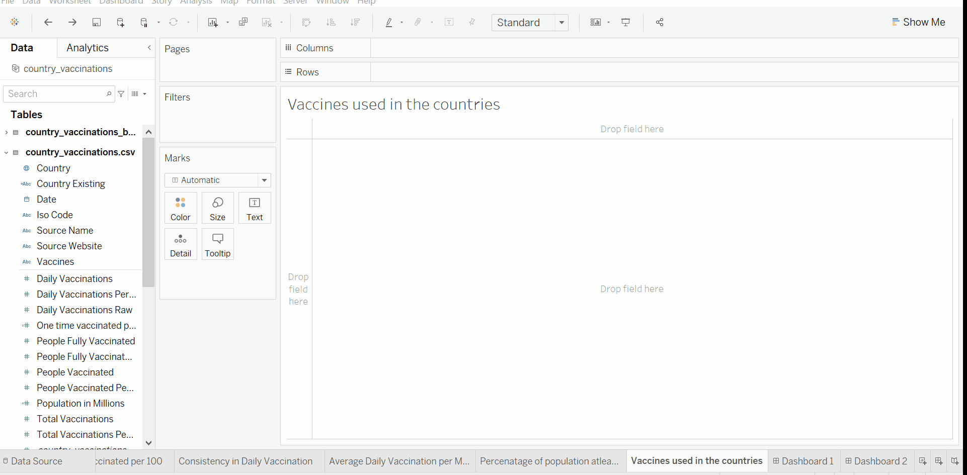
Tableau Tutorial: Creating a map viz. of Countries vs Vaccines (Visualization 9)
Tableau Visualization 9: Dimension – Country, Map Color Scheme – Vaccine
- Key Insights
1. UK and USA both use Moderna and Pfizer vaccines.
2. India uses Covaxin, which requires an 84 days gap between the two doses of vaccine. This long gap can also be a reason for the highly less fully vaccinated population as compared to at least one time vaccinated population in India.
Tableau Tutorial: Creating a map viz. of Countries vs People vaccinated per hundred (Visualization 10)
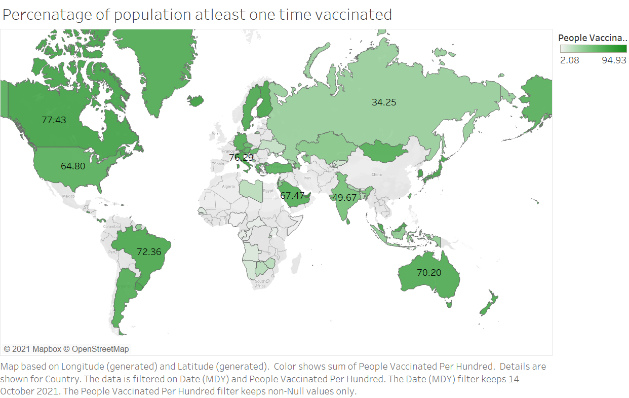
Tableau Visualization 10
3. Sputnik, a vaccine developed by Russia, is the most used vaccine in the world.
4. CanSino, a vaccine developed by China, is the least used vaccine in the world.
- Conclusion
With this, we come to the end of this blog. In this blog, we analyzed the vaccination data and discussed notable insights from it. Visit link to explore all the previous visualizations 🔥interactively 🖥️. I hope this blog was informative. Do let me know your feedback in the comments. Happy Analyzing 🙂
About the Author
I am a 3rd-year undergrad at BIT Mesra, pursuing an Integrated Masters in Mathematics and Computer Science. Please do not hesitate to contact me!
Connect with me on Linked in – https://www.linkedin.com/in/yash-khandelwal-a40484bb/
Github – https://github.com/YashK07
The media shown in this article is not owned by Analytics Vidhya and are used at the Author’s discretion.
I am currently a final year student pursuing Masters in Mathematics & Computing at Birla Institute of Technology, Ranchi. My areas of experiences and interests include - Data Science, Quantitative research, applied Machine Learning & Deep Learning.


