This article was published as a part of the Data Science Blogathon
.png)
Data Visualization is important to uncover the hidden trends and patterns in the data by converting them to visuals. For visualizing any form of data, we all might have used pivot tables and charts like bar charts, histograms, pie charts, scatter plots, line charts, map-based charts, etc., at some point in time. These are easy to understand and help us convey the exact information. Based on a detailed data analysis, we can decide how to best make use of the data at hand. This helps us to make informed decisions.
Now, if you are a Data Science or Machine Learning beginner, you surely must have tried Matplotlib and Seaborn for your data visualizations. Undoubtedly these are the two most commonly used powerful open-source Python data visualization libraries for Data Analysis.
Data Visualization libraries- Seaborn and Altair
Seaborn is based on Matplotlib and provides a high-level interface for building informative statistical visualizations. However, there is an alternative to Seaborn. This library is called ‘Altair’, an open-source Python library built for statistical data visualization. According to the official documentation, it is based on the Vega and Vega-lite language. Using Altair we can create interactive data visualizations through bar chart, histogram, scatter plot and bubble chart, grid plot and error chart, etc. similar to the Seaborn plots.
While Matplotlib library is imperative in syntax style, both Altair and Seaborn libraries are declarative in approach i.e., a user needs to only specify what is to be done, and the machine decides the how part of it. This gives the user freedom to focus on interpreting the data rather than being caught up in writing the correct syntax. The only downside of this declarative approach could be that the user has lesser control over customizing the visualization which is ok for most of the users unfamiliar with the coding part.
In this article, we will compare Seaborn to Altair. For this comparison, we will create the same set of visualizations using both libraries and conclude if one library has a clear advantage over the other in terms of ease of use, syntax, visualization look and style, and ability to customize the visualization.
Installing Seaborn and Altair
To install these libraries from PyPi, use the following commands
pip install altair
pip install seaborn
Importing Basic libraries and dataset
As always, we import Pandas and NumPy libraries to handle the dataset, Matplotlib and Seaborn along with the newly installed library Altair for building the visualizations.
#importing required libraries
import pandas as pd
import numpy as np
import seaborn as sns
Import matplotlib.pyplot as plt
import altair as alt
We will use the ‘mpg’ or the ‘miles per gallon’ dataset from the seaborn dataset library to generate these different plots. This famous dataset contains 398 samples and 9 attributes for automotive models of various brands. Let us explore the dataset more.
#importing dataset
df = sns.load_dataset('mpg')
df.shape
>>(398, 9)
#dataset column names
df.keys()
Output
>>Index([‘mpg’, ‘cylinders’, ‘displacement’, ‘horsepower’, ‘weight’,
‘acceleration’, ‘model_year’, ‘origin’, ‘name’],
dtype=’object’)
#checking datatypes
df.dtypes
#checking dataset
df.head()
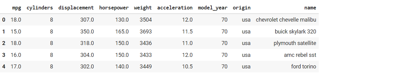
This dataset is simple and has a nice blend of both categorical and numerical features. We can now plot our charts for comparison.
Scatter & Bubble plots in Seaborn and Altair
We will start with simple scatter and bubble plots. We will use the ‘mpg’ and ‘horsepower’ variables for these.
For Seaborn scatterplot, we can use either the relplot command and pass ‘scatter’ as the kind of plot
sns.relplot(y='mpg',x='horsepower',data=df,kind='scatter',size='displacement',hue='origin',aspect=1.2);
or we can directly use the scatterplot command.
sns.scatterplot(data=df, x="horsepower", y="mpg", size="displacement", hue='origin',legend=True)
whereas for Altair, we use the following syntax
alt.Chart(df).mark_point().encode(alt.Y('mpg'),alt.X('horsepower'),alt.Color('origin'),alt.OpacityValue(0.7),size='displacement')
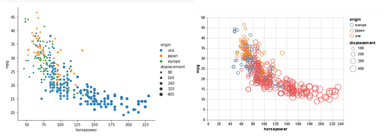
Here in both the libraries, we pass the DataFrame for the data source and the earlier selected ‘horsepower’, ‘mpg’ columns as x and y respectively. It is possible to color the legend entries using another attribute ‘origin’ and control the size of the points using an additional variable ‘displacement’ for both libraries. In Seaborn, we can control the aspect ratio of the plot using the ‘aspect’ setting. However, in Altair, we can also control the opacity value of the point by passing a value between 0 to 1(1 being perfectly opaque). To convert a scatter plot in Seaborn to a bubble plot, simply pass a value for ‘sizes’ which denotes the smallest and biggest size of bubbles in the chart. For Altair, we simply pass (filled=True) for generating the bubble plot.
sns.scatterplot(data=df, x="horsepower", y="mpg", size="displacement", hue='origin',legend=True, sizes=(10, 500))
alt.Chart(df).mark_point(filled=True).encode(
    x='horsepower',
    y='mpg',
    size='displacement',
    color='origin'
)
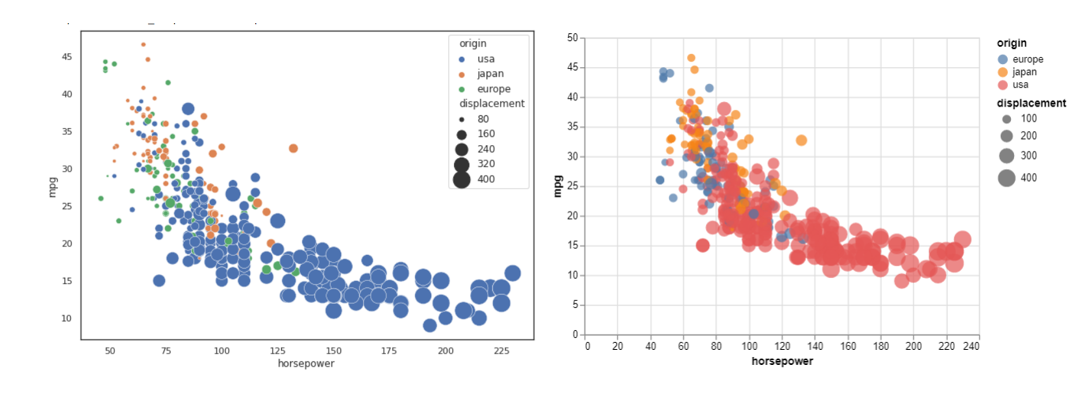
With the above scatter plots, we can understand the relationship between ‘horsepower’ and ‘mpg’ variables i.e., lower ‘horsepower’ vehicles seem to have a higher ‘mpg’. The syntax for both plots is similar and can be customized to display the values.
Line plots in Seaborn and Altair
Now, we plot line charts for ‘acceleration’ vs ‘horsepower’ attributes. The syntax for the line plots is quite simple for both. We pass DataFrame as data, the above two variables as x and y while the ‘origin’ as the legend color.
Seaborn-
sns.lineplot(data=df, x='horsepower', y='acceleration',hue='origin')
Altair-
alt.Chart(df).mark_line().encode(
    alt.X('horsepower'),
    alt.Y('acceleration'),
    alt.Color('origin')
    )
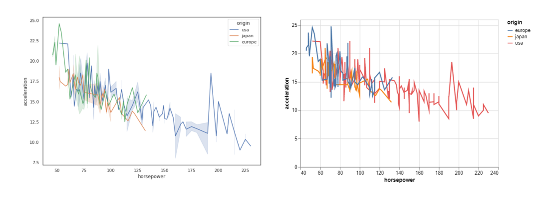
Here we can understand that ‘usa’ vehicles have a higher range of ‘horsepower’ whereas the other two ‘japan’ and ‘europe’ have a narrower range of ‘horsepower’. Again, both graphs provide the same information nicely and look equally good. Let us move to the next one.
Bar plots & Count plots in Seaborn and Altair
In the next set of visualizations, we will plot a basic bar plot and count plot. This time, we will add a chart title as well. We will use the ‘cylinders’ and ‘mpg’ attributes as x and y for the plot.
For the Seaborn plot, we pass the above two features along with the Dataframe. To customize the color, we choose a palette=’magma_r’ from Seaborn’s predefined color palette.
sns.catplot(x='cylinders', y='mpg', hue="origin", kind="bar", data=df, palette='magma_r')
In the Altair bar plot, we pass df, x and y and specify the color based on the ‘origin’ feature. Here we can customize the size of the bars by passing a value in the ‘mark_bar’ command as shown below.
plot=alt.Chart(df).mark_bar(size=40).encode(
    alt.X('cylinders'),
    alt.Y('mpg'),
    alt.Color('origin')
)
plot.properties(title='cylinders vs mpg')
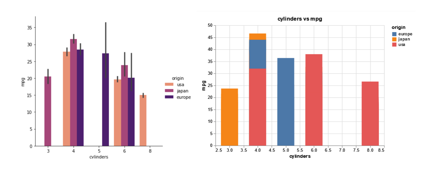
From the above bar plots, we can see that vehicles with 4 cylinders seem to be the most efficient for ‘mpg’ values.
Here is the syntax for count plots,
Seaborn- We use the FacetGrid command to display multiple plots on a grid based on the variable ‘origin’.
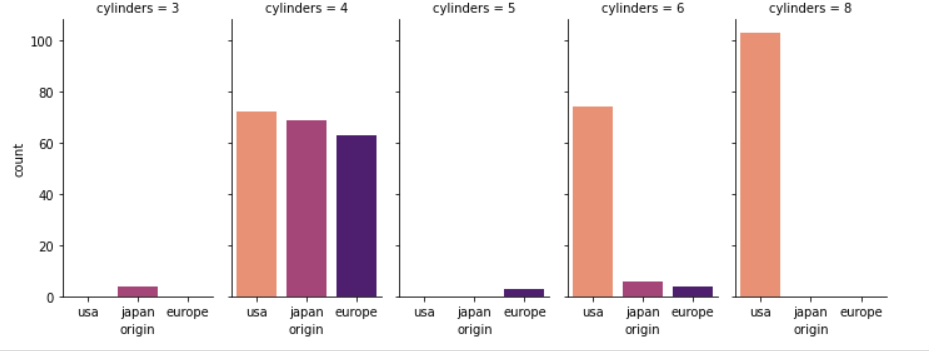
g = sns.FacetGrid(df, col="cylinders", height=4,aspect=.5,hue='origin',palette='magma_r')
g.map(sns.countplot, "origin", order = df['origin'].value_counts().index)
Altair- We use the ‘mark_bar’ command again but pass the ‘count()’ for cylinders column as y to generate the count plot.
alt.Chart(df).mark_bar().encode(
    x='origin',
    y='count()',
    column='cylinders:Q',
    color=alt.Color('origin')
).properties(
    width=100,
    height=100
)
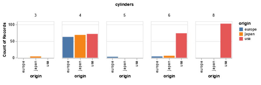
From these two count plots, we can easily understand that ‘japan’ has (3,4,6) cylinder vehicles, ‘europe’ has (4,5,6) cylinder vehicles and ‘usa’ has (4,6,8) cylinder vehicles. From a syntax point of view, the libraries require inputs for the data source, x, y to plot. The output looks equally pleasing for both the libraries. Let us try a couple of more plots and compare them.
Histogram
In this set of visualizations, we will plot the basic histogram plots. In Seaborn, we use the distplot command and pass the name of the dataframe, name of the column to be plotted. We can also adjust the height and width of the plot using the ‘aspect’ setting which is a ratio of width to height.
Seaborn
sns.distplot(df, x='model_year', aspect=1.2)
Altair
alt.Chart(df).mark_bar().encode(
    alt.X("model_year:Q", bin=True),
    y='count()',
).configure_mark(
    opacity=0.7,
    color='cyan'
)
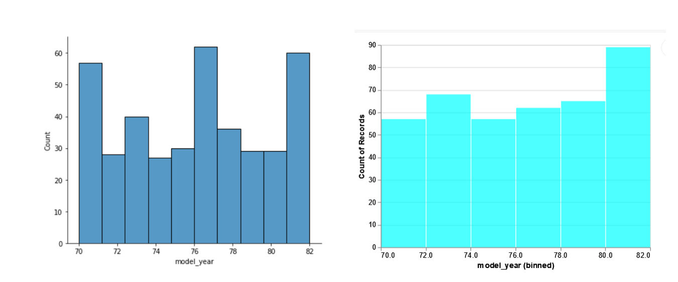
In this set of visualizations, the selected default bins are different for both libraries, and hence the plots look slightly different. We can get the same plot in Seaborn by adjusting the bin sizes.
sns.displot(df, x='model_year',bins=[70,72,74,76,78,80,82], aspect=1.2)
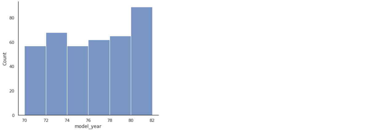
Now the plots look similar. However, in both the plots we can see that the maximum number of vehicles was after ’76 and prominently in the year ’82. Additionally, we used a configure command to modify the color and opacity of the bars, which sort of acts like a theme in the case of the Altair plot.
Strip plots using both Libraries
The next set of visualizations are the strip plots.
For Seaborn, we will use the stripplot command and pass the entire DataFrame and variables ‘cylinders’, ‘horsepower’ to x and y respectively.
ax = sns.stripplot(data=df, y= ‘horsepower’, x= ‘cylinders’)
For the Altair plot, we use the mark_tick command to generate the strip plot with the same variables.
alt.Chart(df).mark_tick(filled=True).encode(
    x='horsepower:Q',
    y='cylinders:O',
    color='origin'
)
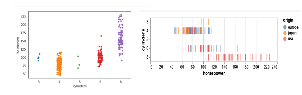
From the above plots, we can clearly see the scatter of the categorical variable ‘cylinders’ for different ‘origin’. Both the charts seem to be equally effective in conveying the relationship between the number of cylinders. For the Altair plot, you will find that the x and y columns have been interchanged in the syntax to avoid a taller and narrower-looking plot.
Interactive plots
We now come to the final set of visualization in this comparison. These are the interactive plots. Altair scores when it comes to interactive plots. The syntax is simpler as compared to Bokeh, Plotly, and Dash libraries. Seaborn, on the other hand, does not provide interactivity to any charts. This might be a letdown if you want to filter out data inside the plot itself and focus on a region/area of interest in the plot. To set up an interactive chart in Altair, we define a selection with an ‘interval’ kind of selection i.e. between two values on the chart. Then we define the active points for columns using the earlier defined selection. Next, we specify the type of chart to be shown for the selection (plotted below the main chart) and pass the ‘select’ as the filter for the displayed values.
select = alt.selection(type='interval')
values = alt.Chart(df).mark_point().encode(
    x='horsepower:Q',
    y='mpg:Q',
    color=alt.condition(select, 'origin:N', alt.value('lightgray'))
).add_selection(
    select
)
bars = alt.Chart(df).mark_bar().encode(
    y='origin:N',
    color='origin:N',
    x='count(origin):Q'
).transform_filter(
    select
)
values & bars
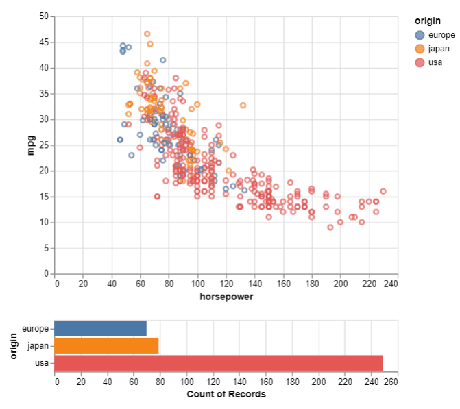
For the interactive plot, we can easily visualize the count of samples for the selected area. This is useful when there are too many samples/points in one area of the chart and we want to visualize their details to understand the underlying data better.
Additional points to consider while using Altair
Pie Chart & Donut Chart
Unfortunately, Altair does not support pie charts. Here is where Seaborn gets an edge i.e. you can utilize the matplotlib functionality to generate a pie chart with the Seaborn library.
Plotting grids, themes, and customizing plot sizes
Both these libraries also allow customizing of the plots in terms of generating multiple plots, manipulating the aspect ratio or the size of the figure as well as support different themes to be set for colors and backgrounds to modify the look and feel of the charts.
Advanced plots
Additionally, there are other advanced plots like the lollipop or the Dash and Dot plot, Heatmap, Treemap which could be plotted using these two libraries (Seaborn might require some additional packages for this) but these have been excluded here in this comparison for keeping it simple.
Conclusion
We saw various types of plots with Seaborn and Altair. Both the data visualization libraries – Seaborn and Altair seem equally powerful. Syntax of Seaborn is a little simpler to write and easier to understand when compared to Altair; whereas data visualizations in Altair seem a little more pleasant and eye-catching when compared to the Seaborn plots. The ability to generate interactive visualizations is another advantage offered by Altair. Therefore, choosing either one of these depends on personal preferences and visualization requirements. Ideally, both libraries are self-sufficient to handle most of the data visualizations requirements. If you need simple plots quickly as a part of your data analysis, then go with Seaborn. Also, if you need pie charts for your project, then matplotlib is your first choice or Seaborn. Further, for interactive and slightly refined-looking visualizations, select Altair. You can find the complete code for this comparison on my GitHub repository.
I hope you enjoyed reading this comparison. If you have not tried Altair before, do give it a try for building some beautiful plots in your next data visualization project!
Author Bio
Devashree has an M.Eng degree in Information Technology from Germany and a Data Science background. As an Engineer, she enjoys working with numbers and uncovering hidden insights in diverse datasets from different sectors to build beautiful visualizations to try and solve interesting real-world machine learning problems.
In her spare time, she loves to cook, read & write, discover new Python-Machine Learning libraries or participate in coding competitions.
You can follow her on LinkedIn, GitHub, Kaggle, Medium, Twitter.
Devashree has an M.Eng degree in Information Technology from Germany and a Data Science background. As an Engineer, she enjoys working with numbers and uncovering hidden insights in diverse datasets from different sectors to build beautiful visualizations to try and solve interesting real-world machine learning problems.
In her spare time, she loves to cook, read & write, discover new Python-Machine Learning libraries or participate in coding competitions.


