Overview
- Get to know the essential data visualization tips and techniques to improve your data stories
- Understand the effects of these data visualization tips
- Choosing the right data visualization techniques for the task
- Avoiding unnecessary information in visualizations
Introduction
I love data visualization. The sheer amount of information it conveys to the viewer in such a limited space and without much explanation is amazing. It is so easy to convey a message using data visualization because it makes the trends and patterns in the data come alive! Not only that, but given how the human brain works, it also allows the audience to grasp an insight into the fastest and the simplest way possible. Therefore, it goes without saying that the importance of data visualization for analysis in any domain is immense!
But hundreds of visualizations are created every day. Some are taken well by the audience while others are outright rejected. Why so? Well, the answer lies in the creation.

Data visualizations are not as easy to create as they look. There is a lot of work and effort that goes into it. There needs to be the right balance between all the visual elements. If you do too little or too much, your visualization will never create an impact. All the correct elements need to be present in the right proportion and, at the same time, certain mistakes need to be avoided to create a meaningful visualization.
In this article, you will find important data visualization tips to improve your visualizations and certain mistakes you need to avoid. So rest assured as it is bound to take your visualization game up a notch!
Table of Contents
- Data visualizations should be audience-specific with a clear requirement
- Choose the right visualization for your data
- Keep your visualizations simple
- Label your data visualizations
- Understand the importance of text in charts
- Use colors effectively in data visualizations
- Avoid deceiving with your visualizations
- Make interpretable data visualizations
1. Data visualization should be audience-specific with a clear requirement
Amongst the data visualization tips, this is the first one. While creating data visualizations, it is important to know the requirement of the chart and the audience it is for. These two things alone can take your visualization from zero to hero. This makes sure that you not only create a visualization with a strategic purpose that answers a specific question but also one that can be easily understood by the audience.
For example, if your audience doesn’t have a background in science, then don’t create a visualization that is filled with scientific information. Similarly, bombarding your chart with multiple trends will most likely divide the attention of the viewer and defeats the purpose of the visualization.
- Know the requirement of the visualization. This allows you to create a chart that conveys a message in a clear and crystal manner. Also, it makes sure that you aren’t overloading your chart with unnecessary information that might confuse the audience. Therefore, know what is required of the visualization and keep it simple by highlighting a specific point. This will have a lasting impact on the viewer.
- Know your audience. Before making the visualization, it is best to ask yourself what the audience will be looking for in the chart. Understand the requirements and preferences of your viewer. Know their background. Do they have enough time for a detailed visualization? How aware are they about the context of the visualization? What additional information are they looking for? Are they aware of the graphs being used? And so on. Your viewer’s information needs should be your guide in creating effective and compelling data visualizations.
The visualization below has so much information making it very hard to understand its purpose. This makes it so difficult to convey the message to the viewer.

Stacked bar graphs are difficult to comprehend for beginners and require patience to interpret. The visualization below isn’t easy to comprehend if you are someone who has no knowledge of stacked bar graphs or someone who is looking to quickly go through visualizations.

2. Choose the right data visualization for your data
Amongst the data visualization tips, this one is of utmost importance. There is a myriad of visualization graphs out there. But choosing the right one is important so as to effectively highlight the key trend in the data. Also, choosing the right graph for your visualization will make sure the message is easy to grasp and the viewers are attracted to your work. Each graph has a specific purpose and one should know where to use which graph.
- Bar graphs are one of the most popular types of data visualizations. They offer a great amount of information in a quick glance. They are best to compare a few values within the same category. For example, comparing the sales of two different products over the years.
- Line plots are useful for visualizing the trend in a numerical value over a continuous time interval. They effectively capture the trends and patterns in data and can be used to compare multiple values. An example of such a data visualization would be to show the trend in the monthly income of a company over the last few months.
- Scatter plots are useful for showing the relationship between two variables. Any correlation between variables or outliers in the data can be easily spotted using scatter plots. For example, it can be used to compare how the price of a house varies with the size of the living room.
- Pie charts are suitable to show the proportional distribution of items within the same category. But they should be used prudently otherwise they do more harm than good. For example, the percentage of android users to iOS users in a country.
- Histograms show the distribution of numeric data through a continuous interval by segmenting data into different bins. They are great for showing the distribution of data. For example, visualizing the number of orders for a product over the years.
And so on. Also, don’t be afraid to combine more than one type of graph in your visualizations. Sometimes it offers a chance for the viewer to explore the data in detail.
You can have a look at the following cheat sheet from the Harvard CS-109 extension program (online resource) to understand when to use a particular visualization graph.

You can also follow this cheatsheet and this comprehensive article on the usage of graphs in visualization.
The visualization below uses a simple horizontal bar graph, but it is so effective in communicating the message. The viewer can easily determine how well the states are doing in producing wind energy. The rankings are clear and the user experience is simple yet spot on!

3. Keep your visualizations simple
It is very easy to put up too much information in a visualization. But harder to get rid of the unnecessary information. A minimalist visualization that is devoid of distractions and unnecessary patterns is likely to convey the message to the viewer more effectively.
All the visual elements in a graph that are not important in helping the viewer comprehend the information in the graph are termed as Chartjunk by Edward Tufte. These can be anything from unnecessary gridlines, distracting visual patterns, redundant axes, shadows, and so on. Chartjunks are an eyesore to the viewers. Have a look for yourself.

The visualization above is a bad example where there is an unnecessary use of gridlines, bold illegible text, and 3D graphs. A simple 2D bar graph would suffice here.
Another example would be the chart below. The numbers are doing all the talking here because the logos seem so unnecessary and confusing. Always avoid such chartjunk. Just have a look at the GDP of Afghanistan. It’s so hard to decipher just from the picture. A simple bar chart would have been sufficient to convey the message to the viewer.

Therefore, it is best to pay close attention to this data visualization technique and only add those elements to your visualization that provide a value-for-money and simplify the chart for the viewer.
4. Label your data visualizations
An important data visualization technique is to label your visualization. This better conveys what the visuals are trying to say. They are an easy miss when creating the visualization, so make sure you double-check for labeling before rolling out your visualization.
- Labels should be legible. If it is not clear, it is of no use. Therefore, make sure the labels are easy to read and comprehensible.
- Give a title to the graph. Viewers can easily get instant gist of what the graph is about when you give a suitable title to your graph.
- Use a legend wisely. A legend makes it easier to spot the difference between the various lines in the graph. But when using line charts, try to label directions. This makes it easier to identify lines.
- Label your axes. Sometimes it might not be clear from the title what the axes represent. Therefore, you might want to label your axes at times.
- Pay attention to the labeling on the axes. Sometimes, you don’t need to label all the ticks on the axes. You can instead label them at intervals if they still convey the right message.
In the visualization below, the title is present which indicates what the visualization is trying to convey. We label the axes properly. An appropriate range for the ticks is used on the axes so that the axes labels don’t become too crowded. The lines have been labeled directly which makes it very easy to focus on what’s happening in the visualization. Although it isn’t a very fancy visualization, the labeling makes sure that the message is delivered to the viewer clearly.

In the data visualization example below, a legend is being used instead of labeling the lines directly. Although the visualization is technically correct, the use of legend to indirectly label the lines makes it difficult to compare the lines to their labels.

5. Understand the importance of text in charts
Data visualization is not just about numbers. The text provides an important context that conveys the right message to the viewer. Headings, sub-headings, and annotations that you put alongside the graphs, explain what is being presented in the visualization. But reiterating the same message in every text and unnecessarily putting too much text can backfire. It can end up doing more harm than good. Therefore, it is best to use text in moderation.
- Try using simple phrases wherever possible. The aim is to allow the visualization to speak for itself.
- Keep only those annotations that provide relevant information. Putting up annotations for every data point will distract the viewer and unnecessarily clutter the visual.
- You might need to use bold or italic text to highlight important parts of the graph, but try not to use them excessively otherwise there will be no difference between regular and emphasized text.
- Avoid text reiterating the same message. For example, the heading and subheading repeating the same message might not be the prudent thing to do.
- Avoid using distracting fonts that are hard to read. The viewer should be able to grasp the message in the graph instantly without much work.
In the data visualization example below, the sub-heading text seems unnecessary. The Life satisfaction scale on the y-axis seems self-explanatory. Also, using “Real GDP per capita (PPP)” on the x-axis would have done the job instead of providing an explanation in the sub-heading.

6. Use colors effectively in data visualizations
Everyone knows the power of colors and the amount of impact it can have on the viewer. It is one of the most important data visualization tricks that you can employ for your visualization. It can provide the right amount of zest that your visualization needs to entice the viewers. But improper use of colors can end up misleading the viewer. Therefore, the data visualization technique requires close attention.
- Use the same color for the same kind of data. For example, a bar graph indicating sales for cars over the year can be indicated in one color while sales of bikes can be depicted in a separate color.
- The color of text annotation should be the same as the bar or line it is representing. This will make sure the viewer is easily able to identify which data is being represented by the text.
- You can use shades of the same color to depict the waning intensity of data. Choropleth maps use this to indicate patterns.
- Limit the use of different colors. The use of too many colors can create a cacophony in your visualization.
- Use colors that the viewer can associate with. For example, using red for hot temperature and blue for cool temperature can be easily understood by the viewer even if no explanation is provided.
The visualization below depicts the population density in different countries using shades of the same color where a darker color indicates high density and lighter color indicates low density. It is a classic case of using the same shade of color to drive the argument home.

The visualization below uses colors effectively. Different colors highlight the Deficit and Surplus in the chart. Also, the text is the same color as the region of the line it represents. All of this makes it super easy to comprehend the chart without having to look for an explanation!

7. Avoid deceiving with your visualizations
While we are trying so much to create a stunning visualization, it can very easily deceive the viewer. And sometimes we won’t even know it while deceiving the viewer. Small things like cherry-picking data, omitting baseline, information overload, etc. can all lead to deception. Therefore, one should avoid such naive mistakes while creating visualizations.
- Include baselines in your graphs. Avoiding baselines is the most basic form of deception. This creates a faux image that artificially augments the difference between two data groups.
- Not including complete data in the graph can give an incomplete picture to the viewer resulting in incorrect decision-making. For example, visualizing only a small part of sales data that indicates an upward trend, while when taken as a whole, there is actually a downward trend!
- Hiding important data. This makes sure that the viewer is kept distracted from the actual part of the graph that matters the most.
- One very smart way of deceiving the viewer is to put an excessive amount of information in the graph. This creates confusion for the viewer who can’t focus on any particular trend.
- Going against convention. For example, using a green color to indicate something wrong and red to indicate something right.
Stock market visualizations are a classic example where deception is very common. If you don’t display the complete picture, you can get a false idea of how a company is doing. The visualization on the left gives the performance of the company in the past month. It looks like the company isn’t doing so well. But, if we look at the stock prices for the past 6 months, we can see that it actually went up and the company is doing relatively well!

The data visualization example below highlights another deception. The viewer instantly focuses on the line depicting the usage of Facebook. But if you see carefully, you can notice a constant increase in the usage of Instagram, while that of Facebook stagnates!

8. Make interpretable data visualizations
The last of the data visualization tips is that the interpretability of the visualization matters more than its visual appeal. All the points we have covered so far should make the visualization more interpretable. Visuals images, patterns, colors, etc. are only good if they don’t distort the message to the viewer. In the end, even if a simple line graph is able to deliver the message across to the viewer, then you don’t really need to put fancy logos or images in your visualizations!
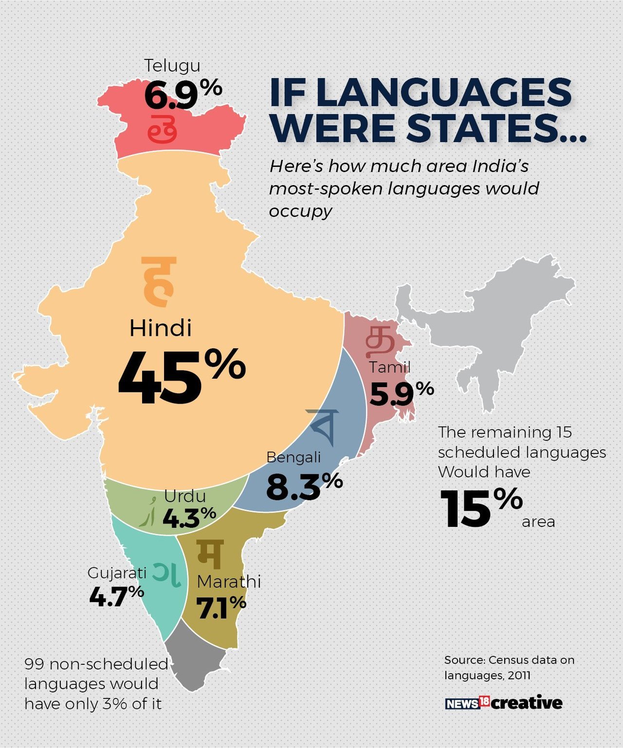
The visualization below is a perfect example of beauty preceding over interpretability. The creator tried to represent the usage of different Indian languages on India’s map. They have not only used arbitrary shapes to represent the numbers but also the positioning of the languages is wrong with respect to the region they belong to. For example, the North has Telegu, and the South has Gujrati.
A better way to represent such data would be to simply use a bar chart which would have accentuated the rankings of the different languages.
Have a look at another data visualization example below. The visualization displays the contributed by each country as a percentage of world GDP. By giving more weightage to beauty the visualization has become unnecessarily difficult to interpret. Not only are the countries difficult to find, but their positioning isn’t intuitive at first glance. Again, a data visualization along the lines of a bar chart would have done a great job here.

Therefore, whenever it comes to data visualization always give precedence to interpretability over beauty.
Endnotes
Data visualization is an art that needs to be mastered over time. These data visualization tips and techniques, though aren’t exhaustive, but will surely help you move in the right direction. Understanding the perspective of the end viewer is the key to creating a successful and effective data visualization. You should always try to ascertain what the end viewer wants to know.
But before employing these data visualization tips, it is important to understand the tool you are using. Therefore, if you want to learn the popular data visualizations tools and how to use them, you can check out the following resources on our platform:
- Tableau for Beginners
- 10 matplotlib Tricks to Master Data Visualization in Python
- 6 Essential Data Visualization Python Libraries
- A Beginner’s Guide to matplotlib for Data Visualization and Exploration in Python
Please feel free to comment below if you have any queries. Also, mention any other data visualization tips if you have any in your mind.
I am on a journey to becoming a data scientist. I love to unravel trends in data, visualize it and predict the future with ML algorithms! But the most satisfying part of this journey is sharing my learnings, from the challenges that I face, with the community to make the world a better place!


Thanks for your article
Hi, Thanks for the informative article. Just one thing I'd like to point out, and I don't want to be pedantic, but I'm mentioning this because it may confuse some readers. Where you say ”Chartjunks is a sight for the sore eyes.", that expression "a sight for sore eyes" actually means the opposite to what you were intending to say. That is, in this case, a visualisation that you might describe as a "sight for sore eyes" is one that *doesn't* contain unnecessary/redundant/complex elements etc. Hope that makes sense!
Hi, David thanks for the feedback. I clearly did not intend to say that! But I have made the changes. Thanks a lot.
Hi, good information... What do you think about timeline charts? and what apps do you recommend for their use? Thanks in advance.