Introduction
We are going to do an analysis of the covid-19 data available with us for the first and second waves in India to understand the different stages of the coronavirus pandemic during that period.

What is Covid-19?
Coronavirus disease (COVID-19) is an infectious disease caused by the SARS-CoV-2 virus. Its origin was Wuhan City, China in Dec. 2019. On Jan. 30, 2020, it was declared a pandemic or a health emergency for the entire globe by the World Health Organization (WHO).
How it is Transmitted?
The coronavirus is transmitted from person to person when they are directly in contact with each other or when the infected person sneezes or coughs. It is a respiratory disease, so it directly affects the respiratory system.
The first case in India was reported on Jan. 30, 2020, in Kerala.
The data we are going to refer to has been downloaded from official sites of the government of India and has data on covid cases from Jan 2020 till Aug 2021.
We will start by importing all the necessary libraries:
import pandas as pd
import matplotlib.pyplot as plt
import numpy as np
import seaborn as sns
import matplotlib.dates as mdates
from matplotlib.dates import DateFormatter
import plotly.express as px
import warnings
warnings.filterwarnings(‘ignore’)
%matplotlib inline
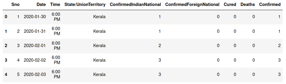
Let us read the csv file now:
df = pd.read_csv(“covid_19_india.csv”)
df.head()
Let us check the columns that we have in the data:
df.columns

Let’s check the shape of the dataframe:
df.shape
From the above, we know that the data has 18110 rows and 9 columns.
Let us now check if the data has any null values:
df.isna().sum()

Let’s check the data types:
df.dtypes

We would also like to see the last few values in the dataframe:
df.tail()

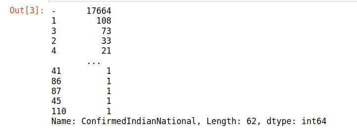
We will check the values for the columns ‘’ConfirmedIndianNational’ and ‘ConfirmedForeignNational’:
df[‘ConfirmedIndianNational’].value_counts()
df[‘ConfirmedForeignNational’].value_counts()

We can see that most of the rows for the above column have null values, hence we can drop this column.
Sno and Time can be dropped as well as it does not have any relevant information.
df = df.drop([‘ConfirmedIndianNational’,’ConfirmedForeignNational’, ‘Sno’, ‘Time’], axis = 1)
df.head()

Now let’s check states for which the dataframe contains the information:
df[‘State/UnionTerritory’].unique()

We will drop rows with states ending with *** as it contains incomplete data.
def drop_star(df):
for i in df[‘State/UnionTerritory’].iteritems():
if i[1][-3:] == “***”:
df.drop(i[0],inplace=True)
drop_star(df)
df[‘State/UnionTerritory’].unique()

Let us rename the column State/UnionTerritory for easy reference.
df.rename(columns={‘State/UnionTerritory’:’States’}, inplace=True)
df[‘States’] = df[‘States’].replace([‘Maharashtra’],’MH’)
df[‘States’] = df[‘States’].replace([‘Kerala’],’KL’)
df[‘States’] = df[‘States’].replace([‘Karnataka’],’KA’)
df[‘States’] = df[‘States’].replace([‘Tamil Nadu’],’TN’)
df[‘States’] = df[‘States’].replace([‘Andhra Pradesh’],’AP’)
df[‘States’] = df[‘States’].replace([‘Uttar Pradesh’],’UP’)
df[‘States’] = df[‘States’].replace([‘Madhya Pradesh’],’MP’)
df[‘States’] = df[‘States’].replace([‘Karanataka’],’KA’)
df[‘States’] = df[‘States’].replace([‘West Bengal’],’WB’)
df[‘States’] = df[‘States’].replace([‘Himachal Pradesh’],’HP’)
df[‘States’] = df[‘States’].replace([‘Jammu and Kashmir’],’JNK’)
df[‘States’].unique()

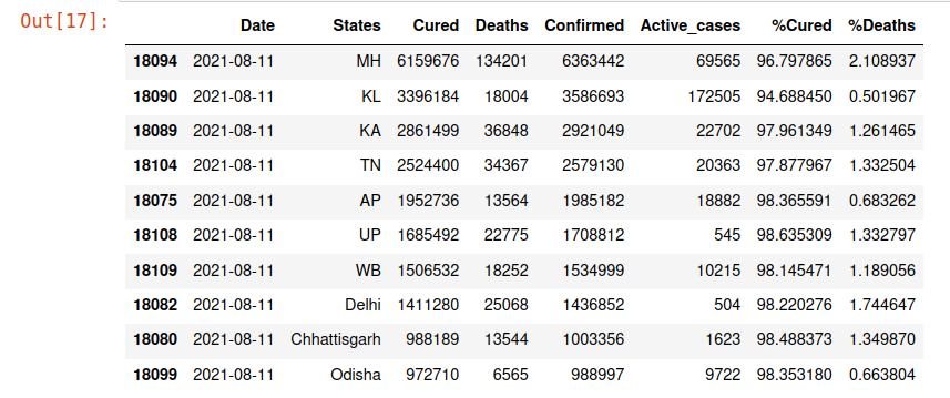
Let us now find out the maximum cases until 11th Aug 2021 for each state.
df_latest = df[df[‘Date’]==”2021-08-11″]
df_latest.head()

Let’s find out the total confirmed cases till 11th Aug 2021:
df_latest[‘Confirmed’].sum()
We will now find out the percentage for Active, fatal and cured cases.
df[‘Active_cases’]=df[‘Confirmed’]-(df[‘Cured’]+df[‘Deaths’])
df[‘%Cured’]=(df[‘Cured’]/df[‘Confirmed’])*100
df[‘%Deaths’]=(df[‘Deaths’]/df[‘Confirmed’])*100
df_latest = df_latest.sort_values(by=[‘Confirmed’], ascending = False)
df_latest.head(10)
Statewise Data
Now we will check the data for the 10 most affected states with covid-19 in India.
df_latest = df_latest.sort_values(by=[‘Confirmed’], ascending = False)
plt.figure(figsize=(12,4), dpi=80)
plt.bar(df_latest[‘States’][:10], df_latest[‘Confirmed’][:10],
align=’center’,color=’blue’)
plt.ylabel(‘Number of Confirmed Cases’, size = 12)
plt.title(“States with maximum confirmed cases till Aug’21”, size = 16)
plt.show()

From the above figure, we can derive that Maharashtra has the maximum cases till Aug’21. On researching further about it, we found that Mumbai and Pune were the majorly affected cities in Maharashtra. Mumbai has a high population density hence an epidemic can easily spread. Pune has a climatic condition favourable for any disease to spread easily.
Now we want to compare the recovery rate and fatality against confirmed cases for each state to understand healthcare facilities and the performance of the respective state governments in this crisis situation.
Top 10 States with Maximum Cases
df2= df_latest.copy()
df_Top= df2.head(10)
df_Top.style.background_gradient(cmap=’Reds’)
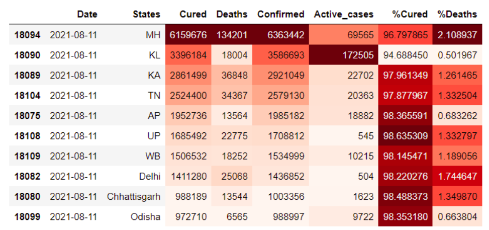
Maharashtra in the previous graph we saw has the highest no. of cases hence it is not surprising it has the highest mortality rate too. However, we observed Kerala and Andhra have lower no. of deaths compared to the confirmed cases in these states.
Now we will check the data statewise:
df2 = df2.sort_values(by=[‘Confirmed’], ascending = False)
for feature in df2[[‘Confirmed’,’Cured’,’Deaths’,’Active_cases’]]:
fig=plt.figure(figsize=(30,10))
plt.title(“Top 10 highly impacted sates as on 11-Aug-21”, size=10)
ax=sns.barplot(data=df2,y=df2[feature],x=’States’, linewidth=0, edgecolor=’black’)
plt.xlabel(‘States’, size = 15)
plt.ylabel(feature, size = 15)
for i in ax.patches:
ax.text(x=i.get_x(),y=i.get_height(),s=i.get_height())
plt.show()

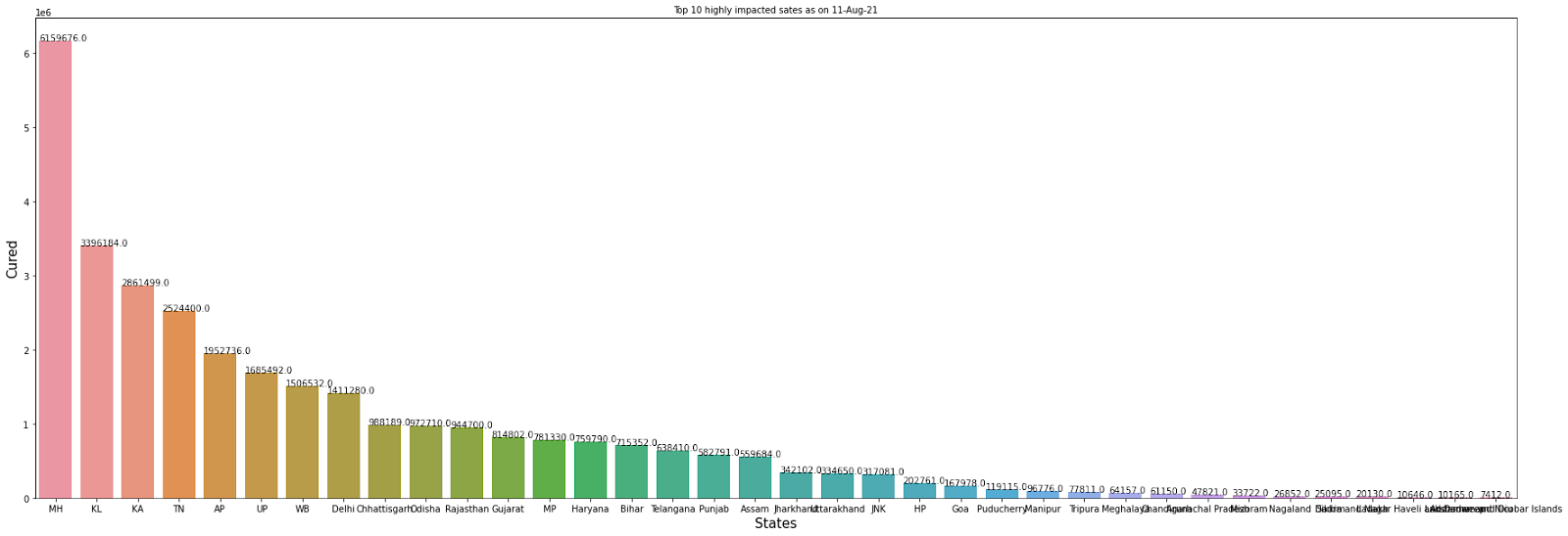


From the above data, we observe that the recovery rate is commendable for all the top 5 states with maximum cases of the corona. Kerala is in the second position in terms of the maximum cases of Covid has a comparatively low mortality rate. It shows the health facilities are comparatively better in Kerala. Another reason could be a comparatively less population for Kerala, we will see a comparison for the same on analyzing the data further.
Now let’s find out the total death till Aug 2021:
df_latest[‘Deaths’].sum()
Also:
The beow graph shows rise in total cases per day
sns.set(rc={‘figure.figsize’:(10,8)})
sns.lineplot(x=’Date’, y=’Confirmed’, data=df)

From the above fig, it can be inferred that initially there was a rapid increase in covid cases every day, however, after the complete lockdown in the country, the government was successful in containing the disease for some time. Once the lockdown was lifted and the virus had mutated itself, there was again an upsurge in cases on March 21(known as the second wave).
Below we have a comparison of the Active, Cured and Confirmed cases for the Top States:
states=[‘Kerala’, ‘Tamil Nadu’, ‘Maharashtra’, ‘Karnataka’, ‘Andhra Pradesh’, ‘Uttar Pradesh’, ‘Madhya Pradesh’,’West Bengal’ ]
MH=df[df[‘States’]==’MH’]
KL=df[df[‘States’]==’KL’]
KR=df[df[‘States’]==’KA’]
TN=df[df[‘States’]==’TN’]
AP=df[df[‘States’]==’AP’]
UP=df[df[‘States’]==’UP’]
WB=df[df[‘States’]==’WB’]
Delhi=df[df[‘States’]==’Delhi’]
Chhattisgarh=df[df[‘States’]==’Chhattisgarh’]
Odisha=df[df[‘States’]==’Odisha’]
fig, ax=plt.subplots(nrows=3, ncols=3, figsize=(23,10), squeeze=False, sharex=True, sharey=False, constrained_layout=True )
plt.suptitle(“Comparison of Active, Cured & Deaths for top States”, size = 25)
sns.lineplot(data=MH, x=’Date’,y=’Active_cases’, ax=ax[0,0], color=’b’)
ax[0,0].set_title(“Maharashtra”, size=20)
sns.lineplot(data=MH, x=’Date’,y=’Cured’, ax=ax[1,0], color=’b’)
sns.lineplot(data=MH, x=’Date’,y=’Deaths’, ax=ax[2,0], color=’b’)
sns.lineplot(data=KL, x=’Date’,y=’Active_cases’, ax=ax[0,1], color=’b’)
ax[0,1].set_title(“Kerala”, size=20)
sns.lineplot(data=KL, x=’Date’,y=’Cured’, ax=ax[1,1], color=’b’)
sns.lineplot(data=KL, x=’Date’,y=’Deaths’, ax=ax[2,1], color=’b’)
sns.lineplot(data=KR, x=’Date’,y=’Active_cases’, ax=ax[0,2], color=’b’)
ax[0,2].set_title(“Karnataka”, size=20)
sns.lineplot(data=KR, x=’Date’,y=’Cured’, ax=ax[1,2], color=’b’)
sns.lineplot(data=KR, x=’Date’,y=’Deaths’, ax=ax[2,2], color=’b’)
plt.show()

fig, ax=plt.subplots(nrows=3, ncols=3, figsize=(23,10), squeeze=False, sharex=True, sharey=False, constrained_layout=True )
plt.suptitle(“Comparison of Active, Cured & Deaths for top States”, size = 25)
sns.lineplot(data=TN, x=’Date’,y=’Active_cases’, ax=ax[0,0], color=’b’)
ax[0,0].set_title(“Tamil Nadu”, size=20)
sns.lineplot(data=MH, x=’Date’,y=’Cured’, ax=ax[1,0], color=’b’)
sns.lineplot(data=MH, x=’Date’,y=’Deaths’, ax=ax[2,0], color=’b’)
sns.lineplot(data=AP, x=’Date’,y=’Active_cases’, ax=ax[0,1], color=’b’)
ax[0,1].set_title(“Andhra Pradesh”, size=20)
sns.lineplot(data=KL, x=’Date’,y=’Cured’, ax=ax[1,1], color=’b’)
sns.lineplot(data=KL, x=’Date’,y=’Deaths’, ax=ax[2,1], color=’b’)
sns.lineplot(data=AP, x=’Date’,y=’Active_cases’, ax=ax[0,2], color=’b’)
ax[0,2].set_title(“Uttar Pradesh”, size=20)
sns.lineplot(data=KR, x=’Date’,y=’Cured’, ax=ax[1,2], color=’b’)
sns.lineplot(data=KR, x=’Date’,y=’Deaths’, ax=ax[2,2], color=’b’)
plt.show()

If we compare the above figures with the ones with confirmed cases, we can see that they are positively correlated. India has been doing more and more tests every day during this period and hence more confirmed case data have. From Aug’20 to Jan’21 however, after the government was able to contain the disease, the tests and the active cases both went down before surging up again during the second wave around Feb-March’21.
df_latest.shape
Now let us divide the data into the year 2020 and 2021 to find the monthwise trend in regards to active cases, recovery rate and fatality.
df[‘Date’]= pd.to_datetime(df[‘Date’]) # Date is converted to DateTime format.
data_20 = df[df[‘Date’].dt.year==2020] # Considering data of only the year 2020.
data_21 = df[df[‘Date’].dt.year==2021] # Considering data of only the year 2021.
data_20[‘Month’]=data_20[‘Date’].dt.month # Month is accessed from the DateTime object.
data_21[‘Month’]=data_21[‘Date’].dt.month
Year 2020
data_confirm_20= data_20[‘Confirmed’].groupby(data_20[‘Month’]).sum()
data_dis_20= data_20[‘Cured’].groupby(data_20[‘Month’]).sum() # creating instances for ‘confirmed’,’deaths’,’discharged’ by month column
data_death_20= data_20[‘Deaths’].groupby(data_20[‘Month’]).sum()
Year 2021
data_confirm_21= data_21[‘Confirmed’].groupby(data_21[‘Month’]).sum()
data_dis_21= data_21[‘Cured’].groupby(data_21[‘Month’]).sum() # creating instances for ‘confirmed’,’deaths’,’discharged’ by month column
data_death_21= data_21[‘Deaths’].groupby(data_21[‘Month’]).sum()
cols_20=[data_confirm_20,data_dis_20,data_death_20]
data_20=pd.concat(cols_20,axis=1)
cols_21=[data_confirm_21,data_dis_21,data_death_21]
data_21=pd.concat(cols_21,axis=1)
Year 2020
data_20[‘discharge_rate_20’] = np.round((data_20[‘Cured’]/data_20[‘Confirmed’])*100, decimals=4) # create instances for ‘death_rate and discharge_rate’
data_20[‘death_rate_20’] = np.round((data_20[‘Deaths’]/data_20[‘Confirmed’])*100, decimals=4)
Year 2020
data_21[‘discharge_rate_21’] = np.round((data_21[‘Cured’]/data_21[‘Confirmed’])*100, decimals=4) # create instances for ‘death_rate and discharge_rate’
data_21[‘death_rate_21’] = np.round((data_21[‘Deaths’]/data_21[‘Confirmed’])*100, decimals=4)
Year 2020
data_20.reset_index(inplace=True)
data_20.head()

Year 2021
data_21.reset_index(inplace=True)
data_21.head()

plt.figure(figsize=(10,5))
sns.lineplot(x=”Month”,y=”discharge_rate_20″,data=data_20,color=”g”,lw=3,marker=’o’,markersize=10)
plt.title(‘DISCHARGE RATE PER MONTH IN 2020’)
plt.show()

The above graph shows, the recovery rate was much higher in the year 2020. This could be attributed to the complete lockdown and telling people were more precautious.
Now let’s check datathe trend for the year 2021:
plt.figure(figsize=(10,5))
sns.lineplot(x=”Month”,y=”discharge_rate_21″,data=data_21,color=”g”,lw=3,marker=’o’,markersize=10)
plt.title(‘DISCHARGE RATE PER MONTH IN 2021’)
plt.show()

Above graph indicates the second wave of corona in the country was much more deadly and we see a steep slope in the discharge rate from March to May.
plt.figure(figsize=(10,5))
sns.lineplot(x=”Month”,y=”death_rate_20″,data=data_20,color=”r”,lw=3,marker=’o’,markersize=10)
plt.title(‘DEATH RATE PER MONTH IN 2020’)
plt.show()
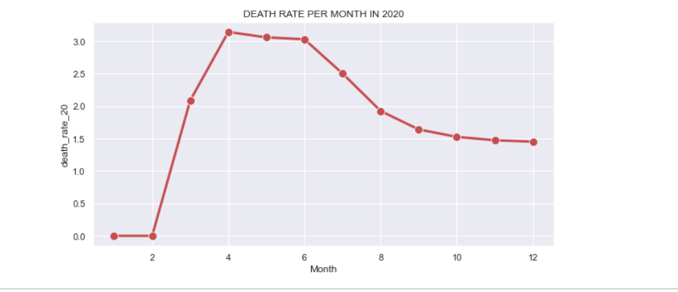
From above figure indicates a decline in the death rate over months in the year 2020.
plt.figure(figsize=(10,5))
sns.lineplot(x=”Month”,y=”death_rate_21″,data=data_21,color=”r”,lw=3,marker=’o’,markersize=10)
plt.title(‘DEATH RATE PER MONTH IN 2021’)
plt.show()
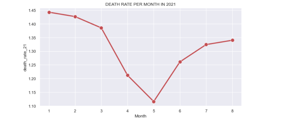
From the above, we observe the death rate is coming down until May, however it shoots up again in May and keeps rising till Aug 2021.
data_20[‘Active_cases’]=data_20[‘Confirmed’]-(data_20[‘Cured’]+data_20[‘Deaths’])
plt.figure(figsize=(10,5))
sns.lineplot(x=”Month”,y=”Active_cases”,data=data_20,color=”b”,lw=3,marker=’o’,markersize=10)
plt.title(‘ACTIVE CASES PER MONTH IN 2020’)
plt.show()

So the above graph shows that till Mar 2020, there were very few cases and the growth was much lower, however April onwards we see a steep rise in cases until Aug. From April to Aug we had complete lock down and hence we see covid cases are decreasing after September till December.
data_21[‘Active_cases’]=data_21[‘Confirmed’]-(data_21[‘Cured’]+data_21[‘Deaths’])
plt.figure(figsize=(10,5))
sns.lineplot(x=”Month”,y=”Active_cases”,data=data_21,color=”b”,lw=3,marker=’o’,markersize=10)
plt.title(‘ACTIVE CASES PER MONTH IN 2021’)
plt.show()
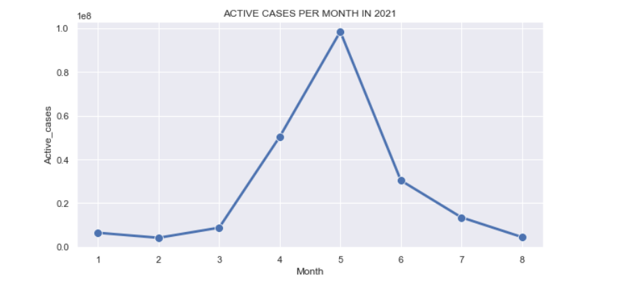
The above figure shows that initially for the first three months there were hardly any active cases, In March we got the news that a new variant of coronavirus was reported and so from there on the slope shoots up. April to Aug, there is a constant rise in the cases and the second wave turned out to be much deadlier than the previous one. During the same time, however, the government was encouraging people to take the Covid vaccine and so we can see an impact of the same after Aug as a considerable population had got the first dose of the vaccine.
India is a diverse country in terms of population, demography and culture. The demography of a state makes a lot of difference in how the disease has spread. So we will check the mortality rate against the population for each state.
Let us read the csv file:
states_data= pd.read_csv(‘population_india_census2011.csv’)
states_data.head()
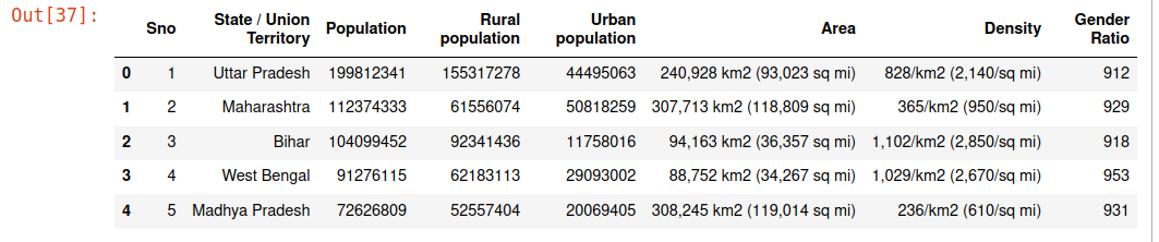
states_data.columns

#Now we will drop those columns that are for now not much relevant.
states_data = states_data.drop([‘Rural population’,’Urban population’,’Area’,’Gender Ratio’], axis = 1)
states_data.head()
We will merge the two datasets to further analyze the data, so let us rename the State / Union Territory column in both the datasets to avoid any ambiguity.
#states_data.rename(columns={‘State / Union Territory’:’States’}, inplace=True)
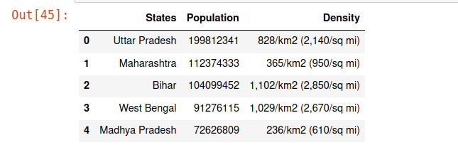
states_data.rename(columns={‘State / Union Territory’:’States’}, inplace=True)
states_data.head()

df_latest.columns

states_data= states_data.sort_values(by=[‘Population’], ascending =False)
states_data.head(10)

states_data.isna().sum()

states_data.duplicated().sum()
# states = states[[“Sno”, “State/Union Territory”, “Density”, “Population”]]
states_data = states_data.drop([‘Sno’], axis = 1)
states_data.head()
Now we will merge both the datasets for a comparison of population of each state with the confirmed covid-19 cases.
df_latest.columns
states_data[‘States’] = states_data[‘States’].replace([‘Maharashtra’],’MH’)
states_data[‘States’] = states_data[‘States’].replace([‘Kerala’],’KL’)
states_data[‘States’] = states_data[‘States’].replace([‘Karnataka’],’KA’)
states_data[‘States’] = states_data[‘States’].replace([‘Tamil Nadu’],’TN’)
states_data[‘States’] = states_data[‘States’].replace([‘Andhra Pradesh’],’AP’)
states_data[‘States’] = states_data[‘States’].replace([‘Uttar Pradesh’],’UP’)
states_data[‘States’] = states_data[‘States’].replace([‘Madhya Pradesh’],’MP’)
states_data[‘States’] = states_data[‘States’].replace([‘Karanataka’],’KA’)
states_data[‘States’] = states_data[‘States’].replace([‘West Bengal’],’WB’)
states_data[‘States’] = states_data[‘States’].replace([‘Himachal Pradesh’],’HP’)
states_data[‘States’] = states_data[‘States’].replace([‘Jammu and Kashmir’],’JNK’)
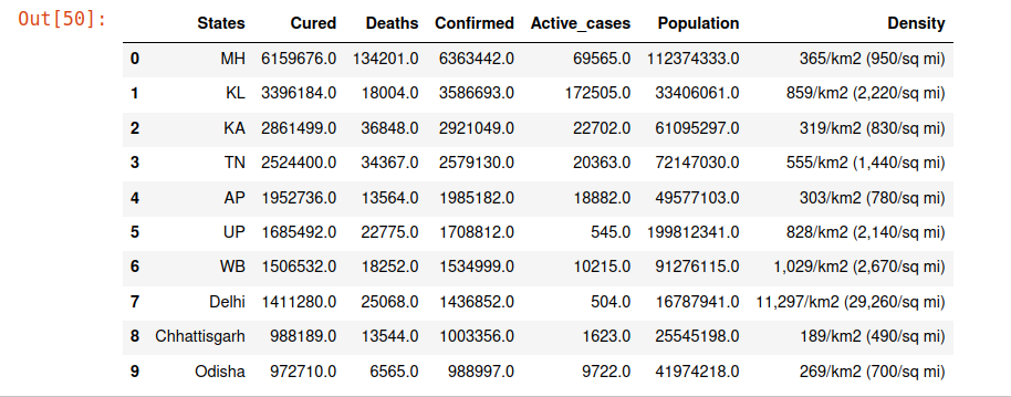
statewise_cases= pd.merge(df_latest.iloc[:,[1,2,3,4,5]], states_data, on=’States’, how=’outer’)
statewise_cases= statewise_cases.sort_values(by=’Population’, ascending =False)
statewise_cases.head(10)
df_latest[‘Cases/10million’] = (df_latest[‘Confirmed’]/states[‘Population’])*10000000
display(pd.merge(df,states, how=’outer’))

So clearly, the above data shows that population is not a criterion for the rise in the cases. From the above, we observe that Uttar Pradesh, Bihar and Madhya Pradesh are among the top five states in terms of population, yet the covid cases in these states are fewer compared to Maharashtra.
statewise_cases= statewise_cases.sort_values(by=’Confirmed’, ascending =False)
statewise_cases.head(10)
From the above comparisons, we understand that even though the states Kerala, Chattisgarh, Delhi and Odisha are not among the top 10 states in terms of population, however, they have a larger number of corona cases.
From further studies regarding it, we infer that Delhi being the capital of the country has a higher influx of people from outside the city and within the country, also the population density is much higher in Delhi compared to other places that would have caused the pandemic to spread rapidly.
plt.figure(figsize = (12,4))
sns.heatmap(statewise_cases.corr(), annot=True)
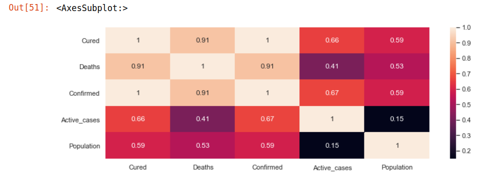
It can be seen that columns like Confirmed, Cured, Deaths are highly co-related and for obvious reasons.
We will now download the data for Vaccination:
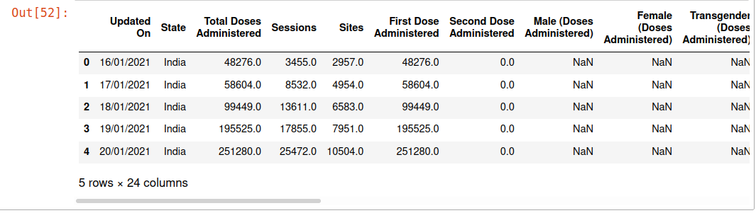
Vaccination = pd.read_csv(“covid_vaccine_statewise.csv”)
Vaccination.head()
Vaccination.columns

Vaccine_drive= Vaccination.copy()
Vaccine_drive= Vaccine_drive.iloc[:,[0,1,2,23]]
Vaccine_drive
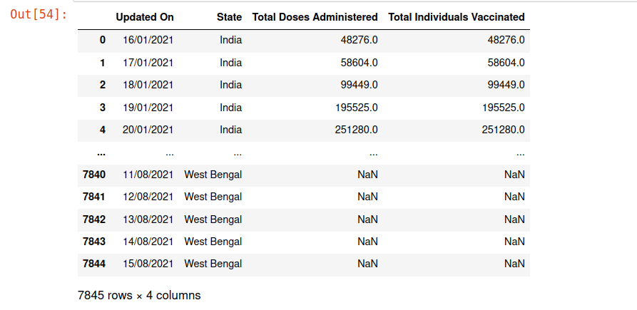
Vaccine_drive.rename(columns={‘Updated On’:’Date’}, inplace=True)
Vaccine_drive.rename(columns={‘Total Doses Administered’:’Total_Doses’}, inplace=True)
Vaccine_drive.rename(columns={‘Total Individuals Vaccinated’:’Citizens’}, inplace=True)
Vaccine_drive.head()

Vaccine_drive.shape
Vaccine_drive.isna().sum()

We will drop the columns State and Citizens as it does not have data for each state and the Citizen column has a lot of null values.
Vaccine_drive = Vaccine_drive.drop([‘State’,’Citizens’], axis = 1)
Vaccine_drive.head()

Let us drop the null values for the column Total_Doses.
Vaccine_drive= Vaccine_drive.dropna()
Vaccine_drive.isna().sum()

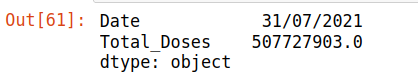
Vaccine_drive[‘Total_Doses’].max()
Vaccine_drive=Vaccine_drive[Vaccine_drive.Total_Doses != 513228400]
Vaccine_drive.max()
Vaccine_drive.tail()

sns.set(rc={‘figure.figsize’:(10,8)})
sns.lineplot(x=’Date’, y=’Total_Doses’, data=Vaccine_drive)
plt.show()

Clearly, the above graph is negatively correlated with the previous graph for Active cases in 2021 except for the initial few months.
Now we will see which state is flattening the curve over months:
plt.figure(figsize=(12,8), dpi=80)
plt.plot(KL[‘Date’], KL[‘Active_cases’])
plt.plot(MH[‘Date’], MH[‘Active_cases’])
plt.plot(Delhi[‘Date’], Delhi[‘Active_cases’])
plt.plot(KR[‘Date’], KR[‘Active_cases’])
plt.plot(TN[‘Date’], TN[‘Active_cases’])
plt.plot(UP[‘Date’], UP[‘Active_cases’])
plt.plot(AP[‘Date’], AP[‘Active_cases’])
plt.plot(Odisha[‘Date’], Odisha[‘Active_cases’])
plt.legend([‘Kerala’, ‘Maharashtra’, ‘Delhi’, ‘Karnataka’, ‘Tamil Nadu’, ‘UP’, ‘WB’, ‘AP’,’Chhatisgarh’,’Odisha’], loc=’upper left’)
plt.xlabel(‘Date’, size=12)
plt.ylabel(‘Active Cases Count’, size=12)
plt.title(‘Which states are flattening the curve ?’, size = 16)
plt.show()
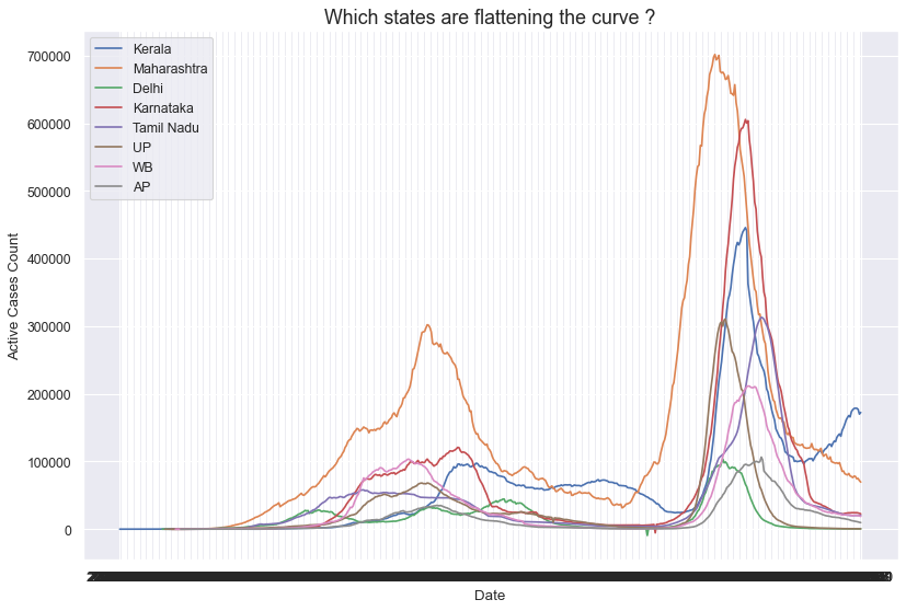
We saw that finally, all states are flattening the curve over time.
Conclusion
1. We saw in the above analysis of COVID-19 that initially more and more cases were coming every day, however, a long lockdown in the year 2020 helped contain the disease to some extent.
2. With the coming of a new variant in the second wave, there was again an upsurge for a few months in the total cases per day.
3. Finally with the vaccination drive and more people getting vaccinated the active cases started coming down Aug onward in the year 2021.


