Exploratory Data Analysis (EDA) – Credit Card Fraud Detection Case Study
This article was published as a part of the Data Science Blogathon.
Overview
Lots of financial losses are caused every year due to credit card fraud transactions, the financial industry has switched from a posterior investigation approach to an a priori predictive approach with the design of fraud detection algorithms to warn and help fraud investigators.
This case study is focused to give you an idea of applying Exploratory Data Analysis (EDA) in a real business scenario. In this case study, apart from applying the various Exploratory Data Analysis (EDA) techniques, you will also develop a basic understanding of risk analytics and understand how data can be utilized in order to minimise the risk of losing money while lending to customers.
Business Problem Understanding
The loan providing companies find it hard to give loans to people due to their inadequate or missing credit history. Some consumers use this to their advantage by becoming a defaulter. Let us consider your work for a consumer finance company that specialises in lending various types of loans to customers. You must use Exploratory Data Analysis (EDA) to analyse the patterns present in the data which will make sure that the loans are not rejected for the applicants capable of repaying.
When the company receives a loan application, the company has to rights for loan approval based on the applicant’s profile. Two types of risks are associated with the bank’s or company’s decision:
- If the aspirant is likely to repay the loan, then not approving the loan tends in a business loss to the company
- If the a is aspirant not likely to repay the loan, i.e. he/she is likely to default/fraud, then approving the loan may lead to a financial loss for the company.
The data contains information about the loan application.
When a client applies for a loan, there are four types of decisions that could be taken by the bank/company:
- Approved
- Cancelled
- Refused
- Unused offer: The loan has been cancelled by the applicant but at different stages of the process.
In this case study, you will use Exploratory Data Analysis(EDA) to understand how consumer attributes and loan attributes impact the tendency of default.
Business Goal
This case study aims to identify patterns that indicate if an applicant will repay their instalments which may be used for taking further actions such as denying the loan, reducing the amount of loan, lending at a higher interest rate, etc. This will make sure that the applicants capable of repaying the loan are not rejected. Recognition of such aspirants using Exploratory Data Analysis (EDA) techniques is the main focus of this case study.
Data
You can get access to data here.
Importing Necessary Packages
# Filtering Warnings
import warnings
warnings.filterwarnings('ignore')

#Other's
import numpy as np
import pandas as pd
import seaborn as sns
import matplotlib.pyplot as plt
from plotly.subplots import make_subplots
import plotly.graph_objects as go
pd.set_option('display.max_columns', 300) #Setting column display limit
plt.style.use('ggplot') #Applying style to graphs
Here, we will use two datasets for our analysis as follows,
- application_data.csv as
df1 - previous_application.csv as
df2
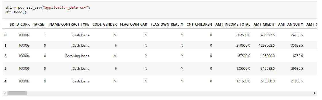
Let’s start with reading those files, we’ll start with df1,
df1 = pd.read_csv("application_data.csv")
df1.head()
Source: Author

Source: Author
Data Inspection
Before starting Exploratory Data Analysis (EDA) procedures we will start with inspecting the data.
df1.shape

Source: Author
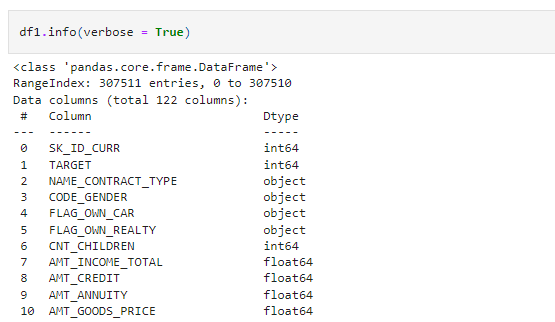
df1.info(verbose = True)
Source: Author
Here, by giving verbose = True, it will give all the information about all the columns. Try it and see the results.
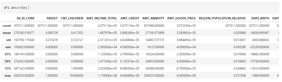
df1.describe()
Source: Author
By describing (), you will get all the statistical information for the numeric columns and get an idea about their distribution and outliers.
Handling Null Values
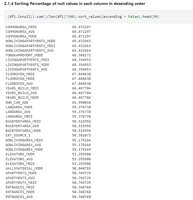
After all the data inspecting, let’s check for the null values,
(df1.isnull().sum()/len(df1)*100).sort_values(ascending = False).head(50)
Source: Author
As you can see we are getting lots of null values. Let’s analyse this further.
null_col = df1.isnull().sum().sort_values(ascending = False)
null_col = null_col[null_col.values >(0.35*len(df1))]


#Plotting Bar Graph for null values greater than 35%

plt.figure(figsize=(20,4))
null_col.plot(kind='bar', color="#4CB391")
plt.title('List of Columns & null counts where null values are more than 35%')

plt.xlabel("Null Columns",fontdict={"fontsize":12,"fontweight":5})                  #Setting X-label and Y-label
plt.ylabel("Count of null values",fontdict={"fontsize":12,"fontweight":5})
plt.show()
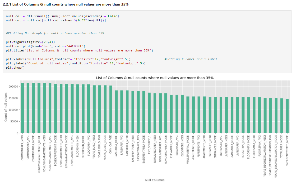
Theoretically, 25 to 30% is the maximum missing values are allowed, beyond which we might want to drop the variable from analysis. But practically we get variables with ~50% of missing values but still, the customer insists to have it for analyzing. In those cases, we have to treat them accordingly. Here, we will remove columns with null values of more than 35% after observing those columns.
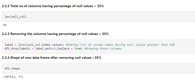
Let’s check how many columns are there with null values greater than 35%. And remove those.
len(null_col)
label = list(null_col.index.values) #Making list of column names having null values greater than 35%
df1.drop(labels = label,axis=1,inplace = True) #Droping those columns
df1.shape
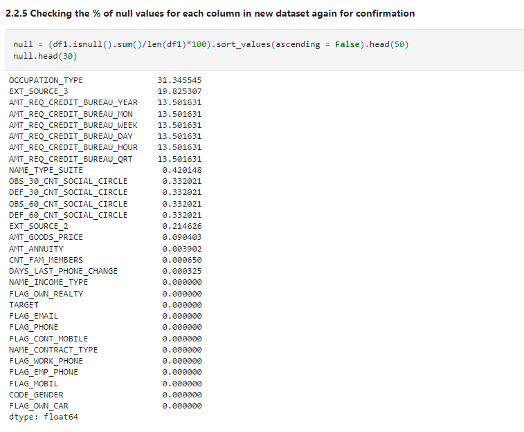
After removing null values, check the percentage of null values for each column again.
null = (df1.isnull().sum()/len(df1)*100).sort_values(ascending = False).head(50)
null.head(30)
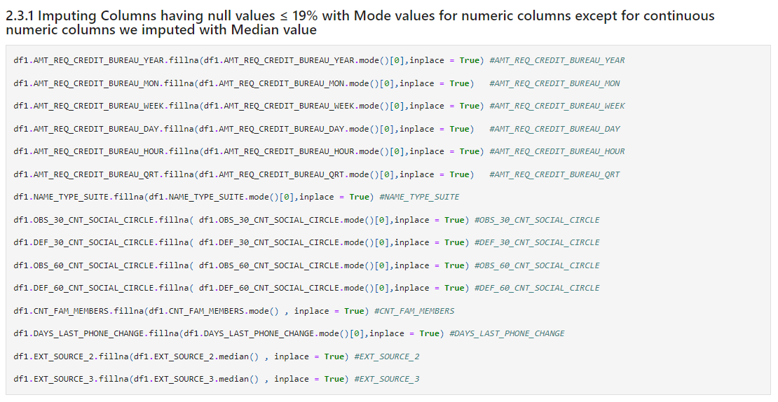
Let’s handle these missing values by observing them.
df1.AMT_REQ_CREDIT_BUREAU_YEAR.fillna(df1.AMT_REQ_CREDIT_BUREAU_YEAR.mode()[0],inplace = True) #AMT_REQ_CREDIT_BUREAU_YEAR

df1.AMT_REQ_CREDIT_BUREAU_MON.fillna(df1.AMT_REQ_CREDIT_BUREAU_MON.mode()[0],inplace = True)   #AMT_REQ_CREDIT_BUREAU_MON

df1.AMT_REQ_CREDIT_BUREAU_WEEK.fillna(df1.AMT_REQ_CREDIT_BUREAU_WEEK.mode()[0],inplace = True) #AMT_REQ_CREDIT_BUREAU_WEEK

df1.AMT_REQ_CREDIT_BUREAU_DAY.fillna(df1.AMT_REQ_CREDIT_BUREAU_DAY.mode()[0],inplace = True)   #AMT_REQ_CREDIT_BUREAU_DAY

df1.AMT_REQ_CREDIT_BUREAU_HOUR.fillna(df1.AMT_REQ_CREDIT_BUREAU_HOUR.mode()[0],inplace = True) #AMT_REQ_CREDIT_BUREAU_HOUR

df1.AMT_REQ_CREDIT_BUREAU_QRT.fillna(df1.AMT_REQ_CREDIT_BUREAU_QRT.mode()[0],inplace = True)   #AMT_REQ_CREDIT_BUREAU_QRT

df1.NAME_TYPE_SUITE.fillna(df1.NAME_TYPE_SUITE.mode()[0],inplace = True) #NAME_TYPE_SUITE

df1.OBS_30_CNT_SOCIAL_CIRCLE.fillna( df1.OBS_30_CNT_SOCIAL_CIRCLE.mode()[0],inplace = True) #OBS_30_CNT_SOCIAL_CIRCLE

df1.DEF_30_CNT_SOCIAL_CIRCLE.fillna( df1.DEF_30_CNT_SOCIAL_CIRCLE.mode()[0],inplace = True) #DEF_30_CNT_SOCIAL_CIRCLE

df1.OBS_60_CNT_SOCIAL_CIRCLE.fillna( df1.OBS_60_CNT_SOCIAL_CIRCLE.mode()[0],inplace = True) #OBS_60_CNT_SOCIAL_CIRCLE

df1.DEF_60_CNT_SOCIAL_CIRCLE.fillna( df1.DEF_60_CNT_SOCIAL_CIRCLE.mode()[0],inplace = True) #DEF_60_CNT_SOCIAL_CIRCLE

df1.CNT_FAM_MEMBERS.fillna(df1.CNT_FAM_MEMBERS.mode() , inplace = True) #CNT_FAM_MEMBERS

df1.DAYS_LAST_PHONE_CHANGE.fillna(df1.DAYS_LAST_PHONE_CHANGE.mode()[0],inplace = True) #DAYS_LAST_PHONE_CHANGE

df1.EXT_SOURCE_2.fillna(df1.EXT_SOURCE_2.median() , inplace = True) #EXT_SOURCE_2

df1.EXT_SOURCE_3.fillna(df1.EXT_SOURCE_3.median() , inplace = True) #EXT_SOURCE_3
Checking null values again after imputing null values.
(df1.isnull().sum()/len(df1)*100).sort_values(ascending=False)
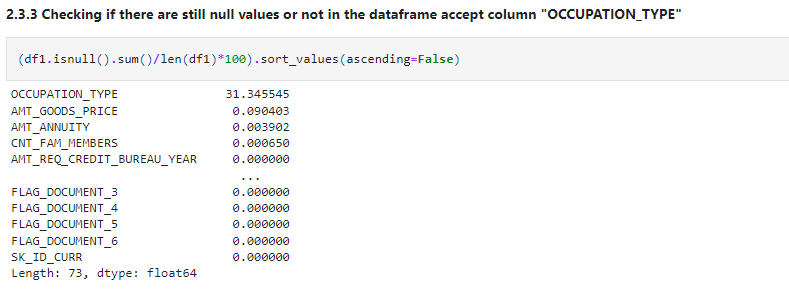
We didn’t impute OCCUPATION_TYPE because it may contain some useful information, so imputing it with mean or median doesn’t make any sense.
We’ll impute ‘OCCUOATION_TYPE” later by analyzing it.
If you observe the columns carefully, you will find that some columns contain an error. So let’s make some changes.
df1[["DAYS_BIRTH","DAYS_EMPLOYED","DAYS_REGISTRATION","DAYS_ID_PUBLISH","DAYS_LAST_PHONE_CHANGE"]]
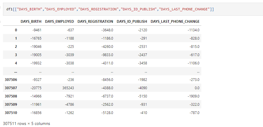
If you see the data carefully, you will find that though these are days, it contains negative values which is not valid. So let’s make changes accordingly.
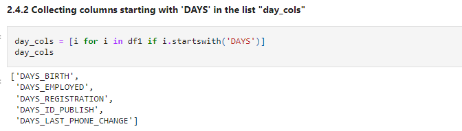
As you can see all the columns starts with DAYS, let’s make a list of columns we want to change for ease of change.
day_cols = [i for i in df1 if i.startswith('DAYS')]
day_cols
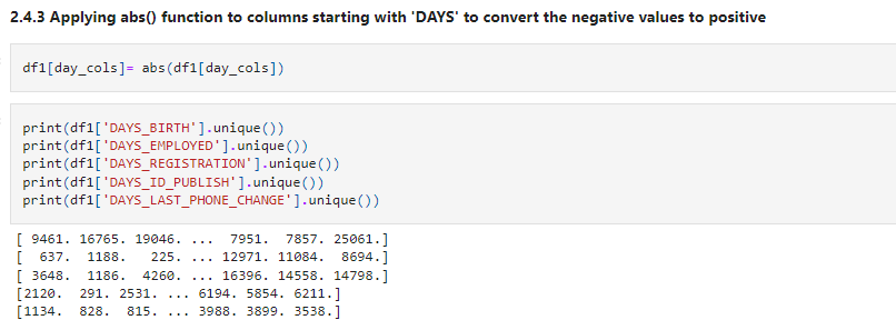
df1[day_cols]= abs(df1[day_cols])
print(df1['DAYS_BIRTH'].unique()) print(df1['DAYS_EMPLOYED'].unique()) print(df1['DAYS_REGISTRATION'].unique()) print(df1['DAYS_ID_PUBLISH'].unique()) print(df1['DAYS_LAST_PHONE_CHANGE'].unique())
Some columns contain Y/N type of values, let’s make it 1/0 for ease of understanding.
df1['FLAG_OWN_CAR'] = np.where(df1['FLAG_OWN_CAR']=='Y', 1 , 0) df1['FLAG_OWN_REALTY'] = np.where(df1['FLAG_OWN_REALTY']=='Y', 1 , 0)
df1[['FLAG_OWN_CAR','FLAG_OWN_REALTY']].head()
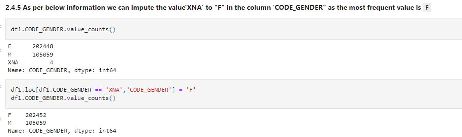
Let’s check the distribution for columns having categorical values. After checking for all the columns, we get to know that some columns contain ‘XNA’ values which mean null. Let’s impute it accordingly.
df1.CODE_GENDER.value_counts()
df1.loc[df1.CODE_GENDER == 'XNA','CODE_GENDER'] = 'F'
df1.CODE_GENDER.value_counts()
Similarly,
df1.ORGANIZATION_TYPE.value_counts().head()

Let’s impute these values. let’s check whether these values are missing at random or are there any pattern between missing values. You can read more about this here.
df1[['ORGANIZATION_TYPE','NAME_INCOME_TYPE']].head(30)
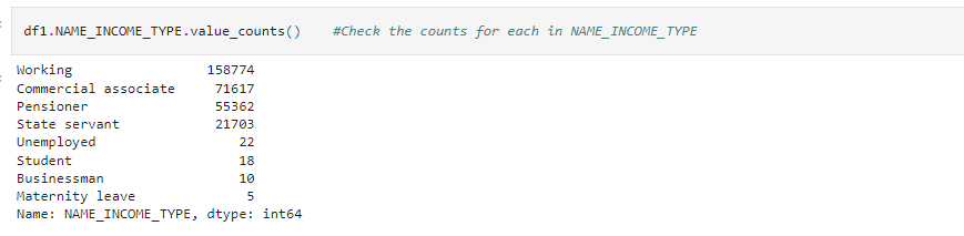
Here we observe that wherever NAME_INCOME_TYPE is Pensioner there only we have null values in ORGANIZATON_TYPE column.Let’s see count of Pensioner and then we’ll decide whether to impute null values of ORGANIZATION_TYPE with Pensioner or not.
df1.NAME_INCOME_TYPE.value_counts() #Check the counts for each in NAME_INCOME_TYPE
Source: Author
- So from these data, we can conclude that Pensioner value is approximately equal to null values in
ORGANIZATION_TYPEcolumn. So the value isMissing At Random
- Similarly imputing null values of
OCCUPATION_TYPEwith Pensioner as most of the null values for OCCUPATION_TYPE compared to Income type variable values we found that “Pensioner” is the most frequent value almost 80% of the null values of OCCUPATION_TYPE
df1['ORGANIZATION_TYPE'] = df1['ORGANIZATION_TYPE'].replace('XNA', 'Pensioner')
df1['OCCUPATION_TYPE'].fillna('Pensioner' , inplace = True)

Source: Author
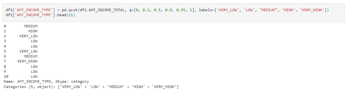
We have some columns which have nominal categorical values. So let’s impute them accordingly. You can read more about this here.
df1['AMT_INCOME_TYPE'] = pd.qcut(df1.AMT_INCOME_TOTAL, q=[0, 0.2, 0.5, 0.8, 0.95, 1], labels=['VERY_LOW', 'LOW', "MEDIUM", 'HIGH', 'VERY_HIGH']) df1['AMT_INCOME_TYPE'].head(11)
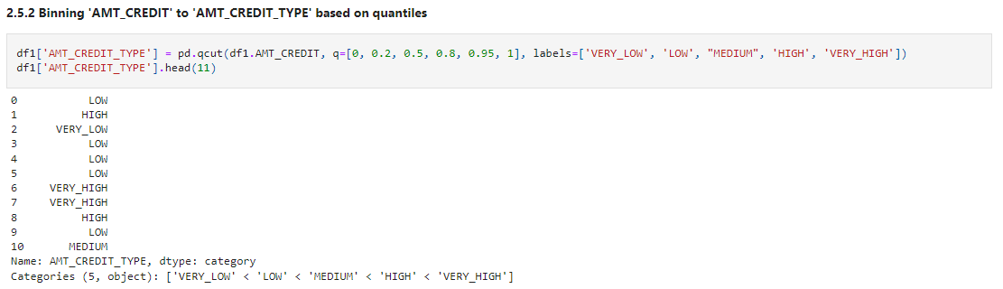
df1['AMT_CREDIT_TYPE'] = pd.qcut(df1.AMT_CREDIT, q=[0, 0.2, 0.5, 0.8, 0.95, 1], labels=['VERY_LOW', 'LOW', "MEDIUM", 'HIGH', 'VERY_HIGH'])
df1['AMT_CREDIT_TYPE'].head(11)
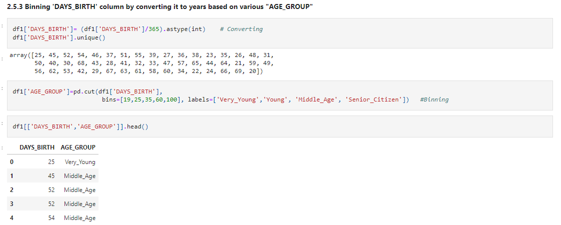
Let’s Bin ‘DAYS_BIRTH’ column by converting it to years based on various “AGE_GROUP”
df1['DAYS_BIRTH']= (df1['DAYS_BIRTH']/365).astype(int)    # Converting
df1['DAYS_BIRTH'].unique()
df1['AGE_GROUP']=pd.cut(df1['DAYS_BIRTH'],
                         bins=[19,25,35,60,100], labels=['Very_Young','Young', 'Middle_Age', 'Senior_Citizen'])   #Binning
df1[['DAYS_BIRTH','AGE_GROUP']].head()
Again check the datatypes for all the columns and change them accordingly.
df1.info()
By checking the data types we found the following columns to change their data types.
df1['NAME_CONTRACT_TYPE'] = df1['NAME_CONTRACT_TYPE'].astype('category')
df1['CODE_GENDER'] = df1['CODE_GENDER'].astype('category')
df1['NAME_TYPE_SUITE'] = df1['NAME_TYPE_SUITE'].astype('category')
df1['NAME_INCOME_TYPE'] = df1['NAME_INCOME_TYPE'].astype('category')
df1['NAME_EDUCATION_TYPE'] = df1['NAME_EDUCATION_TYPE'].astype('category')
df1['NAME_FAMILY_STATUS'] = df1['NAME_FAMILY_STATUS'].astype('category')
df1['NAME_HOUSING_TYPE'] = df1['NAME_HOUSING_TYPE'].astype('category')
df1['OCCUPATION_TYPE'] = df1['OCCUPATION_TYPE'].astype('category')
df1['WEEKDAY_APPR_PROCESS_START'] = df1['WEEKDAY_APPR_PROCESS_START'].astype('category')
df1['ORGANIZATION_TYPE'] = df1['ORGANIZATION_TYPE'].astype('category')
After observing all the columns, we found some columns which don’t add any value to our analysis, so simply drop them so that the data looks clear.
unwanted=['FLAG_MOBIL', 'FLAG_EMP_PHONE', 'FLAG_WORK_PHONE', 'FLAG_CONT_MOBILE',
       'FLAG_PHONE', 'FLAG_EMAIL','REGION_RATING_CLIENT','REGION_RATING_CLIENT_W_CITY','FLAG_EMAIL', 'REGION_RATING_CLIENT',
       'REGION_RATING_CLIENT_W_CITY', 'FLAG_DOCUMENT_2', 'FLAG_DOCUMENT_3','FLAG_DOCUMENT_4', 'FLAG_DOCUMENT_5', 'FLAG_DOCUMENT_6',
       'FLAG_DOCUMENT_7', 'FLAG_DOCUMENT_8', 'FLAG_DOCUMENT_9','FLAG_DOCUMENT_10', 'FLAG_DOCUMENT_11', 'FLAG_DOCUMENT_12',
       'FLAG_DOCUMENT_13', 'FLAG_DOCUMENT_14', 'FLAG_DOCUMENT_15','FLAG_DOCUMENT_16', 'FLAG_DOCUMENT_17', 'FLAG_DOCUMENT_18',
       'FLAG_DOCUMENT_19', 'FLAG_DOCUMENT_20', 'FLAG_DOCUMENT_21']

df1.drop(labels=unwanted,axis=1,inplace=True)
Outlier Analysis
Outlier detection for any data science process is very important. Sometimes removing outliers tend to improve our model meanwhile sometimes outliers may give you a very different approach to your analysis.
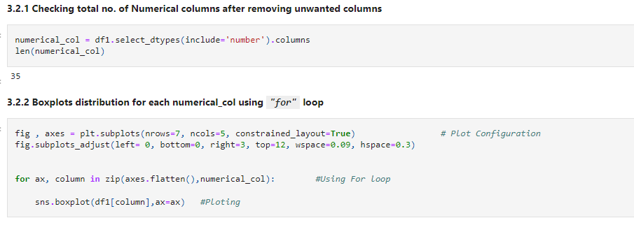
So let’s make a list of all the numeric columns and plot boxplots to understand the outliers in the data.
numerical_col = df1.select_dtypes(include='number').columns
len(numerical_col)
fig , axes = plt.subplots(nrows=7, ncols=5, constrained_layout=True)                 # Plot Configuration
fig.subplots_adjust(left= 0, bottom=0, right=3, top=12, wspace=0.09, hspace=0.3)


for ax, column in zip(axes.flatten(),numerical_col):        #Using For loop

    sns.boxplot(df1[column],ax=ax)   #Ploting
You will get a 7×5 boxplot matrix. Let’s have a look at a very small portion.
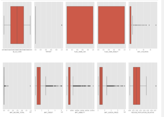
Observe the plot and try to make your own insights.
Insights
CNT_CHILDRENhave outlier values having children more than 5.- IQR for
AMT_INCOME_TOTALis very slim and it has a large number of outliers. - Third quartile of
AMT_CREDITis larger as compared to the First quartile which means that most of the Credit amount of the loan of customers are present in the third quartile. And there are a large number of outliers present inAMT_CREDIT. - The third quartile
AMT_ANNUITYis slightly larger than the First quartile and there is a large number of outliers. - Third quartile of
AMT_GOODS_PRICE,DAYS_REGISTRATIONANDDAYS_LAST_PHONE_CHANGEis larger as compared to the First quartile and all have a large number of outliers. - IQR for
DAYS EMPLOYEDis very slim. Most of the outliers are present below 25000. And an outlier is present 375000. - From boxplot of
CNT_FAM_MEMBERS, we can say that most of the clients have 4 family members. There are some outliers present. DAYS_BIRTH,DAYS_ID_PUBLISHandEXT_SOURCE_2,EXT_SOURCE_3don’t have any outliers.- Boxplot for
DAYS_EMPLOYED,OBS_30_CNT_SOCIAL_CIRCLE,DEF_30_CNT_SOCIAL_CIRCLE,OBS_60_CNT_SOCIAL_CIRCLE,DEF_60_CNT_SOCIAL_CIRCLE,AMT_REQ_CREDIT_BUREAU_HOUR,AMT_REQ_CREDIT_BUREAU_DAY,AMT_REQ_CREDIT_BUREAU_WEEK,AMT_REQ_CREDIT_BUREAU_MON,AMT_REQ_CREDIT_BUREAU_QRTandAMT_REQ_CREDIT_BUREAU_YEARare very slim and have a large number of outliers. FLAG_OWN_CAR: It doesn’t have First and Third quantile and values lies within IQR, So we can conclude that most of the clients own a carFLAG_OWN_REALTY: It doesn’t have First and Third quantile and values lies within IQR, So we can conclude that most of the clients own a House/Flat
Before we start analysing our data, let’s check the data imbalance. It’s a very important to step in any machine learning or deep learning process.
Target0 = df1.loc[df1["TARGET"]==0] Target1 = df1.loc[df1["TARGET"]==1]
round(len(Target0)/len(Target1),2)
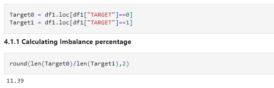
The Imbalance ratio we got is "11.39"
Let’s check the distribution of the target variable visually using a pie chart.
count1 = 0
count0 = 0
for i in df1['TARGET'].values:
    if i == 1:
        count1 += 1
    else:
        count0 += 1

count1 = (count1/len(df1['TARGET']))*100
count0 = (count0/len(df1['TARGET']))*100

x = ['Defaulted Population(TARGET=1)','Non-Defauted Population(TARGET=0)']
y = [count1, count0]

explode = (0.1, 0)  # only "explode" the 1st slice

fig1, ax1 = plt.subplots()
ax1.pie(y, explode=explode, labels=x, autopct='%1.1f%%',
        shadow=True, startangle=110)
ax1.axis('equal')  # Equal aspect ratio ensures that pie is drawn as a circle.
plt.title('Data imbalance',fontsize=25)
plt.show()
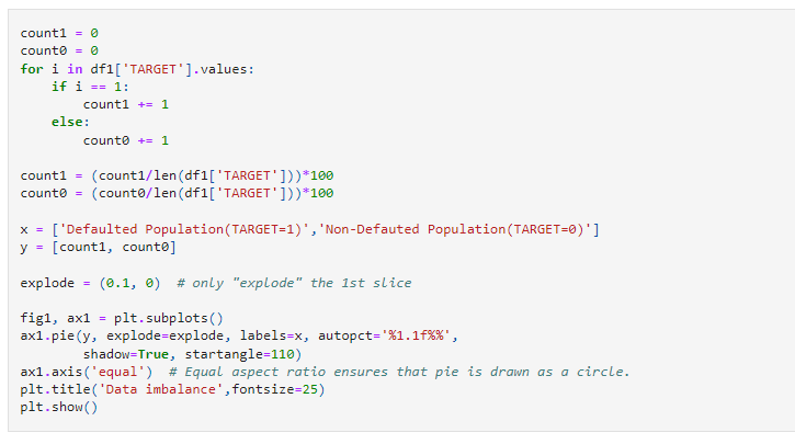
Result:
Insights
- df1 dataframe that is application data is highly imbalanced.
Defaulted population is 8.1 % and non- defaulted population is 91.9%.Ratio is11.3
We will separately analyse the data based on the target variable for a better understanding.
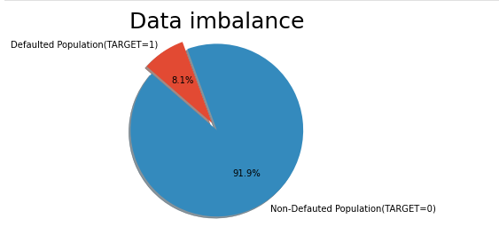
plt.figure(figsize=(15,8))
plt.subplot(121)
sns.countplot(x='TARGET',hue='CODE_GENDER',data=Target0, palette = 'Set2')
plt.title("Gender Distribution in Target0")
plt.subplot(122)
sns.countplot(x='TARGET',hue='CODE_GENDER',data=Target1, palette = 'Set2')
plt.title("Gender Distribution in Target1")

plt.show()
Insights
- It seems like Female clients applied higher than male clients for loan
66.6% Femaleclients are non-defaulters while33.4% maleclients are non-defaulters.57% Femaleclients are defaulters while42% maleclients are defaulters.
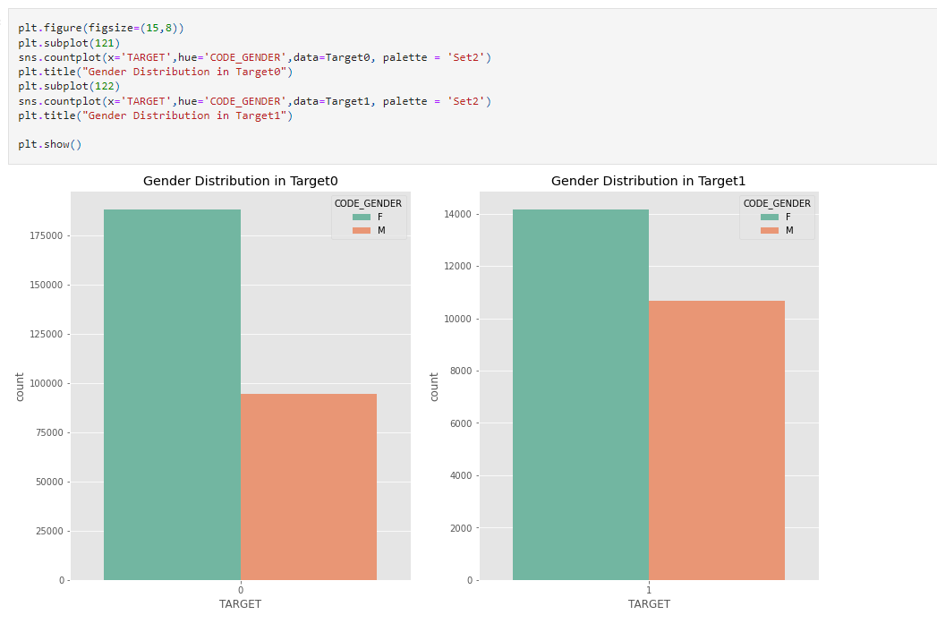
plt.figure(figsize=(15,7))
plt.subplot(121)
sns.countplot(x='TARGET',hue='AGE_GROUP',data=Target0,palette='Set2')
plt.subplot(122)
sns.countplot(x='TARGET',hue='AGE_GROUP',data=Target1,palette='Set2')
plt.show()
Source: Author
Insights
Middle Age(35-60)the group seems to applied higher than any other age group for loans in the case of Defaulters as well as Non-defaulters.
- Also,
Middle Agegroup facing paying difficulties the most.
- While
Senior Citizens(60-100)andVery young(19-25)age group facing paying difficulties less as compared to other age groups.
Organization’s Distribution Based on Target 0 and Target 1
plt.figure(figsize=(40,5))
plt.rcParams["axes.labelsize"] = 80
plt.rcParams['axes.titlesize'] = 80                                                           # Plot Configuration
plt.rcParams['axes.titlepad'] = 50
fig, axes = plt.subplots(nrows=1,ncols=2)
sns.set_context('talk')
fig.subplots_adjust(left= 0.09,bottom=1,right=3,top= 12,wspace=0.5,hspace=0.3)


plt.subplot(121)
plt.xscale('log')                                                                             # For Target0
sns.countplot(data=Target0,y='ORGANIZATION_TYPE',
              order=df1['ORGANIZATION_TYPE'].value_counts().index,palette='Set3',hue = 'TARGET')
plt.title("ORGANIZATION_TYPE Vs Target 0")


plt.subplot(122)
plt.xscale('log')                                                                              # For Target1
sns.countplot(data=Target1,y='ORGANIZATION_TYPE',
              order=df1['ORGANIZATION_TYPE'].value_counts().index,palette='Set1',hue = 'TARGET')
plt.title("ORGANIZATION_TYPE Vs Target 1")


plt.show();
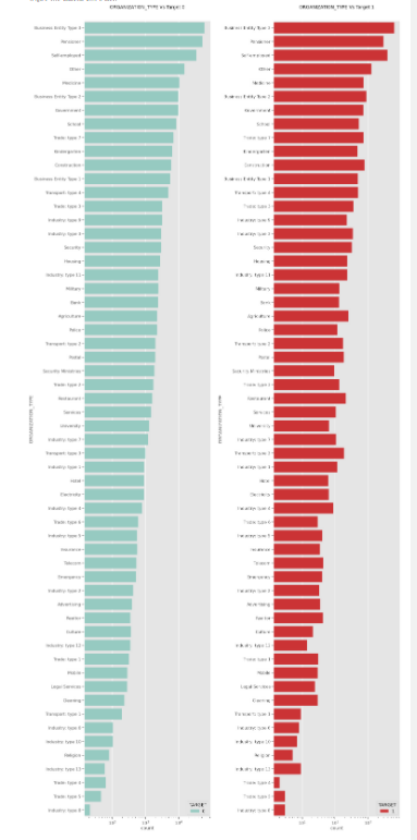
Insights
- (Defaulters as well as Non-defaulters) Clients with ORGANIZATION_TYPE
Business Entity Type 3, Self-employed, Other ,Medicine, Government,Business Entity Type 2applied the most for the loan as compared to others
- (Defaulters as well as Non-defaulters) Clients having ORGANIZATION_TYPE
Industry: type 13, Trade: type 4, Trade: type 5, Industry: type 8applied lower for the loan as compared to others.
Creating a plot for each feature manually becomes a too tedious task. So we will define a function and use a loop to iterate through each categorical column.
def categorical_plot(var):
    plt.figure(figsize=(40,20))

    plt.rcParams['axes.labelpad'] = 50
    plt.subplot(1, 2, 1)
    sns.countplot(var, data=Target0, palette = 'Set3', hue='TARGET')
    plt.xlabel(var, fontsize= 30, fontweight="bold")                                                         #Target 0
    plt.ylabel('Non Payment Difficulties', fontsize= 30, fontweight="bold")
    plt.xticks(rotation=90, fontsize=30)
    plt.yticks(rotation=360, fontsize=30)


    plt.rcParams['axes.labelpad'] = 50
    plt.subplot(1, 2, 2)
    sns.countplot(var, data=Target1, palette = 'Set1', hue='TARGET')                                           # Target 1
    plt.xlabel(var, fontsize= 30, fontweight="bold")
    plt.ylabel('Payments Difficulties', fontsize= 30, fontweight="bold")
    plt.xticks(rotation=90, fontsize=30)
    plt.yticks(rotation=360, fontsize=30)
    plt.show()
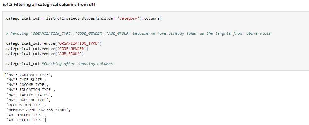
Let’s create a list for all categorical columns.
categorical_col = list(df1.select_dtypes(include= 'category').columns)


# Removing 'ORGANIZATION_TYPE','CODE_GENDER','AGE_GROUP' because we have already taken up the isights from  above plots

categorical_col.remove('ORGANIZATION_TYPE')
categorical_col.remove('CODE_GENDER')
categorical_col.remove('AGE_GROUP')

categorical_col #Checking after removing columns
for cat in categorical_col:
    categorical_plot(cat)
Result:
Insights
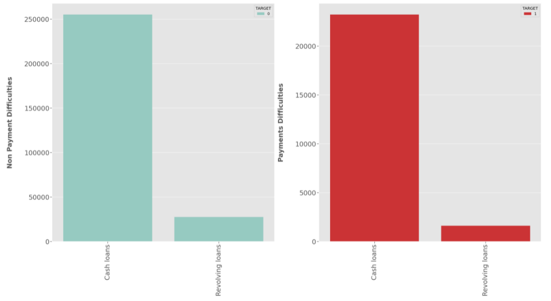
NAME_CONTRACT_TYPE:
- Most of the clients have applied for
Cash Loanwhile very small proportion have applied forRevolving loanfor both Defaulters as well as Non-defaulters.
- Most of the clients have applied for
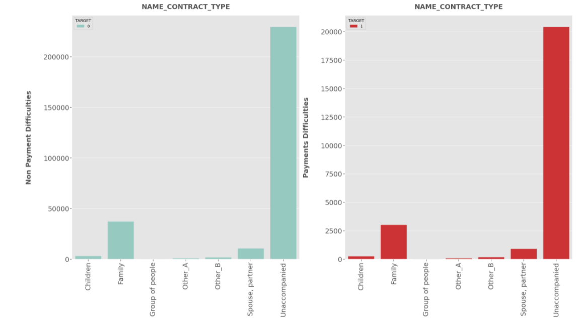
NAME_TYPE_SUIT:
- Most of the clients were accompanied while applying for the loan.And with few clients a family member was accompanying for both Defaulters and Non-Defaulters.
- But who was accompanying client while applying for the loan doesn’t impact on the default.Also both the populations have same proportions.
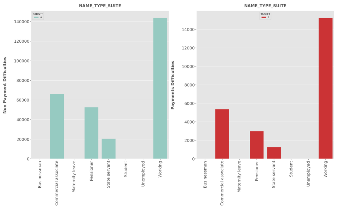
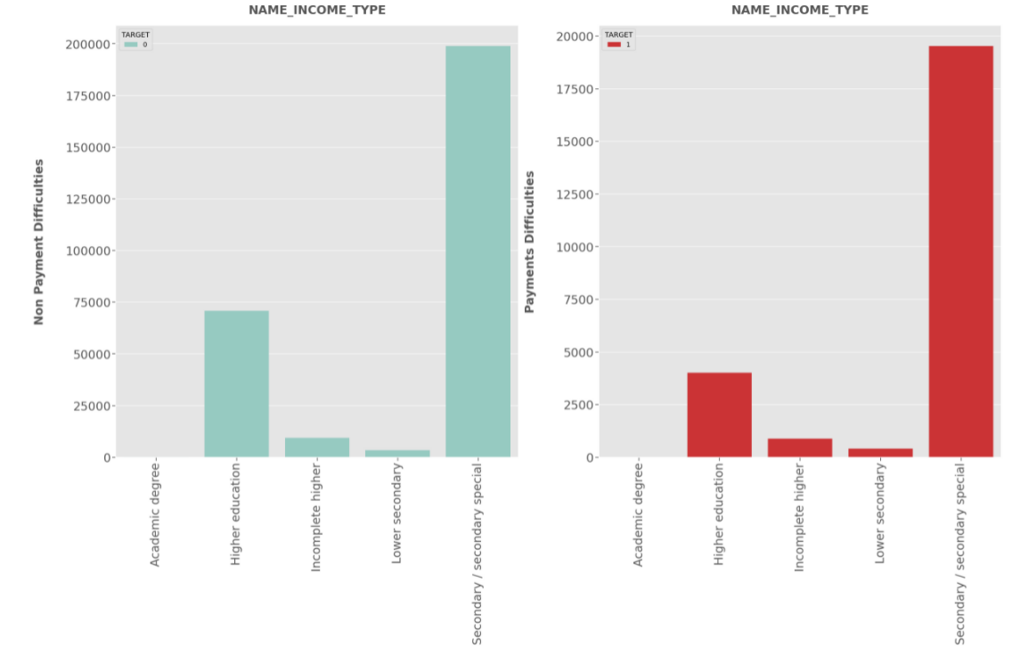
NAME_INCOME_TYPE:
- Clients who applied for loans were getting income by Working,Commercial associate and Pensioner are more likely to apply for the loan, highest being the
Working class category. - Businessman, students and Unemployedless likely to apply for loan .
- Working category have high risk to default.
- State Servant is at Minimal risk to default.
- Clients who applied for loans were getting income by Working,Commercial associate and Pensioner are more likely to apply for the loan, highest being the
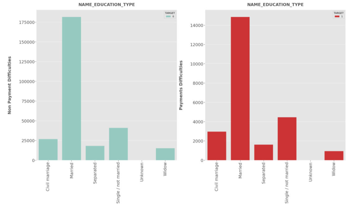
NAME_EDUCATION_TYPE:
- Clients having education
Secondary or Secondary Specialare more likey to apply for the loan. - Clients having education
Secondary or Secondary Specialhave higher risk to default.Other education types have minimal risk.
- Clients having education
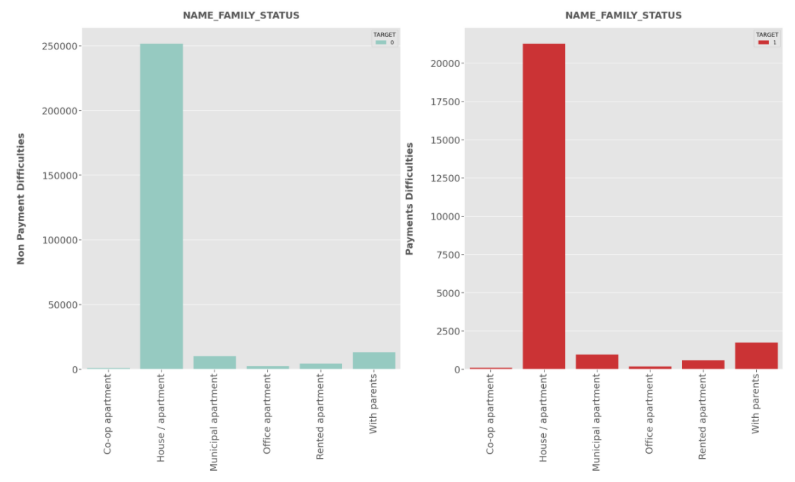
NAME_FAMILY_STATUS:
- Married Clients seems to be applied most for the loan compared to others for both Defaulters and Non-Defaulters.
- In case of Defaulters,Clients having single relationship are less risky
- In case of Defaulters, Widows shows Minimal risk.
NAME_HOUSING_TYPE:
- From the bar chart, it is clear that Most of the clients own a house or living in a apartment for both Defaulters and Non-Defaulters.
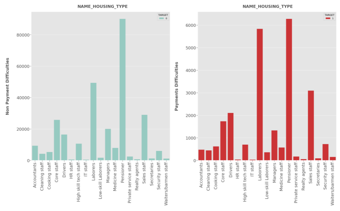
OCCUPATION_TYPE:
- Pensioners have applied the most for the loan in case of Defaulters and Non-Defaulters.
- Pensioner being highest followed by
laborershave high risk to default.
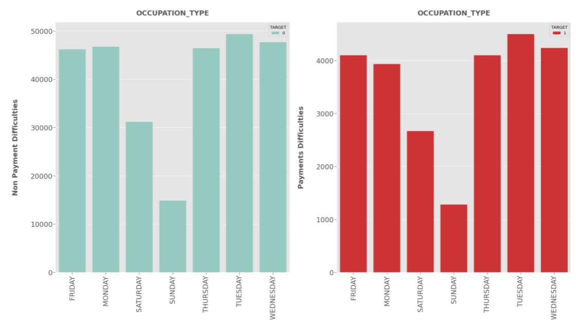
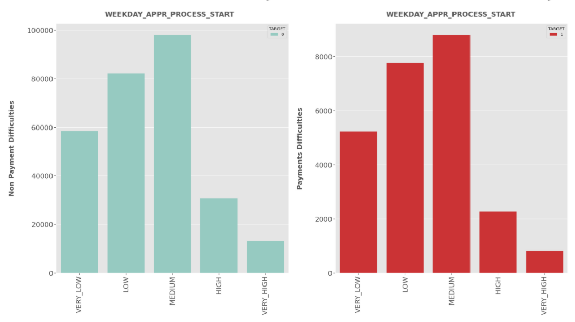
WEEKDAY_APPR_PROCESS_START:
- There is no considerable difference in days for both Defaulters and Non-defaulters.
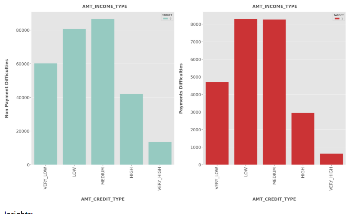
AMT_INCOME_TYPE:
- Clients having Medium salary range are more likely to apply for the loan for both Defaulters and Non-defaulters.
- Clients having
lowandmediumincome are at high risk to default.
AMT_CREDIT_TYPE:
- Most of the clients applied for Medium Credit Amount of the loan for both Defaulters and Non-defaulters.
- Clients applying for
highandlowcredit are at high risk of default.
Univariate Analysis of Numerical Columns W.R.T Target Variable
def uni(col):
    sns.set(style="darkgrid")
    plt.figure(figsize=(40,20))


    plt.subplot(1,2,1)
    sns.distplot(Target0[col], color="g" )
    plt.yscale('linear')
    plt.xlabel(col, fontsize= 30, fontweight="bold")
    plt.ylabel('Non Payment Difficulties', fontsize= 30, fontweight="bold")                    #Target 0
    plt.xticks(rotation=90, fontsize=30)
    plt.yticks(rotation=360, fontsize=30)


    plt.subplot(1,2,2)
    sns.distplot(Target1[col], color="r")
    plt.yscale('linear')
    plt.xlabel(col, fontsize= 30, fontweight="bold")
    plt.ylabel('Payment Difficulties', fontsize= 30, fontweight="bold")                       # Target 1
    plt.xticks(rotation=90, fontsize=30)
    plt.yticks(rotation=360, fontsize=30)

    plt.show();
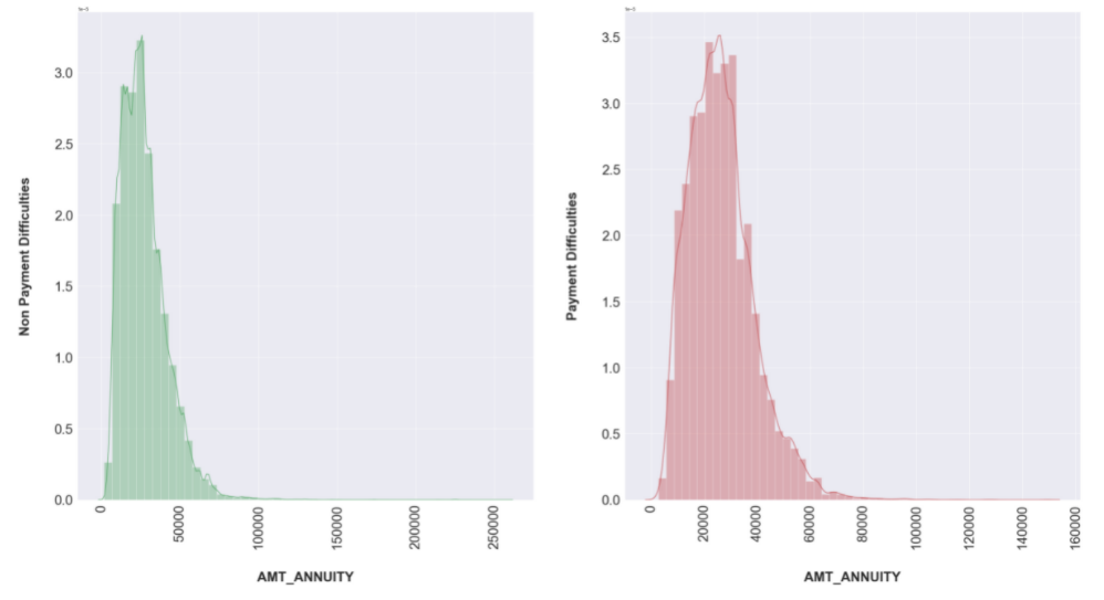
uni(col='AMT_ANNUITY')
Result:
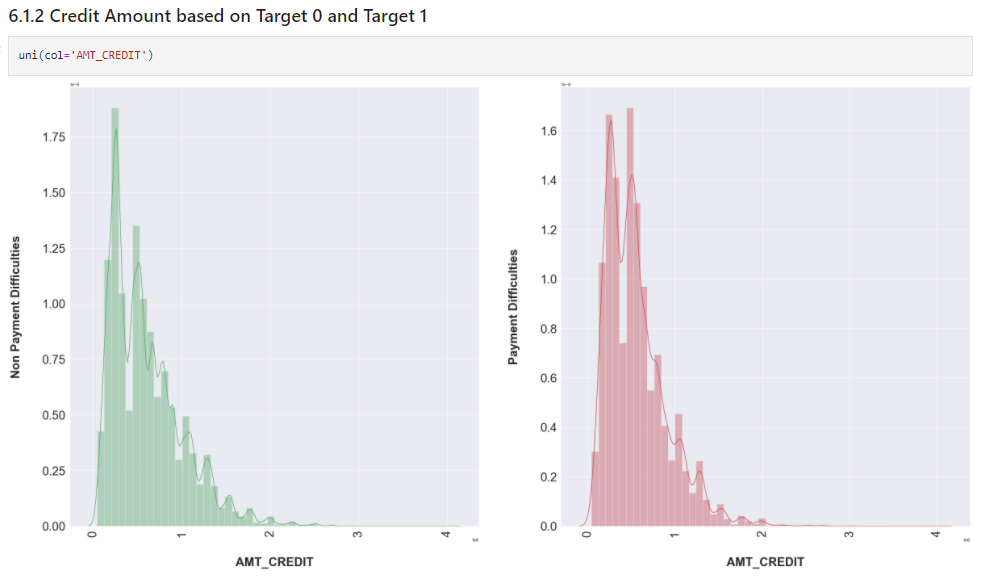
uni(col='AMT_CREDIT')
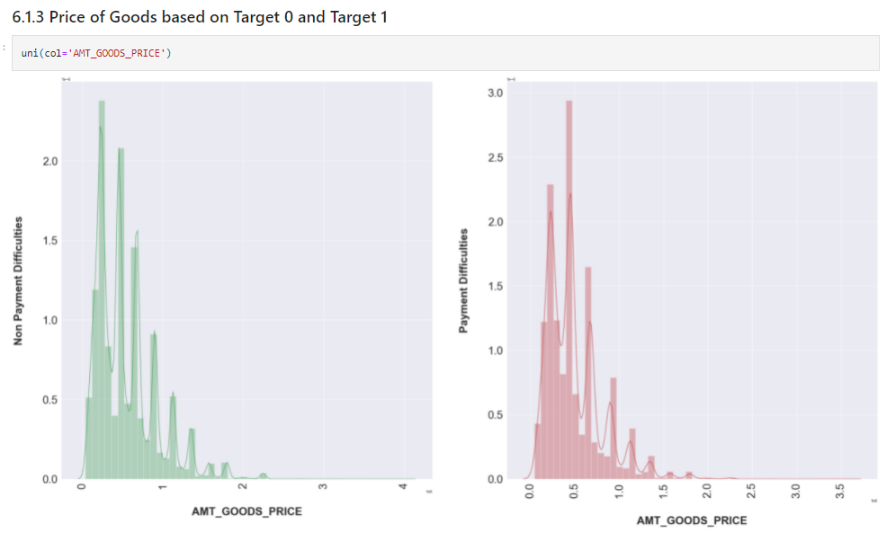
uni(col='AMT_GOODS_PRICE')
uni(col='AMT_INCOME_TOTAL')
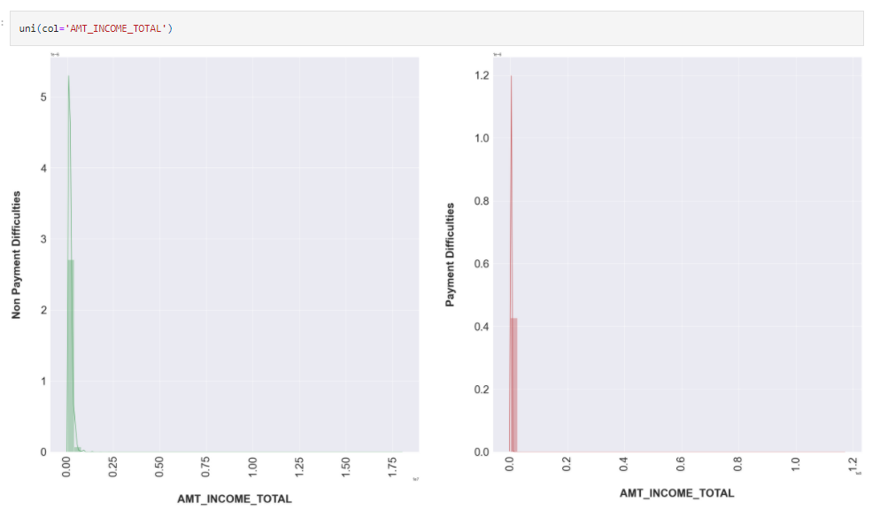
Insights
- People with target one has largely staggered income as compared to target zero. Dist. plot clearly shows that the shape in Income total, Annuity, Credit and Good Price is similar for Target 0 and similar for Target 1.
- The plots are also highlighting that people who have difficulty in paying back loans with respect to their income, loan amount, price of goods against which loan is procured and Annuity.
- Dist. plot highlights the curve shape which is wider for Target 1 in comparison to Target 0 which is narrower with well-defined edges.
Bivariate Analysis: Numerical & Categorical W.R.T Target variables
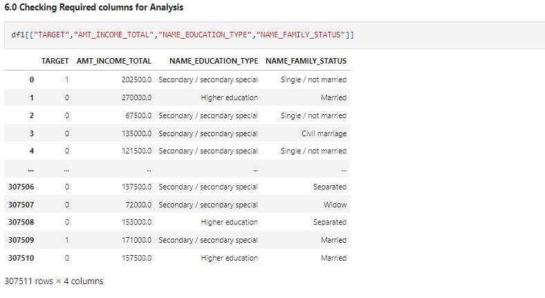
Let’s check the required columns for analysis.
df1[["TARGET","AMT_INCOME_TOTAL","NAME_EDUCATION_TYPE","NAME_FAMILY_STATUS"]]
For Target 0
plt.figure(figsize=(35,14))
plt.yscale('log')                     #As the values are too large, it is convinient to use log for better analysis
plt.xticks(rotation = 90)


sns.boxplot(data =Target0, x='NAME_EDUCATION_TYPE',y='AMT_INCOME_TOTAL',   #Boxplot w.r.t Data Target 0
            hue ='NAME_FAMILY_STATUS',orient='v',palette='Set2')


plt.legend( loc = 'upper right')                                              #Adjusting legend position
plt.title('Income amount vs Education Status',fontsize=35 )
plt.xlabel("NAME_EDUCATION_TYPE",fontsize= 30, fontweight="bold")
plt.ylabel("AMT_INCOME_TOTAL",fontsize= 30, fontweight="bold")
plt.xticks(rotation=90, fontsize=30)
plt.yticks(rotation=360, fontsize=30)

plt.show()
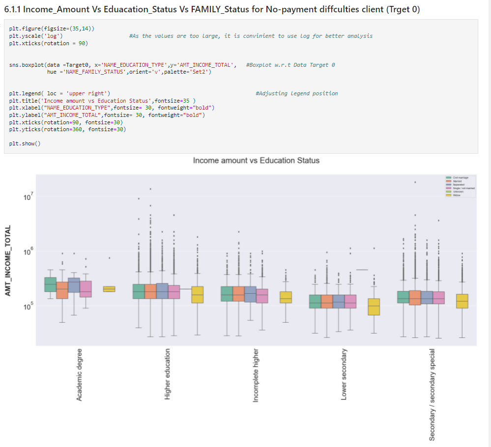
Insights
- Widow Client with Academic degree have very few outliers and doesn’t have First and Third quartile. Also, Clients with all types of family statuses having academic degrees have very less outliers as compared to other types of education.
- Income of the clients with all types of family status having rest of the education type lie Below the First quartile i.e.
25%
- Clients having Higher Education, Incomplete Higher Education, Lower Secondary Education and Secondary/Secondary Special have a higher number of outliers.
- From the above figure, we can say that some of the clients having Higher Education tend to have the highest income compared to others.
- Though some of the clients who haven’t completed their Higher Education tend to have higher incomes.
- Some of the clients having Secondary/Secondary Special Education tend to have higher incomes.
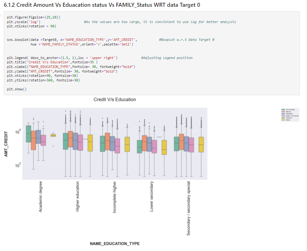
plt.figure(figsize=(25,10))
plt.yscale('log')                      #As the values are too large, it is convinient to use log for better analysis
plt.xticks(rotation = 90)


sns.boxplot(data =Target0, x='NAME_EDUCATION_TYPE',y='AMT_CREDIT',           #Boxplot w.r.t Data Target 0
            hue ='NAME_FAMILY_STATUS',orient='v',palette='Set2')


plt.legend( bbox_to_anchor=(1.5, 1),loc = 'upper right')            #Adjusting legend position
plt.title('Credit V/s Education',fontsize=35 )
plt.xlabel("NAME_EDUCATION_TYPE",fontsize= 30, fontweight="bold")
plt.ylabel("AMT_CREDIT",fontsize= 30, fontweight="bold")
plt.xticks(rotation=90, fontsize=30)
plt.yticks(rotation=360, fontsize=30)

plt.show()
Source: Author
Insights
- Clients with different Education types except Academic degrees have a large number of outliers**
- Most of the population i.e. clients’ credit amounts lie below 25%.
- Clients with an Academic degree and who is a widow tend to take higher credit loan.**
- Some of the clients with Higher Education, Incomplete Higher Education, Lower Secondary Education and Secondary/Secondary Special Education are more likely to take a high amount of credit loans.
plt.figure(figsize=(30,12))
plt.yscale('log')                     #As the values are too large, it is convinient to use log for better analysis
plt.xticks(rotation = 90)


sns.boxplot(data =Target1, x='NAME_EDUCATION_TYPE',y='AMT_INCOME_TOTAL',   #Boxplot w.r.t Data Target 1
            hue ='NAME_FAMILY_STATUS',orient='v',palette='Set2')


plt.legend( loc = 'upper right')                                              #Adjusting legend position
plt.title('Income amount vs Education Status',fontsize= 35)
plt.xlabel("NAME_EDUCATION_TYPE",fontsize= 30, fontweight="bold")
plt.ylabel("AMT_INCOME_TOTAL",fontsize= 30, fontweight="bold")
plt.xticks(rotation=90, fontsize=30)
plt.yticks(rotation=360, fontsize=30)

plt.show()
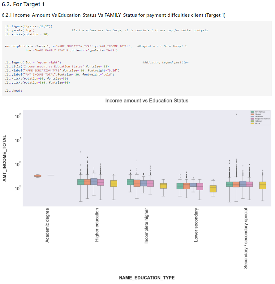
Insights
- The income amount for Married clients with an academic degree is much lesser as compared to others.
- (Defaulter) Clients have relatively less income as compared to Non-defaulters.
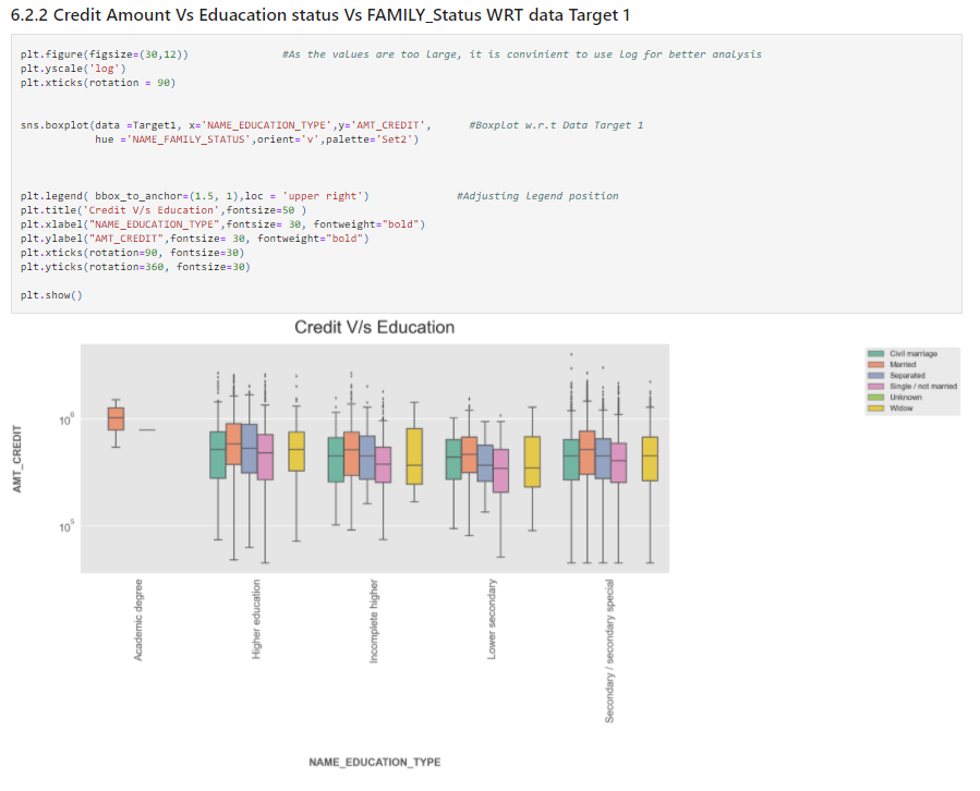
plt.figure(figsize=(30,12))               #As the values are too large, it is convinient to use log for better analysis
plt.yscale('log')
plt.xticks(rotation = 90)


sns.boxplot(data =Target1, x='NAME_EDUCATION_TYPE',y='AMT_CREDIT',      #Boxplot w.r.t Data Target 1
            hue ='NAME_FAMILY_STATUS',orient='v',palette='Set2')


plt.legend( bbox_to_anchor=(1.5, 1),loc = 'upper right')              #Adjusting legend position
plt.title('Credit V/s Education',fontsize=50 )
plt.xlabel("NAME_EDUCATION_TYPE",fontsize= 30, fontweight="bold")
plt.ylabel("AMT_CREDIT",fontsize= 30, fontweight="bold")
plt.xticks(rotation=90, fontsize=30)
plt.yticks(rotation=360, fontsize=30)

plt.show()
Source: Author
Insights
- Married client with academic applied for a higher credit loan. And doesn’t have outliers. Single clients with academic degrees have a very slim boxplot with no outliers.
- Some of the clients with Higher Education, Incomplete Higher Education, Lower Secondary Education and Secondary/Secondary Special Education are more likely to take a high amount of credit loans.
Bivariate Analysis of Categorical-Categorical to Find the Maximum % Clients with Loan-Payment Difficulties
Define a function for bivariate plots
def biplot(df,feature,title):
    temp = df[feature].value_counts()

# Calculate the percentage of target=1 per category value

    perc = df[[feature, 'TARGET']].groupby([feature],as_index=False).mean()
    perc.sort_values(by='TARGET', ascending=False, inplace=True)
    fig = make_subplots(rows=1, cols=2,
                        subplot_titles=("Count of "+ title,"% of Loan Payment difficulties within each category"))
    fig.add_trace(go.Bar(x=temp.index, y=temp.values),row=1, col=1)
    fig.add_trace(go.Bar(x=perc[feature].to_list(), y=perc['TARGET'].to_list()),row=1, col=2)
    fig['layout']['xaxis']['title']=feature
    fig['layout']['xaxis2']['title']=feature
    fig['layout']['yaxis']['title']='Count'
    fig['layout']['yaxis2']['title']='% of Loan Payment Difficulties'
    fig.update_layout(height=600, width=1000, title_text=title, showlegend=False)
    fig.show()
Distribution of Amount Income Range and the category with maximum % Loan-Payment Difficulties
biplot(df1 ,'AMT_INCOME_TYPE','Income range')
Distribution of Type of Income and the category with maximum Loan-Payment Difficulties
biplot(df1 ,'NAME_INCOME_TYPE','Income type')
Distribution of Contract Type and the category with maximum Loan-Payment Difficulties
biplot(df1 ,'NAME_CONTRACT_TYPE','Contract type')
Distribution of Education Type and the category with maximum Loan-Payment Difficulties
biplot(df1 ,'NAME_EDUCATION_TYPE','Education type')
Distribution of Housing Type and the category with maximum Loan-Payment Difficulties
biplot(df1 ,'NAME_HOUSING_TYPE','Housing type')
Distribution of Occupation Type and the category with maximum Loan-Payment Difficulties
biplot(df1 ,'OCCUPATION_TYPE','Occupation type')
You may be wondering here why I haven’t attached screenshots here. Well, plot the charts and try to give insights based on that on your own. That’s the best way to learn.
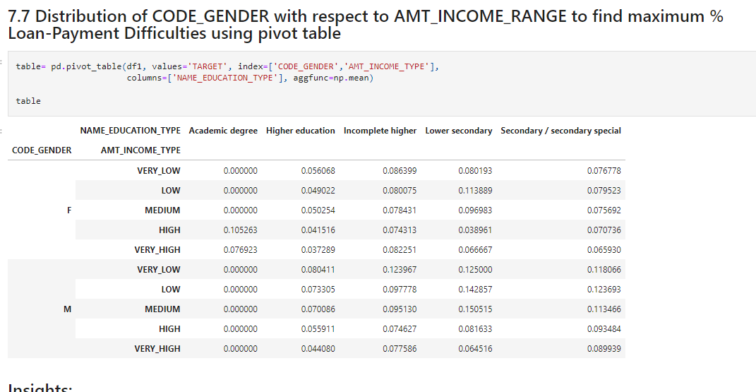
Distribution of CODE_GENDER with respect to AMT_INCOME_RANGE to find maximum % Loan-Payment Difficulties using pivot table
table= pd.pivot_table(df1, values='TARGET', index=['CODE_GENDER','AMT_INCOME_TYPE'],
                      columns=['NAME_EDUCATION_TYPE'], aggfunc=np.mean)

table
Source: Author
Insights
- Female clients with an Academic degree and high-income type have a higher risk of default
- Male clients with Secondary/Secondary Special Education having all types of salaries have a higher risk of default.
- Male clients with Incomplete Education having very low salaries have a high risk of default.
- Male Clients with Lower Secondary Education having very low or medium have a high risk to default
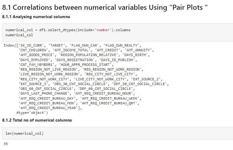
Let’s check correlations in the data visually. For that make a list of all numeric features.
numerical_col = df1.select_dtypes(include='number').columns
numerical_col
len(numerical_col)
Source: Author
Let’s use pairplot to get the required charts.
pair = Target0[['TARGET','AMT_CREDIT', 'AMT_ANNUITY', 'AMT_INCOME_TOTAL', 'AMT_GOODS_PRICE', 'DAYS_BIRTH','CNT_CHILDREN','DAYS_EMPLOYED']].fillna(0)
sns.pairplot(pair)

plt.show()
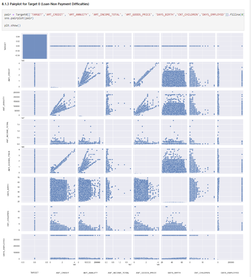
Source: Author
pair = Target1[['TARGET','AMT_CREDIT', 'AMT_ANNUITY', 'AMT_INCOME_TOTAL', 'AMT_GOODS_PRICE', 'DAYS_BIRTH','CNT_CHILDREN','DAYS_EMPLOYED']].fillna(0)
sns.pairplot(pair)

plt.show()
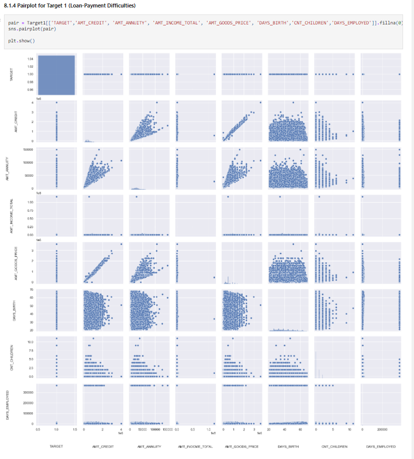
Insights
AMT_CREDITandAMT_GOODS_PRICEare highly correlated variables for both defaulters and non – defaulters. So as the home price increases the loan amount also increasesAMT_CREDITandAMT_ANNUITY(EMI) are highly correlated variables for both defaulters and non – defaulters. So as the home price increases the EMI amount also increases which is logical- All three variables
AMT_CREDIT,AMT_GOODS_PRICEandAMT_ANNUITYare highly correlated for both defaulters and non-defaulters, which might not give a good indicator for defaulter detection
Now, let’s check correlations using heatmaps.
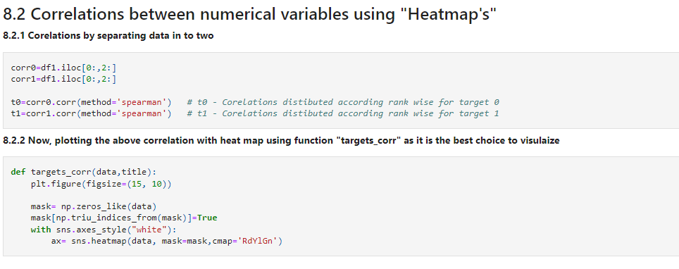
corr0=df1.iloc[0:,2:]
corr1=df1.iloc[0:,2:]

t0=corr0.corr(method='spearman')   # t0 - Corelations distibuted according rank wise for target 0
t1=corr1.corr(method='spearman')   # t1 - Corelations distibuted according rank wise for target 1
Source: Author
targets_corr(data=t0,title='Correlation for Target 0')
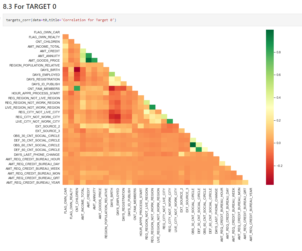
Insights
AMT_CREDITis inversely proportional to theDAYS_BIRTH, peoples belong to the low-age group taking high Credit amount and vice-versaAMT_CREDITis inversely proportional to theCNT_CHILDREN, means the Credit amount is higher for fewer children count clients have and vice-versa.AMT_INCOME_TOTALis inversely proportional to theCNT_CHILDREN, means more income for fewer children clients have and vice-versa.- fewer children clients have in a densely populated area.
AMT_CREDITis higher in a densely populated area.AMT_INCOME_TOTALis also higher in a densely populated area.
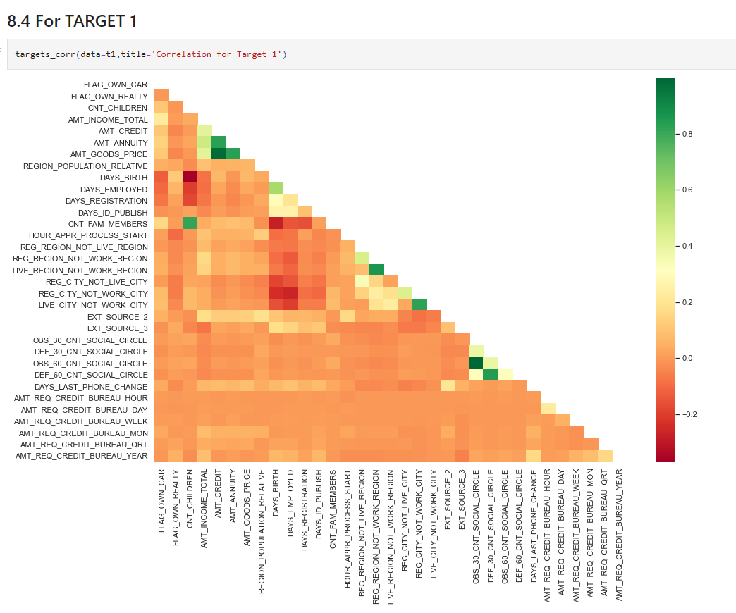
targets_corr(data=t1,title='Correlation for Target 1')
Source: Author
Insights
- This heat map for Target 1 is also having quite the same observation just like Target 0. But for a few points are different. They are listed below.
- The client’s permanent address does not match the contact address are having fewer children.
- The client’s permanent address does not match the work address are having fewer children.
This is the analysis of current application data. We have one more data for the previous applications & have to analyse that also. Consider that data and do the analysis. Try to give insights.
Conclusion
Now that we have understood and gained insight into the dataset ie performed an Exploratory Data Analysis, try to use ML algorithms to classify fraudulently. So let’s summarize what we have learnt in this case study,
- we have extensively covered pre-processing steps required to analyze data
- We have covered Null value imputation methods
- We have also covered step by step analyzing techniques such as Univariate analysis, Bivariate analysis, Multivariate analysis, etc
Find the link to the source code here.
Hope you enjoyed my article on exploratory data analysis. Thank you for reading!
Read more articles on exploratory data analysis on our blog.
The media shown in this article is not owned by Analytics Vidhya and are used at the Author’s discretion.


