This article was published as a part of the Data Science Blogathon.
Introduction on Tableau
Hi and welcome to this article. Visualization has become a necessary skill that eases the process of communicating with people outside your domain. And if you are a person struggling to get the right platform to start learning about visualization, this course is the right place.
Getting Started!
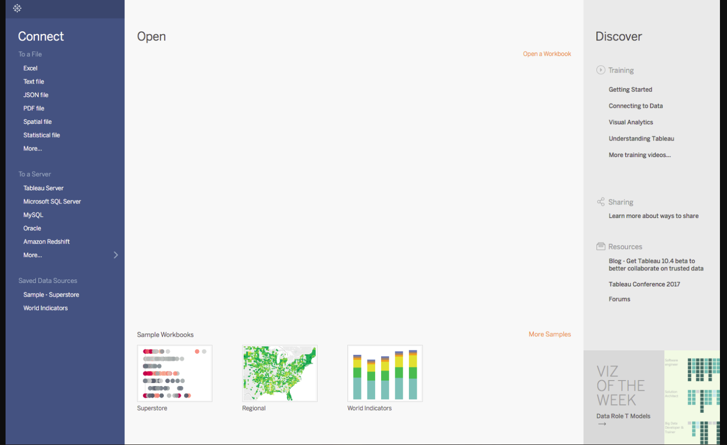
You should see a screen similar to the one above. This is where you import your data. As is visible, there are multiple formats that your data can be in. It can be in a flat-file such as Excel, or CSV or you can directly load it from data servers too.
You can see that Tableau itself offers some Sample Workbooks, with pre-drawn charts and graphs. I would suggest going through these later for further exploration.
The best way to learn is to get your hands dirty. Let us start with our Data, which can be found here. The data is that of a United States Superstore which is deliberating over its expansion. It wishes to know the prospective regions of the country where it could and hence requires your help.
The first thing that you will obviously need to do is import the data onto Tableau. So quickly follow the below steps:
1. Since the data is in an Excel File, click on Excel and choose the Sample – Superstore.xls file to get :
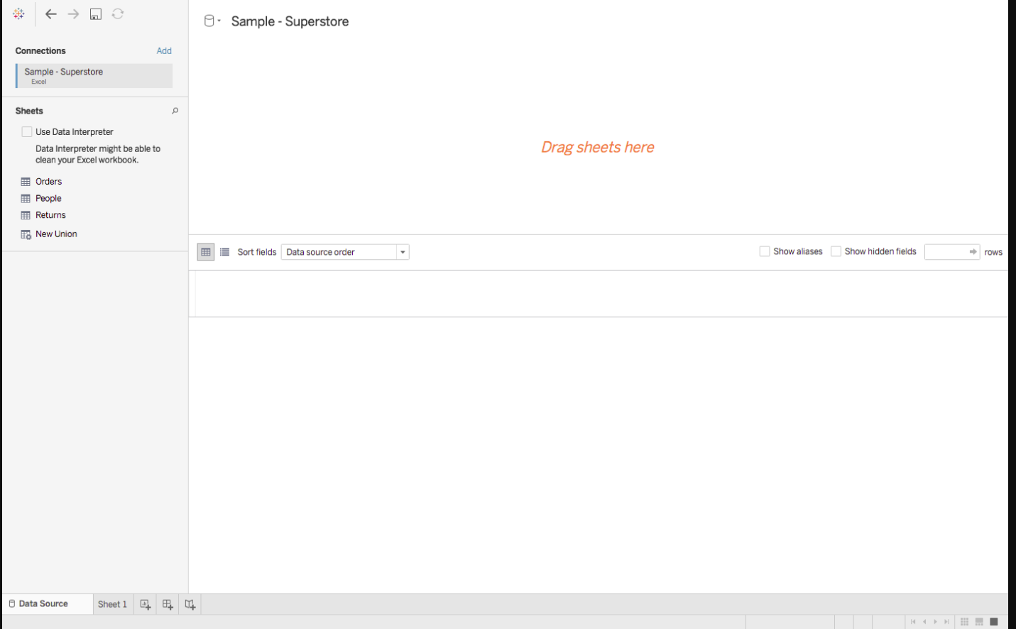
You can see three sheets on the screen, but we are only going to be dealing with Orders here, so go ahead and drag the same on Drag sheets here :
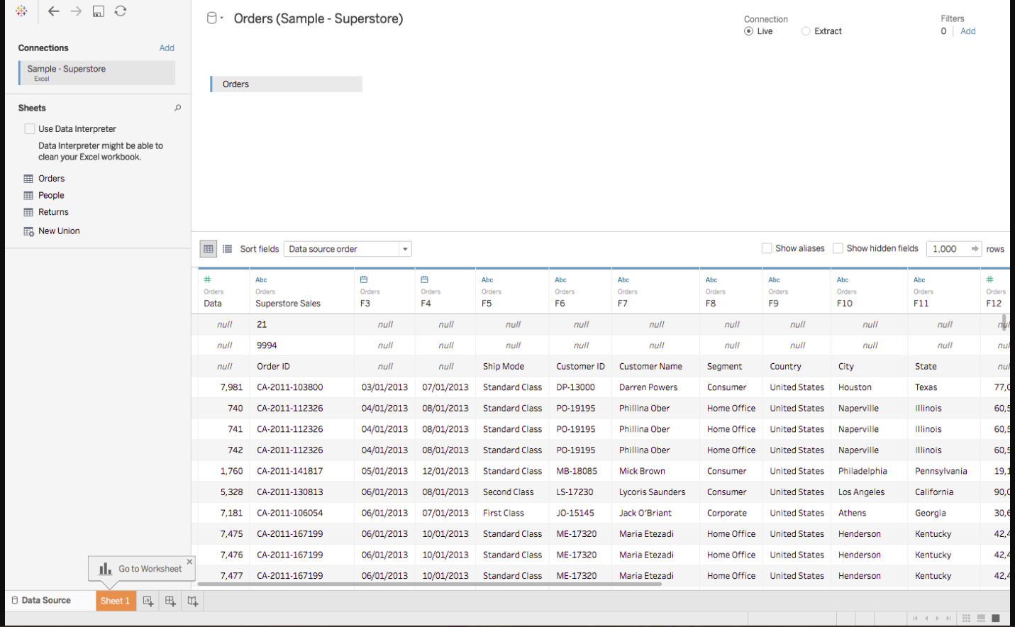
The imported data looks a bit different for the first few rows. Don’t worry, the solution lies right ahead.
Data Interpreter
3. Do You see the option of Use Data Interpreter? Click on it to get the following clean view :
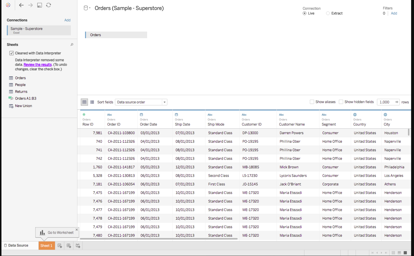
All that messy data magically disappeared!
If you open the Excel data file, you will see some metadata in it, i.e. information about data :
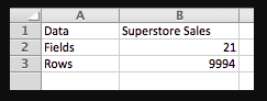
Tableau imports the entire data file as is, but anticipating such discrepancies, explicitly provides a solution in the form of a Data Interpreter. If you wish to view the exact changes that it made, click on Review the results, and choose the Orders tab in the opened Excel sheet.
As it will show, it simply removed the erroneous data.
Data Visualization
As soon as you had imported your dataset, next to the Data Source tab near the bottom of the screen, you immediately must have seen Go to Worksheet. A Worksheet is where you make all of your graphs, so click on that tab to reach the following screen :
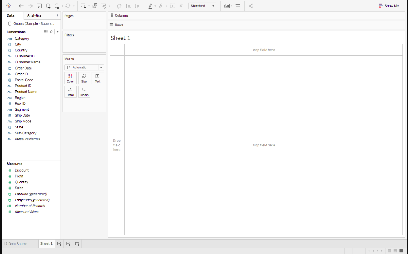
Don’t get overwhelmed by the various elements that you see here, we will cover them all one by one.
Let’s start with Dimensions and Measures:
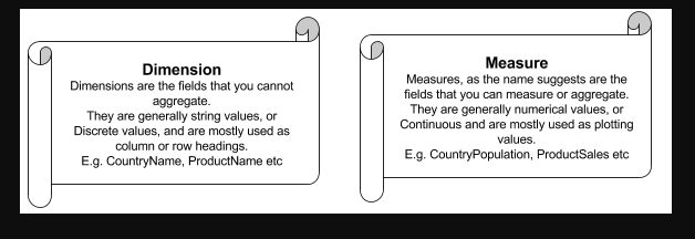
Visualization in Tableau is possible through dragging and dropping Measures and Dimensions onto these different Shelves.
- Rows and Columns: Represent the x and y-axis of your graphs/charts.
- Filter: Filters help you view a strained version of your data. For example, instead of seeing the combined Sales of all the Categories, you can look at a specific one, such as just Furniture.
- Pages: Pages work on the same principle as Filters, with the difference that you can actually see the changes as you shift between the Paged values. Remember that Rosling chart? You can easily make one of your own using Pages.
- Marks: The Marks property is used to control the mark types of your data. You may choose to represent your data using different shapes, sizes or text.
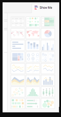
When you drag and drop fields onto the visualization area, Tableau makes default graphs for you, as we shall see soon, but you can change these by referring to the Show Me option.
Note:- Not every graph can be made with any combination of Dimensions or Measures. Each graph has its own conditions for the number and types of fields that can be used, which we shall discuss next.
Different Types of Charts in Tableau
Net Statistics
So far we have pretty much covered the requisite theoretical knowledge. Lets finally begin with some visualizations now.
We prefer to start from the shallow side of the pool, slowly swimming towards the deeper end. So we would suggest beginning by getting an overview of the Superstore Sales and Profit Statistics. That would include the Net Sales, the Net Profit and the growth of the two measures, to name a few. Here is a gist of what we will be making :
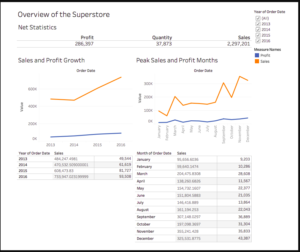
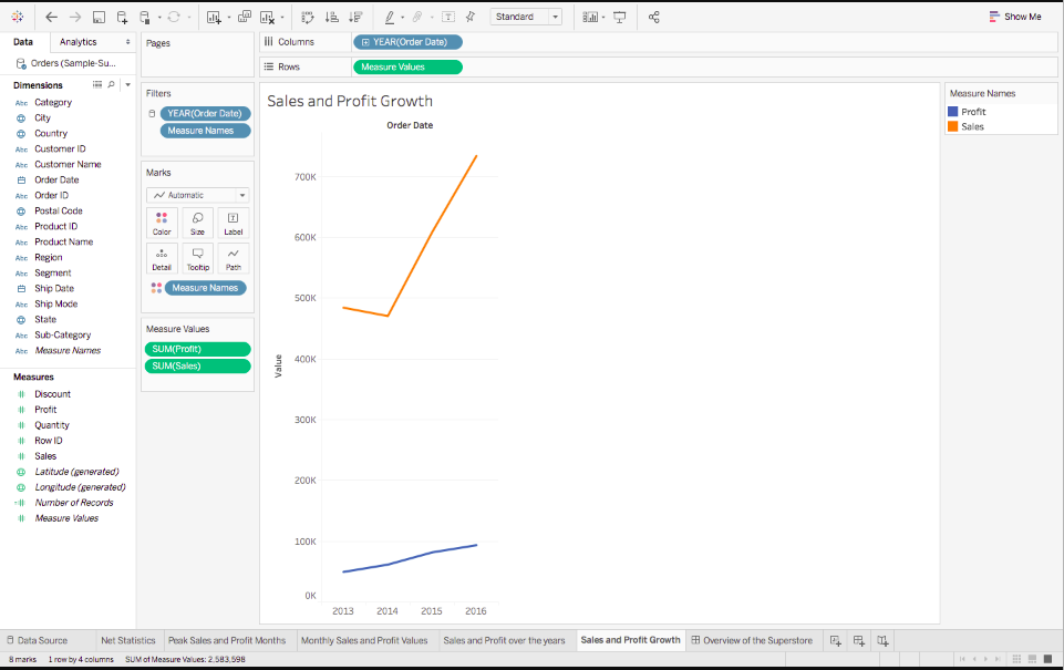
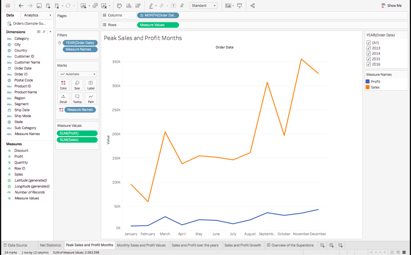
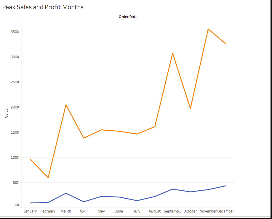
From what can be observed, the net sales are on the rise, but the Profit is creeping up slowly. We can also quite clearly see the peak of Sales Months, which could be attributed to various reasons. We can only know more as we explore more.
Before we start, there is one thing that I would like to recommend and that is you name your Worksheets as being done here. Since I will be referencing them back and forth throughout the article, it will be easier for you to follow.
Let’s begin with the simplest visualization, and that is displaying the Net Statistics numbers. Tableau, being as smart as it is, automatically computes such values under Measure Names and Measure Values. Follow these steps to make what is called a Text Table.
- Drag Measure Names from Dimensions onto the central empty area so that you see a Text Table.
- Measure Names will be displayed automatically onto Rows, so drag it from Rows to Columns.
- Since we don’t really need Measures like the Row ID, Discount, etc, you can drag them off from below the Marks Pane, to get something like this
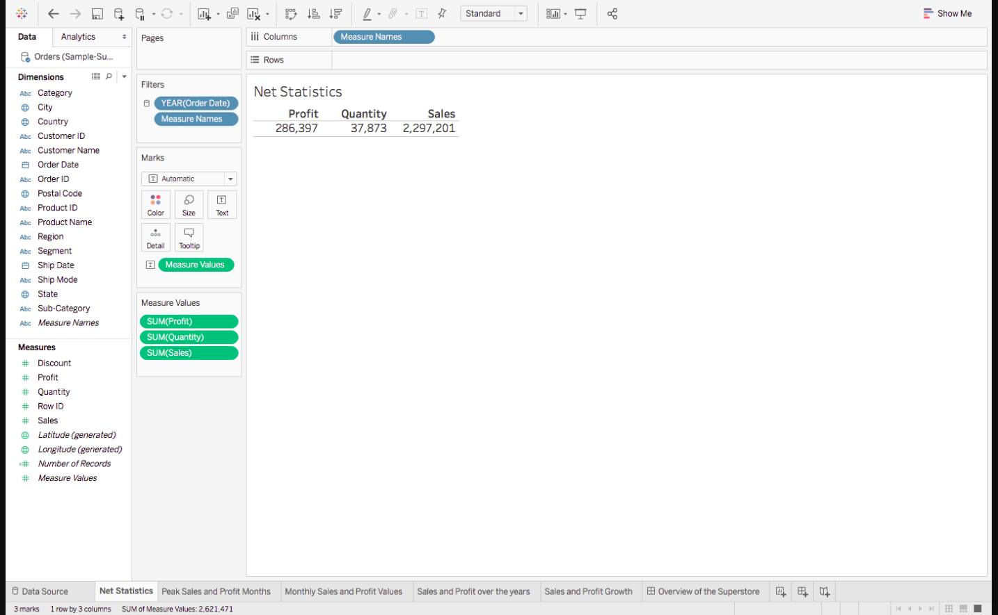
Note: Don’t get confused by the different colours of the fields that you see. Just remember one small trick: Blue means Discrete and Green, Continous.
Net Statistics Part 2
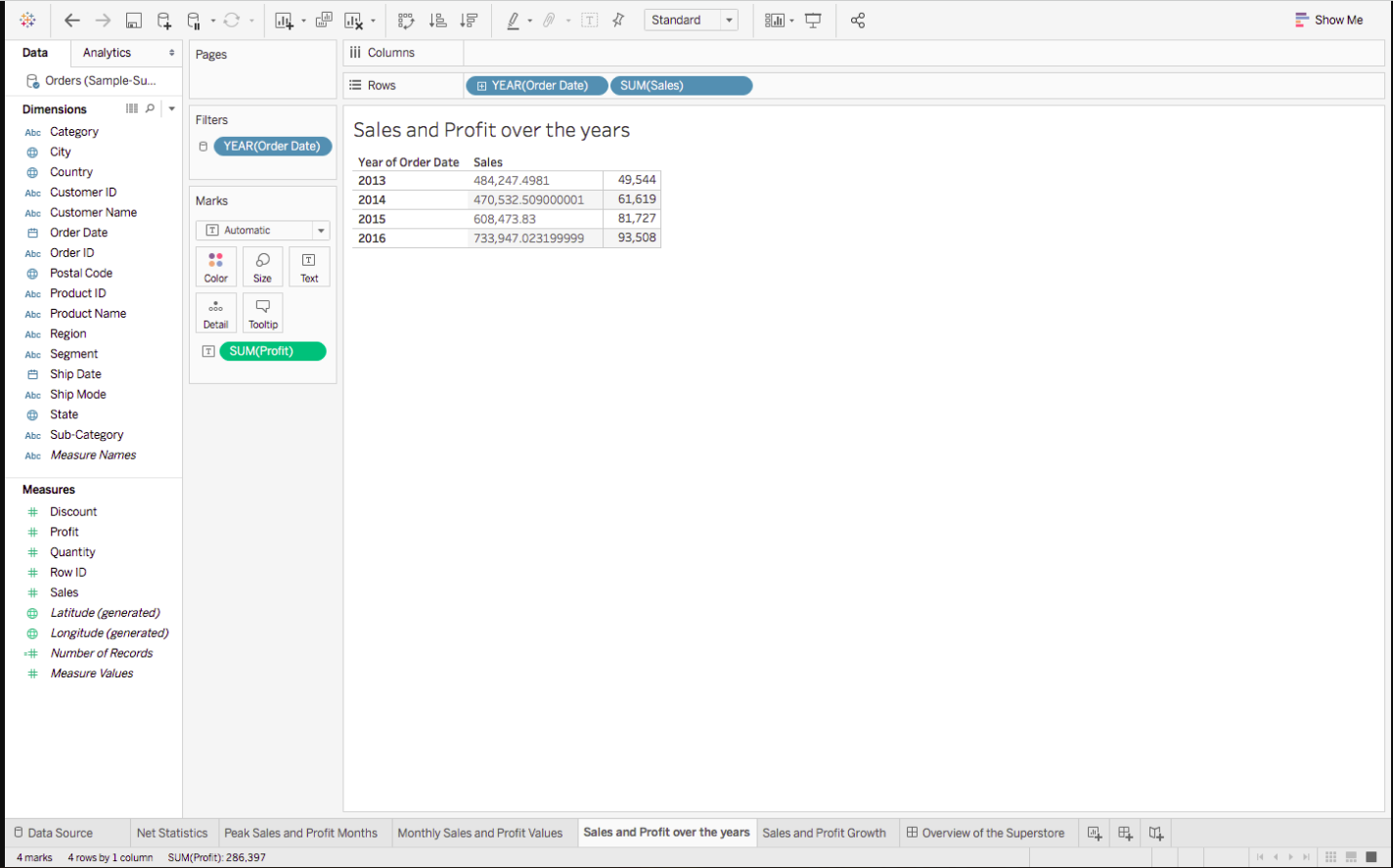
So we have the net Sales and Profit values, let’s delve a little deeper by getting the Sales and Profit Values over the years. Let’s make another, but a more detailed, Text Table :
Drag Order Date from Dimensions and Sales from Measures to Rows
Right-click on the green Sales Pill, and select Discrete, in place of Continuous, since we want the explicit values and not the bar graphs.
Finally, drag profit on the ‘abc’ column to get:
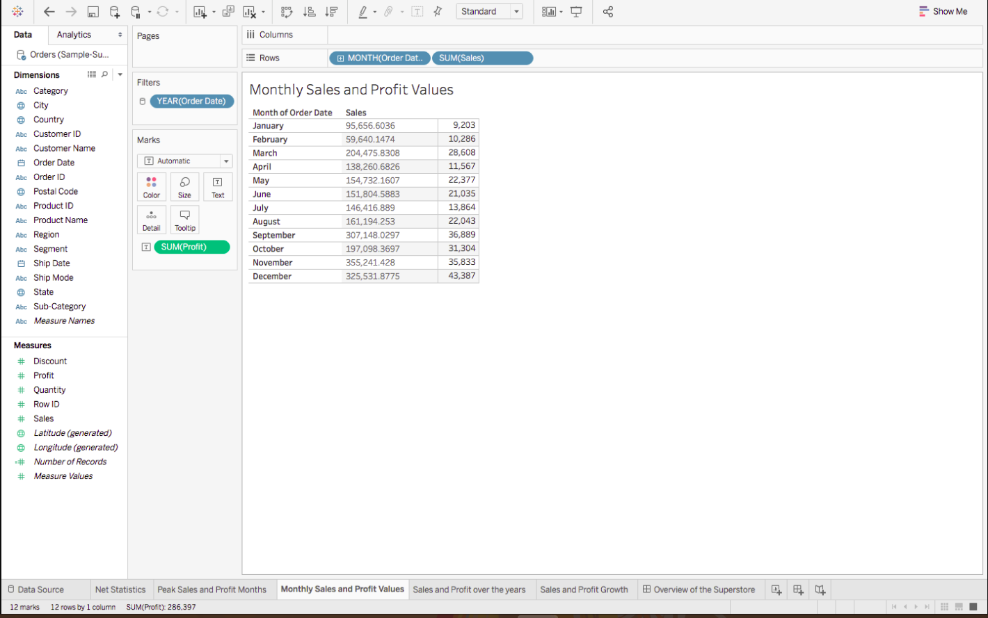
Do the same thing for Monthly Sales and Profit Values, but this time change the format of Order Date, from Year to Month, by right-clicking on Order Date in the Rows, and choosing Month, to get something like this :
Line Chart
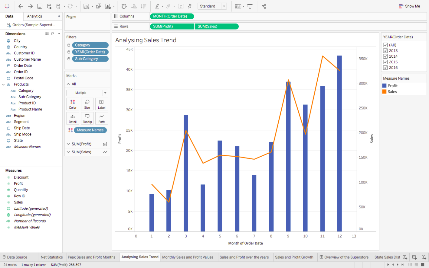
We have just covered the numeric part of the Dashboard, but that is not its selling point. It’s then Line chart. Lets quickly learn how to make one:
1. To create the chart of sales and profit growth, drag the order date over the Columns, sales over rows and then profit over the formed sales axis – so that you see an equals sign – to get the following :
2. Repeat the same to find the Peak Sales and Profit Months , but again change the format of Order Date , from Year to Month, and get:
If you were to click on show me, , you will see the different types of Line Charts that you can make, and if you were to hover over each of them, you will get to see their Dimension and Measure requirements too. In case you ever feel lost, we recommend referring to Show Me.
Pie Chart
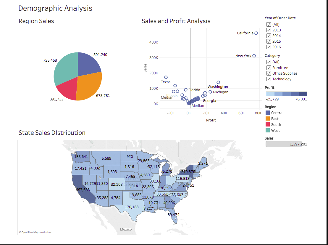
With the previous visualizations, we had gotten a brief overview of the Superstore. Let’s dig a little deeper now. The next thing that I can think of exploring is the demographic of the Sales and Profit. What are the States that have the highest Sales Revenue, which ones are generating the maximum Profits:
Before discussing the inferences, let’s first create the Pie Chart of Region Sales:
- Drag Regions onto Rows and Sales onto Columns.
- Go to show me, and select the pie chart
- And finally, drag sales over the label in the marks pane to get:
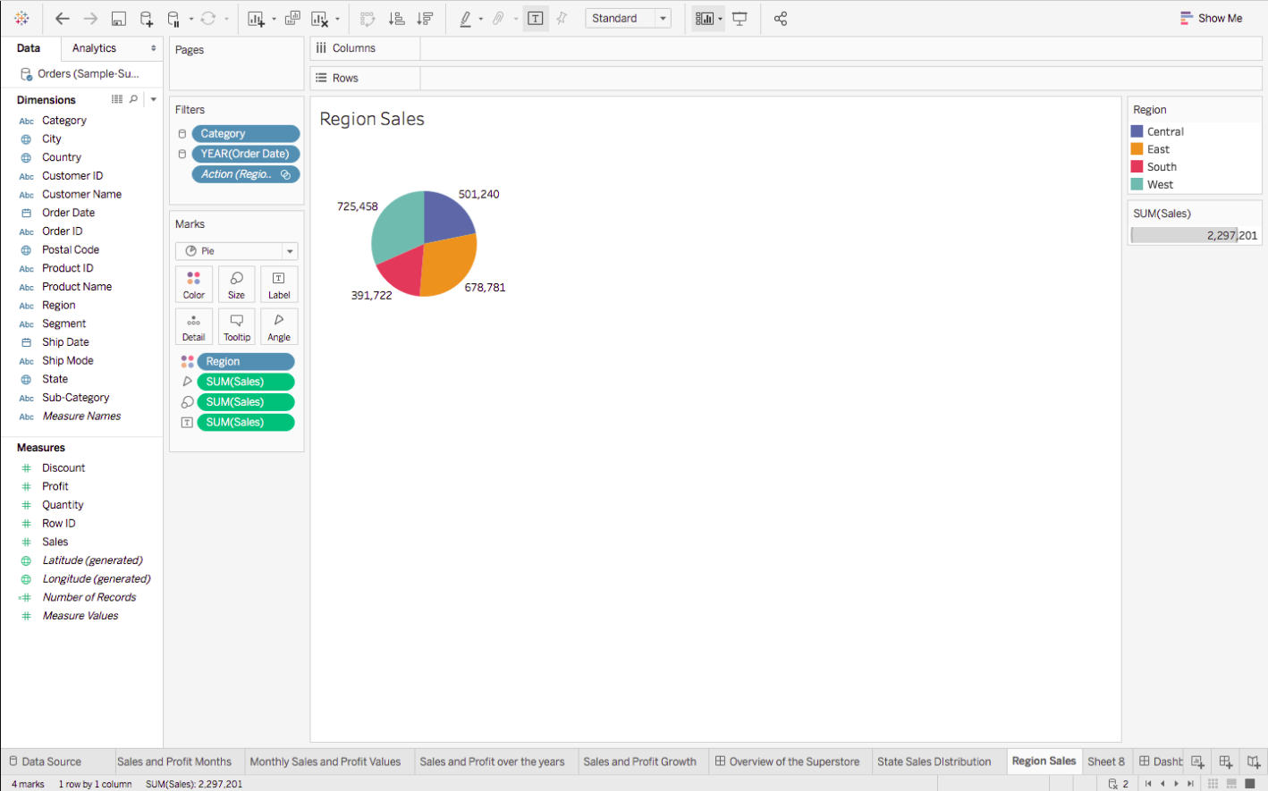
From the visual, it’s pretty evident that the two opposite ends, East and West are leading in the Sales game. Let’s dissect this a bit more.
Map Chart
Whenever you have some geographical data, it is always advisable to plot and see it on a Map to gain better insights.
So, we are now going to make the Map Chart of State Sales Distribution:
1. Since it’s the States that we wish to analyze, drag States onto the empty area, so that you automatically see a Map, with small Circles. Follow this step by dragging Profits next. You will notice the size of these circles changing to represent the varying values of Profits. This is called a Symbol Map. But we are going to convert this into a Filled one, by going to Show Me, and selecting the Filled Map.
2. Drag Profits again, but this time onto Label in the Marks Pane, to view the Profit Values mapped as well, like so :
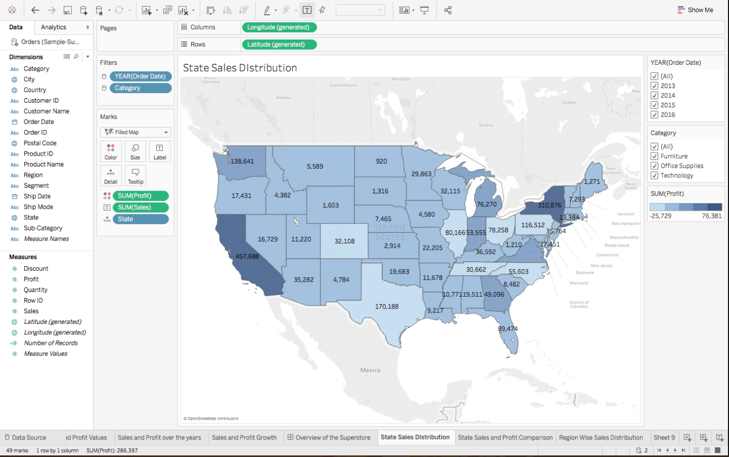
California and New York are the top sellers from the West and East region, but unfortunately, there are other states such as Texas, and Colorado which even after having good Sales, have negative Profits! This is certainly not good news for the Superstore. You can perceive a good analysis of the other States as well.
Scatter Plots
And lastly, here are the steps for making the scatter plot of sales and profit analysis:
- Drag Sales onto Rows, and Profit onto Columns. You will see one tiny circle, which actually represents the Total Sales and Profit Values.
- To get more information, drag States onto the graph created so that these circles/bubbles scatter to represent the individual States.
- To better understand the central tendency of the data, we have also added a Median axis as Reference Line. This can be easily done by right-clicking on the Sales / Profit Axis – > Adding Reference Line and choosing Median over the default Average Reference.
- Finally, for some more insight, drag States again, but this time onto Label in the Marks Pane, and get:
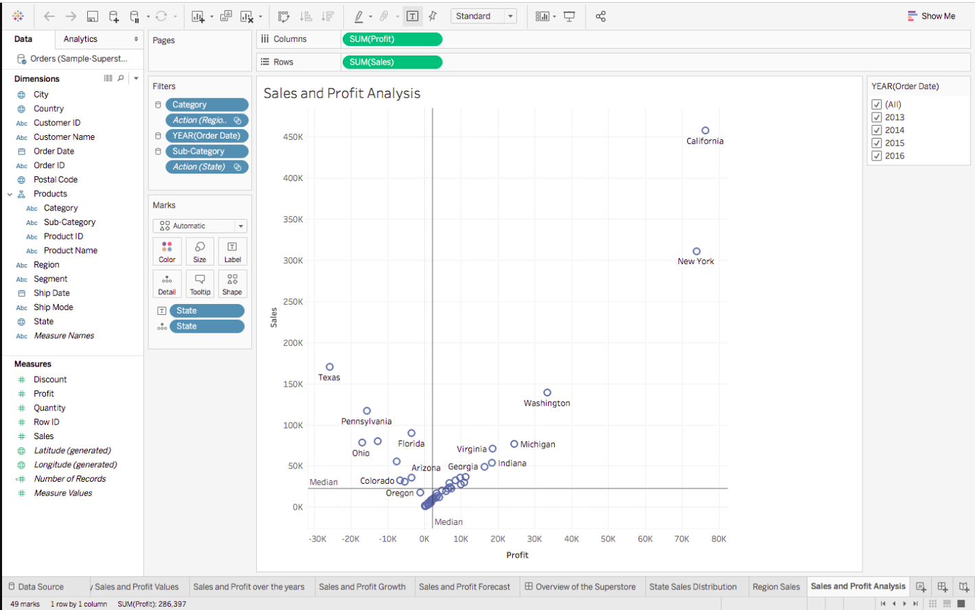
The findings from the Map chart become more prominent with the following Scatter plot inferences:
- The states in the top right, with high Sales and high Profits, mean good business for the organisation.
- States with positive Sales and Profits, but near the two respective axis are the ones where there is some scope of improvement.
- Whereas the states that belong to the 2nd or 3rd quarter are the ones which are not generating much revenue.
Other Functionalities in Tableau
-
Filters
Till now we have only made simple charts, that actually provide cumulative data, which is combined data over the lifetime of the Superstore. To look at Sales of a particular Year, a Month, for a certain Product, or to basically view the distinct aspects of the data, Filters are the way to go.
Let’s head back to the first-ever Chart that we had made, of Peak Sales and Profit Months :
The visual here is an accumulation of all 4 years of data, for all Regions, States, Categories and Sub Categories.
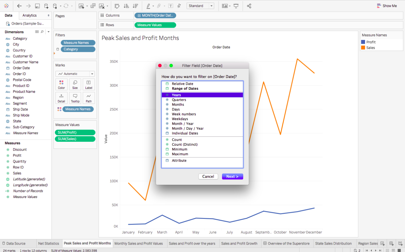
The steps of turning any Dimension into a Filter are the same. Let’s first experiment with the Order Date ( formatted to Year ) :
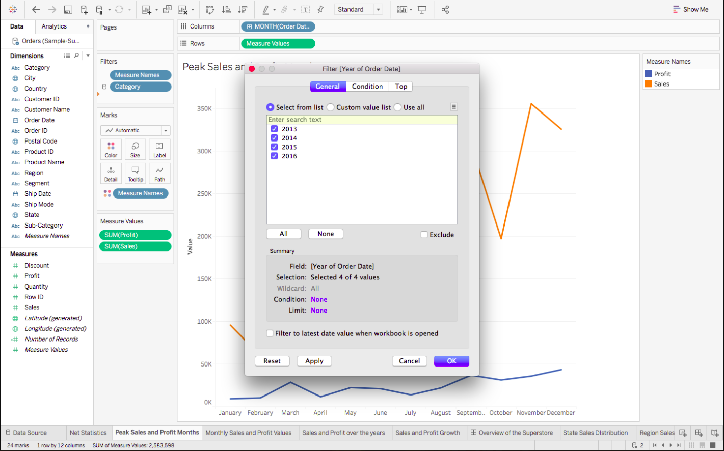
1. Drag the Dimension to the Filters’ Shelf, to see the following pop up. Here we will be choosing Years :
2. Choose the values that you want to be a part of your Filter :
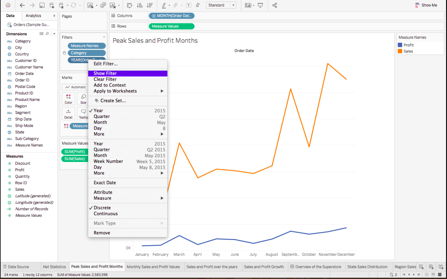
3. Right-click on the newly generated Filter, and then choose Show Filter:
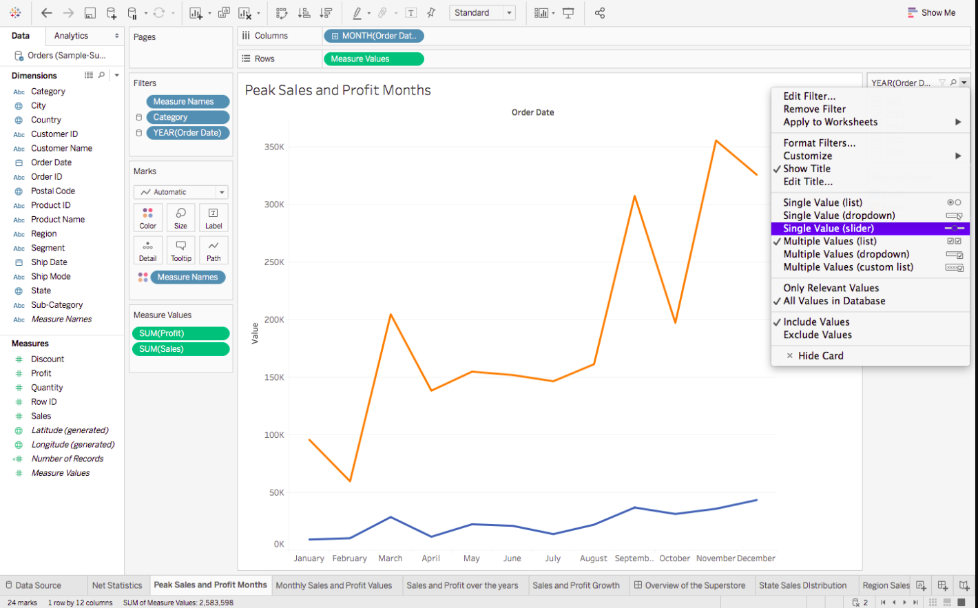
4. You can also change the format of your Filter, for example, whether you wish for a Dropdown list, a Slider, a Single Value List, etc :
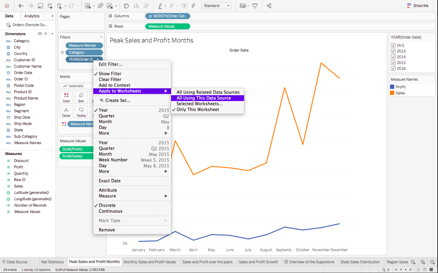
5. If you feel that some of your filters can be applied to other sheets as well, then rather than repeating the steps, you can simply Apply the Filter to all other relevant Worksheets :
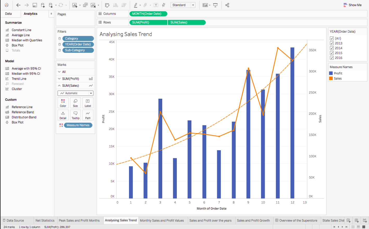
Trend Line
Traverse back to the Peak Sales and Profit Month Chart and follow these steps to make a Trend Line of your own :
1. Go to Show Me and choose the Dual Combination chart, to get this chart :
2. To get the Trend Line, go to Analytics, and simply drag Trend Line over the chart, to get :
Conclusion
we have completed this article to learn the new concept of the tableau. We hope it provided a good insight into how important the visualization is and how can we leverage Tableau to beautifully communicate our analysis.
If you want to learn the advanced concepts of Tableau, then check our course- https://courses.analyticsvidhya.com/courses/tableau-2-0
Thanks for reading!
I hope that you have enjoyed the article. If you like it, share it with your friends also. Please feel free to comment if you have any thoughts that can improve my article writing.
The media shown in this article is not owned by Analytics Vidhya and is used at the Author’s discretion.
Hi, I am Kajal Kumari. have completed my Master’s from IIT(ISM) Dhanbad in Computer Science & Engineering. As of now, I am working as Machine Learning Engineer in Hyderabad.
hope that you have enjoyed the article. If you like it, share it with your friends also. Please feel free to comment if you have any thoughts that can improve my article writing.
If you want to read my previous blogs, you can read Previous Data Science Blog posts here. Connect with me


