Introduction
Seaborn is a Python data visualization library that is built on top of Matplotlib. It provides a high-level interface for creating informative and attractive statistical graphics. One of the most commonly used plots in Seaborn is the scatter plot, which allows us to visualize the relationship between two variables.

Table of contents
Understanding Scatter Plots
A scatter plot is a type of plot that displays the relationship between two continuous variables. Each point on the plot represents an observation in the data set. The position of the point on the x-axis represents the value of one variable, while the position on the y-axis represents the value of the other variable.
To create a scatter plot in Seaborn, we can use the scatterplot() function. This function takes in the data, as well as the names of the variables we want to plot. We can also specify additional parameters such as the color and size of the points.
Also Read: Scatter Plot Visualization in Python using matplotlib
Scatter Plot Basics
Scatter plots are a type of data visualization that displays the relationship between two numerical variables. They are particularly useful for identifying patterns, trends, and outliers in the data. In this section, we will explore the definition and purpose of scatter plots, as well as the key components that make up a scatter plot.
Definition and Purpose
A scatter plot is a graph that uses dots to represent individual data points. The position of each dot on the graph corresponds to the values of two variables. The horizontal axis represents one variable, while the vertical axis represents the other variable. By plotting these points, we can visually analyze the relationship between the two variables.
The purpose of a scatter plot is to identify any patterns or trends in the data. It allows us to determine if there is a positive, negative, or no correlation between the variables. Additionally, scatter plots can help us identify any outliers or unusual observations that may exist in the data.
To create a scatter plot in Python, we can use the Seaborn library. Seaborn is a powerful data visualization library that is built on top of Matplotlib. It provides a high-level interface for creating informative and visually appealing statistical graphics.
Key Components of a Scatter Plot
A scatter plot consists of several key components that help us interpret the data. These components include:
- Data Points: Each data point represents an individual observation and is plotted as a dot on the graph.
- X-Axis and Y-Axis: The X-axis represents one variable, while the Y-axis represents the other variable. The values of the variables are plotted along these axes.
- Title: The title of the scatter plot provides a brief description of the data being visualized.
- Labels: The X-axis and Y-axis are labeled to indicate the variables being plotted.
- Legend: If there are multiple groups or categories in the data, a legend can be included to differentiate between them.
- Gridlines: Gridlines can be added to the scatter plot to aid in reading and interpreting the data.
To create a scatter plot with Seaborn, we can use the scatterplot() function. This function takes in the data, as well as optional parameters such as the x and y variables, hue (for grouping), size (for dot size), and style (for dot style).
Creating Scatter Plots with Seaborn in Python
Scatter plots are a powerful visualization tool used to display the relationship between two continuous variables. Seaborn is a popular Python library that provides a high-level interface for creating attractive and informative statistical graphics. In this article, we will explore how to create scatter plots using Seaborn and customize them to enhance their visual appeal.
Installing Seaborn
Before we dive into creating scatter plots with Seaborn, we need to make sure that the library is installed on our system. To install Seaborn, we can use the following command:
Code:
!pip install seabornImporting Required Libraries
Once Seaborn is installed, we need to import it along with other required libraries such as Matplotlib and Pandas. Here’s the code to import these libraries:
Code:
import seaborn as sns

import matplotlib.pyplot as plt

import pandas as pd
Loading the Dataset
To create a scatter plot, we first need to load the dataset that contains the variables we want to visualize. Seaborn provides built-in datasets that we can use for practice. For example, let’s load the “tips” dataset:
Code:
tips = sns.load_dataset("tips")Basic Scatter Plot
To create a basic scatter plot, we can use the `scatterplot()` function provided by Seaborn. Here’s an example:
Code:
sns.scatterplot(x="total_bill", y="tip", data=tips)

plt.show()
Output:
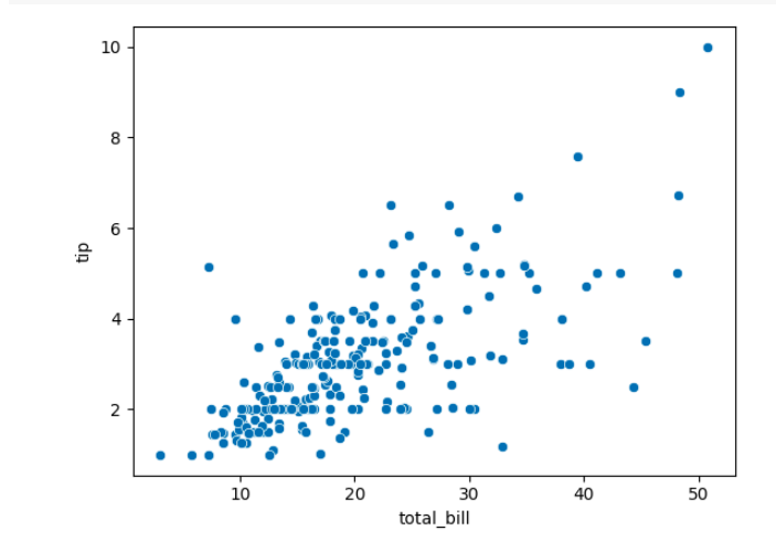
This code will generate a scatter plot with the “total_bill” variable on the x-axis and the “tip” variable on the y-axis.
Customizing Scatter Plots
Now that we have created a basic scatter plot, let’s explore some ways to customize it and make it more visually appealing.
Changing Marker Styles
We can change the marker styles in our scatter plot to differentiate between different data points. Seaborn provides various marker styles such as circles, squares, triangles, etc. Here’s an example:
Code:
sns.scatterplot(x="total_bill", y="tip", data=tips, marker="s")

plt.show()
Output:

In this code, we have changed the marker style to squares using the `marker` parameter.
Adjusting Marker Sizes
We can also adjust the size of the markers in our scatter plot to emphasize certain data points. Seaborn allows us to specify the marker size using the `s` parameter. Here’s an example:
Code:
sns.scatterplot(x="total_bill", y="tip", data=tips, s=100)

plt.show()
Output:
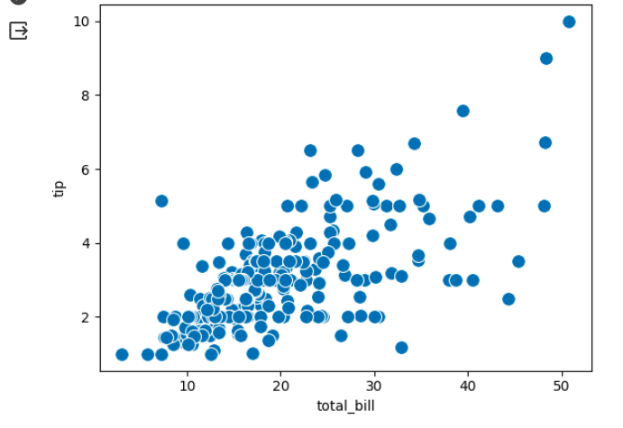
In this code, we have increased the marker size to 100 using the `s` parameter.
Adding Color to Scatter Plots
Adding color to scatter plots can help us visualize additional information or highlight specific groups within the data. Seaborn allows us to specify the color using the `color` parameter. Here’s an example:
Code:
sns.scatterplot(x="total_bill", y="tip", data=tips, color="red")

plt.show()
Output:

In this code, we have changed the color of the markers to red using the `color` parameter.
Adding Regression Lines
We can also add regression lines to our scatter plots to visualize the relationship between the variables more clearly. Seaborn provides the `regplot()` function to create scatter plots with regression lines. Here’s an example:
Code:
sns.regplot(x="total_bill", y="tip", data=tips)

plt.show()
Output:
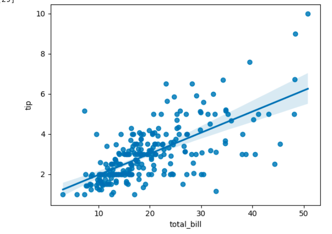
This code will generate a scatter plot with a regression line.
Highlighting Groups in Scatter Plots
If our dataset contains groups, we can highlight them in our scatter plot using different colors or marker styles. Seaborn allows us to do this by specifying the `hue` parameter. Here’s an example:
Code:
sns.scatterplot(x="total_bill", y="tip", data=tips, hue="smoker")

plt.show()
Output:

In this code, we have highlighted the “smoker” group by assigning different colors to the markers.
Conclusion
Creating scatter plots with Seaborn in Python is a powerful tool for visualizing relationships between variables. With Seaborn’s easy-to-use functions and customizable options, you can create visually appealing scatter plots that effectively convey your data. By following the steps outlined in this article, you can import the necessary libraries, load your dataset, and create scatter plots with just a few lines of code. Whether you’re a data scientist, analyst, or researcher, Seaborn’s scatter plots can help you gain valuable insights from your data.
So why wait? Start exploring the world of scatter plots with Seaborn today and unlock the potential of your data visualization.
Want to become a python expert? Enroll in our FREE Introduction to Python Course today!
Seasoned AI enthusiast with a deep passion for the ever-evolving world of artificial intelligence. With a sharp eye for detail and a knack for translating complex concepts into accessible language, we are at the forefront of AI updates for you. Having covered AI breakthroughs, new LLM model launches, and expert opinions, we deliver insightful and engaging content that keeps readers informed and intrigued. With a finger on the pulse of AI research and innovation, we bring a fresh perspective to the dynamic field, allowing readers to stay up-to-date on the latest developments.


Hi, can you provide code and /or guidance w.r.t. constructing a function that plots a (1- alpha)% confidence ellipse over the scatterplot so that the ellipse contains (1- alpha)% of all the data points in the scatterplot and the gradient of the major axis of the ellipse corresponds to the gradient of the linear regression line fitted to the bivariate data