Introduction
Data exploration is a critical initial step in the data analysis process, where analysts examine large datasets to uncover patterns, outliers, and relationships before formal modeling and analysis occur. This stage, called exploratory data analysis (EDA), utilizes various statistical techniques and powerful data visualization tools to understand the data’s key characteristics, quality, and structure. Popular open-source tools like Python and R and software like Tableau enable robust data visualization during exploration of data through methods like histograms, scatter plots, box plots, and more.
Effective data exploration allows early detection of data quality issues, identifies variables and relationships of interest, and guides the direction of subsequent predictive modeling and machine learning workflows. Data Analysts can make data-driven decisions by fully understanding the raw data, optimizing their analysis approach, and extracting maximum insight from the available information. Careful exploratory analysis is, therefore, a crucial foundational step for any successful data science or analytics project. This guide will explore the key stages, statistical methods, and data exploration techniques skilled data analysts and scientists use.
Overview:
- Learn about the data analysis process to understand large datasets’ key characteristics, quality, and structure.
- Gain an understanding of the steps of data exploration.
- Understand the importance of data exploration, such as understanding data, identifying issues, guiding analysis, enhancing data quality, and facilitating data-driven decision-making.
- Learn different statistical methods and visualization tools (like Python, R, and Tableau) and their applications in EDA.
Table of contents
What is Data Exploration?
Data exploration is a critical step in data analysis, where data scientists and analysts examine large datasets to understand their main characteristics before further analysis. This stage, often called Exploratory Data Analysis (EDA), involves using various statistical techniques and data visualization tools to uncover patterns, relationships, and outliers within the data. Tools like Python, R, and Tableau are commonly used for this purpose, enabling data visualization through graphs, histograms, scatter plots, and box plots.
Stages of Data Exploration
- Data Collection begins with gathering raw data from various sources. This data can be structured, semi-structured, or unstructured and is often stored in SQL databases or spreadsheets.
- Data Cleaning: This involves addressing missing values, removing duplicates, correcting errors, and ensuring the dataset is high quality. Data preparation is crucial for accurate analysis.
- Data Transformation: Data scientists transform the data into suitable formats for analysis, including normalizing and creating new variables or features. This step can involve using algorithms to preprocess the data.
- Data Visualization: Data analysts create visual representations of the data using tools like Tableau, Excel, and Python libraries. Scatter plots, bar charts, histograms, and box plots help identify trends and outliers.
- Statistical Summary: Analysts compute basic statistics, including mean, median, mode, and standard deviation, to summarize the data. Univariate and bivariate analyses are performed to understand relationships between variables.
- Hypothesis Generation: Based on the insights gained from the previous stages, analysts generate hypotheses and identify areas for further analysis. This step guides subsequent data mining and machine learning workflows.
Importance of Data Exploration
- Understanding of the Data: Exploration of data provides a comprehensive understanding of the dataset, including its structure, distribution, and anomalies. This foundational knowledge is crucial for effective data analysis and decision-making.
- Identifying Issues: Early detection of data quality issues, such as outliers and missing values, ensures that these do not negatively impact the results of further analysis.
- Guiding Analysis: By identifying key patterns and trends, data exploration helps prioritize areas for detailed analysis and model development, ensuring the efficient use of resources.
- Enhancing Data Quality: Cleaning and transformation processes improve the overall quality of the dataset, leading to more reliable and accurate analytical outcomes.
- Facilitating Decision-Making: The insights gained from data exploration inform business intelligence efforts, enabling data-driven decision-making. Effective exploratory data analysis (EDA) can significantly enhance predictive modeling and other advanced data analytics tasks.
Steps of Data Exploration and Preparation
Remember, the quality of your inputs decides the quality of your output. So, once your business hypothesis is ready, spending a lot of time and effort here makes sense. With my estimate, data exploration, cleaning, and preparation can take up to 70% of your total project time.
Below are the steps data analysis professionals typically follow to understand, clean, and prepare data for building predictive models:
- Variable Identification
- Univariate Analysis
- Bi-variate Analysis
- Missing values treatment
- Outlier treatment
- Variatransformationtion
- Variable creation
Finally, we will need to iterate over steps 4 – 7 multiple times before we develop our refined model.
Let’s now study each stage of data exploration in detail.
Variable Identification in Data Exploration
First, identify the Predictor (Input) and Target (output) variables. Next, identify the data type and category of the variables.
Let’s understand this step in data exploration more clearly by taking an example.

For Example, suppose we want to predict whether the students will play cricket (refer to the data set below). Here, you need to identify predictor variables, target variables, data type of variables, and category of variables. Below, the variables have been defined in different categories:

Univariate Analysis
At this stage, we explore variables one by one. The method to perform univariate analysis will depend on whether the variable type is categorical or continuous. Let’s look at these methods and statistical measures for categorical and continuous variables individually:
Continuous Variables: In the case of continuous variables, we need to understand the central tendency and spread of the variable. These are measured using various statistical metrics visualization methods in data exploration as shown below:

Note: Univariate analysis is also used to highlight missing and outlier values. In the upcoming part of this series, we will examine methods for handling missing and outlier values.
Categorical Variables: For categorical variables, we’ll use a frequency table to understand the distribution of each category. We can also read the percentage of values under each category. It can be measured against each category using two metrics: Count and Count%. A bar chart can be used as a visualization.
Bivariate Analysis
Bivariate analysis in data exploration refers to finding the relationship between two variables. Here, we look for association and disassociation between variables at a pre-defined significance level. We can perform a bivariate analysis for any combination of categorical and continuous variables, such as Categorical and categorical, Categorical and continuous, and Continuous and continuous. Different methods are used to tackle these combinations during the analysis process.
Let’s understand the possible combinations in detail:
Continuous & Continuous
In a bivariate analysis of two continuous variables, we should look at a scatter plot. It is a nifty way to determine the relationship between two variables. The pattern of the scatter plot indicates the relationship between variables, which can be linear or non-linear.

A scatter plot shows the relationship between two variables but does not indicate its strength. To find the strength of the relationship, we use Correlation, which varies between -1 and +1.
- -1: Perfect negative linear correlation
- +1: Perfect positive linear correlation
- 0: No correlation
This correlation can be derived using the following formula:
Correlation = Covariance(X,Y) / SQRT( Var(X)* Var(Y))
Various tools have functions or functionality to identify correlations between variables in data exploration. In Excel, function CORREL() returns the correlation between two variables, and SAS uses procedure PROC CORR to identify the correlation. This function returns the Pearson Correlation value to identify the relationship between two variables:

In above example, we have good positive relationship(0.65) between two variables X and Y.
Categorical & Categorical
To find the relationship between two categorical variables, we can use the following methods:
- Two-way table: We can start analyzing the relationship by creating a two-way table of count and count%. The rows represent the category of one variable, and the columns represent the categories of the other variable. We show the count or count% of observations available in each combination of row and column categories.
- Stacked Column Chart: This method is more of a visual form of a two-way table.
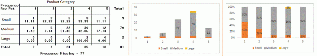
- Chi-Square Test: This test derives the statistical significance of the relationship between the variables and tests whether the evidence in the sample is strong enough to generalize the relationship to a larger population. Chi-square Test is based on the difference between the expected and observed frequencies in one or more categories in the two-way table. It returns the computed chi-square distribution probability with the degree of freedom.
- 0 Probability: It indicates that both categorical variables are dependent
- Probability of 1: It shows that both variables are independent.
- Less than 0.05 Probability: It indicates that the relationship between the variables is significant at 95% confidence.
The chi-square test statistic for a test of independence of two categorical variables is found by:


Where O represents the observed frequency. E is the expected frequency under the null hypothesis.
From the previous two-way table, the expected count for product category 1 to be of small size is 0.22. It is derived by taking the row total for Size (9) times the column total for Product category (2) and then dividing by the sample size (81). This procedure is conducted for each cell. Statistical Measures used to analyze the power of relationship are:
- Cramer’s V for Nominal Categorical Variable
- Mantel-Haenszed Chi-Square for ordinal categorical variable.
Categorical & Continuous:
To explore the relation between categorical and continuous variables, we can draw box plots for each level of categorical variables. The plots will not show statistical significance if the levels are small in number. We can perform a Z-test, T-test, or ANOVA to examine the statistical significance.
- Z-Test/ T-Test: Either test assesses whether the mean of two groups is statistically different. If the probability of Z is small, then the difference between the two averages is more significant. The T-test is very similar to the Z-test but is used when the number of observations for both categories is less than 30.

- ANOVA: It assesses whether the average of more than two groups is statistically different.
Example: Suppose we want to test the effect of five different exercises. For this, we recruited 20 men and assigned one type of exercise to 4 men (5 groups). Their weights are recorded after a few weeks. We need to determine whether these exercises’ effect on them is significantly different. This can be done by comparing the weights of the 5 groups of 4 men each.
Also Read: Difference between Z-Test and T-Test
Missing Value Treatment
Now, we will examine the methods for treating Missing values. More importantly, we will also examine why missing values occur in our data and why treating them is necessary.
Why is Missing Values Treatment Required?
Missing data in the training data set can reduce the power/fit of a model or lead to a biased model because we have not analyzed the behavior and relationship with other variables correctly. Missing Value Treatment can also lead to wrong predictions or classifications in data exploration.

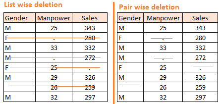
Notice the missing values in the image above: In the left scenario, we have not treated missing values. The inference from this data set is that males’ chances of playing cricket are higher than females’. On the other hand, if you look at the second table, which shows data after treatment of missing values (based on gender), we can see that females have higher chances of playing cricket than males.
Why Does my Data have Missing Values?
We looked at the importance of treating missing values in a dataset. Now, let’s explain the reasons for these missing values. They may occur in two stages:
- Data Extraction: The extraction process may have problems. In such cases, we should double-check for correct data with data guardians. Some hashing procedures can also be used to ensure correct data extraction. Errors at the data extraction stage are typically easy to find and can be corrected easily.
- Data collection: These errors occur during data collection and are more challenging to correct. They can be categorized into four types:
- Missing completely at random is when the probability of missing a variable is the same for all observations. For example, respondents in the data collection process declare their earnings after tossing a fair coin. If a head occurs, the respondent declares his / her earnings and vice versa.
- Missing at random: This is when a variable is missing at random, and the missing ratio varies for different values/levels of other input variables.
- Missing that depends on unobserved predictors: This is a case when the missing values are not random and are related to the unobserved input variable. For example, in a medical study, if a particular diagnostic causes discomfort, there is a higher chance of dropping out.
- Missing that depends on the missing value itself: This is a case when the probability of a missing value is directly correlated with the missing value itself. For example, people with higher or lower incomes are likely to provide non-response to their earnings.
Which are the Methods to Treat Missing Values?
Deletion
It is of two types: List Wise Deletion and Pair Wise Deletion.
- In list-wise deletion, we delete observations where any variable is missing. Simplicity is one major advantage of this method, but this method reduces the power of the model because it reduces the sample size.
- In pair-wise deletion, we analyze all cases where the variables of interest are present. This method has the advantage of keeping as many cases available for analysis as possible. One disadvantage is that it uses different sample sizes for other variables.

- Deletion methods are used when the nature of missing data is “Missing completely at random.” Otherwise, non-random missing values can bias the model output.
Mean/ Mode/ Median Imputation
Imputation is a method of filling in the missing values with estimated ones. The objective is to employ known relationships that can be identified in the valid values of the data set to assist in evaluating the missing values. Mean / Mode / Median imputation is one of the most frequently used methods. It consists of replacing the missing data for a given attribute with the mean or median (quantitative attribute) or mode (qualitative attribute) of all known values of that variable. It can be of two types:-
Generalized Imputation
In this case, we calculate the mean or median for all non-missing values of that variable and then replace the missing value with the mean or median. In the above table, the variable “Manpower” is missing, so we take the average of all non-missing values of “Manpower” (28.33) and then replace the missing value with it.
Similar Case Imputation
In this case, we calculate the average of non-missing values for gender “Male” (29.75) and “Female” (25) individually and then replace the missing value based on gender. For “Male, ” we will replace the missing values of manpower with 29.75 and for “Female,” with 25.
Prediction Model
The prediction model is a sophisticated method for handling missing data. Here, we create a predictive model to estimate values that will substitute the missing data. In this case, we divide our data set into two sets: One set with no missing values for the variable and another with missing values. The first data set becomes the training data set of the model. In contrast, the second data set with missing values is the test data set, and the variable with missing values is treated as the target variable. Next, we create a model to predict the target variable based on other attributes of the training data set and populate missing values of the test data set. We can use regression, ANOVA, Logistic regression, and various modeling techniques to perform this. There are two drawbacks to this approach:
- The model-estimated values are usually more well-behaved than the actual values.
- If there are no relationships between attributes in the data set and the attribute with missing values, then the model will not be precise for estimating missing values.
KNN Imputation
In this imputation method, the missing values of an attribute are imputed using the given number of attributes most similar to the attribute whose values are missing. The similarity of the two characteristics is determined using a distance function. It is also known to have certain advantages & disadvantages.
- Advantages:
- K-nearest neighbor can predict both qualitative & quantitative attributes
- The creation of a predictive model for each attribute with missing data is not required
- Attributes with multiple missing values can be easily treated
- The correlation structure of the data is taken into consideration
- Disadvantage:
- The KNN algorithm is very time-consuming when analyzing an extensive database. It searches through all the datasets, looking for the most similar instances.
- The choice of k-value is critical. A higher value of k would include attributes that are significantly different from what we need, whereas a lower value implies missing out on significant attributes.
After dealing with missing values, the next task is dealing with outliers. We often neglect outliers while building models, which is discouraging. Outliers tend to make data skewed and reduce accents. Let’s learn more about outlier treatment.
Techniques of Outlier Detection and Treatment
Let us now look at techniques of outlier detection and treatment for data exploration.
What is an Outlier?
Data analysts and data scientists commonly use outliers. They need close attention, or else they can result in wildly wrong estimations. Simply speaking, an Outlier is an observation that appears far away and diverges from an overall pattern in a sample.
For example, we do customer profiling and find out that the average annual income of customers is $0.8 million. However, two customers have yearly incomes of $4 and $4.2 million. These two customers’ annual incomes are much higher than the rest of the population. These two observations will be seen as Outliers.

Also Read: Detecting and Treating Outliers | Treating the odd one out!
What are the Types of Outliers?
Outliers can be of two types: Univariate and Multivariate. Above, we have discussed the example of a univariate outlier. Outlier outliers can be found when we look at the distribution of a single variable. Multi-variate outliers are outliers in an n-dimensional space. To find them, you have to look at distributions in multi-dimensions.
Let us understand this with an example. Let us say we know the relationship between weight and weight. Below, we have univariate and bivariate distributions of weight and weight. Take a look at the box plot. We do not have any outliers (above and below 1.5*IQR, the most common method). Now, look at the scatter plot. Here, we have two values below and one above the average in a specific segment of weight an eighth.

What Causes Outliers?
Whenever we come across outliers, the ideal way to tackle them is to find out the reason for having these outliers. The method to deal with them would then depend on the reason for their occurrence. Causes of outliers can be classified into two broad categories:
- Artificial (Error) / Non-natural
- Natural.
Types of Outliers
- Data Entry Errors: Human errors, such as errors caused during data collection, recording, or entry, can cause outliers in data. For example, a customer’s income is $100,000. Accidentally, the data entry operator puts an additional zero in the figure. Now, the income becomes $1,000,000, which is ten times higher. This will be the outlier value compared to the rest of the population.
- Measurement Error is the most common source of outliers. It is caused when the measurement instrument used turns out to be faulty. For example, there are ten weighing machines. Nine of them are correct, and one is defective. The weight measured by people on the defective machine will be higher / lower than those in the group. The weights measured on the faulty machine can lead to outliers.
- Experimental Error: Another cause of outliers is experimental error. For example, in a 100-meter sprint with seven runners, one runner missed concentrating ‘n ‘on the ‘Go’ call, which caused him to start late. Hence, his run time was more than the other runners, and his total run time can be an outlier.
- Intentional Outlier: This is commonly found in self-reported measures involving sensitive data. For example, Teens typically underreport the amount of alcohol they consume. Only a fraction of them report actual values. Here, actual values might look like outliers because the rest of the teens are underreporting their consumption.
- Data Processing Error: We extract data from multiple sources while mining data. Some manipulation or extraction errors may lead to outliers in the dataset.
- Sampling error: For instance, we have to measure the weight of athletes. By mistake, we include a few basketball players in the sample. This inclusion is likely to cause outliers in the dataset.
What is the Impact of Outliers on a Dataset?
Outliers can drastically change the results of the data analysis and statistical modeling. There are numerous unfavorable impacts of outliers in the data set:
- It increases the error variance and reduces the power of statistical tests
- If the outliers are non-randomly distributed, they can decrease normality
- They can bias or influence estimates that may be of substantive interest
- They can also impact the basic assumptions of regression, ANOVA, and other statistical model assumptions.
To understand the impact deeply, let an example check what happens to a data set with and without outliers in the data set.

Example:
As you can see, a data set with outliers has significantly different mean and standard deviation. In the first scenario, we will say that the average is 5.45. But with the outlier, the average soars to 30, which would completely change the estimate.
How to Detect Outliers?
The most commonly used method to detect outliers in data exploration is visualization. We use various visualization methods, like Box-plot, Histogram, and Scatter Plot (above, we have used box and scatter plots for visualization). Some analysts also use various thumb rules to detect outliers. Some of them are:
- Any value which is beyond the range of -1.5 x IQR to 1.5 x IQR
- Use capping methods. Any value that is out of the range of the 5th and 95th percentile can be considered an Outlier
- Data points three or more standard deviations away from the mean are considered outliers. Outlier detection is merely examining data for influential data points; it also depends on the business’s understanding.
- Bivariate and multivariate outliers are typically measured using either an index of influence leverage or distance. Popular indices such as Mahalanobis’ distance and Cook’s D are frequently used to detect outliers.
- In SAS, we can use PROC Univariate and PROC SGPLOT. We also examine statistical measures like STUDENT, COOKD, STUDENT, and others to identify outliers and influential observations.
How to Remove Outliers?
Most ways to deal with outliers in data exploration is similar to methods of missing values, like deleting observations, transforming them, binning them, treating them as a separate group, imputing values, and other statistical methods. Here, we will discuss the standard techniques used to deal with outliers:
- Deleting observations: We delete outlier values if they are due to data entry errors, data processing errors, or outlier observations that are very small in numbers. We can also use trimming at both ends to remove outliers.
- Transforming and binning values: Transforming variables can also eliminate outliers. The natural log of a value reduces the variation caused by extreme values. Binning is also a form of variable transformation. The decision Tree algorithm allows us to deal with outliers well due to the binning of variables. We can also use the process of assigning weights to different observations.

- Imputing: Like imputation of missing values, we can also impute outliers. We can use mean, median, and mode imputation methods. Before imputing values, we should analyze whether they are natural, outliers, or artificial. If it is artificial, we can go with imputing values. We can also use a statistical model to predict the values of outlier observations, and after that, we can blame them with expected values.
- Treat separately: If there are many outliers, we should treat them separately in the statistical model. One approach is to treat both groups as separate entities, build an individual model for each group, and then combine the output.
We have learned about the steps of data exploration, missing value treatment, and outlier detection and treatment techniques. These three stages will improve your raw data regarding information availability and let’s. Let’s proceed to the final stage of data exploration: Feature Engineering.
The Art of Feature Engineering
What is Feature Engineering?
Feature engineering is the science (and art) of extracting more information from existing data. You are not adding any new data here, but you are making the data you already have more helpful.
For example, you are trying to predict footfall in a shopping mall based on dates. If you try to use the dates directly, you may be unable to extract meaningful insights from the data. This is because footfall is less affected by the day of the month than by the day of the week. This information about the day of the week is implicit in your data. You need to bring it out to improve your model.
This exercise of bringing out information from data is known as feature engineering.
What is the Process of Feature Engineering?
You perform feature engineering once you have completed the first 5 steps in data exploration – Variable Identification, Univariate, Bivariate Analysis, Missing Values Imputation, and Outliers Treatment. Feature engineering itself can be divided into 2 steps:
- Variable transformation.
- Variable / Feature creation.
These two techniques are vital in data exploration and remarkably impact prediction. Let’s plot each step in these steps.
What is Variable Transformation?
In data modeling, transformation refers to replacing a variable with a function. For instance, replacing a variable x by the square/cube root or logarithm x is a transformation. In other words, transformation is a process that changes the distribution or relationship of a variable with others.
Let’s look at the situations when variable transformation is useful.
When Should we use Variable Transformation?
Below are the situations where variable transformation is a requisite:
- When we want to change the scale of a variable or standardize the values of a variable for better understanding. While transformation ion is a must if you have data in different scales, transformation ion does not change the shape of the variable distribution.
- When we can transform complex non-linear relationships into linear relationships, the existence of a linear relationship between variables is more straightforward compared to a non-linear or curved relation. Transformation helps us convert a non-linear relation into a linear relation. A scatter plot can be used to find the relationship between two continuous variables. These transformations also improve prediction. Log transformation is the commonly used transformation tech in these situations.
- Symmetric distributions are preferred over skewed distributions as they are easier to interpret and generate inferences. Some modeling techniques require a normal distribution of variables. So, we can use transformations that reduce skewness whenever we have a skewed distribution. For a right-skewed distribution, we take the square/cube root or logarithm of the variable, and for a left-skewed distribution, we take the square/cube or exponential of the variables.
- Variable Transformation is also done from an implementation point of view (Human involvement). Let’s understand it more clearly. In one of my projects on employee performance, I found that age directly correlates with the employee’s performance, i.e., the higher the age, the better the performance. From an implementation standpoint, launching an age-based program might present an implementation challenge. However, categorizing the sales agents into three age group buckets of <30 years, 30-45 years, and >45 and formulating three different strategies for each group is judicious. This categorization technique is known as the Binning of Variables.
What are the Common Methods of Variable Transformation?
Various methods are used to transform variables. As discussed, some include square root, cube root, logarithmic, binning, reciprocal, and many others. Examine these methods in detail and highlight their pros and cons.
- Logarithm: The log of a variable is a standard transformation method used to change the shape of the variable’s distribution on a distribution plot. It is generally used to reduce the right skewness of variables. However, it can also not be applied to zero or negative values.
- Square / Cube root: A variable’s square and cube root affect variable distribution. However, it is not as significant as logarithmic transformation. Cube root has its advantages. It can be applied to negative values, including zero. Square root can be applied to positive values, including zero.
- Binning is used to categorize variables. It is performed on original values, percentiles, or frequencies. The decision to use this categorization technique is based on business understanding. For example, we can categorize income into three categories: high, Average, and Low. We can also perform co-variate binning, which depends on the value of more than one variable.
What is Feature / Variable Creation & What Are Its Benefits?
Feature / Variable creation generates new variables/features based on an existing variable(s). For example, a date(dd-mm-yy) is an input variable in a data set. We can generate new variables like day, month, year, week, and weekday that may have a better relationship with the target variable. This step is used to highlight the hidden relationship in a variable:


There are various techniques to create new features. Let’s look at some of the commonly used methods:
- Creating derived variables: means creating new variables from existing variable(s) using a set of functions or different methods. Let’s look at it through the “Titanic – Kaggle competition.” In this data set, variable age has missing values. To predict missing values, we used the salutation (Master, Mr, Miss, Mrs) of the name as a new variable. How do we decide which variable to create? Honestly, this depends on a business understanding of the analyst, his curiosity, and the set of hypotheses he might have about the problem. Methods such as taking the log of variables, binning variables, and other methods of variable transformation can also be used to create new variables.
- Creating dummy variables: One of the most common applications of dummy variables is to convert categorical variables into numerical variables. Dummy variables are also called Indicator Variables. It is useful to take categorical variables as a predictor in statistical models. Categorical variables can take values 0 and 1. Let’s take a variable ‘gender’. We can produce two variables, namely, “Var_Male” with values 1 (Male) and 0 (No male) and “Var_Female” with values 1 (Female) and 0 (No Female). We can also create dummy variables for more than two classes of categorical variables with n or n-1 dummy variables.
Conclusion
Comprehensive data exploration is a critical initial step for any data science, machine learning, or analytics project involving large datasets. Data analysts and scientists deeply understand the raw data through exploratory data analysis (EDA) techniques like univariate analysis, bivariate analysis, data visualization with graphs and plots, and outlier detection. Popular open-source tools like Python and commercial options like Tableau enable robust EDA through histograms, scatter plots, box plots, and other visualizations.
Effective data exploration allows early identification of data quality issues like missing values and outliers, guides future analysis like regression modeling and predictive modeling, and facilitates data-driven decision-making for business intelligence. The data exploration phase lays the groundwork for accurate insights, optimal data mining, and reliable statistical analysis outputs by transforming variables, creating new features, and preparing high-quality datasets. Leveraging best practices in EDA is essential for data scientists to unlock maximum value from their data assets across formats and domains.
Frequently Asked Questions
Q1. What is the difference between data analysis and data exploration?
A. Data analysis interprets data to conclude, often using statistical methods and algorithms. Data exploration is the preliminary phase of examining data to understand its structure, identify patterns, and spot anomalies through visualizations and summary statistics.
Q2. What are data exploration tools?
A. Data exploration tools are software or platforms that assist in exploring and analyzing data. These tools enable users to interact with and visualize data, identify patterns, and discover insights. Some popular data exploration tools include Tableau, Power BI, QlikView, and Google Analytics.
Q3. What to do during data exploration?
A. During data exploration, visualize data, check for missing values, assess data distributions, and identify correlations and patterns to understand the dataset’s characteristics and prepare for detailed analysis.
Sunil Ray is Chief Content Officer at Analytics Vidhya, India's largest Analytics community. I am deeply passionate about understanding and explaining concepts from first principles. In my current role, I am responsible for creating top notch content for Analytics Vidhya including its courses, conferences, blogs and Competitions.
I thrive in fast paced environment and love building and scaling products which unleash huge value for customers using data and technology. Over the last 6 years, I have built the content team and created multiple data products at Analytics Vidhya.
Prior to Analytics Vidhya, I have 7+ years of experience working with several insurance companies like Max Life, Max Bupa, Birla Sun Life & Aviva Life Insurance in different data roles.
Industry exposure: Insurance, and EdTech
Major capabilities: Content Development, Product Management, Analytics, Growth Strategy.


Really useful and comprehensive, thanks
Hi Ray, I would like to thank you very much for this useful post I took more than 30 statistical courses but your post has summarized them for me Now all things are clear about EDA I'm member of the John Hopkins University Data Scientists (Coursera) Group Best,
Excellent series of blog posts. Thanks and keep up the good work!