In my previous article, we discussed how to use Qlikview for visualization of tabular information. Now, let’s think of a scenario, where we need to represent location wise sales for a company running operations in India.
We can represent this information in many ways – tabular format, graphical representation or representation on geographical maps. Let’s have a look at each of these representations and see why should we represent information on Geo-Map?

A few key benefits of using geo-spatial visualization are:
- We can easily understand the distribution of Organizations presence across the country.
- Easy to represent high number of locations compare to tabular or graphical representation
- More intuitive decision making for the business owner.
Due to these benefits, there has been a marked increase in geo-spatial visualizations. Almost all BI tools have started offering this visualization as a standard option (e.g. Qlikview, Tableau, SAS Visual Analytics etc.).
When I started using Qlikview a years back, I wanted this visualization to be part of the dashboards I prepare, but i was unable to find a nicely structured tutorial around it. Hence I thought to contribute this article for the benefit of other analysts like me, who are struggling with similar question.
[stextbox id = “section”]Steps to represent information on Google Map:[/stextbox]
- Load base data (with Latitude and Longitude of location).
- Generate Google Map Variables
- Create a Scatter plot and configure Google Map
[stextbox id = “section”] Loading the base data with the Latitude and Longitude of Location:[/stextbox]
Following is the excel file used for this tutorial. Load this in Qlikview:
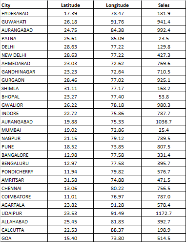
Qlikview Google Map Base Data
Make sure that Latitude and Longitude variable names are in lower case, as google map variable gets generated based on lower case only.
[stextbox id = “section”]Generate Google map variables:[/stextbox]
Create another tab in script (File -> Edit Script. Then in new window Tab .> Add New). The paste the following code to generate Google Map variable.
[stextbox id = “grey”]
// Google Maps Key
// get a key here http://code.google.com/apis/maps/signup.html
gmap_key = 'ABQIAAAAPTYGDOAE5g8mVF5kIaY54RSHwNu1JdqUbdjDP-YY4oym4d2mTxSRdsISI-1rwwnl-9gjJrMO3oTkMA';
max_zoom_level = 5; //maximum value 17
def_map_size = 400;

// Variables required for calculating map
// No need to change these
var_pi180= '=pi()/180';
var_lat_offset= '0';
var_mc2= '=256*pow(2,$(var_zoom))';
var_mc1= '=256*pow(2,($(var_zoom)-1))';
var_mid_lat= '=min(latitude)+(1+var_lat_offset)*((max(latitude)-min(latitude))/2)';
var_mid_long= '=min(longitude)+(max(longitude)-min(longitude))/2';
var_zoom= '=max(aggr(if(max( round(256*pow(2,(_zoom_level -1)))+( longitude *((256*pow(2,_zoom_level ))/360)) )-min( round(256*pow(2,(_zoom_level -1)))+( longitude *((256*pow(2,_zoom_level ))/360)) ) <map_size_x AND max((256*pow(2,(_zoom_level-1)))+((0.5*log((1+(sin((latitude)*pi()/180)))/(1-(sin((latitude)*pi()/180)))))*((-256*pow(2,_zoom_level))/(2*pi()))))-min((256*pow(2,(_zoom_level-1)))+((0.5*log((1+(sin((latitude)*pi()/180)))/(1-(sin((latitude)*pi()/180)))))*((-256*pow(2,_zoom_level))/(2*pi()))))<map_size_y,_zoom_level,1),_zoom_level))';
var_maptype= '=if(isnull(only(maptype)),fieldvalue( '&chr(39)&'maptype'&chr(39)&', 1 ),maptype)';
map_size_x= '400';
map_size_y= '400';
SET HidePrefix='_' ;
// Field required for calcualting best zoom level
_zoom_level:
Load RecNo( ) as _zoom_level autogenerate(max_zoom_level);
maptype:
LOAD * INLINE [maptype roadmap mobile satellite terrain hybrid ];
[/stextbox]
After pasting the code, click ‘Save’ and then ‘Ok’ to close the Window and reload the script.

Google Map Variable
[stextbox id = “section”]Create a Scatter Chart and configure for Google map:[/stextbox]
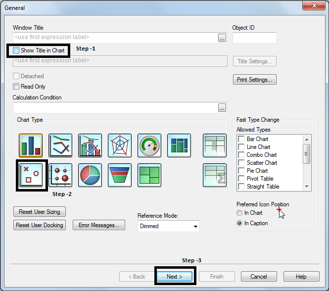
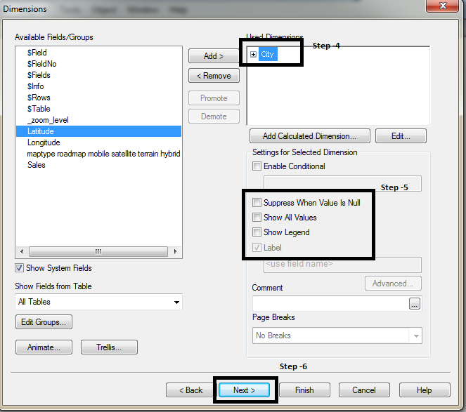
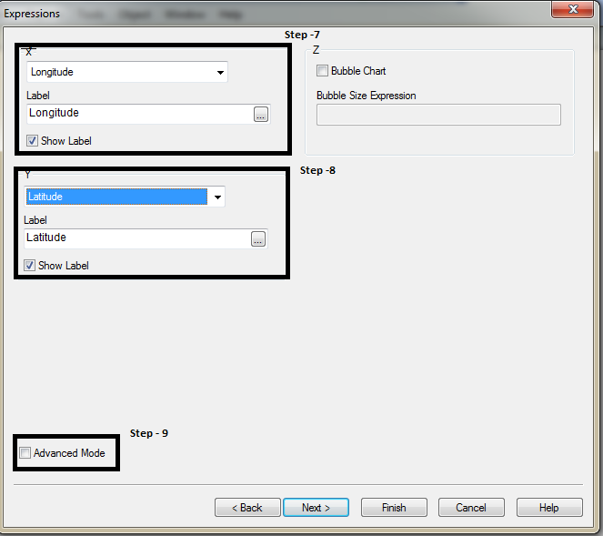
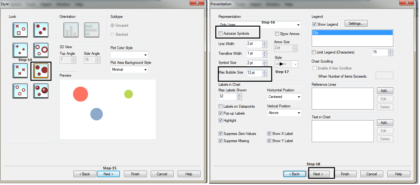
To create chart, “New Sheet Object” –> “Chart” –> Follow the steps shown in below pictures
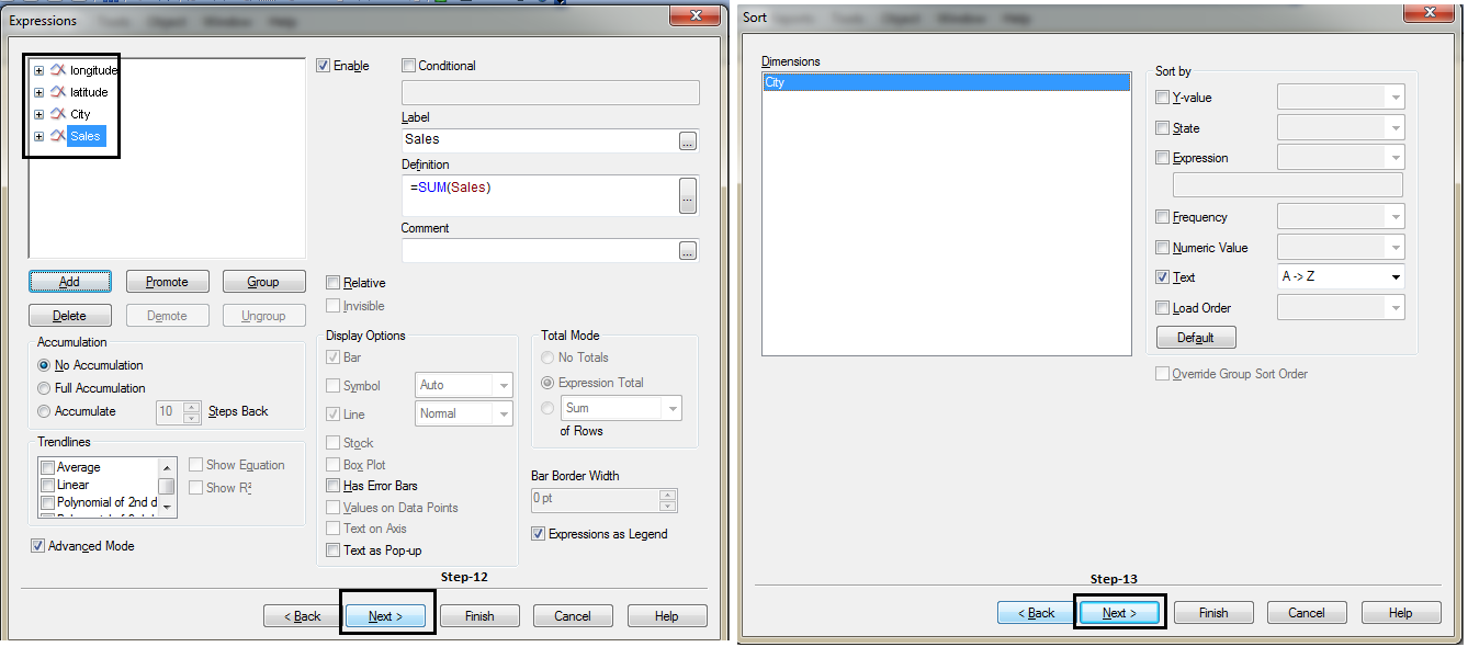
Step -10: Next, move to SORT tab, press back button and write following code in expression:
[stextbox id = “grey”]
longitude: “=SUM( round (256*pow(2,($(var_zoom)-1)))+( longitude *((256*pow(2,$(var_zoom)))/360)) )”
latitude: “=SUM(((256*pow(2,($(var_zoom)-1)))+((0.5*log((1+(sin((latitude)*pi()/180)))/(1-(sin((latitude)*pi()/180)))))*((-256*pow(2,$(var_zoom)))/(2*pi())))))”
[/stextbox]
Step -11: Add two more expressions: City and Sales
[stextbox id = “grey”]
City:= “City”
Sales: “=sum(Sales)”
[/stextbox]
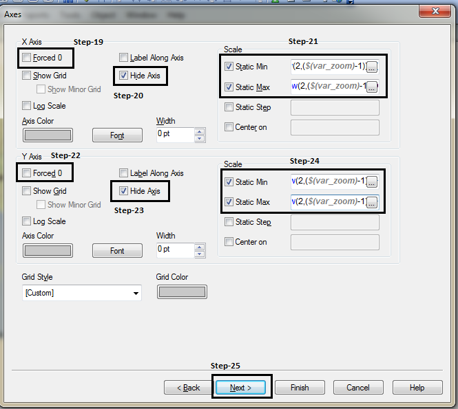
Copy and paste following code in step 21 and 24
[stextbox id = “grey”]
X axis:
static Min: =(256*pow(2,($(var_zoom)-1)))+( var_mid_long *((256*pow(2,$(var_zoom)))/360)) -round(map_size_x/2)
Static Max: =( (256*pow(2,($(var_zoom)-1)))+( var_mid_long *((256*pow(2,$(var_zoom)))/360)) + round(map_size_x/2))
Y axis:
Static Min: =((256*pow(2,($(var_zoom)-1)))+((0.5*log((1+(sin(var_mid_lat*pi()/180)))/(1-(sin(var_mid_lat*pi()/180)))))*((-256*pow(2,$(var_zoom)))/(2*pi())))+round(map_size_y/2))
Static Max: =((256*pow(2,($(var_zoom)-1)))+((0.5*log((1+(sin(var_mid_lat*pi()/180)))/(1-(sin(var_mid_lat*pi()/180)))))*((-256*pow(2,$(var_zoom)))/(2*pi())))-round(map_size_y/2))
[/stextbox]
Copy and Paste following code in Step-26:
[stextbox id = “grey”]
='http://maps.google.com/staticmap?center='
 &
 num(var_mid_lat, '##############', '.', ',' )
 &
 ','
 &
 num(var_mid_long, '##############', '.', ',' )
 &
 '&zoom=$(var_zoom)'
 &
 '&maptype='&var_maptype
 &
 '&size='&map_size_x&'x'&map_size_y
 &
 '&key='&gmap_key & '&.jpg'
[/stextbox]
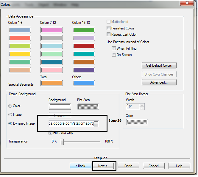
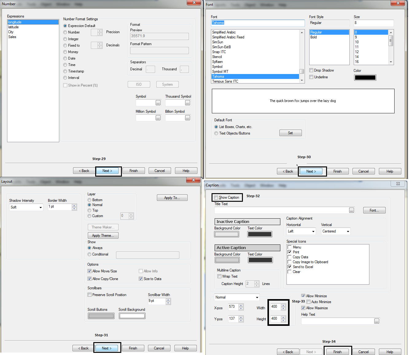
In Caption tab, width and height according to map_size_x and map_size_y (defined in the script).
Finally, we get the desired results:
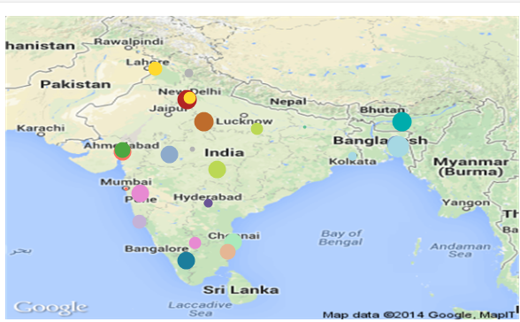
This is an example where we represent information on geographical map in Qlikview. Have you done something similar in past? Do you have any experience / case studies illustrating the same in Qlikview or other visualization tools.
Do share your thoughts through comments below.
If you like what you just read & want to continue your analytics learning, subscribe to our emails, follow us on twitter or like our facebook page.
Sunil Ray is Chief Content Officer at Analytics Vidhya, India's largest Analytics community. I am deeply passionate about understanding and explaining concepts from first principles. In my current role, I am responsible for creating top notch content for Analytics Vidhya including its courses, conferences, blogs and Competitions.
I thrive in fast paced environment and love building and scaling products which unleash huge value for customers using data and technology. Over the last 6 years, I have built the content team and created multiple data products at Analytics Vidhya.
Prior to Analytics Vidhya, I have 7+ years of experience working with several insurance companies like Max Life, Max Bupa, Birla Sun Life & Aviva Life Insurance in different data roles.
Industry exposure: Insurance, and EdTech
Major capabilities: Content Development, Product Management, Analytics, Growth Strategy.


This is quite an interesting way to represent data! Is there a way to add the legend value as well? Also, believe there is a constraint of plotting only a single variable at a time. Or can we plot multiple?
Nice article. Note, that in some cases "Google Map key" problem could raise. Then better to use this link in Dynamic Image ='http://maps.google.com/maps/api/staticmap?center=' & num(var_mid_lat, '##############', '.', ',' ) & ',' & num(var_mid_long, '##############', '.', ',' ) & '&zoom=$(var_zoom)' & '&maptype='&var_maptype & '&size='&map_size_x&'x'&map_size_y & '&sensor=false'
Yes, you are right Andrei Kaliahin.
Hi Sunil, Nice Article and m able to replicate it..Just curious.Could u please shed some light on the working of code?