In my last post, I discussed how a simple dashboard can provide information effectively. I will continue from where I left and go through the steps involved in creating the dashboard.
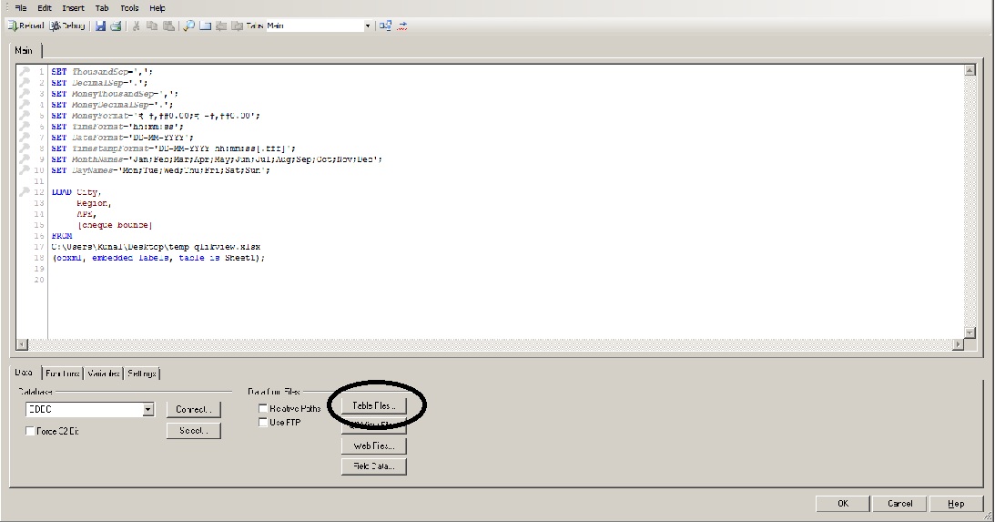
[stextbox id=”section”]Step 1: Import data from source [/stextbox]In case the data source is excel (which is the case here), go to File -> Edit Script or Ctrl + E. Once the script page opens, go to Table Files.
In case you want to import data through databases, you can connect through ODBC or OLE DB connectivity provided on left of “Table Files”.
Once you select the file from desired location, following code will be added on the script window:
[stextbox id=”grey”]LOAD City,
Region,
business_sourced,
rejections
FROM
C:\Users\Kunal\Desktop\temp_qlikview.xlsx
(ooxml, embedded labels, table is Sheet1);
[/stextbox]
Once the script is written with correct location, Save the script and Reload it. Once the script gets reloaded, Qlikview will open up a dialog box showing list of fields which have been loaded in Qlikview. Check that all the fields you wanted (City, Region, business_sourced and Rejections) are mentioned in this window. Close this window after checking the fields.
[stextbox id=”section”]Step 2: Selecting the chart [/stextbox]Next, right click on Main sheet and select New sheet object -> Chart…. In the next screen, select block chart from the list of charts, add any Windows title you want to add (Business Volume) and click on Next.
[stextbox id=”section”]Step 3: Create a location based drilldown group[/stextbox]Select Edit Groups on the next screen. A window for Groups will open up. In this window, select New. On the next Window which opens, enter Group Name (Location Hierarchy), Used Fields (in order of hierarchy) and the type of group (Drill-down).
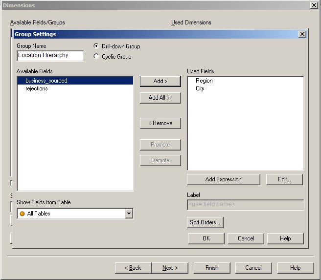
Click on OK a couple of times to come out to Dimensions window. Add Location Hierarchy in Used Dimensions.
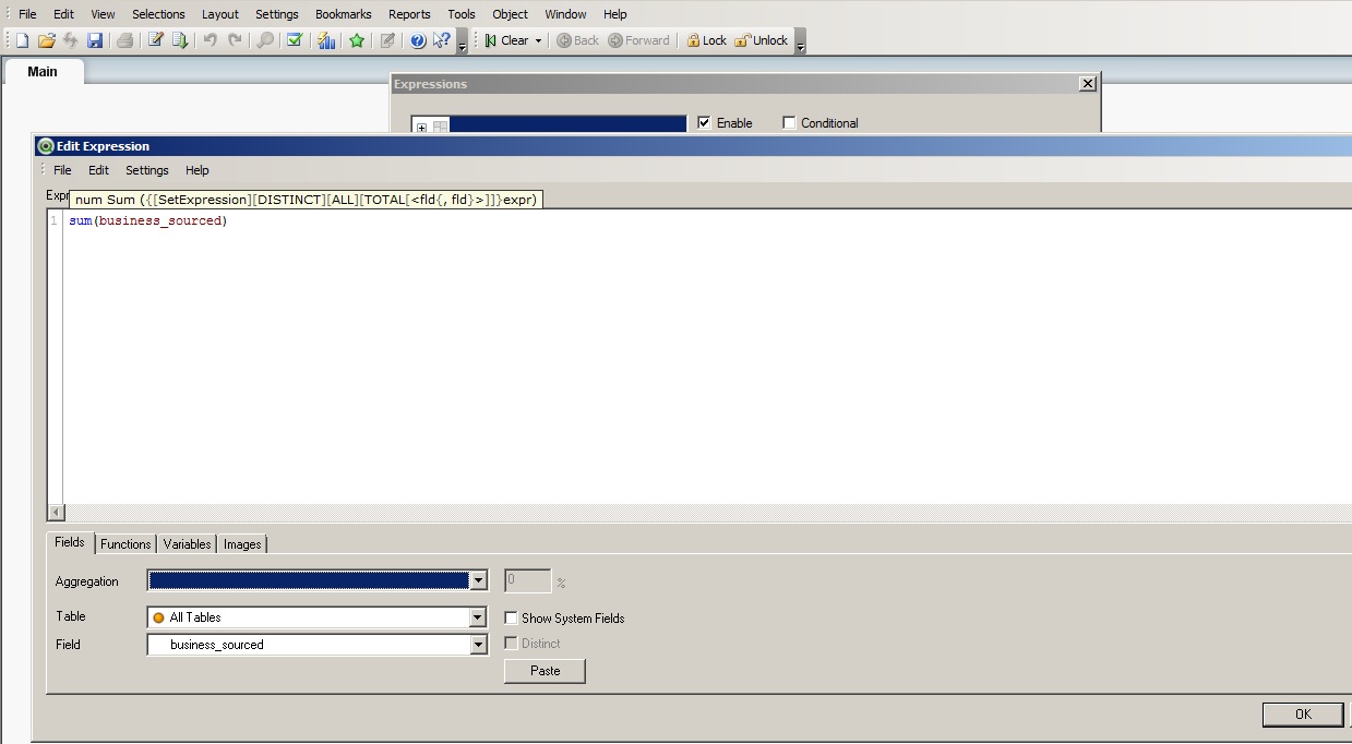
[stextbox id=”section”]Step 3: Add expressions and background colour based on second dimension[/stextbox]When you click Next, window for Edit Expression opens up. This is the expression which determines sizes of box in your chart. Enter sum(business_sourced) here.
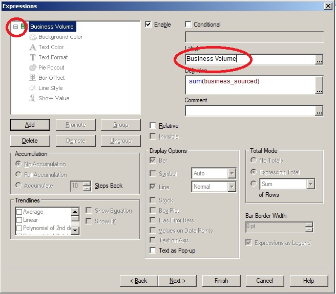
 Once you press OK, Window for expressions opens up, with definition provided in last window. Add desired Label (Business Volume) and expand the parameters (as on next screen).
Next, you can select Background color and click on Definition. In this window, you can define the parameter for defining colors of the boxes in your chart. Insert the following code in the expression tab:
[stextbox id=”grey”]if(sum(rejections)/sum(business_sourced) < 0.06, green(), red())
[/stextbox]
This expression would color the box red when there are rejections more than 6%, otherwise they will be colored green.
If you want to add gradients of green and red color, the code can be changed to something like this:
[stextbox id=”grey”]if(sum(rejections)/sum(business_sourced) < 0.06, colormix1(sum(rejections)/sum(business_sourced)*10,green(), lightgreen()),
colormix1(sum(rejections)/sum(business_sourced)*5,lightred(), red()))
[/stextbox]
This expression would color the boxes in gradient between green and light green or red and light red. Next, you can click Finish to see your chart.
This simple tutorial creates an effective dashboard with drill down and colors showing quality of business. Hope you would have found the tutorial helpful.
In case of any questions, please feel free to reach out to me. Also, let me know in case you apply these ideas to some other location.
If you like what you just read & want to continue your analytics learning, subscribe to our emails or like our facebook page
Kunal Jain is the Founder and CEO of Analytics Vidhya, one of the world's leading communities of Al professionals. With over 17 years of experience in the field, Kunal has been instrumental in shaping the global Al landscape. His expertise spans diverse markets, from developed economies like the UK to emerging ones like India, where he has successfully led and delivered complex data-driven solutions. As a recognized thought leader, Kunal has empowered countless individuals to realize their Al ambitions through his visionary approach to Al education and community building. Before founding Analytics Vidhya, Kunal earned both his undergraduate and postgraduate degrees from IIT Bombay and held key roles at Capital One and Aviva Life Insurance across multiple geographies. His passion lies at the intersection of analytics, Al, and fostering a thriving community of data science professionals.


Hi Kunal, I want to create a drill down dashboard in QlikView. For each level there is a separate table in SQL which is the source. The hierarchy is as follows: WW->Region->Sub-Region->Manager->Sales Rep->Transaction. Can you please help me. Thanks.
Arpan, If you open the data sources and link them by key, you would be able to define them in a hierarchy. To create a hierarchy, you need to define this as a drill down group. Let me know if you have any specific question. Thanks, Kunal
Hi Kunal, Thanks for the reply. I did not understand what do you mean by linking by key. Could you please elaborate?
Arpan, When you import data in qlikview, it will by default find the joins and keys between tables. If it does not (or in case it joins through an artifical key), provide the right joins. After this define the hierarchy. The tutorials available on Qlikview website can take you through this step by step. Thanks, Kunal
Hi Kunal, Linking through the primary key is clear and I have done that. But how to define the hierarchy is all what I want to know? Can you guide me to some dashboard which I can refer for defining the hierarchy? Regards, Arpan