Introduction
Here is a famous quote on learning:
We Learn . . .
10% of what we read
20% of what we hear
30% of what we see
50% of what we see and hear
70% of what we discuss
80% of what we experience
95% of what we teach others.
If we create a similar ordering on ability to interpret data in various forms – the order will surely look like this:
Text < Table < Charts < Interactive Charts
On the other hand, the amount of data which needs processing and interpretation is increasing by the second. Combined, these two factors are making data visualization an integral form of data science workflow – probably more important than ever before.
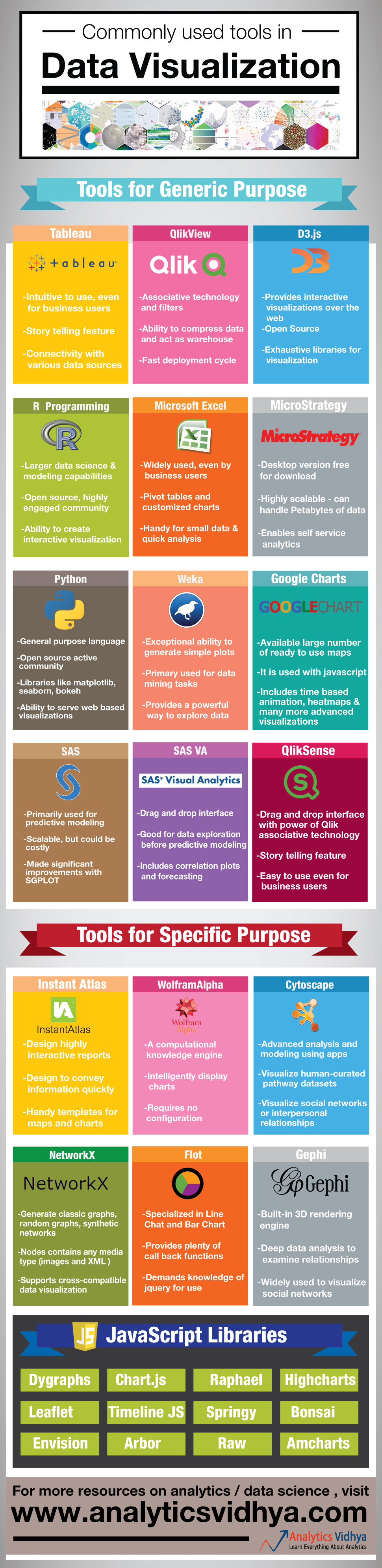
In order to address this need for creating simple, yet powerful visualization, there are multiple tools which can come in handy. However, a lot of analysts & data scientists are not aware of these tools. Hence, we have created an infographic, which provides high level overview of various tools people use for creating data visualization.
What do you think about the infographic? Do you think, there are other tools which should be part of this infographic? If yes, let us know through comments below
P.S. Online Data Hackathon 3.x coming up on 5th & 6th September. Register now
If you like what you just read & want to continue your analytics learning, subscribe to our emails, follow us on twitter or like our facebook page.
Kunal Jain is the Founder and CEO of Analytics Vidhya, one of the world's leading communities of Al professionals. With over 17 years of experience in the field, Kunal has been instrumental in shaping the global Al landscape. His expertise spans diverse markets, from developed economies like the UK to emerging ones like India, where he has successfully led and delivered complex data-driven solutions. As a recognized thought leader, Kunal has empowered countless individuals to realize their Al ambitions through his visionary approach to Al education and community building. Before founding Analytics Vidhya, Kunal earned both his undergraduate and postgraduate degrees from IIT Bombay and held key roles at Capital One and Aviva Life Insurance across multiple geographies. His passion lies at the intersection of analytics, Al, and fostering a thriving community of data science professionals.


You need to fix it - one of those libraries called Raphael, not Rapheal!
Thanks Sergey for highlighting it. We have fixed the error. Regards
How many of these tools are in open source domain ? I know R , python and Gephi are open ..what about others ?
Premsankar, You are right R, Python, Gephi and the JavaScript libraries - D3.js are open source. Other tools like QlikView and MicroStrategy, Google Charts provide a free personal edition, but charge for enterprise editions. SAS provides a base version in form of a University edition. Tableau offers a public version for free, but your data will be published in open. Regards, Kunal
A straight picture of perfection, just what we need is delivered :) :) Wonderful :D
Thanks Hemant