Statistics is the foundation of Data Science. Before jumping to any Machine Learning model or complex modeling techniques, one should be well versed in the basics which are Statistics.
There are two areas of Statistics which is used in Data Science – Descriptive Statistics and Inferential Statistics.
Today, In this article we will learn about the simplest concept of Descriptive Statistics which is used in understanding our datasets before applying any transformations to the data. The topic of today’s discussion is Five Number Summary.
I will try to explain this concept in the most simplistic way so keep on reading 🙂
Table of Contents
What is Five Number Summary
How to calculate Five Number Summary
How it is used in the interpretation of data
Box plots and How they are constructed
What is Five Number Summary
Descriptive Statistics involves understanding the distribution and nature of the data. Five number summary is a part of descriptive statistics and consists of five values and all these values will help us to describe the data.
The minimum value (the lowest value)
25th Percentile or Q1
50th Percentile or Q2 or Median
75th Percentile or Q3
Maximum Value (the highest value)
How to calculate Five Number Summary
Let’s understand this with the help of an example . Suppose we have some data such as : 11,23,32,26,16,19,30,14,16,10
Here, in the above set of data points our Five Number Summary are as follows :
First of all , we will arrange the data points in ascending order and then calculate the summary : 10,11,14,16,16,19,23,26,30,32
Minimum value: 10
25th Percentile: 14
Calculation of 25th Percentile : (25/100)*(n+1) = (25/100)*(11) = 2.75 i.e 3rd value of the data
50th Percentile : 17.5
Calculation of 50th Percentile : (16+19)/2 = 17.5
75th Percentile : 26
Calculation of 75th Percentile : (75/100)*(n+1) = (75/100)*(11) = 8.25 i.e 8th value of the data
Maximum value: 32
How is it used in the interpretation of data?
Now, our major question is that How the Five number Summary values describe our data? Let’s understand this practically using a dataset.
We are going to use a subset of the famous Titanic dataset.
import pandas as pd
data=pd.read_csv('titanic.csv')
data=data[['Age','Fare','Survived']]
print(data.head())
Here our data consists of 3 columns, Age, Fare, and Survived. Age and Fare are independent variables and Survived is a dependent variable with two categories, 1 means Survived and 0 means not survived.
Please find the link to the dataset attached.
We will use the describe function in Python to see the Five Number Summary and other details of the data. describe() function gives us the count and mean of the features including the summary values.
data.describe()
Output :
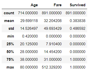
Understanding Summary values from data’s perspective and describing our data based on the same :
From the Fare Column, we can analyze that our 25th Percentile is 7.9 i.e 8 which means 25% of the data is less than 8.
75th Percentile value is 31 meaning 75% of data lies below 31.
One major thing to note is that there is a major difference between the 75 percentile value and maximum value, which can be interpreted as the Fare feature is highly skewed and does not follow a Normal Distribution.
The presence of outliers can also be detected from such differences.
Another thing to note is that Mean>Median(50th Percentile) i.e 32>14 so the distribution is skewed to the right. We can also check the value of skewness using a python function called data.skew().
Same interpretations can be made for the Age column. There is not a huge difference between the maximum and 75th percentile values and Median and Mean values are kind of the same so the distribution is not highly skewed.
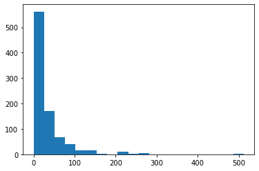
Checking the distribution of Fare column in Python. We can confirm from the below figure that Fare is skewed towards the right and the presence of outliers can also be detected.
import matplotlib.pyplot as plt
plt.hist(data.Fare,bins=20)
Output :
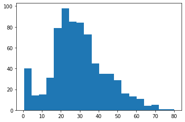
Now, Checking the distribution of the Age column. We can justify our interpretation of the Age column from the below figure.
plt.hist(data.Age,bins=20);
Output :
Another and more efficient way to detect outliers is Boxplot which is constructed from the Five Summary values.
Box plots and how they are constructed?
Boxplots are the graphical representation of the distribution of the data using Five Number summary values. It is one of the most efficient ways to detect outliers in our dataset.
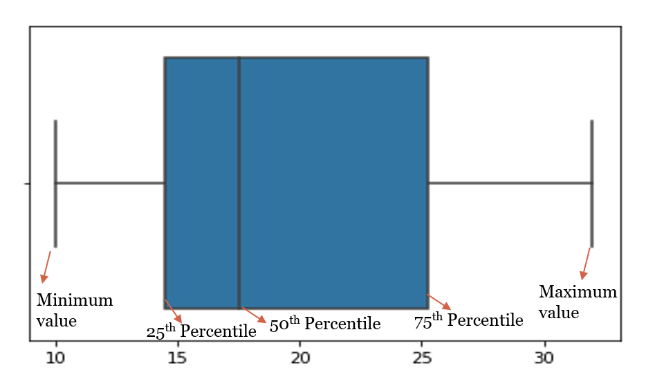
In statistics, an outlier is a data point that differs significantly from other observations. An outlier may be due to variability in the measurement or it may indicate experimental error; the latter are sometimes excluded from the dataset. An outlier can cause serious problems in statistical analyses.
Plotting the boxplot of the data points taken for the above example (11,23,32,26,16,19,30,14,16,10) where the Five number summary was :
- Minimum value: 10
- 25th Percentile: 14
- 50th Percentile: 17.5
- 75th Percentile: 26
- Maximum value: 32
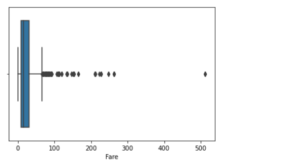
Plotting the boxplot of Fare Column of Titanic Dataset. We can see the number of outliers present in the column Fare in the below graph and it needs to be treated before Model building.
import seaborn as sns
sns.boxplot(data.Fare);
Output :
End Notes :
Another use of 5 Number Summary is the calculation of IQR i.e Inter Quartile Range which helps to deal with outliers. We will study this some other time, but for now, I hope you understood the basic interpretation of data from this simple concept of Five Number Summary.
Feel free to share your thoughts and suggestions here or on LinkedIn
About the Author
I am Deepanshi Dhingra currently working as a Data Science Researcher, and possess knowledge of Analytics, Exploratory Data Analysis, Machine Learning, and Deep Learning.
The media shown in this article are not owned by Analytics Vidhya and is used at the Author’s discretion.


