This article was published as a part of the Data Science Blogathon
Introduction
Pandas is an important data science library and everybody involved in data science uses it extensively. It presents the data in the form of a table similar to what we see in excel. If you have worked with excel, you must be aware that you can customize your sheets, add colors to the cells, and mark important figures that need extra attention.
While working with pandas, have you ever thought about how you can do the same styling to dataframes to make them more appealing and explainable? Generating reports out of the dataframes is a good option but what if you can do the styling in the dataframe using Pandas only?
That’s where the Pandas Style API comes to the rescue. This detailed article will go through all the features of Pandas styling, various types of built-in functions, creating our custom functions, and some of its advanced usages.Null values marked red for each column

Image by Author (Made in Canva)
Table of contents
Introduction to Pandas Style
A pandas dataframe is a tabular structure comprising rows and columns. One prevalent environment for data-related tasks is Jupyter notebooks, which are web-based, platform-independent integrated development environments (IDEs). In Jupyter notebooks, the pandas style of the dataframe is achieved through the use of HTML tags and CSS for rendering. Consequently, you have the flexibility to customize the appearance of these web elements.
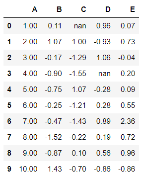
We will see this in action in upcoming sections. For now, let’s create a sample dataset and display the output dataframe.
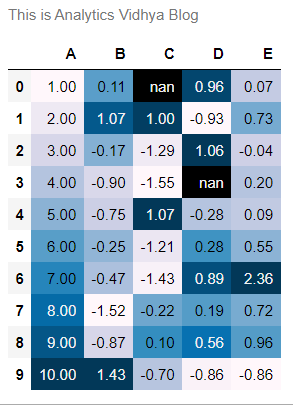
Doesn’t this look boring to you? What if you transform this minimal table to this:
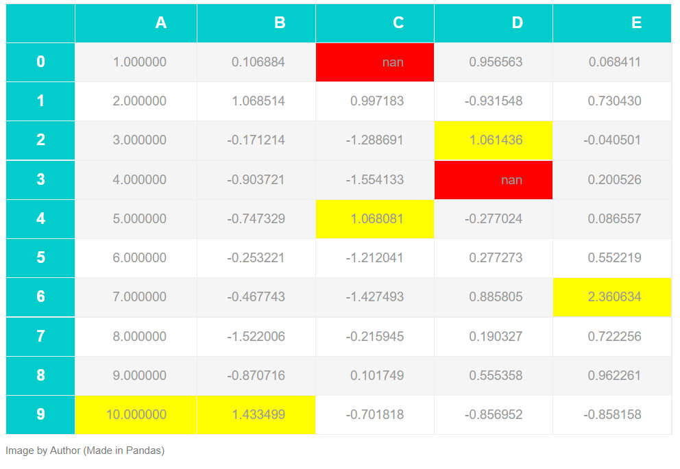
The transformed table above has:
- Maximum values marked yellow for each column
- Null values marked red for each column
- More appealing table style, better fonts for header, and increased font size.
Now, we will be exploring all the possible ways of styling the dataframe and making it similar to what you saw above, so let’s begin!
Styling the DataFrame
To leverage all the pandas styling properties for the dataframe, employ the pandas styling accessor (assuming the dataframe is stored in the variable “df”):
df.style
This accessor helps in the modification of the styler object (df.style), which controls the display of the dataframe on the web. Let’s look at some of the methods to style the dataframe.
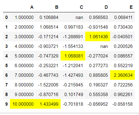
1. Highlight Min-Max values
The dataframes can take a large number of values but when it is of a smaller size, then it makes sense to print out all the values of the dataframe. Now, you might be doing some type of analysis and you wanted to highlight the extreme values of the data. For this purpose, you can add style to your dataframe that highlights these extreme values.
1.1 For highlighting maximum values: Chain “.highlight_max()” function to the styler object. Additionally, you can also specify the axis for which you want to highlight the values. (axis=1: Rows, axis=0: Columns – default).
df.style.highlight_max()
1.2 For highlighting minimum values: Chain “.highlight_min()” function to the styler object. Here also, you can specify the axis at which these values will be highlighted.
df.style.highlight_min()
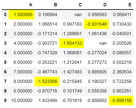
Both Min-Max highlight functions support the parameter “color” to change the highlight color from yellow.
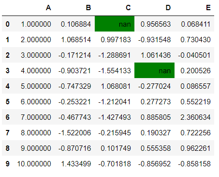
2. Highlight Null values
Every dataset has some or the other null/missing values. These values should be either removed or handled in such a way that it doesn’t introduce any biasness. To highlight such values, you can chain the “.highlight_null()” function to the styler object. This function doesn’t support the axis parameter and the color control parameter here is “null_color” which takes the default value as “red”
df.style.highlight_null(null_color="green")
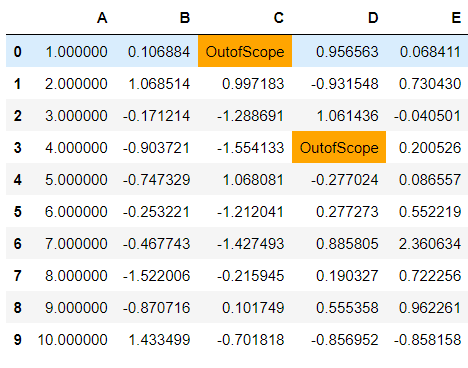
set_na_rep(): Along with highlighting the missing values, they may be represented as “nan”. You can change the representation of these missing values using the set_na_rep() function. This function can also be chained with any styler function but chaining it with highlight_null will provide more details.
df.style.set_na_rep("OutofScope").highlight_null(null_color="orange")
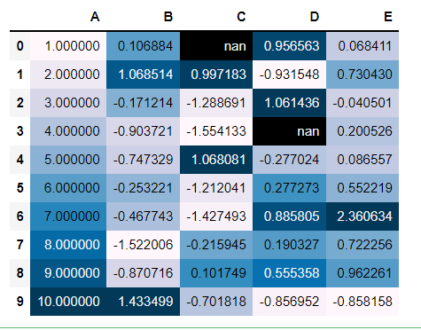
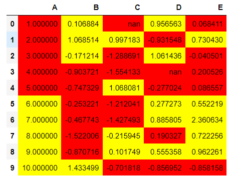
3. Create Heatmap within dataframe
Heatmaps are used to represent values with the color shades. The higher is the color shade, the larger is the value present. These color shades represent the intensity of values as compared to other values. To plot such a mapping in the dataframe itself, there is no direct function but the “styler.background_gradient()” workaround does the work.
df.style.background_gradient()
There are few parameters you can pass to this function to further customize the output generated:
- cmap: By default, the “PuBu” colormap is selected by pandas You can create a custom matplotlib colormap and pass it to the camp parameter.
- axis: Generating heat plot via rows or columns criteria, by default: columns
- text_color_threshold: Controls text visibility across varying background colors.
4. Table Properties
As mentioned earlier also, the dataframe presented in the Jupyter notebooks is a table rendered using HTML and CSS. The table properties can be controlled using the “set_properties” method. This method is used to set one or more data-independent properties.
This means that the modifications are done purely based on visual appearance and no significance as such. This method takes in the properties to be set as a dictionary.
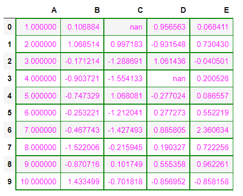
Example: Making table borders green with text color as purple.
df.style.set_properties(**{'border': '1.3px solid green',
                          'color': 'magenta'})
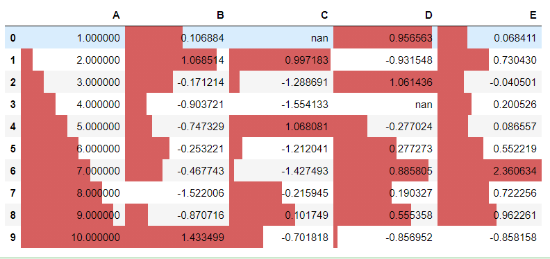
5. Create Bar charts
Just as the heatmap, the bar charts can also be plotted within the dataframe itself. The bars are plotted in each cell depending upon the axis selected. By default, the axis=0 and the plot color are also fixed by pandas but it is configurable. To plot these bars, you simply need to chain the “.bar()” function to the styler object.
df.style.bar()
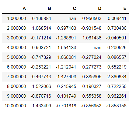
6. Control precision
The current values of the dataframe have float values and their decimals have no boundary condition. Even the column “A”, which had to hold a single value is having too many decimal places. To control this behavior, you can use the “.set_precision()” function and pass the value for maximum decimals to be allowed.
df.style.set_precision(2)
Now the dataframe looks clean.
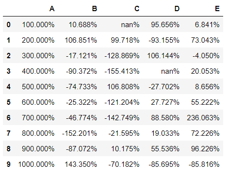
7. Add Captions
Like every image has a caption that defines the post text, you can add captions to your dataframes. This text will depict what the dataframe results talk about. They may be some sort of summary statistics like pivot tables.
df.style.set_caption("This is Analytics Vidhya Blog").set_precision(2).background_gradient()
(Here, different methods have been changed along with the caption method)
8. Hiding Index or Column
As the title suggests, you can hide the index or any particular column from the dataframe. Hiding index from the dataframe can be useful in cases when the index doesn’t convey anything significant about the data. The column hiding depends on whether it is useful or not.
df.style.hide_index()
9. Control display values
Using the styler object’s “.format()” function, you can distinguish between the actual values held by the dataframe and the values you present. The “format” function takes in the format spec string that defines how individual values are presented.
You can directly specify the specification which will apply to the whole dataset or you can pass the specific column on which you want to control the display values.
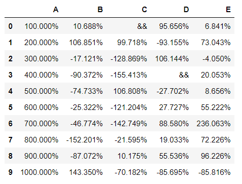
df.style.format("{:.3%}")
You may notice that the missing values have also been marked by the format function. This can be skipped and substituted with a different value using the “na_rep” (na replacement) parameter.
df.style.format("{:.3%}", na_rep="&&")
Create your Own Styling Method
Although you have many methods to style your dataframe, it might be the case that your requirements are different and you need a custom styling function for your analysis. You can create your function and use it with the styler object in two ways:
- apply function: When you chain the “apply” function to the styler object, it sends out the entire row (series) or the dataframe depending upon the axis selected. Hence, if you make your function work with the “apply” function, it should return the series or dataframe with the same shape and CSS attribute-value pair.
- apply map function: This function sends out scaler values (or element-wise) and therefore, your function should return a scaler only with CSS attribute-value pair.
Let’s implement both types:
Target: apply function
def highlight_mean_greater(s):
    '''
    highlight yellow is value is greater than mean else red.
    '''
    is_max = s > s.mean()
    return ['background-color: yellow' if i else 'background-color: red' for i in is_max]
df.style.apply(highlight_mean_greater)
Target: apply map function
def color_negative_red(val):
    """
    Takes a scalar and returns a string with
    the css property `'color: red'` for negative
    strings, black otherwise.
    """
    color = 'red' if val < 0 else 'black'
    return 'color: %s' % color
df.style.apply(color_negative_red)
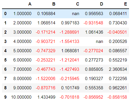
Table Styles
These are styles that apply to the table as a whole, but don’t look at the data. It is very similar to the set_properties function but here, in the table styles, you can customize all web elements more easily.
The function of concern here is the “set_table_styles” that takes in the list of dictionaries for defining the elements. The dictionary needs to have the selector (HTML tag or CSS class) and its corresponding props (attributes or properties of the element). The props need to be a list of tuples of properties for that selector.
The images shown in the beginning, the transformed table has the following style:
styles = [
    dict(selector="tr:hover",
                props=[("background", "#f4f4f4")]),
    dict(selector="th", props=[("color", "#fff"),
                               ("border", "1px solid #eee"),
                               ("padding", "12px 35px"),
                               ("border-collapse", "collapse"),
                               ("background", "#00cccc"),
                               ("text-transform", "uppercase"),
                               ("font-size", "18px")
                               ]),
    dict(selector="td", props=[("color", "#999"),
                               ("border", "1px solid #eee"),
                               ("padding", "12px 35px"),
                               ("border-collapse", "collapse"),
                               ("font-size", "15px")
                               ]),
    dict(selector="table", props=[
                                    ("font-family" , 'Arial'),
                                    ("margin" , "25px auto"),
                                    ("border-collapse" , "collapse"),
                                    ("border" , "1px solid #eee"),
                                    ("border-bottom" , "2px solid #00cccc"),
                                      ]),
    dict(selector="caption", props=[("caption-side", "bottom")])
]
And the required methods which created the final table:
df.style.set_table_styles(styles).set_caption("Image by Author (Made in Pandas)").highlight_max().highlight_null(null_color='red')
Export to Excel
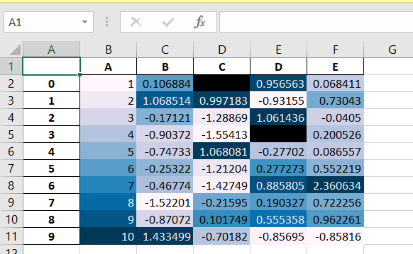
You can store all the styling you have done on your dataframe in an excel file. The “.to_excel” function on the styler object makes it possible. The function needs two parameters: the name of the file to be saved (with extension XLSX) and the “engine” parameter should be “openpyxl”.
df.style.set_precision(2).background_gradient().hide_index().to_excel('styled.xlsx', engine='openpyxl')
Frequently Asked Questions
Q1. What is pandas style?
A. Pandas styling refers to the capability in the Python library Pandas to apply formatting and styling to tabular data frames. It allows users to customize the visual representation of their data, such as changing cell colors, fonts, and highlighting specific values, making it easier to analyze and present data in a more visually appealing and informative manner.
Q2. What is the code style of pandas?
A. Pandas follows the PEP 8 style guide, which is the Python Enhancement Proposal for code style conventions. This style guide outlines various recommendations for writing clean, readable, and consistent Python code. Key aspects of the Pandas code style include:
1. Indentation: Pandas code uses 4 spaces for indentation, following the standard Python convention.
2. Variable and Function Naming: Descriptive, lowercase variable names with underscores (snake_case) are preferred. Function names should also be lowercase with underscores.
3. Line Length: Pandas code adheres to the recommended line length of 79 characters per line, with a maximum of 72 characters for docstrings and comments.
4. Import Statements: Imports are organized with standard libraries first, followed by third-party libraries, and then Pandas imports.
5. Whitespace: Consistent use of whitespace around operators and after commas is encouraged.
6. Comments: Code should be well-documented with clear and concise comments.
By adhering to these guidelines, Pandas code remains consistent, readable, and easy to maintain.
Conclusion
In this detailed article, we saw all the built-in methods to style the dataframe. Then we looked at how to create custom styling functions and then we saw how to customize the dataframe by modifying it at HTML and CSS level. We also saw how to save our styled dataframe into excel files.
If you have any doubts, queries, or potential opportunities, then you can reach out to me via
1. Linkedin – in/kaustubh-gupta/
2. Twitter – @Kaustubh1828
3. GitHub – kaustubhgupta
4. Medium – @kaustubhgupta1828
The media shown in this article are not owned by Analytics Vidhya and are used at the Author’s discretion.
Kaustubh Gupta
13 Sep, 2023
Hi, I am a Python Developer with an interest in Data Analytics and am on the path of becoming a Data Engineer in the upcoming years. Along with a Data-centric mindset, I love to build products involving real-world use cases. I know bits and pieces of Web Development without expertise: Flask, Fast API, MySQL, Bootstrap, CSS, JS, HTML, and learning ReactJS. I also do open source contributions, not in association with any project, but anything which can be improved and reporting bug fixes for them.


hide_index() doesn't seem to work. Ref last screenshot of the excel output.