This article was published as a part of the Data Science Blogathon.
Overview
In this article, we will be predicting the income of US people based on the US census data and later we will be concluding whether that individual American have earned more or less than 50000 dollars a year. If you want to know more about the dataset visit this link.

Takeaways
- Exploratory data analysis: Learn Exploratory data analysis on the complex dataset.
- Data Insights: Visualizing the data and getting the business-related insights using data visualization.
- Visualization Library: Learn about the powerful visualization library i.e.Plotly and Dexplot.
Import all the libraries
import pandas as pd
import numpy as np
import matplotlib.pyplot as plt
import seaborn as sns
import plotly.express as px
import plotly.graph_objs as go
from plotly.offline import iplot
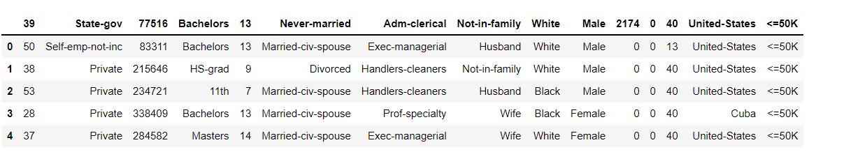
Reading the Data from the CSV file
df = pd.read_csv(r"D:Data Science projectsUS census income predictionPredicting the Income Level- US census dataadult.csv")
df.head()
Output:
Let’s check what columns do this dataset has
df.columns
Output:
Index(['39', ' State-gov', ' 77516', ' Bachelors', ' 13', ' Never-married',
       ' Adm-clerical', ' Not-in-family', ' White', ' Male', ' 2174', ' 0',
       ' 40', ' United-States', ' <=50K'],
      dtype='object')
Exploratory Data Analysis (EDA)
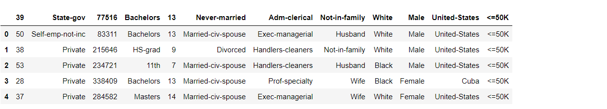
Here we are dropping down 2174, 0, and 40 columns from the dataset which is irrelevant to the dataset.
df.drop([' 2174', ' 0', ' 40'], axis = 'columns', inplace = True)
df.head()
Output:
Since with the given name, we are unable to judge what the data from the US census data is indicating so, let us rename the columns name to understand the dataset more easily.
df.columns = ['Age', 'Type_of_Owner', 'id', 'Education', 'No_of_Projects_Done',
              'Marital_Status', 'Job_Designation', 'Family_Relation', 'Race', 'Gender',
              'Country', 'Salary']
Let’s have a look at our dataset now
df.head()
Output:
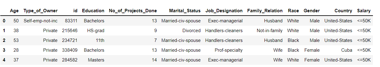
Inference: Now the data seems quite readable to us so let’s move forward now.
Finding the shape of the data
df.shape
Output:
(32560, 12)
Inference: There are 32560 rows and 12 columns in the dataset.
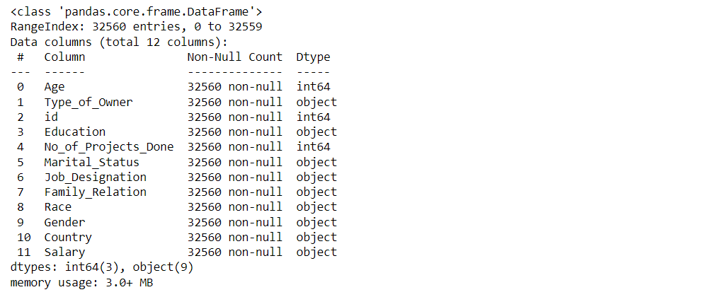
Let’ have a look at what information we can draw from our dataset.
df.info()
Output:
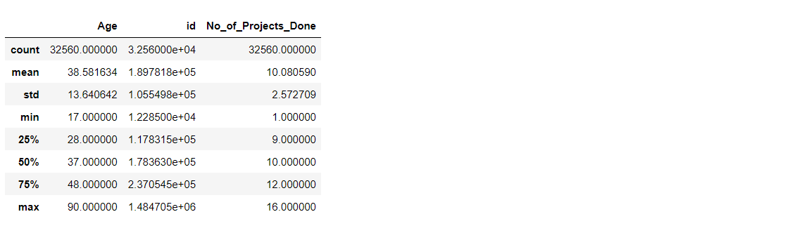
Describing the Data
df.describe()
Output:
Let’s see how many null values are there in our dataset
df.isnull().sum()
Output:
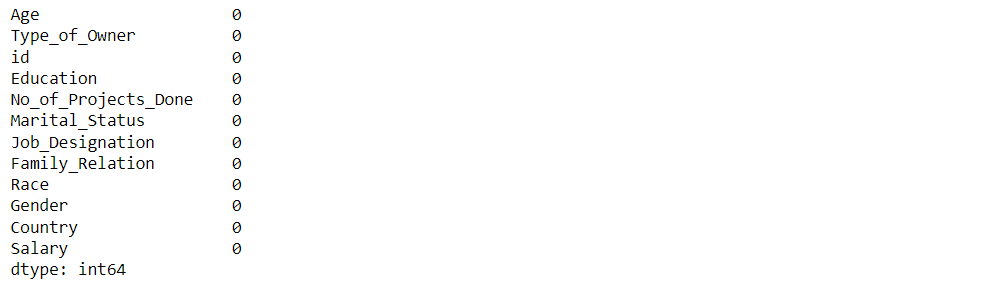
Inference: Bingo! there are no missing values in our dataset.
Data Visualization
Visualizing the Type of US Census Data
labels = df['Type_of_Owner'].value_counts().index
values = df['Type_of_Owner'].value_counts().values

colors = df['Type_of_Owner']

fig = go.Figure(data = [go.Pie()])

fig.show()
Output:
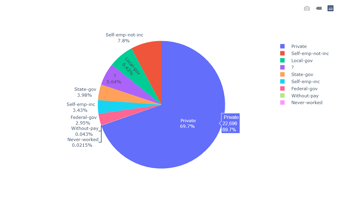
Inference: From the above datasets we can see that most of the US census data says that Jobs lie in the private sector and it’s around 70%.
Visualizing the Type of Age Dataset in US Census Data
labels = df['Age'].value_counts()[:10].index
values = df['Age'].value_counts()[:10].values

colors = df['Age']

fig = go.Figure(data = [go.Pie()])

fig.show()
Output:
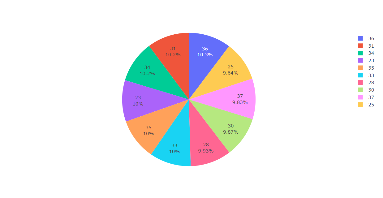
Inference: From the above graph we can see that most of the job-seeker falls in the age-group of 30-40.
Visualizing the Highest Degree of Education
labels = df['Education'].value_counts().index
values = df['Education'].value_counts().values

colors = df['Education']

fig = go.Figure(data = [go.Pie()])

fig.show()
Output:
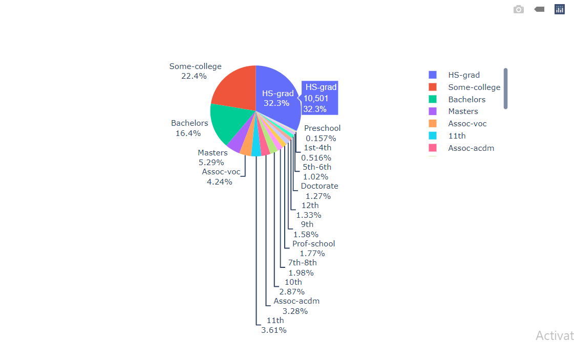
Inference: Most of the Working Class people have High school graduation degrees followed by Some-College degrees and bachelor.
Visualizing the No_of_Projects_Done
labels = df['No_of_Projects_Done'].value_counts().index
values = df['No_of_Projects_Done'].value_counts().values

colors = df['No_of_Projects_Done']

fig = go.Figure(data = [go.Pie()])

fig.show()
Output:
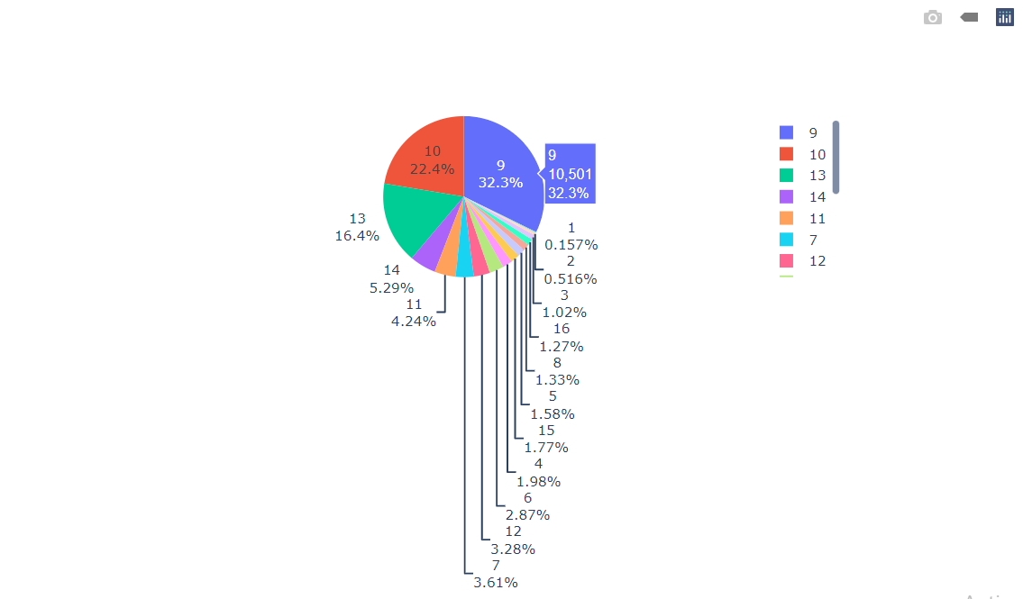
Inference: Here we can conclude that most of the People have 9 or 10 projects.
Visualizing the Marital Status of the Working Class People
labels = df['Marital_Status'].value_counts().index
values = df['Marital_Status'].value_counts().values

colors = df['Marital_Status']

fig = go.Figure(data = [go.Pie()])

fig.show()
Output:
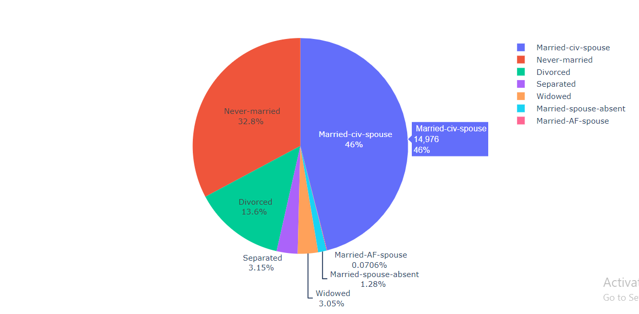
Inference: From the output, we can see that 46% of people are married and 32.8% of people never get married.
Visualizing the Job Descriptions of the Working Class People
labels = df['Job_Designation'].value_counts().index
values = df['Job_Designation'].value_counts().values

colors = df['Job_Designation']

fig = go.Figure(data = [go.Pie()])

fig.show()
Output:
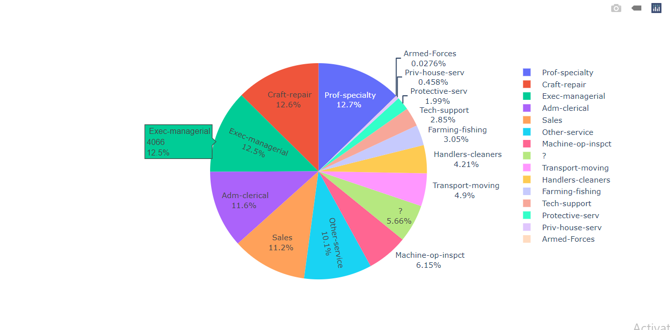
Inference: About 50% of the people are involved in Prof-speciality, Craft-repair, Exec-managerial, and Adm-clerical.
Visualizing the Family-Relation of the Working Class People
labels = df['Family_Relation'].value_counts().index
values = df['Family_Relation'].value_counts().values

colors = df['Family_Relation']

fig = go.Figure(data = [go.Pie()])

fig.show()
Output:

Inference: Most of the working-class people are Husbands of someone.
Try to see the different types of the race of the Working Class
df['Race'].unique()
Output:
array([' White', ' Black', ' Asian-Pac-Islander', ' Amer-Indian-Eskimo',
       ' Other'], dtype=object)
Inference: There are 4 different races of the Working Class of the people.
Visualizing the Race of the Working Class People
labels = df['Race'].value_counts().index
values = df['Race'].value_counts().values

colors = ['#98adbf',
 '#1d4466',
 '#2678bf',
 '#2c6699']

fig = go.Figure(data = [go.Pie()])

fig.show()
Output:
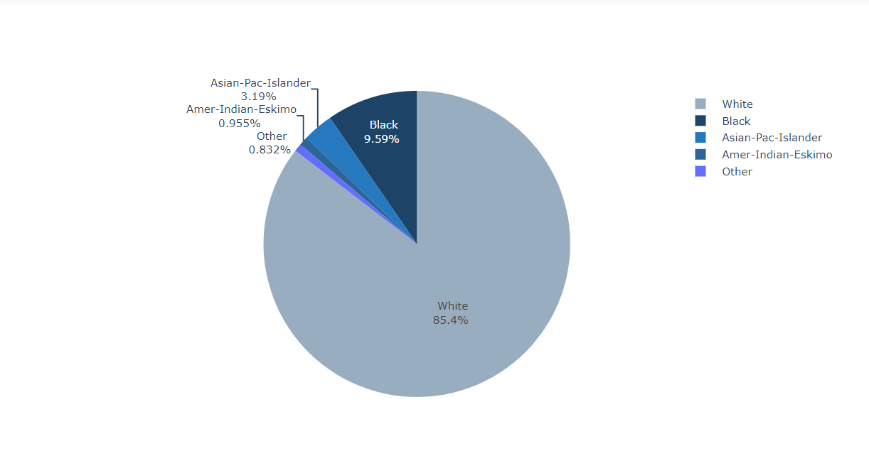
Inference: From the above plot it is quite visible that White People have supremacy over the Black while getting jobs and Black people still face Color Discrimination.
Visualizing the Gender of the Working Class People
labels = df['Gender'].value_counts().index
values = df['Gender'].value_counts().values

colors = ['#98adbf',
 '#2c6699']

fig = go.Figure(data = [go.Pie()])

fig.show()
Output:

Visualizing the Salary of the Working Class People
labels = df['Salary'].value_counts().index
values = df['Salary'].value_counts().values

colors = ['#98adbf',
 '#2c6699']

fig = go.Figure(data = [go.Pie()])

fig.show()
Output:
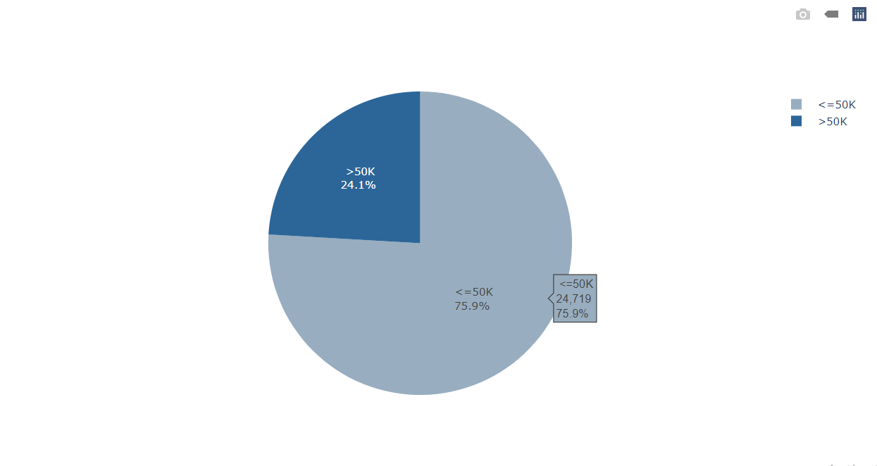
Inference: Only around 24% of the people get a salary above 24% and around 76% of the people get 50k or less than 50k as salary.
Importing the Dexplot
import dexplot as dxp

dxp.count(
    val="Age",
    data = df,
    split="Type_of_Owner",
    stacked = True,
    figsize=(12,12))
Output:
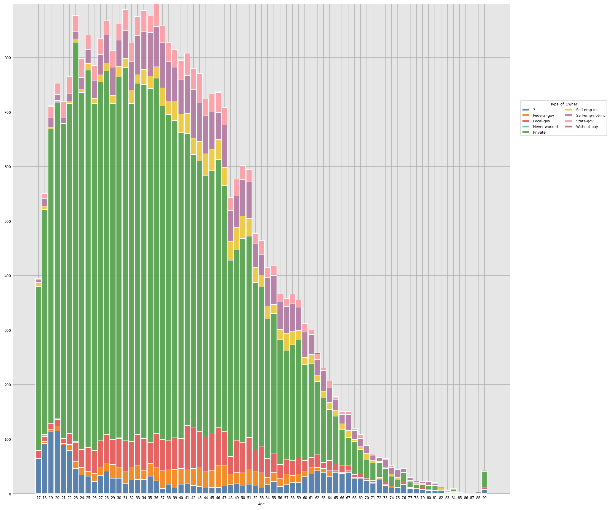
Inference: From the above graph we can see how the Job Type of People of Different Age varies, Though most people are involved in Private Job Type in all the age group Private Job is predominantly occupied by the people in the age group of 17-60 years old people.
dxp.count(
    val="Age",
    data = df,
    split="Marital_Status",
    stacked = True,
    figsize=(12,12))
Output:
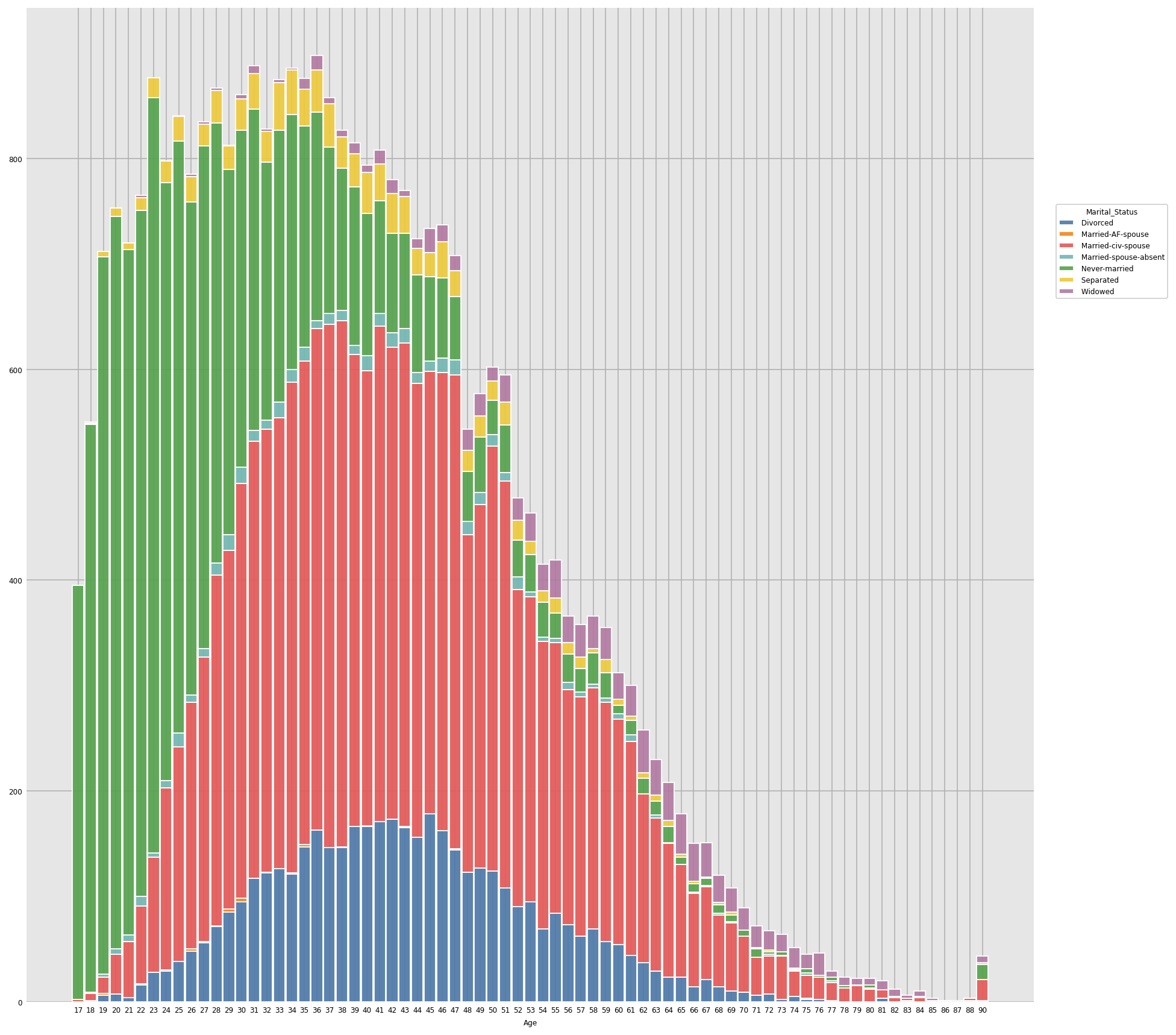
Inference: From the above data it is clear that people falling in the age group of 17-30 are unmarried and people falling in the age group of 30-65 years are predominantly married also a large portion of people in the age-group 30-55 years are divorced.
dxp.count(
    val="Age",
    data = df,
    split="Job_Designation",
    stacked = True,
    figsize=(12,12))
Output:
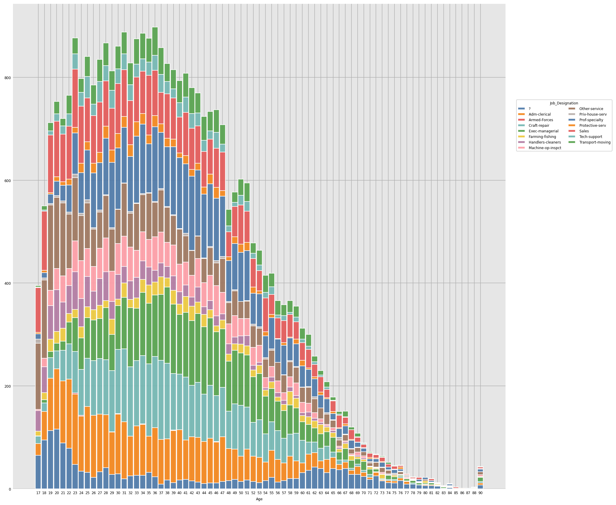
Inference: From the above graph we can see how the Age and Job-Profile of people vary.
dxp.count(
    val="Age",
    data = df,
    split="Race",
    stacked = True,
    figsize=(12,12))
Output:
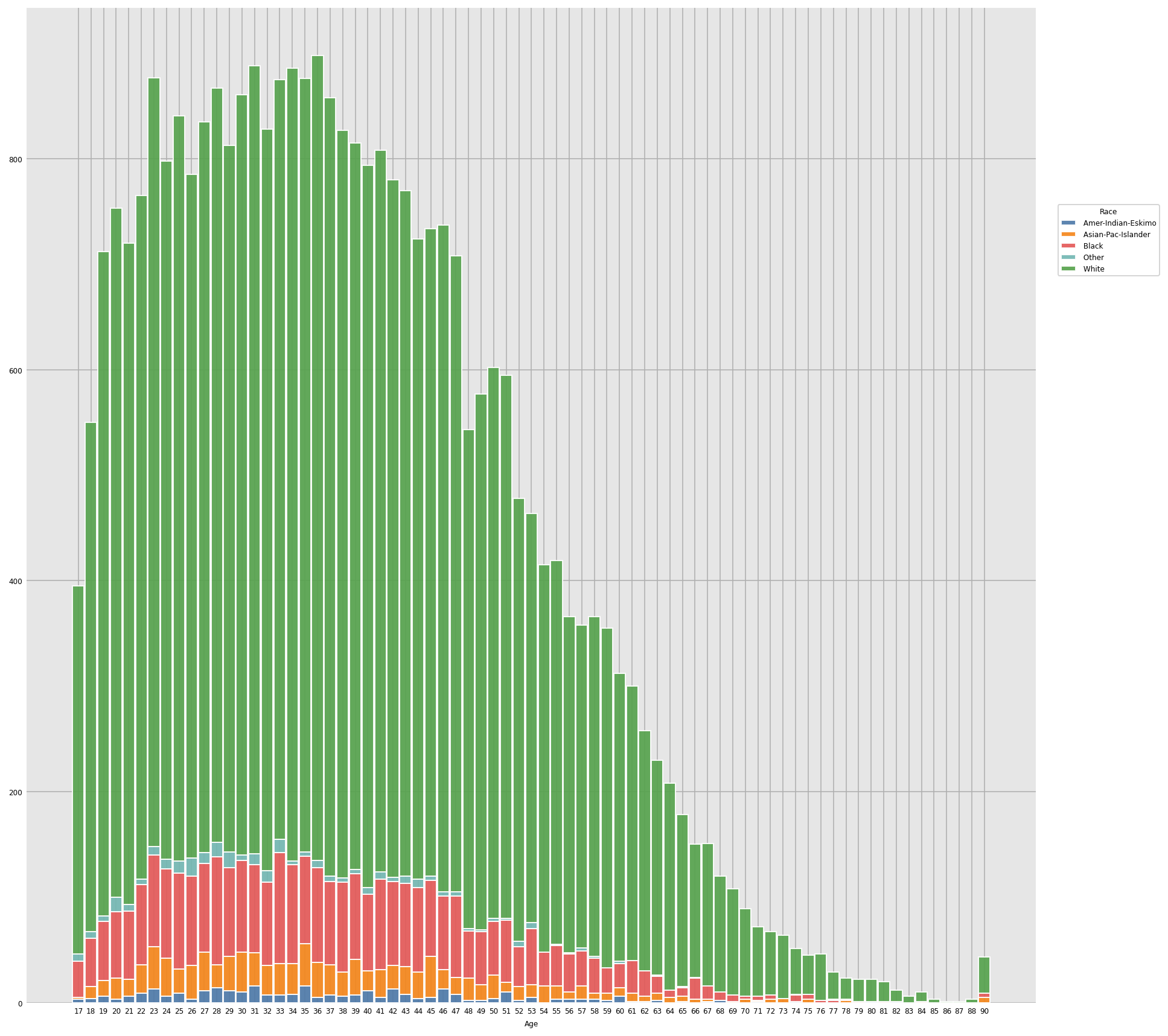
Inference: From the above graph it’s clear most people in any age group are predominantly white.
dxp.count(
    val="Age",
    data = df,
    split="Gender",
    stacked = True,
    figsize=(12,12))
Output:
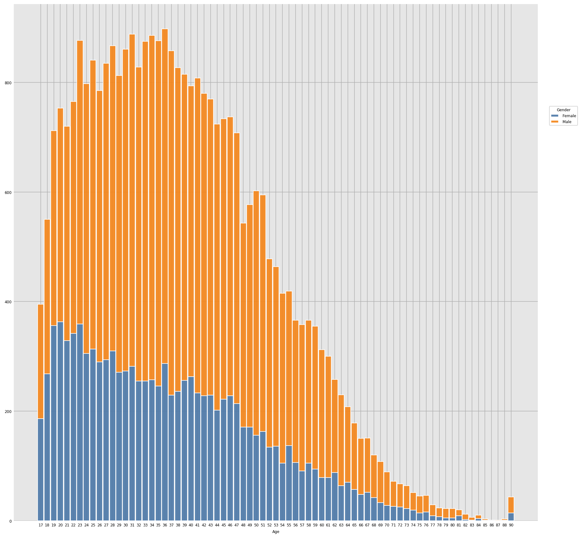
Inference: It’s clear from the above graph that most working females fall in the age group of 17-55 and in fact they have started working at an early age while most males are in the age group of 23 onwards.
dxp.count(
    val="Age",
    data = df,
    split="Salary",
    stacked = True,
    figsize=(12,12))
Output:
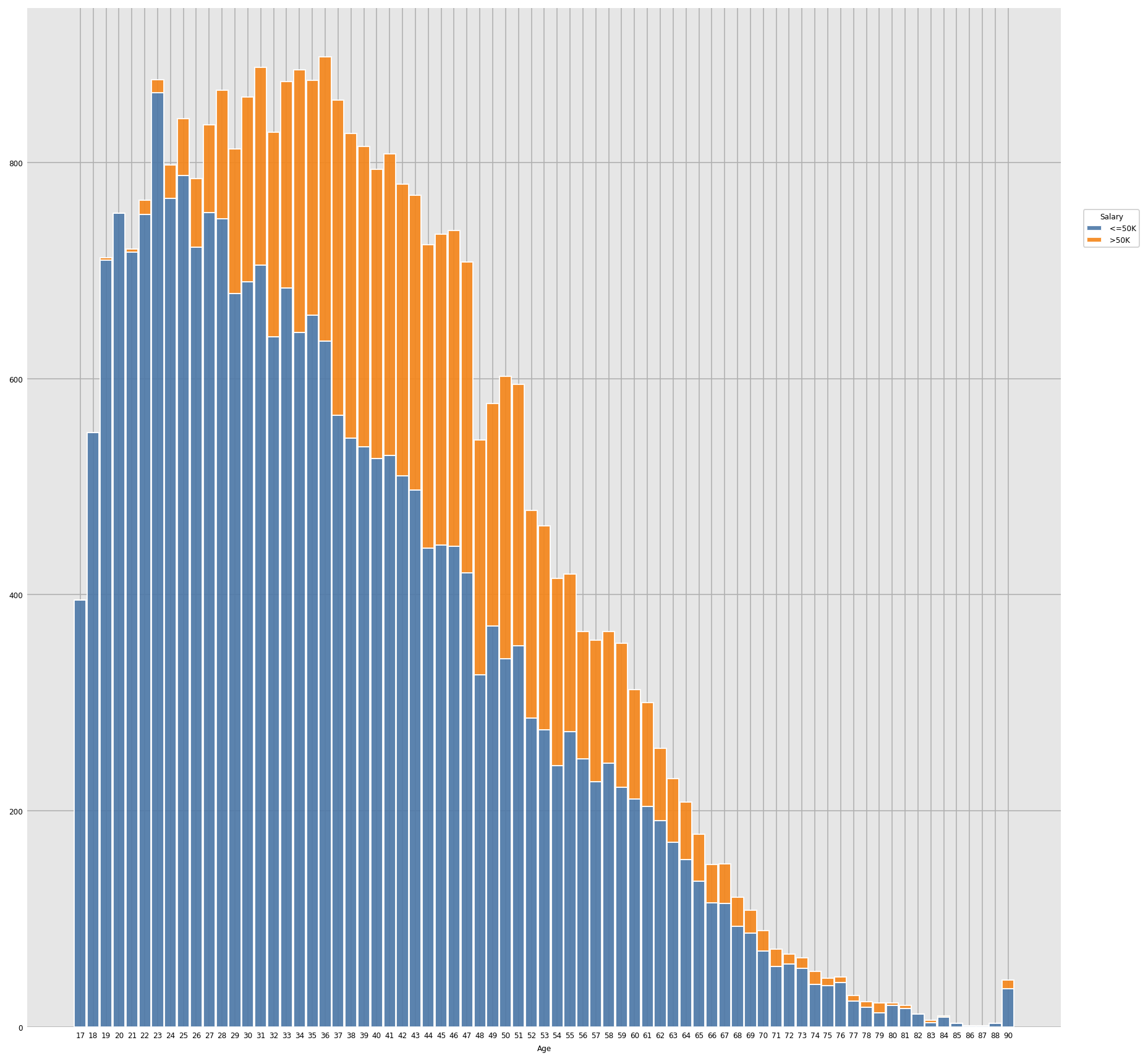
Inference: It’s obvious from the graph that with the passes of age tend to get more salaries increases in general.
Conclusion
We did the entire EDA process for this dataset from looking at the head of the dataset to get the insights of each and every feature whether it is univariate analysis or the bivariate analysis and along with getting the insights from the data numerically we also have used two one of the most interactive visualization libraries i.e. Plotly and Dexplot.
Endnotes
Here’s the repo link to this article.
Note: All images/ screenshots used in the article are by the Author. If the source isn’t mentioned otherwise.
About Me
Greeting to everyone, I’m currently working in TCS and previously, I worked as a Data Science Analyst in Zorba Consulting India. Along with full-time work, I’ve got an immense interest in the same field, i.e. Data Science, along with its other subsets of Artificial Intelligence such as Computer Vision, Machine learning, and Deep learning; feel free to collaborate with me on any project on the domains mentioned above (LinkedIn).
Here you can access my other articles, which are published on Analytics Vidhya as a part of the Blogathon (link).
The media shown in this article is not owned by Analytics Vidhya and are used at the Author’s discretion.


