This article was published as a part of the Data Science Blogathon
Hi all, this is my first blog hope you all like it and can learn, gain some information out of it!
Introduction
In this blog, we will try to understand the process of EDA(Exploratory Data Analysis) and we will also perform a practical demo of how to do EDA with SAS and Python.
The dataset that I will be using is the bank loan dataset which has 100514 records and 19 columns. I took this big dataset so that we could learn more from it rather than just using a small dataset for our project which would not be so much fun and learning.
This blog that I’m writing is just for making you’ll understand the way things work in both of these tools (i.e SAS and Python), which are undoubtedly the top best tools out in the market for Data Science and Analysis. You can always tweak the code and make it much more dynamic and reliable.
I have seen that there are ample resources available out there for Python, but this is not the same case with SAS, So I thought of giving you a clearer picture of how things work in SAS.
Let’s get started and dive deep into this process…
Exploratory Data Analysis
First, we’ll answer few questions about this process-
- What is EDA?-
- Why do we use it?-
- How to perform this process?
Answer(1)- It is a process in which we get to know our data by summarizing the information and even using graphical charts to better visualize our data.
Answer(2)- It’s a building block of a data science life cycle and will further help us determine the properties, importance of variables, and build a more robust model for our dataset.
Answer(3)- We just need to select our dataset and perform some basics operations on it like Identification of variables and their data types, Descriptive statistics of our dataset, Finding Missing values, Checking for Unique values in our data, Univariate and Bivariate Analysis, etc…
So now we will start with practical examples for SAS followed by Python and I’ll mention codes for both of the tools simultaneously for each process…..
In the graphical visualizations part, I haven’t used all variables for demonstrating different types of visualizations I just have used a few no. of variables because it increases the processing time as our data is large, and the second and most important thing is that I don’t want to make this blog too long for viewers to read. My main motive is to make them understand how things work so they can relate to it and further scale their knowledge and write code efficiently.
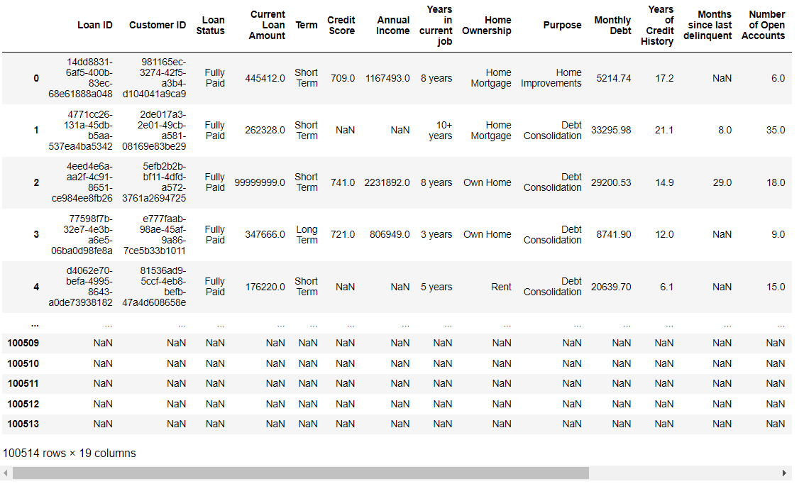
Identification of variables and data types-
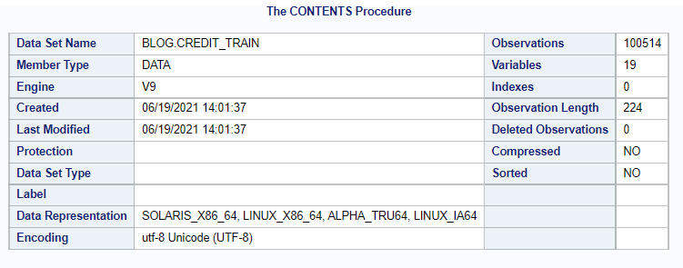
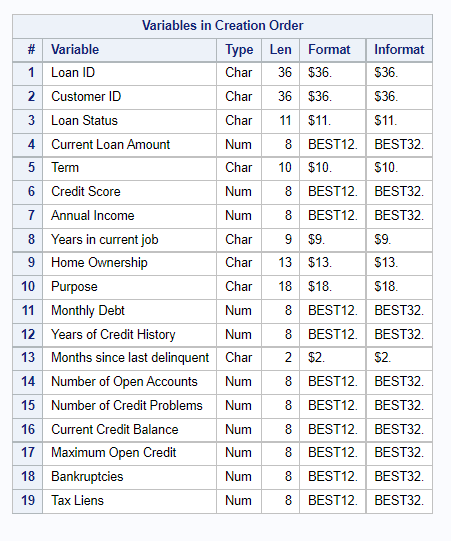
Here we will look at the metadata of our dataset with the type of variables present in it.
SAS Code-
/* Checking the contents of the dataset */
proc contents data=blog.credit_train;
run;
/* Taking a look at the dataset for only 50 records */
proc print data=blog.credit_train obs=50;
run;
Output-
Contents of the dataset-
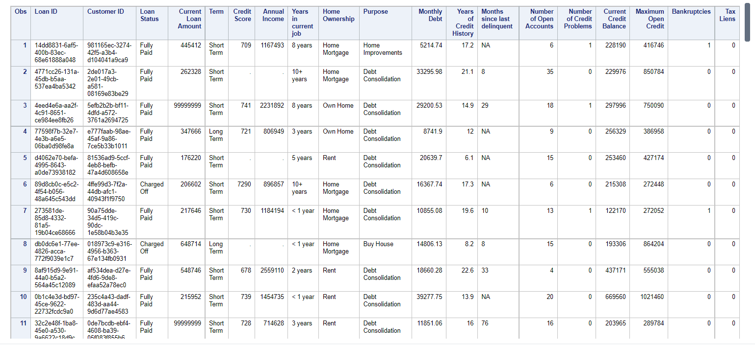
Viewing only 100 records from the dataset as the original no is too huge (i.e 1 lakh+)-
Here only 11 records are captured in the image while we can scroll it further when implementing.
Python Code-
# Importing the libraries for the blog's dataset
import numpy as np
import pandas as pd
import matplotlib.pyplot as plt
%matplotlib inline
import seaborn as sns
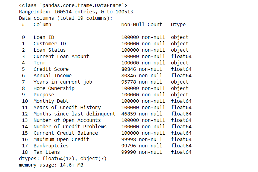
# Contents of the data and shape of the data
df.info()
# Reading the dataset
df = pd.read_csv('C:\Users\Aspire 5\Desktopcreditcredit_train.csv')
df
df.head(50)
Output-
Contents of the data and shape of the dataset-
Reading the dataset-
-
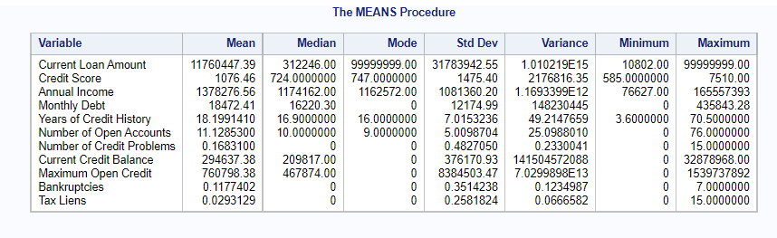
Descriptive Statistics of our dataset-
Here we will check the mean, median, mode, etc… for our dataset
SAS Code-
/* Descriptive statistics of our dataset */
proc means data=blog.credit_train mean median mode std var min max;
run;
Output-
Descriptive stats-
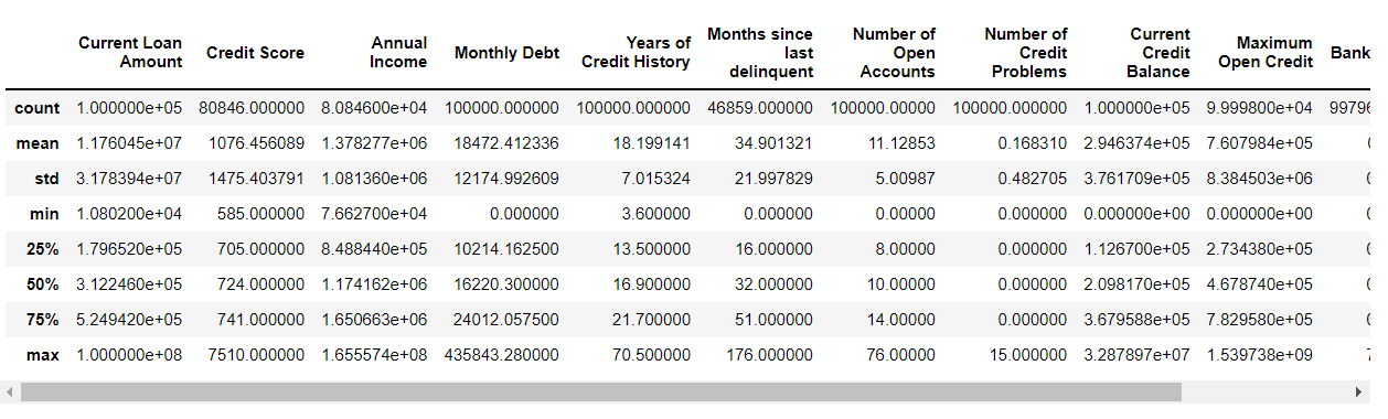
Python Code-
# Descriptive statistics of our dataset
df.describe()
Output-
Descriptive stats-
-
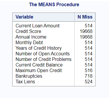
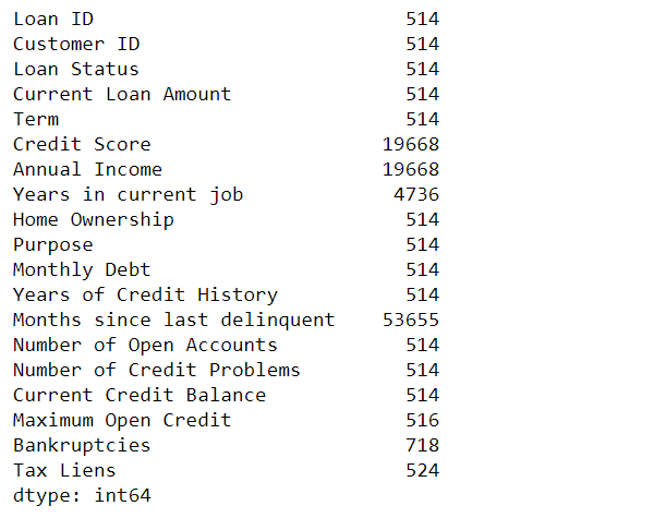
Finding missing values-
We will check the no. of missing values in each column.
SAS Code-
/* Missing values in our dataset */
proc means data=blog.credit_train nmiss;
run;
Output-
Missing Count-
Python Code-
# Total no of missing values in each column
df.isnull().sum()
Output-
Missing values count in each column-
-
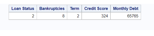
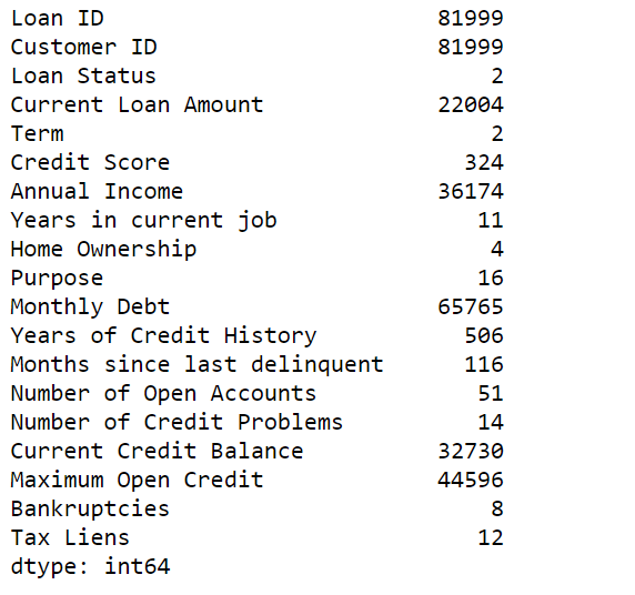
Unique values in our data-
We are checking for unique values in our dataset to get familiar with how much value a variable truly holds out of all the records, which may help in normalizing the data if the values are too less.
Unique values for columns-
SAS Code-
Here is the unique value for 5 columns but we can scale it for more columns just by adding the count distinct statement…
/* Unique values for 5 columns */
proc sql;
select count(distinct 'Loan Status'n) as 'Loan Status'n,
       count(distinct Bankruptcies) as Bankruptcies,
       count(distinct Term) as Term,
       count(distinct 'Credit Score'n) as 'Credit Score'n,
       count(distinct 'Monthly Debt'n) as 'Monthly Debt'n
  from blog.credit_train;
quit;
Output-
Python Code-
# Total count of unique values for each column
a = pd.DataFrame(df)
a.nunique()
Output-
-
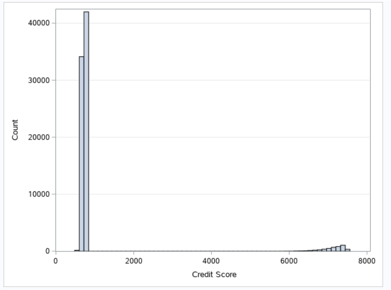
Univariate Analysis-
It is a part of statistical analysis where we take into consideration a single variable and perform analysis on it
Histogram-
It is the representation of distribution for numerical data.
SAS Code-
Here I have used only a single variable just to show you, but you all can do it for multiple variables furthermore you can use another procedure for doing so I’ll list both of the procedures below.
/* You can give multiple variables in this procedure to create histograms */
proc univariate data=blog.credit_train  novarcontents;
histogram 'Current Loan Amount'n 'Credit Score'n / ;
run;
/* Creating histogram with only one variable (i.e Credit Score) */
ods graphics / reset width=6.4in height=4.8in imagemap;
proc sgplot data=BLOG.CREDIT_TRAIN;
	histogram 'Credit Score'n /;
	yaxis grid;
run;
Output-
Here the output is from the second procedure (i.e proc sgplot) for the Credit Score variable…
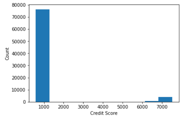
Python Code-
# Creating histogram for Credit Score variable
plt.hist(df['Credit Score'])
plt.xlabel('Credit Score')
plt.ylabel('Count')

plt.show()
Output-
- Bivariate Analysis-
It is a part of statistical analysis where we take into consideration multiple variables and perform analysis on them.
Scatter plot-
It is used to check the relationship between numeric variables.
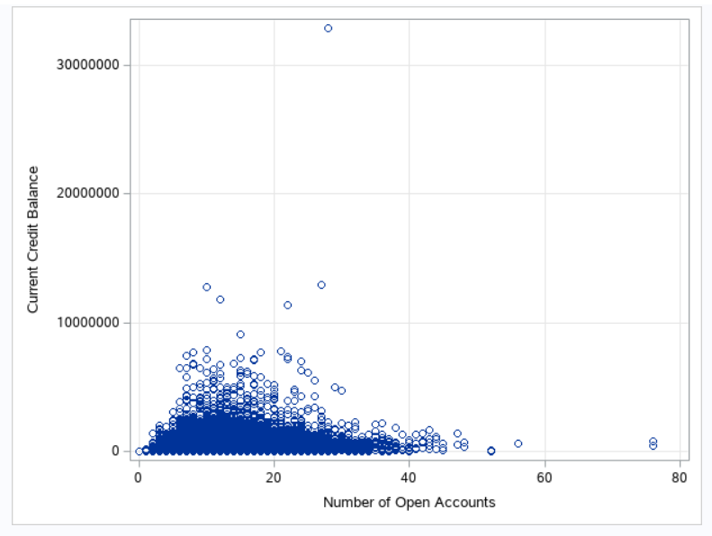
SAS Code-
/* Checking Relationship between two variables by using scatter plot */
ods graphics / reset width=6.4in height=4.8in imagemap;
proc sgplot data=BLOG.CREDIT_TRAIN;
	scatter x='Number of Open Accounts'n y='Current Credit Balance'n /;
	xaxis grid;
	yaxis grid;
run;
ods graphics / reset;
Output-
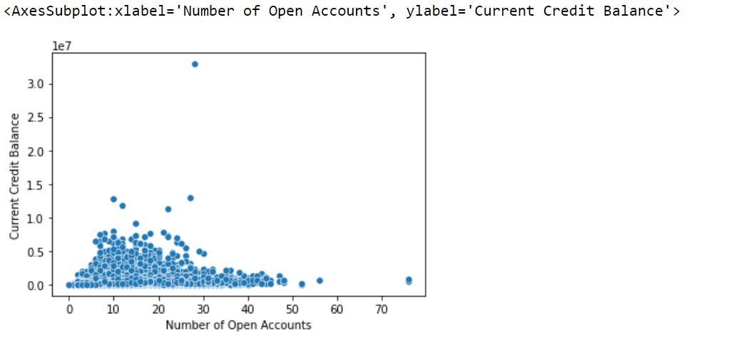
Python Code-
# Creating a scatter plot to observe relationship between numeric variables
sc = sns.scatterplot(data=df, x="Number of Open Accounts" ,y="Current Credit Balance")
sc
Output-
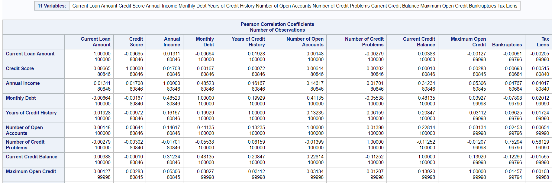
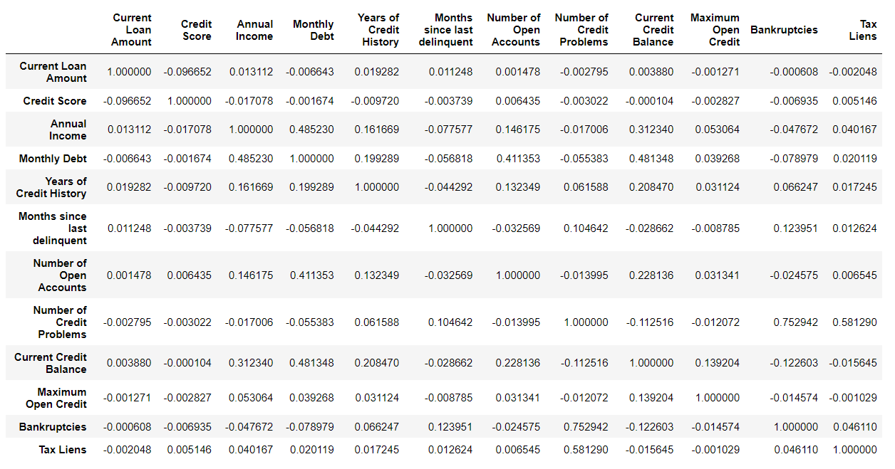
Correlation-
It says how the variables are correlated with one another, which will further help take important variables into account for model building.
SAS Code-
/* Correaltion among numeric variables */
ods noproctitle;
ods graphics / imagemap=on;
proc corr data=BLOG.CREDIT_TRAIN pearson nosimple noprob plots=none;
	var 'Current Loan Amount'n 'Credit Score'n 'Annual Income'n 'Monthly Debt'n
		'Years of Credit History'n 'Number of Open Accounts'n
		'Number of Credit Problems'n 'Current Credit Balance'n 'Maximum Open Credit'n
		Bankruptcies 'Tax Liens'n;
run;
Output-
Python Code-
# Correlation among variables
df.corr() #Displaying numerical values
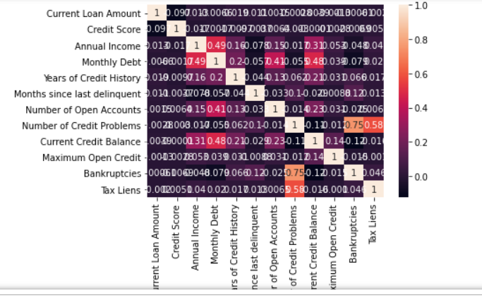
df_corr = df.corr() #Generating Graphical visualization
sns.heatmap(df_corr,
xticklabels = df_corr.columns.values,
yticklabels = df_corr.columns.values,
annot = True);
Output-
Displaying numerical values as output-
Generating graphical visualization as output-
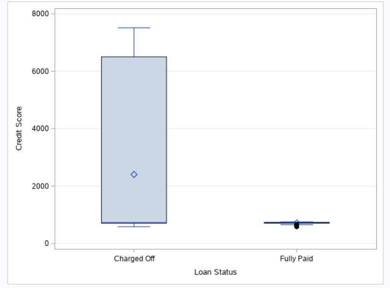
Boxplot-
It is used to assess the outliers in our dataset for variables as having outlier’s results in degrading our model performance and lack of accuracy.
SAS Code-
/* Box plot for checking outliers in the data */
ods graphics / reset width=6.4in height=4.8in imagemap;
proc sgplot data=BLOG.CREDIT_TRAIN;
	vbox 'Credit Score'n  / category='Loan Status'n;
	yaxis grid;
run;
ods graphics / reset;
Output-
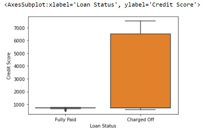
Python Code-
# Creating a boxplot for a variable
ax = sns.boxplot(x='Loan Status', y='Credit Score', data=df )
ax
Output-
Let me give you all a short summary about myself so I’m a graduate in Statistics and now aspiring to become a SAS Data Scientist while I have already gained some skills and Certifications around this domain such as Big Data Professional, Machine Learning Specialist, etc…
End Notes
I am now looking forward to writing blogs and further expand my knowledge and help other people to understand the things hovering around this domain. I’m also an active sports player(football) who likes to play and stay fit.
Here’s my LinkedIn id if you all want to connect… till then happy learning!
The media shown in this article are not owned by Analytics Vidhya and are used at the Author’s discretion.


