Introduction
In today’s data-driven world, abundant information from various sources presents opportunities and challenges. Extracting meaningful insights from this vast amount of data requires effective visualization. This article explores the process of building explainer dashboards in Python, offering valuable insights and practical guidance. By leveraging the advancements in technology and the availability of tools, we can transform complex data into visually appealing and informative dashboards, enabling better decision-making and analysis. Let’s dive into the world of explainer dashboards and unlock the power of data visualization in Python.
This article was published as a part of the Data Science Blogathon.
Table of contents
What is the Need of Dashboards in Python?
There are also scenarios where business disagrees with certain reports/ recommendation purely because they understand the business better than the model and the data on which it was built. So, how should a business make their decision when they have conflicting recommendations?. A simple way would be to give the power of data & visualization to businesses where they can view the data from a business perspective with minimal dependencies on technical teams. This has given rise to dashboards and tools like Power BI /Tableau enabled the business to make business decisions on the fly. But, these tools are not free, there is a premium associated with them and it is sometimes per user based.
Also Read: Create Interactive Dashboards with Streamlit and Python
Building Explainer Dashboards in Python
Here is a stepwise guide on how to build a explainer dashboard in Python:
Step 1: Install the Library
Open your terminal and install the library with the below code
pip install explainerdashabordWe will build a random forest classifier model using a built-in dataset. Hence we will install other dependencies as follows:
from sklearn.ensemble import RandomForestClassifier
from explainerdashboard import ClassifierExplainer, ExplainerDashboard
from explainerdashboard.datasets import titanic_survive, feature_descriptions
Step 2: Create Our train/test Dataset as Below
X_train, y_train, X_test, y_test = titanic_survive()Step 3: Create an Object
We will create an object by explainer which will help us create a dashboard.
explainer = ClassifierExplainer(model, X_test, y_test,
                               cats=['Sex', 'Deck', 'Embarked'],
                               descriptions=feature_descriptions,
                               labels=['Not survived', 'Survived'])
Step 4: Run the Explainer Object
Finally, we will run the explainer object to viewing the dashboard.
ExplainerDashboard(explainer).run()* Serving Flask app "explainerdashboard.dashboards" (lazy loading) * Environment: production WARNING: This is a development server. Use a production WSGI server instead. * Debug mode: off * Running on http://0.0.0.0:8050/ (Press CTRL+C to quit)
Step 5: View the Dashboard
Now we can click on http://0.0.0.1:8050/ to view the dashboard.
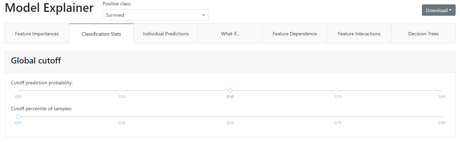
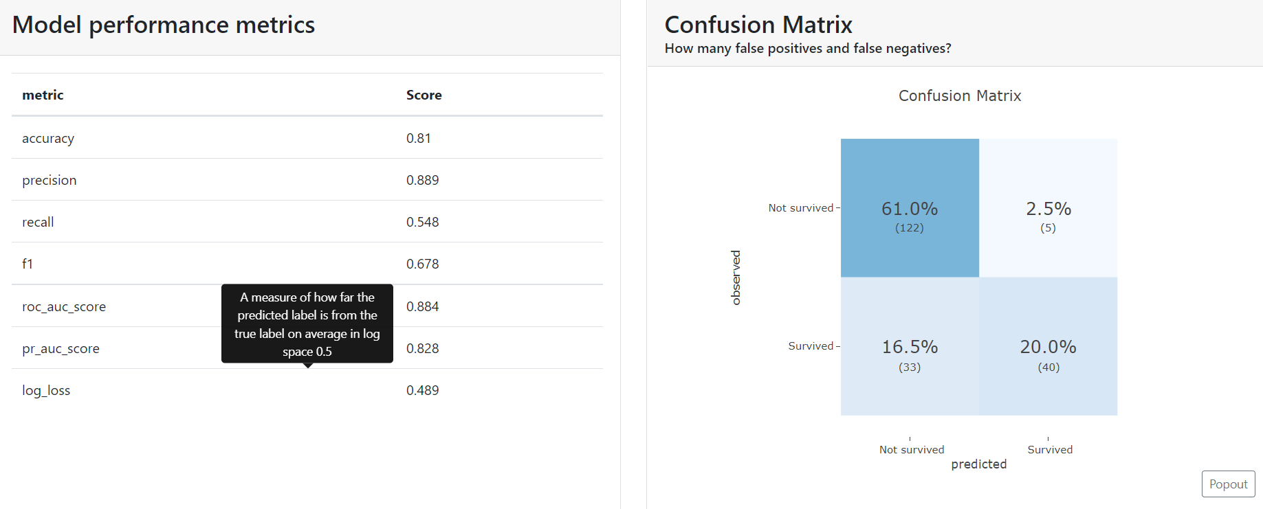
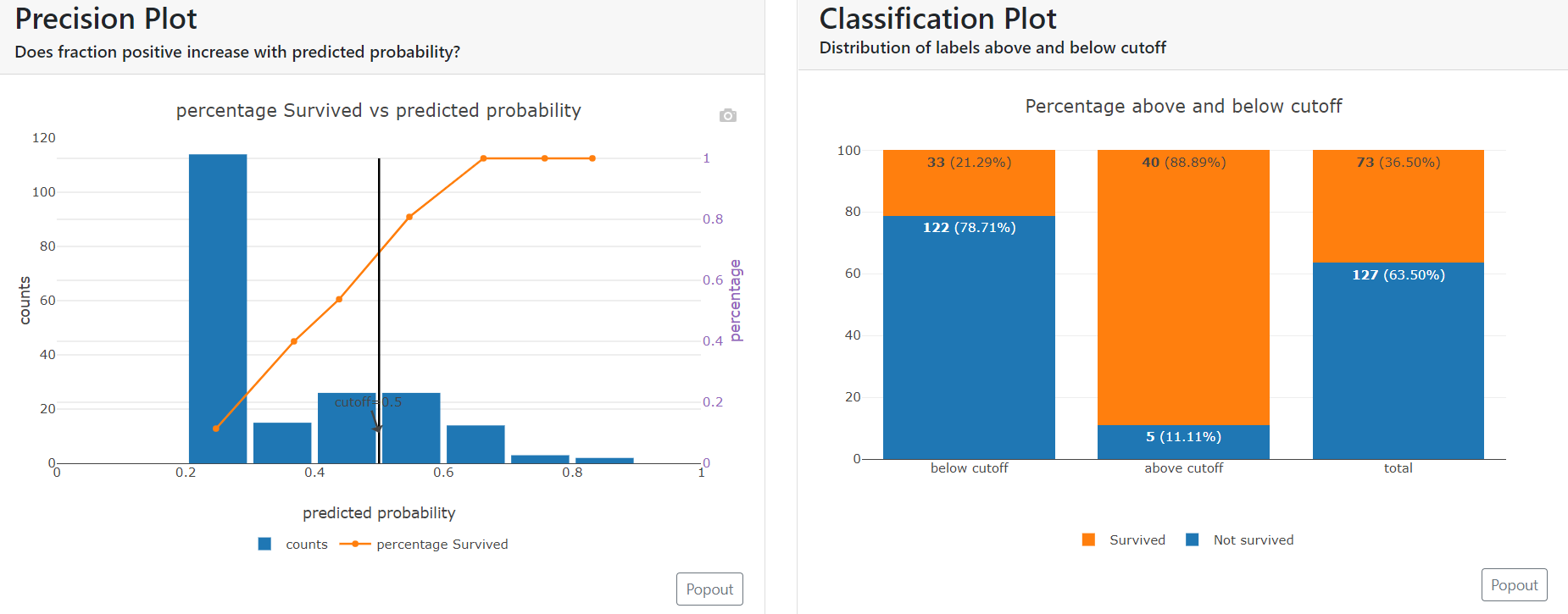
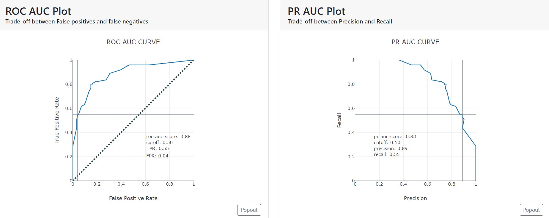
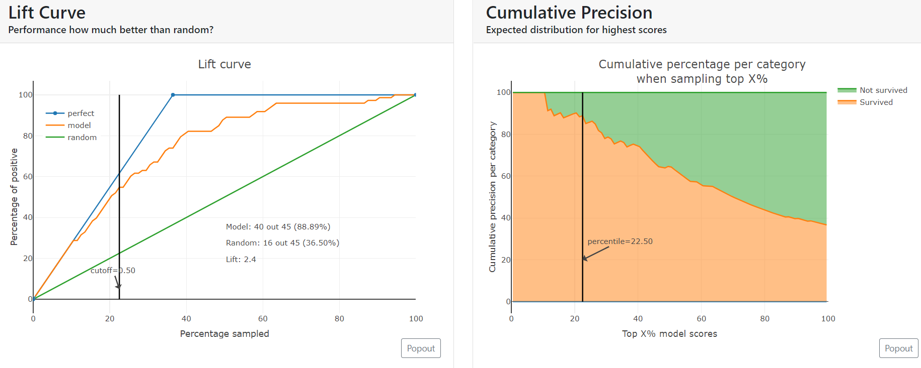
All the plots and metrics that we saw above are generated automatically by the explainer dashboard and it is also neatly segregated into various tabs. It lets users peek into areas of their interest, make changes to configuration and draw conclusions.
Step 6: Switching off The Tabs
We can also hide the tabs that we don’t need with the below setting.
ExplainerDashboard(explainer,
   importances=True,
   model_summary=False,
   contributions=True,
   whatif=True,
   shap_dependence=True,
   shap_interaction=False
   decision_trees=True
).run()
One of the interesting sections is “What if…” where users can make various selections and instantly see the outcomes. This is very similar to the implementation we tried in the R shiny app and here we achieved more than that with only a few lines of code.
Also Read: Streamlit vs Gradio – A Guide to Building Dashboards in Python
Closing Note on Dashboards in Python
Data visualization is needed because our brain is not equipped with the capacity to analyze and process huge volumes of structured/unstructured data, identify the trends and make meaningful sense out of it. Graphically representing data lets us interact with data and interpret the result in a way that makes business sense to us. The dashboard by itself doesn’t answer all of our questions but definitely helps us figure out answers in our own way.
If you want to learn how to make better dashboards in other tools, sign up for our exclusive Blackbelt Program. Explore the program to know more!
Hope you liked the blog on dashboards in Python. Happy Learning!
Frequently Asked Questions
Q1. Can I make dashboards with Python?
A. Yes, you can make dashboards with Python using libraries such as Plotly and Dash, which provide powerful tools for creating interactive visualizations and dashboards.
Q2. What are the best dashboarding tools for Python?
A. Some of the best dashboarding tools for Python include Dash, Plotly, Bokeh, and Panel. These tools offer various features and flexibility for building dynamic and interactive dashboards.
Q3. Why is dash used in Python?
A. Dash is used in Python because it is a user-friendly and powerful framework for creating web-based analytical applications and interactive dashboards. It allows you to build complex dashboards with interactive components using Python syntax.
Q4. How do I create an interactive dashboard in Python?
A. You can use libraries like Dash or Plotly to create an interactive dashboard in Python. These libraries provide intuitive APIs to define the layout, add interactive components, and connect them to data sources. You can also customize the appearance and behavior of the dashboard to suit your needs.
The media shown in this article is not owned by Analytics Vidhya and are used at the Author’s discretion.
Amit Kulkarni
28 Jun, 2023


