Introduction
What’s most crucial to us? Could it be the ability to create a fortune, have good physical health, or be the focus of attention? In line with the latest World Happiness Report, it is evident that being happy has become a worldwide priority. The World Happiness Report rates happiness on six indicators: positive emotions, mental health, life expectancy, social relationships, physical health, and professional happiness.
The World Happiness Report states that focusing on our material belongings doesn’t donate to long-term happiness. Indeed, it demonstrates that mental wellness and social interactions are indeed one of the main aspects to keep us happy, especially during times like the COVID-19 pandemic.

In this article, we use Python to analyze the World Happiness Report during the COVID-19 pandemic, from 2020 to 2021 and see how it changed in 2022. We shall analyze how happiness metrics have changed during the pandemic and how this influenced country rankings based on citizen happiness levels.
Learning Objectives
- Analysis of the World Happiness Report from 2020 to 2022 using Python
- Exploring how to calculate world happiness scores and rankings
- Description and understanding of the six parameters affecting a country’s people’s happiness
This article was published as a part of the Data Science Blogathon.
Dataset Description
The dataset has been taken from Kaggle. You’ll find the dataset here.
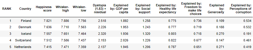
World Happiness Report is a survey that ranks countries according to how content and happy their residents think they are. Significantly more than 150 countries are ranked in the World Happiness Report. Using quantitative measures, the report analyses six qualitative characteristics to determine how they affect a country’s population’s happiness. There will be six indicators:
- GDP per capita of the country
- Healthy life expectancy
- Social support
- Freedom to produce life decisions
- Generosity
- Perceptions of corruption
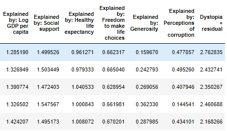
Additionally, dystopia residual compares to the worst possible life in every aspect.
Calculation of World Happiness Report
Information from the Gallup World Poll is used to calculate happiness ratings and rankings. Based on responses to the questionnaire, the results are calculated. The Cantril ladder is a questionnaire that asks respondents to rank their present lives on a scale from 0 to 10, with 10 being the best possible life for them and 0 being the worst possible existence. The estimates are representative due to the use of Gallup weights and scores from the national sample for 2020-2022.
These factors are thought to be raising life assessments around the world. The best life is represented by a number closer to 10, while the opposite is represented with a score closer to 0. After the citizen responses are collected, they’re averaged to have the country’s happiness score. Countries worldwide are ranked top to bottom in decreasing order of happiness. Now that we interpreted the way happiness score is calculated and how rankings are awarded to countries worldwide, let’s dive into analyzing the happiness reports for 2020, 2021, and 2022.
Exploratory Data Analysis: World Happiness Report
Step 1: Import the libraries
We will majorly work with Python pandas for managing the data and matplotlib and seaborn for data visualizations.
import numpy as np
import pandas as pd
import matplotlib.pyplot as plt
import seaborn as sns
Step 2: Loading the datasets
Here, we will load three different world happiness reports corresponding to the years 2020, 2021 and 2022 respectively.
report_2020= pd.read_csv("C:\Users\admin\Desktop\Python_anaconda\Projects\World Happiness Reports\2020.csv")
report_2021= pd.read_csv("C:\Users\admin\Desktop\Python_anaconda\Projects\World Happiness Reports\2021.csv")
report_2022= pd.read_csv("C:\Users\admin\Desktop\Python_anaconda\Projects\World Happiness Reports\2022.csv")
Step 3: Understanding the data
Understanding the type of data that is accessible, as well as its structure, properties, and features, is crucial before attempting to glean insights. Let’s look at a sample of the datasets first.
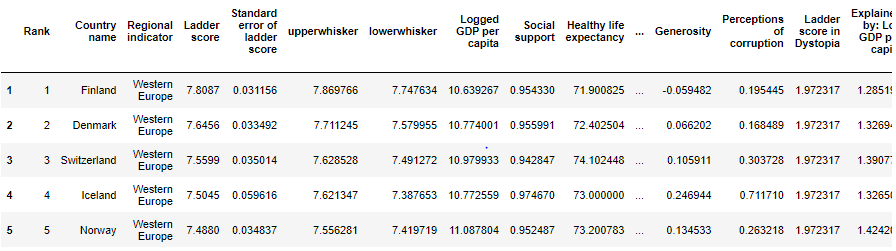
report_2020.head()
report_2021.head()
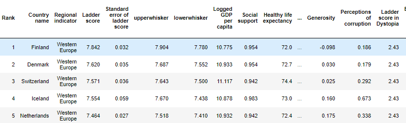
report_2022.head()
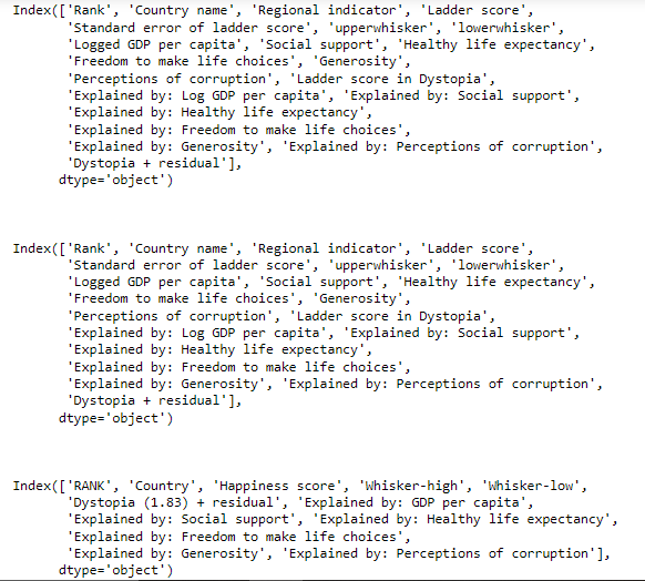
We look at the columns each of these datasets has to comprehend them better and make the subsequent process easier.
print(report_2020.columns)
print("nn")
print(report_2021.columns)
print("nn")
print(report_2022.columns)
print("Number of null or missing values in 2020 report: ",report_2020.isnull().sum().sum())
print("Number of null or missing values in 2021 report: ",report_2021.isnull().sum().sum())
print("Number of null or missing values in 2022 report: ",report_2022.isnull().sum().sum())

No missing numbers exist because these datasets are straight compilations of the published official reports.
print("No. of countries ranked in 2020: ", len(report_2020))
print("No. of countries ranked in 2021: ", len(report_2021))
print("No. of countries ranked in 2022: ", len(report_2022))

A quick check at the number of countries ranked indicates that more than 150 nations were awarded the world happiness rankings in 2020, while 149 and 146 countries were considered in 2021 and 2022, respectively.
Step 4: Data Visualization and Analysis
(1) Analyzing the top-ranked nations in 2020, 2021, and 2022
First, let us see which countries were ranked highest and lowest in the happiness reports.
plt.figure(figsize=(24,8))
plt.subplot(1,3,1)
sns.barplot(report_2020['Country name'][0:5], report_2020['Rank'][0:5])
plt.subplot(1,3,2)
sns.barplot(report_2021['Country name'][0:5], report_2020['Rank'][0:5])
plt.subplot(1,3,3)
sns.barplot(report_2022['Country'][0:5], report_2020['Rank'][0:5])
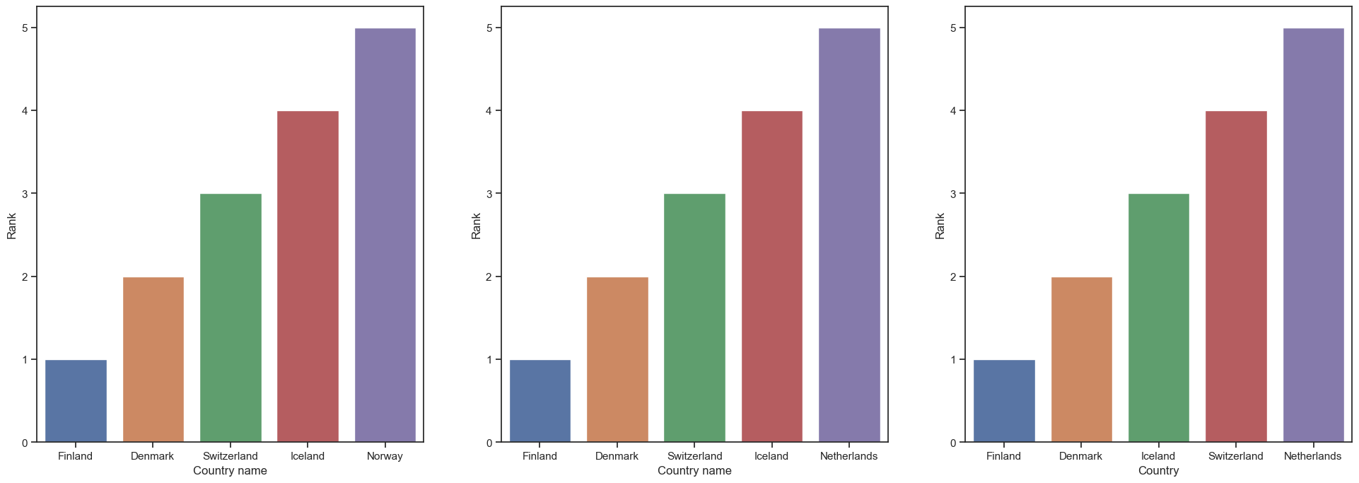
During the period from 2020 to 2022, Finland and Denmark were clearly ranked as the #1 and #2 happiest nations. Though the rankings have shifted slightly over time, Finland, Denmark, Switzerland, Iceland, Norway, and the Netherlands remain the top five most happy nations over the years.
print("Average happiness score of Finland is ", (report_2020['Ladder score'].iat[0]+report_2021['Ladder score'].iat[0])/2)

Remarkably, Finland has retained the highest position in the world happiness reports, with an average happiness score of 7.8 out of 10.
(2) Analysis of the unhappiest country in the world during 2020,2021 and 2022
print("Most unphappiest Country in 2020: ", report_2020['Country name'].iat[-1], "(", report_2020['Ladder score'].iat[-1], ')')
print("Most unphappiest Country in 2021: ", report_2020['Country name'].iat[-1], "(", report_2021['Ladder score'].iat[-1], ')')
print("Most unphappiest Country in 2022: ", report_2020['Country name'].iat[-1], "(", report_2022['Happiness score'].iat[-1], ')')

Getting into the details of the unhappiest nations, Afghanistan has been granted the lowest happiness score in all three years, with a score of 2.4 in 2022.
Now, let us look at the most current scenario of 2022.
(3) Happiness rankings of nations in 2022
import plotly.graph_objs as go
from plotly.offline import download_plotlyjs, init_notebook_mode, plot, iplot
init_notebook_mode(connected=True)
data = dict(type = 'choropleth',
           locations = report_2022['Country'],
           locationmode = 'country names',
           z = report_2022['RANK'],
           text = report_2022['Country'],
           colorbar = {'title':'Happiness'})
layout = dict(title = 'Global Happiness 2022',
             geo = dict(showframe = False))
choromap3 = go.Figure(data = [data], layout=layout)
iplot(choromap3)
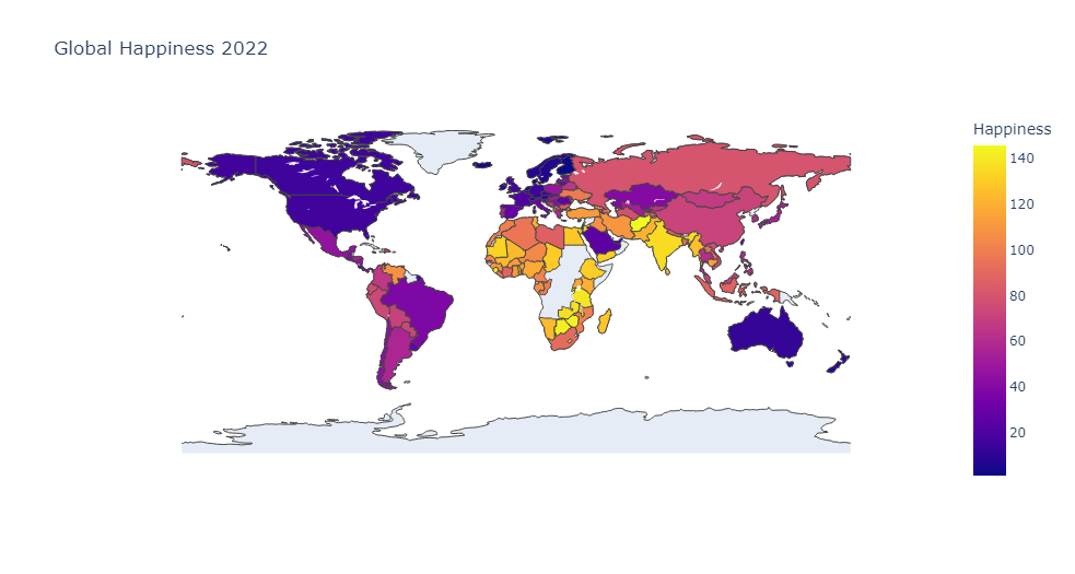
The above-plotted map shows the country rankings based on the happiness rankings allotted to them in 2022. It is clear that most of the African nations are least ranked, and the western nations have been ranked high in terms of citizen happiness.
(4) Country-wise analysis based on the six happiness indicators
Let’s see how the happiness rankings of countries vary based on the six parameters that were used to calculate happiness scores in 2022.
(a) Country rankings based on GDP per capita
import plotly.graph_objs as go
from plotly.offline import download_plotlyjs, init_notebook_mode, plot, iplot
init_notebook_mode(connected=True)
data = dict(type = 'choropleth',
           locations = report_2022['Country'],
           locationmode = 'country names',
           z = report_2022['Explained by: GDP per capita'],
           text = report_2022['Country'],
           colorbar = {'title':'GDP per capita'})
layout = dict(title = 'GDP per capita in 2022',
             geo = dict(showframe = False))
choromap3 = go.Figure(data = [data], layout=layout)
iplot(choromap3)
.png)
The GDP per capita of the nation is the primary factor that affects happiness. GDP measures the overall value of all goods, values, and services produced within a nation’s borders. GDP per capita measures citizens’ effectiveness with which resources are produced, allocated, and utilized. It is considered as an important indicator of people’s well-being in a nation. It included unemployment, liability, skills, education, and other related topics. GDP per capita and happiness scores are closely correlated since the status of the economy, available resources, and employment opportunities all significantly impact citizen contentment. The Scandinavian and Western countries had large GDPs in 2022, which accounts for their high happiness ratings and low happiness rankings. Most of African countries will have relatively high GDP in 2022, which explains their high happiness scores and low ranks. Most African countries have low GDP per capita and, as a result, poor happiness scores.
(b) Country rankings based on Healthy life expectancy
import plotly.graph_objs as go
from plotly.offline import download_plotlyjs, init_notebook_mode, plot, iplot
init_notebook_mode(connected=True)

data = dict(type = 'choropleth',
           locations = report_2022['Country'],
           locationmode = 'country names',
           z = report_2022['Explained by: Healthy life expectancy'],
           text = report_2022['Country'],
           colorbar = {'title':'Healthy life expectancy'})
layout = dict(title = 'Healthy life expectancy in 2022',
             geo = dict(showframe = False))
choromap3 = go.Figure(data = [data], layout=layout)
iplot(choromap3)
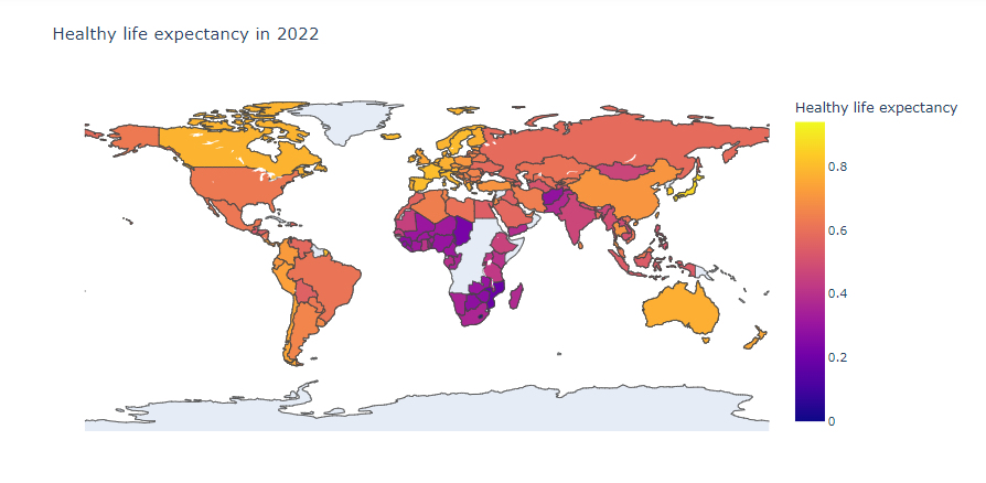
The people’s life expectancy is the second sign of a happy country. Health, medical resources, availability of resources at hand, and many other factors are considered while estimating life expectancy. Thus, it is a vital measure of people’s happiness.
The average life expectancy in the world at the time of the epidemic was 64 years. However, it increased to 69 in 2022. The following code presents this precisely:
print("Average life expectancy in 2020: ",report_2020['Healthy life expectancy'].mean())
print("Average life expectancy in 2021: ",report_2021['Healthy life expectancy'].mean())
print("Average life expectancy in 2022: ",report_2020['Explained by: Healthy life expectancy'].mean()*100)

print("Average life expectancy during the pandemic was ", (report_2020['Healthy life expectancy'].mean()+report_2021['Healthy life expectancy'].mean())/2)
print("Minimum life expectancy during the pandemic was ", (report_2020['Healthy life expectancy'].min()+report_2021['Healthy life expectancy'].min())/2)

During the COVID-19 pandemic, the average and minimum life span were 65 and 47, respectively.
sorted_2020 = report_2020.sort_values('Healthy life expectancy')[0:5]
sorted_2021 = report_2021.sort_values('Healthy life expectancy')[0:5]
plt.figure(figsize=(16,8))
plt.subplot(1,2,1)
sns.barplot(x='Country name',
            y="Healthy life expectancy", data=sorted_2020)
plt.subplot(1,2,2)
sns.barplot(x='Country name',
            y="Healthy life expectancy", data=sorted_2021)
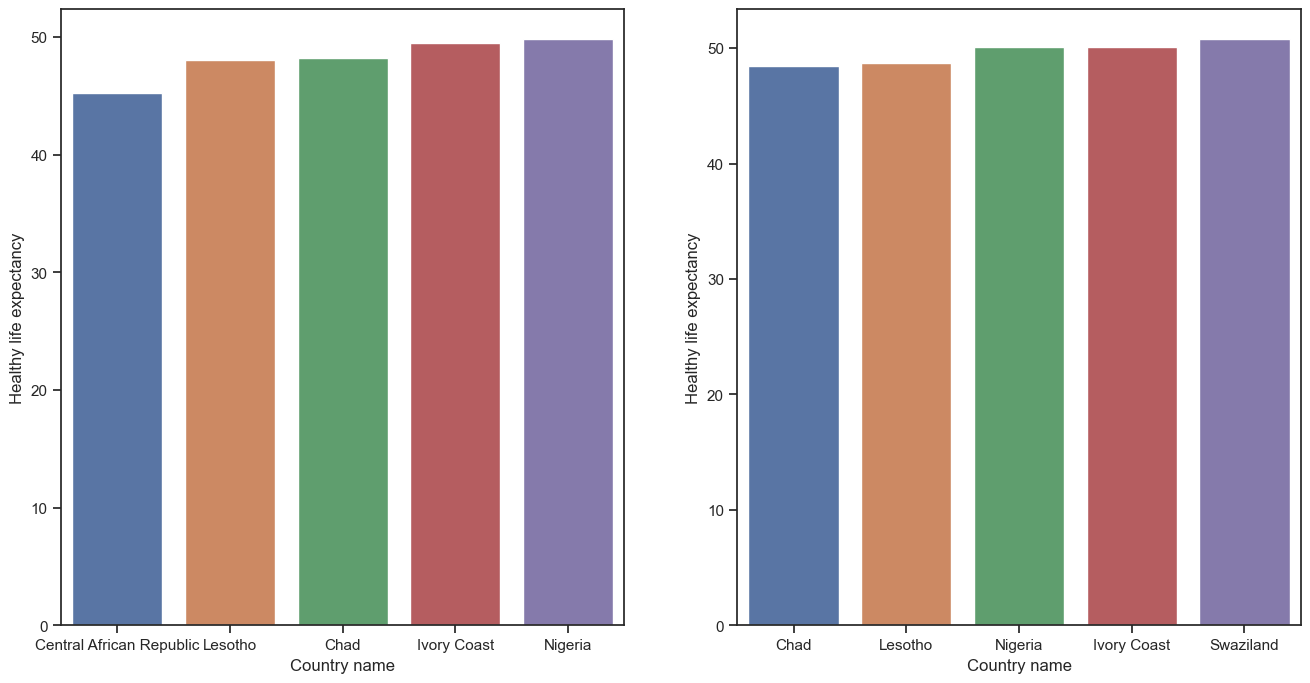
Singapore, Hong Kong, Japan, Spain, and Switzerland have the greatest average life expectancies out of the more than 150 countries considered. Despite the epidemic, the average life expectancy in these countries was 77, 77, 75, 75, and 74 in 2020 and 2021, respectively. Most African countries have the lowest life expectancy rates, including Nigeria, the Central African Republic, Chad, Lesotho, and Ivory Coast. According to the bar plots, the average citizen life expectancy in the Central African Republic is only 45 years.
(c) Country ranking based on Social support
Social support is the second element considered while calculating the happiness score. Social support is defined as “A group of family, friends, neighbors, and community members that are available in times of need to give physical, psychological, and financial support.” This is crucial because the people in our lives and those around us directly or indirectly impact how happy and content we are. Afghanistan, the country with the lowest level of happiness in the world, has the least social support.
import plotly.graph_objs as go
from plotly.offline import download_plotlyjs, init_notebook_mode, plot, iplot
init_notebook_mode(connected=True)

data = dict(type = 'choropleth',
           locations = report_2022['Country'],
           locationmode = 'country names',
           z = report_2022['Explained by: Social support'],
           text = report_2022['Country'],
           colorbar = {'title':'Social support'})
layout = dict(title = 'Social support in 2022',
             geo = dict(showframe = False))
choromap3 = go.Figure(data = [data], layout=layout)
iplot(choromap3)
.png)
Most of the countries in the world showed strong societal support in 2022. It is surprising to see how little social support there is in India.
(d) Country rankings Freedom to make life choices
import plotly.graph_objs as go
from plotly.offline import download_plotlyjs, init_notebook_mode, plot, iplot
init_notebook_mode(connected=True)
data = dict(type = 'choropleth',
           locations = report_2022['Country'],
           locationmode = 'country names',
           z = report_2022['Explained by: Freedom to make life choices'],
           text = report_2022['Country'],
           colorbar = {'title':'Freedom to make life choices in 2022'})
layout = dict(title = 'Freedom to make life choices in 2022',
             geo = dict(showframe = False))
choromap3 = go.Figure(data = [data], layout=layout)
iplot(choromap3)
.png)
Citizens’ freedom to live their lives the same way they want is remarkably similar to the pattern of social support. This shows how people make decisions in their lives, affecting their degree of satisfaction, thus affecting their happiness levels. Clearly, people living in the western part of the world have more freedom and liberty than the rest of the world.
(e) Country rankings based on Generosity
The below image makes it clear that generosity seems to be one of the least influential factors of happiness. One can conclude that people are not generous to each other, thus indirectly affecting the happiness of the people around them.
import plotly.graph_objs as go
from plotly.offline import download_plotlyjs, init_notebook_mode, plot, iplot
init_notebook_mode(connected=True)
data = dict(type = 'choropleth',
           locations = report_2022['Country'],
           locationmode = 'country names',
           z = report_2022['Explained by: Generosity'],
           text = report_2022['Country'],
           colorbar = {'title':'Generosity'})
layout = dict(title = 'Generosity in 2022',
             geo = dict(showframe = False))
choromap3 = go.Figure(data = [data], layout=layout)
iplot(choromap3)
.png)
(f) Country rankings based on Perceptions of corruption
import plotly.graph_objs as go
from plotly.offline import download_plotlyjs, init_notebook_mode, plot, iplot
init_notebook_mode(connected=True)
data = dict(type = 'choropleth',
           locations = report_2022['Country'],
           locationmode = 'country names',
           z = report_2022['Explained by: Perceptions of corruption'],
           text = report_2022['Country'],
           colorbar = {'title':'Perceptions of corruption'})
layout = dict(title = 'Perceptions of corruption in 2022',
             geo = dict(showframe = False))
choromap3 = go.Figure(data = [data], layout=layout)
iplot(choromap3)
.png)
The sixth and last aspect in the happiness indicators is residents’ view of their country’s levels of corruption. This is the only happiness indicator that negatively impacts a country’s happiness score. In 2022, it is clear that corruption has had a significant influence on most Asian and African countries.
(5) Analysis of relations among the happiness factors
Let us now see how the six measures used to calculate happiness scores are interrelated with each other.
plt.figure(figsize=(24,8))
plt.subplot(1,3,1)
plt.scatter( report_2020['Ladder score'], report_2020['Logged GDP per capita'])
plt.scatter( report_2021['Ladder score'], report_2021['Logged GDP per capita'])
plt.xlabel('Logged GDP per capita in 2020 and 2021')
plt.ylabel('Happiness score')
plt.legend(['2020','2021'])
plt.subplot(1,3,2)
plt.scatter( report_2020['Ladder score'], report_2020['Social support'])
plt.scatter( report_2021['Ladder score'], report_2021['Social support'])
plt.xlabel('Social support in 2020 and 2021')
plt.ylabel('Happiness score')
plt.legend(['2020','2021'])
plt.subplot(1,3,3)
plt.scatter( report_2020['Ladder score'], report_2020['Healthy life expectancy'])
plt.scatter( report_2021['Ladder score'], report_2021['Healthy life expectancy'])
plt.xlabel('Healthy life expectancy in 2020 and 2021')
plt.ylabel('Happiness score')
plt.legend(['2020','2021'])
plt.figure(figsize=(24,8))
plt.subplot(1,3,1)
plt.scatter( report_2020['Ladder score'], report_2020['Freedom to make life choices'])
plt.scatter( report_2021['Ladder score'], report_2021['Freedom to make life choices'])
plt.xlabel('Freedom to make life choices in 2020 and 2021')
plt.ylabel('Happiness score')
plt.legend(['2020','2021'])
plt.subplot(1,3,2)
plt.scatter( report_2020['Ladder score'], report_2020['Generosity'])
plt.scatter( report_2021['Ladder score'], report_2021['Generosity'])
plt.xlabel('Generosity in 2020 and 2021')
plt.ylabel('Happiness score')
plt.legend(['2020','2021'])
plt.subplot(1,3,3)
plt.scatter( report_2020['Ladder score'], report_2020['Perceptions of corruption'])
plt.scatter( report_2021['Ladder score'], report_2021['Perceptions of corruption'])
plt.xlabel('Perceptions of corruption in 2020 and 2021')
plt.ylabel('Happiness score')
plt.legend(['2020','2021'])
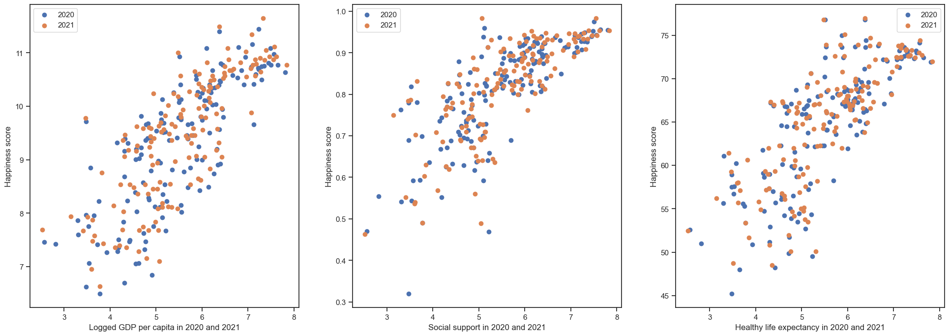
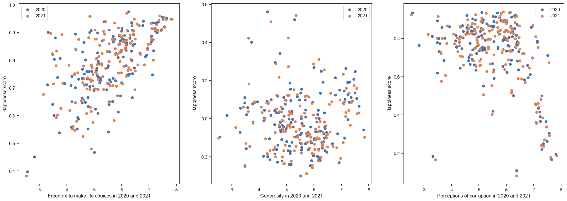
The scatter plots above represent the interdependence of numerous happiness indicators. Main correlations have been identified between GDP per capita, Healthy life expectancy, and social support in 2020 and 2021.
correlations_2020 = report_2020[['Logged GDP per capita', 'Social support', 'Healthy life expectancy',
                                 'Freedom to make life choices', 'Generosity','Perceptions of corruption',
                                 'Dystopia + residual']]
sns.pairplot(correlations_2020, kind='reg')
correlations_2021 = report_2020[['Logged GDP per capita', 'Social support', 'Healthy life expectancy',
'Freedom to make life choices', 'Generosity','Perceptions of corruption',
'Dystopia + residual']]
sns.pairplot(correlations_2021, kind='reg')
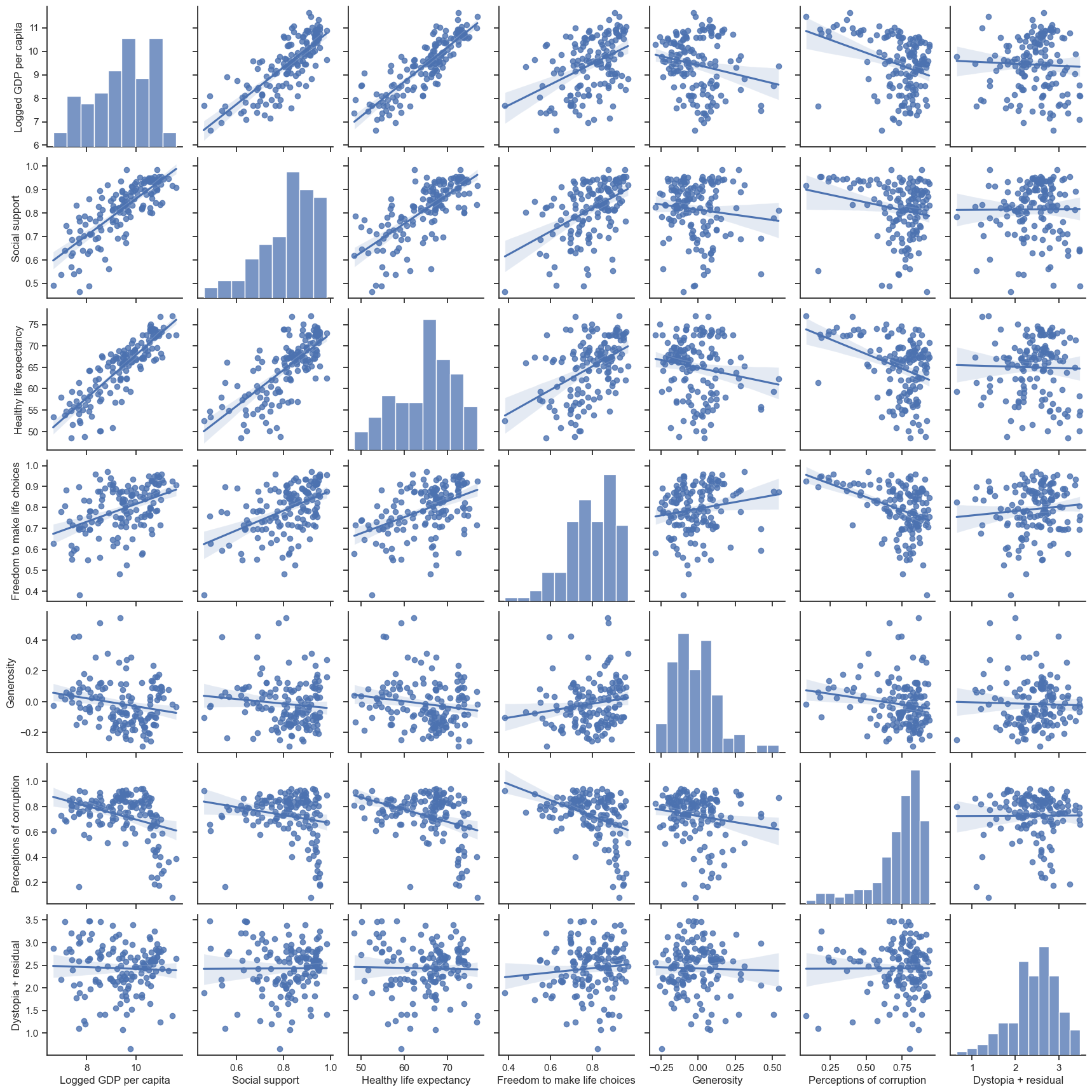
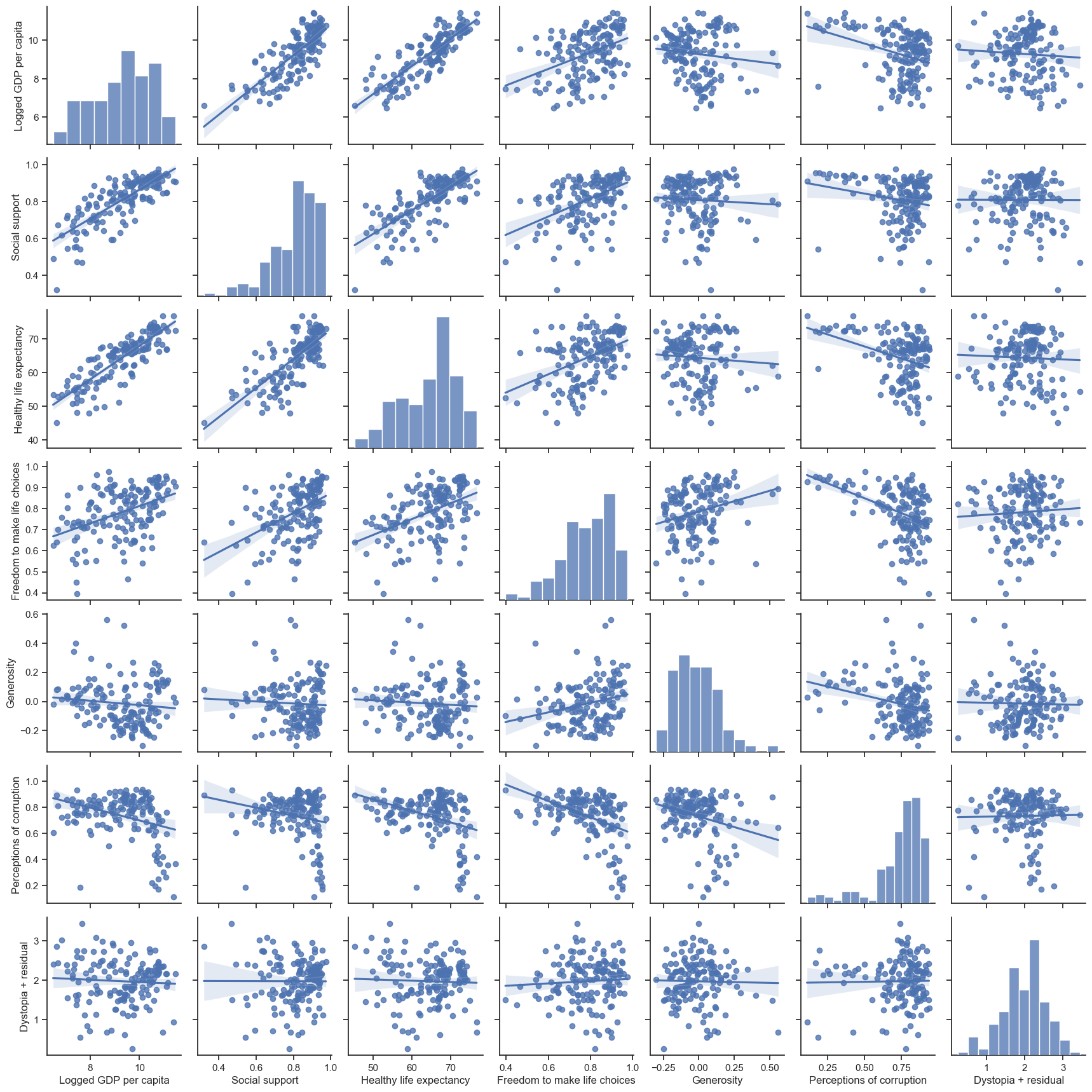
The following may be seen from the pair plots:
- The GDP per capita determines residents’ life expectancy and the country’s corruption level.
- Countries where people have the freedom to make their life decisions have cultures that support them.
- The social support we receive from others around us directly influences our life span.
- Higher degrees of corruption have a negative impact on all other categories, reducing the happiness score.
Conclusion
This brings our data analysis of global happiness reports to a close. A brief overview of our process of data exploration: we began by examining the countries with the highest and lowest levels of happiness. Next, we analyzed how countries worldwide ranked based on the six happiness factors. Finally, we analyzed how happiness indices are related to one another. The following are some important findings from the analysis:
- Finland retained the greatest level of happiness, with an average score of 7.81, while Afghanistan was found to be the most unhappy.
- Despite the pandemic and the thousands of deaths it caused worldwide, a healthy person can expect to live for an average of 65 years, with a minimum of 45 years.
- The rankings of 2022 show very little difference when compared to 2020 and 2021, implying that the epidemic had minimal influence on the happiness scores of the countries.
- Suppose a country wants to improve its happiness ranking. In that case, it must reduce corruption, provide people the freedom to make their own decisions, and provide and generate resources for a better living.
I hope you liked my article “Data Analysis on World Happiness Report During The Pandemic.” If you have any questions, then comment below. The entire code for this project can be found in my GitHub repository.
Connect with me on LinkedIn for further discussion.
The media shown in this article is not owned by Analytics Vidhya and is used at the author’s discretion.
Data science enthusiast and storyteller. Sharing my learnings and findings from the world of NLP, data science and machine learning through my articles. Let's explore the world of data together! Spreading knowledge, one post at a time.


Thanks. Great work and an interesting data set.