This article was published as a part of the Data Science Blogathon.
Introduction
In order to be able to analyze multiple sample data, for instance of a quarter in a long-term view, large amounts of data may have to be queried and displayed (plotted) by a data analytics program – like SimplexNumerica in this case. If, for example, eight different machine data (e.g. pressure, temperature, etc.) are queried every 10 milliseconds and stored in a database (or CSV file), these are then extrapolated to a quarter of approx. 207’360’000 (~ 200 Million) values in series only for this machine.
In a time-series chart (cartesian coordinate system), such a huge amount of data usually will be plotted zoomed and then scrolled to the left. The reason the program makes requests for a range of data using a display period is that it needs to perform calculations on data that has limited resources, or bounded memory capacity. But in particular, the screen resolution is much lower than the number of data points in this case. If it becomes too dense in order to calculate the value of multiple samples, it often provides the following options for this calculation:
· Average: The value will be an average of all the individual samples within the multiple samples, as will the timestamp.
· Maximum: The value will be the maximum value out of all the individual samples within the multiple samples. The timestamp will be that of the individual sample that was the maximum. The timestamp will be the average of all the individual samples within the multiple samples.
· Minimum: The value will be the minimum value out of all the individual samples within the multiple samples. The timestamp will be that of the individual sample that was the minimum. The timestamp will be the average of all the individual samples within the multiple samples.
· Newest: The value will the latest arrived value out of all the individual samples within the multiple samples. The timestamp will be that of the individual sample that was the newest. The timestamp will be the average of all the individual samples within the multiple samples.
But what is the essential problem, here?
All right, here’s a case study: You are the operator (shift leader) in a control room of a huge plant. The shift has just been changed. You had three weeks of vacation. Now, you want to get a plant overview of the running behavior of certain machines.
But you don’t just want to see a section, you want to get an overview of the last weeks. You then let the programs plot the millions of data, right. But what if these are just averages? Yes, then essential outlier processes may have simply been ironed out. Unfortunately, you will not see any (short) peaks in your time-series. And you cannot fix defects that occur only for a short time, because you did not aware of them.
So, the essential problem is that time-series trends do not display all occurrences.
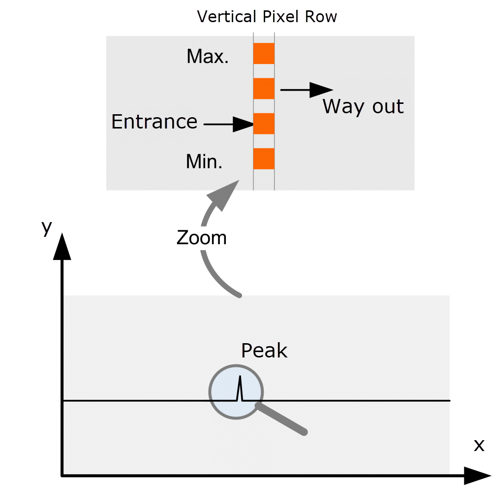
In order to display the values of a machine over a period of e.g. one quarter without reservation, these 200 million values must be displayed on a screen with e.g. width of 1920 pixels in such a way that all details are recognizable. If the values were to be transferred one-to-one to the screen, 108’000 values would have to be displayed on a vertical row of pixels without losing important detailed information. This is not possible without a sensible data reduction.
Now it comes:
According to the so-called Simplexety Method, implemented into SimplexNumerica, the 108’000 values (per vertical row) are reduced to the following four values, only:
1. the Entrance Value
2. the Way-out Value
3. the Minimum Value
4. the Maximum Value
because the others are camouflaged underneath these four ones, right? So, no need to plot them.
This applies only in the case that the curve plot is made by a line plot, polyline, or polygon and the marker is not shown. Marker can not be shown because then it will get too dense in the chart.
See the next picture that explains the Simplexety Method:
That is the simplest method in the world to display large amounts of data.
SimplexNumerica queries and displays only these four values e.g. from a (remote) database or (local) file system and connects them by a polyline/polygon. This avoids large amounts of data and the data can be processed in a short time.
However, this procedure has the consequence that it is not possible to zoom into the long-term display without having the data been loaded from the database again (for that new range). So, if you want to look at a range for the entire period, the database must be queried again.
The Simplexety Method was developed by Dipl.-Phys.-Ing. Ralf Wirtz for the program SimplexNumerica to visualize the huge amount of data from the Citect SCADA system without having installed that SCADA system, itself.
The media shown in this article are not owned by Analytics Vidhya and is used at the Author’s discretion.


