Introduction
Microsoft Excel is one of the best tools one can use to analyse data, make stunning charts, plots and dashboards, and basically play with data. But unfortunately, the majority of people use MS Excel only to insert data and perform basic arithmetic operations, without knowing its true potential. So my dear audience, let us today explore one of the most interesting features of MS Excel i.e., the Dashboard.
A dashboard is a visual representation of key metrics that allow the user to view, interpret and analyze your data in one place. There are many significant benefits of dashboards like enhanced visibility into your data, timesaving efficiency, better forecasting, inventory control, real-time customer analysis, better decision making and many more. Once you get the hang of creating dashboards in MS Excel, then there is no stopping as this whole process is so FUN!
In this article I’m making two assumptions:
1) You have the basic knowledge of Microsoft Excel, if not then I would suggest the course, Microsoft Excel: Formulas & Functions or you can also refer to these articles:
2) You have the basic knowledge about charts, if not then you can refer to these articles:
- 12 Data Plot Types for Visualization from Concept to Code
- Data Visualization – A Useful tool to Explore Data
- How to choose the Right Chart for Data Visualization
To be honest, this article is written in such a way that you can easily follow it and create the Dashboard without any prior experience with MS Excel, but that would be of no use if you just blindly follow this article without knowing the basics of MS Excel and charts. So, if you have zero experience with MS Excel, I highly recommend you go through the above articles.
Now, when everything is clear, let’s start with the Dashboarding process, so my fellow passengers, fasten your seatbelt as we are taking off.
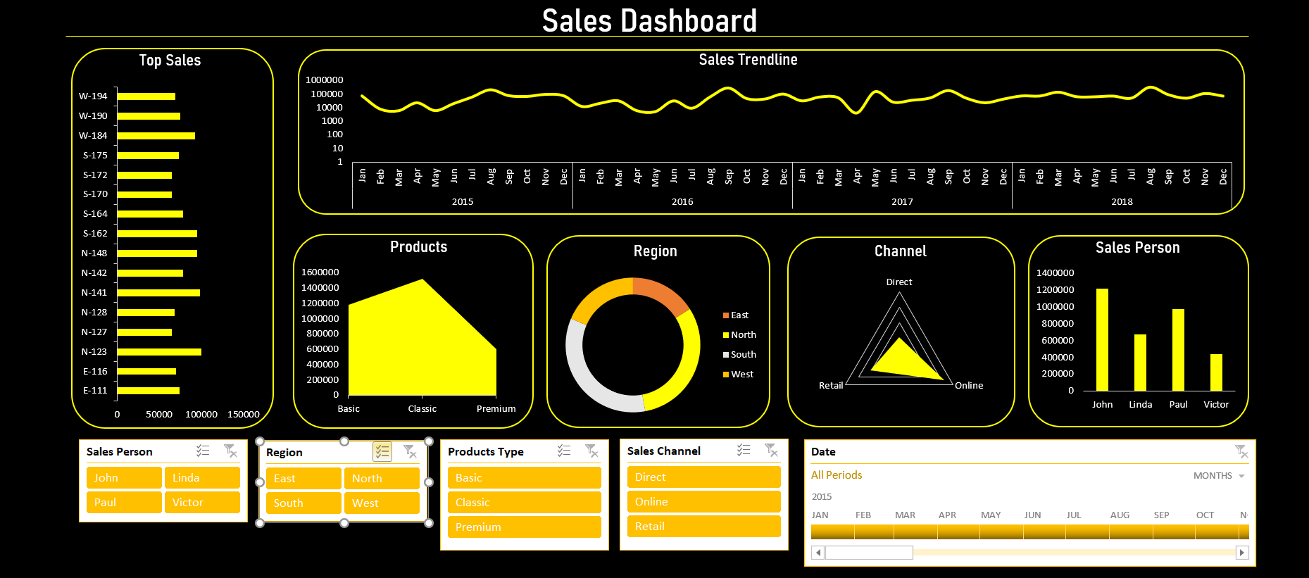
Here is the preview of what you will be able to build at the end of this article:
Dataset for the Dashboard
In this article, we will be working with hypothetical sales data for a hypothetical company. The dataset includes the following columns: “Order ID”, “Data”, “Sales Person”, “Region”, “Products Type”, “Sales Channel” and “Sales”. Here is the snapshot of the data:
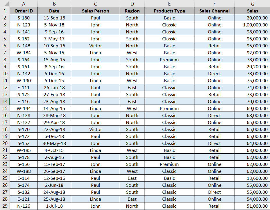
Here is the link to download the dataset: Download dataset (the file will only contain the data in .xlsx format)
NOTE: I’ve uploaded the dataset in my personal Analytics Vidhya’s google drive, please shift it to another official google drive.
Planning the Dashboard
Before creating any dashboard, one must plan out the whole approach. Every dataset and every dashboard has its unique approach. In this article, we will use the given sales data to create a sales dashboard.
So let us take a look at the data first, we must figure out all the important key metrics that we must include in the dashboard so that it provides clear and informative insights into the data and helps in forecasting & decision making.
As we are working on the sales dashboard, our focus should be on the sales and every metric correlated to it. Here is the list of all the charts we will be including in the dashboard:
- Top Sales by Order ID
- Sales Trendline
- Total Sales by each Product type
- Total Sales by each Sales Channel
- Total Sales by Region
- Total Sales made by each Sales Person
Here you must observe that every chart has its purpose, and gives a useful insight to the company to track the sales for their company. A good amount of research must be done before finalizing the charts for the dashboard, as these charts will reflect the performance of the company. So, all the charts must be informative, and minimal, and they should justify the data they are reflecting.
Creating Table
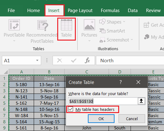
Before starting with the charts, we must prepare the datasheet, for that we must convert the range into a table as tables update automatically. To convert the range into a table, follow the given steps:
- Select any cell in the data or you can also select the whole data using the ctrl+A.
- In the ribbon, go to Insert, select Table or you can use the shortcut ctrl+T.
- In the Create Table pop-up window make sure you check the checkbox for “My table has headers” then click OK.
Now that you have your table prepared we will move to PivotTables.
NOTE: For the first chart, I’ll explain the whole PivotTable process in detail and for later charts, I will directly jump into making the visualization.
Creating Visualizations
Now for those who don’t know, a PivotTable is an interactive way to quickly summarize large amounts of data. You can use a PivotTable to analyze numerical data in detail and answer unanticipated questions about your data. A PivotTable is specially designed for: Querying large amounts of data in many user-friendly ways.
We will be creating our whole Dashboard using PivotTables so make sure you understand the concept of PivotTable.
Top Sales by Order ID
In the data, every Order ID has its share of sales, and we want to find out the top 10 Order IDs with the highest total sales for that we need an aggregation of total sales for each Order ID. Therefore, we will create a PivotTable.
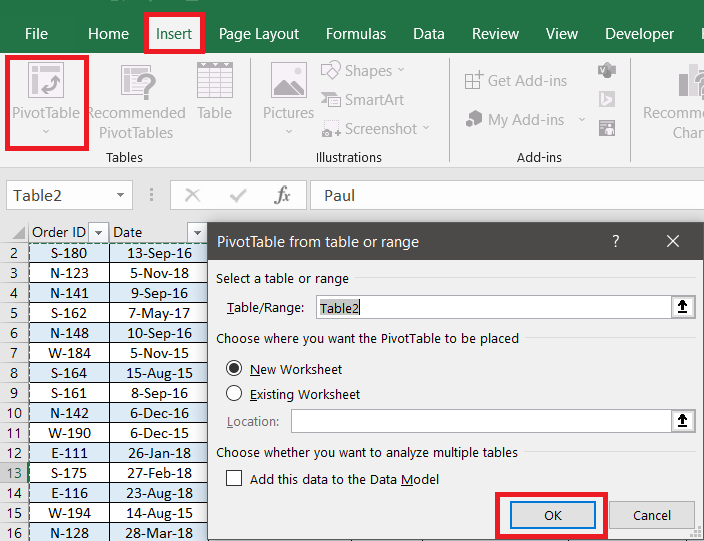
To create a PivotTable, follow the given steps:
- Select any cell in the data or you can also select the whole data using the ctrl+A.
- In the ribbon go to Insert, select PivotTable.
- In the PivotTable pop-up window do not change anything and click OK.
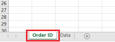
This will open a new sheet with Pivot options on the right. For better understanding rename the new sheet as “Order ID“. To rename the sheet, right-click on the sheet tab and select Rename or you can double-click on the sheet tab to rename it.
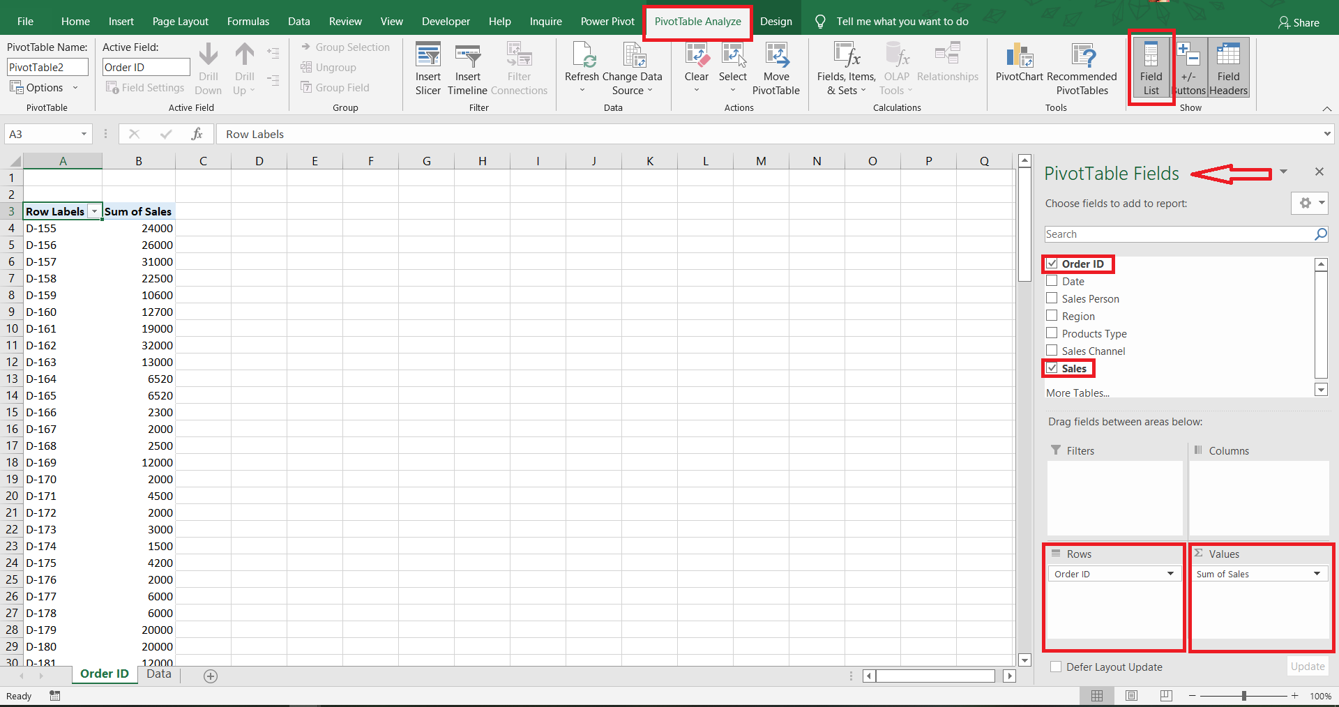
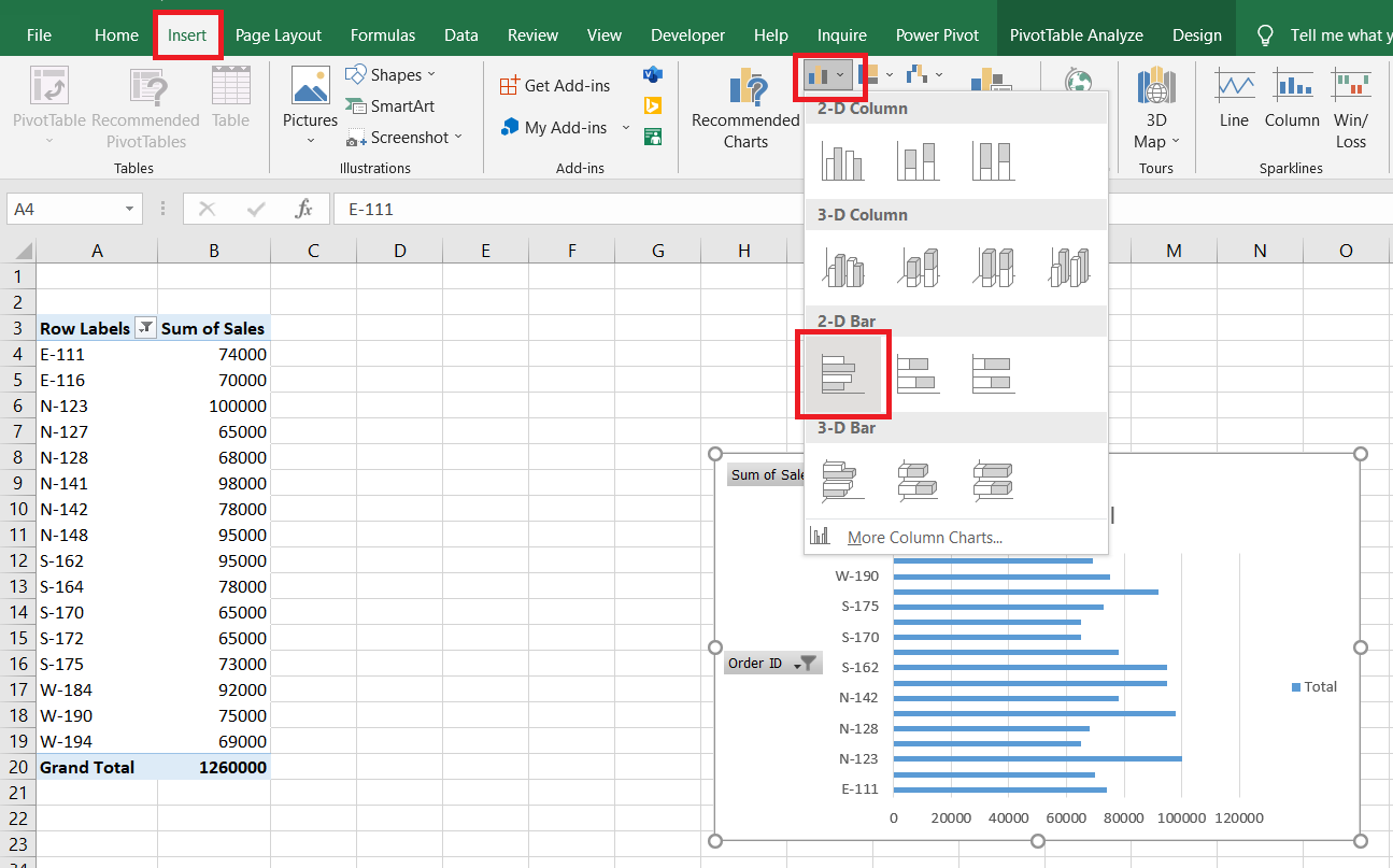
After renaming your sheet, go to PivotTable Fields (if it is not visible, go to PivotTable Analyze in ribbon, and click on Field List), drag “Order ID” into the Rows section and “Sales” into the Values section. (By default MS Excel will aggregate “Sales” into the sum of sales, if you want to change it, you can go to Value Field Settings in the dropdown)
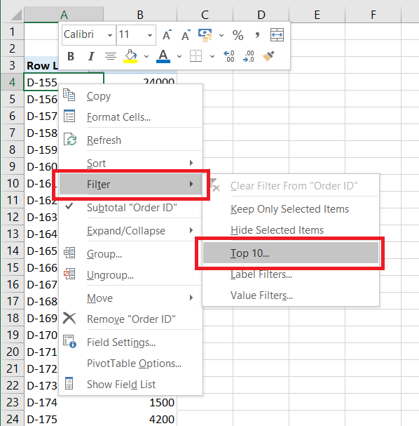
We only want to show the Top 15 Order IDs in the chart, and for that right-click on any cell in the PivotTable, go to Filter and select Top 10.
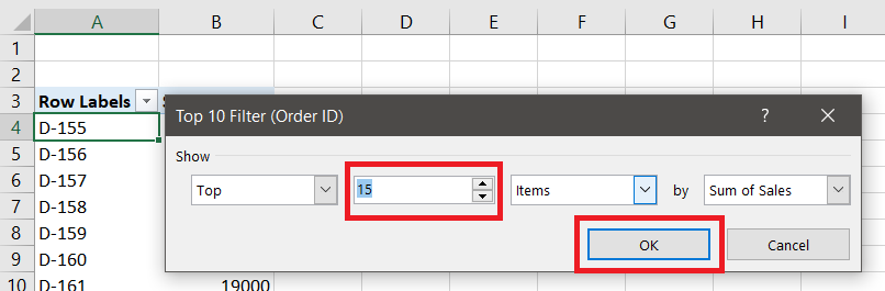
In the Top 10 Filter pop-up window change the value from 10 to 15 and click OK.
This will give you the Top 15 Order IDs. Now to create a chart from the data, select any cell from the Pivot Table, go to Insert, in the Charts section go to Insert Column or Bar Chart, go to 2-D Bar, and select Clustered Bar.
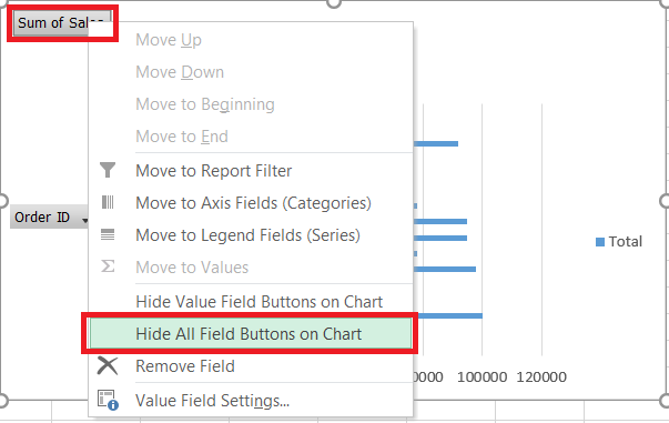
This will create a 2-D Clustered Bar Chart for you. Now we have to customize the chart to make it look minimalistic because our goal is to provide useful insights from the chart and remove all the unnecessary elements. To create your chart minimalistic, follow these two steps:
1. Right-click on any field button on the chart and select Hide All Field Buttons on Chart.
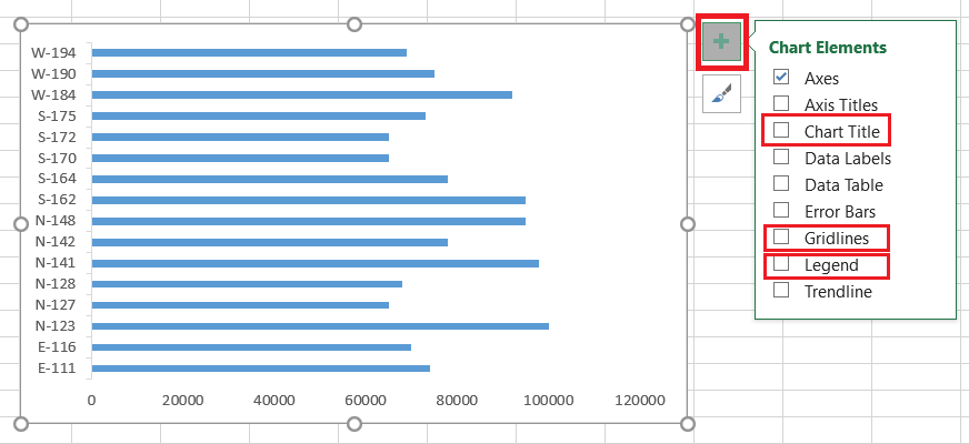
2. At the Top-right corner of the chart, click on Chart Elements then un-check Chart Title, Gridlines and Legend. This step is not mandatory, it is completely your choice what you want to show in your chart. I prefer it clean and minimalistic.
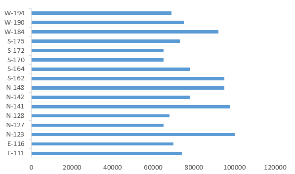
With this, we have successfully created our first chart for the Dashboard:
NOTE: For the rest of the charts, I’ll only give a short brief as most of them follow the same procedure as above.
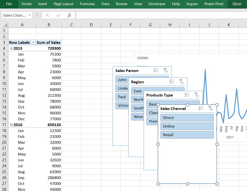
Sales Trendline
In this graph, we will show the sales trendline over time. To create this chart follow the same process as above, Create PivotTable > Rename the sheet as “Sales“> In PivotTable Fields drag “Sales” into the Values section and “Date” into the Rows section.
NOTE: After you drag the “Date” column into the Rows section, MS Excel will automatically include Years and Quarters into the section. We are only considering Years and Date in this chart, so select any cell of PivotTable, go to PivotTable Analyze, in the Group section select Group Selection, unselect Quarters and click OK.
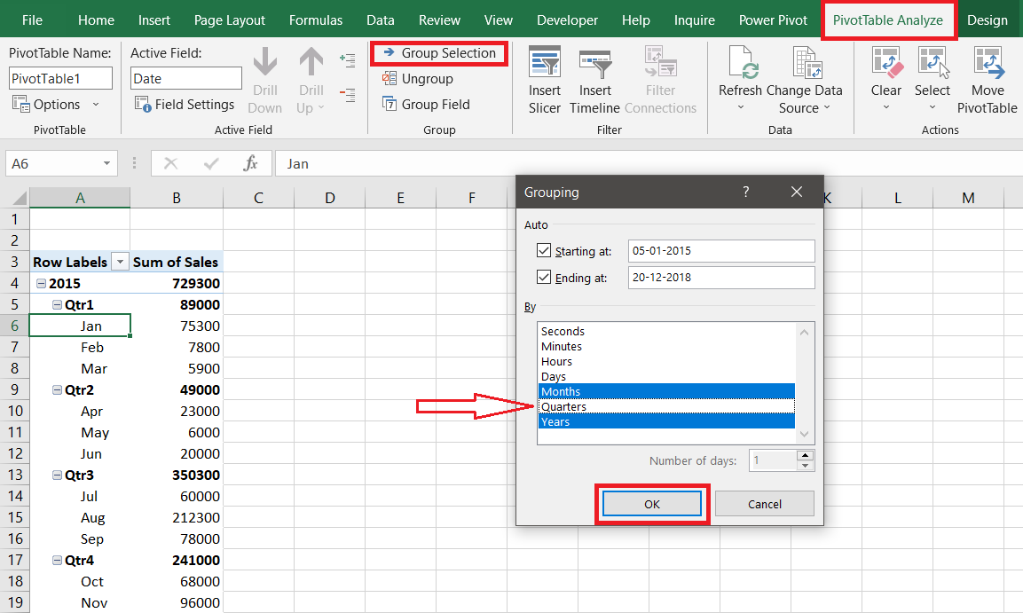
Then select any cell of PivotTable > go to Insert > go to Charts Section > Insert line or Area Chart > 2-D Line > Line.
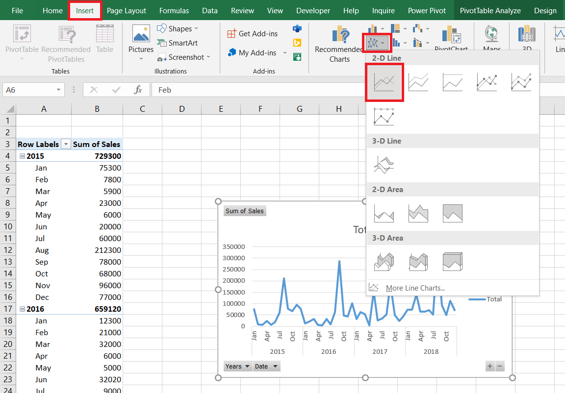
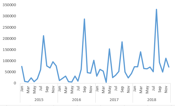
Same as the previous chart, hide all field buttons on the chart and delete title, gridlines & legends. Finally, you will get a chart like this:
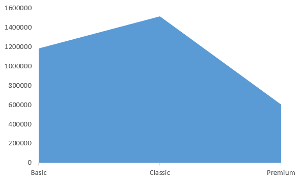
Total Sales by each Product type
In this graph, we will show the total sales made by each product type. To create this chart follow the same process as above, Create PivotTable > Rename the sheet as “Products“> In PivotTable Fields drag “Sales” into the Values section and “Products Type” into the Rows section > select any cell of PivotTable > Insert > go to Charts Section > select Recommended Charts > go to Area section > select Area Chart.
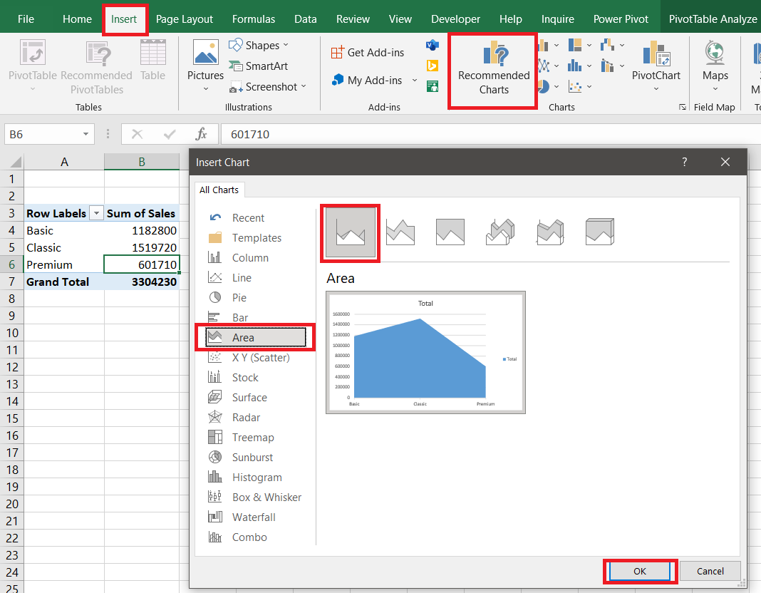
Again, hide all field buttons on the chart and delete title, gridlines & legends. Finally, you will get a chart like this:
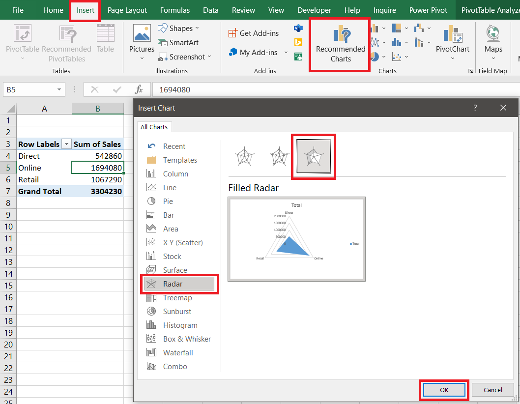
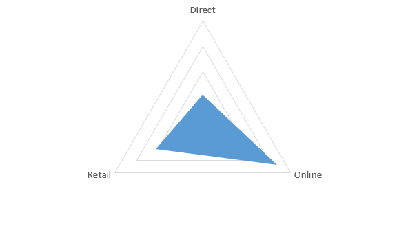
Total Sales by each Sales Channel
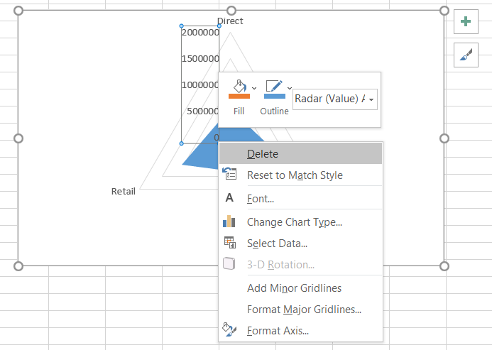
In this graph, we will show the total sales made by each sales channel. To create this chart follow the same process as above, Create PivotTable > Rename the sheet as “Channel“> In PivotTable Fields drag “Sales” into the Values section and “Sales Channel” into the Rows section > select any cell of PivotTable > Insert > go to Charts Section > select Recommended Charts > go to Radar section > select Filled Radar Chart.
Again, hide all field buttons on the chart but for this chart only delete the title & legends. Also, delete the Radar (Value) Axis from the chart.
Finally, you will get a chart like this:
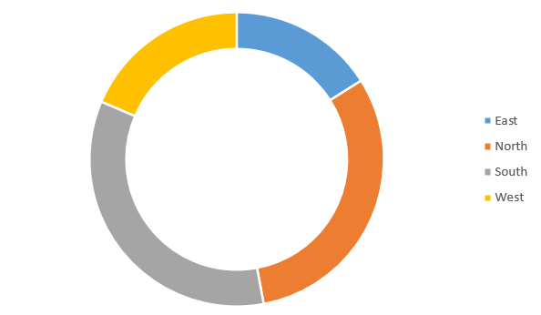
Total Sales by Region
In this graph, we will show the total sales made by each region. To create this chart follow the same process as above, Create PivotTable > Rename the sheet as “Region“> In PivotTable Fields drag “Sales” into the Values section and “Region” into the Rows section > select any cell of PivotTable > Insert > go to Charts Section > Insert Pie or Doughnut Chart > Doughnut Chart (if Doughnut Chart is not available use Pie Chart instead).
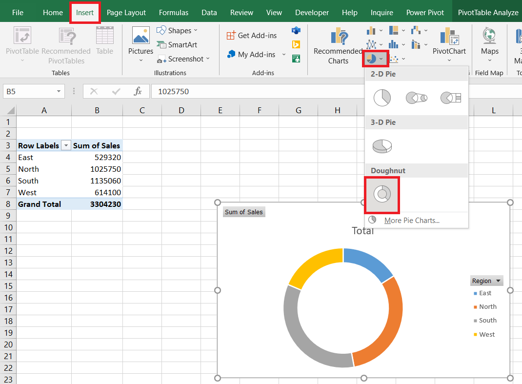
Again, hide all field buttons on the chart and for this chart only delete the title. Finally, you will get a chart like this:
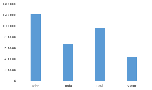
Total Sales made by each Sales Person
In this graph, we will show the total sales made by each salesperson. To create this chart follow the same process as above, Create PivotTable > Rename the sheet as “Person“> In PivotTable Fields drag “Sales” into the Values section and “Sales Person” into the Rows section > select any cell of PivotTable > Insert > go to Charts Section > Insert Column or Bar Chart > 2-D Column > Clustered Column.
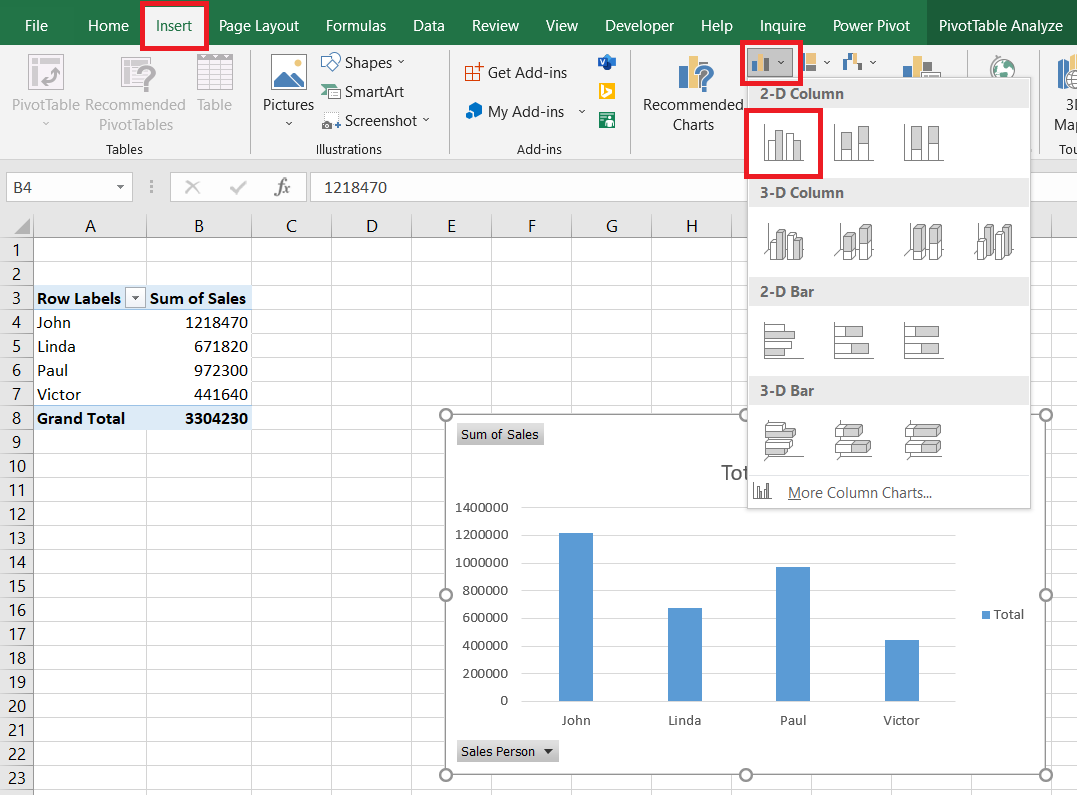
Again, hide all field buttons on the chart and delete title, gridlines & legends. Finally, you will get a chart like this:
Designing the Dashboard
We are done with all the visualizations and now we will be designing the dashboard.
First, we will create the layout for our dashboard; follow these steps:
- Create a new sheet in the workbook and rename it “Dashboard“.
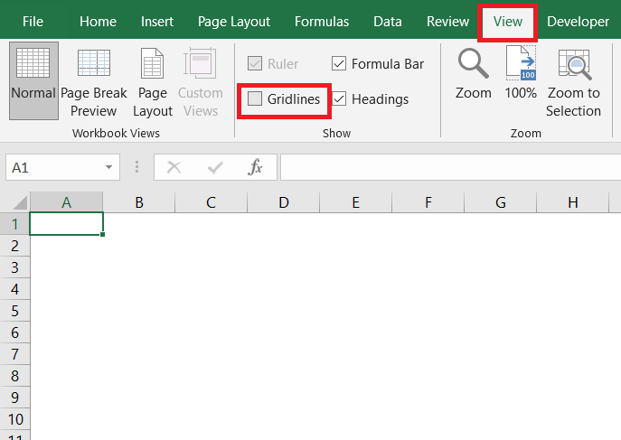
- Go to View and in the Show section uncheck Gridlines.
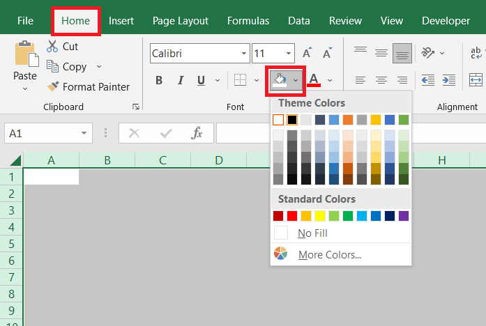
- Select all the cells in the sheet using ctrl+A, go to Home, in the Font section, go to Fill Color and select any colour of your choice (I’m choosing black colour as I’ll be following a black and yellow colour theme). You can also choose any background image of your choice, by going to Insert, then in the Illustrations section click on Pictures and then select any image of your choice (you can search for high-quality images on unsplash.com or you can create a fresh background on canva.com).
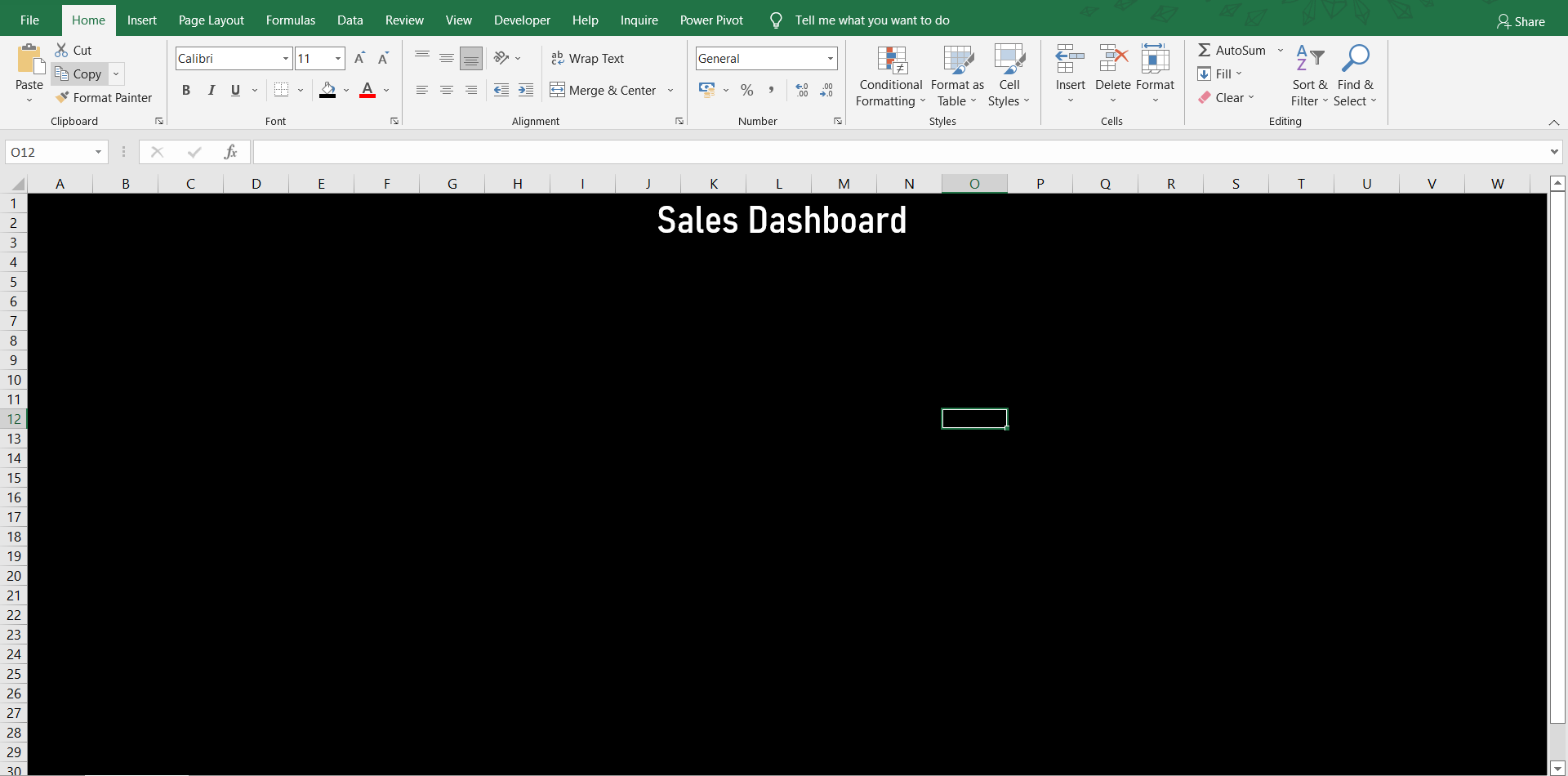
- Now to add a title to the dashboard, go to Insert, then in the Text section select Text Box and then draw the text box in the dashboard, type “Sales Dashboard” as the title and format it accordingly (I’ve chosen Bahnschrift SemiCondensed as the font, font-size is 28 and the colour is white).
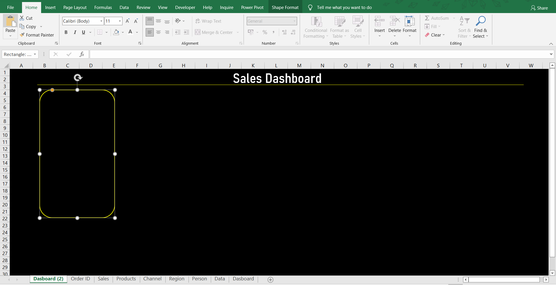
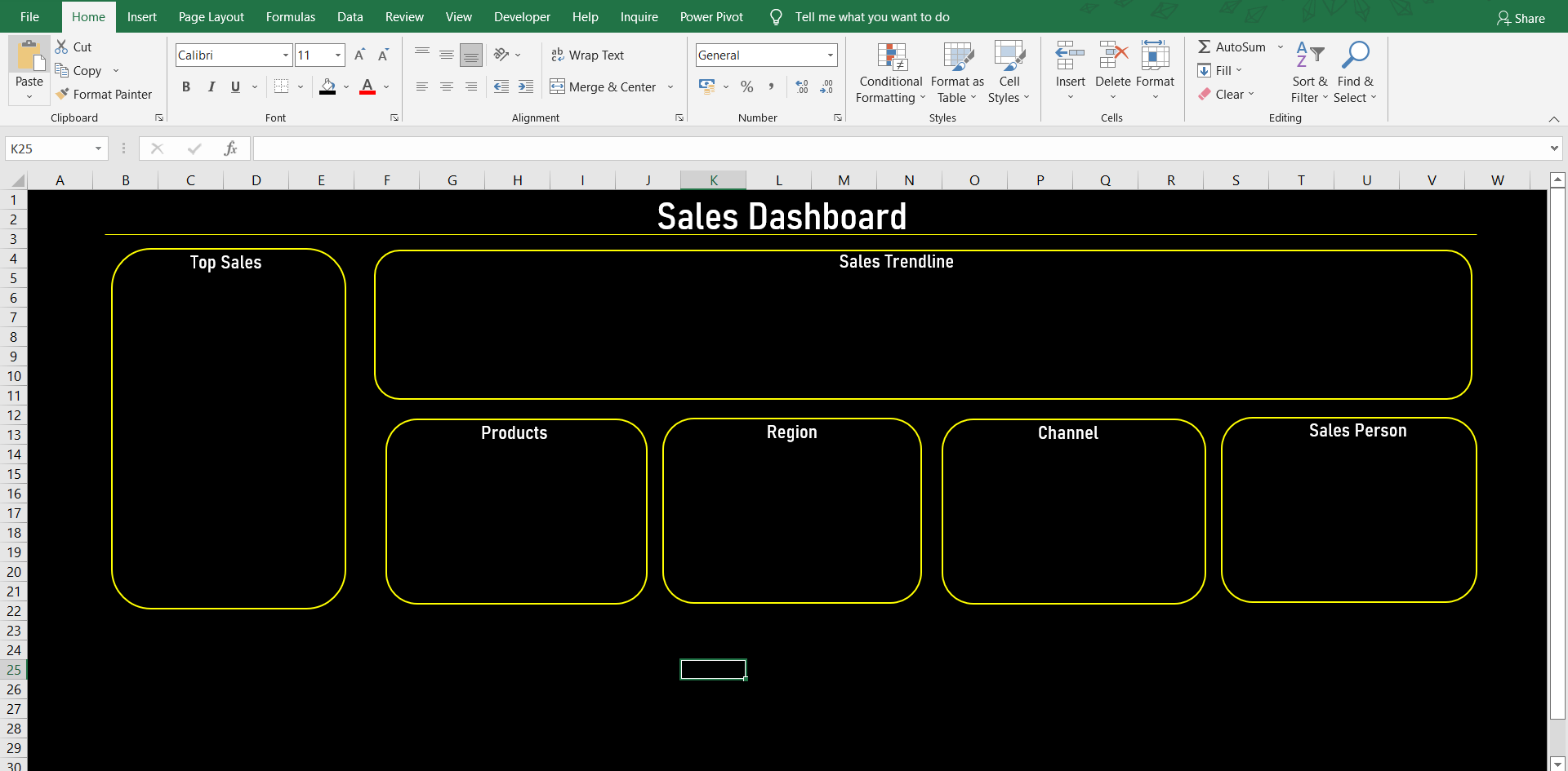
- Now go to Insert, in the Illustrations section go to Shapes and select Line and draw it under the title as shown in the figure below; go to Shape Format and change Shape Outline to yellow. Again go to Insert, from Shapes select Rectangle: Rounder Corner and draw a rectangle on the sheet as shown in the figure below. Select the rectangle, go to Shape Format and in the Shape Fill select No Fill and in Shape Outline select the yellow colour.
- Now copy and paste the rectangular box/tile and make an ordered collage as shown in the figure below, these boxes/tiles will be the base for our charts. Also, add the headings on the top of every box/tile as shown in the figure below.NOTE: Do not waste your time aligning the tiles in this step, after inserting the charts into the dashboard, you can align them accordingly.
NOTE: For better display and more space for the dashboard you can double click on any button on the ribbon (eg. Home button) and it will minimize (unpin) the ribbon. And, to maximize (pin) the ribbon again, double click on any button on the ribbon.
After we have completed the layout for the dashboard, it is time for adding the visualizations to the dashboard.
I’ll only demonstrate the process for the first chart; follow these steps:
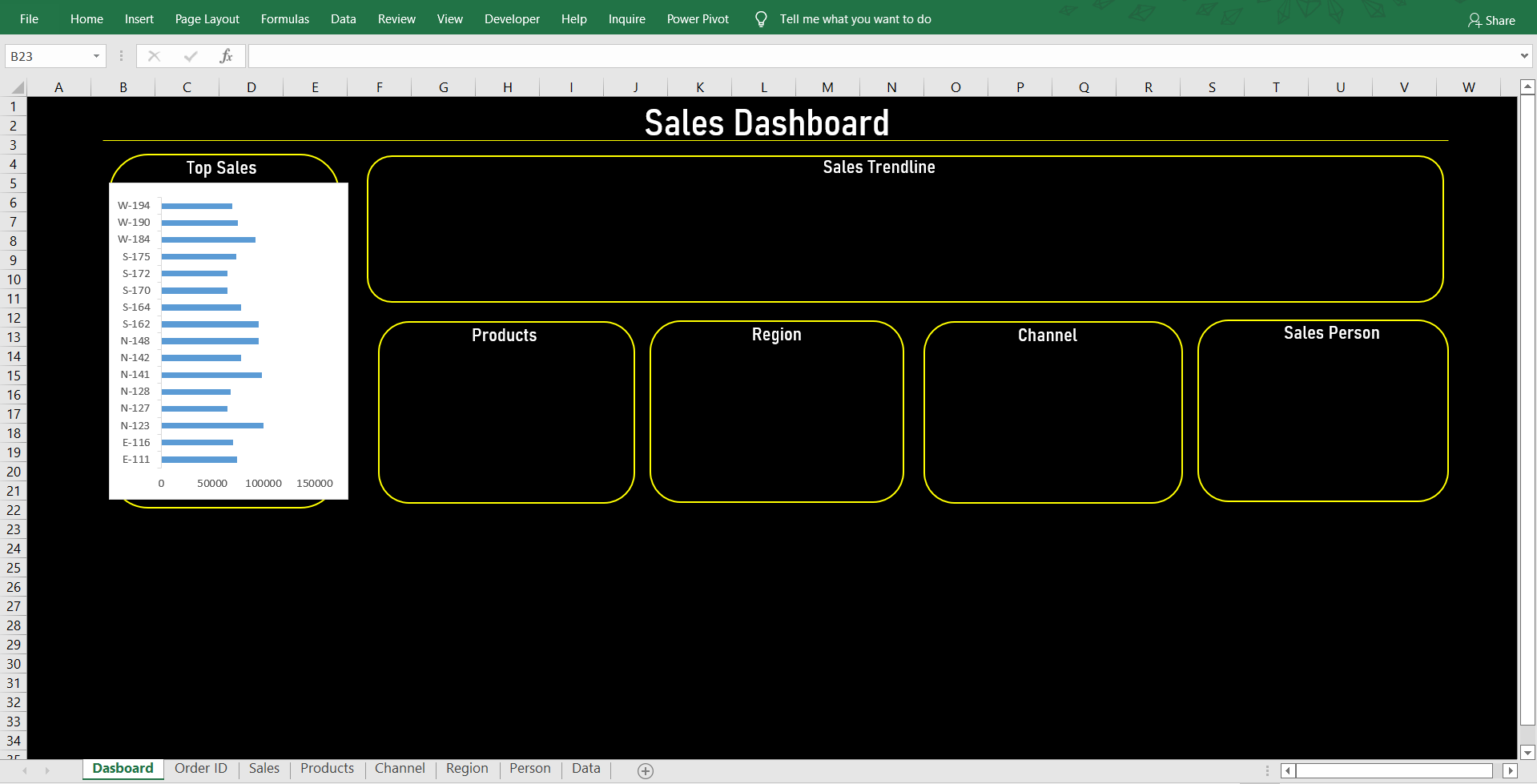
- Copy the chart from the “Order ID” sheet and paste it into the “Dashboard” sheet and align the chart into the Top Sales box accordingly.
- Select the chart, go to Format, then go to Shape Fill, select No Fill then go to Shape Outline and select No Outline.
- Select the Primary Vertical Axis of the chart, go to Home, in the Font section change the Font Colour to white, similarly change the Font colour of Primary Horizontal Axis to white, then select the bars on the chart, go to Home, in the Font section and change the Font Colour to yellow.
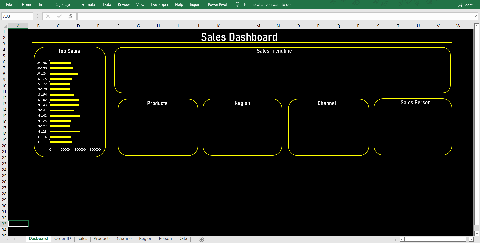
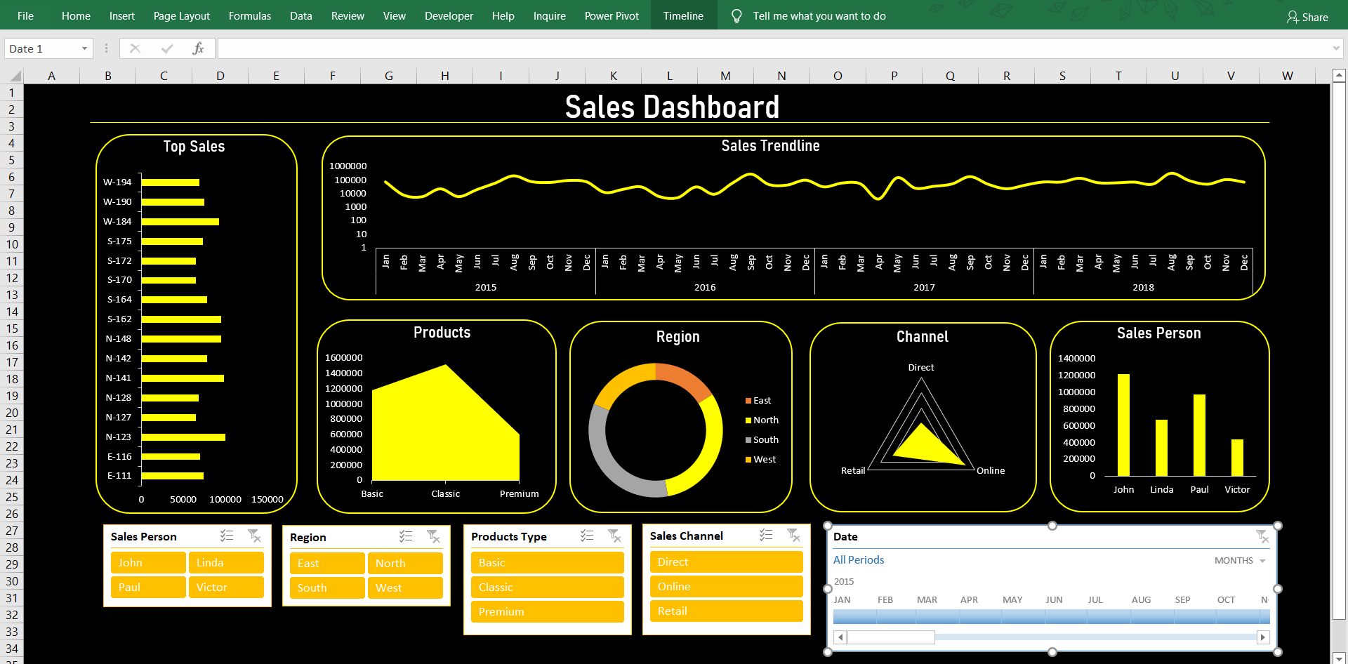
- Now repeat the same customization process for Products, Region, Channel and Sales Person Charts (exclude Sales Trendline Chart in this step), and after inserting and customizing all the charts you will get a dashboard like this:
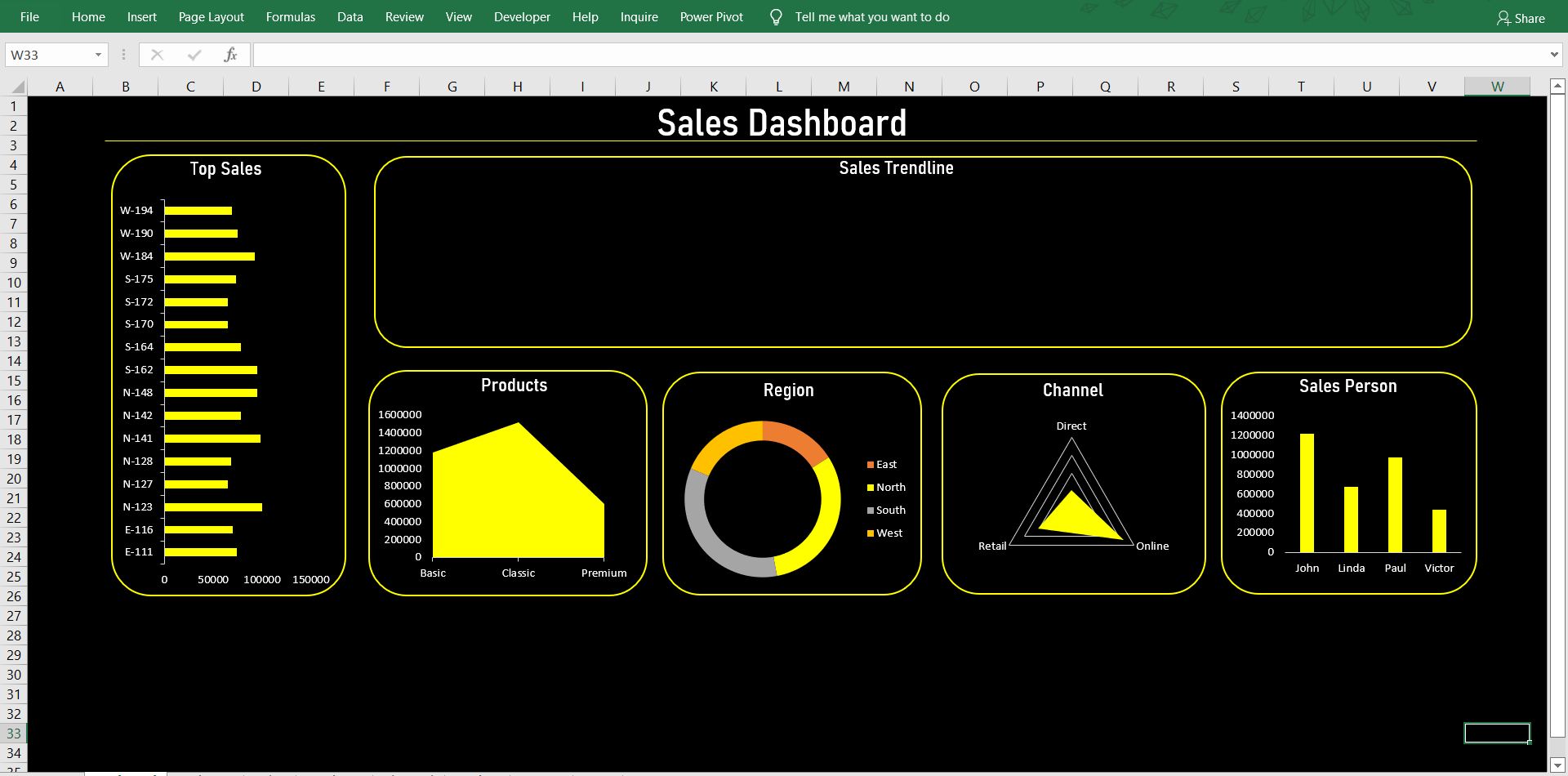
- Now for Sales Trendline Chart, the process is a little different, first, repeat the same process as the previous charts for shape fill, shape outline and font colour of both axes. Then right-click on the trend line in the chart and select Format Data Series, go to Fill & Line, change the colour to yellow and select the Smoothed Line (you can also change the trendline to Logarithmic scale, for that go to Vertical (Value) Axis in Format Data Series, then go to Axis Options and select Logarithmic scale with base 10). After completing step this you will get a dashboard like this:

Congratulations on completing your dashboard. At this moment it is a static dashboard but to make it an interactive dashboard we need to insert slicers and a timeline into the dashboard.
Adding Filters/Slicers and Timeline
For those who don’t know, a slicer in MS Excel provides buttons that you can click to filter tables or PivotTables and a timeline in MS Excel is mainly used for filtering the underlying datasets by date.
Adding Filters/Slicers
- To add multiple slicers in the dashboard, go to any sheet, say “Sales”, then select the chart, go to Insert, then in the Filters section select Slicer. This will open an Insert Slicer pop-up window, and in that only select Sales Person, Region, Products Type and Sales Channel.
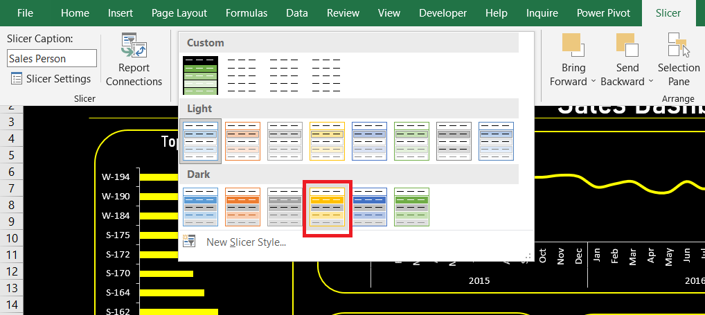
- Copy all the four slicers and paste them into the dashboard, then align and resize them accordingly. You can change the column number in the slicer, go to Slicer in the ribbon, in the Buttons section, and change Columns to 2.
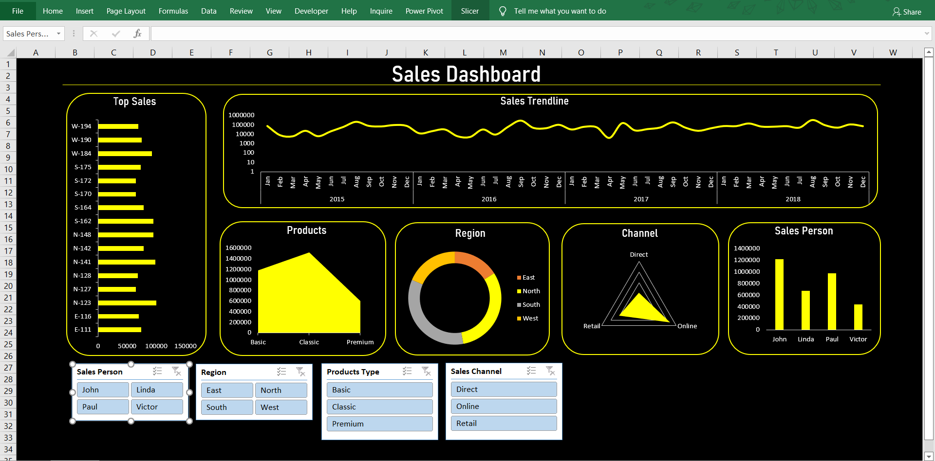
- Then select any slicer in the ribbon and go to Slicer, in the Slicer Styles section, select the Light Yellow, Slicer Style Dark-4. Customize every slicer accordingly.
- Then to make the connection between slicers and charts, select any chart, right-click on it and select Report Connections. It will open a Report Connections pop-up window, in which you can select any chart you want to connect the slicer with. For this dashboard, we will be connecting every slicer with every chart, but you can customize the connections as per your requirements.
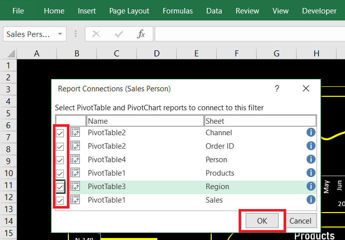
- Repeat the above process for every slicer. (do not connect the Sales Channel slicer with the Channel Chart, as the chart requires a minimum of three values to provide insights)
Adding Timeline
- To add a timeline in the dashboard, go to any sheet, say “Sales”, then select the chart, go to Insert, then in the Filters section select Timeline. This will open an Insert Timelines pop-up window, as timelines are used for filtering dates, the pop-up window will only show the option for Date, select it and click OK.
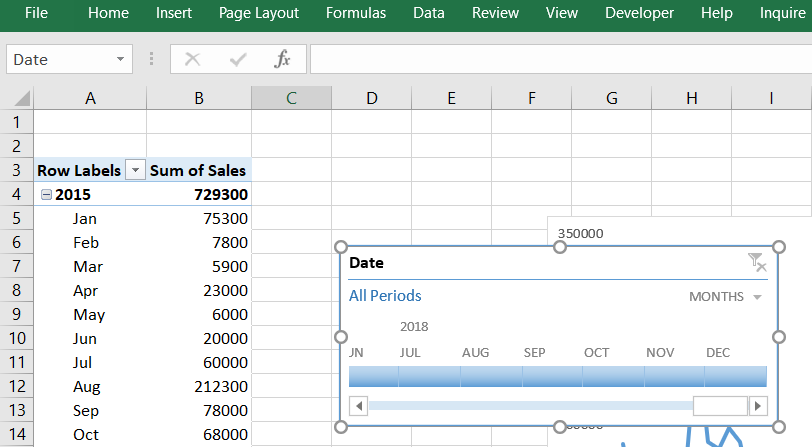
- Copy the timeline and paste it into the dashboard, then align and resize it accordingly.
- Same as slicers, change the timeline style to Light Yellow, Timeline Style Dark-4.
- Same as slicers, connect the timeline with every chart in the dashboard.
You can always customize your dashboard’s layout, charts, colour theme, slicers and timeline according to you as in this article we only targeted the basics of making a dashboard.
Final Dashboard
And now we are at the end of this dashboard creation. Have a look at the final result:

Have a look at a much more customized and better-looking dashboard that I created, and you can also have your take on the dashboard:
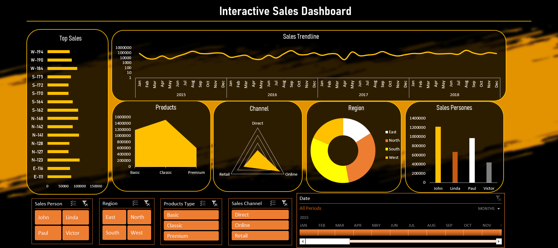
You can also customize your dashboard using your creativity and requirements, you can customize the background, slicers and timeline to make it more attractive.
Conclusion
In this article, I have explained how to create an interactive sales dashboard from scratch on MS Excel (without VBA). I discussed how to plan the dashboard, create tables and pivot tables, create and customize visualizations/charts, create the layout of the dashboard, how to bring all charts together on the dashboard, make the charts beautiful and how to connect all these charts to common slicers and timeline.
The media shown in this article is not owned by Analytics Vidhya and is used at the Author’s discretion.
I'm an Artificial Intelligence enthusiast, currently employed as an Associate Data Scientist. I'm passionate about sharing knowledge with the community, focusing on project-based articles. #AI #DataScience #Projects #Community


Thank you so much for this article, This is the best article I have read recently, I will be happy if I have a copy of your instructional materials sent to my mail