Last week had been very hectic. I had slogged more than 100 hours to come out with an awesome recommender based on market basket analysis.
“Now was the time to shine!” I thought, just before the meeting with stakeholders was about to start. I had prepared a good presentation and was feeling confident about the work. Thirty minutes into the presentation, I was trying my level best to explain lift, support and confidence in an imaginary 3d plane to the stakeholders.
Guess what – they were not impressed, they found the technique too complex. The meeting ended up with the key stakeholder saying “Can you create something simpler and more intuitive?”
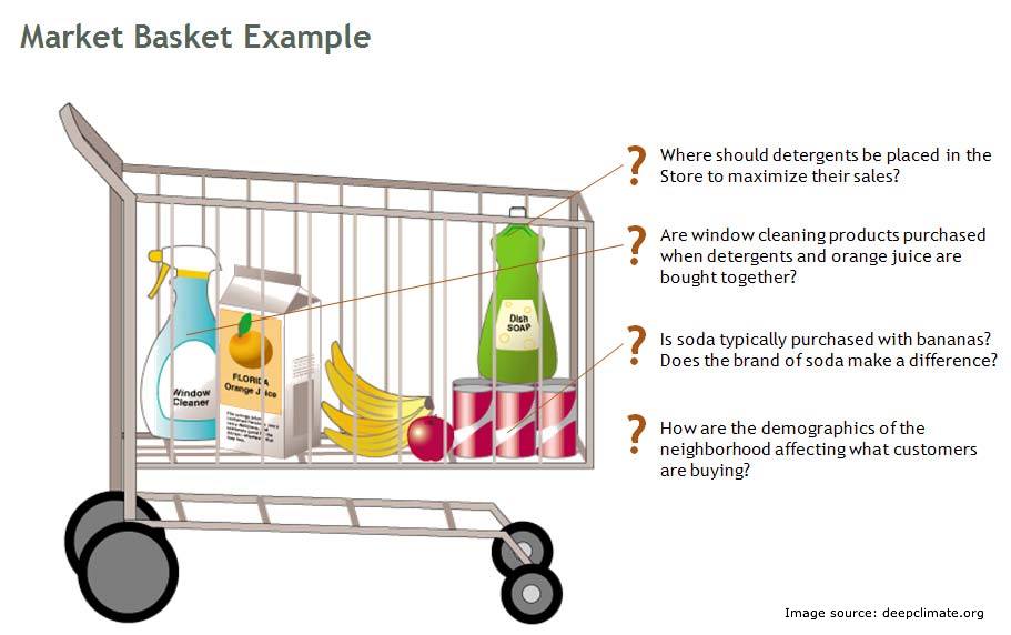
This is when I went back to a drawing board and came out with this technique to visualize and explain market basket analysis in very simple visualization. This was the core thought behind this technique:
Algorithm used in Text mining can be leveraged to create relationship plots in a Market basket analysis.
Market basket is a widely used analytical tool in retail industry. However, retail industry use it extensively, this is no way an indication that the usage is limited to retail industry. Various X-sell strategies in different industries can be made using a market basket analysis. There is a good amount of content available in the web world on the theory behind market basket analysis but I have hardly seen any articles on how to visualize market basket analysis . In this article, I will leverage some algorithm of text mining to get such visual plots.
Some basic Definitions
Support : Support is simply the probability of an event to occur. If we have an event to buy a product A, Support(A) is simple the number of transactions which includes A divided by total number of transactions.
Confidence : Confidence is essentially the conditional probability of an event A happening given that B has happened.
For more detailed definition refer to our last article (last post).
Importing the dataset
The first part of any analysis is to bring in the dataset. I am using a dummy data to demonstrate this application. The data has details of 12k transactions. Each transaction has 3 products. Following is the code to import the transaction data stored in a CSV file.
[stextbox id=”grey”]txn_data<-read.csv("Retail_Data.csv")
summary(txn_data)
transaction_id Prod1 Prod2 Prod3
Min. : 100001 A:2983 E:3962 H:5907
1st Qu.: 103001 B:3024 F:4053 I:6093
Median :106001 C:3047 G:3985
Mean : 106001 D:2946
3rd Qu.: 109000
Max. : 112000
As you can observe, each transaction has all 3 products. Product 1 takes only A,B,C and D. Product 2 takes E,F and G. Product 3 takes H and I. All the three products are mutually exclusive.
Creating an “item-transaction” Matrix
This is a concept, I learned in text mining. But it very well fits into this application as well. We will first create a matrix with flags on each product. In total we have 9 products, hence we generate 9 vectors to capture these flags. Here is the code to generate the 9 vectors and joining them to form item document matrix.
[stextbox id=”grey”]#Initializing vectors
A <- numeric(0)
B <- numeric(0)
C <- numeric(0)
D <- numeric(0)
E <- numeric(0)
F <- numeric(0)
G <- numeric(0)
H <- numeric(0)
I <- numeric(0)
#Preparing the flag metrics
for ( i in 1:nrow(txn_data))
{
if (txn_data$Prod1[i] == "A") A[i] <- 1 else A[i]<-0
if (txn_data$Prod1[i] == "B") B[i] <- 1 else B[i]<-0
if (txn_data$Prod1[i] == "C") C[i] <- 1 else C[i]<-0
if (txn_data$Prod1[i] == "D") D[i] <- 1 else D[i]<-0
if (txn_data$Prod2[i] == "E") E[i] <- 1 else E[i]<-0
if (txn_data$Prod2[i] == "F") F[i] <- 1 else F[i]<-0
if (txn_data$Prod2[i] == "G") G[i] <- 1 else G[i]<-0
if (txn_data$Prod3[i] == "H") H[i] <- 1 else H[i]<-0
if (txn_data$Prod3[i] == "I") I[i] <- 1 else I[i]<-0
}
final.mat <- rbind(A,B,C,D,E,F,G,H,I)
[/stextbox]
Creating plots using igraph library
Once we have the transactions-item matrix, it is time to create an item-item correlation matrix. I have done this using a simple mathematical formulation. We multiple the transaction-item matrix with its own transpose to get item-item correlation matrix. In this matrix, the number on diagonal gives an indication of Support whereas all other numbers give the confidence. We use both these numbers to build a relationship plot. Following is the code to build the matrix and the plot.
[stextbox id=”grey”]#Creating the relationship matrix termMatrix <- final.mat %*% t(final.mat) #Creating the graphs library(igraph) # build a graph from the above matrix g <- graph.adjacency(termMatrix, weighted=T, mode = "undirected") # remove loops g <- simplify(g) # set labels and degrees of vertices V(g)$label <- V(g)$name V(g)$degree <- degree(g) # set seed to make the layout reproducible set.seed(3952) layout1 <- layout.fruchterman.reingold(g) plot(g, layout=layout1) plot(g, layout=layout.kamada.kawai) tkplot(g, layout=layout.kamada.kawai)[/stextbox]
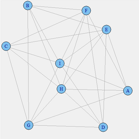
As of now we have not incorporated the strength of confidence or the support to plot this graph. Something to observe in this plot is that products like A and B are not connected. This is simply because they never co-exist together in any transaction. This plot can be use to visualize the negative lift items. Such items should not be placed near each other. The next step is to incorporate the support of each product in the visual plot.
[stextbox id=”grey”]V(g)$label.cex <- 2.2 * V(g)$degree / max(V(g)$degree)+ .2 V(g)$label.color <- rgb(0, 0, .2, .8) V(g)$frame.color <- NA egam <- (log(E(g)$weight)+0.2) / max(log(E(g)$weight)+0.2)[/stextbox]
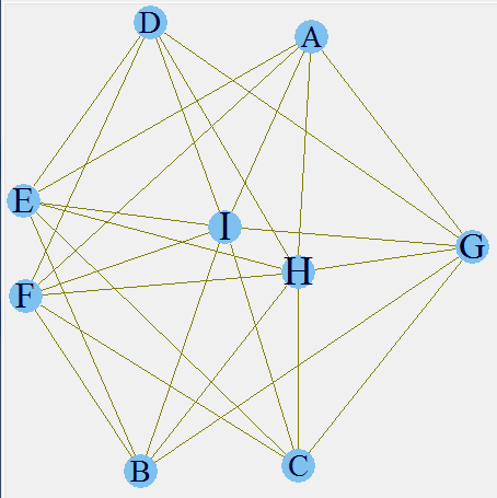
Here, we have incorporated the support of each product. As you can see H and I form the biggest letters and A,B,C and D the smallest. This is an indication of higher and lower support. You can validate these inferences from the initial frequency distribution. The next step is to incorporate the confidence as well in the relationship line width.
[stextbox id=”grey”]E(g)$color <- rgb(.5, .5, 0, egam) E(g)$width <- egam # plot the graph in layout1 plot(g, layout=layout1) tkplot(g, layout=layout.kamada.kawai)[/stextbox]
The final plot makes the entire story clear. We have already seen that H and I have the highest support. Now it is also clear that E-I , I-F and H-F have a high confidence as well. Hence, if a customer buys a product F there is a high propensity that he will also buy product H and I. Hence, following are the rules which we can infer from this analysis :
1. If a customer buys E, he has a high propensity to also buy I.
2.If a customer buys F, he has a high propensity to also buy I.
3. If a customer buys F, he has a high propensity to also buy H.
4. If a customer buys I, there is very small that he will also buy H.
The arrangement of items should flow from these rules in order to maximize the sales.
End Notes
Graphical representation of market basket analysis makes the interpretation of the entire puzzle of “probabilities/conditional probability/lift above random events” much simpler than a tabular format. This simplification can be more appreciated when we have a large number of transactions and product list. In case of large lists, we can simply find out using the dimension of product sign and width of the line connecting them to infer out simple rules which otherwise were buried in a matrix of complex probabilities.
Have you ever visualized relationships in a market basket analysis? If you did, what algorithm did you use? Did you find the article useful? Did this article solve any of your existing dilemma?
If you like what you just read & want to continue your analytics learning, subscribe to our emails, follow us on twitter or like our facebook page.
Tavish Srivastava, co-founder and Chief Strategy Officer of Analytics Vidhya, is an IIT Madras graduate and a passionate data-science professional with 8+ years of diverse experience in markets including the US, India and Singapore, domains including Digital Acquisitions, Customer Servicing and Customer Management, and industry including Retail Banking, Credit Cards and Insurance. He is fascinated by the idea of artificial intelligence inspired by human intelligence and enjoys every discussion, theory or even movie related to this idea.


Which tool did you use to write that code ?
I used R for this application.
Hi Tavish, Excellent work. You could also try the arulesViz package which provides network visualizations Example subrules2 <- head(sort(rules, by="lift"), 10) plot(subrules2, method="graph",control=list(type="items")) there are more control parameters which you can read about and apply if required.
Thanks Clarence for sharing the additional code.
Well done, thank you for sharing! Two minor corrections may be in order: -Refer to nine (9) products/vectors rather than eight (8)? -Rule four above is about I -> E, not I -> I? Thanks!
Thanks Maurice, You are right. Both the changes have been made.