This article was published as a part of the Data Science Blogathon
Introduction
We all watch a lot of TV shows. Who doesn’t love to spend some free time on the weekend?
Many online streaming services offer a large number of TV shows, which are at our disposal to watch, at the price of a subscription cost. The major online streaming services across the world are Netflix, Prime Video, Hulu, and Disney+.
We shall have a look at a TV Show data set and perform some Data Exploration and analysis.
The Dataset
The data ” TV shows on Netflix, Prime Video, Hulu and Disney+ ” can be found here.
The dataset contains a large number of TV shows from the above-mentioned streaming services. Regarding, the features, the dataset contains:
1. Name of the TV Show
2. The year in which the TV Show was produced
3. Target age group
4. IMDB Rating
5. Rotten Tomatoes percentage score
6. 1 or 0 feature indicating whether the TV Show is available on a particular Streaming service.
The dataset is not that feature-rich, but it can tell us a lot about TV Shows.
Let us start with exploring the dataset, by getting started with the code.
Getting Started with the Code
Let us start by importing the libraries.
#Importing libraries
import re
import numpy as np
import pandas as pd
import seaborn as sns
import matplotlib.pyplot as plt
import random
from wordcloud import WordCloud, STOPWORDS
import nltk
from nltk.sentiment.vader import SentimentIntensityAnalyzer
Now, let us read the data.
#reading the data
data=pd.read_csv("/kaggle/input/tv-shows-on-netflix-prime-video-hulu-and-disney/tv_shows.csv")
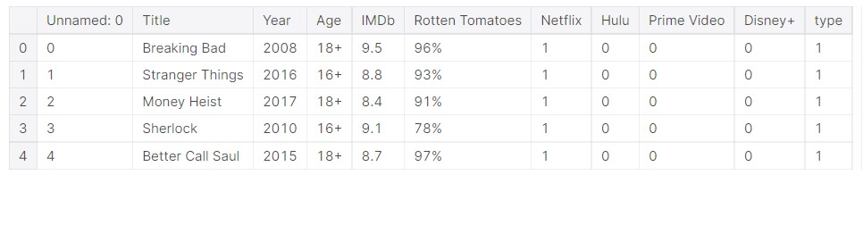
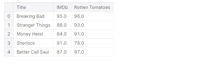
The dataset looks like this.
data.head()
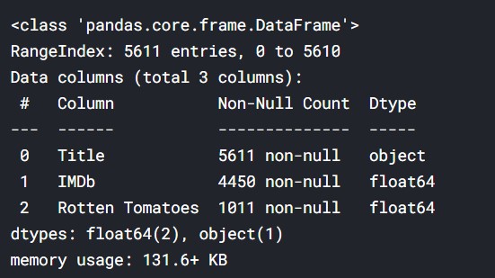
Let us look at the overall dataset.
#looking at the data
data.info()
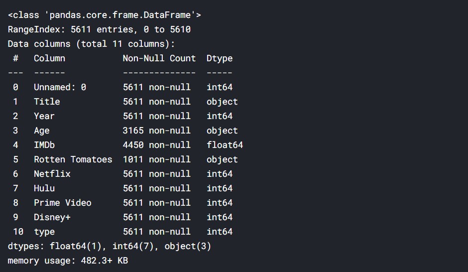
There are a lot of missing values. This data has various TV Shows and their ratings etc. The “%” from rotten tomatoes must be removed and the “+” from age ratings must be removed. The data has to be cleaned properly to do the proper analysis. We will try to do an overall analysis of the TV Shows and understand the trends.
Data Cleaning
Let us get started with data cleaning, it is an important part of the whole process.
#Converting the percentages to number
data['Rotten Tomatoes'] = data['Rotten Tomatoes'].str.rstrip('%').astype('float')
#Removing the "+" sign from age rating
data["Age"] = data["Age"].str.replace("+","")
#Conveting it to numeric
data['Age'] = pd.to_numeric(data['Age'],errors='coerce')
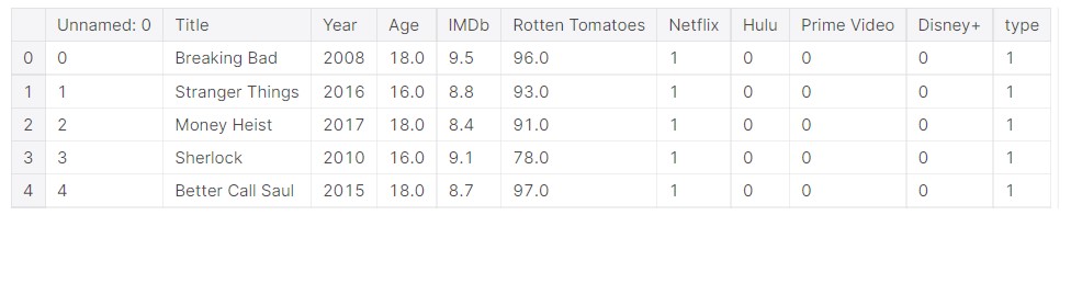
Now, the data should have been cleaned.
#Final data
data.head()
Let us look at the cleaned data.
But, there is a lot of missing values. We need data points with complete data, and the incomplete ones can be removed.
#only the data will complete column values available
#later use
df=data.dropna()
Age Analysis
df["Age"].value_counts()
Output:
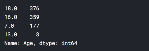
So,
18+ = 376 shows
16+ = 359 shows
7+ = 177 shows
13+ = 7 shows
Thus, we can assume that most shows are for a mature audience. There aren’t many shows for kids here in the data.
Analysis based on Title Names
We will analyze the title names of the TV Shows. This dataset lacks genre or a plot summary of the TV Shows, so we shall work with the text data provided, that is just the Title Names.
#Taking the values
titles=data["Title"].values
#Joining into a single string
text=' '.join(titles)
len(text)
Output: 100723
Hence, the text data is quite long.
#How it looks
text[1000:1500]
Output:
"er Love, Death & Robots Marvel's Jessica Jones New Girl The Good Wife The Umbrella Academy Marvel's The Punisher Ash vs Evil Dead Master of None Bodyguard Schitt's Creek Narcos: Mexico The West Wing Bates Motel Atypical Once Upon a Time Gomorrah Making a Murderer Death Note Castlevania Riverdale Burn Notice Fauda Russian Doll Our Planet Big Mouth American Horror Story Gotham I Am Not Okay with This Criminal Minds The Vietnam War Waco Star Trek The OA Outer Banks The Midnight Gospel Good Girls Ch"
#Removing the punctuation
text = re.sub(r'[^ws]','',text)
Now, the punctuation has been removed. Now the text looks like this.
#Punctuation has been removed
text[1000:1500]
Output:
'ots Marvels Jessica Jones New Girl The Good Wife The Umbrella Academy Marvels The Punisher Ash vs Evil Dead Master of None Bodyguard Schitts Creek Narcos Mexico The West Wing Bates Motel Atypical Once Upon a Time Gomorrah Making a Murderer Death Note Castlevania Riverdale Burn Notice Fauda Russian Doll Our Planet Big Mouth American Horror Story Gotham I Am Not Okay with This Criminal Minds The Vietnam War Waco Star Trek The OA Outer Banks The Midnight Gospel Good Girls Chilling Adventures of Sab'
Title Word Frequency
We will tokenize the words and find out the frequency of each word. This will give us an idea of how many times a word appears in a title, and also give the words which appear maximum in a title.
#Creating the tokenizer
tokenizer = nltk.tokenize.RegexpTokenizer('w+')
#Tokenizing the text
tokens = tokenizer.tokenize(text)
#now we shall make everything lowercase for uniformity
#to hold the new lower case words
words = []
# Looping through the tokens and make them lower case
for word in tokens:
    words.append(word.lower())
#Stop words are generally the most common words in a language.
#English stop words from nltk.
stopwords = nltk.corpus.stopwords.words('english')
words_new = []
#Now we need to remove the stop words from the words variable
#Appending to words_new all words that are in words but not in sw
for word in words:
    if word not in stopwords:
        words_new.append(word)
Now, we get the frequency distribution of the words.
#The frequency distribution of the words
freq_dist = nltk.FreqDist(words_new)
So, now we plot the frequency distribution.
#Frequency Distribution Plot
plt.subplots(figsize=(20,12))
freq_dist.plot(50)
Output:
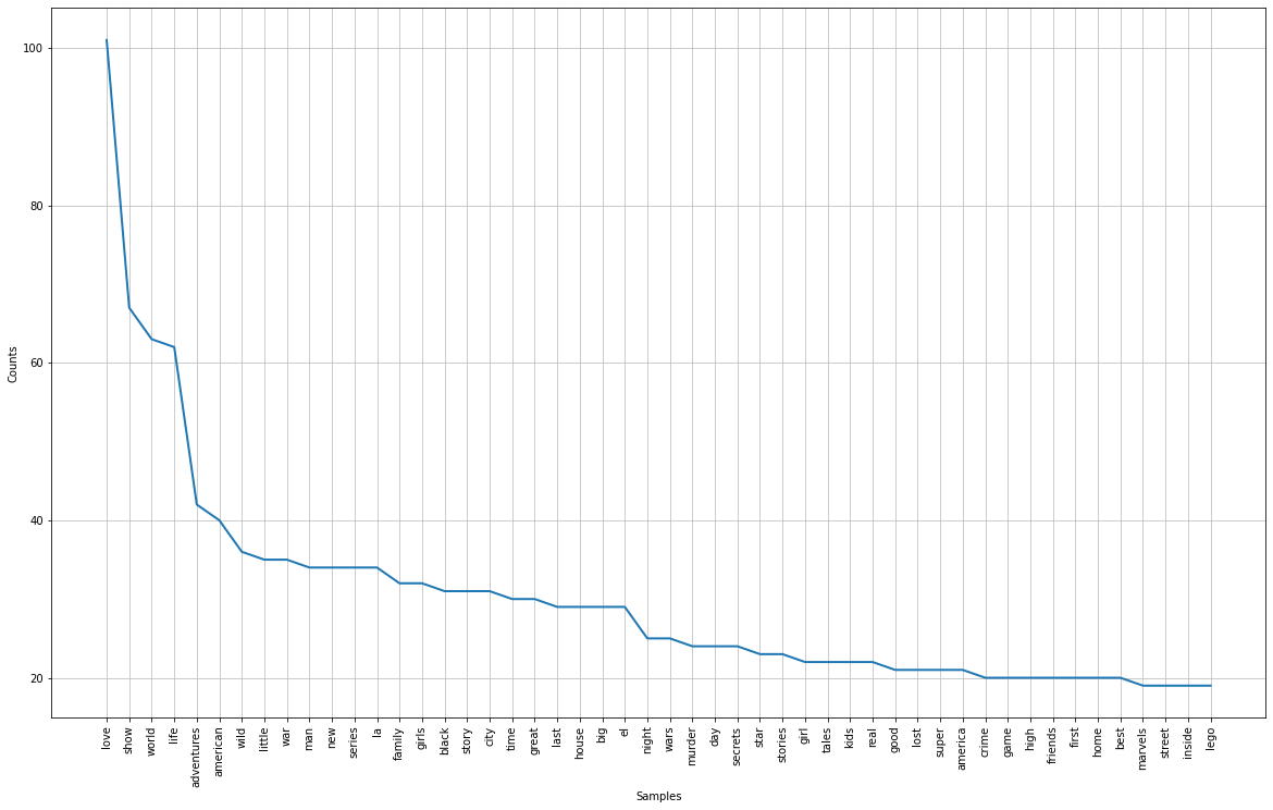
The plot is not very clear in the image, but I shall leave the link to the Kaggle Notebook, please have a look there.
Some observations:
- The maximum seen word is love, so we can say titles do have romantic/love-oriented names.
- Other frequent words are the world, life, adventure, wild, family, story, etc.
- These are common elements of day-to-day life and hence they are common in the titles.
- No stopwords as we removed them.
Now, let us make some wordclouds.
#converting into string
res=' '.join([i for i in words_new if not i.isdigit()])
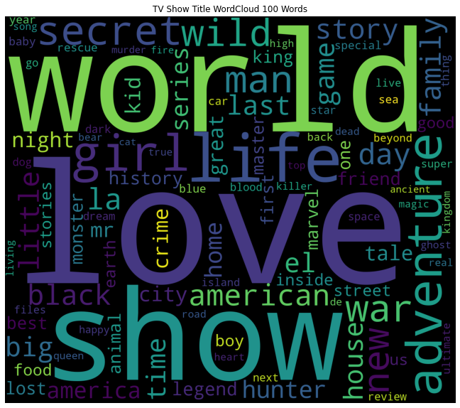
WordCloud
WordCloud with 100 words.
#wordcloud
plt.subplots(figsize=(16,10))
wordcloud = WordCloud(
                          stopwords=STOPWORDS,
                          background_color='black',
                          max_words=100,
                          width=1400,
                          height=1200
                         ).generate(res)
plt.imshow(wordcloud)
plt.title('TV Show Title WordCloud 100 Words')
plt.axis('off')
plt.show()
Output:
Now, let us try 500 words.
#wordcloud
plt.subplots(figsize=(16,10))
wordcloud = WordCloud(
                          stopwords=STOPWORDS,
                          background_color='black',
                          max_words=500,
                          width=1400,
                          height=1200
                         ).generate(res)
plt.imshow(wordcloud)
plt.title('TV Show Title WordCloud 500 Words')
plt.axis('off')
plt.show()
Output:
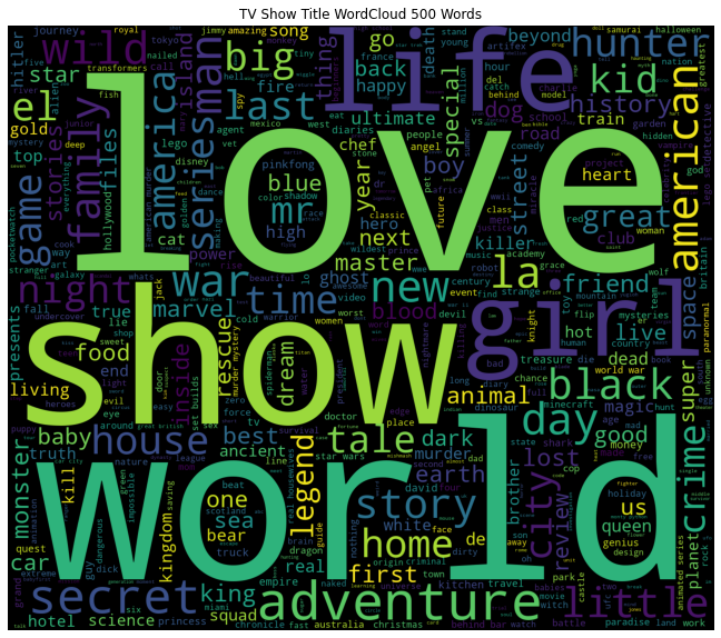
Some of the key observations are:
- Love, world, girl, life, day, family, secret, etc occupy large spaces.
- As they occupy large spaces, this means they have a high frequency.
- This shows that a large number of tv shows will have some sort of these components.
Now, let us look into the numeric data.
Analysis of Numeric Data
First, we plot the year of production of the TV Shows. This gives us an idea of the general timelines.
#overall year of release analysis
plt.subplots(figsize=(8,6))
sns.distplot(data["Year"],kde=False, color="blue")
Output:
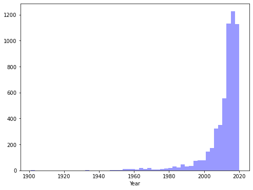
So, as we can see, mainly new TV Shows, especially after 2010. We can understand that most of the content is catered for a younger audience.
Let us now look at the IMDB ratings.
IMDB Rating Data
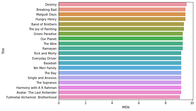
print("TV Shows with highest IMDb ratings are= ")
print((data.sort_values("IMDb",ascending=False).head(20))['Title'])
Output:
TV Shows with highest IMDb ratings are=
3023                             Destiny
0                           Breaking Bad
3747                        Malgudi Days
3177                        Hungry Henry
3567                    Band of Brothers
2365                 The Joy of Painting
4128                      Green Paradise
91                            Our Planet
3566                            The Wire
325                              Ramayan
1931                      Rick and Morty
4041                     Everyday Driver
3701                            Baseball
282                      Yeh Meri Family
3798                             The Bay
4257                  Single and Anxious
3568                        The Sopranos
4029             Harmony with A R Rahman
9             Avatar: The Last Airbender
15      Fullmetal Alchemist: Brotherhood
Name: Title, dtype: object
Now, the top 20 shows with the best ratings.
#barplot of rating
plt.subplots(figsize=(8,6))
sns.barplot(x="IMDb", y="Title" , data= data.sort_values("IMDb",ascending=False).head(20))
Output:
Now, the TV shows with the worst ratings.
#barplot of rating
plt.subplots(figsize=(8,6))
sns.barplot(x="IMDb", y="Title" , data= data.sort_values("IMDb",ascending=True).head(20))
Output:
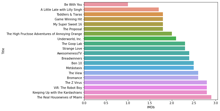
Well, these are some of the worst-rated TV Shows.
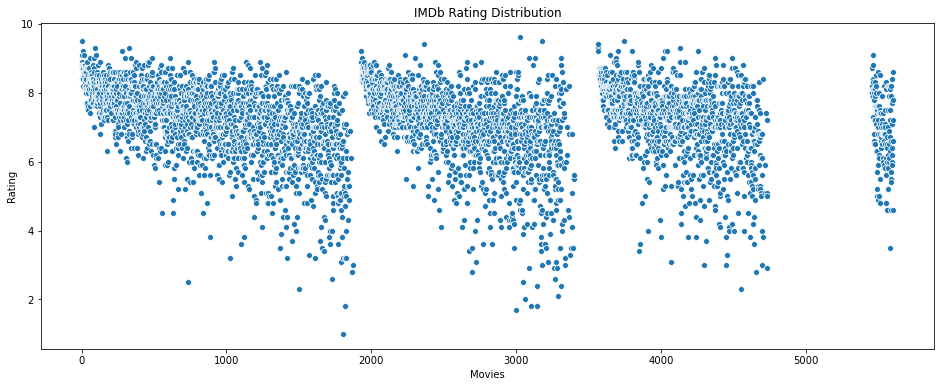
Let us look at the overall IMDB rating data. Having a look at the overall data will show the data distribution.
#Overall data of IMDb ratings
plt.figure(figsize=(16, 6))
sns.scatterplot(data=data['IMDb'])
plt.ylabel("Rating")
plt.xlabel('Movies')
plt.title("IMDb Rating Distribution")
Output:
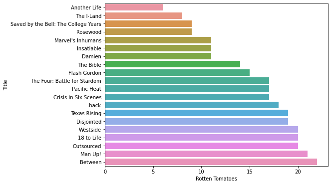
Rotten Tomatoes Scores
Now, we proceed with the Rotten Tomatoes scores.
#barplot of rating
plt.subplots(figsize=(8,6))
sns.barplot(x="Rotten Tomatoes", y="Title" , data= data.sort_values("Rotten Tomatoes",ascending=False).head(20))
Output:
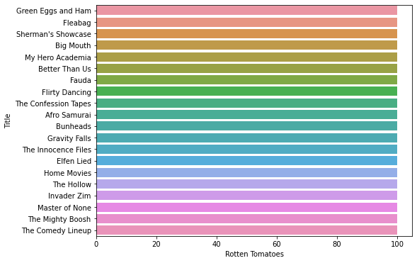
Now, a look at the worst scores.
#barplot of rating
plt.subplots(figsize=(8,6))
sns.barplot(x="Rotten Tomatoes", y="Title" , data= data.sort_values("Rotten Tomatoes",ascending=True).head(20))
Output:
Now, let us see the distribution of the scores.
#Overall data of Rotten Tomatoes scores
plt.figure(figsize=(16, 6))
sns.scatterplot(data=data['Rotten Tomatoes'])
plt.ylabel("Rotten Tomatoes score")
plt.xlabel('Movies')
plt.title("Rotten Tomatoes Score Distribution")
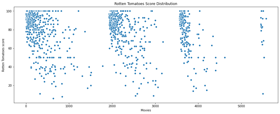
The breaks in the data are the missing data points, which we removed.
Overall, we can see that the data has many types of values. I have done a lot of Data Exploration, the full of it can be found in the Kaggle notebook. i will share the link.
TV Show Clustering based on ratings
Now, we shall cluster the TV shows based on the IMDB rating and Rotten Tomatoes score. First, we start by taking the data.
#Taking the relevant data
ratings=data[["Title",'IMDb',"Rotten Tomatoes"]]
ratings.head()
The data looks like this:
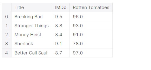
So, we only have the name of the TV Show and the ratings.
ratings.info()
Output:
We see that there are much data that is missing. But for undergoing the process, we need complete data. So we shall delete the data which has missing values and only work on data that is complete.
#Removing the data
ratings=ratings.dropna()
Important thing is that IMDB data is on a scale of 0-10, and Rotten Tomatoes data is on a scale of 0-100. But data on different scales might not lead to proper clustering, so we convert the IMDb data into a scale of 0-100, that is, we shall multiply it by 10.
ratings["IMDb"]=ratings["IMDb"]*10
#New data
ratings.head()
Output:
Let us now proceed with clustering, by taking the input data.
#Input data
X=ratings[["IMDb","Rotten Tomatoes"]]
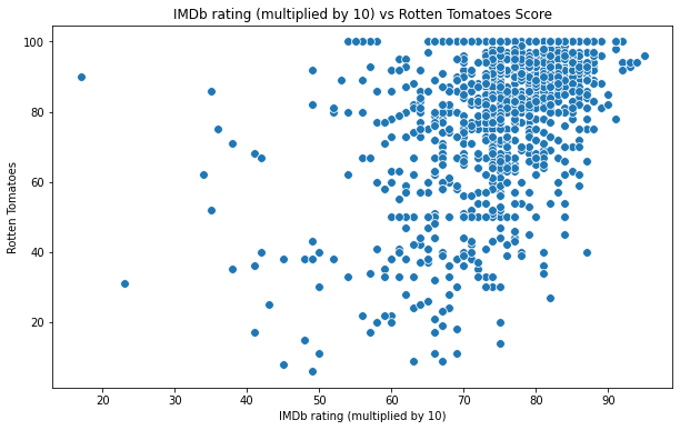
Let us now see, how the data looks like.
#Scatterplot of the input data
plt.figure(figsize=(10,6))
sns.scatterplot(x = 'IMDb',y = 'Rotten Tomatoes',  data = X  ,s = 60 )
plt.xlabel('IMDb rating (multiplied by 10)')
plt.ylabel('Rotten Tomatoes')
plt.title('IMDb rating (multiplied by 10) vs Rotten Tomatoes Score')
plt.show()
Output:
KMeans is one of the simple but popular unsupervised learning algorithms. Here K indicates the number of clusters or classes the algorithm has to divide the data into. First, when starting, the algorithm selects random centroids. These centroids are used as the beginning points for every cluster. The positions of the centroids are determined by repeated calculations.
#Importing KMeans from sklearn
from sklearn.cluster import KMeans
Now we calculate the Within Cluster Sum of Squared Errors (WSS) for different values of k. Next, we choose the k for which WSS first starts to diminish.
wcss=[]
for i in range(1,11):
    km=KMeans(n_clusters=i)
    km.fit(X)
    wcss.append(km.inertia_)
#The elbow curve
plt.figure(figsize=(12,6))
plt.plot(range(1,11),wcss)
plt.plot(range(1,11),wcss, linewidth=2, color="red", marker ="8")
plt.xlabel("K Value")
plt.xticks(np.arange(1,11,1))
plt.ylabel("WCSS")
plt.show()
Output:
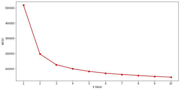
This is known as the elbow graph, the x-axis being the number of clusters, the number of clusters is taken at the elbow joint point. This point is the point where making clusters is most relevant.
#Taking 4 clusters
km=KMeans(n_clusters=4)
#Fitting the input data
km.fit(X)
#predicting the labels of the input data
y=km.predict(X)
#adding the labels to a column named label
ratings["label"] = y
Now, let us look at how the clusters look like.
#Scatterplot of the clusters
plt.figure(figsize=(10,6))
sns.scatterplot(x = 'IMDb',y = 'Rotten Tomatoes',hue="label",
                 palette=['green','orange','red',"blue"], legend='full',data = ratings  ,s = 60 )
plt.xlabel('IMDb rating(Multiplied by 10)')
plt.ylabel('Rotten Tomatoes score')
plt.title('IMDb rating(Multiplied by 10) vs Rotten Tomatoes score')
plt.show()
Output:
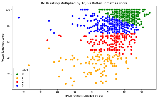
Analysis
- The cluster at the top is surely the best TV Shows, they have high scores by both IMDb and Rotten Tomatoes.
- The middle two are good and average TV Shows. There are outliers, and in some cases, some TV Shows have been rated high by one but rated low by the other.
- The outliers are mainly caused by the fact that say IMDb rated them well, but Rotten Tomatoes rated them badly.
- The bottom cluster is usually the TV Shows with bad ratings by both, but there are some outliers.
I displayed all the data in the notebook. For, having a look at the entire code, please visit this link on Kaggle: TV Shows Analysis.
Thus, we had a look at a very interesting dataset on a wide variety of TV Shows.
About me:
Prateek Majumder
Data Science and Analytics | Digital Marketing Specialist | SEO | Content Creation
Connect with me on Linkedin.
My other articles on Analytics Vidhya: Link.
Thank You.
The media shown in this article on TV Shows Analysis are not owned by Analytics Vidhya and are used at the Author’s discretion.
Prateek is a dynamic professional with a strong foundation in Artificial Intelligence and Data Science, currently pursuing his PGP at Jio Institute. He holds a Bachelor's degree in Electrical Engineering and has hands-on experience as a System Engineer at TCS Digital, where he excelled in API management and data integration. Prateek also has a background in product marketing and analytics from his time with start-ups like AppleX and Milkie Way, Inc., where he was involved in growth campaigns and technical blog management. Recognized for his structured thinking and problem-solving abilities, he has received accolades like the Dr. Sudarshan Chakraborty Award for Best Student Performance. Fluent in multiple languages and passionate about technology, Prateek continues to expand his expertise in the rapidly evolving AI and tech landscape.


