Introduction
Data Visualization is the way a data scientist expresses himself / herself. Creating a meaningful visualization requires you to think about the story, the aesthetics of the visualization and various other aspects.
If you are planning to create custom visualizations on the web, chances are that you’d have already heard about D3.js. A web based visualization library that features a plethora of APIs to handle the heavy lifting of creating advanced, dynamic and beautiful visualization content on the web.
In this article, we would learn some of D3’s powers and use them to create magic of our own! By end of the article, you will be able to create awesome stories for yourself!
This article is a continuation of my previous article, Beginner’s guide to build data visualizations on the web with D3.js . Which I would recommend you to read before going further for a better understanding 🙂

Note: The code in this article uses D3 v3.
Table of Contents
- Refreshing previous concepts of D3.js
- A glance at advanced concepts: Scales, Axes and Reading data from external sources
- Building basic charts and code reusability
- Line Chart
- Area Chart
- Chart as a modular structure
- Case Study
- Visualizing Game of Thrones Social Network – Force Directed Graph in action!
- Case Studies – Some interesting charts built using D3.js
- Introduction to Dimple.js – D3 made easy!
1. Refreshing previous concepts of D3.js
Let’s quickly refresh some of the important concepts we have learned in the previous article!
Selections
In order to perform an operation on an element in the DOM(our HTML page), we would first need to “select” it. We do that using d3.select(..) method. If you want to select the <body> tag, you would do :
d3.select(“body”);
Adding Elements
In case you want to add an element to your DOM, you use .append(..) method. For example, to add a <svg> element to your body, you would do :
var svg = d3.select(“body”).append(“svg”);
Notice that here we use another important D3 concept, method chaining. Here, we reuse the output of the d3.select(“body”) and apply the .append() method to add a <svg> element to it.
Setting attributes
D3 gives you a clean way to add/remove attributes for a selected DOM element. For example, you’d like to set the width and height of your <svg> :
svg.attr({“width”:500, “height”:500});
Appending data to DOM
In D3, if you want to add some data to DOM elements, you would create what is called a “Enter, Update, Exit” cycle. For example, You want to create a set of rectangles each having a height as given in an array you’d do :
//data values
var data_values = [10,20,30,40,50,5,2,12,70,26];
//create rectangles
var bars = svg.selectAll("rect")
 .data(data_values)
 .enter()
 .append("rect")
 .attr("width","25px")
 .attr("height", function(d){ return d; });
Now, having refreshed some of the important concepts, let’s learn some new topics.
2. A glance at advanced concepts: Scales, Axes and Reading data from external sources
These are some of the most useful features that come out of the box with D3. We will cover them one by one:
2.1 Scales

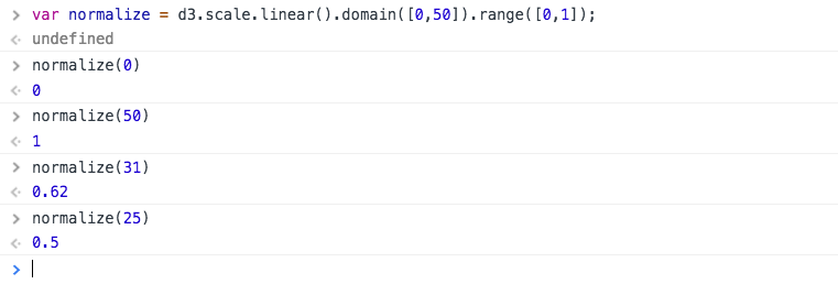
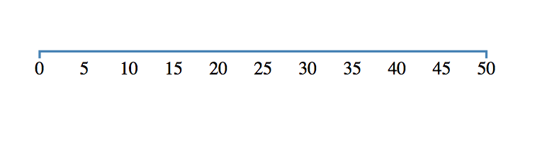
As data enthusiasts, you had probably come across cases where you have data in different scales. For any meaningful inference, it had to be “scaled” to a common range. For example, when you normalize for values between 0 and 1. Here if you want to rescale a data set, you’d need to create a linear scale with fixed domain and range values. Then call the scale with the required value:
// Create a linear scale
var normalize = d3.scale.linear().domain([0,50]).range([0,1]);
Here domain(..) is used to set the max and min values of the input data and range(..) is used to set the max and min values of the output needed. A domain of [0,50] and a range of [0,1] means we have created a linear scale that’d map any value in [0,50] to a value in [0,1]. Let’s check how well our scale works :
It looks the scale is working quite well! D3 supports plenty of scales to cover almost all of your data needs. Read more here.
2.2 Axes
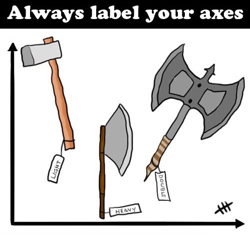
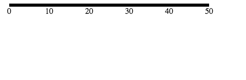
Axes are a very important part of a visualization. They add a great deal of useful information like the magnitude of data, measurement unit and the direction of magnitude etc. We will create an axis with the domain of data [0,50] and the range of our scale will be in [10,400] which represent the pixels. Let’s look at the code to fit into our <svg> :
//create an svg element
var svgElement = d3.select("body")
.append("svg")
.attr({"width" : 500, "height" : 500});
//create a linear scale to map data to pixels, domain is [0,50] and range is [10,400]
var xScale = d3.scale.linear().domain([0,50]).range([10,400]);
//create a axis based on the scale
var xAxis = d3.svg.axis().scale(xScale)
.ticks(5) //limit number of ticks to 5
.orient("bottom"); //horizontal axis with labels to  the bottom
//create a new group to hold the axis
var x = svgElement.append("g")
.call(xAxis);
 Let’s beautify the axis a little by adding the following code to the CSS :
path{
stroke: steelblue;
fill: none;
stroke-width: 2;
}
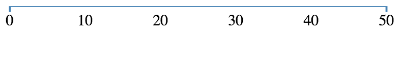 That looks quite better! I personally feel CSS is like “parameter tuning” of visualization with D3.
What happened here?
var xAxis = d3.svg.axis().scale(xScale)
.ticks(5) //limit number of ticks to 5
.orient("bottom"); //horizontal axis with labels to the bottom
We created an axis using d3.svg.axis() method. The scale() method then sets the scale to our newly created scale. ticks() sets the number of ticks our axis will have, the default is 10. The above axis without ticks(5) would look like :
var x = svgElement.append("g")
.call(xAxis);
An axis a combination of many SVG elements that for its scale, ticks, labels etc. So it is better to group them using <g> in the SVG. That’s we appended a group and called xAxis() function to plot the axis. You can read more about axes in D3 here. Now that we know how to plot axes, let’s learn how to load external data into D3!
2.3 Loading data from external sources
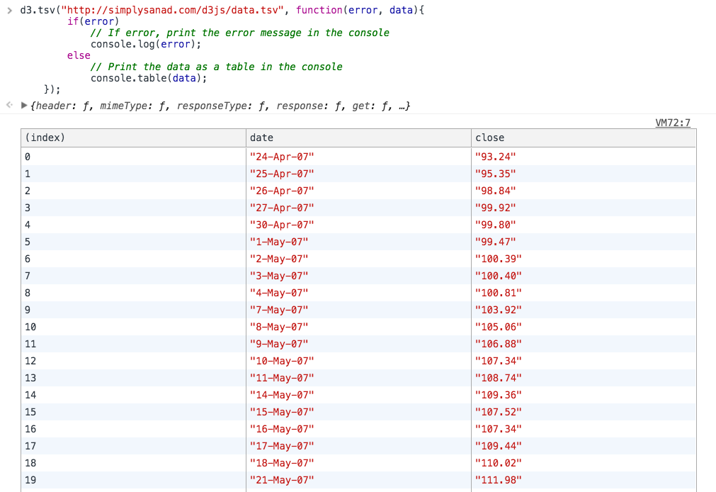
As data scientists , we deal with a variety of data formats like JSON, CSV, TSV, XML,HTML etc. D3 supports all of these formats and much more by default. For example, loading data from a tsv is as simple as calling a function :
d3.tsv("http://simplysanad.com/d3js/data.tsv", function(error, data){
if(error)
// If error, print the error message in the console
console.log(error);
else
// Print the data as a table in the console
console.table(data);
});
Things to note:
- d3.tsv(..) – Loads a tab separated value file from the given URL.
- console.table(data) – Nicely prints the data as a table.
Now that we have learned how to create the building blocks of a visualization, let’s create some charts using D3.
3. Building basic charts and code reusability
All of the concepts that we have learned till now are used as modules for creating a visualization in D3. We will create two charts of our own, a line chart and an area chart.
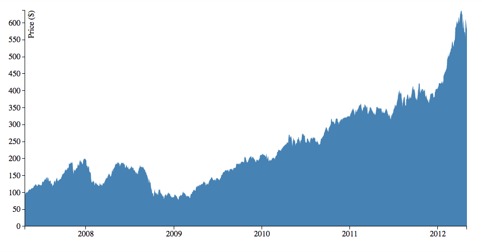
3.1 Line Chart
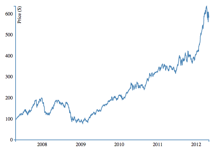
Line charts are one of the most widely used chart types when it comes to showing time series based data to depict trends over time. Let’s create the above line chart!
About Dataset
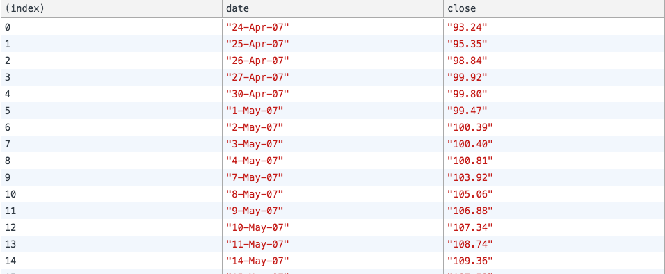
We will be using a sample data set in the form of tab-separated-values. You can find it here. There are three columns in our data set – index , date and close. While index is the index of the entry, date denotes the recorded date of stock and close is the closing price of the stock at the given date.
Data preprocessing – Handling date and type conversions
Notice that both the date and price is in string format. Before we can use them to make plots, we need to convert them into usable formats. Make the following changes to your earlier code of loading external data:
//Create a date parser
var ParseDate = d3.time.format("%d-%b-%y").parse;

//Read TSV file
d3.tsv("data.tsv", function(error, data){
//Parse Data into useable format
data.forEach(function(d){
d.date = ParseDate(d.date);
d.close = +d.close;
//the + sign converts numeric string to number
});

//Print the data as a table in the console
console.table(data);
});
Let’s view our data once again :
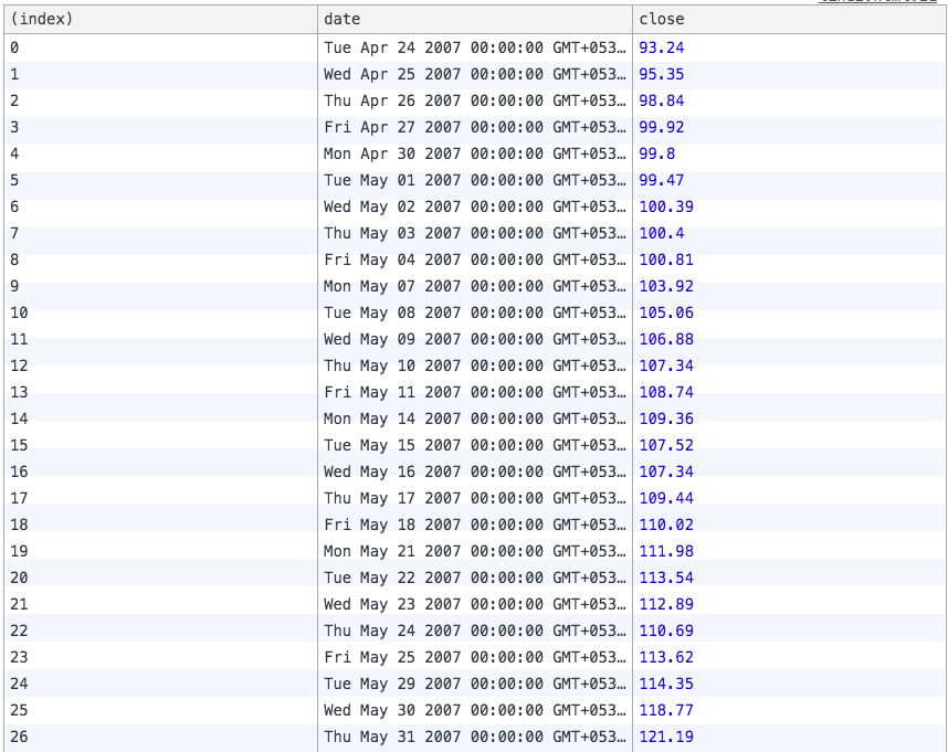
Looks like we have successfully formatted our data. Let’s take a closer look at the code:
- We first create a date parser object using D3’s time.format.parse() function. Notice that we have given the format of the date as “%d-%b-%y”. You can read more about various formats here. This part tells our D3 parser how to correctly extract date info from the given string and D3 does all the work of converting the dates for you 🙂
- We then iterate through every data value using D3’s forEach() function. This function executes any code inside it for every element of the given array.
- To format date we use our previously defined ParseDate() function.
- Notice the ‘+’ sign in the next line, the ‘+’ sign converts numerical strings to the numeric type.
Now that our data is properly preprocessed, we are ready to convert the data into visuals.
Plotting line
When we plot a line in an SVG, we give coordinates of the path to follow but that’s a tedious process. Enter D3, here we just need to provide data values and the scale they should follow and D3 does all the heavy lifting of calculating coordinates for us! The following code will create a reusable line generator for our data :
//Create a line generator
var valueline = d3.svg.line()
.x(function(d){
return xScale(d.date);
})
.y(function(d){
return yScale(d.close);
});
Bringing it all together
Now that we have all the pieces together, let’s build the final chart! The following code should make the above chart:
<!DOCTYPE html>
<html>
<head>
<title>D3 Line Chart</title>
<style type="text/css">
body{ font: Arial 18px; text-align: center; }

path{
stroke: steelblue;
fill: none;
stroke-width: 2;
}

.axis path, .axis line{
fill: none;
stroke: grey;
stroke-width: 1;
shape-rendering: crispEdges;
}
</style>
<link rel="stylesheet" type="text/css" href="main.css">
</head>
<body>
<h3>Basic Line Chart</h3>
<script type="text/javascript" src="https://d3js.org/d3.v3.js"></script>
<script type="text/javascript">
//Set margins and sizes
var margin = {
top: 20,
bottom: 50,
right: 30,
left: 50
};

var width = 700 - margin.left - margin.right;
var height = 500 - margin.top - margin.bottom;
//Create date parser
var ParseDate = d3.time.format("%d-%b-%y").parse;
//Create x and y scale to scale inputs
var xScale = d3.time.scale().range([0, width]);
var yScale = d3.scale.linear().range([height, 0]);

//Create x and y axes
var xAxis = d3.svg.axis().scale(xScale)
.orient("bottom")
.ticks(5);
var yAxis = d3.svg.axis().scale(yScale)
.orient("left")
.ticks(5);

//Create a line generator
var valueline = d3.svg.line()
.x(function(d){
return xScale(d.date);
})

.y(function(d){
return yScale(d.close);
});
//Create an SVG element and append it to the DOM
var svgElement = d3.select("body").append("svg")
.attr({"width": width+margin.left+margin.right, "height": height+margin.top+margin.bottom})
.append("g")
.attr("transform","translate("+margin.left+","+margin.top+")");
//Read TSV file
d3.tsv("http://simplysanad.com/d3js/data.tsv", function(data){
//Parse Data into useable format
data.forEach(function(d){
d.date = ParseDate(d.date);
d.close = +d.close;
//the + sign converts string automagically to number
});

//Set the domains of our scales
xScale.domain(d3.extent(data, function(d){ return d.date; }));
yScale.domain([0, d3.max(data, function(d){ return d.close; })]);

//append the svg path
var path = svgElement.append("path")
.attr("d", valueline(data));

//Add X Axis
var x = svgElement.append("g")
.attr("transform", "translate(0,"+height+")")
.call(xAxis);

//Add Y Axis
var y = svgElement.append("g")
.call(yAxis);

//Add label to y axis
y.append("text")
.attr("fill", "#000")
.attr("transform", "rotate(-90)")
.attr("y", 6)
.attr("dy", "0.71em")
.attr("text-anchor", "end")
.text("Price ($)");
});
</script>
</body>
</html>
3.2 Area Chart
One of the magical things about D3 is if you design your code smartly, a lot of it can be reused in other visualizations. An area chart can be thought as a modified version of the line chart, here we shade the region of the chart that comes under the line.
The interesting thing here is, you can create the above chart by changing 4-5 lines in the previous chart’s code! The final code for area chart would be :
<!DOCTYPE html>
<html>
<head>
<script type="text/javascript" src="https://d3js.org/d3.v3.js"></script>
<style>
body{ font: Arial 12px; text-align: center;}
.axis path, .axis line{
fill: none;
stroke: black;
stroke-width: 1;
shape-rendering: crispEdges;
}
</style>
<link rel="stylesheet" type="text/css" href="main.css">
</head>
<body>
<h3>Area Chart</h3>
<script type="text/javascript">
//Set margins and sizes
var margin = {
top: 20,
bottom: 50,
right: 30,
left: 50
};

var width = 960 - margin.left - margin.right;
var height = 500 - margin.top - margin.bottom;
//Create date parser
var ParseDate = d3.time.format("%d-%b-%y").parse;
//Create x and y scale to scale inputs
var xScale = d3.time.scale().range([0, width]);
var yScale = d3.scale.linear().range([height, 0]);

//Create x and y axes
var xAxis = d3.svg.axis().scale(xScale)
.orient("bottom")
.ticks(5);

var yAxis = d3.svg.axis().scale(yScale)
.orient("left");

//Create a area generator
var area = d3.svg.area()
.x(function(d){
return xScale(d.date);
})
.y1(function(d){
return yScale(d.close);
});

//Create an SVG element and append it to the DOM
var svgElement = d3.select("body")
.append("svg").attr({"width": width+margin.left+margin.right, "height": height+margin.top+margin.bottom})
.append("g")
.attr("transform","translate("+margin.left+","+margin.top+")");

//Read TSV file
d3.tsv("http://simplysanad.com/d3js/data.tsv", function(data){
//Parse Data into useable format
data.forEach(function(d){
d.date = ParseDate(d.date);
d.close = +d.close;
//the + sign converts string automagically to number
});

//Set the domains of our scales
xScale.domain(d3.extent(data, function(d){ return d.date; }));
yScale.domain([0, d3.max(data, function(d){ return d.close; })]);
area.y0(yScale(0));
//append the svg path
var path = svgElement.append("path")
.attr("d", area(data))
.attr("fill", "steelblue");
//Add X Axis
var x = svgElement.append("g")
.attr("transform", "translate(0,"+height+")")
.attr("class", "x axis")
.call(xAxis);

//Add Y Axis
var y = svgElement.append("g")
.call(yAxis)
.attr("class", "y axis");

//Add label to Y axis
y.append("text")
.attr("fill", "#000")
.attr("transform", "rotate(-90)")
.attr("y", 6)
.attr("dy", "0.71em")
.attr("text-anchor", "end")
.text("Price ($)");
});
</script>
</body>
</html>
Notice that we have only made the following changes :
- Replaced line generation code with area generation code, because we need D3 to calculate area and coordinates for it based on our data set.
Now that we have successfully built some visualizations let’s look at some case studies with D3.
3.3 Chart as a modular structure
You have already built a bunch of charts using D3, did you notice any pattern or structure in them? After working with D3 for a while, I have noticed a general structure that I follow in my code to create charts. The following structure is how I logically layout my code :
- Basic HTML and CSS
- Setting the stage
- Setting the margins, sizes, and variables that would be needed later on
- Building scales, axes, and color scales
- Creating data preprocessing structures like data parser, percentage formatter
- Visualization specific setup – Sometimes we need to write chart specific code, Eg: line generator in line chart and area generator in area chart
- Create the SVG – The most important step, the base SVG element, and all its properties should be prepared in this step
- Loading external data –
- Code for loading data based on format, source
- Applying pre-processing, cleaning if required on the data using the structures set up in step 1.c
- Verify loaded data and its format once before going to the next step
- Bringing it all together – Now that everything is set up and ready to be attached to the chart. One by one all the axes, bars, paths etc. should be drawn on the SVG in this step
- Adding Extras – After all who doesn’t like extras? Animations, Labels, etc. are to be put in at this step
Note that sometimes you won’t be able to follow the order because of other factors and that is alright. This is not a rigid rule but just a way to divide and conquer the process of building a chart in D3 so that it can be easily understood and reused whenever possible. Confused much? Let’s understand it with a practice problem!
3.4 Case Study
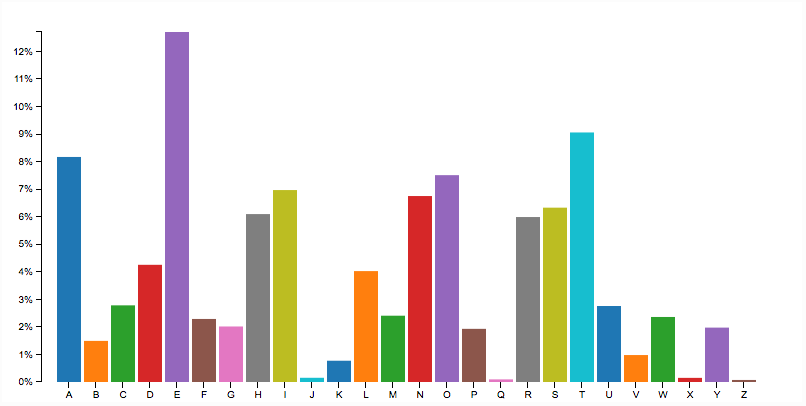
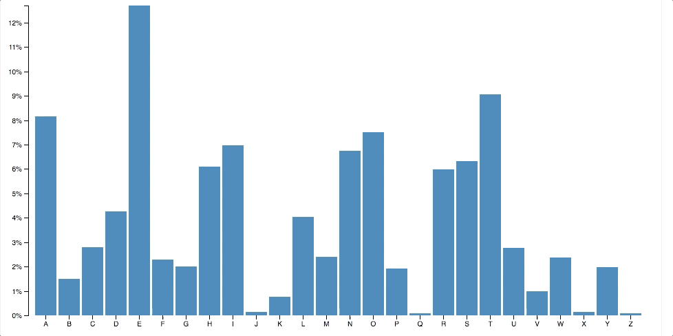
This section is very important because here, it’s your turn to build! You will be building the following beautiful bar chart. After the basic chart is built a huge task awaits you, give your best. This chart is built on a data set of character frequency. The dataset can be found here. Let’s follow the general structure that we just learned and try to build this chart!
Step 1. Basic HTML and CSS
<!DOCTYPE html>
<html>
<head>
  <script src="d3.min.js"></script>
  <style type="text/css">
    .axis path,
    .axis line {
      fill: none;
      stroke: #000;
      shape-rendering: crispEdges;
    }
    .x.axis path{
      display: none;
    }
    body{
    font: 10px arial;
     text-align: center;
    }
  </style>
  <link rel="stylesheet" type="text/css" href="main.css">
</head>
<body>
  <h1>Animated Barchart</h1>
  <script type="text/javascript">
Step 2. Setting the stage
    //Set up margin and percentage formatter
    var margin = {top:20, right: 30, bottom: 30, left:40};
    var width = 800-margin.left-margin.right;
    var height = 400-margin.top-margin.bottom;

    //Creating a percentage formatter
    var formatPercent = d3.format("%.0");

     //Create x and y scale
    var yScale = d3.scale.linear().range([height,0]);
    var xScale = d3.scale.ordinal().rangeRoundBands([0,width],0.1,0.2);

    //Create category 10 scale for color
    var c10 = d3.scale.category10();
In the above code, we started out by setting up basic margins and width, height values. Then we created a percentage formatter using D3’s format(..) so that we can convert our y axis labels to %. Then we defined scales for x and y axis and defined the range for the same. Lastly, since we would be needing color for our bars, we will use one of D3’s color bands, category10. The category10 contains the following 10 colors :
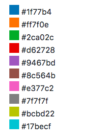
D3 has more color scales. Read more here.
Step 3. Visualization specific code
For the above simple bar chart, we don’t need any visualization specific code.
Step 4. Create the SVG
Now that we have set the stage, it is time to create the SVG along with the above settings:
    //Create SVG Element
    var svg = d3.select("body")
          .append("svg")  .attr({"width":width+margin.left+margin.right,"height":height+margin.top+margin.bottom})
          .append("g")
          .attr("transform","translate("+margin.left+","+margin.right+")");
Step 5. Loading external data
Since we have a URL to load data from and it is in tsv format, we can just make a single function call to load data:
d3.tsv("http://simplysanad.com/d3js/words.tsv", function(data){});
Remember some preprocessing of data? Now that we get our data, we need to set the domain of our x and y scales which we couldn’t set earlier because we didn’t have the data:
 //Set domain of x and y scales based on loaded data
      yScale.domain([0,d3.max(data, function(d){ return d.frequency; })]);
      xScale.domain(data.map(function(d){ return d.letter; }));
Step 6. Bringing it all together
We have our data nicely formatted and ready, we also have our axes, colors ready. Let’s bring it all together and attach them to our chart. Notice the new code added in external data loading function :
      //Load data from external tsv file
      d3.tsv("http://simplysanad.com/d3js/words.tsv", function(data){
      //Set domain of x and y scales based on loaded data
      yScale.domain([0,d3.max(data, function(d){ return d.frequency; })]);
      xScale.domain(data.map(function(d){ return d.letter; }));
      //Create X and Y Axis based on scales and data
      var xAxis = d3.svg.axis()
                .scale(xScale)
                .orient("bottom");
      var yAxis = d3.svg.axis()
                .scale(yScale)
                .orient("left")
                .tickFormat(formatPercent);
      //Add bars
      var bars = svg.selectAll("rect")
                    .data(data)
                    .enter()
                    .append("rect")
                    .attr("class","bar")
                    .attr("width", xScale.rangeBand())
                    .attr("fill","steelblue")
                    .attr("fill", function(d,i){
                      return c10(Math.random()*10*i);
                    })
                    .attr("y", function(d){
                      return yScale(d.frequency);
                    })
                    .attr("x", function(d){
                      return xScale(d.letter);
                    })
                   .attr("height", function(d){
                      return height-yScale(d.frequency);
                   });

     //Add X Axis
     svg.append("g")
     .attr("transform","translate(0,"+height+")")
     .call(xAxis)
     .attr("class","x axis");
      //Add Y Axis
      svg.append("g")
        .attr("class", "y axis")
        .call(yAxis);
    });
  </script>
</body>
</html>
Now that you have the basic chart drawn, it is time for you to jump into action and do something creative!
Task – Add Step 7. Extras to the bar chart
This is the step where you come in. After all, who doesn’t like something extra? Visualization is no different! Since we already have a basic bar chart, I challenge you to go ahead and add animation/interactivity to this chart. The following is a list of common effects that you can easily add to your chart using D3:
Tooltips
Interactivity
Animation

The above is just a minor set of options. You’ll find enough resources in the endnotes to refer. You can post about your approach/discuss your doubts with the community here :
https://discuss.analyticsvidhya.com/
Go ahead, surprise me with your creativity!
4. Visualizing the Game of Thrones Social Network: Force-Directed Graph in action!
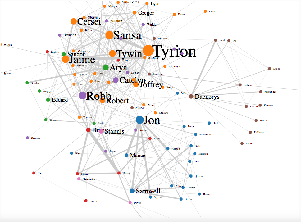
Now that you have pretty much learnt all the basics of D3 and made plenty of charts on your own, it is time to move to the next level and do something that is niche to D3, you’ll be building one of the case study – Force-Directed Graph to visualize a very popular TV Series, Game of Thrones.
A little context about Game of Thrones
The TV sensation Game of Thrones is based on George R. R. Martin’s epic fantasy novel series, “A Song of Ice and Fire.” The series is famous for its sweeping plotlines, its cast of hundreds of characters, and its complex web of character dynamics. In addition, “Game of Thrones” is an ensemble piece, featuring many prominent characters with intertwined relationships.

Here, interaction among characters and the strength of their relationship is important. Also, there are some characters who are much more influential than others and steer the course of the story.
About the dataset
The dataset for this visualization is based on Andrew Beveridge’s data set of “A Storm of Swords”, the third book in the series. In Andrew’s words,
“We represented each character in the book as a vertex. We then added a link between two characters whenever their names appeared within 15 words of one another. So a link between characters means that they interacted, spoke of one another, or that another character spoke of them together. Characters that interacted frequently are connected multiple times.”
Using the above data set, I calculated the influence of character based on the “the number of times her/his interaction has appeared in the book”. For example, if Sansa has 6 records where she is the source and 4 records where she is the target of an interaction, her influence will be 6+4=10.
I then formatted the data so that D3 can easily use it. The result was a simple JSON file here.
Data format for force-directed graph
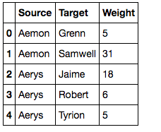
The force directed graph can be divided into two major components – nodes and links. The nodes represent entities whose relationship is to be plotted and similarly links are those relationships. These are analogous to vertex and edge in a graph.
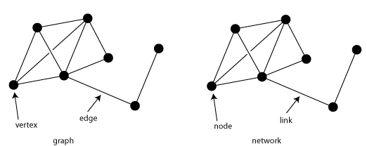
D3 expects two arrays for force layout. The first one should be an array of nodes and the second one an array of links. The links refer to the index of the node and should have two attributes “source” and “target”. This is exactly how I have laid out our JSON.
Now that we are versed in the basics, let’s build our Social Network Graph by following the earlier steps :
Step 1. Basic HTML and CSS
<!DOCTYPE html>
<html>
<head>
<script type="text/javascript" src="d3.min.js"></script>
<style>
body{ font: Arial 12px; text-align: center;}
.link {
  stroke: #ccc;
}
.node text {
  pointer-events: none;
  font: sans-serif;
}
</style>
<link rel="stylesheet" type="text/css" href="main.css">
</head>
<body>
<h3>Game of Thrones-Social Network Analysis</h3>
<script type="text/javascript">
Step 2. Setting the stage
//Set margins and sizes
var margin = {
top: 20,
bottom: 50,
right: 30,
left: 50
};

var width = 960 - margin.left - margin.right;
var height = 700 - margin.top - margin.bottom;

//Load Color Scale
var c10 = d3.scale.category10();
Step 3. No visualization specific code
Step 4. Create the SVG
//Create an SVG element and append it to the DOM
var svgElement = d3.select("body")
.append("svg").attr({"width": width+margin.left+margin.right, "height": height+margin.top+margin.bottom})
.append("g")
.attr("transform","translate("+margin.left+","+margin.top+")");
Step 5. Load external data
//Load External Data
d3.json("http://simplysanad.com/d3js/got_social_graph.json", function(dataset){
//Extract data from dataset
var nodes = dataset.nodes,
links = dataset.links;
Step 6. Bringing it all together – force layout, nodes, links
//Create Force Layout
var force = d3.layout.force()
.size([width, height])
.nodes(nodes)
.links(links)
.gravity(0.05)
.charge(-200)
.linkDistance(200);
//Add links to SVG
var link = svgElement.selectAll(".link")
.data(links)
.enter()
.append("line")
.attr("stroke-width", function(d){ return d.weight/10; })
.attr("class", "link");
//Add nodes to SVG
var node = svgElement.selectAll(".node")
.data(nodes)
.enter()
.append("g")
.attr("class", "node")
.call(force.drag);
Step 7. Adding extras – Labels, Starting the simulation
//Add labels to each node
var label = node.append("text")
.attr("dx", 12)
.attr("dy", "0.35em")
.attr("font-size", function(d){ return d.influence*1.5>9? d.influence*1.5: 9; })
.text(function(d){ return d.character; });
//Add circles to each node
var circle = node.append("circle")
.attr("r", function(d){ return d.influence/2>5 ? d.influence/2 : 5; })
.attr("fill", function(d){ return c10(d.zone*10); });
//This function will be executed once force layout is done with its calculations
force.on("tick", function(){
//Set X and Y of node
node.attr("r", function(d){ return d.influence; })
.attr("cx", function(d){ return d.x; })
.attr("cy", function(d){ return d.y; });
//Set X, Y of link
link.attr("x1", function(d){ return d.source.x; })
link.attr("y1", function(d){ return d.source.y; })
link.attr("x2", function(d){ return d.target.x; })
link.attr("y2", function(d){ return d.target.y; });
//Shift node a little
node.attr("transform", function(d) { return "translate(" + d.x + "," + d.y + ")"; });
});

//Start the force layout calculation
force.start();
});
</script>
</body>
</html>
What’s happening here?
First, we perform steps 1 to 4 of building a D3 chart as discussed earlier. Then we create a force layout here :
//Create Force Layout
var force = d3.layout.force()
.size([width, height])
.nodes(nodes)
.links(links)
.gravity(0.05)
.charge(-200)
.linkDistance(200);
- d3.layout.force() – initializes a new force layout
- .size() – set the size of the layout
- .nodes(nodes) – pass in the nodes array
- .links(links) – pass the links array
- .gravity() – sets a pseudo-gravity force that attracts our nodes to the center of the area
- .charge() – sets a charge force between nodes. If positive will be an attractive force, repulsive if negative values.
- .linkDistance() – set the minimum distance in pixels that each node should have. In other words, the minimum length of a link.
When the above code is executed, it asks D3 to make the necessary calculations for the position of each node, the distance between them, calculating coordinates of links joining them etc. All of this happens in the background and D3 takes care of it all. While the above calculations are being done, we need to keep updating the position of the nodes and links. We attach a listener to our force layout :
//This function will be executed for every tick of force layout
force.on("tick", function(){
//Set X and Y of node
node.attr("r", function(d){ return d.influence; })
.attr("cx", function(d){ return d.x; })
.attr("cy", function(d){ return d.y; });
//Set X, Y of link
link.attr("x1", function(d){ return d.source.x; })
link.attr("y1", function(d){ return d.source.y; })
link.attr("x2", function(d){ return d.target.x; })
link.attr("y2", function(d){ return d.target.y; });
//Shift node a little
node.attr("transform", function(d) { return "translate(" + d.x + "," + d.y + ")"; });
});
The above code basically tells D3 for every “tick” (single step of the simulation), redraw(updated) all the nodes and their links. Now when everything is done, we start the simulation :
//Start the force layout simulation
force.start();
If you want to dig deeper into force layouts, you can read its documentation here. With this, you have your very own GoT Social Graph!
Few things to note about the visualization:
- The nodes represent the characters and the links their interactions.
- The size of node and name represents the influence of character. Tyrion, way to go!
- The thickness of link denotes the weight of the relationship between the characters. See the thick link between Jaime & Brienne, Jon & Sam, Bran & Hodor, Daenerys & Sir Jorah? 😀 and how can you forget Jon and Ygritte! 😛
- The node is color-coded based on an influential character’s current geolocation and supporting characters around it. There you go Jon, Daenerys, Tyrion, Robb, Bran, Arya, Stannis 🙂
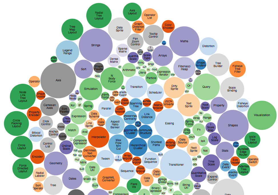
5. Case Studies – Different Charts using D3.js
D3 has been used on a versatile set of visualization problems. Let’s look into some of the interesting ones.
Bubble Chart – Visualizing 3 Dimensional data
What would you do if you want to show 3-dimensional data in 2 dimensions? You’d use a bubble chart! The area of the circle and the x and y coordinates are used to encode all the 3 dimensions.
Concept Map – Relationship between concepts
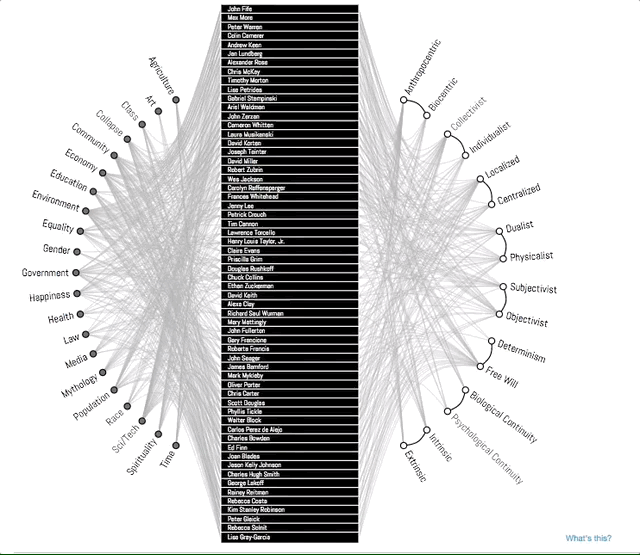
A concept map typically represents ideas and information as boxes or circles, which it connects with labeled arrows in a downward-branching hierarchical structure. The relationship between concepts can be articulated in linking phrases such as causes, requires, or contributes to. In this example, D3 is used to show an improvised concept map to better convey the story. Notice how the branches get highlighted when you select a topic. This is a good example of interactivity D3 enables in your visualizations.
Map Chart – Visualizing Demographical Data
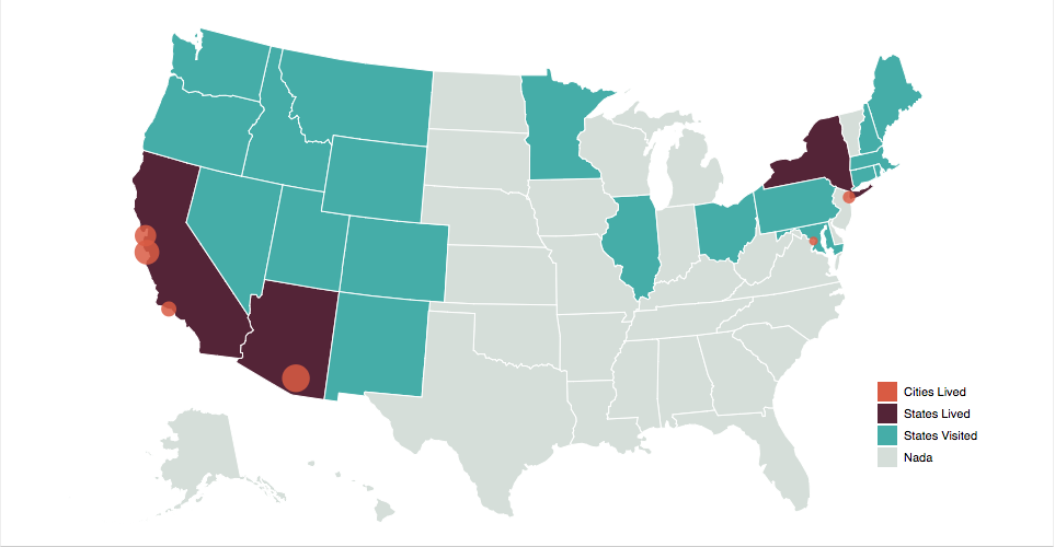
D3 provides amazing inbuilt support to create interactive, map-based visualizations that can be used to show demographically distributed data.
Sankey Diagrams
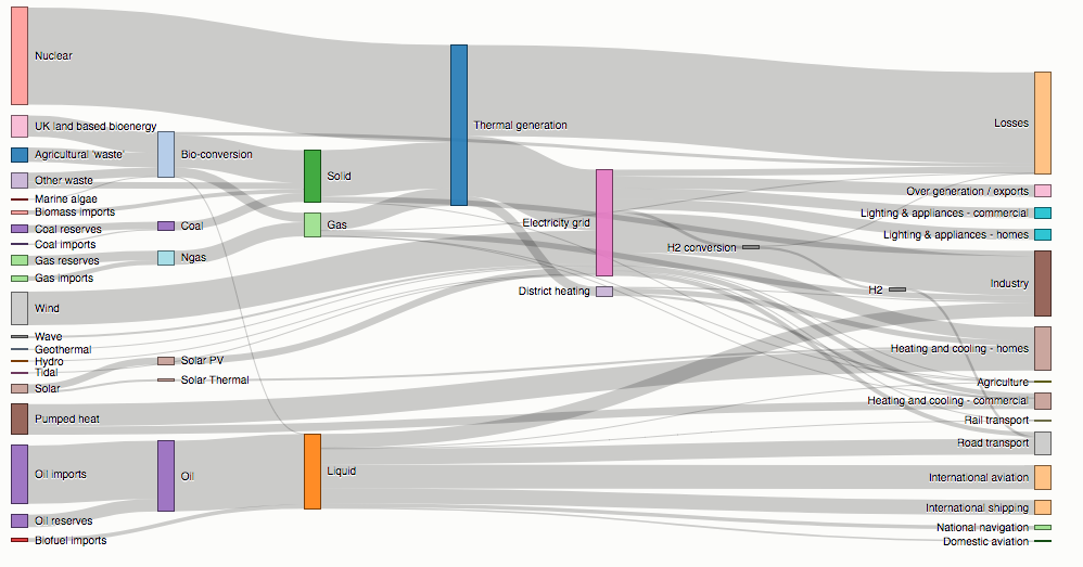
Sankey diagrams visualize the magnitude of flow between nodes in a network. This intricate diagram shows a possible scenario for UK energy production and consumption in 2050: energy supplies are on the left, and demands are on the right. Intermediate nodes group related forms of production and show how energy is converted and transmitted before it is consumed (or lost!). The thickness of each link encodes the amount of flow from source to target.
Parallel Coordinates
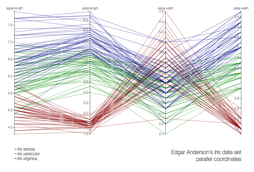
Parallel coordinates is a visualization technique used to plot individual data elements across many dimensions. Each of the dimensions corresponds to a vertical axis and each data element is displayed as a series of connected points along the dimensions/axes. In the above example, the very famous iris dataset is plotted.
6. A Brief Introduction to dimple.js – D3 made easy!
D3 code can be quite verbose. That begs the question, is there a simpler way of creating basic charts using D3 but with fewer lines of code? That’s exactly what dimple.js lets you do.
It is a library that is directly built on top of D3 and provides an easy interface to build visualizations. It can be loosely compared to the relationship between keras and tensorflow in python. Let’s build a basic visualization using dimple :
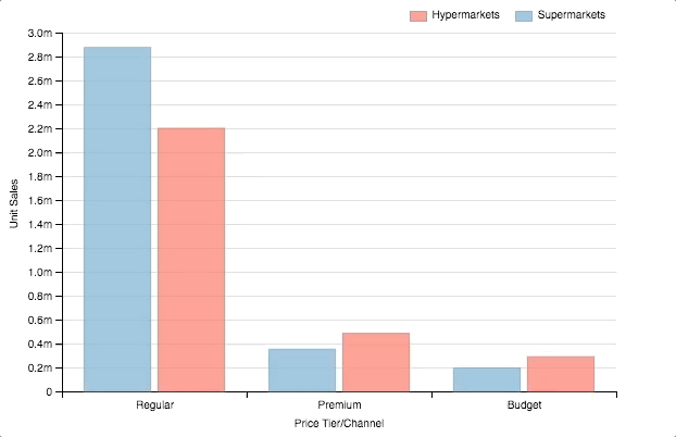
<html>
<div id="chartContainer">
  <script src="https://d3js.org/d3.v4.min.js"></script>
  <script src="http://dimplejs.org/dist/dimple.v2.3.0.min.js"></script>
  <script type="text/javascript">
    //Create the SVG
    var svg = dimple.newSvg("#chartContainer", 590, 400);

    //Load external data
    d3.tsv("http://dimplejs.org/data/example_data.tsv", function (data) {
      //Create a chart object using svg and data
      var myChart = new dimple.chart(svg, data);
      //Set the size of the plot within SVG
      myChart.setBounds(60, 30, 510, 330
      //Add an axis of categorical values
      myChart.addCategoryAxis("x", ["Price Tier", "Channel"]);
      //Add an axis of continuous values
      myChart.addMeasureAxis("y", "Unit Sales");
      //Make a barchart
      myChart.addSeries("Channel", dimple.plot.bar);
      //Add legends
      myChart.addLegend(65, 10, 510, 20, "right");
      //Draw the chart
      myChart.draw();
    });
  </script>
</div>
</html>
What happened here?
- dimple.newSvg() – create a SVG element
- new dimple.chart(svg, data) – create a new dimple chart
- .setBounds() – set boundaries of the chart within the svg
- .addCategoryAxis() – add an axis that will have categorical values
- .addMeasureAxis() – add an axis that will have continuous values
- .addSeries(, dimple.plot.bar) – make a barplot
- .addLegends() – add legends to the chart
Note: that with only a few lines of code, you were able to create a beautiful visualization. Also, dimple took care of basic interaction and animation. If you want to explore dimple more, check out these other examples created using dimple.js.
End Notes
In this article, we refreshed some of D3’s basics and further learned a lot of techniques and new functionalities. We also learned how to preprocess data and successfully build a line chart and modified it into an area chart.
We used a practice problem to create a colorful bar chart. We also saw some of the most useful and amazing visualizations created using D3.js. We ended up analyzing Game of Thrones data using one of the case studies – Force-Directed Graph and with this,
I hope, this article has given you the necessary impetus on your D3 journey!
All of the code used in this article is available at GitHub.
Here are some useful links for D3.js :
- D3.js, Data Visualization Meetup – https://vimeo.com/29458354
- D3.js Tips and Tricks Book- https://leanpub.com/D3-Tips-and-Tricks/read
- Mike Bostock’s Blog – https://bost.ocks.org/mike/
- This site is like GitHub for D3 projects – https://bl.ocks.org/
Sanad is a Senior AI Scientist at Analytics Vidhya, turning cutting-edge AI research into real-world Agentic AI products. With an MS in Artificial Intelligence from the University of Edinburgh, he’s worked at top research labs tackling multilingual NLP and NLP for low-resource Indian languages. Passionate about all things AI, he loves bridging the gap between deep research and practical, impactful products.


Helpful post.
Hey Diwash, Thanks! :D Sanad
Thanks for providing the technical information of data visualization with d3.. you have provinded various things and steps and coding part , that help me a lot to get the clear picture.. keep posting the updates.. SEO Company in Chennai
Hey Thavamani, Thank you for your reply :D
Looks great. On it, learning.
Nice, good to know! :)