This article was published as a part of the Data Science Blogathon
Hey Guys, Hope You all are doing well.
This article is going to be awesome. We will learn some more skills in data visualization used by data scientists to make their data stories interesting. This article will focus on techniques which are generally used by intermediate-level data science practitioner. If you are new to data visualization I will strongly recommend you to read this Part1: Guide to Data Visualization with python which you can find HERE.
I will be providing a link to my Kaggle notebook so don’t worry about the coding part.
The article will cover the topics mentioned below.
Table of Content
2. SECTION – 2
2.1 Box Plot
2.2 Bubble Plot
2.3 Area Plot
2.4 Pie Charts
2.5 Venn Diagrams
2.6 Pair Plot
2.7 Joint Plot / Marginal Plots
3. SECTION – 3
3.1 Violin Plot
3.2 Dendrograms
3.3 Andrew Curves
3.4 Tree Maps
3.5 Networks Chart
3.6 3-D Plot
3.7 Geographical Maps
Link to Kaggle
Introduction
Let’s have a quick introduction to data visualization.
Data Visualization: Data visualization is the graphical representation of information that is present inside a dataset with the help of visual elements such as charts, maps, graphs, etc.
n this article we will be using multiple datasets to show exactly how things work. The base dataset will be the iris dataset which we will import from sklearn. We will create the rest of the dataset.
Let’s import all the libraries which are required for doing
import math,os
import pandas as pd
import numpy as np
import seaborn as sns
import scipy.stats as stat
import matplotlib.pyplot as plt
from mpl_toolkits.mplot3d import Axes3D
Reading the data (Main focused dataset)
iris = pd.read_csv('../input/iris-flower-dataset/IRIS.csv') # iris dataset
iris_feat = iris.iloc[:,:-1]
iris_species = iris.iloc[:,-1]
Let’s Start the Hunt for ways to visualize data.
Note: The combination of features used for illustration may or may not make sense. They were only used for demo purposes.
Box Plot
This is one of the most used methods by data scientists. Box plot is a way of displaying the distribution of data based on the five-number theory. It basically gives information about the outliers and how much spread out data is from the center. It can tell if data symmetry is present or not. It also gives information about how tightly or skewed your data is. They are also known as Whisker plots
sepal_length = iris_feat['sepal_length']
petal_length = iris_feat['petal_length']
petal_width = iris_feat['petal_width']
sepal_width = iris_feat['sepal_width']
data = [sepal_length , petal_length , petal_width , sepal_width]
fig1, ax1 = plt.subplots()
ax1.set_title('Basic Plot')
ax1.boxplot(data)
plt.show()
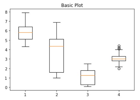
The dots or bubbles outside the 4th boxplot are the outliers. The line inside the box is depicting the median of data points of that category of variables.
Bubble Plot
A bubble plot is a variation of a scatter plot where a numeric value is added to represent the size of the dots/bubble. Each bubble in the bubble plot corresponds to a data point and the value of the variables are represented with x,y, size dimensions.
Like, scatter plot bubble plots are used to depict the relationship between two variables. However, the addition of a third allows you to add another element to the comparison. For example, you have coordinates of the location in latitude and longitude format and you also have the population size of that location. A Scatter plot will not be able to plot this data. But with a bubble plot, you can use X and Y axis for representing the location and size of population for the size of the bubble.
N = 50
# Creating own dataset.
x = np.random.normal(200, 20, N)
y = x + np.random.normal(5, 25, N)
area = (30 * np.random.rand(N))**2
df = pd.DataFrame({
    'X': x,
    'Y': y,
    "size":area})
# Bubble plot
plt.scatter('X', 'Y', s='size',alpha=0.5, data=df)
plt.title('Title')
plt.xlabel('X axis')
plt.ylabel('Y axis')
plt.show()
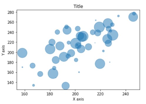
There are certain points to remember about bubble plot:
1. Use transparency while plotting bubble plots, so that overlapping is visible.
2. Avoid bubble plots if you have too many data points. It will only mess things up.
3. Scale the size of bubbles.
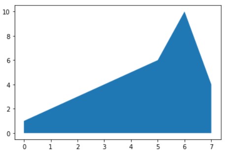
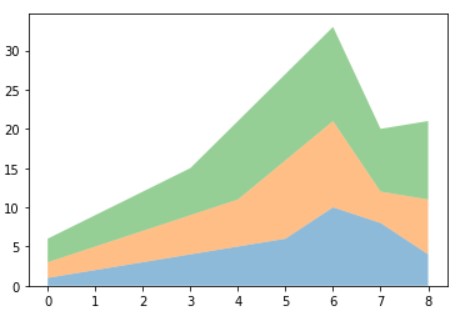
Area Charts
Area charts are advanced to classical line plots with colors filled under the line. They are used to track changes over a period of time. Area graphs are drawn by first plotting points to the Cartesian Plane, then joining them with the line, and finally filling in the color. Majorly 2 varieties of area plots are used: Single variable and multivariable (Stacked area plots)
# Making some temporary data
y = [1,2,3,4,5,6,10,4]
x = list(range(len(y)))
#Creating the area chart
plt.fill_between(x, y)
#Show the plot
plt.show()
# Making up some random data
y = [[1,2,3,4,5,6,10,8,4] , [2,3,4,5,6,10,11,4,7] , [3,4,5,6,10,11,12,8,10]]
x = list(range(len(y[0])))
ax = plt.gca()
ax.stackplot(x, y, labels=['A','B','c'],alpha=0.5)
plt.show()
Pie Plot
A pie plot is a circular representation of data that can be represented in relative proportions. A pie chart is divided into various parts depending on the number of numerical relative proportions.
#Creating the dataset
students = ['A','B','C','D','E']
scores = [30,40,50,10,5]
#Creating the pie chart
plt.pie(scores, explode=[0,0.1,0,0,0], labels = students,
colors = ['#EF8FFF','#ff6347','#B0E0E6','#7B68EE','#483D8B'])
#Show the plot
plt.show()
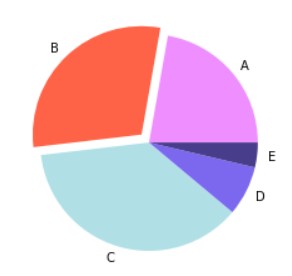
By removing argument explodes from the above function you can create a completely joined pie chart.
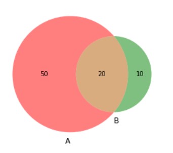
Venn Diagram
Venn diagrams are also called a set or logic diagrams they allow all possible relationships between a finite set. Venn diagrams are best suited when you have 2 or 3 finite sets and you want to gain insights about differences and commonalities between them. The intersection represented with different colors depicts the similarity while the area with different colors depicts the differences.
Below is the code for 2 set Venn diagram
from matplotlib_venn import venn2
#Making venn  diagram
# Venn Diagram with 2 groups
venn2(subsets = (50, 10, 20), set_labels = ('A', 'B'),alpha=0.5)
plt.show()
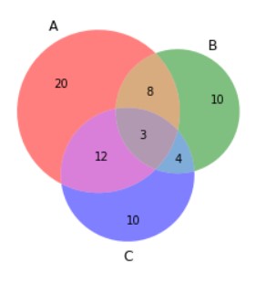
# Venn Diagram with 3 groups
venn3(subsets=(20, 10, 8, 10, 12, 4, 3),
      set_labels=('A', 'B', 'C'),alpha=0.5)
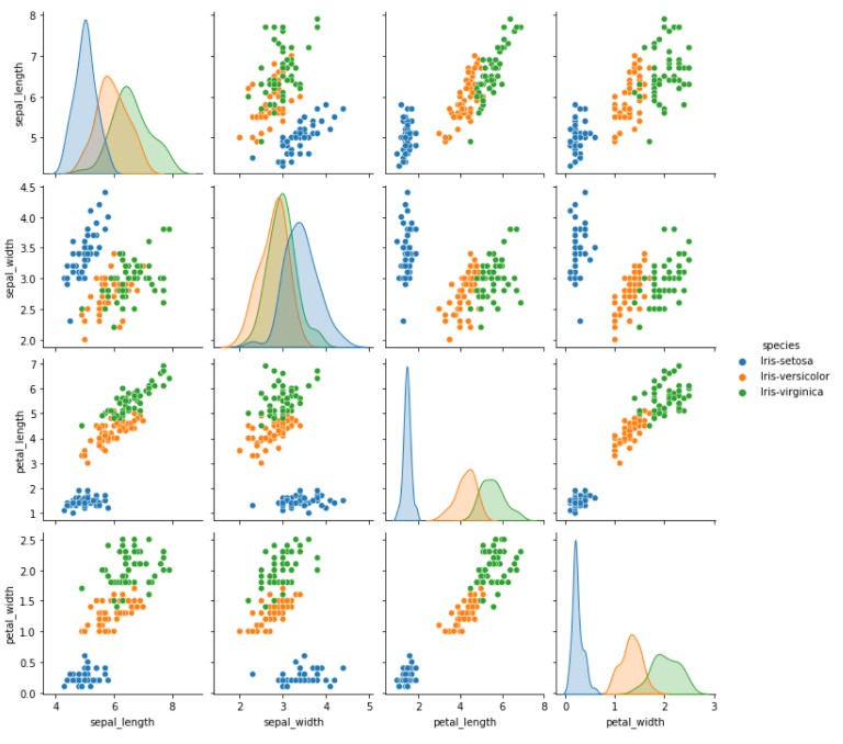
Pair Plot
Pair plots are used to plot the pairwise relationship between the data points. This method is used for bivariate analysis. It is also possible to show a subset of variables or plot different variables on the rows and columns. The total number of combinations generated is (n,2). Seaborn provides a simple default method for making pair plots that can be customized. So we will be using Seaborn for implementing pair plots. They are actually the best way to visualize data with more than 4 columns as it would create nC2 graphs only.
There are various methods of creating a pair-plot. We will be discussing only 2 here. Others can be read here
# type-1
sns.pairplot(iris)
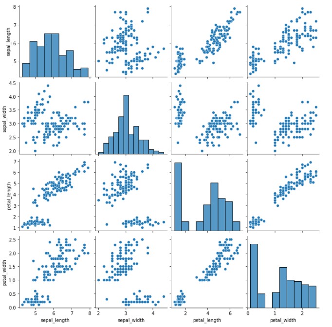
# type-2
sns.pairplot(iris, hue="species")
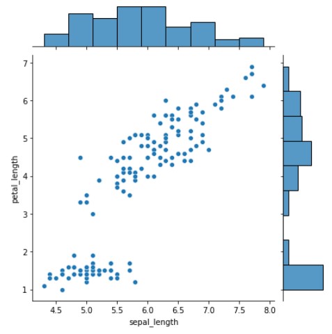
Joint Plot
This method is used for doing bivariate and univariate analysis at the same time.
Seaborn provides a convenient method to plot these graphs, so we will be using seaborn. There are various ways to plot joint graphs. We will be only looking at 2. You can learn more from here.
# Type -1
sns.jointplot(data=iris_feat, x="sepal_length", y="petal_length")
# Type -2
sns.jointplot(data=iris_feat, x="sepal_length", y="petal_length",kind="reg")
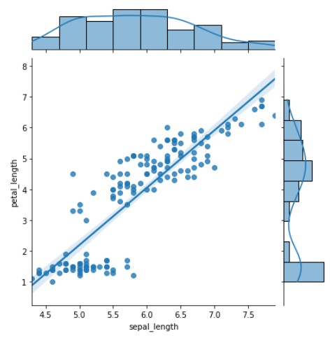
‘kind’ argument in the above function is quite powerful it creates a regression line in the data which may help to get some insights with ease.
The plots above depicting sepal_length and to right depicting petal_length to the square grid are for univariate analysis while the scatter plot created at the center is for bivariate analysis.
This concludes Our Section-2 of Guide to Data Visualization.
SECTION – 3
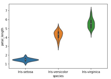
Violin Plot
Violin plot is a hybrid of a box plot and a kernel density plot, which shows peaks in the data. It shows the distribution of quantitative data across several levels of one (or more) categorical variables such that those distributions can be compared. Unlike a box plot, in which all of the plot components correspond to actual data points, the violin plot features a kernel density estimation of the underlying distribution.
sns.violinplot(x="species", y="petal_length", data=iris, size=6)
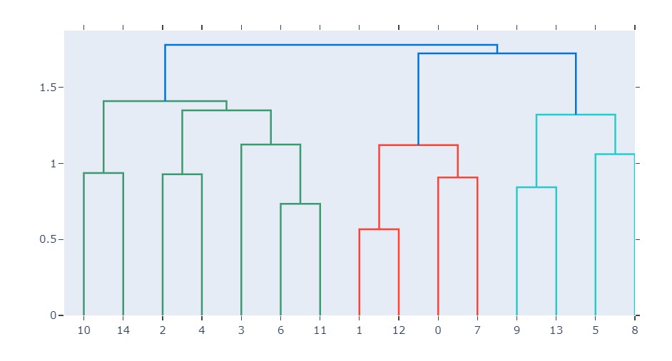
Dendrograms
According to Wikipedia
A dendrogram is a diagram representing a tree. This diagrammatic representation is frequently used in different contexts: in hierarchical clustering, it illustrates the arrangement of the clusters produced by the corresponding analysis.
So basically dendrograms are used to show relationships between objects in a hierarchical manner. It is most commonly used to show the output of hierarchical clustering. The best use of this method is to form clusters of objects. The key to read dendrograms is to focus height at which they are joined. If we have to give clusters to dendrograms we start by breaking the highest link between them,
import plotly.figure_factory as ff
X = np.random.rand(15, 10)
fig = ff.create_dendrogram(X, color_threshold=1.5)
fig.update_layout(width=800, height=500)
fig.show()
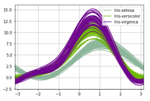
Andrew Curves
Andrew curves are used for visualizing high dimensional data by mapping each observation onto a function. Scatter plots are good till 3-dimension so we need some method for more than 3-dimension data which was suggested by Andrew. The formula for Andrew curves is given by
T(n) = x_1/sqrt(2) + x_2 sin(n) + x_3 cos(n) + x_4 sin(2n) + x_5 cos(2n) + …
Andrew curves are most preferred for multivariate analysis. Another usage of Andrew Curves is to visualize the structure of independent variables. The possible usage is a lightweight method of checking whether we have enough features to train a classifier or whether we should keep doing feature engineering and cleaning data because there is a mess in data.
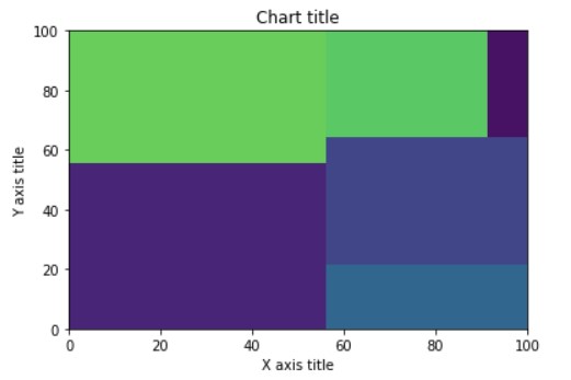
Tree Maps
TreeMap displays each element of a dataset as a rectangle. It helps to display what proportions of each element. The size of each element in rectangle form is proportional to its value. Greater the size of the rectangle larger will be its value. It is somewhat similar to a piechart except for its way of representation.
To plot treemaps we need to use an external package which is squarify.
import squarify
sizes = [50, 40, 15, 30, 20,5]
squarify.plot(sizes)
# Show the plot
plt.show()
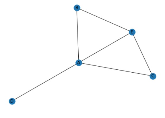
Network Charts
As the name suggests these charts help in understanding the relationship between different entities by connecting them together. Each entity is represented as a node and the connection between these nodes is represented as an edge. Their basic use is to get an insight into how nodes are connected with each other. In our example nodes in from list and nodes in to list got connected with links in between them.
 import networkx as nx
# Build a dataframe with 4 connections
df = pd.DataFrame({ 'from':['A', 'B', 'C','A' ,'A' ,'E'], 'to':['D', 'A', 'E','C','E','B']})
# Build your graph
graph=nx.from_pandas_edgelist(df, 'from', 'to')
# Plot it
nx.draw(graph, with_labels=True)
plt.show()
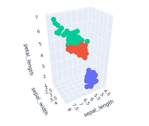
3-D Plots
This method is used to plot Interactive 3-D plots. It is more like a scatter plot in 3-Dimension. These plots follow all properties that we have discussed in the scatter plot. They are quite a powerful tool for visualization.
import plotly.express as px
fig = px.scatter_3d(iris, x='sepal_length', y='sepal_width', z='petal_length',
              color='species')
fig.show()
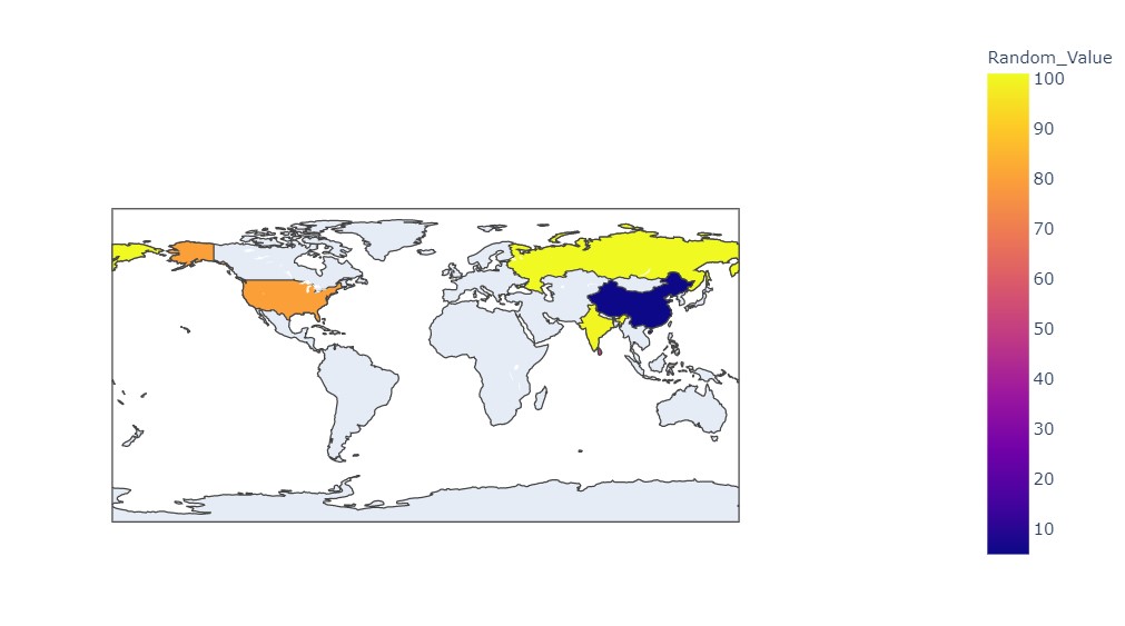
Geographical Maps
As the name suggests these graphs help us in plotting and showing data with different colors for different locations. Each color represents some values. For our example, dark color represents smaller values and light color represents greater values. The idea of Geographical maps is similar to heatmaps with the exception that heatmap forms a grid but here we have geographical representation for our data.
import plotly.express as px
df = pd.DataFrame({
    'Country': ['India','Russia','United States', 'China','Sri Lanka'],
    'Random_Value': [100,101,80,5,50]
})
fig = px.choropleth(df, locations="Country",
                    color="Random_Value",
                    locationmode='country names',
                    color_continuous_scale=px.colors.sequential.Plasma)
fig.show()
EndNote
You can find Code here
Link To Kaggle NoteBook – Click Here
In this article, we saw various techniques for univariate, bivariate, and multivariate analysis. We tried to represent different types of data in the most effective way possible. With the idea of these many data visualization techniques, readers will be able to ace any competition. And will also be able to explain their data stories in the most effective way. There are many more techniques in the market that are used for data visualization. But these are the most commonly used techniques. And keeping the length of article in mind all other techniques can not be explained.
If you think this article contains mistakes, please let me know through the below links.
About Author
LinkedIn: Click Here
Github: Click Here
Also, check out my other article here.
My Github Repository for Deep Learning is here.
The media shown in this article are not owned by Analytics Vidhya and are used at the Author’s discretion.