Let us look at this chart for a second,
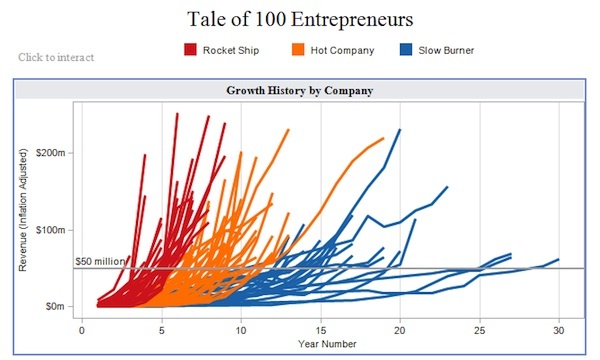
This visualization (originally created using Tableau) is a great example of how data visualization can help decision makers. Imagine telling this information to an investor through a table. How long do you think you will take to explain it to him?
With ever increasing volume of data in today’s world, it is impossible to tell stories without these visualizations. While there are dedicated tools like Tableau, QlikView and d3.js, nothing can replace a modeling / statistics tools with good visualization capability. It helps tremendously in doing any exploratory data analysis as well as feature engineering. This is where R offers incredible help.
R Programming offers a satisfactory set of inbuilt function and libraries (such as ggplot2, leaflet, lattice) to build visualizations and present data. In this article, I have covered the steps to create the common as well as advanced visualizations in R Programming. But, before we come to them, let us quickly look at brief history of data visualization. If you are not interested in history, you can safely skip to the next section.
Brief History of Data Visualization:
Historically, data visualization has evolved through the work of noted practitioners. The founder of graphical methods in statistics is William Playfair. William Playfair invented four types of graphs: the line graph, the bar chart of economic data , the pie chart and the circle graph. Joseph Priestly had created the innovation of the first timeline charts, in which individual bars were used to visualize the life span of a person (1765). That’s right timelines were invented 250 years and not by Facebook!
Among the most famous early data visualizations is Napoleon’s March as depicted by Charles Minard. The data visualization packs in extensive information on the effect of temperature on Napoleon’s invasion of Russia along with time scales. The graphic is notable for its representation in two dimensions of six types of data: the number of Napoleon’s troops; distance; temperature; the latitude and longitude; direction of travel; and location relative to specific dates
Florence Nightangle was also a pioneer in data visulaization. She drew coxcomb charts for depicting effect of disease on troop mortality (1858). The use of maps in graphs or spatial analytics was pioneered by John Snow ( not from the Game of Thrones!). It was map of deaths from a cholera outbreak in London, 1854, in relation to the locations of public water pumps and it helped pinpoint the outbreak to a single pump.
Data Visualization in R:
In this article, we will create the following visualizations:
Basic Visualization
- Histogram
- Bar / Line Chart
- Box plot
- Scatter plot
Advanced Visualization
- Heat Map
- Mosaic Map
- Map Visualization
- 3D Graphs
- Correlogram
R tip: The HistData package provides a collection of small data sets that are interesting and important in the history of statistics and data visualization.
BASIC VISUALIZATIONS
Quick Notes:
- Basic graphs in R can be created quite easily. The plot command is the command to note.
- It takes in many parameters from x axis data , y axis data, x axis labels, y axis labels, color and title. To create line graphs, simply use the parameter, type=l.
- If you want a boxplot, you can use the word boxplot, and for barplot use the barplot function.
1. Histogram
Histogram is basically a plot that breaks the data into bins (or breaks) and shows frequency distribution of these bins. You can change the breaks also and see the effect it has data visualization in terms of understandability.
Let me give you an example.
Note: We have used par(mfrow=c(2,5)) command to fit multiple graphs in same page for sake of clarity( see the code below).
The following commands show this in a better way. In the code below, the main option sets the Title of Graph and the col option calls in the color pallete from RColorBrewer to set the colors.
library(RColorBrewer)
data(VADeaths)
par(mfrow=c(2,3))
hist(VADeaths,breaks=10, col=brewer.pal(3,"Set3"),main="Set3 3 colors")
hist(VADeaths,breaks=3 ,col=brewer.pal(3,"Set2"),main="Set2 3 colors")
hist(VADeaths,breaks=7, col=brewer.pal(3,"Set1"),main="Set1 3 colors")
hist(VADeaths,,breaks= 2, col=brewer.pal(8,"Set3"),main="Set3 8 colors")
hist(VADeaths,col=brewer.pal(8,"Greys"),main="Greys 8 colors")
hist(VADeaths,col=brewer.pal(8,"Greens"),main="Greens 8 colors")
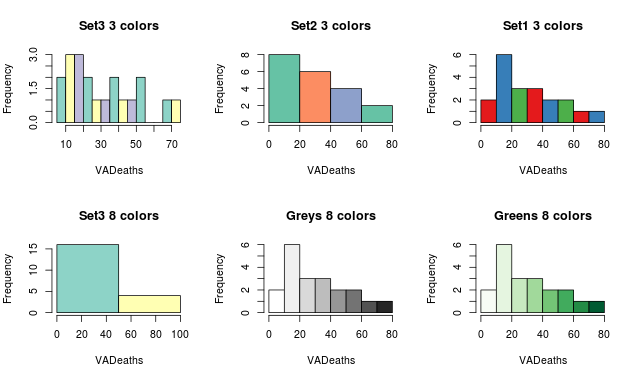
Notice, if number of breaks is less than number of colors specified, the colors just go to extreme values as in the “Set 3 8 colors” graph. If number of breaks is more than number of colors, the colors start repeating as in the first row.
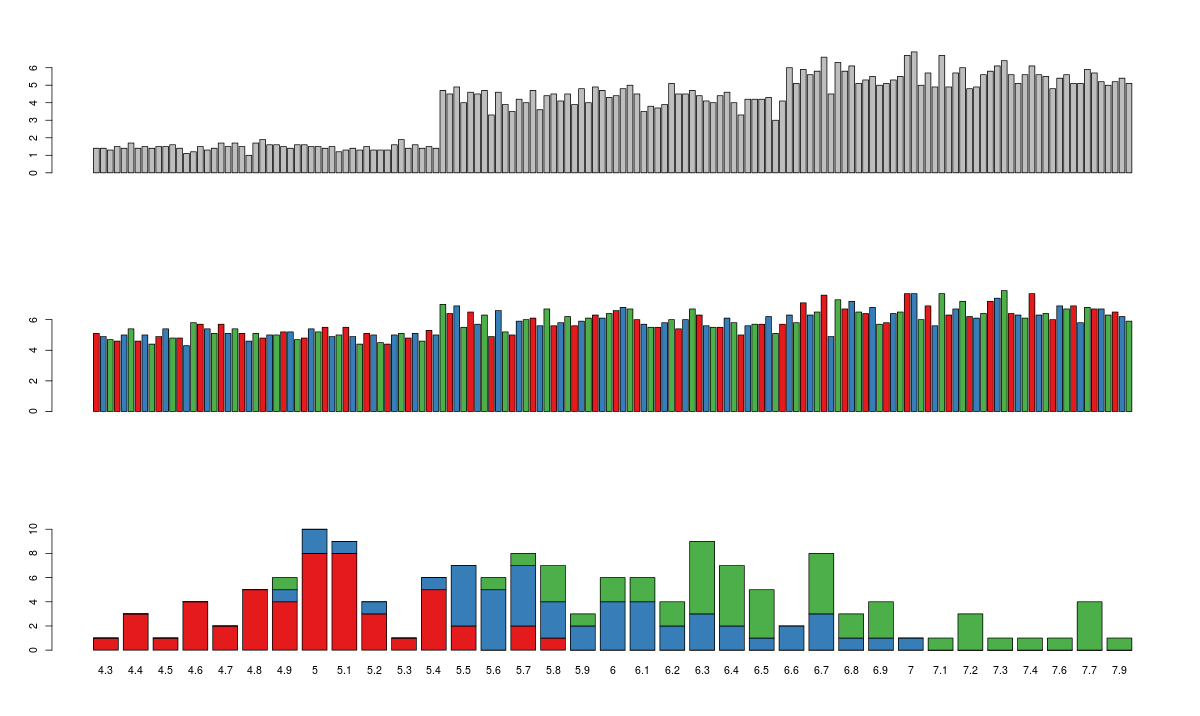
2. Bar/ Line Chart
Line Chart
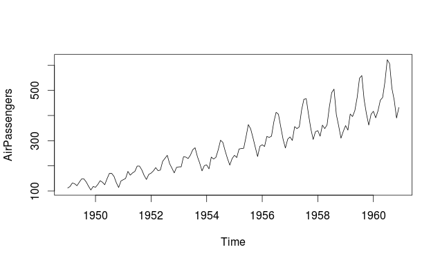
Below is the line chart showing the increase in air passengers over given time period. Line Charts are commonly preferred when we are to analyse a trend spread over a time period. Furthermore, line plot is also suitable to plots where we need to compare relative changes in quantities across some variable (like time). Below is the code:
plot(AirPassengers,type="l") #Simple Line Plot
Bar Chart
Bar Plots are suitable for showing comparison between cumulative totals across several groups. Stacked Plots are used for bar plots for various categories. Here’s the code:
barplot(iris$Petal.Length) #Creating simple Bar Graph
barplot(iris$Sepal.Length,col  = brewer.pal(3,"Set1"))
barplot(table(iris$Species,iris$Sepal.Length),col  = brewer.pal(3,"Set1")) #Stacked Plot
3. Box Plot ( including group-by option )
Box Plot shows 5 statistically significant numbers- the minimum, the 25th percentile, the median, the 75th percentile and the maximum. It is thus useful for visualizing the spread of the data is and deriving inferences accordingly. Here’s the basic code:
boxplot(iris$Petal.Length~iris$Species) #Creating Box Plot between two variable
Let’s understand the code below:
In the example below, I have made 4 graphs in one screen. By using the ~ sign, I can visualize how the spread (of Sepal Length) is across various categories ( of Species). In the last two graphs I have shown the example of color palettes. A color palette is a group of colors that is used to make the graph more appealing and helping create visual distinctions in the data.
data(iris)
par(mfrow=c(2,2))
boxplot(iris$Sepal.Length,col="red")
boxplot(iris$Sepal.Length~iris$Species,col="red")
oxplot(iris$Sepal.Length~iris$Species,col=heat.colors(3))
boxplot(iris$Sepal.Length~iris$Species,col=topo.colors(3))
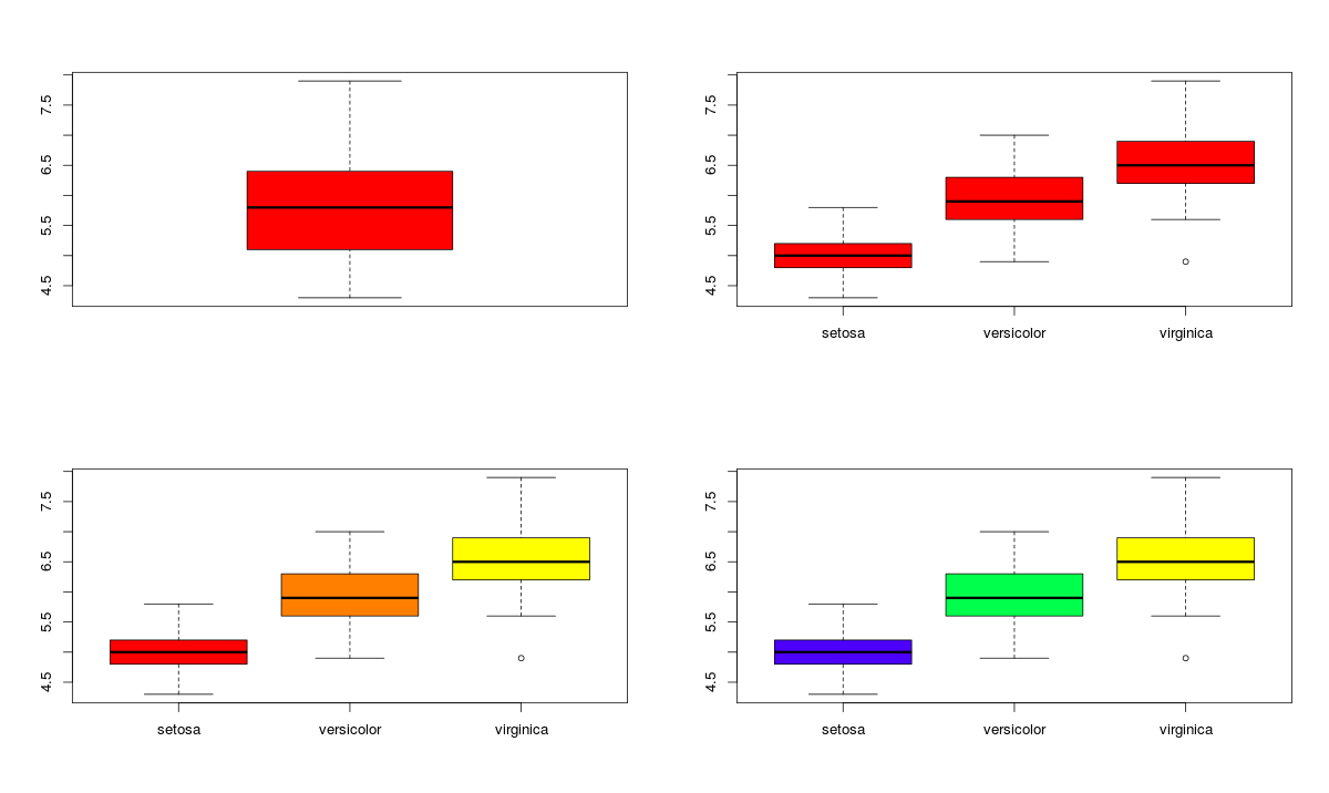
To learn more about the use of color palletes in R, visit here.
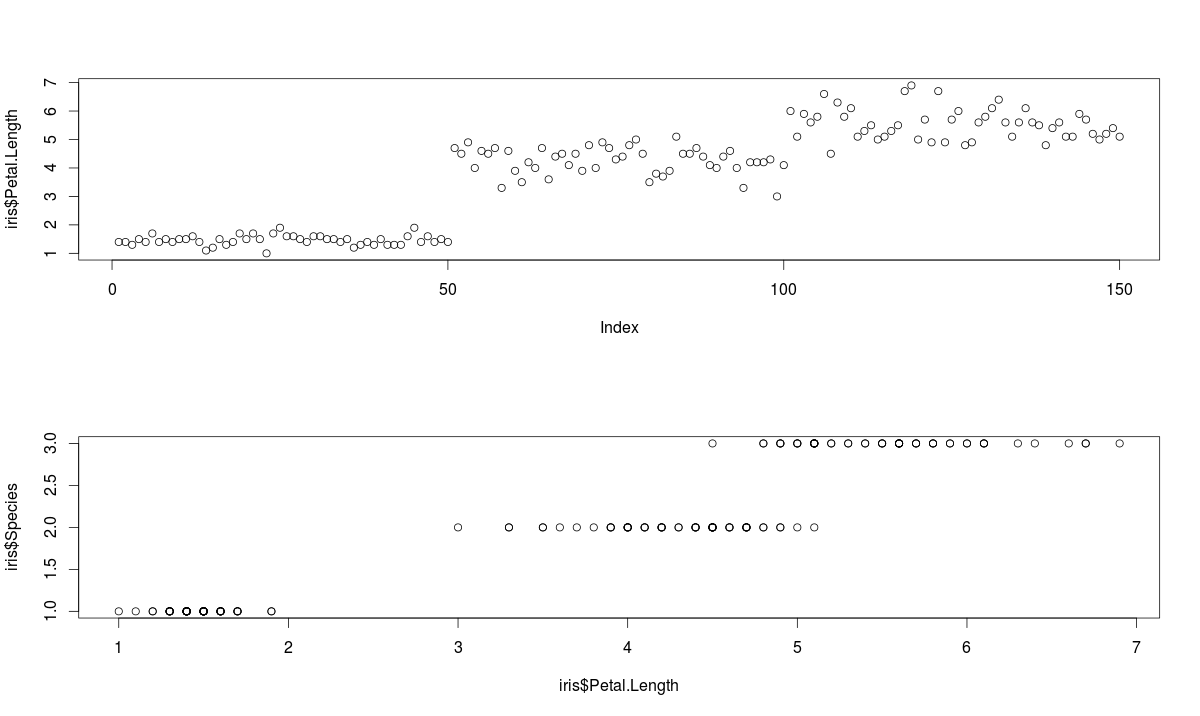
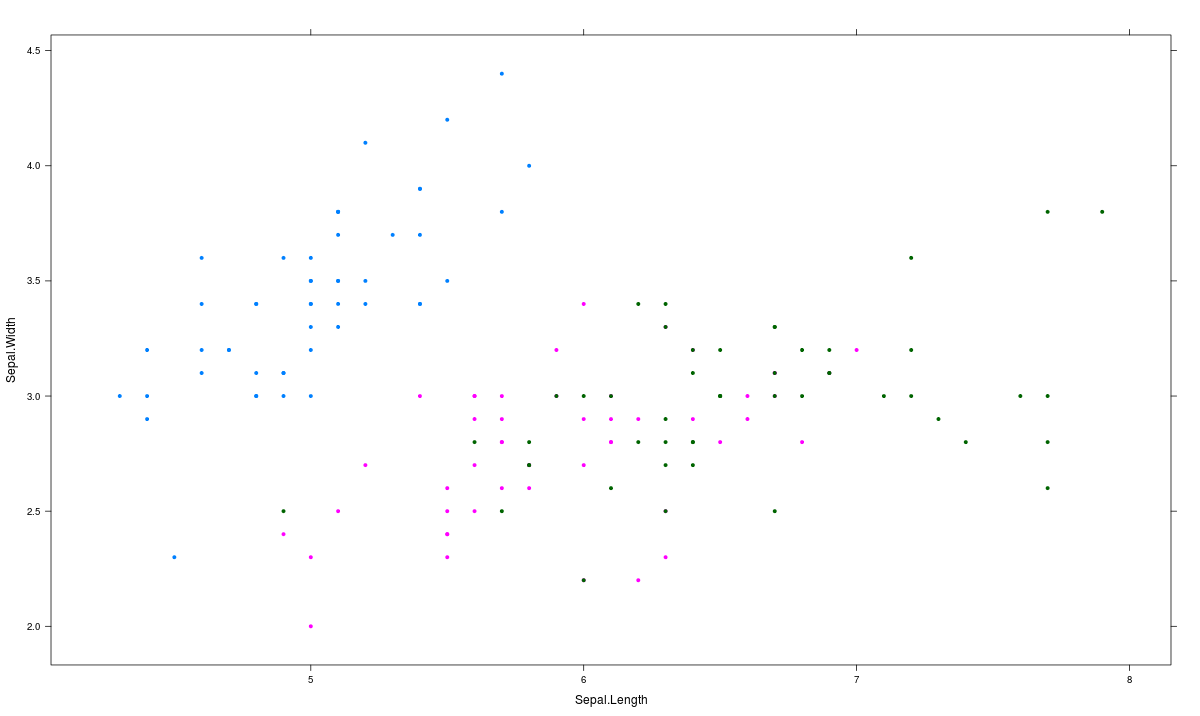
4. Scatter Plot (including 3D and other features)
Scatter plots help in visualizing data easily and for simple data inspection. Here’s the code for simple scatter and multivariate scatter plot:
plot(x=iris$Petal.Length) #Simple Scatter Plot
plot(x=iris$Petal.Length,y=iris$Species) #Multivariate Scatter Plot
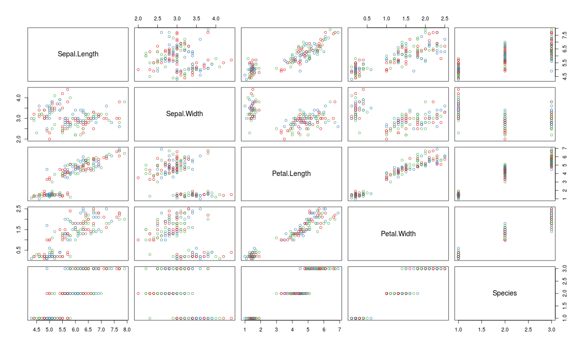
Scatter Plot Matrix can help visualize multiple variables across each other.
plot(iris,col=brewer.pal(3,"Set1"))
You might be thinking that I have not put pie charts in the list of basic charts. That’s intentional, not a miss out. This is because data visualization professionals frown on the usage of pie charts to represent data. This is because of the human eye cannot visualize circular distances as accurately as linear distance. Simply put- anything that can be put in a pie chart is better represented as a line graph. However, if you like pie-chart, use:
pie(table(iris$Species))
Here’a a complied list of all the graphs that we have learnt till here:
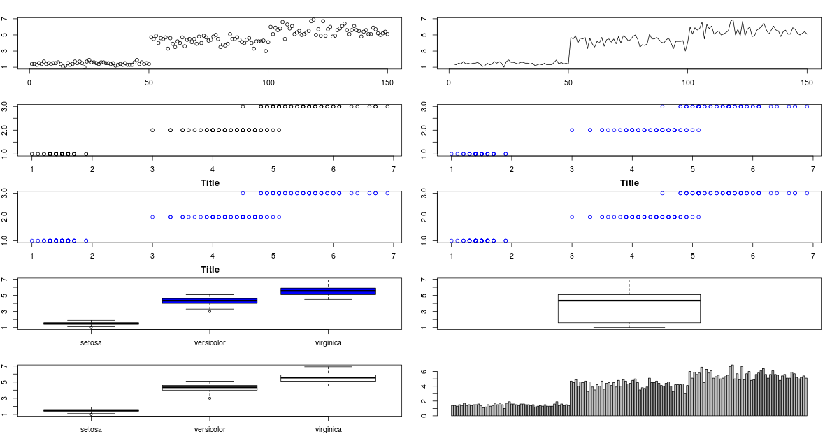
You might have noticed that in some of the charts, their titles have got truncated because I’ve pushed too many graphs into same screen. For changing that, you can just change the ‘mfrow’ parameter for par .
Advanced Visualizations
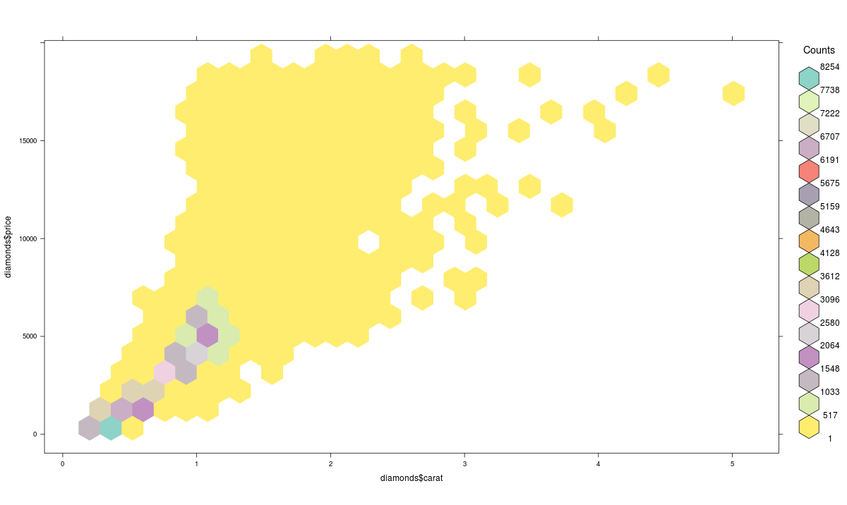
What is Hexbin Binning ?
We can use the hexbin package in case we have multiple points in the same place (overplotting). Hexagon binning is a form of bivariate histogram useful for visualizing the structure in datasets with large n. Here’s the code:
>library(hexbin)
>a=hexbin(diamonds$price,diamonds$carat,xbins=40)
>library(RColorBrewer)
>plot(a)
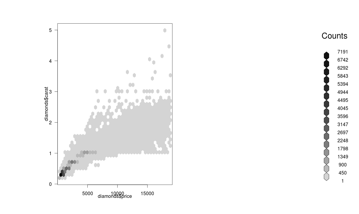
We can also create a color palette and then use the hexbin plot function for a better visual effect. Here’s the code:
>library(RColorBrewer)
>rf <- colorRampPalette(rev(brewer.pal(40,'Set3')))
>hexbinplot(diamonds$price~diamonds$carat, data=diamonds, colramp=rf)
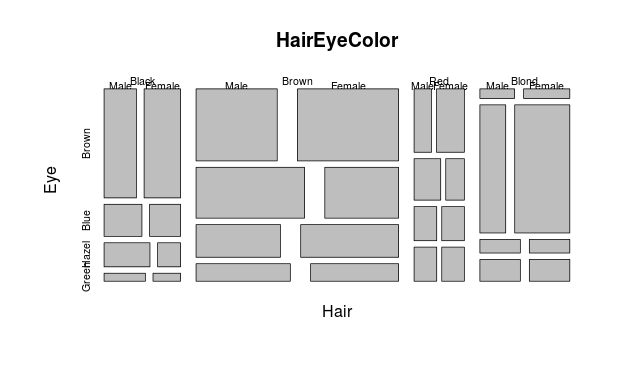
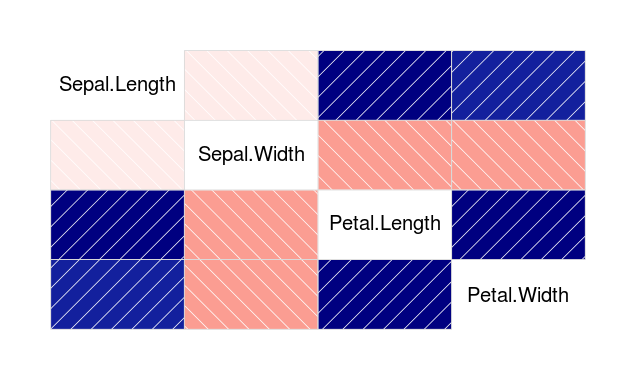
Mosaic Plot
A mosaic plot can be used for plotting categorical data very effectively with the area of the data showing the relative proportions.
> data(HairEyeColor)
 > mosaicplot(HairEyeColor)
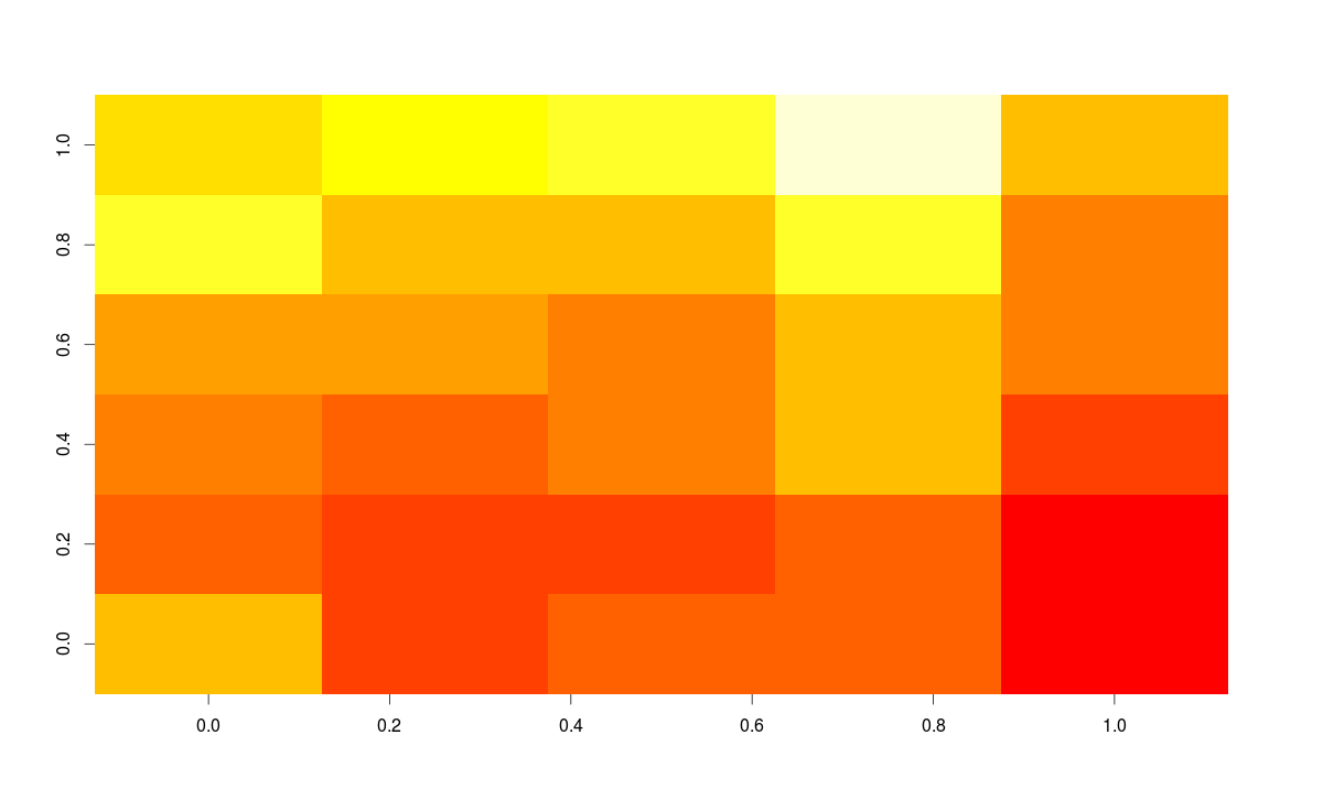
Heat Map
Heat maps enable you to do exploratory data analysis with two dimensions as the axis and the third dimension shown by intensity of color. However you need to convert the dataset to a matrix format. Here’s the code:
> heatmap(as.matrix(mtcars))
You can use image() command also for this type of visualization as:
> image(as.matrix(b[2:7]))
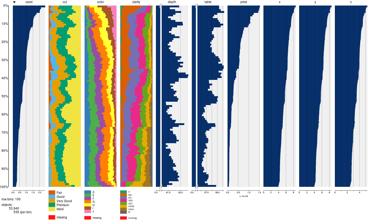
How to summarize lots of data ?
You can use tableplot function from the tabplot package to quickly summarize a lot of data
Map Visualization
The latest thing in R is data visualization through Javascript libraries. Leaflet is one of the most popular open-source JavaScript libraries for interactive maps. It is based at https://rstudio.github.io/leaflet/
You can install it straight from github using:
devtools::install_github("rstudio/leaflet")
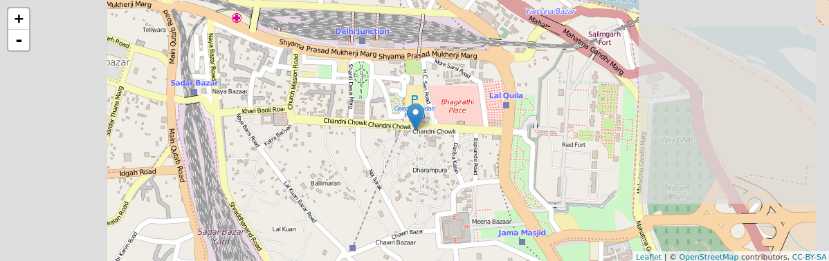
The code for the above map is quite simple:
library(magrittr)
library(leaflet)
m <- leaflet() %>%
addTiles() %>%  # Add default OpenStreetMap map tiles
addMarkers(lng=77.2310, lat=28.6560, popup="The delicious food of chandni chowk")
m  # Print the map
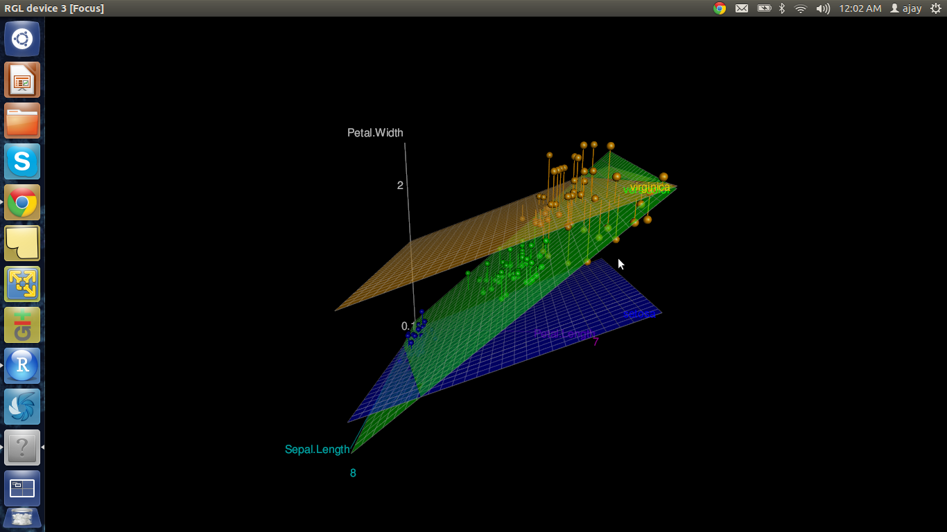
3D Graphs
One of the easiest ways of impressing someone by R’s capabilities is by creating a 3D graph in R without writing ANY line of code and within 3 minutes. Is it too much to ask for?
We use the package R Commander which acts as Graphical User Interface (GUI). Here are the steps:
- Simply install the Rcmdr package
- Use the 3D plot option from within graphs
The code below is not typed by the user but automatically generated.
Note: When we interchange the graph axes, you should see graphs with the respective code how we pass axis labels using xlab, ylab, and the graph title using Main and color using the col parameter.
>data(iris, package="datasets")
>scatter3d(Petal.Width~Petal.Length+Sepal.Length|Species, data=iris, fit="linear"
>residuals=TRUE, parallel=FALSE, bg="black", axis.scales=TRUE, grid=TRUE, ellipsoid=FALSE)
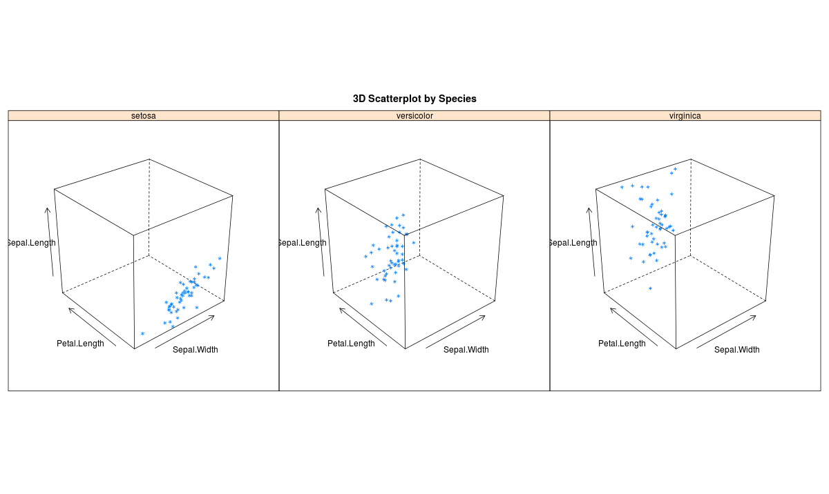
You can also make 3D graphs using Lattice package . Lattice can also be used for xyplots. Here’s the code:
>attach(iris)# 3d scatterplot by factor level
>cloud(Sepal.Length~Sepal.Width*Petal.Length|Species, main="3D Scatterplot by Species")
>xyplot(Sepal.Width ~ Sepal.Length, iris, groups = iris$Species, pch= 20)
Correlogram (GUIs)
Correlogram help us visualize the data in correlation matrices. Here’s the code:
> cor(iris[1:4])
 Sepal.Length Sepal.Width Petal.Length Petal.Width
 Sepal.Length    1.0000000  -0.1175698    0.8717538   0.8179411
 Sepal.Width    -0.1175698   1.0000000   -0.4284401  -0.3661259
 Petal.Length    0.8717538  -0.4284401    1.0000000   0.9628654
 Petal.Width     0.8179411  -0.3661259    0.9628654   1.0000000
 > corrgram(iris)
There are three principal GUI packages in R. RCommander with KMggplots, Rattle for data mining and Deducer for Data Visualization. These help to automate many tasks.
Frequently Asked Questions
Q1. Is R good for data visualization?
A. Yes, R is excellent for data visualization. R has a wide range of powerful libraries and tools for creating high-quality, interactive visualizations of complex data sets. R’s ggplot2 library is a popular choice for creating sophisticated, customizable data visualizations, and it has a large and active community of users and contributors.
Q2. What is a ggplot2 in R?
A. ggplot2 is a popular data visualization package in R that allows users to create sophisticated and customizable graphics with ease. It is based on the concept of a “grammar of graphics,” which means that it provides a flexible and consistent framework for creating a wide range of visualizations, including scatterplots, line graphs, bar charts, histograms, and more. ggplot2 offers many features for customizing the appearance of visualizations, including color, font, size, labels, and annotations.
End Notes
I really enjoyed writing about the article and the various ways R makes it the best data visualization software in the world. While Python may make progress with seaborn and ggplot nothing beats the sheer immense number of packages in R for statistical data visualization.
In this article, I have discussed various forms of visualization by covering the basic to advanced levels of charts & graphs useful to display the data using R Programming.
Did you find this article useful ? Do let me know your suggestions in the comments section below.


This is wonderful. The article is clear and to the point. It cannot be any better.
Awesome Ajay. This is a very useful post. It is not only about using R to create visualization but also a primer on different visualization types , charts. Thanks for the post
Great stuff, thanks for share