Introduction
Exploratory Data Analysis or EDA is a vital step in the Data Science Life Cycle. A lot of primary observations and insights are drawn during the Exploratory Data Analysis step. Apart from this, we also perform hypothesis testing, outlier analysis and necessary data cleaning. In all these processes, data visualization plays an imperative role. For visualizing, we often use charts and plots for Uni-variate and Bi-variate Analysis such as Count Plots, Box Plots, Histogram, Scatter Plots et Cetra.
We can plot these charts for each of the features in our dataset but this can be time-consuming when we have limited time to present our insights. Of course, we can define a function to do the tasks in lesser lines of code, but when we talk about drawing insights quickly from data, we need something that can accomplish the task in a single command. Luckily, we have few methods with us to do the same.
In this article, we will explore some methods that are very useful in drawing insights in no time from our data. Although, it gives limited information, but drawing primary observations from our data, when e don’t have enough time in our hands, is a boon.
FacetGrid and the EDA
Exploratory Data Analysis helps in identifying the underlying patterns and trends which are not observable just by looking at the data. For example, plotting a distribution plot for a numeric feature, say Age in a dataset displays the distribution of Age of the people for the continuous interval. A scatter plot of two variables would help in determining the relationship between the variables how the increase or decrease in one affects the other.
To accomplish the task, our fundamental libraries Matplotlib and Seaborn have all the required methods. We just have to pass the dataset we are working on as an argument, specify the column we want to explore and we will get our plots within seconds. The methods we are going to use are will plot on Seaborn’s FaceGrid. A FacetGrid is a multi-axes grid with subplots visualizing the distribution of variables of a dataset and the relationship between multiple variables. Now, let’s see the methods which can help to perform EDA in no time.
The .catplot() Method
Seaborn’s .catplot() method plots the relationship between numerical and one or more categorical variables onto the FacetGrid. Seaborn library is built over the Matplotlib thus it has all the functionalities of including the recovered drawbacks of Matplotlib. For the proper functionality and usability of catplot, we need to pass 3 main parameters, i.e. the data, variable to be plotted on the x-axis and variable to be plotted on the y-axis. To increase usability, we often pass ‘col’ and ‘hue’ parameters which also takes features from our dataset, preferably categorical as that’s what our motive is.
Let’s understand this with an example.
Importing the Libraries
import seaborn as sns
Importing the data
df = sns.load_dataset('mpg')
Here, we are using the ‘mpg’ dataset from Seaborn’s data library.
Checking the Dataset
df.head()
Plotting the catplot
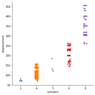
Here we decided to plot the number of cylinders by the displacement of the vehicle.
sns.catplot(data=df, x="cylinders", y="displacement");
Putting it all together
Python Code:
import seaborn as sns
import matplotlib.pyplot as plt
df = sns.load_dataset('mpg')
# df.head()
sns.catplot(data=df, x="cylinders", y="displacement")
plt.show()
On executing this code, we get:
Increasing Usability of catplot
To make the most out of the catplot, we will define additional parameters which will help us explore the data to a larger extent and drawing insights.
1. Specifying the ‘col’ Parameter
Specifying the col parameter will determine the faceting of the plot. For example, if we specify a categorical feature into the ‘col‘ parameter which has 3 unique values, we will have 3 different plots, each for each unique value of the categorical variable used in the FacetGrid. Let’s understand it with an example:
import seaborn as sns
df = sns.load_dataset('mpg')
# df.head()
sns.catplot(data=df, x="cylinders", y="displacement", col = 'origin');
On executing this code, we get:
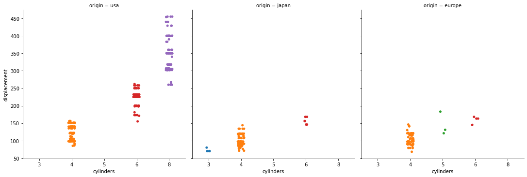
Image Source – Personal Computer
In this, we can see, we get 3 different plots for 3 kinds of origin in our dataset, namely ‘usa‘, ‘japan‘, and ‘europe‘.
2. Specifying the ‘hue’ Parameter
Specifying the ‘hue‘ parameter will specify the colour of the data points based on the feature used in the ‘hue’ parameter. For example,
import seaborn as sns
df = sns.load_dataset('mpg')
# df.head()
sns.catplot(data=df, x="cylinders", y="displacement", col = 'origin', hue = 'model_year');
On executing this code, we get:
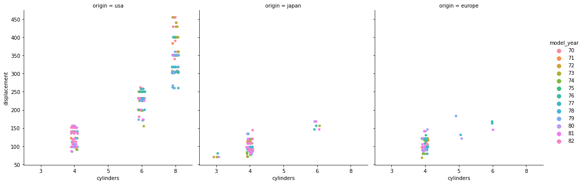
Image Source – Personal Computer
This will add ‘hue‘ to the plots as per the variable ‘model_year‘.
3. Specifying the ‘kind’ Parameter
The default kind of plot of the FacetGrid we saw above is ‘strip’. We can change the kind of plots used as per our need. The options available are ‘swarm‘, ‘box‘, ‘violin‘, ‘boxen‘, ‘point‘, ‘bar‘, or ‘count‘ apart from ‘strip’. Of course, we don’t need to specify both the axes x and y if we are plotting a count plot (kind = ‘count’). Let’s understand this with an example:
import seaborn as sns
df = sns.load_dataset('mpg')
# df.head()
sns.catplot(data=df, x="cylinders", y="displacement", col = 'origin', hue = 'model_year', kind = 'box');
On executing this, we get:
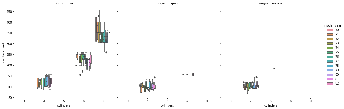
Image Source – Personal Computer
The FaceGrid is cluttery because we have more than 10 categories in the ‘model_year‘ feature.
The .pairplot() Method
Seaborn’s .pairplot() method is used to plot relationships of each feature with all the other features. This method primarily takes one parameter of the data to be used. The .pairplot() method takes the numeric features only from the data. Execting the .pairplot() method will generate a FacetGrid having N × N plots where N is the number of numeric features in our dataset. In the FacetGrid, we have numeric features written on the left side specifying the y-axis for each plot and on the bottom specifying the x-axis of the plots. The diagonal of the FaceGrid will have plots of the variables’ distribution as in diagonal the variable would intersect with itself. Let’s understand this with an example.
Importing the Libraries
import seaborn as sns
Importing the data
df = sns.load_dataset('penguins')
Here, we are using the ‘penguins’ dataset from Seaborn’s data library.
Checking the Dataset
df.head()
Plotting the pairplot
sns.pairplot(df, dropna = True);
Here, we are dropping the NA values by setting the ‘dropna’ parameter to True
Putting it all together
import seaborn as sns
df = sns.load_dataset('penguins')
# df.head()
sns.pairplot(df, dropna = True);
On executing this code, we get:
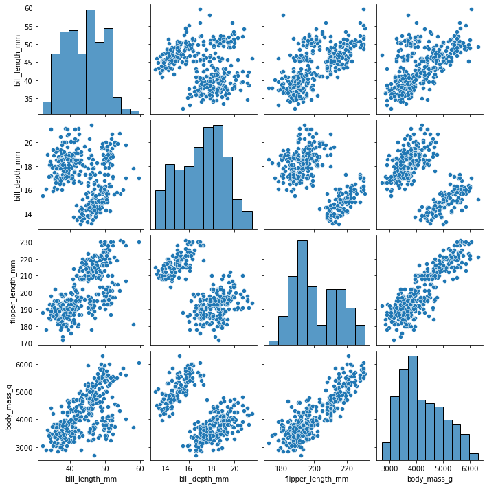
Thus, on the diagonal, we see the distribution of each variable with names of variables on the left side and bottom of FacetGrid.
Increasing Usability of pairplot
As a part of Modification to pairplot, not very much we can do as all the plots are already self-explanatory. To increase the usability of the pairplot, we will do the following:
1. Specifying the ‘hue’ Parameter
Specifying the ‘hue’ parameter in pairplot will specify the colour of the data points based on the feature used in the ‘hue’ parameter. For example,
import seaborn as sns
df = sns.load_dataset('penguins')
# df.head()
sns.pairplot(df, dropna = True, hue = 'island');
On executing this code, we get:
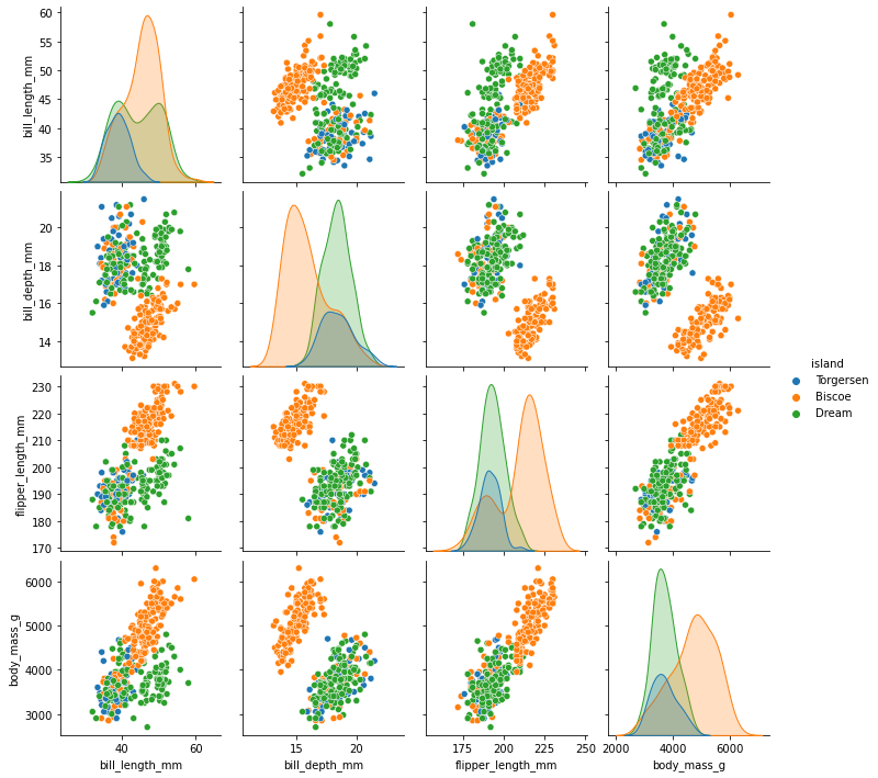
Image Source – Personal Computer
This will assign ‘hue‘ as per the ‘island‘ variable.
2. Specifying the ‘kind’ Parameter
We can specify the ‘kind’ parameter in pairplot which will determine the kind of plot for the non-diagonal plots of the FaceGrid. We can build four kinds of plots in FacetGrid namely, scatter plot by specifying the value ‘scatter‘, KDE plot by specifying the value ‘kde‘, histogram by specifying the value ‘hist‘, regression plot by specifying the value ‘reg‘. By default, the scatter plot is plotted on the non-diagonal plots of the Grid. For example,
import seaborn as sns
df = sns.load_dataset('penguins')
# df.head()
sns.pairplot(df, dropna = True, hue = 'island', kind = 'kde');
On executing this code, we get:
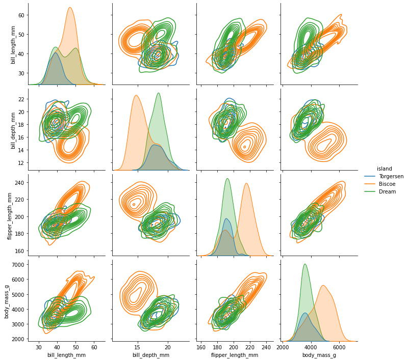
Image Source – Personal Computer
This will generate KDE or Kernel Density Estimation Plots on the non-diagonal axes.
Conclusions
In this article, we learnt how to build FaceGrid using Seaborn’s .pairplot() and .catplot() methods. The .catplot() needs to have at least one categorical feature to fulfil its purpose. While .pairplot() takes by default all the numeric features. If we wish to specify selected features into consideration for pairplot, we can build a new dataframe with the selected variables of our choice. Pairpltos can be a good choice when we have a lot of Numeric features in our dataset and plotting each of them would be a tedious task. Apart from this, we can try adding more optional parameters for catplots and pairplots. There are other methods in the Seaborn library that also return a FaceGrid object such as .relplot() which can do the same task. One can try exploring more of these methods to perform EDA in no time when needed.
About the Author
Connect with me on LinkedIn Here.
Check out my other Articles Here
You can provide your valuable feedback to me on LinkedIn.
Thanks for giving your time!
The media shown in this article are not owned by Analytics Vidhya and are used at the Author’s discretion.
IT Engineering Graduate currently pursuing Post Graduate Diploma in Data Science.


