-
A/B Testing for Data Science using Python – A Must-Read Guide for Data Scientists
A/B Testing is a way to test your products. In this article learn what is A/b testing in data science and how data scientists leverage it.
Shipra Saxena 10 Jan, 2025
-
Exploring Inheritance in Python OOPs Concept
Learn inheritance in oops python language, and explore advanced concepts such as multiple inheritance and method resolution order.
Himanshi Singh 20 Feb, 2024
-
10 Questions Every Data Science Beginner Asks (with Answers and Resources)
In this article, we will discuss the most asked questions by data science enthusiasts and beginners to make the right decisions.
Ram Dewani 21 Jun, 2022
-
What are the differences between Data Lake and Data Warehouse?
Data lake and data warehouse is very crucial for every big data engineer. Understand the difference between data lake and data warehouse.
Lakshay arora 20 Nov, 2020
-
Examining the Simple Linear Regression method for forecasting stock prices using Excel
Linear Regression is one of the simplest ways to make predictions. In this article, we are forecasting stock prices of Infosys in Excel.
Allwyn 26 Oct, 2021
-
8 Things you Absolutely Should Know Before Starting your Data Science Career
Data Science will be the most exciting career in the next decade. Here are 8 things you must know to build a data science career in 2020
Ram Dewani 05 Mar, 2021
-
SQL vs NoSQL Databases – A Key Concept Every Data Engineer Should Know
Understand what SQL vs NoSQl databases are. In this article we will talk about some key difference between SQL and NoSQL databases.
Aniruddha Bhandari 20 Nov, 2020
-
12 Powerful Tips to Ace Data Science and Machine Learning Hackathons
Ace data science hackathons with the 12 powerful tips provided in the article. Cracking the top positions in in your hands!
Lakshay arora 28 Oct, 2024
-
The Power of Azure ML and Power BI: Dataflows and Model Deployment
Understand what is azure ML & power BI? Learn how to deploy models using Azure ML studio & integrate the results in Microsoft Power BI report
Kaushikrch 23 Nov, 2020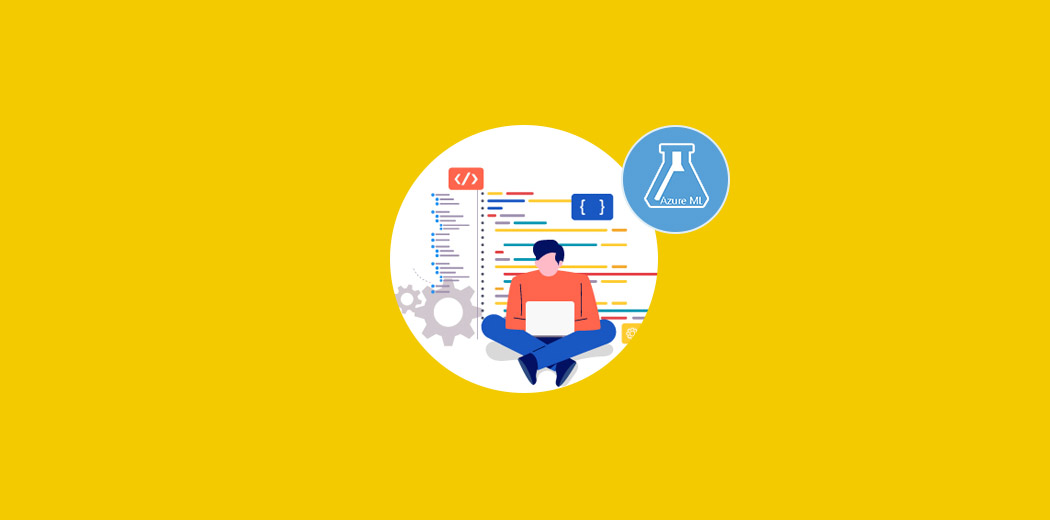
-
Getting Started with Analytics in your Organization: Think Big, Start Small
To be able to succeed in today’s digital era, an organization have to be hyper-aware and Analytics is the only way to capture these insights.
amit_kumar 23 Nov, 2020