-
How to Create Stunning and Interactive Dashboards in Excel?
Here, we will show you how to create interactive and stunning dashboards in Excel. It is a powerful tool that doesn't require coding
Kaustubh Gupta 10 Sep, 2021
-
Performing EDA of Netflix Dataset with Plotly
In this article we will be performing EDA on Netflix dataset using plotly. Plotly is an open source widely used visualization library .
Kashish Rastogi 23 Oct, 2024
-
How to choose the Right Chart for Data Visualization
Data Visualization is an important topic. In this article, you will learn “How to choose the right chart for data visualization”.
Harshit Ahluwalia 04 Apr, 2025
-
Create Stock Exchange Dashboard using Dash in Python!
Dash is an open-source web framework for creating analytical dashboards. Here we will create a stock exchange dashboard using dash in python.
Siddharth 27 Aug, 2021
-
What is Exploratory Data Analysis ?
Learn the fundamentals of Exploratory Data Analysis (EDA), techniques, data preparation, & visualizations to uncover insights from datasets.
Pratik 04 Apr, 2025
-
Creating Customized Word Cloud in python
A word cloud is a visualization technique for text data where the most frequent word is shown. Let's create a word cloud in python
Parul Rajput 15 Aug, 2021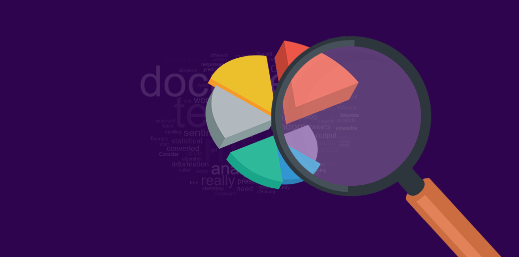
-
Better EDA with 3 Easy Python Libraries for Any Beginner
In this article, we are discussing three interesting auto-EDA Python libraries for beginners and apply it on the iris dataset
Devashree 12 Nov, 2024
-
Exploring Matplotlib Stylesheets For Data Visualization
We will learn about the Matplotlib Stylesheets in Python and some popular stylesheet options which can improvise the power of visualization.
Rahul Shah 12 Nov, 2024
-
How to Create a Bar Plot in Python: A Step-by-Step Guide (Updated 2026)
Discover bar plots, their differences from histograms, and how to create them in Python, including types and time series applications.
Siddharth M 26 Dec, 2025
-
8 Charts You Must Know To Excel In The Art of Data Visualization!
Data Visualization is an essential skill to understand the data. In this article we will learn about 8 charts you must know using python.
Sruthi 05 Aug, 2021