-
Time Intelligence in Power BI: Capitalize on time
Implementation of Time Intelligence functions in Power BI. Also understand why these are important business metrics to be evaluated.
Kaushikrch 05 Aug, 2020
-
12 Univariate Data Visualizations With Illustrations in Python
Learn univariate data visualization using Python. Explore scatter plots, histograms, box plots, to uncover patterns in single-variable data.
Guest Blog 02 May, 2025
-
8 Data Visualization Tips to Improve Data Stories
Data visualization is not easy to master. Therefore, this article covers some esentials data visualization tips to create better visuals for your data.
Aniruddha Bhandari 28 Jul, 2020
-
Top 20 Visualization Dashboards for Mapping COVID-19
Data Visualization has played a key role in understanding the spread of Covid-19. Have a look at the 20 most compelling COVID-19 Dashboard across the globe.
Guest Blog 20 Jul, 2020
-
How to Improve Forecast Accuracy Using Power BI?
Discover Data Forecasting, Forecast Accuracy with Power BI. Learn accurate time series forecasting with a for insightful visuals.
Guest Blog 12 Mar, 2024
-
Tableau Tip: Visualize a Single Value Against Others
Tableau is a premium Business Intelligence tool. Learn to visualize the comparison between single values against a range of values using Tableau tips.
Guest Blog 12 Jul, 2020
-
3 Ambitious Excel Charts to Boost your Analytics and Visualization Portfolio
Excel charts enable analysts to create powerful and ambitious visualizations. Here are 3 Excel charts: Waterfall, Funnel and Pareto for analytics domain.
Ram Dewani 26 Aug, 2021
-
3 Advanced Excel Charts Every Analytics Professional Should Try
Advanced excel charts tutorials explains 3 advanced excel charts sparklines, gantt charts and thermometer charts that every analytics professional should try
Ram Dewani 26 Aug, 2021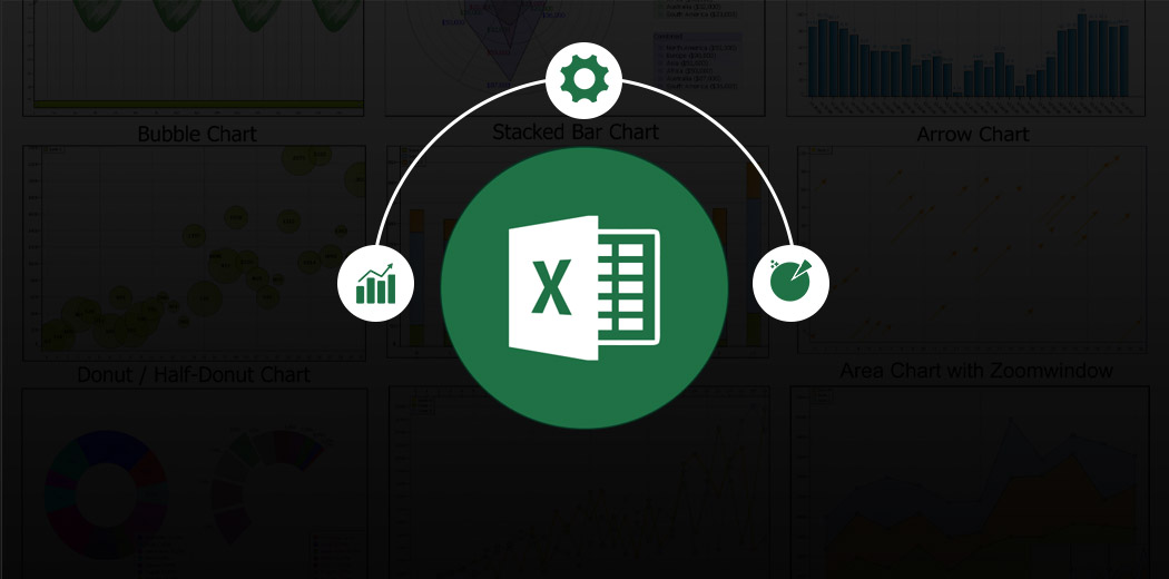
-
Build your own Animated Data Visualization in Tableau in Just 5 Minutes
Animated visualizations are a pwoerful way of showing your data and results. Learn how to use Tableau to created animated visualizations.
Pranav Dar 15 Jun, 2020
-
5 Powerful Excel Dashboards for Analytics Professionals
Learn to represent crucial data using Excel for quick consensus and strategic decision-making. Explore five powerful Excel dashboards here.
Ram Dewani 31 Jan, 2025