-
6 Key Points you Should Focus on for your Next Data Science Interview
6 must-know tips you should know 1 day before you go for your data science interview. These are 6 tips every data scientist should know.
khyati 24 Sep, 2020
-
Time Series in Excel! Learn Exponential Smoothing Models for Time Series Forecasting in Excel
The exponential smoothing algorithms are popularly used for forecasting univariate time series. We will see how to use them in MS Excel.
Aishwarya Singh 23 Sep, 2020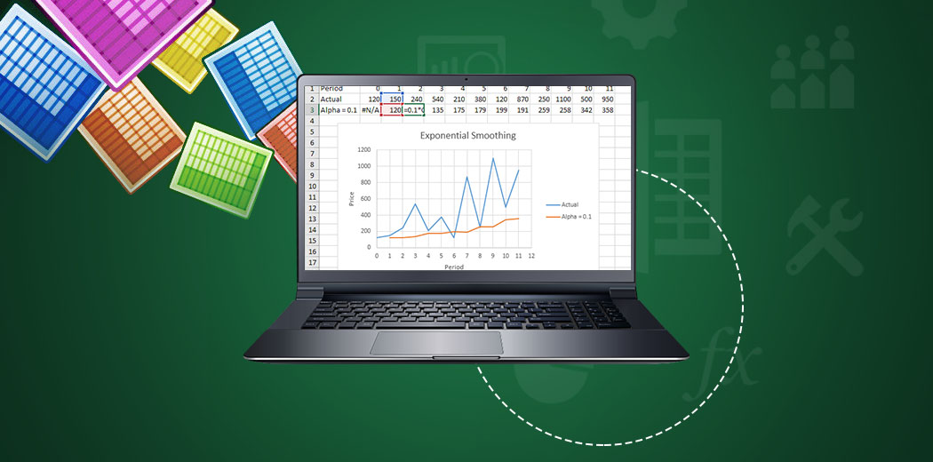
-
How to Rank Entities with Multi-Criteria Decision Making Methods(MCDM)
Multi-Criteria Decision Making Methods is considered a complex decision-making tool involving both quantitative and qualitative factors
Guest Blog 22 Sep, 2020
-
5 Popular NoSQL Databases Every Data Science Professional Should Know About
NoSQL databases are important due to the sheer volume of data we produce in the present times. Learn about different types of NoSQL Databases
Lakshay arora 21 Sep, 2020
-
A Detailed Study of Self Supervised Contrastive Loss and Supervised Contrastive Loss
Understand in detail, Self-Supervised Contrastive Loss and Supervised Contrastive Loss and how to implement it in python.
Guest Blog 19 Apr, 2024
-
Hyperopt: The Alternative Hyperparameter Optimization Technique You Need to Know
Know all about Hyperopt, the Bayesian hyperparameter optimization technique that allows you to get the best parameters for a given model.
Guest Blog 09 Jan, 2025
-
5 Must-Watch Talks Before your Next Data Science Hackathon (featuring SRK, Dipanjan Sarkar, and more!)
Top data scientists share their journey and their hacks, tips, and tricks in these talks to help us excel in data science hackathons.
Ram Dewani 17 Sep, 2020
-
How to create your AI Virtual Assistant using Python
AI virtual assistant, is an application program that understands natural language voice commands and completes tasks for the user.
Guest Blog 23 May, 2023
-
11 Easy-to-Achieve Steps to Transition into Data Science (for Reporting and BI Professionals!)
Are you a MIS/Reporting/BI professional trying to transition into data science? Here are 11 steps you should follow!
Sunil Ray 29 Dec, 2020
-
TensorFlow Object Detection — 1.0 & 2.0: Train, Export, Optimize (TensorRT), Infer (Jetson Nano)
Object detection is seeing widespread adoption presently with diverse applications. Learn TensorFlow Object Detection in versions 1.0 & 2.0.
Guest Blog 16 Sep, 2020