This article was published as a part of the Data Science Blogathon.
Motivation
While working on the spark application tuning problem, I spent a considerable amount of time trying to make sense of the visualizations from the Spark Web UI. Spark Web UI is a very handy tool for this task. For beginners, it becomes very difficult to gain intuitions of a problem from these visualizations alone. Though there are very good resources on spark performance, the information was scattered. Thus, I felt the need to document and share my learnings.
Target Audience and Takeaways
This post assumes the readers have a basic understanding of spark concepts. This post will help beginners in identifying probable performance problems in their applications runs from a Spark Web UI. The focus is only on the information that is not obvious from the UI and the inferences to draw from this non-obvious information. Please note, it does not contain an exhaustive list of information to interpret from Spark Web UI, but only the ones that I found relevant to my project and yet general enough for the audience to know.
Spark Web UI
Spark Web UI is available only when the application is running. For analyzing past runs, the history server needs to be enabled to store the event logs that can then be used to populate the Web UI.
Spark Web UI displays useful information about your application in the tabs, namely
- Executors
- Environment
- Jobs
- Stages
- Storage
The remaining post describes the intuitions from each of the tabs, in the mentioned order.
Executors tab
Gives information on the tasks run by every executor.
Fig 1: Executor tab summary
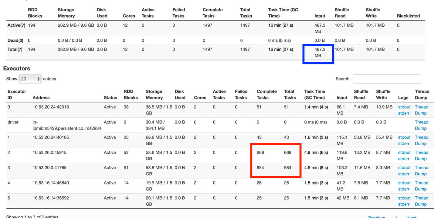
From Fig 1, one can understand there is one driver and 5 executors each running with 2 cores and 3 GB memory.
The box marked in red shows the uneven distribution of tasks where one node of the cluster is overdoing tasks, while others are comparatively idle.
The box marked in blue shows that the input data size was 487.3 MB. Now, this application was run on a dataset size of 83 MB. The input data size comprises of original dataset read and the shuffle data transfers across nodes. This shows a lot of data (approx 400+ MB) was been shuffled in the application.
Environment tab
There are many spark properties to control and fine-tune the application. These properties could be set either while submitting the job or creating the context object. Unless the property is explicitly added, it does not get applied. We mistook this by assuming that the properties get applied with their default values, when not explicitly set. All applied properties can be viewed from the Environment tab. If the property is not seen there, it means the property has not gotten applied whatsoever.
Jobs tab
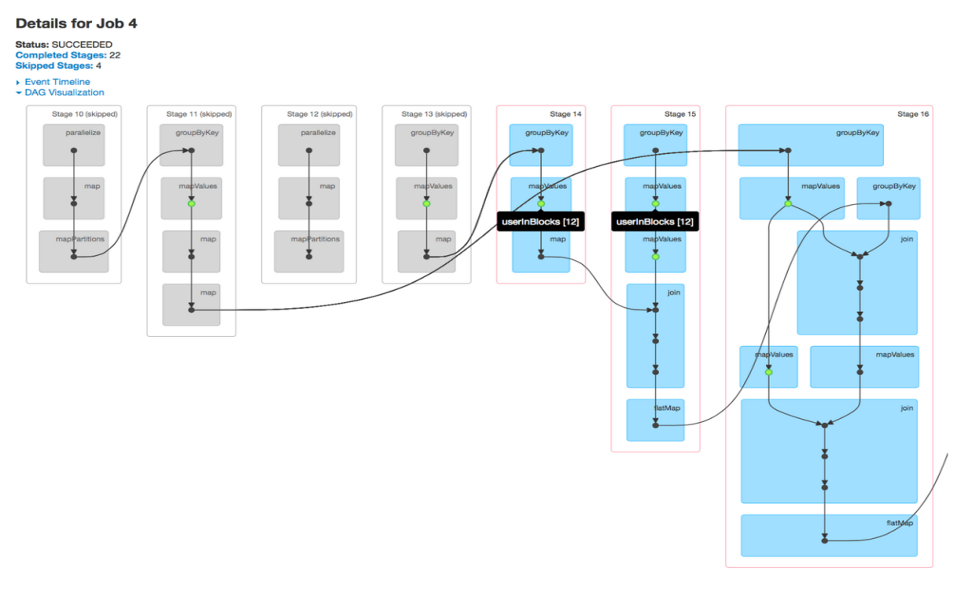
A job is associated with a chain of Resilient Distributed Dataset dependencies organized in a direct acyclic graph (DAG) that looks like Fig 2. From DAG visualizations, one can find the stages been executed and the number of skipped stages. By default, the spark does not reuse its computed steps in the stages, unless explicitly persisted/cached. Skipped stages are cached stages marked in grey, where computation values are stored in memory and not recomputed after accessing HDFS. A glance at the DAG visualization is enough to know if RDD computations are repeatedly performed or cached stages are used.
Fig 2: DAG Visualization of a job
Stages tab
Gives a deeper view of the application running at the task level. A stage represents a segment of work done in parallel by individual tasks. There is a 1-1 mapping between tasks and data partitions, i.e 1 task per data partition. One can deep dive into a job, into specific stages, and down to every task in a stage from the Spark Web UI.
The stage gives a good overview of the executions – DAG visualizations, Event Timelines, Summary/Aggregator Metrics of its’ tasks.
I prefer looking at event timelines to analyze the tasks. They give a pictorial representation of the details of time spent in the stage’s execution. With a single glance, we could draw quick inferences on how well the stage performed, and how we could further improve the execution time.
Fig 3 – Event timeline sample
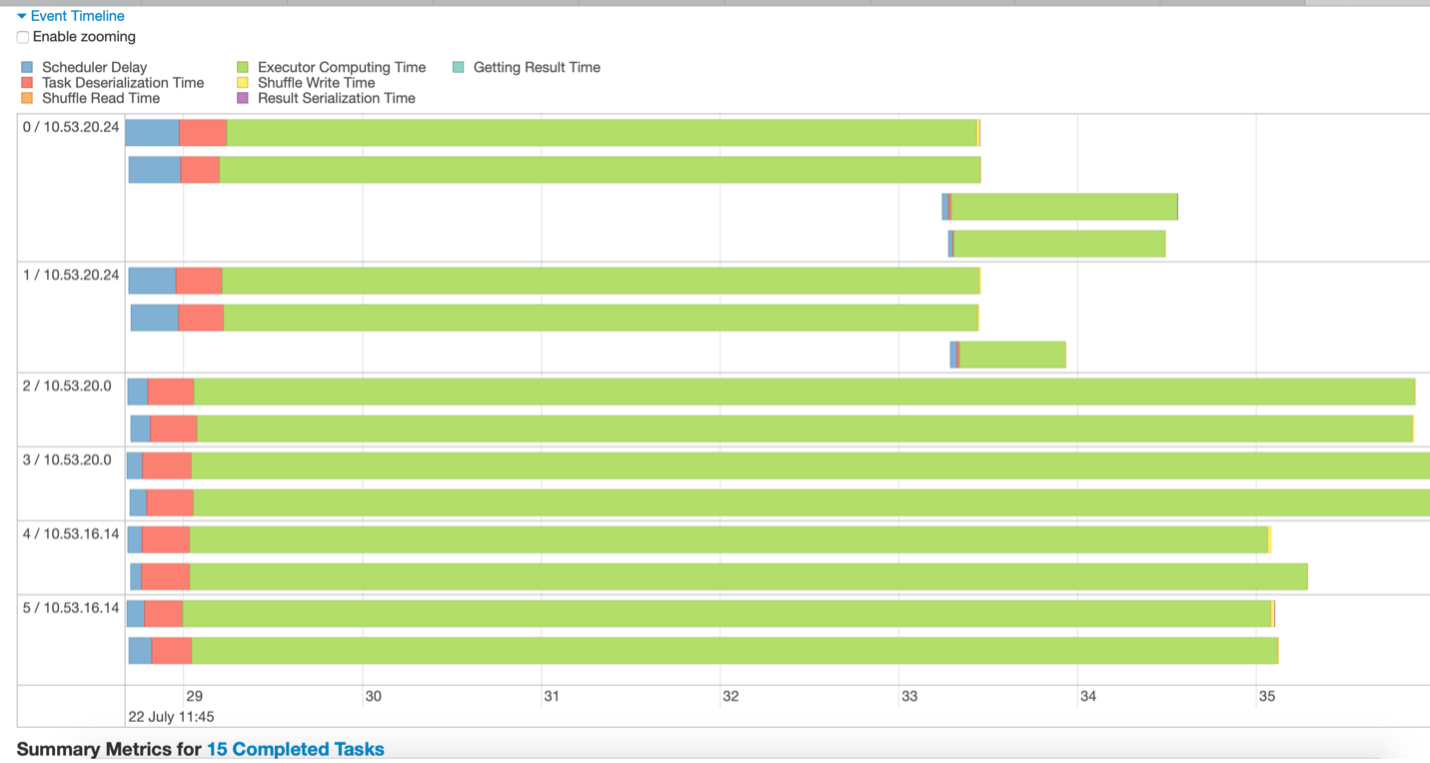
For e.g, inferences drawn from Fig 3 could be:
- The data is divided into 15 partitions. Thus, 15 tasks are running (represented with 15 green lines).
- The tasks are executing on 3 nodes, each with 2 executors
- The stage completes only when the longest-running task finishes. Other executors remain idle until the longest task finishes.
- There are few long-running tasks, while few tasks run for a very short time indicating that data is not well partitioned.
- Not a lot of time is been spent on scheduler delay or serialization in this stage which is good.
Fig 4 – Event Timeline of a stage with many data partitions.
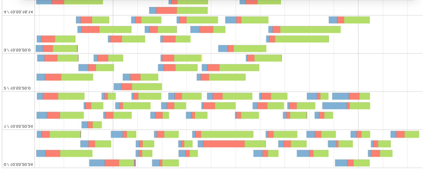
Looking at fig 4, we can infer that data is not well distributed and unnecessarily partitioned. From the evaluation metric, one can confirm that task scheduling took more time than actual execution time. The greater the percentage of green in the timeline, the more efficient is the stage computation.
It is desirable to have a lesser number of stages in the jobs. Whenever the data gets shuffled, a new stage is created. Shuffling is expensive and thus, attempt to reduce the number of stages your program needs.
Input Data Size
Another important insight is to look at the input size of the data been shuffled. One of the goals is also to reduce the size of this shuffle data.
Fig 5 – Stages Tab Overview.
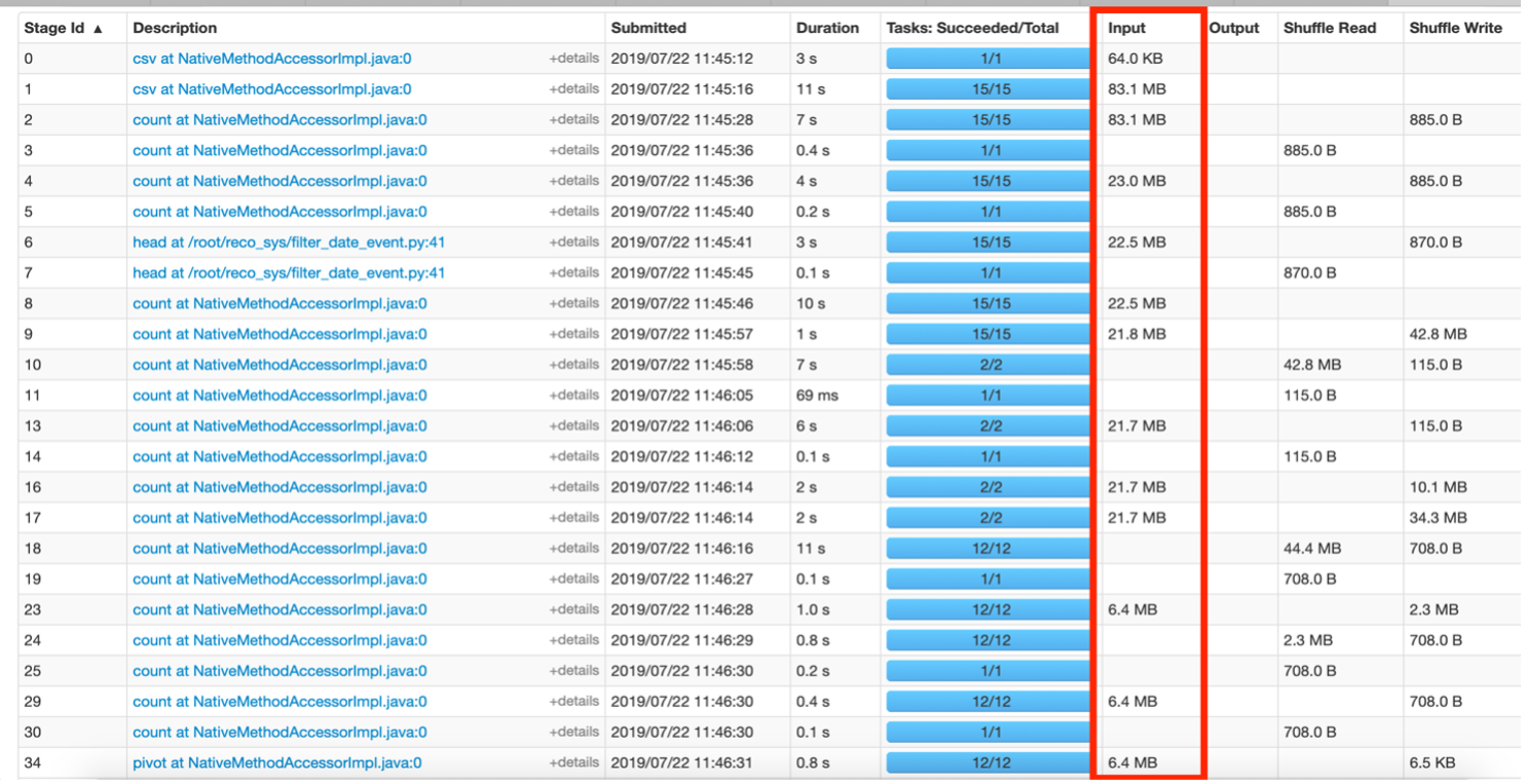
Fig 5 above shows stages where data is moved in MBs. This hints that the code can be improved to reduce the size of data been juggled around between stages. For e.g, say if a filter was applied on some data for a given event ‘x’, then in the resultant RDD, the column “event” becomes redundant as technically all rows are of event ‘x’. This column could be dropped from future RDDs built on this filtered data to save additional information been transferred during shuffle operations.
Storage Tab
Shows only the RDDs that have been persisted ie using persist() or cache(). To make it more legible, you can assign a name to the RDD while storing it using setName(). Only the RDDs that you want to persist must show in the Storage Tab and they could be easily recognizable with the custom names provided.
Summary
This article helps provide insights into identifying the problems from Spark Web UI such as the size of data been shuffled, the execution time of stages, re-computation of RDDs due to lack of caching. If one understands their data and application, then the ideal data distribution and desired number of partitions could be gauged by inferring from execution UI. Overloading of one node Vs others in the cluster is another area of improvement that could be seen from this UI. The resolution to some of these problems is discussed more in the Apache Spark Performance Tuning article.
The media shown in this article are not owned by Analytics Vidhya and is used at the Author’s discretion.


Very impressive great please do post like this
Very impressive great please do post more like this