Introduction
I love the wide variety of charts Tableau offers. If we’re ever confused about which chart to design, Tableau offers a ton of in-build options that do the trick for us.
All the common charts are one-click away in Tableau:
- Bar charts
- Stacked bar charts
- Map visualizations
- Pie charts (no other chart divides opinion quite like a pie chart!)
- Line charts
- Scatter plots
And many others. But here’s the thing – what if the chart you want isn’t readily available? What if the visualization isn’t built into Tableau? That’s the question we will address today by designing a donut chart in Tableau from scratch.

If you are new to Tableau and are excited to learn more, make sure you check out the FREE ‘Tableau for Beginners‘ course. You will learn about the different functionalities of Tableau and also how to design different chart types in Tableau. It’s the perfect starting point.
Now, before we fire up Tableau and look at how to design a donut chart, let’s quickly understand WHY we need this in the first place. It’s one of the more useful charts you’ll use in a business setting but you should be aware of when to use it.
Table of contents
What is a Donut Chart?
You might be wondering what is the point of a donut chart. It sounds like a fancy name but does it have any real-world use cases? Or is it limited to sounding like a delicious treat?
Here’s the good news – it is SUPER useful if you know how and when to use it. It is, in a way, a variation on the much-debated pie chart – but with additional benefits.
Here’s a look at what we’ll be making in this tutorial:

I love this definition and comparison by DataVizCatalogue:
Pie Charts are sometimes criticised for focusing readers on the proportional areas of the slices to one another and to the chart as a whole. This makes it tricky to see the differences between slices, especially when you try to compare multiple Pie Charts together.
A Donut Chart somewhat remedies this problem by de-emphasizing the use of the area. Instead, readers focus more on reading the length of the arcs, rather than comparing the proportions between slices.
You can also use the hole in the middle of the donut chart to display additional information, such as the total sales numbers.
Creating a Donut Chart in Tableau
So, are you ready to fire up Tableau and create your own donut chart?
We will be using the popular Superstore dataset here. You will find it under the Tableau repository in your ‘My Documents’ folder. Tableau downloads it for you when you install the tool (both Desktop and Public).
Our aim is to create a donut chart that shows Category-wise sales for the Superstore. Additionally, we want to display the total sales as well in this donut chart.
Let’s begin!
Step 1: Setting the Base in Tableau
In your rows field, type this:
avg(0)
Then, next to this, again type:
avg(0)
Note: This is the number 0 and not the alphabet.
This is what you should get:

Step 2: Working with the First Feature
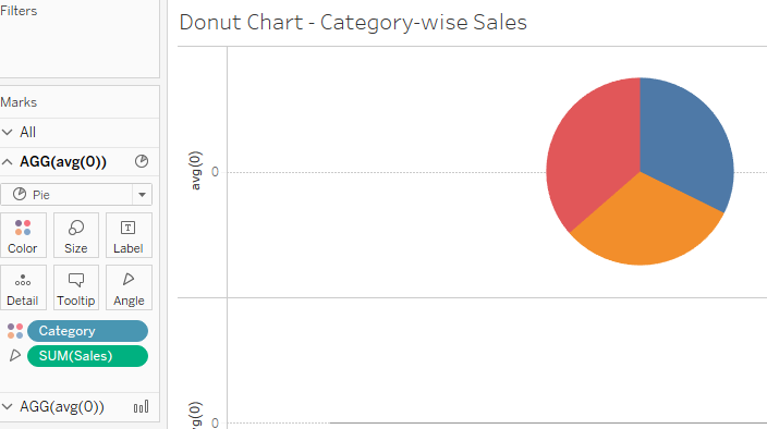
You’ll notice that there are a couple of new additions under the ‘Marks’ card on the left named ‘AGG(avg(0))’. These are the two empty placeholders we created in the first step. Here, click on the first instance.
- Select the pie chart in the drop-down menu
- Drag and drop the ‘Category’ dimension to the Colors card
- Drag and drop the ‘Sales’ dimension to your Angle card
This is what you should have (you can increase the size from the Marks card):
Let’s perform some aesthetic steps to improve our visualization:
- Drag and drop Sales and Category to the Labels card
- Right-click Sales (under the labels option) -> Quick Table Calculation -> Percent of Total
The idea is to show the total share of each category to the total sales value:

Can you see our donut chart taking shape?
Step 3: Working with the Second Feature
Click on the second ‘AGG(avg(0))’ option under the Marks card. Let’s get the second part of our donut chart going:
- Select the Circle chart from the drop-down menu
- Click on the Color card and select white. This will be the hole in our donut chart
- Drag and drop the Sales measure to the Labels card
Step 4: Putting it all together! Our Donut Chart in Tableau
Let’s get everything under the same umbrella. This is where we will combine our two charts using Tableau’s Dual-axis chart feature.
- Right-click on the second instance of ‘AGG(avg(0))’ in the Rows field
- Click on ‘Dual Axis’
- Increase the size of the pie chart and the circle from your Marks card
And voila! Here is your donut chart in Tableau:

Let’s perform a few quick aesthetic changes to make our chart visually appealing:
- Drag and drop all your labels inside the donut chart (just click on each label and drag it)
- In your second ‘AGG(avg(o))’ option under the Marks card on your left, right-click on the Sales measure in the labels and select ‘Format’
- Under the ‘Default’ option, click on the Numbers drop-down and select ‘Currency (Custom)’
- Under the ‘Prefix/Suffix’ option, replace the default sign with $ (or you can keep the default currency if you want)
Here’s how your final donut chart should look in Tableau:
Conclusion
Don’t you love the ease with which we can create a custom chart in Tableau? It takes just a few clicks to assemble a powerful visualization without the need for programming. It’s aesthetically pleasing and makes sense from a business perspective – a win-win!
How would you customize this chart? And what other charts would you want to learn about in Tableau? I look forward to hearing from you in the comments section below.
Frequently Asked Questions
Q1. What is donut chart in tableau?
A. A donut chart in Tableau is a type of data visualization that resembles a pie chart with a hole in the center. It displays data as segmented rings, making visualizing proportions and comparisons within a dataset easy.
Q2. How to make a donut in tableau?
A. To create a donut chart in Tableau, you can follow these steps:
a. Connect your data source.
b. Drag and drop the dimension and measure fields onto the Rows and Columns shelves.
c. Choose the “Pie” chart type.
d. Adjust the “Size” shelf to create a hole in the center to turn it into a donut chart.
Q3. What is a doughnut chart good for?
A. A doughnut chart is useful for displaying data where you want to show the parts’ contribution to the whole while also highlighting the overall composition. It’s good for illustrating percentages and comparing multiple categories with similar data.
Q4. What is the difference between pie chart and donut chart?
A. The main difference between a pie chart and a donut chart is a hole in the center. Pie charts have no hole and display data as a complete circle, while donut charts have a hole in the center, which can be used for additional data or labels. Donut charts are often preferred when you want to display data focusing on the parts’ contribution to the whole while maintaining the overall context.
Senior Editor at Analytics Vidhya.Data visualization practitioner who loves reading and delving deeper into the data science and machine learning arts. Always looking for new ways to improve processes using ML and AI.


For the first time I came to know about the Donut Chart. I have never cared about color matrix. Thanks for helping me understand it.