This article was published as a part of the Data Science Blogathon
Introduction :
As the title suggests, we will be exploring data and analyze Haberman Data set of cancer Survivals in this blog. Exploring data is the first step to draw conclusions on how to approach the objective. Keeping objective in mind one analyses data. Let’s understand what and how data is explored and analyzed.
Data Exploration :
The prerequisite for exploring data is data acquisition.
Steps to be followed before data is acquired :
- Check data availability
- If the data availability is good, In most of the cases data acquired will be in CSV file formats, which can be easy to work.
- If the data availability is not good, data acquisition needs a lot of searching and data cleansing in order to start with data exploration.
- Can the data source be trusted?
- Is there any permission to be taken care of to use the data?
As we’ll explore Haberman Data set of cancer Survivals , Let’s download the Data set using the below link
https://www.kaggle.com/gilsousa/habermans-survival-data-set
With data acquired, we’ll understand the data set using the following metrics
- Number of attributes
- Classify data into Dependent variables/Class attribute and Independent variables/ Features
- Comprehending each attribute
- Data types of each attribute
- Are there any missing attributes
- How relevant/helpful attributes can be in achieving the objective
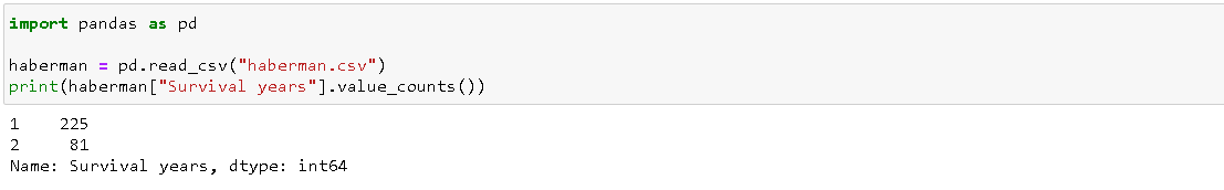
Count of whole instances along the number of attributes with shape method in data frame created using pandas. Names of the columns in the data set can be checked using the columns method in the data frame created using pandas.
Dataset columns and shape
import pandas as pd
haberman = pd.read_csv("haberman.csv")
print(haberman.columns)
print(haberman.shape)
The above code gives us information that the dataset contains and the shape (i.e., no. of instances and no. of columns)

Class attribute/Dependent variable in the data set determines how balanced the data set is. Instances distributed over each class decide the balance of the data set. In this data set, Survival years is the class attribute. For all instances, the value of the Survival years attribute is either 1 or 2.
Determining the survival span, the attribute Survival years is given value as bulleted below
- 1 if survival after the operation is less than 5 years
- 2 if survival after the operation is greater than 5 years
- With more no. of instances on class( 1 ) and class(2) is having instances of almost one by third of the class(1). Classification of a class attribute over whole instances 306 could be seen as :
- 81 in the class(2) i.e., 81 instances are of patients who survived over 5 years after operation and 225 instances are of patients who could not survive over 5 years after the operation
import pandas as pd
import seaborn as sns
import matplotlib.pyplot as plt
import numpy as np
haberman = pd.read_csv("haberman.csv")
print(haberman["Survival years"].value_counts())
Independent variables are used in data analysis and machine learning model training to determine/predict class attribute/s. Data analysis could be progressed on plotting. With univariate/ bivariate and multivariate analysis available, let’s perform and draw conclusions from each analysis
Uni Variate Analysis
Only one variable analysis is concentrated in this analysis. Let’s see the range of one independent variable using histogram and pdf curves(continuous line over histograms)
Distplot function combines kde plot and rug plot functions from the seaborn module for the curve and hist function from matplotlib module for the histogram. Operation Year attribute is plotted against the class attribute, Survival years.
Same graphs can be obtained and the behavior of the independent variable at every instance range as shown in X-axis across class attribute in Y-axis can be understood.
In the below plot, there’s overlapping of Operation Year attribute, this can be said as a grim situation, as this makes classification of Operation Year attribute over class attribute Survival years hard i.e., if Operation Year attribute is distributed evenly against the class attribute, then a range of the distribution would have made classification easy and usable.
Overlapping can be spotted with the different color area, that is not displayed in the legend.
Operation Year independent attribute distribution against Class attribute Survival years
import pandas as pd
import seaborn as sns
import matplotlib.pyplot as plt
import numpy as np
haberman = pd.read_csv("haberman.csv")
sns.FacetGrid(haberman,hue="Survival years",size=12).
map(sns.distplot,"Operation Year").
add_legend()
plt.show()
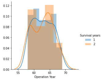
The other two independent variables are distributed in the same style as the Operation Year attribute when tried to classify against class attribute Survival years.
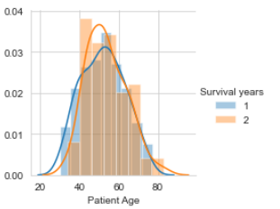
Patient Age Distribution
import pandas as pd
import seaborn as sns
import matplotlib.pyplot as plt
import numpy as np
haberman = pd.read_csv("haberman.csv")
sns.set_style("whitegrid");
sns.FacetGrid(haberman,hue="Survival years",size = 3)
.map(sns.distplot,"Patient Age").
add_legend()
plt.show()
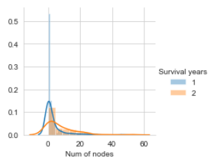
Number of nodes Distribution
import pandas as pd

import seaborn as sns

import matplotlib.pyplot as plt

import numpy as np

haberman = pd.read_csv("haberman.csv")

sns.set_style("whitegrid");

sns.FacetGrid(haberman,hue="Survival years",size = 3)

.map(sns.distplot,"Num of nodes").

add_legend()

plt.show()
CDF of each independent variable against class attribute shows us the distribution across the range of its value, below is the graph that shows CDF.along with its PDF.
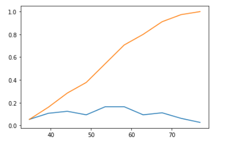
Patient Age CDF and PDF
The orange curve in the graph is CDF(Cumulative Density Function) for Patient Age independent attribute against class attribute Survival years with the class as 1(i.e., patients survived less than 5 years after the operation).
CDF gives information of patient age, such as every patient age is greater than 70, for all patients who could not survive more than 5 years after the operation and half of the patient's age lie between 50 and 60. Blue line in the plot below is PDF shows how patient age is distributed across the age range, with an increase of bins size in the histogram method of NumPy module, PDF is plotted more specifically for all points.
import pandas as pd
import seaborn as sns
import matplotlib.pyplot as plt
import numpy as np
haberman = pd.read_csv("haberman.csv")
haberman_Survival_years = haberman.loc[haberman["Survival years"] == 1]
counts,bin_edges = np.histogram(haberman_Survival_years["Patient Age"], bins = 10, density = True)
pdf = counts/(sum(counts))
cdf = np.cumsum(pdf)
plt.plot(bin_edges[1:],pdf)
plt.plot(bin_edges[1:],cdf)
plt.show()
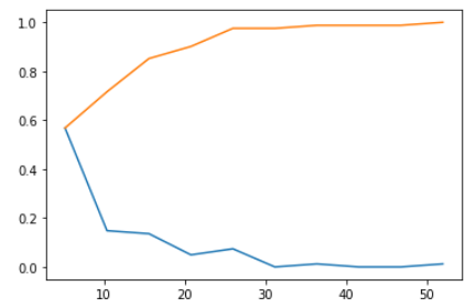
Num of nodes CDF and PDF
The orange curve in the graph is CDF(Cumulative Density Function) for the Number of Nodes independent attribute against class attribute Survival years with the class as 2(i.e., patients survived greater than 5 years after the operation).
CDF gives information of patient age, such as 60 % of patients had less than 10 nodes, for all patients who could survive more than 5 years after the operation and every patient’s number of nodes are between 5 and 55(approximately). Blueline in the plot below is PDF shows how a number of nodes in patients are distributed across the number of nodes range. Blueline(PDF) gives information that no patient survived more than 5 years after an operation who diagnosed with more than 30 nodes.
import pandas as pd
import seaborn as sns
import matplotlib.pyplot as plt
import numpy as np
haberman = pd.read_csv("haberman.csv")
haberman_Survival_years = haberman.loc[haberman["Survival years"] == 2]
counts,bin_edges = np.histogram(haberman_Survival_years["Num of nodes"], bins = 10, density = True)
pdf = counts/(sum(counts))
cdf = np.cumsum(pdf)
plt.plot(bin_edges[1:],pdf)
plt.plot(bin_edges[1:],cdf)
plt.show()
Bi variate Analysis
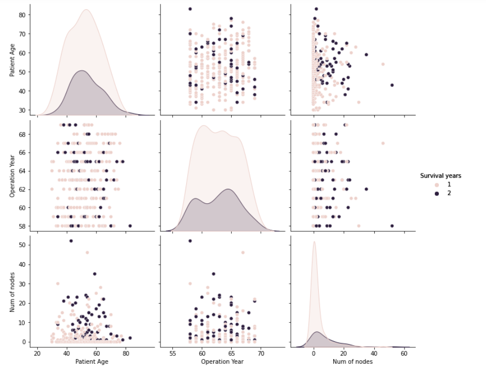
Let’s pair plot, using two variables on each axis and color on the data points to classify the class attribute. Pair plot is a data visualization technique, coloring class attribute with plotting two independent variables in all combinations possible.
The last graph in the pair plot below shows that the number of lymph nodes contributed to deciding class attribute( Survival years ).
The first graph in the pair plot below shows that the older patients are leaning to class1( Survival years after operation 5).
Pair Plots
import pandas as pd

import seaborn as sns

import matplotlib.pyplot as plt

import numpy as np

haberman = pd.read_csv("haberman.csv")

sns.pairplot(haberman, hue="Survival years", size = 3).

add_legend()

plt.show()
Multi-Variate Analysis
Using more than two independent variables in plotting graphs can be hard to visualize, for 3-D analysis link provided below can be used
https://plotly.com/python/3d-scatter-plots/
Observations of EDA
When data is imbalanced and data(independent variables) are not greatly contributing to deciding class attribute better data analysis and visualization techniques are required. Haberman Cancer Survival Dataset is imbalanced and independent attributes relevance to the class attribute is not great when analyzed using the above techniques. Univariate analysis(CDF) provides information about the distribution of attributes across the range for each class in the class attribute, irrespective of how much the dataset is balanced/imbalanced.


