
Introduction
Quite often we have a requirement to visualize categorical data in a dataset. For visualizing such a type of data, there are several different options to choose from like the pie charts, horizontal bar charts (that indicate percentages of the categories), waffle charts, and Venn diagrams, etc. These charts help in displaying the proportions of part-to-whole to the reader.
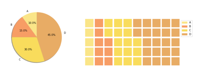
Pie charts and bar charts are generally a staple choice to build categorical visualization as they give an overview of the distribution and are easy to build. On the other hand, waffle charts are eye-catching as we can customize them with icons to build an infographic (chart with icons to display quantitative data). The following pie chart and waffle charts (charts created in Python) show the categorical distribution of four categories (A, B, C, D) respectively.
All these charts are included in most of the Data Analytics/Business Intelligence tools like Power BI, Tableau, Looker, etc., and can be simply built by using a drag and drop method. It is also possible to build these charts in Python as well with a little yet simple coding. Thanks to some amazing open-source Python packages, we can not only build these charts but also customize them.
In this article, we will explore one such chart called ‘Treemap’ for categorical visualization with different ways to build the same chart in Python and a step-by-step tutorial for each option.
What is a Treemap?
A treemap is a special type of chart for visualization using a set of nested rectangles of categorical data that is preferably hierarchical. Treemaps were first used in the 1990s by Professor Ben Shneiderman at the University of Maryland.
In Hierarchical data, the categories or items share parent-child type relationships in an overall tree structure. The simplest example of this type of data structure can be seen in a company where all individuals and their designations within teams could be grouped under one entity i.e., the company itself. However, sometimes, treemaps can also be used with non-hierarchical data. A few examples of these have been mentioned later in this article.
When to use a Treemap?
These are some key points to consider before using treemaps for visualization.
– Treemaps work well when there is a clear ‘Part-to-whole’ relationship amongst multiple categories present in the data.
– Hierarchical Data is needed. This indicates that the data could be arranged in branches and sub-branches. These can then be visualized using rectangles of different dimensions and using more than one color. All this is based on calculated values from the proportions of the quantitative variables.
– The focus is not on precise comparisons between categories but rather on spotting the key factors/trends or patterns.
Benefits of using a Treemap
Treemaps offer some interesting advantages over the regular pie charts and bar charts in certain situations like –
– Space constraint: There is a large amount of hierarchical data that needs to be visualized in a smaller space.
– Easier to read: When compared to a circular multi-level pie chart, the treemap is easier to read due to its linear visual appearance.
– Quickly spot patterns: Since each group is represented by a rectangle and the area of this rectangle is always proportional to its value, trends and patterns (similarities and anomalies) are quickly visible in treemaps.
Few Real-world use cases for Treemap Charts
The treemap chart can be used in different industries but some general use cases (please note all these examples use dummy data to demonstrate the chart applicability) are mentioned below.
1. Displaying region-wise customer complaints about a product
Suppose there are 10 different types of complaints (assume these are denoted as C1 to C10) about a product and the company wants to visualize which complaints are relevant to a region then in such a case a treemap could be used as shown below. Here, it can be clearly seen how different regions have specific types of user complaints.
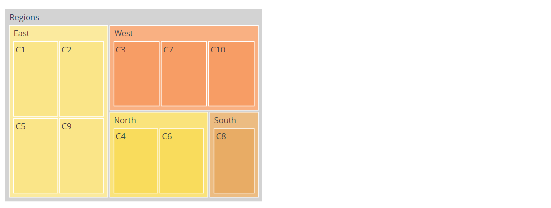
Image source: Author
2. Showcasing category-wise product availability like mobile phones
Let us assume that there are four categories of mobile phones with their market share percentages i.e., Low-end (up to 10,000 INR – 15%), Mid-Range (10,000-25000 INR- 55%), Premium (above 25,000 to 50,000 INR-25%), and Top-end (above 50,000 INR-10%). From this treemap, we can gauge that there is a bigger demand and market for Mid-Range phones while there are limited phones available in the Top-End category.

3. Explore customer segmentation for a product
Usually, companies for apparel or personal products divide their customers based on their age. This way they can categorize their products and the product variants separately for each age group. In the case of this treemap, the company could decide whether to launch more products for particular customer segments based on the distribution.
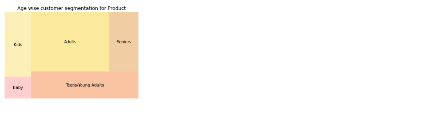
Image source: Author
In all the above charts, the size of each rectangle represents the variable in consideration i.e., sales, complaints, and customer segments (age-groups). Similarly, treemaps could be used for other cases like country-wise distribution of population, country-wise distribution of import-export goods, nationwide insurance policy sales or claims, allocation of budget for marketing or advertising in an organization, etc.
Challenges associated with a Treemap
Treemaps also come with a set of limitations as outlined below-
– Treemaps built with large data points on a single level could be hard to read as well as print for reporting purposes.
– Sometimes, additional sorting might be required to understand the data better. However, all the rectangles are automatically ordered within the parent node by area.
– With too many categories and colors to represent these, the treemap becomes overwhelming for the reader.
– Treemaps become ineffective for datasets with balanced trees i.e., when items are of a similar value. In these cases, the main purpose of a treemap of highlighting the largest item in a given category becomes impossible. In such cases, interactive treemaps are a better choice than static treemaps.
Alternatives to Treemaps
Although treemaps are a good choice for categorical data visualization, sometimes it is important to look for alternatives to treemaps. This is likely when there are simply too many categories to visualize and the focus is more on finding the top ‘n’ categories based on a value or there is simply no hierarchy in the data to be plotted. In such cases, treemaps prove to be difficult to read and ineffective.
A Bar chart can replace a treemap where the data to be plotted has one quantitative and one categorical variable. A Scatter plot could be a replacement where the plotted data has two quantitative variables. For example, to identify products with higher sales volume and profits, a 2D scatter plot is a better option since both variables are quantitative. On the other hand, a bar chart could be a better choice if we only intend to plot sales volume for different products or total revenue.
Tutorial: Building a Treemap in Python
As always, we import pandas and numpy to handle the data points.
import pandas as pd
import numpy as np
import matplotlib.pyplot as plt
Import seaborn as sns
We will generate a small and simple data frame for plotting the treemaps so that it is easier to compare the syntax and look of these plots in different libraries.
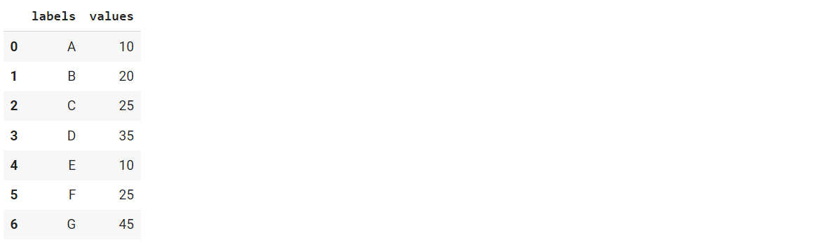
data = {'labels': ["A","B","C","D","E","F","G"],
        'values':[10,20,25,35,10,25,45]}
df = pd.DataFrame(data)
df #print the dataframe
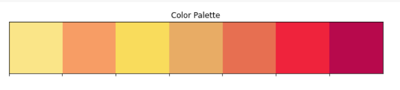
Further, we set the colors for visualization to keep everything consistent. The image below displays the selected colors in order.
colors=['#fae588','#f79d65','#f9dc5c','#e8ac65','#e76f51','#ef233c','#b7094c'] #color palette
Creating a Treemap with Seaborn and Squarify
To build a treemap with Seaborn and Squarify, we first install the Squarify library
pip install squarify
Next, we import the newly installed squarify library
import squarify
sns.set_style(style="whitegrid") # set seaborn plot style
sizes= df["values"].values# proportions of the categories
label=df["labels"]
squarify.plot(sizes=sizes, label=label, alpha=0.6,color=colors).set(title='Treemap with Squarify')
plt.axis('off')
plt.show()
Hit Run to see how the treemap looks-
Python Code:
import pandas as pd
import numpy as np
import matplotlib.pyplot as plt
import seaborn as sns
import squarify

data = {'labels': ["A","B","C","D","E","F","G"],
        'values':[10,20,25,35,10,25,45]}
df = pd.DataFrame(data)

colors=['#fae588','#f79d65','#f9dc5c','#e8ac65','#e76f51','#ef233c','#b7094c'] #color palette

sns.set_style(style="whitegrid") # set seaborn plot style
sizes= df["values"].values# proportions of the categories
label=df["labels"]
squarify.plot(sizes=sizes, label=label, alpha=0.6, color=colors).set(title='Treemap with Squarify')
plt.axis('off')
plt.show()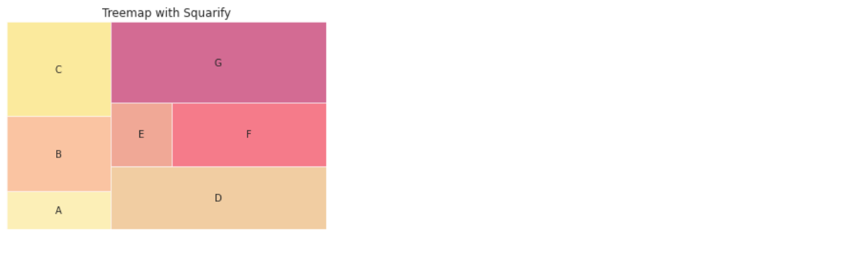
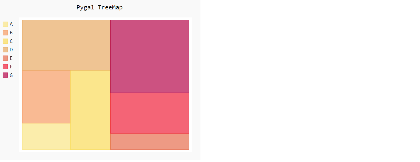
Creating a Treemap with Pygal
To build a treemap with Pygal, let us install the library
pip install pygal
Also use the following command to avoid ModuleNotFoundError: No module named ‘cairosvg’ error.
Since Pygal renders the image as an SVG, we also require a package to convert it to PNG to display. This is what the CairoSVG package does.
pip install CairoSVG
Next, we import the pygal library and style settings from it to customize the colors (already defined earlier) for our visualization.
import pygal
from pygal.style import Style
custom_style = Style(colors=colors) #define colors
Now, we initialize the treemap from Pygal library with custom figure size
treemap = pygal.Treemap(width=500, height=400, explicit_size=True,style=custom_style)  # define size of the treemap
treemap.title = 'Pygal Treemap'
Further, we will pass on the values from our data frame to each rectangle in the treemap.
#Treemap with sample dataframe
treemap.add(df['labels'].iloc[0], df["values"].iloc[0])
treemap.add(df['labels'].iloc[1], df["values"].iloc[1])
treemap.add(df['labels'].iloc[2], df["values"].iloc[2])
treemap.add(df['labels'].iloc[3], df["values"].iloc[3])
treemap.add(df['labels'].iloc[4], df["values"].iloc[4])
treemap.add(df['labels'].iloc[5], df["values"].iloc[5])
treemap.add(df['labels'].iloc[6], df["values"].iloc[6])
treemap #render the treemap
This is how the output looks-
Creating a Treemap with Plotly Express
We start with installing the plotly library using the pip command.
pip install --upgrade plotly #optional command to avoid any version related errors
pip install plotly-express
Now, we import the plotly library and use the following syntax to plot the treemap.
import plotly.express as px
fig = px.treemap(df, path=['labels'],values='values', width=800, height=400)
fig.update_layout(
    treemapcolorway = colors, #defines the colors in the treemap
    margin = dict(t=50, l=25, r=25, b=25))
fig.show()
Here is how the treemap looks –
.png)
The Plotly treemap is interactive and different categories can be clicked to view the details. More information on complex treemaps is available in the official documentation.
Points to Remember
The main purpose of a treemap is to allow the reader to make a generic comparison (not very accurate) between different levels of hierarchical data. When selecting a treemap, one needs to remember that the data needs to be hierarchical in nature for the treemap to be more effective. Next, when there are too many categories, we end up with complex treemaps that become harder to interpret. Hence, treemaps are best replaced by simple bar charts in such cases. Additionally, when using a treemap, it is best to visually separate the different high-level categories as well as select only a few colors for displaying the values with due consideration to color-blind readers (i.e., avoid using reds and greens in a single chart).
Conclusion
Treemaps are an effective way of visualizing categorical data in a small space. In this article, we saw how we can easily build treemaps with Python using three different open-source Python libraries. These are easy to use, even for beginners, and can effectively communicate the ‘Part-to-Whole’ relationship of the categorical variables in a dataset. The treemaps built using Squarify and Pygal are static, while the Plotly treemap is interactive.
I hope you enjoyed reading this article. The code for these treemaps is available on my GitHub repository. Go ahead and explore these treemaps to customize them as per your liking. Also, do try the treemap chart in your next data visualization project.
Author Bio:
Devashree has an M.Eng degree in Information Technology from Germany and a Data Science background. As an Engineer, she enjoys working with numbers and uncovering hidden insights in diverse datasets from different sectors to build beautiful visualizations to try and solve interesting real-world machine learning problems.
In her spare time, she loves to cook, read & write, discover new Python-Machine Learning libraries or participate in coding competitions.
You can follow her on LinkedIn, GitHub, Kaggle, Medium, Twitter.
Devashree has an M.Eng degree in Information Technology from Germany and a Data Science background. As an Engineer, she enjoys working with numbers and uncovering hidden insights in diverse datasets from different sectors to build beautiful visualizations to try and solve interesting real-world machine learning problems.
In her spare time, she loves to cook, read & write, discover new Python-Machine Learning libraries or participate in coding competitions.


