This article was published as a part of the Data Science Blogathon.
Introduction
Customer segmentation is the process by which we divide customers into groups based on common characteristics like demographics (age, gender, income, etc.), geography, psychology, and behavior. The main aim of customer segmentation is to identify different groups of customers so that specific groups can be targeted and marketed with particular plans.
This article will take us through the essential concepts of customer segmentation and RFM analysis. We will learn the step-by-step process of performing RFM analysis in Tableau. We will explore specific tools and functions in Tableau to analyze key customer traits. Ultimately, we will understand how to create customer groups or segments using on transactional data.
So, let’s get started.
What is RFM Analysis?
RFM analysis is a method for customer segmentation that groups customers based on their past purchase behavior. RFM stands for three key customer traits, i.e., Recency of purchase, Frequency of purchase, and Monetary value of purchase.
Recency (R) – Time or days since last purchase or last order
Frequency (F) – Total number of purchases or count of transactions
Monetary value (M) – Total amount spend or average basket size
Frequency and Monetary attributes affect a customer’s lifetime value, and Recency affects retention and the amount of engagement. RFM is popularly used to analyze customer types, especially in the retail industry. For example, people who make frequent purchases on an e-commerce website but of small amounts can be considered high “frequency” but “low-monetary” customers. RFM analysis can help answer critical business questions like who are the best customers, who have the potential to become the best customers, who can contribute to churn, and who respond to a particular marketing campaign.
RFM Analysis in Tableau is an effective way to gain insights into customer behavior. Tableau is helpful to effectively and intuitively get outputs and insights.
Steps to Perform RFM Analysis in Tableau
Step 1: Collecting required data
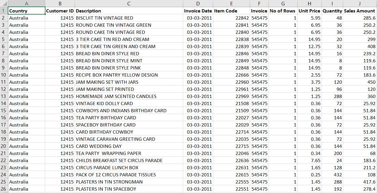
To perform RFM analysis, we will need the customers’ purchase history data. One can get this data from the company’s accounting software, ERP, or transactional database. I have used a random dataset here for demonstration. The link to the dataset is attached. This dataset consists of all the required variables needed to perform RFM analysis like Customer ID, Item Code, Invoice ID, Invoice Date, Unit Price, Quantity, and Sales Amount.
Step 2: Connecting the dataset to Tableau
On opening Tableau, the first page that appears is the data connection page, with options to connect to different data files and databases. We will connect to our required dataset file in this section.
On connecting with the required dataset, Tableau takes us to the Data source page, which shows the different variables in the dataset along with their data types. Here we can switch between the Live connection and Extract option and connect to other datasets to perform Data Modeling using joins and relationships.

Worksheet 1 is where we will start our analysis and make visualizations. Tableau has identified and divided the variables into two categories, i.e., dimensions and measures.
Step 3: Calculating RFM Measures
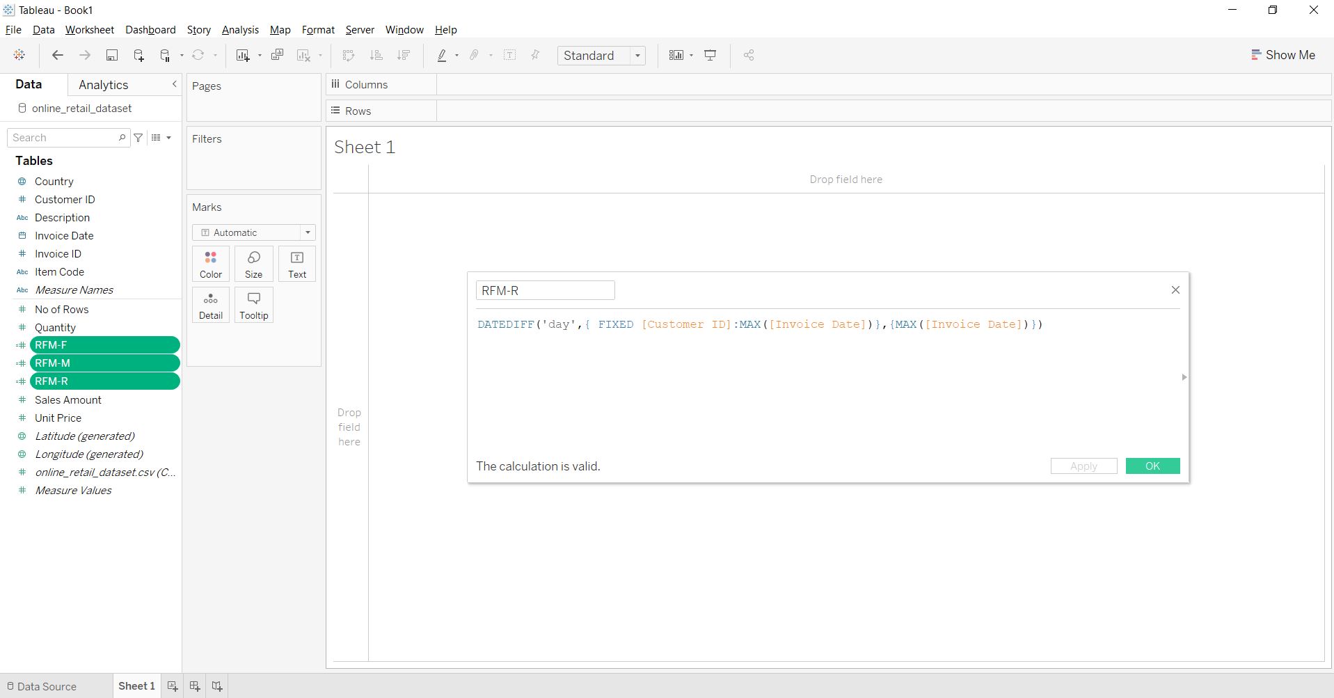
For performing RFM Analysis, we will create three new measures using the “Create Calculation Field” option, namely “RFM-R,” “RFM-F,” and “RFM-M.” RFM-R is the recency attribute calculated using the ‘datediff’ function to calculate the number of days since the most recent purchase or the maximum invoice date for each CustomerID. RFM-F is the purchase frequency attributed calculated using the count of distinct Invoice IDs for each customer ID. RFM-M is the monetary-value attribute computed using the sum of the Sales Amount or the Spend for each customer ID.
RFM-R
DATEDIFF('day',{ FIXED [Customer ID]:MAX([Invoice Date])},{MAX([Invoice Date])})
RFM-F
({ FIXED [Customer ID]:COUNTD([Invoice ID])})
RFM-M
{FIXED [Customer ID]: SUM([Sales Amount])}
Step 4: Calculating RFM Scores
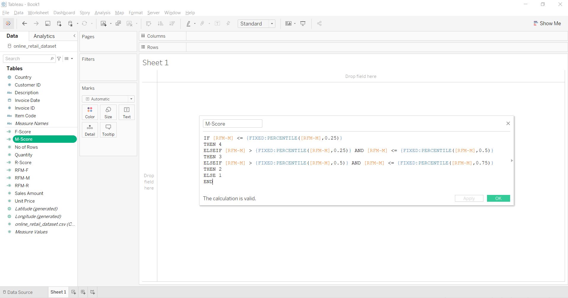
After getting the RFM measures, we will create three new fields, i.e., “R-Score,” “F-Score,” and “M-Score.” Here we are trying to assign a score to each customer ID, from 1 to 4 (where 1 is the best and 4 is the worst) based on the percentile in which their RFM measures fall. For example, a smaller value of RFM-R, i.e., recency, shows that the customer has made the purchase more recently, so all RFM-R values falling in the first 25 percentile are assigned an R-Score of 1, and so on. But, since good customers are expected to make high-value and frequent purchases, for RFM-F and RFM-M, all values falling in the top 75 percentile are assigned a score of 1, and so on. Finally, we will calculate a combined RFM-Score after calculating all three individual scores. These scores will be our basis for segmenting and defining the type of customers.
R-Score
IF [RFM-R] <= {FIXED:PERCENTILE([RFM-R],0.25)}
THEN 1
ELSEIF [RFM-R] > {FIXED:PERCENTILE([RFM-R],0.25)} AND [RFM-R] <= {FIXED:PERCENTILE([RFM-R],0.5)}
THEN 2
ELSEIF [RFM-R] > {FIXED:PERCENTILE([RFM-R],0.5)} AND [RFM-R] <= {FIXED:PERCENTILE([RFM-R],0.75)}
THEN 3
ELSE 4
END
F-Score
IF [RFM-F] <= {FIXED:PERCENTILE([RFM-F],0.25)}
THEN 4
ELSEIF [RFM-F] > {FIXED:PERCENTILE([RFM-F],0.25)} AND [RFM-F] <= {FIXED:PERCENTILE([RFM-F],0.5)}
THEN 3
ELSEIF [RFM-F] > {FIXED:PERCENTILE([RFM-F],0.5)} AND [RFM-F] <= {FIXED:PERCENTILE([RFM-F],0.75)}
THEN 2
ELSE 1
END
M-Score
IF [RFM-M] <= {FIXED:PERCENTILE([RFM-M],0.25)}
THEN 4
ELSEIF [RFM-M] > {FIXED:PERCENTILE([RFM-M],0.25)} AND [RFM-M] <= {FIXED:PERCENTILE([RFM-M],0.5)}
THEN 3
ELSEIF [RFM-M] > {FIXED:PERCENTILE([RFM-M],0.5)} AND [RFM-M] <= {FIXED:PERCENTILE([RFM-M],0.75)}
THEN 2
ELSE 1
END
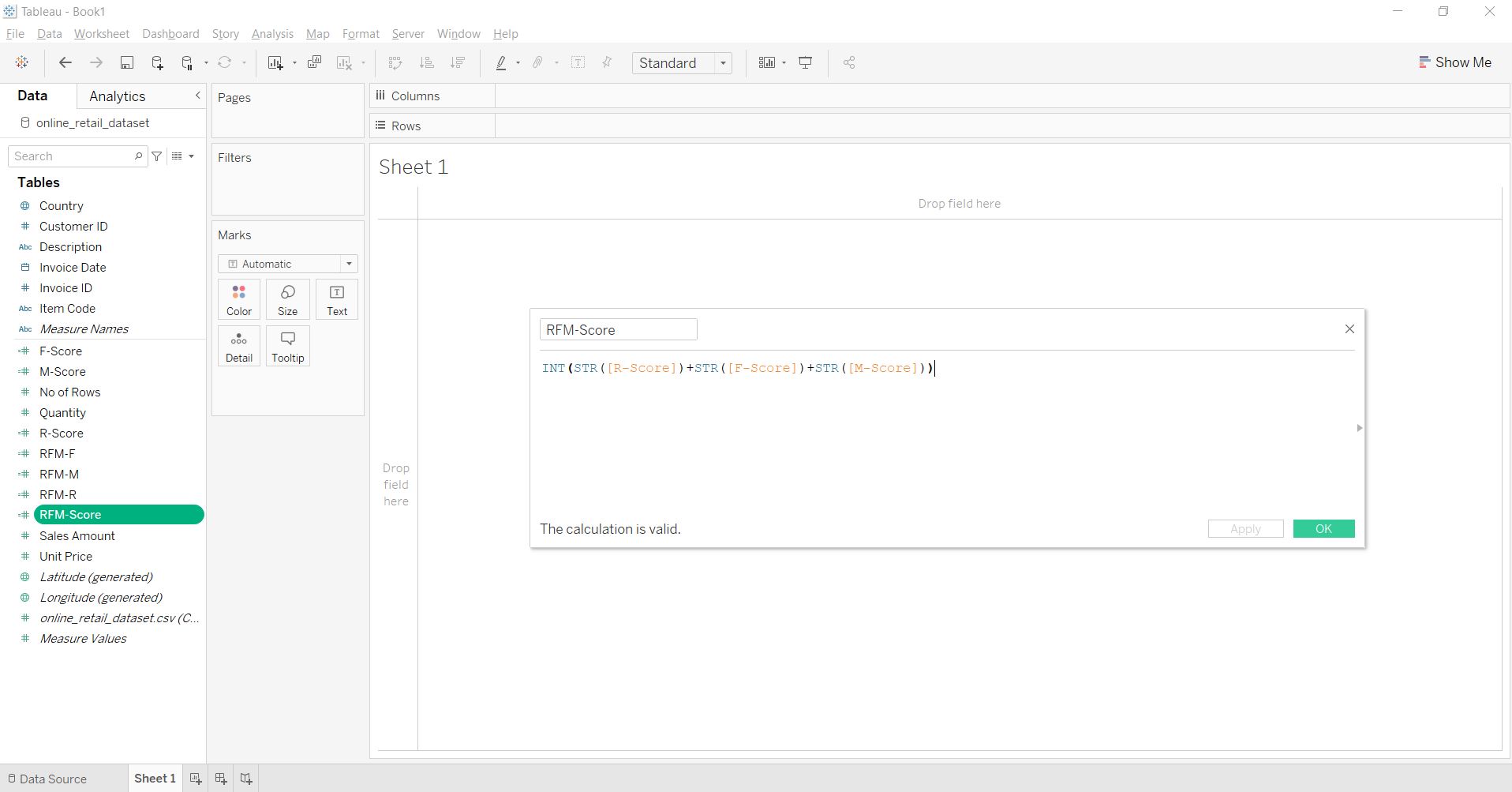
RFM-Score
INT(STR([R-Score])+STR([F-Score])+STR([M-Score]))
Step 5: Creating RFM Segments
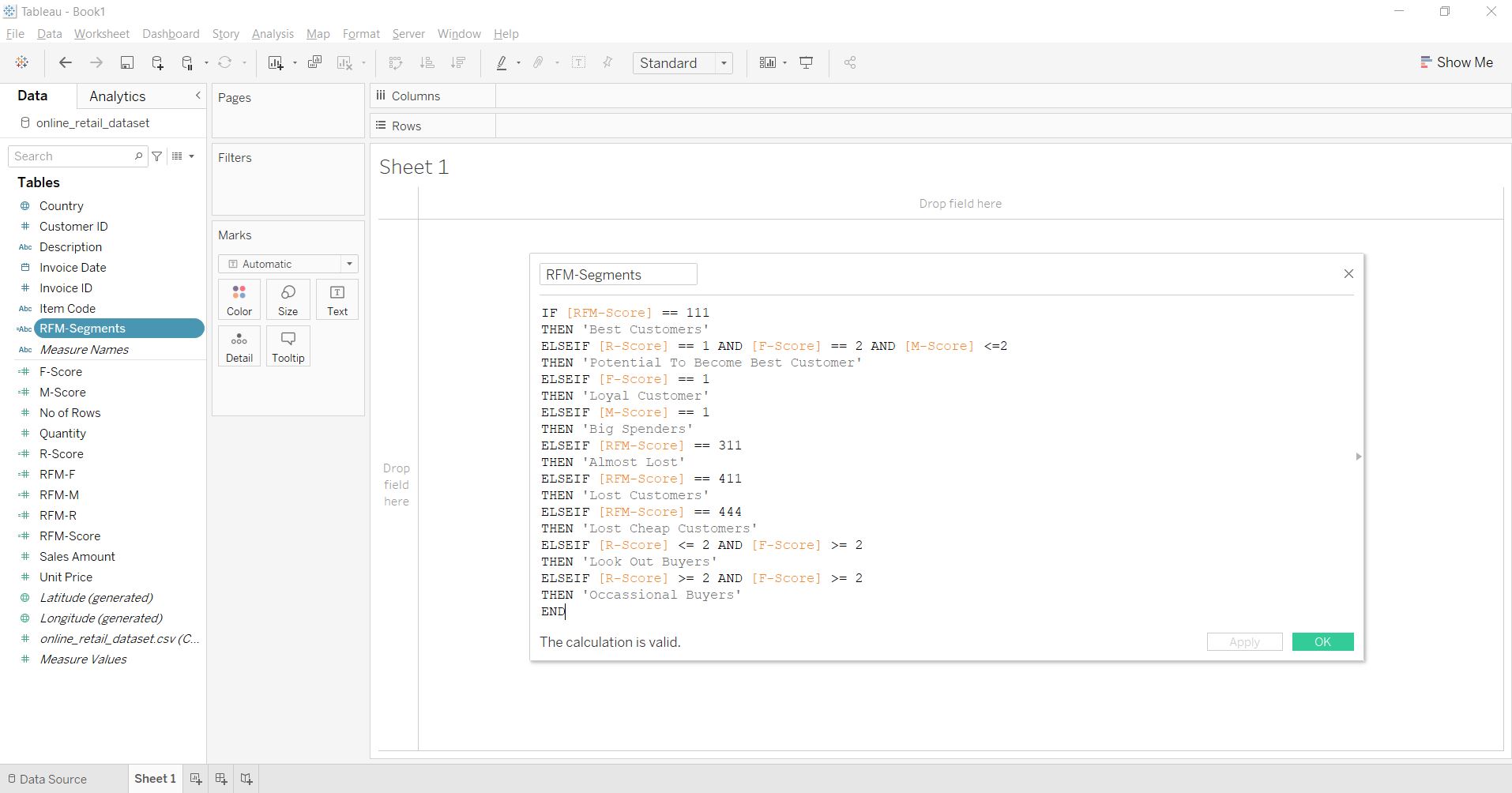
We will create a new calculation field, “RFM-Segments.” With a series of if-else statements in the calculation field, we will categorize the customers based on the combination of different RFM scores we calculated in the last step. For example, if all three R, F, and M-Scores are equal to 1 for a customer, then that customer is considered the “Best Customer,” and if all three R, F, and M-Scores are equal to 4, then that customer is regarded as the “Lost Cheap Customer.” It is easy to understand the logic behind the terminology of customer groups. Here, we have defined nine customer groups, i.e., Best, Potential to become Best, Loyal, Big Spenders, Almost Lost, Lost, Lost Cheap, Look Out Buyers, and Occasional Buyers.
RFM-Segments
IF [RFM-Score] == 111

THEN 'Best Customers'

ELSEIF [R-Score] == 1 AND [F-Score] == 2 AND [M-Score] <=2

THEN 'Potential To Become Best Customer'

ELSEIF [F-Score] == 1

THEN 'Loyal Customer'

ELSEIF [M-Score] == 1

THEN 'Big Spenders'

ELSEIF [RFM-Score] == 311

THEN 'Almost Lost'

ELSEIF [RFM-Score] == 411

THEN 'Lost Customers'

ELSEIF [RFM-Score] == 444

THEN 'Lost Cheap Customers'

ELSEIF [R-Score] = 2

THEN 'Look Out Buyers'

ELSEIF [R-Score] >= 2 AND [F-Score] >= 2

THEN 'Occasional Buyers'

END
Step 6: Visualization and Reporting
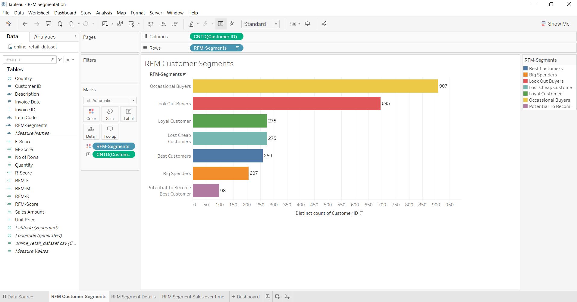
Now, since we have created all the attribute measures and customer groups, we can move on to analyze them with the help of different visualizations. As the first visualization, we will create a bar chart showing the count of customers in every group. To make this visual, we need to drag RFM-Segments into rows and CustomerID into columns, then convert its Measure type into a distinct count.
The chart gives an idea about the strength of the customer group in terms of customer counts. Here we can see that Occasional and Lookout buyers who purchase occasionally or during a special deal comprise the most prominent groups.
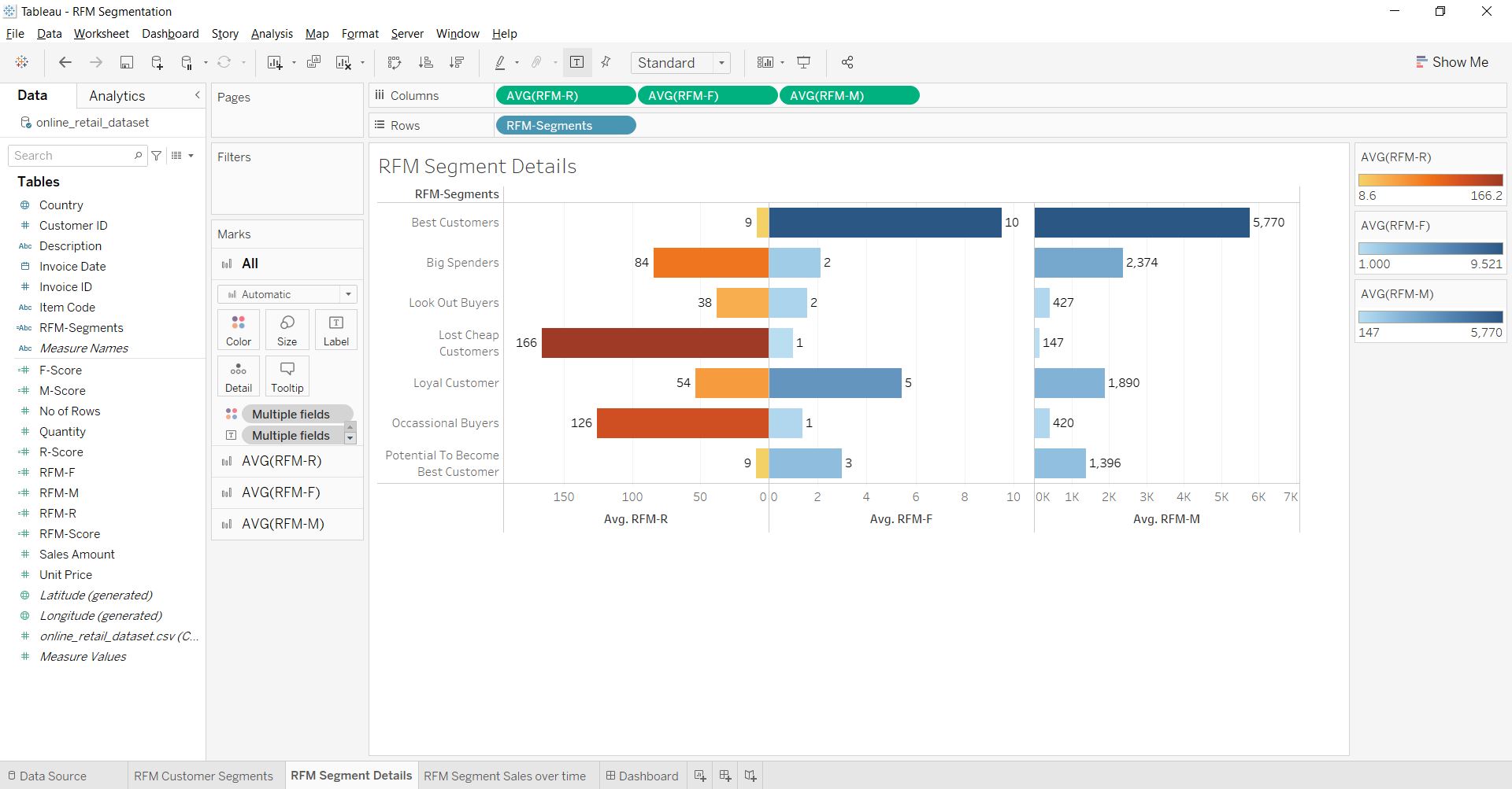
We will analyze the customer groups based on their average RFM scores in the second visual. For this, we need to drag RFM-Segments into rows and RFM-R, RFM-F, and RFM-M into columns, followed by right-clicking on them and converting their Measure type into Average. The bar chart provides us with many insights into each customer group. For example, Best Customers spend an average amount of 5770, have made ten average purchases, and their last purchase was around nine days ago.
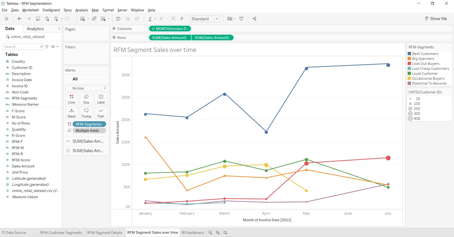
We can analyze each customer group’s monthly sales trend through a third visual. We need to drag the Invoice Date into columns and then right-click it and change its level of granularity from Year to Month-Year. Further, we need to drag the Sales Amount into rows twice and change the shape of the second visual from a Line to a Circle and drag the CustomerID into size, so the size of each circle-point will represent the count of customers. Finally, we can visualize the line and circle on a common axis using the Dual Axis option. Through this visual, we can notice trends such as the spending of the “Best customers” increasing from April to May. Similarly, the spending of the “Potential to Become Best customers” has risen since May, and the count of “Look Out Buyers” is growing. But both the amount spend and the count of “Loyal customers” are dropping.
We can create many other charts and visuals to analyze customer groups further. For example, we can create a tabular chart to showcase each customer with their RFM Scores through which we can target unique customers. Finally, we can combine all the charts in the dashboard tab and share them in a Tableau report.
Conclusion
This article gave us a basic understanding of customer segmentation and how to perform it using RFM analysis.
Key Takeaways:
1. We learned to analyze the transactional data variables used to perform customer segmentation based on customer purchase behavior.
2. We learned how to measure the three purchase behavior attributes, i.e., recency of purchase, Frequency of purchase, and monetary value of purchase.
3. We learned the calculation and logic behind RFM-Scores.
4. We learned how to create and name different customer groups based on their RFM scores.
5. We explored different features, functions, and visualizations in Tableau to analyze the customer groups.
The media shown in this article is not owned by Analytics Vidhya and is used at the Author’s discretion.
I am an MBA (Business Analytics) student. Highly enthusiastic about learning Machine learning and its use case across industries. I strongly believe in knowledge sharing and follow the same through my articles on Analytics Vidhya.


What a great article! ” Your information is very helpful. Keep sharing.
what about case 144,134,133,123,132 - 'others'? can you mark them somehow?
why R-Score calculation is 1-2-3-4 and not 4-3-2-1? are they the same everywhere else?