Understanding the distribution of data is one of the most important aspects of performing data analysis. Visualizing the distribution helps us understand the patterns, trends, and anomalies that might be hidden in raw numbers. While histograms are often used for this purpose, they sometimes can be too blocky to show some subtle details. Kernel Density Estimation (KDE) plots provide a smoother and more accurate way to visualize continuous data by estimating its probability density function. This allows data scientists and analysts to see important features such as multiple peaks, skewness, and outliers more clearly. Learning to use KDE plots is a valuable skill for better understanding data insights. In this article, we’ll go over KDE plots and their implementations.
Table of contents
What are Kernel Density Estimation (KDE) Plots?
Kernel Density Estimation (KDE) is a non-parametric method for estimating the probability density function (PDF) of a continuous random variable. Simply speaking, KDE makes a smooth curve (density estimate) which approximates the distribution of data, rather than using separated bins like in a histogram. Concept-wise, we have a “kernel” (a smooth and symmetric function) on each data point and add them up to form a continuous density. Mathematically, if we have data points x1,…,xn, then the KDE at a point x is:

Where K is the kernel (mostly a bell kind of function) and h is the bandwidth (a smoothness parameter). Since no fixed form like “normal” or “exponential” is taken for the distribution, KDE is called a non-parametric estimator. KDE “smooths a histogram” by turning each data point into a small hill; all these hills together make the total density (as can be seen from the following diagram).

Different kinds of kernel functions are used according to the use case. For example, the Gaussian (or normal) kernel is popular because of its smoothness, but others like Epanechnikov (parabolic), uniform, triangular, biweight, or even triweight can also be used. By default, many libraries go with a Gaussian kernel, meaning every data point gives a bell-shaped bump to the estimate. Epanechnikov kernel minimises the mean squared error between all, but still, the Gaussian is often picked just for convenience.
Density plots are super helpful in analysing data to show the shape of a distribution. They work well for big datasets and can show things (like multiple peaks or long tails) that a histogram might hide. For example, KDE plots can catch bimodal or skewed shapes that tell you about sub-groups or outliers. When exploring a new numeric variable, plotting KDE is often one of the first things people do. In some areas (like signal processing or econometrics), KDE is also called the Parzen-Rosenblatt window method.
Important Concepts
Here are the key things to keep in mind when understanding how KDE plot works :
- Non-parametric PDF estimation: KDE does not assume the underlying distribution. It builds a smooth estimate directly from the data.
- Kernel functions: A kernel K (e.g., Gaussian) is a symmetric weighting function. Common choices include Gaussian, Epanechnikov, uniform, etc. The choice has a small effect on the result as long as the bandwidth is adjusted.
- Bandwidth (smoothing): The parameter h (or, equivalently, bw ) scales the kernel. Larger h yields smoother (wider) curves; smaller h yields tighter, more detailed curves. The optimal bandwidth often scales like n−1/5.
- Bias-variance tradeoff: A key consideration is balancing detail vs. smoothness: too small h leads to a noisy estimate; too large h can oversmooth important peaks or valleys.
Using KDE Plots in Python
Both Seaborn (built on Matplotlib) and pandas make it easy to create KDE plots in Python. Now, I will be showing some usage patterns, parameters, and customisation tips.
Seaborn’s kdeplot
First, use seaborn.kdeplot function. This function plots univariate (or bivariate) KDE curves for a dataset. Internally, it uses a Gaussian kernel by default and supports many other options. For example, to plot the distribution of the sepal_width variable from the Iris dataset.
Univariate KDE Plot Using Seaborn (Iris Dataset Example)
The following example demonstrates how to create a KDE plot for a single continuous variable.
import seaborn as sns

import matplotlib.pyplot as plt

# Load example dataset

df = sns.load_dataset('iris')

# Plot 1D KDE

sns.kdeplot(data=df, x='sepal_width', fill=True)

plt.title("KDE of Iris Sepal Width")

plt.xlabel("Sepal Width")

plt.ylabel("Density")

plt.show()
From the previous image, we can see a smooth density curve of the speal_width values. Also, the fill=True argument shapes the area under the curve, and if it is fill = False, only the dark blue line would have been visible.
Comparing KDE plots across Categories
So far, we have seen simple univariate KDE plots. Now, let’s see one of the most powerful uses of Seaborn’s kdeplot method, which is its ability to compare distributions across subgroups using the hue parameter.
Let’s say we want to analyse how the distribution of total restaurant bills differs between lunch and dinner times. So, for this, let’s use the tips dataset. With this, we can overlay two KDE plots, one for Lunch and one for Dinner, on the same axes for direct comparison.
import seaborn as sns

import matplotlib.pyplot as plt

tips = sns.load_dataset('tips')

sns.kdeplot(data=tips, x='total_bill', hue='time', fill=True,

common_norm=False, alpha=0.5)

plt.title("KDE of Total Bill (Lunch vs Dinner)")

plt.show()
So we can see that the above code overlays two density curves. The fill=True shades under each curve to make the difference more visible, common_norm= False makes sure that each group’s density is scaled independently, and alpha=0.5 adds transparency so the overlapping regions are easy to interpret.
You can also experiment with multiple=‘layer’, ‘stack’, or ‘fill’ to change how multiple densities are shown.
Pandas and Matplotlib
If you are working with pandas, you can also use built-in plotting to get KDE plots. A pandas series has a plot(kind=’density’) or plot.density() method that acts as a wrapper for the relevant methods in Matplotlib.
Code:
import pandas as pd

import numpy as np

data = np.random.randn(1000) # 1000 random points from a normal distribution

s = pd.Series(data)

s.plot(kind='density')

plt.title("Pandas Density Plot")

plt.xlabel("Value")

plt.show()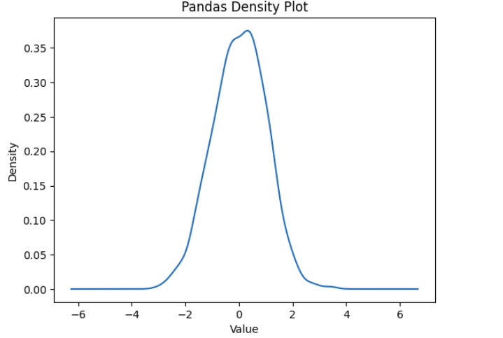
Alternatively, we can compute and plot KDE manually using SciPy’s gaussian_kde method.
import numpy as np

from scipy.stats import gaussian_kde

data = np.concatenate([np.random.normal(-2, 0.5, 300), np.random.normal(3,

1.0, 500)])

kde = gaussian_kde(data, bw_method=0.3) # bandwidth can be a factor or

'silverman', 'scott'

xs = np.linspace(min(data), max(data), 200)

density = kde(xs)

plt.plot(xs, density)

plt.title("Manual KDE via scipy")

plt.xlabel("Value"); plt.ylabel("Density")

plt.show()
The above code creates a bimodal dataset and estimates its density. In practice, using Seaborn or pandas for achieving the same functionality is much easier.
Interpreting KDE Plot or Kernel Density Estimator plot
Reading a KDE plot is similar to a histogram, but with a smooth curve. The height of the curve at a point x is proportional to the estimated probability density there. The area under the curve over a range corresponds to the probability of landing in that range. Because the curve is continuous, the exact value at any point is not as important as the overall shape:
- Peaks (modes): A high peak indicates a common value or cluster in the data. Multiple peaks suggest multiple modes (e.g., mixture of sub-populations).
- Spread: The width of the curve shows dispersion. A wider curve means more variability (larger standard deviation), while a narrow, tall curve means the data is tightly clustered.
- Tails: Observe how quickly the density tapers off. Heavy tails imply outliers; short tails imply bounded data.
- Comparing curves: When overlaying groups, look for shifts (one distribution systematically higher or lower) or differences in shape.
Use Cases and Examples
KDE plots have many useful applications in day-to-day data analysis:
- Exploratory Data Analysis (EDA): When we first look at a dataset, KDE helps us see how the variables are distributed, whether they look normal, skewed, or have more than one peak(multimodal). As we all know that checking the distribution of your variables one by one is probably the first task you should do when you get a new dataset. KDE, being smoother than histograms, is often more helpful when trying to get a feel of the data during EDA.
- Comparing distributions: KDE works well when we want to compare how different groups behave. For example, plotting the KDE of test scores for boys and girls on the same axis shows if there’s any difference in average or variation. Seaborn makes it super easy to overlay KDE using different colours. KDE plots are usually less messy than side-by-side histograms, and they give a better sense of how the groups differ.
- Smoothing histograms: KDE can be thought of as a smoother version of a histogram. When histograms look too choppy or change a lot with bin size, KDE gives a more stable and clear picture. For instance, the Airbnb price example above could be shown as a histogram, but KDE makes it much easier to interpret. KDE helps create a more continuous estimate of the data’s shape, which is very handy, especially when the data isn’t too large or too small.
Alternatives to Kernel Density Plots
So, while KDE plots are super useful for showing smooth estimates of a distribution, they are not always the best thing to use. Depending on the data size or what exactly you are trying to do, there are other types of plots you can try, too. Here are a few common ones:
Histograms
Honestly, the most basic way to look at distributions. You just chop the data into bins and count how many things fall in each. Easy to use, but can get messy if you use too many bins or too few. Sometimes it hides patterns. KDE kind of helps with that by smoothing the bumps.

Box Plots(also called box-and-whisker)
These are good if you just wanna know, like where most of the data is, you get the median, quartiles, etc. It’s fast to spot outliers. But it doesn’t really show the shape of the data like KDE does. Still useful when you don’t need every detail.

Violin Plots
Think of these like a fancy version of box plots that also shows the KDE shape. It’s like the best of both, you get summary stats and a sense of distribution. I use these when comparing groups side by side.

Rug Plots
Rug plots are simple. They just show each data point as small vertical lines on the axis. Often, along with KDE, to show where the real data points are. But when you have too much data, it can look kind of messy.

Histogram + KDE Combo
Some people like to combine a histogram with KDE, as a histogram shows the counts and KDE adds a smooth curve on top. This way, they can see both raw frequencies and the smoothed pattern together.

Honestly, which one you use just depends on what you need. KDE is great for smooth patterns, but sometimes you don’t need all that; maybe a simple box plot or histogram says enough, especially if you are short on time or just exploring stuff quickly.
Conclusion
KDE plots offer a powerful and intuitive way to visualize the distribution of continuous data. Unlike normal histograms, they give a smooth and continuous curve by estimating the probability density function with the help of kernels, which makes subtle patterns like skewness, multimodality, or outliers easier to notice. Whether you are doing Exploratory Data Analysis, comparing distributions, or finding anomalies, KDE plots are really helpful. Tools like Seaborn or pandas make it quite simple to create and use them.
Hi, I am Janvi, a passionate data science enthusiast currently working at Analytics Vidhya. My journey into the world of data began with a deep curiosity about how we can extract meaningful insights from complex datasets.


