Introduction
We are currently in the midst of a global fitness revolution. Most of the people I know are geeking out over the latest gadget in the market that will help them achieve their fitness goals. My focus, however, is slightly different. I can’t help it – I’m a data scientist after all!
All these fitness trackers, bands, even our smartphones – they all store our health data via certain applications, like Healthkit on iOS, Google Fit on Android, etc. We are literally a few touches away from accessing our health data – distance covered, steps-taken, calories burned, heart rate, etc.

Now, I wanted to analyze certain trends in my fitness level. The applications I have don’t quite offer that depth or level of analysis. So I turned to the one thing I love – data visualization in R. I could easily extract this data from the apps and perform all sorts of analysis in R, including building animated plots.
That’s right – I used my health data and analyzed all sorts of metrics using really cool animated plots in R! And in this article, I will show how you can easily make these plots using just a few lines of R code.
Table of Contents
I have written this article in a step-by-step manner. My recommendation would be to follow the sequence mentioned below:
- Extracting the Health Data from your Fitness app
- Importing the XML Data File into R
- Pre-processing our Health Data
- Drawing up our Hypothesis
- Exploring the Health Data
- Building Cool Animated Plots in R
Extracting the Health Data from your Fitness App
I’m an iOS aficionado so I used the HealthKit app on my device to store my health data. You can follow the below steps to export your data:
- Open the Health app on your iPhone
- Click on ‘user’
- Click on ‘Export health data’ and email it to yourself (or choose whichever option is most convenient)
Voila! You will receive a zip file containing XML objects. Download and read it into your R console (discussed in the next section).
Android users can also extract their health data but the steps will be a little different. Follow the steps mentioned in this link export your health data from the Google Fit app.
Importing the XML Data File into R
Once you have downloaded your health data, you need to import it using an R-friendly format. Use the below code block to read the XML file:
Note: Install the ‘XML’ package first from the CRAN repository if you haven’t done so already.
Pre-processing our Health Data
We’ll have to transform a few variables and add new features before we can prepare visualizations and build our dashboard. This will help us in easily subsetting and preparing intuitive plots. We’ll be using the date column to add new columns like years, month, week, hour, etc.
For this, we require the ‘lubridate’ package in R. I personally love this package – it is very useful when we’re dealing with date and time data.
Now, let’s look at the structure of the cleaned and sorted data:
Output:
'data.frame':	422343 obs. of  14 variables:
 $ type         : Factor w/ 12 levels "HKQuantityTypeIdentifierActiveEnergyBurned",..: 9 4 7 7 7 7 7...
 $ sourceName   : Factor w/ 3 levels "Health","Mukeshâ\200\231s Apple Watch",..: 1 1 2 2 2 2 2 2 2...
 $ sourceVersion: Factor w/ 22 levels "10.3.3","11.0.1",..: 1 1 17 17 17 17 17 17 17 17 ...
 $ unit         : Factor w/ 8 levels "cm","count","count/min",..: 1 5 3 3 3 3 3 3 3 3 ...
 $ creationDate : Factor w/ 167201 levels "2017-08-18 19:33:16 +0530",..: 8 8 2450 2452 2464 2472 ...
 $ startDate    : Factor w/ 361820 levels "2017-08-18 18:30:27 +0530",..: 27 27 9642 9647 9655 9664...
 $ endDate      : POSIXct, format: "2017-08-19 10:34:01" "2017-08-19 10:34:01" "2018-05-01 08:24:12"...
 $ value        : num  163 79 83 82.1 83 ...
 $ device       : Factor w/ 102050 levels "<<HKDevice: 0x283c00dc0>, name:Apple Watch, manufacturer:Apple,...
 $ month        : chr  "08" "08" "05" "05" ...
 $ year         : chr  "2017" "2017" "2018" "2018" ...
 $ date         : chr  "2017-08-19" "2017-08-19" "2018-05-01" "2018-05-01" ...
 $ dayofweek    : Ord.factor w/ 7 levels "Sunday"<"Monday"<..: 7 7 3 3 3 3 3 3 3 3 ...
 $ hour         : chr  "10" "10" "08" "08" ...
Quite a lot of observations for us to begin our analysis. But what’s the first thing a data scientist should do before anything else? Yes, it is necessary to set your hypothesis first.
Drawing up our Hypothesis
Our aim here is to use the readily available health-app data to study and answer the below pointers:
- Average steps, heart-rate, distance covered, flights climbed
- Which months in each year have been really strenuous in terms of step counts and flights climbed?
- Comparative study of the step-counts, calories burned, distance covered from the previous months
- A weekly breakdown of the step-counts to check for dominant days in a month
- Are there any outliers?
- How does the activity compare on weekdays and weekends?
- Does the subject transition to a healthy lifestyle after a certain period?
Any other you can think of? Let me know and we can add that into the final analysis!
Exploring the Health Data
Let’s look at what kind of observations were stored by the Apple Watch, the fitness band, and the health app:
Output:
HKQuantityTypeIdentifierActiveEnergyBurned              HKQuantityTypeIdentifierAppleExerciseTime
                                          220673                                             6905
       HKQuantityTypeIdentifierBasalEnergyBurned                 HKQuantityTypeIdentifierBodyMass
                                           47469                                                1
  HKQuantityTypeIdentifierDistanceWalkingRunning           HKQuantityTypeIdentifierFlightsClimbed
                                           48447                                             7822
               HKQuantityTypeIdentifierHeartRate HKQuantityTypeIdentifierHeartRateVariabilitySDNN
                                           45371                                              567
                  HKQuantityTypeIdentifierHeight         HKQuantityTypeIdentifierRestingHeartRate
                                               1                                              313
               HKQuantityTypeIdentifierStepCount  HKQuantityTypeIdentifierWalkingHeartRateAverage
                                           44575                                              199
We have sufficient observations under each type. We will narrow down our focus to a few important variables in the next section.
But first, begin by installing and importing a few important libraries that will help us in subsetting the data and generating plots:
Preparing our Personalized Fitness Tracker Dashboard
The wait is over! Let’s begin preparing our dashboard to create intuitive and advanced visualizations. We are primarily interested in the following metrics:
- Heart rate
- Steps count
- Active energy burned
- Stairs climbed
- Distance covered
Let’s take them up one by one.
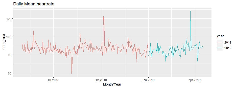
Heart Rate
Easily the most critical metric in our dataset.
Let’s look at the heart rate since I started using these fitness tracking devices. We will group the mean values of the heart rate by date, month and year. You can do this using the following code block:
Output:
head(heart_rate)
# A tibble: 6 x 4
# Groups:   date, year [6]
  date       year  month heart_rate
  <date>     <chr> <chr>      <dbl>
1 2018-05-01 2018  05          92.8
2 2018-05-02 2018  05          85.3
3 2018-05-03 2018  05          86.0
4 2018-05-04 2018  05          84.2
5 2018-05-05 2018  05          85.2
6 2018-05-06 2018  05          93.5
Having too many dates on the X-axis will look haphazard. So, scale the X-axis by just representing the month and year:
Output:
Nice! This is a good start. Let’s take things up a notch, though. Yes, I’m talking about animated plots in R!
You must have come across animated plots on social media. I certainly can’t scroll by without seeing one or two of those. How about we create an animated plot ourselves? We’ll be needing the ‘gganimate’ package for this:
Output:

Looks cool, right? We got a really “good looking” plot using just one line of code.
Now, we know that the normal resting heart-rate should be somewhere between 60-100 bpm and the normal active heart-rate should be between 100-120 bpm.
There have been times when the heart rate has crossed these boundaries. It could potentially be that there was some extra activity done on those days. Could be data points be outliers? Let’s look at the median heart-rate values to figure this out:
Output:

Some of the spikes still remain prominent. This could be due to an increased number of steps or stairs climbed.
That naturally leads us into the next metric of our health data.
Step Count
Many recent studies reveal that you need to take a certain amount of steps per day to stay healthy. For the purposes of our project here, we’ll assume the below categories apply:
- Less than 5,000 steps a day – sedentary
- Between 5,000-7,500 – low on activity
- Between 7,500 and 10,000 – somewhat active
- More than 10,000 – really active
Please note that this categorization is entirely for the sake of our study and not recommended by any medical professional.
So, let’s create a plot that shows us the total number of steps taken every day per year:
Output:

That’s a bit of an eye-opener for me. This plot shows I was “somewhat active” till May 2018 and then started taking more steps daily. An increasing trend is clearly visible.
But there is a decrease post-February 2019. I wanted to dig a little deeper to understand this at a more granular level.
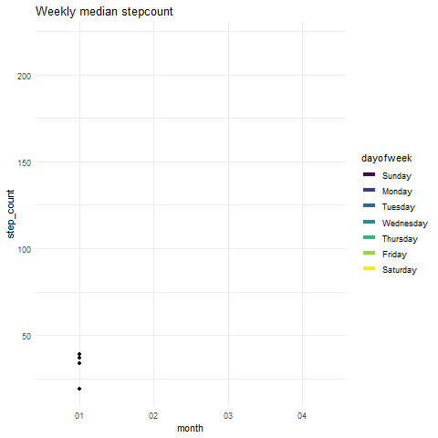
So, I created a plot that summarises the weekly step count. Since we see an abnormal hike in 2019, let’s look at the weekly median step count:
Output:

We can see that the median number of steps for all days is pretty much the same. So we can safely say there are some outliers present in the step count data. Instead of plotting the median, you can plot mean counts. This will show you that one of the Thursdays has an extremely high observation.
Time to animate our plot:
Output:
Lovely! Let’s move on to the next health metric.
Active energy burned
I feel this is an underrated metric in our fitness trackers. We tend to focus on the number of steps we walked to see if we covered enough ground. What about the calories we burned? That’s a pretty interesting metric if you ask me.
We will again create a time series plot that will show us the total calories burned daily:
Output:
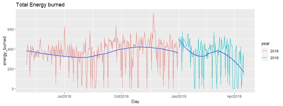
A good amount of active calories have been burnt on most days. The range falls between 400-600 kcal daily. But there are a number of observations where the calories burnt are between 0-200 kcal.
So, in order to transition to a healthier lifestyle, I should burn about 500 calories every day in order to lose 1 pound in a week.
There is a sharp decline towards the end of our plot due to an inadequate number of observations for April 2019.
What else can we do with this data? To understand which days require more physical activity to burn the required amount of calories, we can draw up a heatmap. Let’s do this in a way such that every day of every month is taken into account.
Output:

The above plot can easily be interpreted in the following way:
On Sunday, in the first week of the 5th month (in 2018), the calories burned are close to 200. That’s quite low compared to our given aim. The activity looks quite good overall, except on Sundays. That’s pretty relatable, right?
We can animate such heatmaps or color density plots using the ‘transition_states()’ function in the ‘gganimate’ package:
Look at this cool visualization:
Output:
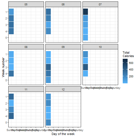
Looks perfect! No surprise to see that there is significantly less energy being burned on weekends as compared to weekdays.
Stairs Climbed
This is a unique metric. A few people I know run up and down stairs to build up their fitness. I certainly don’t do that but let’s see what we can squeeze out of this data.
For each year, we will aggregate the total number of stairs climbed in a month. Then we’ll plot a bar chart which compares the flights climbed from the previous year:
Output:
 Anything that jumps out at you? The maximum number of stairs climbed is in September and November 2018. There’s a logical explanation to that – I was part of the organizing team at a conference. Hence, the spike in the data.
Now here, we can correlate our findings with the burned energy plot we saw earlier. We saw a decreasing trend in the energy burned in 2019, right? Notice how the number of stairs climbed is decreasing in 2019. That’s partly down to inadequate data again in April 2019.
Animating this plot is as easy as before, come on let’s give it a try!
Output:

Distance Covered
Using the above method, we can again aggregate the distance traveled (in kilometers) for different months corresponding to their respective years:
Output:
 As expected, the distance traveled in November 2018 really stands out. There’s a lot of insight to be gained from each plot we’ve generated in this article. This has been quite a fun journey for me!
Lastly, another animated plot for the distance covered:
Output:

End Notes
Data Visualization is one of the crucial steps in the robust analysis of any data. Not just fancy datasets, you can check your environment for any data sources and use them for your own personalized projects. Isn’t that exciting?
We showed you plenty of plots to get you started with your own fitness dashboard. Transfer the data and begin practicing! Do not forget to update the community if you prepare any better or improved plots.


Would the number of steps data be bias if the device is attached to your wrist for measurement but the occupation is a touch typer over a computer that I had observed increases the number of steps too high? Which adjustments to remove/compensate those bias would you think benefit?
Hi Peter! Ideally, your band or fitness device should not count these movements as steps. It should correctly differentiate between the resting the active states. I'm not sure about how to remove that bias though. But that error could be a little hard to deal with.
nice!, keep going
Thank you sebastian!
Superb!!! I loved the way you explained it... Thank You.