There are plent of drag-and-drop tools in business intelligence (BI), but none has come close to matching the Swiss army knife nature of Microsoft’s Power BI. It truly simplifies the task of crunching numbers, analyzing data, and visualizing patterns. You pick a field you want to analyze, drop it into the Power BI dashboard, and voila! Insights are right in front of you. But what if we want to dive deeper into our analysis? What should we do if we want to customize certain variables or generate new ones? Just doing a quick drag and drop won’t solve our problem. That’s where the power of Data Analysis Expressions (DAX) in Power BI comes into play.
Power BI when powered with DAX makes it a handy tool to learn for any data science professional, not just an aspiring business intelligence one. It saves us a ton of time we would otherwise be spending churning out the code. In this article, we will first understand what BI is and the typical role of a BI industry professional. We will then introduce you to the powerful Microsoft Power BI tool and then deep dive into ten useful DAX functions we can use in Power BI.

Table of contents
Introduction to Business Intelligence (BI)
Business Intelligence has a broad scope but we can define it as the process of tracking and reviewing business metrics.
Let’s take an example to understand this.
Consider that we’re running a shipping company that delivers products to our customers in different parts of the country. As with any business, we want to improve our customer experience. There are several metrics we can measure for gauging customer satisfaction, including:
- The rate at which the product was delivered to them
- Whether the product was damaged or not
- Was the correct product delivered?
This data is processed and displayed in the form of lucid reports, which makes it easier to bring home the insights. So, if the chart for the rate of delivery displays a lower rating than expected, we can try to find the root cause and improve the delivery speed.
The Role of a Business Intelligence Professional
Now, what does a business intelligence professional do? I’m sure this must have crossed your mind while going through the above scenario. Below are a few common tasks a typical BI person does:
- Write (SQL) queries or connectors to fetch data from relational/NoSQL databases.
- Write (SQL) queries to process data and calculate the business metrics.
- Design code to create charts with interactive widgets to visualize the business metrics.
- Create dashboards from the charts and deploy them to be used by the end user.
The skillset required to become a BI professional varies from project to project. But broadly, you would need to have a solid knowledge of a BI tool, such as Tableau, Power BI, or Qlik, along with some experience in a programming language like Python, R, or SQL. Knowledge of the domain and structured thinking are also sought after.
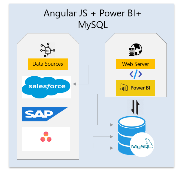
Power BI is one of the most popular and powerful BI tools out there. That will be our focus in this article. Before we get there, here’s a wonderful illustration of a typical business intelligence architecture:
What is Power BI?
Power BI is a popular and incredibly powerful business intelligence tool developed by Microsoft. It has different flavors and offerings. The most basic version is free, but it has the ability to perform mid-sized business intelligence exercises easily.

In broad terms, Power BI is a cloud-based business analytics solution suite that provides the necessary tools to turn vast volumes of data across silos into accessible information. It has been consistently ranked in the Gartner BI Magic Quadrant.
Power BI is popular for its versatility, interactivity, aesthetic designs, extensive connectivity to databases, and ease of creating low-effort dashboards. It also leverages support from other tools from its Microsoft ecosystem – Azure, Cortana, SQL Server, Azure Active Directory, Azure Blob Storage, etc.
Here are a couple of cool things Power BI can do:
- Real-time alerts and visualization for monitoring the health of manufacturing equipment. This is done by passing IoT sensor data through IoT Azure Hub, Azure Data Factory, Cognos DB, and then analyzing it in Power BI.
- Create and fetch charts and Power BI reports, and dashboards by giving voice instructions using Windows voice assistant Cortana.
What Are Data Analytics Expressions (DAX) and Why Are They Needed?
We can read data into Power BI from CSV files or a database. We can also merge tables in Power BI. Quite often, the data required for plotting is readily available in table columns (though that’s not always the case).
Consider a situation where we need to modify or change the data to improve our dashboards. Suppose those custom modifications we need are not readily available in Power BI. What do we do then? How can we perform this kind of modification and data analysis?
The answer is DAX (short for Data Analysis Expressions). DAX is used to bring some meaningful information hidden inside the raw data. In simple words, DAX is used for data manipulation.

There are certain rules we have to follow for using DAX. You’ll understand these rules quickly if you are familiar with Excel functions. DAX is just an advanced form of that.
There are two places where we write DAX:
- Calculated columns are very similar to regular columns that we see in most datasets. The difference is that calculated columns are the result of our computations by using two or more columns or using columns from different tables. They can be used when we want to perform row-wise calculations.
- Calculated measure, on the other hand, is similar to a calculated column. However, they do not occupy any physical memory, and their results cannot be seen in the form of a column. We usually use this when we want to perform dynamic computations on a group of rows or by grouping data.
Implementation of DAX Functions in Power BI
We will work on a few useful DAX commands and their functions in this section. We will be using the ‘Sample Super Store’ dataset. You can download the dataset here and start experimenting on your own as well!
The dataset contains three tables – ‘Orders’, ’Returns’, and ’Users’. Go ahead and load the Sample Superstore dataset Excel file into Power BI.
Open Power BI and look for “Get data” in the ‘Home’ tab. Select Excel and then browse to the dataset file present on your local machine. Load the entire file into your BI window.
Now, let’s get going!
1. LOOKUP( )
The LOOKUP function is pretty similar to VLookup in Microsoft Excel.
The third table in our dataset contains the details of all the managers per region. Now, here is where LOOKUP comes in handy. We can perform a lookup for the ‘Manager’ column in the ‘users’ table against the corresponding ‘Region’ column in the ‘orders’ table.
So, how do we perform a lookup in Power BI? There are two things we need to remember:
- We need a common column to perform a lookup.
- We also need unique values in at least one of the matching columns chosen from two different tables. The basic syntax for lookup is:
LOOKUPVALUE(Result Column Name, Search Column Name, Search Column value)Putting this syntax using our dataset variables:
Manager = LOOKUPVALUE(Users[Manager],Users[Region],Orders[Region])2. FILTER( ) & CALCULATE( )
The DAX displayed below is similar to the group by function. It dynamically aggregates a column based on the filter. This is helpful when we are creating a table in Power BI dashboards and need to filter only one column (while the remaining column remains unaffected by the filter).
This DAX comes in handy where every column used in the table can have its filter. Let’s take an example to understand how this works.
We want to calculate the sum of sales by region. So first, the filter function divides the region column into north, south, east and west. Then, it calculates the sum of sales according to the segregation. We are using a measure here since a particular region can have any number of rows involved within it.
Sum of sales based on region =
VAR reg = SELECTEDVALUE('Orders'[Region])
RETURN
CALCULATE (
    SUM(Orders[Sales]),
    FILTER('Orders', 'Orders'[Region] = reg)
)
Here, we are declaring a variable, reg, which acts as a key for the filter. We can declare a variable using the keyword VAR. The RETURN keyword gives us the result of the calculation (sum of sales, in our example).
3. Nested IF Condition
Consider the orders table in our dataset. The ‘Order Priority’ column has five values under it. Let’s assume we need some integer values instead of the original values present in that column. The Nested IF statement is our friend here:
Nested IF = IF(Orders[Order Priority] ="Critical", 5, IF(Orders[Order Priority] ="High", 4, IF(Orders[Order Priority] = "Medium", 3, IF(Orders[Order Priority] = "Low", 2, IF(Orders[Order Priority] = "Not Specified", 1)))))
4. Conditional Formatting
Conditional formatting is one of the most commonly used features of Microsoft Excel. And we can leverage that inside Power BI as well!
Conditional formatting, for those who haven’t used it before, is the ability to change the font color of a column based on a condition from another column. This can be done by creating a new column as per our condition and then using that column to set rules in the conditional formatting tab.
Let’s try this with an example from our Sample Superstore dataset.
We want to change the color of the values displayed in the ‘Order priority’ column of the orders table. For example, all ‘Critical’ values should be in red, all ‘High’ values should be in green color, etc.
We can use the Nested IF column we created above since the conditions are already specified. Set rules in the conditional formatting tab – if the value of the column created above is 1, then the font color should be red. If the value is 2, then it should be orange, and so on.
Here’s an image to show how you can do it in Power BI:


5. Splitting a String Based on Delimiters
Another common Excel function we can use in Power BI:
customer_split_1 = PATHITEM(SUBSTITUTE(Orders[Customer Name]," ","|"),1)The above PATHITEM function returns the resulting string. The SUBSTITUTE function replaces the delimiter specified with a particular character and fetches the corresponding word based on the value mentioned.
For example, let’s perform a split on the ‘Customer Name’ field. Here, the ” ” space will be the delimiter, and we have replaced it with a pipeline “|”. We need only the first name of a customer, so we have specified 1. You can change this value and see what results you get.
Now let’s perform three splits like this and name them as customer_split_1, customer_split_2, customer_split_3, respectively.
6. Fetching a Particular Letter From a Word
What if we wanted to extract only a particular letter from a word? It sounds tricky, but it’s quite easy in Power BI:
customer_initial_1 = LEFT(Orders[customer_split_1],1)We did it in just one line of code!
Let’s say a particular customer’s name is “Helen Stein,” and the split is divided into two parts. We use the above DAX to get the first letter from the first split word (Helen). The LEFT function returns the number of characters by positioning to the start of the string. If we give 2 instead of 1, the above DAX will return “He” instead of “H”.
7. Concatenating Strings
We often find ourselves in situations where we need to combine two words. To see how this works in Power BI, let’s assume we have multiple initials in our data.
We need to specify only the customer’s initials in the visualization rather than their whole name. This will help keep the table neat and compact:
customer_initials = CONCATENATE(Orders[customer_initial_1],CONCATENATE(Orders[customer_initial_2],Orders[customer_initial_3]))The concatenate function joins strings together. Here, we have performed a concatenation of three columns:

8. WEEKDAY()
The WEEKDAY function returns an integer number giving us the current day. Let’s figure out the day when a few orders were dispatched:
weekday = WEEKDAY(Orders[Ship Date],2)The integer number displayed above specifies the start day:
- 1 – Start from Sunday = 1 and ends on Saturday = 7
- 2 – Start from Monday = 1 and ends on Sunday = 7
- 3 – Start from Monday = 0 and ends on Sunday = 6
9. DATE Split Up
There are times when we need to unpivot the date for certain projects. Here’s the good news – we can do this with the help of DAX and the query editor in Power BI.
Now, we have two columns – order date and shipping date. We want to delist the dates lying between the two intervals. Let’s take the order date as 01-01-2015 and the shipping date as 03-01-2015. Since there’s a 3-day difference between them, this row will be listed three times.
We can do this through the query editor in Power BI. Select the ‘Custom Column’ option in the ‘Add Column’ Tab. The below window pops up, and we can add a column name and use the DAX query:
{Number.From([Order Date[)..Number.From([Ship Date])}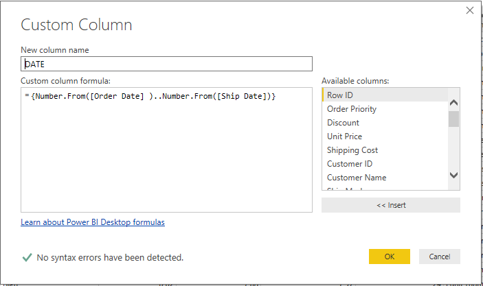
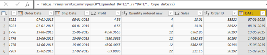
Next, find the DATE column in our dataset. Click on the small box inside the DATE column header and select the ‘Expand to new rows’ option:

Notice how the values are appearing in the form of whole numbers? Now, right-click on the column and change the data type to ‘Date‘ format:
10. Complex Aggregations Based on DATE
Working with date data is quite a complicated challenge. There is a lot more to it than just splitting up the different days, months, etc.
In this section, we will work on an example of complex aggregation based on dates. For instance, what is the total number of hours listed for the next 2 weeks or the past 2 weeks?
We’ll switch our dataset for this section. You can download the new dataset, called ‘Weekcal’, from Forecast. This dataset is modeled on team time allocation and a planning tool called Float. Float helps us assign tasks and calculate the estimated hours for team members.
There’s one caveat in Float we should be aware of. A week always starts from Monday in the Float tool. For example, if you want to calculate the assigned hours for next week starting from Thursday, you will find hours assigned from the most recent Monday to Friday and not from this Thursday to next Thursday.
Now, the dataset contains the following features:
- Start day – Start day of the task
- End date – End day of the task
- Hours/day – Number of hours spent on the task per day
- Task Name – Name of the task
Let’s assume we are interested in finding the number of hours allocated for next week. We can do this using the logic below:
FORECAST_1 WEEK = if (Forecast1[start_date]>=TODAY()-(WEEKDAY(TODAY(),2)-1) && Forecast1[end_date]<=TODAY()-(WEEKDAY(TODAY(),2)-1)+7,DATEDIFF(Forecast1[start_date],Forecast1[end_date],DAY)+1 * Forecast1[hours/day],

IF(Forecast1[start_date] > TODAY()-(WEEKDAY(TODAY(),2)-1) ,0,IF(Forecast1[start_date]<=TODAY()-(WEEKDAY(TODAY(),2)-1) && Forecast1[end_date]<=TODAY()-(WEEKDAY(TODAY(),2)-1)+7 && Forecast1[end_date]>=TODAY()-(WEEKDAY(TODAY(),2)-1),DATEDIFF(TODAY()-(WEEKDAY(TODAY(),2)-1),Forecast1[end_date],DAY)* Forecast1[hours/day],

IF(Forecast1[start_date]>=TODAY()-(WEEKDAY(TODAY(),2)-1) && Forecast1[end_date] >=TODAY()-(WEEKDAY(TODAY(),2)-1)+7,DATEDIFF(Forecast1[start_date],TODAY()-(WEEKDAY(TODAY(),2)-1)+7,DAY)* Forecast1[hours/day],

IF(Forecast1[start_date]<=TODAY()-(WEEKDAY(TODAY(),2)-1)&& Forecast1[end_date]>=TODAY()-(WEEKDAY(TODAY(),2)-1)+7,DATEDIFF(TODAY()-(WEEKDAY(TODAY(),2)-1),TODAY()-(WEEKDAY(TODAY(),2)-1)+7,DAY) * Forecast1[hours/day],BLANK())))))- TODAY() – (WEEKDAY(TODAY(), 2) – 1 returns the current Monday of the week
DATEDIFFfunction returns the difference between two dates
Check out the table below to see the estimated hours for each task for the following week:

Also read: DAX functions in Power BI
Conclusion
Power BI is a powerful and easy-to-use tool to create quick dashboards with a variety of data sources. DAX queries are used to map data, create new variables and business metrics, and manipulate data. This article gives a brief and quick guide to start your DAX journey.
You should also check out the Official Microsoft Tutorials for Power BI – a great resource!
Frequently Asked Questions
Q1. What is Power BI?
A. Power BI is a cloud-based business analytics solution suite that provides the necessary tools to turn vast volumes of data across silos into accessible information.
Q2. What Are Data Analytics Expressions (DAX)?
A. DAX (Data Analysis Expressions) is a syntax language consisting of formulas and expressions that can be used to manipulate data.
Q3. What are some examples of Data Analytics Expressions (DAX) functions in Power BI?
A. Some of the most commonly used DAX functions in Power BI are LOOKUP, FILTER, CALCULATE, PATHITEM, SUBSTITUTE, CONCATENATE, AND WEEKDAY.


Hi, Region coulmn in Orders table has many values stored in my dataset. When we use below DAX expression to create measure, it is showing blank. Sum of sales based on region = VAR reg = SELECTEDVALUE('Orders'[Region]) RETURN CALCULATE( SUM(Orders[Sales]), FILTER('Orders','Orders'[Region]=reg) )
Great resource for learning Power BI, thanks!
Carefully observe the winners, don't always pay attention to the losers