This article was published as a part of the Data Science Blogathon.
Introduction
BI tools, including software services, apps, and data connectors, make up the Microsoft Power BI portfolio. Data from many sources are combined into a single dataset in this cloud-based platform. These data sets create shareable reports, dashboards, and apps for data visualization, evaluation, and analysis.
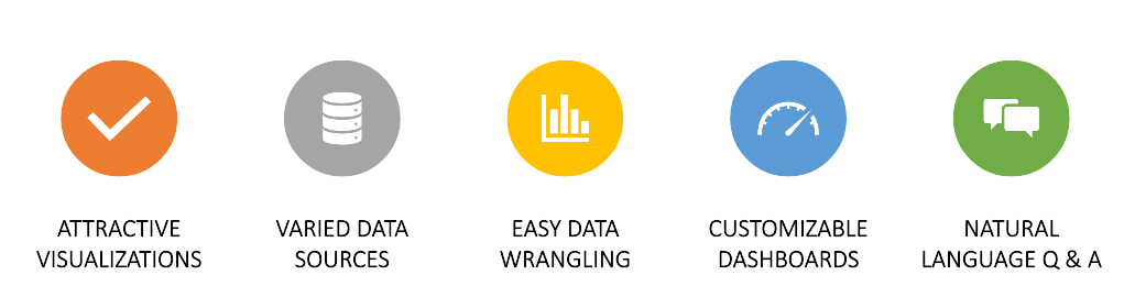
Figure 1: Features of Power BI
Power BI is used to import data from local databases/data sources cloud-based data sources, Excel files, and several other hybrid sources. Because of this and the many other BI products, Power BI leads, it is an effective and user-friendly tool to analyze data. To create interactive dashboards, evaluate information, and produce and share information with other users.
All your disparate data sources can be brought together using Power BI’s software services produces meaningful insights. There are numerous methods to store data, from simple spreadsheets to hybrid data warehouses combining cloud and on-premises storage options. Access your data sources using Power BI, connect quickly, explore and share important insights with others, and connect quickly.
Power BI Q&A Overview
- Using a natural language search is the fastest way to find an answer from your data.
- Q&A in Power BI allows you to explore your data in a way that makes sense to you using your own words.
- Interacting with the audience through Q&A may be a lot of fun.
- You can explore the data using natural language with the power bi q&a feature.
- As the visualizations show new avenues of deeper knowledge, the single question often leads to another.
- It is only the beginning to ask the search.
- Look at the facts from a different perspective.
- Interactive and fast.
- Free for everyone. You can download the Power BI and use the feature.
- Can generate automated visualization.
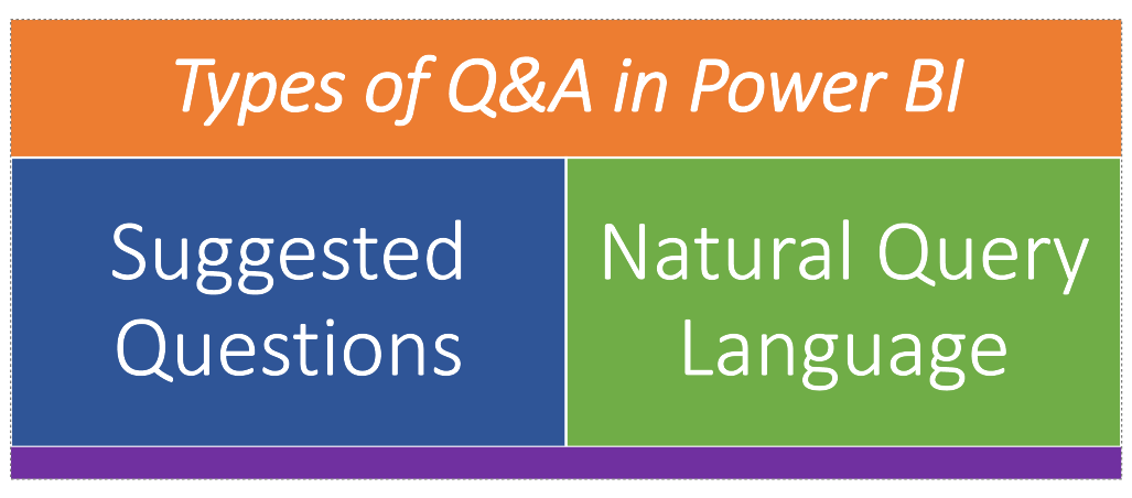
Types of Power BI Q&A
We can add Power BI Q&A in two ways:
Steps to Add Suggested Q&A
- Download and install the Power BI desktop from here.
- Open Power BI desktop
- Load the data using the get data option (refer to Figure 2.)
- I am using a CSV file, so I have selected the Text/CSV option.
- Select the dataset which you have. I used the COVID19 data set from here.
- You will get a window where you can see the overview of the dataset. Click load.
- Now click Q&A from the visualization pane (Refer to Figure 3.)
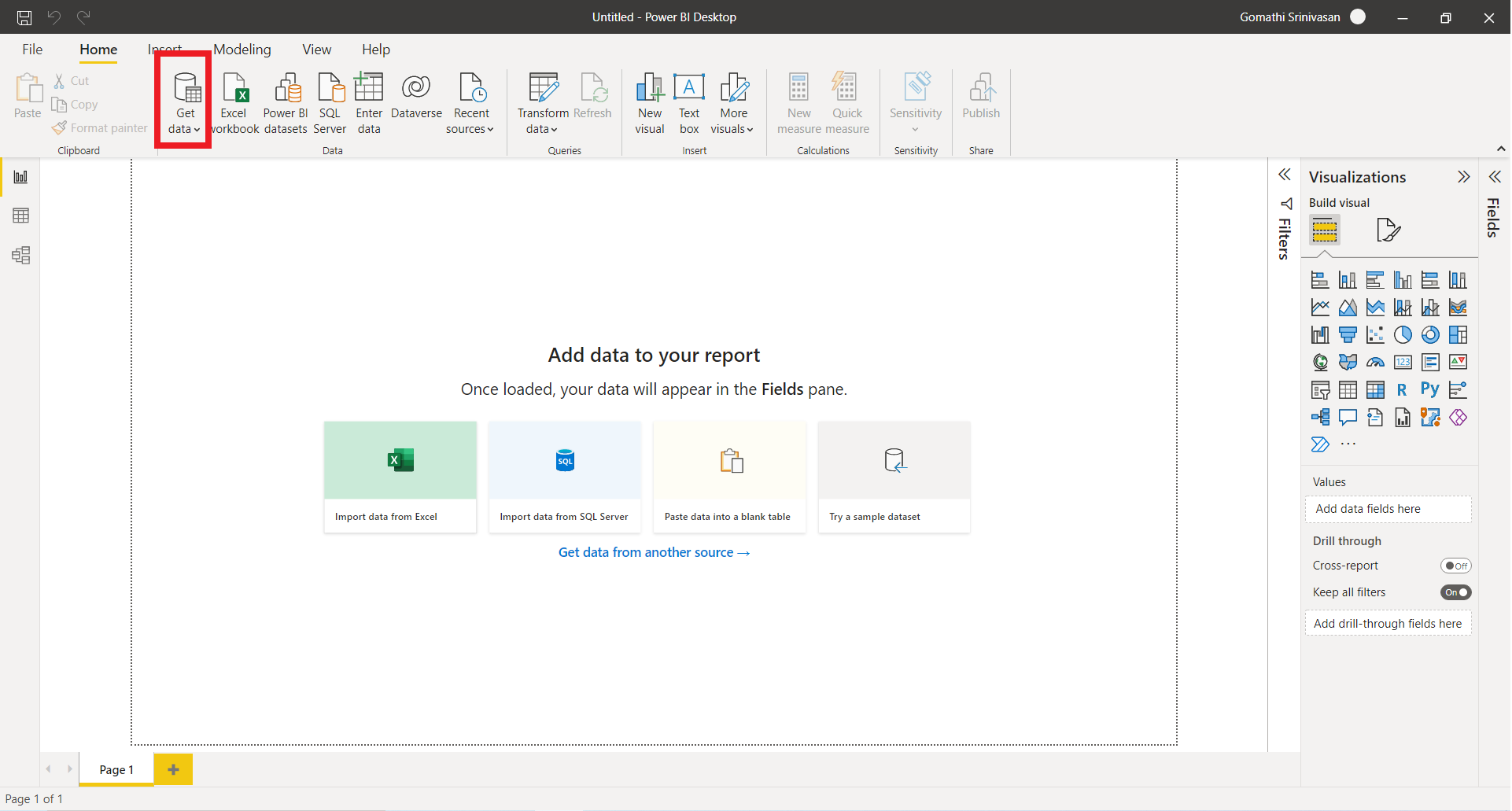
Figure 2: Get data
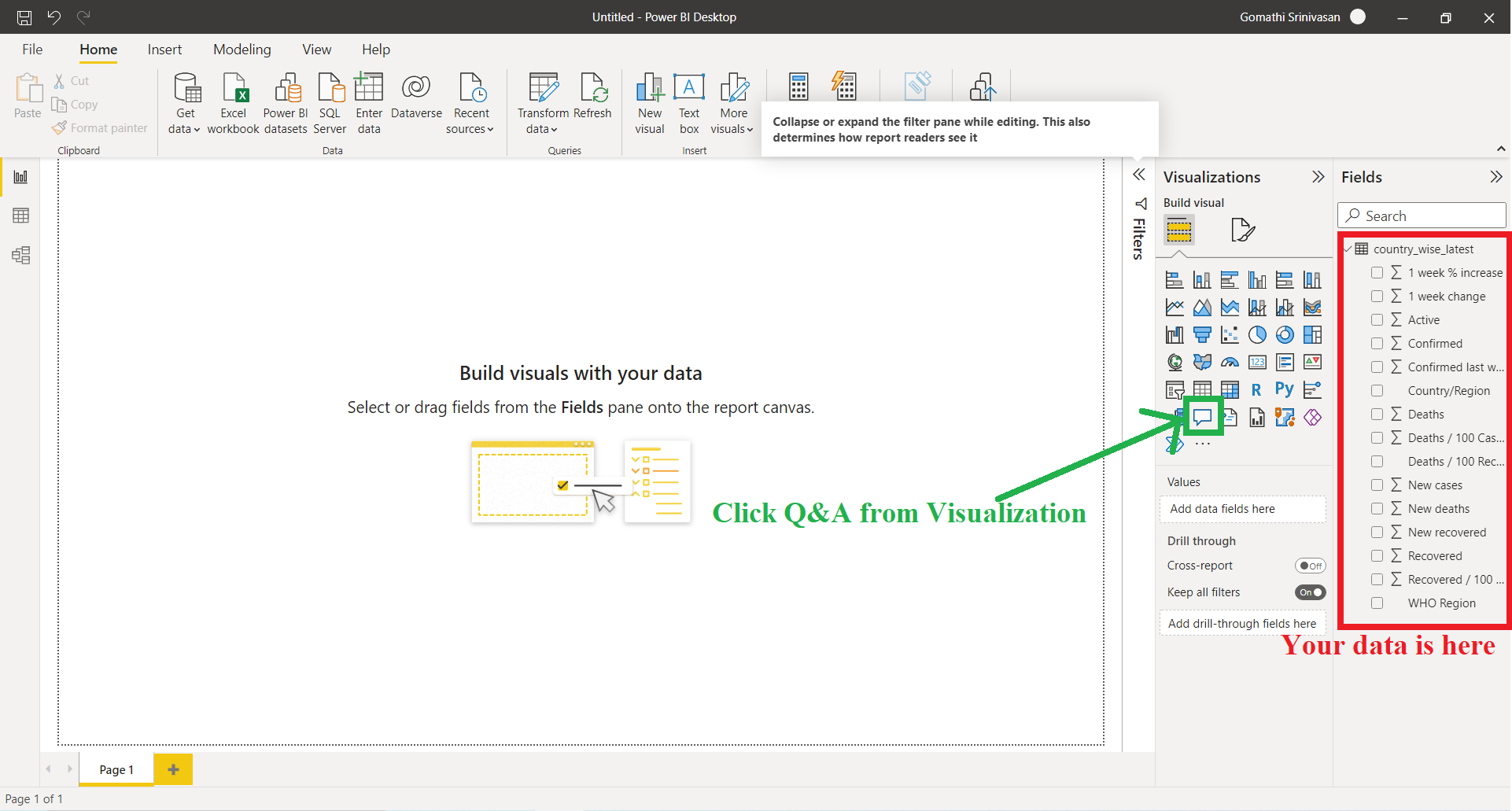
Figure 3: Q&A in Visualization pane
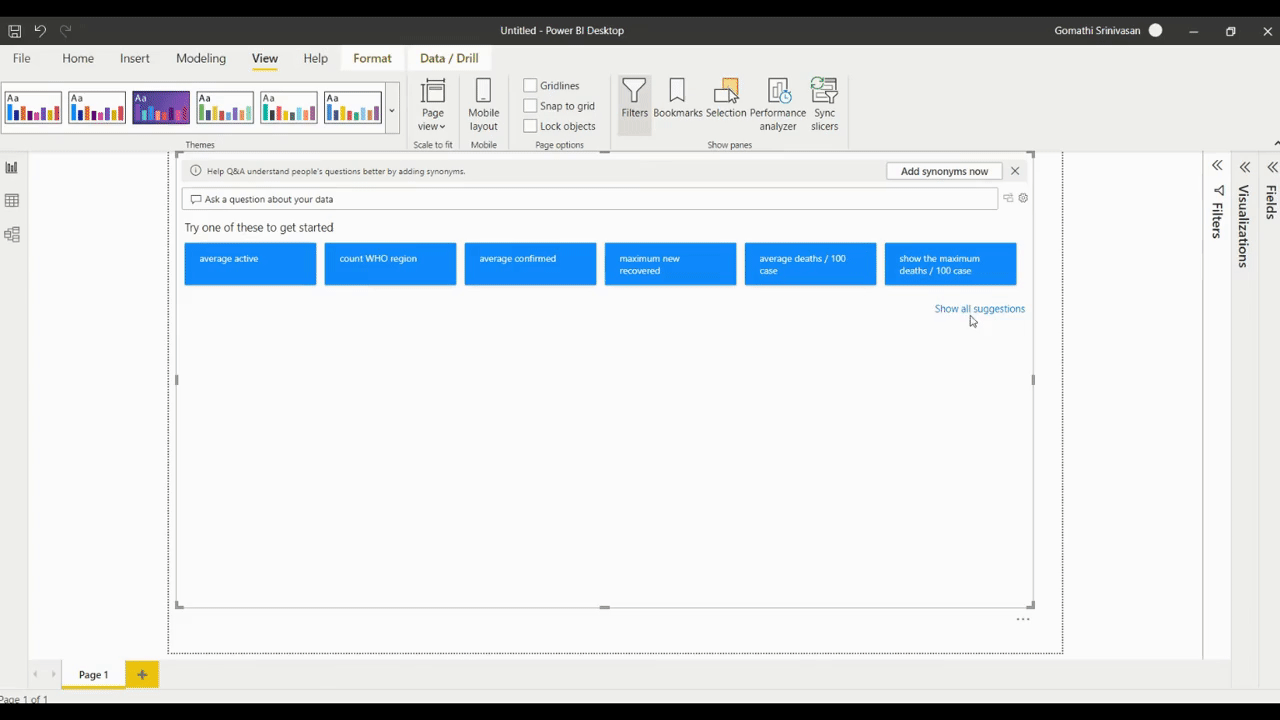
Now Q&A check the Q&A (Refer to Figure 4). You can enlarge it according to your need.
This Q&A is generated by Power BI itself based on the data.
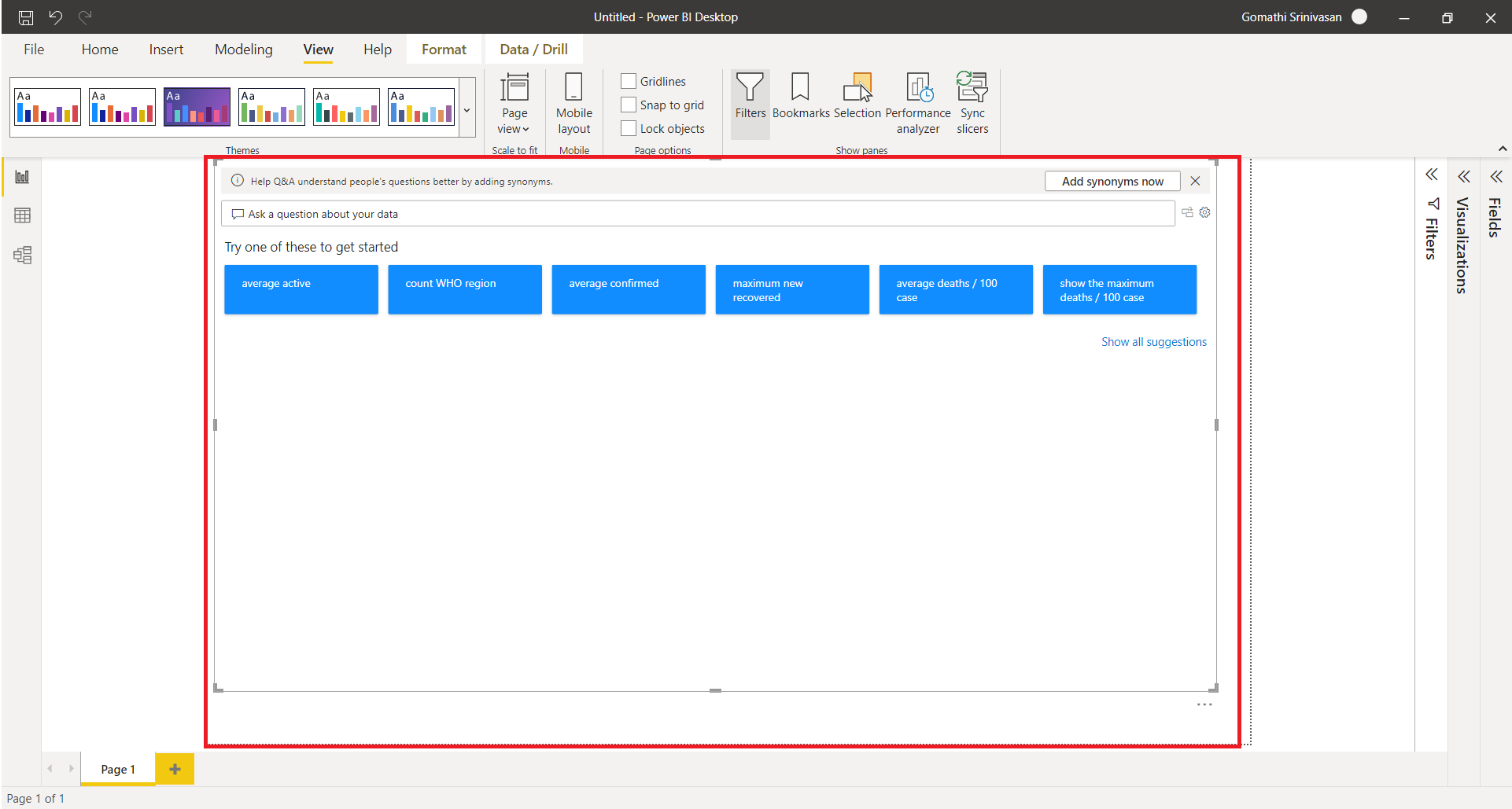
Figure 4: Q&A generated by Power BI
Components of Power BI Suggested Q&A
Let us understand the Components of Power BI from Figure 5 and Figure 6
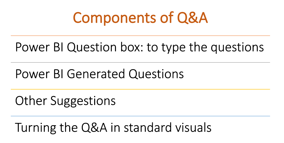
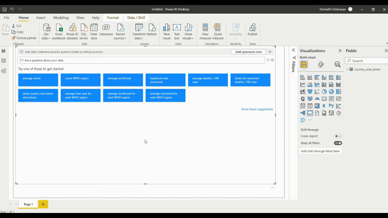
Figure 5: Components of Power BI Q&A
Question Box: the users should type the questions to get insights.
Generated Questions: By default, Power BI will generate a set of Q & A based on the data we are using.
Other Suggestions: If you click on “other suggestions”, will show some more questions which are generated by the Power BI
Turning the Q&A into standard visuals: You can make the Q&A outcome a shared vision.
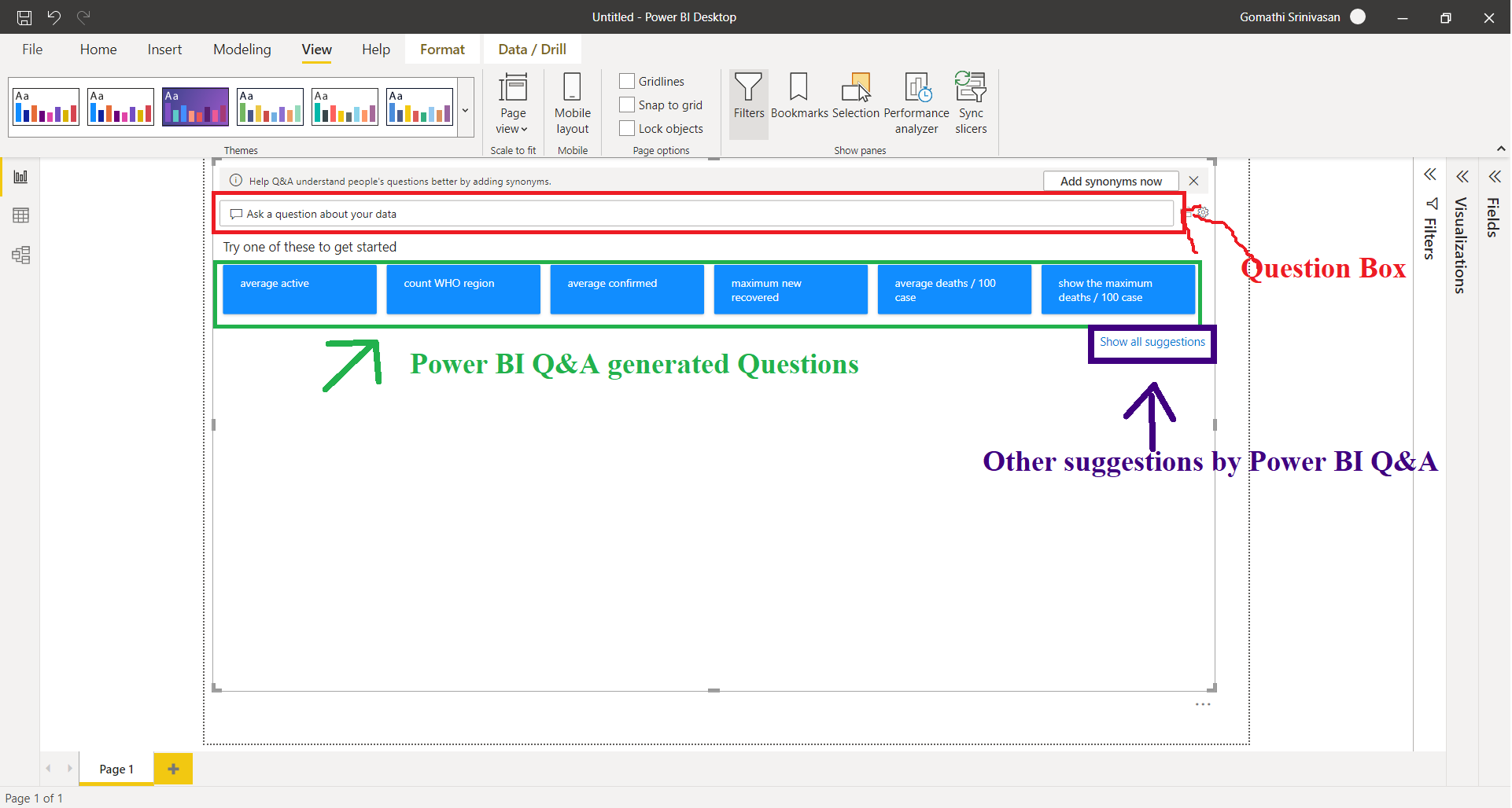
Figure 6: Components explained
Demo of all the Components
Question Box
Let us try the Question box (Refer to the below Gif)

Change the chart type by writing “as” in the question. (refer to the below image)
Power BI generated questions
By default, Power BI will generate the questions based on the Data you are using, shown in the blue colour component. Click to see the results. (Refer to the below GIF).

Show all suggestions
Click the “Show all suggestions” to see some more questions generated by the tool.
To change the colour of the chart, use the View menu.
Turn the Q&A result to the standard visuals.
How to Frame Questions in Q&A?
To assist us in writing our query, Q&A provides us with a list of suggested words and phrases. We can begin with one of the pre-selected questions or type our own. The following are just a few examples of the types of questions that Q&A can help with:
Natural questions: Which country has the highest death?
Apply a relative date filter: Show me the death in the last month
Top N: Top 5 country-wise latest by confirmed
Incorporate a filter: Show me death in India
Provide numerous options: Show me recovers in India and France.
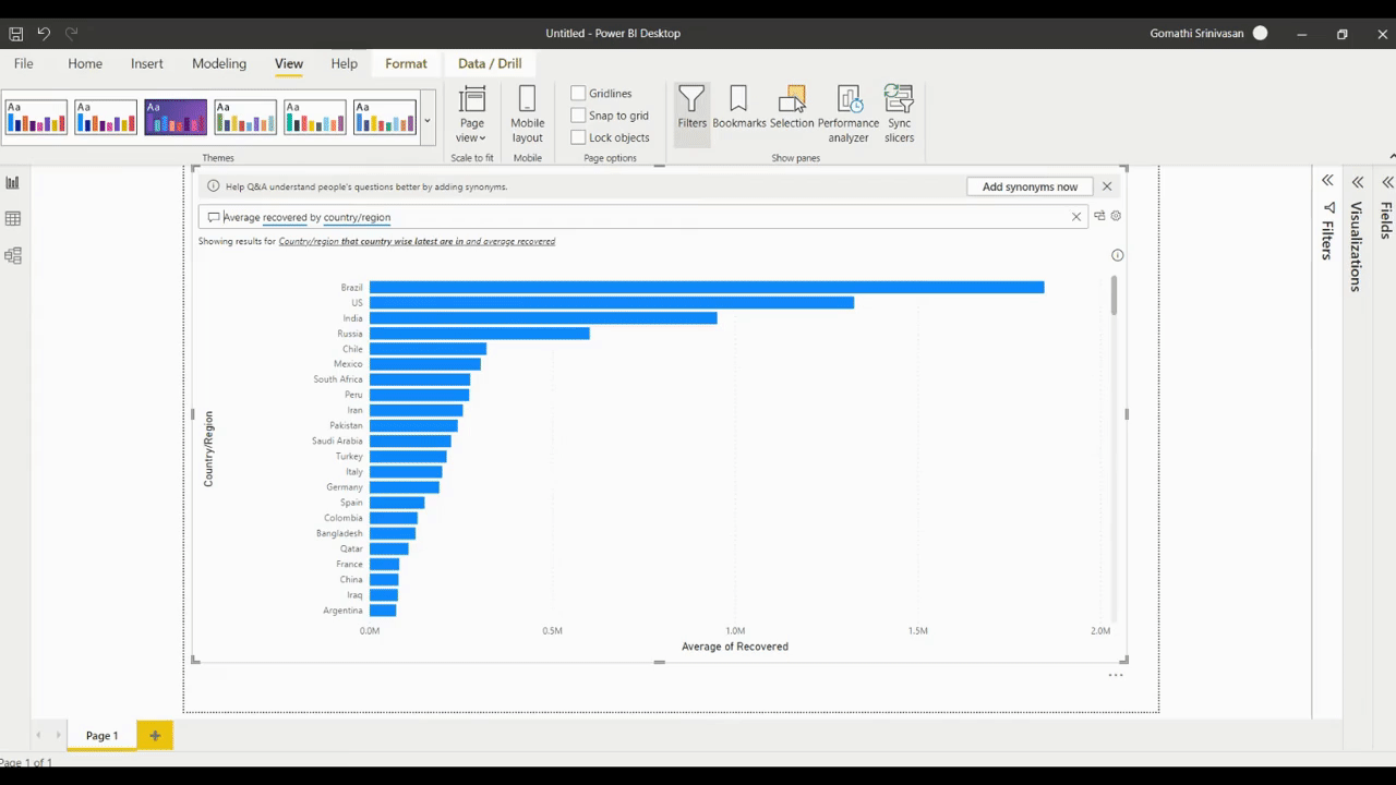
Bring up a specific visual: Show me region-wise recovered as a pie chart.
Complicated aggregations: Show me median deaths by WHO region.
Comparing Data: show me the WHO region-wise total confirmed and total recovered
See what’s hot and what’s not: Show me death overtime. (if you have a date column)
Sorting Data: Show me the top 5 countries by death order by deaths / 100 cases.
Other Features
Autocomplete
Power BI Q&A gives the related opinion and contexts when we start writing the query, permitting you to become productive using natural language quickly. It’s a lot like entering a search engine’s URL. Every time you type, you will be provided with immediate feedback and results.
Orange/Red/Blue underlines
With Q&A, you can see which words the machine recognised and which it didn’t by looking for terms with underlines.
Orange: The words with an orange dotted underline to show that the confidence is low.
Red: Using red underlining indicates that Q&A was unable to identify the term.
Solid Blue: To show that a term has been matched to a specific field or value in the imported data, underlining in a blue.
Type of charts
Q&A’s recent improvements include an attempt to read the question and automatically plot the fields to the proper axis.
In “Death by country,” Q&A recognises the country field and Death field and applies the fields properly in the chart.
You can use ‘as chart type’ after the question if you want to alter the visualisation type.
Currently, Q&A supports the following types of visualisations in its user interface:
- Map
- Bar chart
- Line chart
- Matrix
- Table
- Card
- Scatter chart
- Bubble chart
- Pie chart
- Area chart
Conclusion
This is a very efficient tool for better visualization and dashboard. In this article, you have learned detailed steps to add suggested AI to your report, components of Power BI Q&A, and how to design and form various queries and suggestions. By adding Q&A, you will add more attractiveness to the dashboard.
You can command and see how to show the response you get from your data with Q&A.
The media shown in this article is not owned by Analytics Vidhya and is used at the Author’s discretion.


