matplotlib – The Most Popular Python Library for Data Visualization and Exploration
I love working with matplotlib in Python. It was the first visualization library I learned to master and it has stayed with me ever since. There is a reason why matplotlib is the most popular Python library for data visualization and exploration – the flexibility and agility it offers is unparalleled!
Matplotlib provides an easy but comprehensive visual approach to present our findings. There are a number of visualizations we can choose from to present our results, as we’ll soon see in this tutorial.
From histograms to scatterplots, matplotlib lays down an array of colors, themes, palettes, and other options to customize and personalize our plots. matplotlib is useful whether you’re performing data exploration for a machine learning project or simply want to create dazzling and eye-catching charts.
Note: If you’re new to the world of Python, we highly recommend taking the below popular free courses:
What is matplotlib?
Let’s put a formal definition to matplotlib before we dive into the crux of the article. If this is the first time you’ve heard of matplotlib, here’s the official description:
“Matplotlib is a Python 2D plotting library which produces publication quality figures in a variety of hardcopy formats and interactive environments across platforms. Matplotlib can be used in Python scripts, the Python and IPython shells, the Jupyter notebook, web application servers, and four graphical user interface toolkits.”
You can draw up all sorts of charts and visualization using matplotlib. I will be exploring the most common plots in the matplotlib Python library in this tutorial. We will first understand the dataset at hand and then start building different plots using matplotlib, including scatterplots and line charts!
Note: If you’re looking for a matplotlib alternative or want to explore other Python visualization libraries, check out the below tutorial on Seaborn:
Here are the Visualization We’ll Design using matplotlib
- Bar Graph
- Pie Chart
- Box Plot
- Histogram
- Line Chart and Subplots
- Scatter Plot
Understanding the Dataset and the Problem Statement
Before we get into the different visualizations and chart types, I want to spend a few minutes understanding the data. This is a critical part of the machine learning pipeline and we should pay full attention to it.
We will be analyzing the Food Demand Forecasting project in this matplotlib tutorial. The aim of this project is to predict the number of food orders that customers will place in the upcoming weeks with the company. We will, of course, only spend time on the exploration stage of the project.
Let us first import the relevant libraries:
I have used a matplotlib stylesheet to make our plots look neat and pretty. Here, I have used the ‘seaborn’ stylesheet. However, there are plenty of other stylesheets in Matplotlib which you can use to best suit your presentation style.
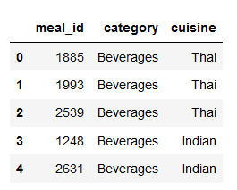
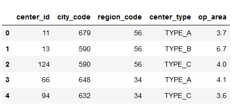
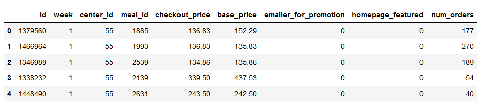
Our dataset has three dataframes: df_meal describing the meals, df_center describing the food centers, and df_food describing the overall food order. Have a look at them below:
I will first merge all the three dataframes into a single dataframe. This will make it easier to manipulate the data while plotting it:
Right – now let’s jump into the different chart types we can create using matplotlib in Python!
1. Bar Graph using matplotlib
First, we want to find the most popular food item that customers have bought from the company.
I will be using the Pandas pivot_table function to find the total number of orders for each category of the food item:
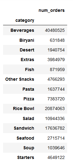
Next, I will try to visualize this using a bar graph.
Bar graphs are best used when we need to compare the quantity of categorical values within the same category.
Bar graph is generated using plt.bar() in matplotlib:
Python Code:
import pandas as pd
import numpy as np
import matplotlib.pyplot as plt
plt.style.use('seaborn')

#reading the meal info csv file
df_meal = pd.read_csv('meal_info.csv')

# Reading fulfilment center info csv file
df_center = pd.read_csv('fulfilment_center_info.csv')

# Reading train food csv file
df_food = pd.read_csv('train_food.csv')

# Merge dataframes
df = pd.merge(df_food,df_center,on='center_id')
df = pd.merge(df,df_meal,on='meal_id')

# Pivot table
table = pd.pivot_table(data=df,index='category',values='num_orders',aggfunc=np.sum)

# Barplot
plt.bar(table.index,table['num_orders'])
plt.xticks(rotation=70)
plt.xlabel('Food item')
plt.ylabel('Quantity sold')
plt.title('Most popular food')
plt.show()
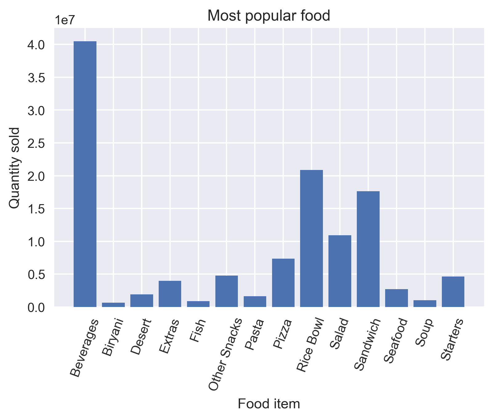
It is always important to label your axis. You can do this by employing the plt.xlabel() and plt.ylabel() functions. You can use plt.title() for naming the title of the plot. If your xticks are overlapping, rotate them using the rotate parameter in plt.xticks() so that they are easy to view for the audience.
You can save your plot using the plt.savefig() function by providing the file path as a parameter. Finally, always display your plot using plt.show().
While analyzing the plot, we can see that Beverages were the most popular food item sold by the company. Wait, was it because they were sold with almost all the meals? Was Rice Bowl the most popular food item?
Let’s divide the total food item order by the number of unique meals it is present in.
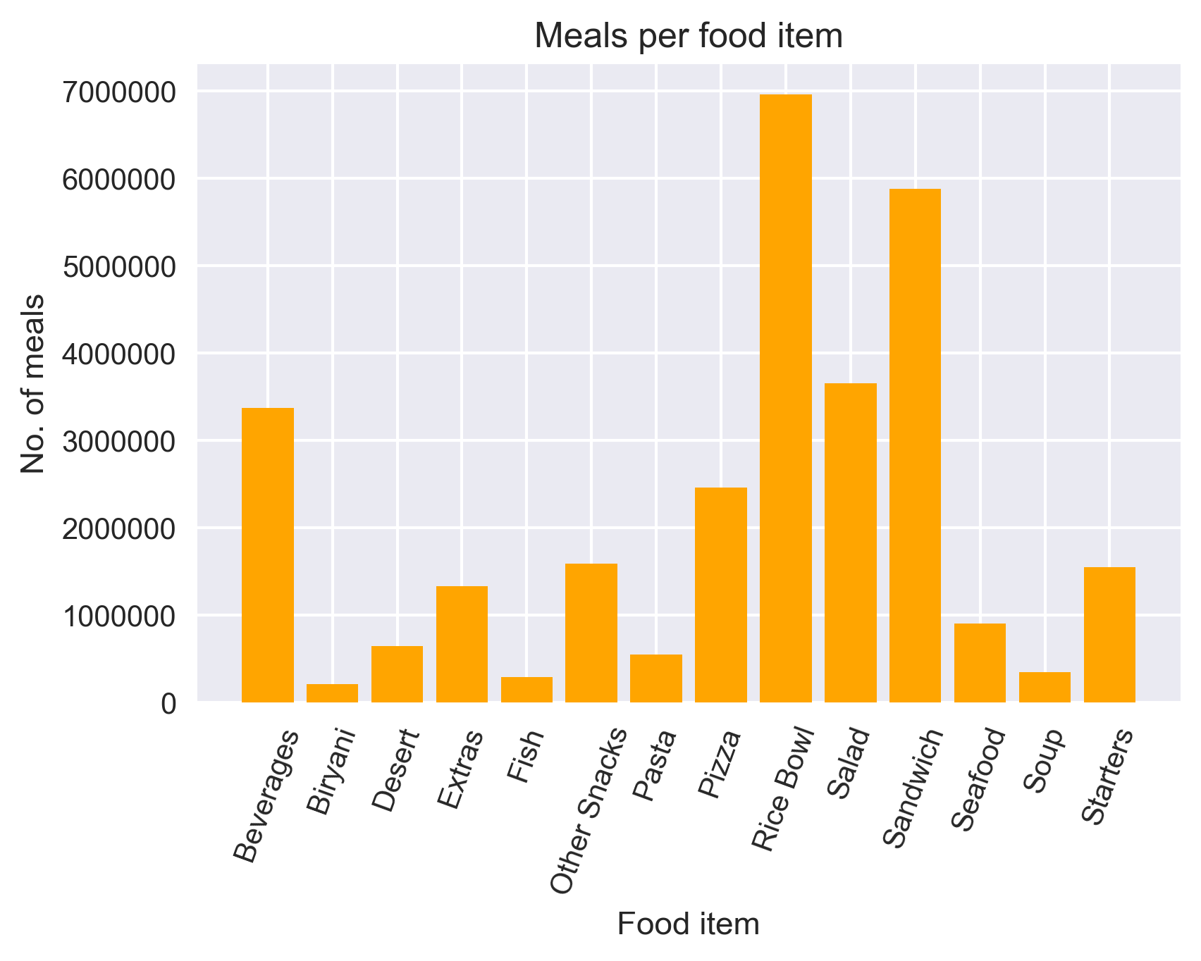
Yes, our hypothesis was correct! Rice Bowl was indeed the most popular food item sold by the company.
Bar graphs should not be used for continuous values.
2. Pie Chart using matplotlib
Let us now see the ratio of orders from each cuisine.
A pie chart is suitable to show the proportional distribution of items within the same category.
Let’s plot the pie chart:
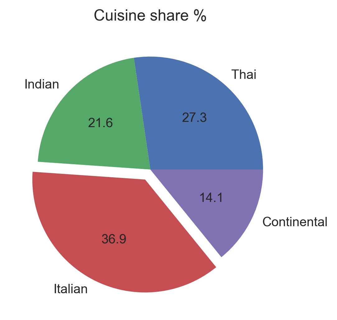
- I used plt.pie() to draw the pie chart and adjust its parameters to make it more appealing
- The autopct parameter was used to print the values within the pie chart up to 1 decimal place
- The explode parameter was used to offset the Italian wedge to make it stand out from the rest. This makes it instantly clear to the viewer that people love Italian food!
A pie chart is rendered useless when there are a lot of items within a category. This will decrease the size of each slice and there will be no distinction between the items.
3. Box Plot using matplotlib
Since we are discussing cuisine, let’s check out which one is the most expensive cuisine! For this, I will be using a Box Plot.
Box plot gives statistical information about the distribution of numeric data divided into different groups. It is useful for detecting outliers within each group.
- The lower, middle and upper part of the box represents the 25th, 50th, and 75th percentile values respectively
- The top whisker represents Q3+1.5*IQR
- The bottom whisker represents Q1-1.5*IQR
- Outliers are shown as scatter points
- Shows skewness in the data
Plotting the boxplot below:
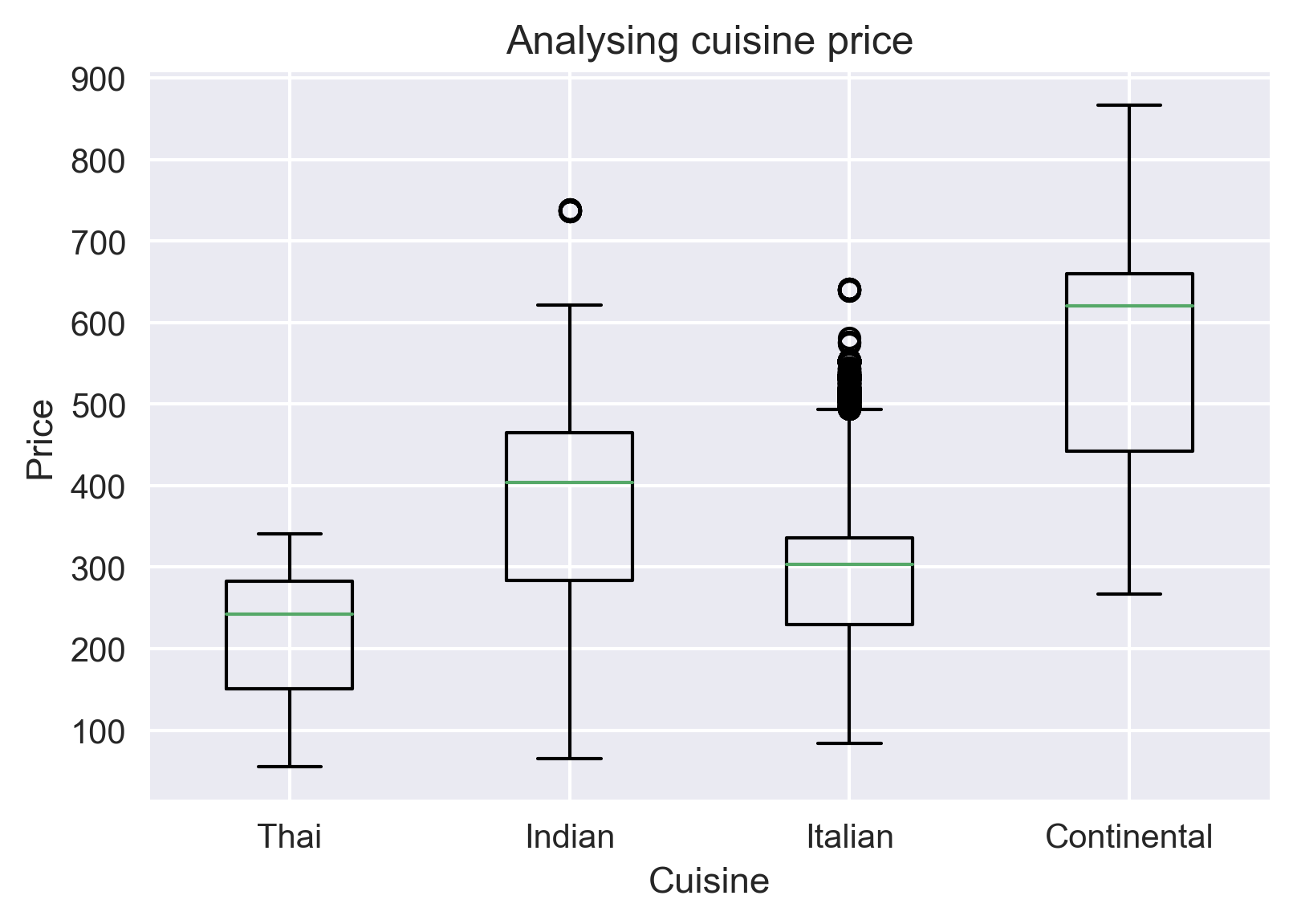
Continental cuisine was the most expensive cuisine served by the company! Even its median price is higher than the maximum price of all the cuisines.
Box plot does not show the distribution of data points within each group.
4. Histogram using matplotlib
On the topic of prices, did we forget to inspect the base price and checkout price? Don’t worry, we will do that using a histogram.
A histogram shows the distribution of numeric data through a continuous interval by segmenting data into different bins. Useful for inspecting skewness in the data.
Since base_price is a continuous variable, we will inspect its range in different distinct orders using a histogram. We can do this using plt.hist().
But the confusing part is what should be the number of bins? By default, it is 10. However, there is no correct answer and you can vary it according to your dataset to best visualize it.
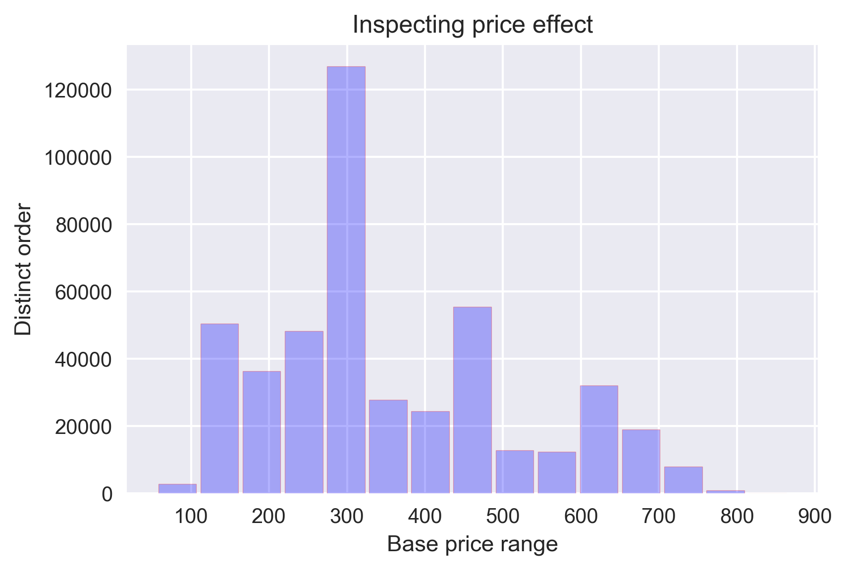
I have chosen the number of bins as 15 and it is evident that most of the orders had a base price of ~300.
It is easy to confuse histograms with bar plots. But remember, histograms are used with continuous data whereas bar plots are used with categorical data.
5. Line Plot and Subplots using matplotlib
A line plot is useful for visualizing the trend in a numerical value over a continuous time interval.
How are the weekly and monthly sales of the company varying? This is a critical business question that makes or breaks the marketing strategy.
Before exploring that, I will create two lists for storing the week-wise and month-wise revenue of the company:
I will compare the revenue of the company in every week as well as in every month using two line-plots drawn side by side. For this, I will be using the plt.subplots() function.
Matplotlib subplots makes it easy to view and compare different plots in the same figure.
To understand how this function works, you need to know what Figure, Axes, and Axis are in a matplotlib plot.
Figure is the outermost container for the Matplotlib plot(s). There can a single or multiple plots, called Axes, within a Figure. Each of these Axes contains the x and y-axis known as the Axis.
The plt.subplots() figure returns the figure and axes. You can provide as an input to the function how you want to display the axes within the figure. These will be adjusted using the nrows and ncols parameters. You can even adjust the size of the figure using the figsize parameter.
Axes are returned as a list. To plot for specific axes, you can access them as a list object. The rest of the plotting is done the same way as simple plots:
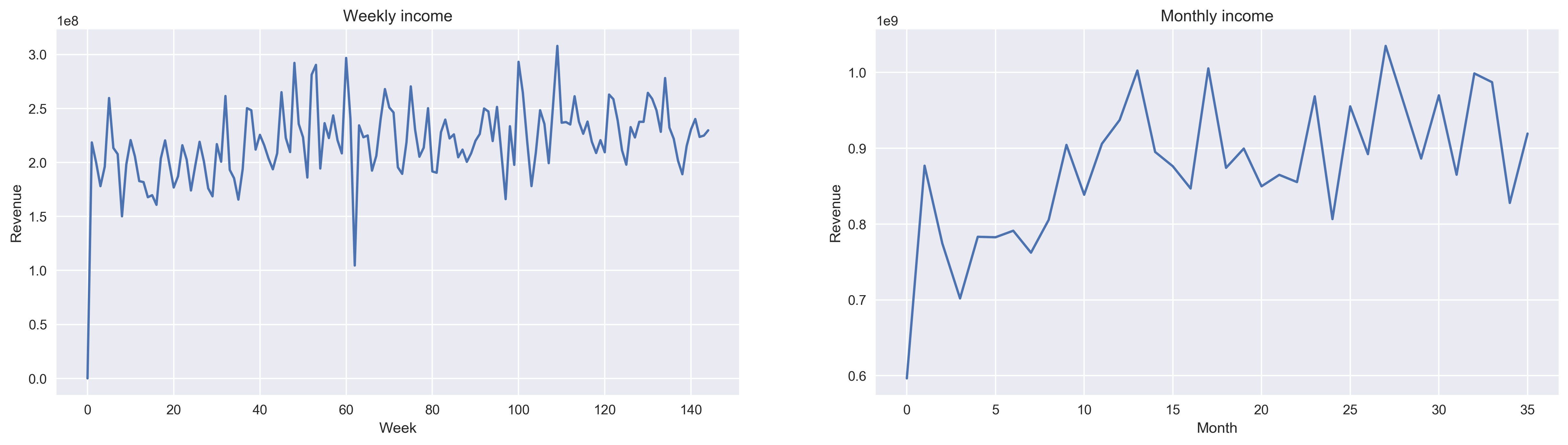
We can see an increasing trend in the number of food orders with the number of weeks and months, though the trend is not very strong.
6. Scatter Plot using matplotlib
Finally, I will try to analyze whether the center type had any effect on the number of orders from different center types. I will do this by comparing a scatter plot, a boxplot and a bar graph in the same figure.
We have already seen the use of boxplots and bar graphs, but scatter plots have their own advantages.
Scatter plots are useful for showing the relationship between two variables. Any correlation between variables or outliers in the data can be easily spotted using scatter plots.
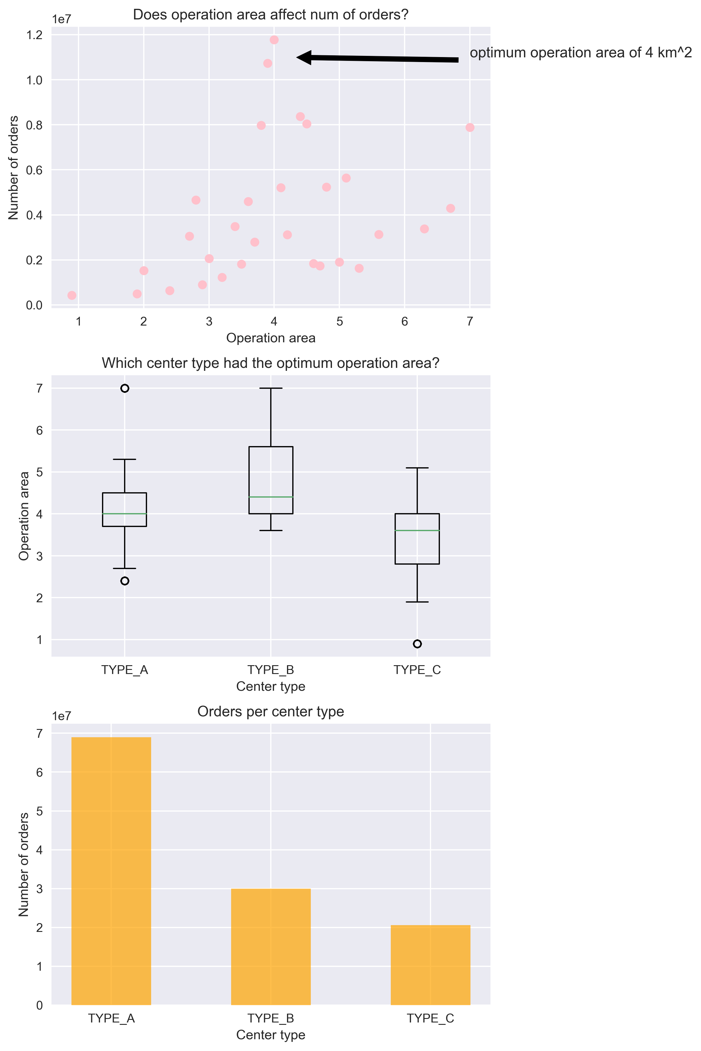
The scatter plot makes it instantly visible that the optimum operation area of a center is 4 km sq. The boxplot shows that the TYPE_A center type had the most number of optimum size centers because of a compact box with a median around 4 km sq. Because of this, they had more orders placed by customers than any other center type.
End Notes
You are now a step closer to creating wonderful plots in Matplotlib. However, the best way to master plotting is to practice, practice and practice!
For this, I suggest you go through other such amazing datasets on the DataHack platform and visualize till you dream in plots!
Next, you can go through the below resources to build your existing skillset:


This is an awesome article!!!
Hello sir, It is an informative article. Could you please explain this below code., df1[df1['category']==table.index[0]].shape[0]